Your Kitchen Floor Plan - How To Visualize!!

I've had a few clients recently who have needed to come to terms with what their space will really feel like. I hear this often, that people cannot visualize how their space will look and feel, based on a floor plan. You know what? Sometimes, it's helpful to me, too, to get out the old tape measure and double check things AFTER I've done the floor plan, in the actual space. It is, after all, a "feeling" for space, that is put on paper. Therefore, it is important to "feel" the space in the front end however you can, before cabinetry is ordered.
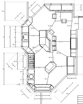
floorplan3.jpgIt's funny that, while it's always at the forefront for me, the movement around the kitchen, I can't say that I'm ever nervous about how the kitchen will feel once it's installed. I mean, it's a huge risk. You're ordering expensive cabinetry in particular sizes where things have to flow and function and operate correctly for a variety of activities. I think it is because the path I use to get to a comfortable flow, works extremely well. It's an interesting phenomenon, having worked off of a floorplan, and then having the real cabinets begin to be put into place. It is the MOST exciting part of what I do, bar none. It is a real rush to see it come to life, for me! When I express enthusiasm to the client, it's for real, I'm as excited, or more so, than they are.

I put a large emphasis on what I call "negative space"...the space which is just space, air. But that "just space" includes the following: walkways, passageways around tables, islands, around appliances, how far appliances project when open, where are steps located, doorways, work flow, all the elements which project into the negative space. It's the negative space, which is extremely important. I mostly consider that first and then "back in" the design of the cabinetry. The negative space often tells the story of how a kitchen can be designed effectively. The first driving force are windows, doors and passageways into other rooms. 

The fundamentals are designed in carefully, even engineered in, often, in my case always, to the 1/8 of an inch. However, that is only half the story. The clients really must be able to understand the new space. 

Here's how the homeowner can visualize their floorplan so they feel confident it feels right:

  • Go over the floorplan with the designer and have the designer measure from one point to another, for as many distances as you can think of on the plan, to verify what the clearances are between which areas.
  • Once you get those distances, do one of two things, or both. Take out the tape measure and look at critical distances in real space. And, or, "mock up" certain items in certain areas in your existing space to see what the "volume" of something will feel like as well as to how it might be situated in the space. This is helpful for something monolithic, like a refrigerator, pantry, to be sure that large items will feel comfortable for you in the space and not block certain views.
  • floorplan1.JPEGTry to see your plan in a perspective drawing. Keep in mind that perspective drawings are, by definition, out of proportion and scale, exaggerating near and far areas of the perspective. Yet, they do show depth fairly well.
  • Ask your designer, if it's a new construction project, via spray paint, or marker, to outline the areas where cabinetry will be going. This is a great tool for visualizing clearances. This should be done when the floorplan is completed and the cabinetry ordered, otherwise you will have many lines drawn on your subfloor, which will be impossible to interpret. For existing remodels, use blue tape in your kitchen. A word to the wise. Normally, there is a window of time to make any changes on the cabinet order, should that be necessary.
  • When doing these exercises, make note of your appliance locations, particularly the depth of your range or refrigerator. Those items can be as deep as 32"!
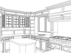
  • kitchen perspective.jpgTake note that you have adequate space surrounding your dining area for someone to pass by to a seat or any other similar situation surrounding chairs for island or dining areas. Also, how the dining area impacts passageways and entry ways, take a look at that. And, measure in real space where you need to, and can.
  • One great thing to do is to double check what your spaces are NOW for clearances around certain areas to verify if they will be getting larger in your new floor plan, or just how they will change, compared to how you are living now. For example, how far is the table to the wall now, vs. in the new floor plan, things like that. Be familiar with your existing conditions.

These tips should be a constructive, efficient, way to get you closer to really understanding what your space AROUND your cabinetry and appliances will feel like. And, that's important. Once some of those exercises are done, you can feel even more confident and excited about your new, enhanced lifestyle to come. I really love this part!


Go Large - Designing Kitchen Windows

large kitchen windowsI just got finished fertilizing about 170 roses in my garden. When I do something, I do it big! It's an extremely exciting time if you are a gardener in the northeast. Hour by hour, all the plants are popping. I'm doubly excited because the  fertilizer I ordered arrived today at my front door, hours before the start of several days of a good, soaking rain. Perfect timing. Coming into the kitchen in the morning shows progress and beauty in the garden every day.

When I remodeled my kitchen a few years back, one of my wishes was to have expansive views of the garden from the kitchen.  We installed 20' of windows. I wanted as many windows as I could get for natural lighting in the kitchen and wonderful garden views. I WAS a bit concerned with not so great views over the winter, but I was willing to pay that very small price. Of course, there is beauty in many winter views as well, with or without snow.

This is a little insight into why I designed large windows in my kitchen (these images are not of my kitchen!)

WHERE DO YOU START? 

When you consider remodeling your kitchen, window size and placement should play an important role. It's funny, but even today, when windows are getting larger in many homes, there is often still hesitation to "go large" with the kitchen window. And, in many cases, and this is a key point, if the kitchen is in the back of the house, the house may have been purchased, partially, for the beauty of the yard, and the existing kitchen windows do not often allow one to fully appreciate the views! It is a paradox that is amusing to me.

kitchen window.jpg 


My recommendation, when planning new windows for the kitchen is to consider:

  • the views of your yard and the role that a lovely view can play in your life in the kitchen
  • the pleasant feeling you get when you are near natural lighting
  • the energy saving costs you could incur, depending on the kitchen's exposure for heating and lighting purposes
  • taking care not to worry that expanding a window relates to an "unacceptable" amount of lost cabinet storage. This part is tricky. Of course, in small kitchens, it is a more critical issue. In medium and large kitchens, carefully evaluate the pros and cons of a larger window before saying a quick "no...I'll lose too much storage."
  • always taking into consideration the architectural view from outside looking in
  • operable vs. non operable windows - operable for needed ventilation, non operable for unobstructed viewing
  • the other windows of your home and select a window style that is the same or very similar
  • if the window or windows should be situated for a specific view of a pool, a play area, garden, wide vista, etc.
  • one's overall psychological well being with a connection to nature
  • what role will privacy play in your window location?

small kitchen windowWhat if your view is not park like, but looks toward a brick wall, a driveway or other nondescript area? Think beyond what you see outside at this moment. Is it possible to add some landscaping to enhance the existing view? Often, it is, but is something the homeowner did not consider.

Is there a spot for a long window? Long windows have a place in a kitchen as well. Short windows are not the only size that must be in a kitchen! I once spoke with a wheelchair bound homeowner and suggested a tall window just beyond the cabinetry, so that he could enjoy the view outdoors. This was a welcome suggestion! 

In a future post, I will discuss how to select the size and shape of the window. 

I'm now energized for the next 6 months of garden viewing out my kitchen window! (see below) And, no, we do not have a gardener! My husband and I designed the garden ourselves, dug every hole (2'x2'), prune every bush, hand water in between rains, do garden clean up multiple times a year, we do not have a "service", it is all our work, which we like to look at and enjoy. A "garden walk" with a glass of wine is a good reward too. Roses were purchased one by one over a several year period. Five more just arrived last week! What can I say? It's a obsession hobby. You'll find me in the garden most days now from 5-8 pm!

UPDATE: While I was thinking roses, see a follow up to this post with good information by Peggy at kitchen-exchange

kitchen window view copy.jpg 

10 things I want For my kitchen

I like lists. Although I'm not the most orderly person around, occasionally I'll get my act together, find a yellow pad (I feel more responsible when I write on a yellow pad) and make a list (usually it's about bills to pay!) but it could be anything. I found this topic floating around the blogs, "10 Things I want For My Kitchen". I'll dream, any chance I can get for a moment, so here are my answers.  The good thing is that I actually had some trouble with making my list. I like my kitchen! I won't tag anyone, but I'd love to see your list, and here's mine:

  1. Gaggenau's oven with a built in rotisserie
  2. Wood countertops - not sure which type...mahogany, walnut, teak
  3. Refrigerator drawers
  4. Very light colored rustic wood floor
  5. the sofa at my kitchen dining area recovered
  6. great speakers for music
  7. easier way to control music from the kitchen
  8. a fantastic juicer
  9. white walls
  10. new cabinetry!
Here are some of the blogs who made lists of kitchen wishes: delicious asian food, food-fusion, mykitch3n, m3rni3.


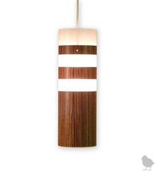
Meanwhile, I can think of a few other things that I could easily enjoy in the kitchen like this pendant from Design Public.

Hatch lamp.jpg 

dinnerware Design Public.jpg


How about this dinnerware from Hatch? Wouldn't it look great in these black and white kitchens


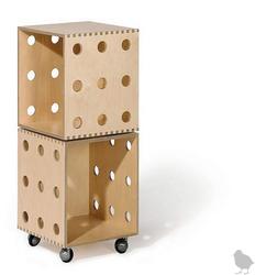
Design Public Storage.jpg


And, last but not least, these boxes. I'm not sure what I'd use it for, but I know it will come in handy for something...Maybe potatoes and onions in baskets? The stock pot? Linens? I'd find a use, I'm sure. 

What about you? What do you want in your kitchen? 


2007 Kitchen Contest - Apartment Therapy

Apartment Therapy - The Kitchen is hosting a contest for kitchens, "Smallest Coolest Kitchen 2007" The deadline has been extended through April 16, so there is still time to enter!

small kitchen.jpg


The entries are being rolled out now, one by one. I think it's great that the smallest of kitchens get a chance for some, well, respect! Small kitchens always need useful ideas, and every inch counts. It should prove to be a great collection. More inspiration, again, from Apartment Therapy. The image is from This Old House.  


Guess Who's Coming To Dinner?

With so much going in the kitchen, figuring out the proper amount of storage space, counter space, fitting in appliances, yada yada, one very important element, the dining area, is easily put aside for awhile. In fact, in the kitchen design, the dining area is a critical element, as it becomes the next activity after cooking, the spot where people begin relating with one another more closely, an "activity" to really pay attention to!

kitchen dining area.jpgI need to find out just how many people will typically be at the table for any given meal. Secondly, how can those people most easily move around the table into surrounding aisles, and how much room is needed for movement?

Another reason adequate room is important around the table is that the proper placement for the dining area will encourage people to linger at the table, enhancing conversation, and even the quality of life. The kitchen is where life happens. I am a big believer that people do not want to feel confined, and if they do, they will find a way out sooner than later. Therefore, comfort is an important factor.

So, we plan the right size table for the right reason. Truth be told, when I design a kitchen, this issue is one of the first areas considered in my planning, working backward into designing the work area, as I consider these areas to be equally important in the plan, but that is a topic for another time, one I look forward to sharing with you! For now, here are some tips to consider when planning the dining area:


  • how many people will you need to seat typically?
  • what is the overflow number of people you would like for the table?
  • when even more come, do you want to use this table? If so, do you want a leaf or a large enough table?
  • Would you like a leaf that comes out from under the table or a leaf that fits into the table? 
  • are you willing to move the table out to accommodate more people?
  • what configuration? square, oval, round
  • would you like built in seating around the table to stretch out and relax?
  • what would you like to be situated near...an outdoor view, media? Both? Neither?
One of the kitchens I am doing now is for a woman who cooks frequently for friends and entertains at the same time. Part of the entertainment is the cooking process, and friends help out. Other friends sit back and interact with each other and the cook. And, this is a frequent happening at her house. As a result, we have the cooktop facing the dining area, which will work out perfectly for her needs and desires. The dining area also is at a window, there is a media wall opposite the table, and built in seating to enhance comfort and the ability to relax in the kitchen when one is not cooking. Many people like to just hang out in their kitchen when they are not cooking! This is just one small example of placing the dining area properly in the room.


These tips should get you started thinking in the right direction. More about how to plan your dining area again soon, there is more to be said about this critical piece in your kitchen design.

I would LOVE to hear about your kitchen dining area, why you love it, why you don't, what you would change, and so on.


NKBA - National Kitchen & Bath Association

The NKBA, as you may know, is the National Kitchen & Bath Association. I've been a member of the NKBA for many years. I also became a Certified Kitchen Designer in 1993.

It's a good thing for a consumer to use an NKBA member firm, or a Certified Kitchen Designer to design his/her kitchen. A CKD must meet requirements for educational points during continuing 2 year periods.

Being a member of an association, generally speaking, means that the member firm is interested in their industry as a whole, going beyond the narrow focus of their business. The NKBA offers many seminars, multi day conferences, and maintains a nation wide chapter organization. There are monthly NBKA chapter meetings which include a presentation on a different topic every month. The NKBA also co-sponsors the enormous KBIS conference each year, to which I travel to every year. It is a good thing for a kitchen designer to be involved in their industry and aware of new philosophies, products, and design information. Now you know a bit more about my national association!

NKBA.gif 

How Low Can Your Kitchen Window Go??

I was reading other blogs and came across this image of a kitchen. There is only the one shot, but I have some thoughts about design and aesthetics that I'd like to share with you.

The image is from Terramia, a great design blog I frequent.

window susan serra.jpg 


I think what first struck me was the feeling of light in this image. I'd like to focus on the windows and where they are situated. They nearly touch the countertop. This is a major factor in the aesthetics in this kitchen. It appears to be a nearly invisible transition to the outdoors in a very effective way. I assume the window just over the eating area is at the same height. It's difficult to see.

To situate the windows as close to the countertop as possible seems relatively easy. Cabinetry is most often 34 1/2" tall, and most countertops are 1 1/2" thick, or 1 1/4", reaching 36" overall in height. So, a thought may be to install the window at 37" of height, or less if one is feeling adventurous. Here are two more images of a low window installation:

window2 susan serrawindow3 susan serra

What comes next will contribute the C factor into it all: Confusing Calculations. When remodeling the kitchen, you must consider many factors, if you want the window to be as close to the countertop as possible. Here are some, just off the top of my head, and may not be all issues to worry plan for (purposely all jumbled together.)


Will the flooring be changed? Does the subfloor have to be changed? How thick will it be? Will the subflooring be leveled? What flooring material will go in? How thick is it? Will there be any sort of adhesive material below the floor? How thick will that be, for example, a mud or thin set application? Will the mud tile installation be leveled if the subflor will not be? What is the high point of the room? What is the low point of the room? Will the cabinetry have to be shimmed? (answer..always). By how much? Is some sort of sill or casing below the window desired, or none at all? What will that dimension be? How thick is the countertop material? How is the window constructed? Who, all. will be the players in all of this labor and design decisions and are they giving reliable information or communicating maybes?? What if the window is put in too low?This, in all honesty, is why you rarely see this application. It's risky, very risky! To me, it's not just nice, it's fantastic.


 I was glad to have come across this design element in Terramia. It is a design detail that would have been far from my radar screen to discuss here. I'd love to know what you think of this type of installation.


Uber Universal Kitchen Design

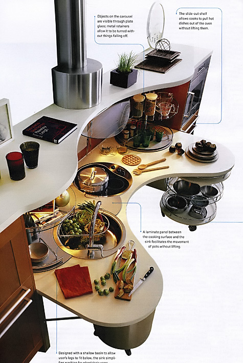
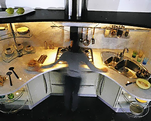
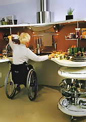
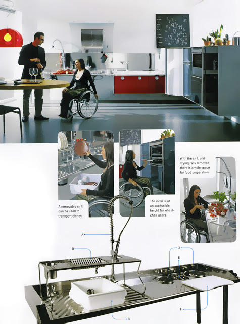
The March issue of Metropolis (mysteriously just received today) has a wonderful feature on "Total Access", three European kitchen companies, dedicating their modern design expertise to universal kitchen design, very aesthetically appealing, very cool. Metropolis talks about 16% of the European population already being over 65!


universal design susan serra003a.jpg

storage/universal design susan serra006a.jpgstorage/universal design susan serra008.jpg

The kitchens included in this entry are Snaidero (top/center images) and Valcucine. Up to now, universal design was virtually an after thought design-wise.  To me, it looks as if universal design thinking for kitchen ergonomics and aesthetics is clearly ahead of the curve. There is more to learn in this feature article. Better get your copy now, it's almost April!

universal design susan serra012a.jpg


Top 5 things to do before you hire a kitchen designer!

I was speaking with a blogging buddy of mine, who mentioned that her parents are planning a kitchen renovation and are having trouble thinking about what to do first. They are at a total stalemate. There are so many issues, so many potential players in a kitchen renovation, I suppose it must be difficult for many to decide just that, what comes first. Well, The Kitchen Designer comes to the rescue! Here are my top five things to do BEFORE you hire a kitchen designer.


  • Get some sort of organized system to make notes in. Whether good, old-fashioned pad and paper, a binder, a software or online program for kitchen organization, begin the process in an organized way. To go one step further, create different categories for your project....one section for cabinetry, one for countertops, one for the contractor, one for the designer, and so on.
  • Do online research for kitchen designers in your area and beyond. This will, and should, take quality time. Don't be afraid to go outside of your area if you seem to connect with the information presented in a website for a particular designer. Many designers travel. Don't limit yourself searching via just one zip code. Take time and "travel" online beyond your town. A great source to begin with is to go to the nkba website. At the time of this writing, their site has been unavailable for some time. Keep trying! Also, speak to your friends and neighbors and check references.
  • At the same time, you will need to begin the search, perhaps for a general contractor, and an architect, depending on if you have structural issues to address in your remodeling project. My personal opinion, is that it is never too early to find your kitchen designer. Who comes first often depends upon the project. In a recent case of mine, I worked with clients for months before the architect was called in. The architect dealt with some of our structural concerns, gave his blessing, and is now awaiting final dimensioning information from me, as the kitchen design is driving the home's extension. In other cases, due to roof lines or other issues, such as surrounding rooms being involved, the architect comes first. Find your professionals and begin the conversation with each of them. The answer what to do first will soon reveal itself to you. Remember, too, that, just as in doctors' practices, each professional has a specific area of expertise. A good professional is one who knows his/her boundaries. Do not ask me about detailed structural issues, that is an architect's domain. Do not ask a contractor about kitchen design. Put the weight of the advice in proportion to the professional's expertise, and to what one does every single day, not on occasion! And, be aware that the product you choose is only as good as your designer. Choose your designer first, and your products second.
  • Begin an idea file. Collect pictures from magazines and bookmark websites where you have seen pictures that you like. Gradually, you will see if your aesthetic vision is focused or, well, all over the place! This will be helpful to communicate to a designer. Do you really want to go crazy? I apologize in advance for turning you on to all of these 1,762 kitchen images. It is well worth the price of a subscription.
  • Work to define a general, not a specific, budget! Think about the quality level of products that you hope to put into your home. Begin some easy leg work, such as pricing out appliances. Write a list of everything you can think of that will have labor attached to it. Don't forget electrical, plumbing, hvac, audio management, general contracting categories. Understand that if you come up with a specific number you want to work with to cover your wish list, this number may or may not be realistic. Be flexible, be open to changing parts of your project, making substitutions, and setting the budget (range) will merely be on your to-do list, rather than be one of anxiety and angst.
  • And, a bonus: Subscribe to this blog, come back, ask questions, start a discussion, and you will find assistance and a constant flow of new ideas and information!


Remember, too, that you do a kitchen once in your life. Put the time in on the front end! Do not get bogged down in any one area, balance all areas and you will come up with a focused direction to begin your project. You will have a budget that you feel comfortable with, and will be well on the way to finding the right people to help you achieve a great result to your project. One step at a time. Now, go, stop procrastinating!!

Go from this:

before kitchen.jpg 


to this: 

after white kitchen.jpg


Sparks Are Flying!

I couldn't resist the title, but, sorry to disappoint, no juicy gossip here, this topic is, drum roll, electricity related! Nonetheless, I promise riveting information.

A kitchen I'm working on has revealed surprising electrical issues, in terms of additional circuits needed to serve the backsplash lifestyle (you didn't know you had a backsplash lifestyle, DID you??) of the homeowner. It's a small kitchen. I initially assumed the existing wiring would serve the electrical needs in this kitchen along the backsplash, yawn, fairly easily. I was very wrong. (I TOLD you it would be riveting!)

kitchenaidmixer.jpgFor one thing, I noticed the client has a fancy Dualite toaster which, gasp, draws 17 amps. That's a lot! The toaster draws 6 amps more than the microwave! The microwave should be on a separate circuit anyway, (although by code, it doesn't have to be) yet, it makes you wonder if an appliance like this toaster should be too. Also in this small kitchen is an instant hot/cold water tap, which comes with a heating unit, the Franke Little Butler. That should be on its own circuit as well.

Now, if that fabulous toaster and a coffee maker go on at the same time, the coffee maker being 6 or 8 amps, the typical circuit will trip with these two heavy load takers. You wouldn't THINK a toaster and coffee maker could blow a circuit, but you also don't want to wait until everything is all finished, with no way to add another circuit, having purchased a $300 fast, 4 slice toaster, with countertop and beautiful $40/square foot tile permanently installed.

4 Slice Toaster-Chrome.jpgInitially, the electrician wanted to have a total of 18 receptacles (including 2 outlets in the next room and plugmold receptacles) on ONE circuit and ONLY TWO receptacles on another circuit. And, the microwave and toaster would be on the 18 receptacles circuit. Was he serious?


So, what to do? Ask questions and provide information to your remodeling pros about your special small appliances, which may draw far more power than you think. Make sure your receptacles are evenly distributed, in different circuits, to handle several small appliances at once in different spots along the countertop.


delonghi espresso.jpgYou may want to consider plugmold, a great way to keep the receptacles out of site, as they are installed just below the wall cabinetry, at the top of the backsplash. It frees up your backsplash to do that great tile design! Whether you use plugmold or standard electrical outlets, they all must be GFI protected.

Bottom line, take inventory of your small countertop appliances and try to have some idea of where you want them placed and communicate that to your various pros.

Meow....Woof!


IMG_6807aa.jpgDo you have a furry friend living with you? We do. First, we had Cleo, a white cat. She had to be an aristorcatic cat of some kind, as she definitely owned US. Next, is another cat, Sparky. We don't love the name, but he responds to his name when he is called! We just adopted Sparky about 2 weeks ago. We keep calling him by his name because it's too much fun when he responds to it! We definitely need to be retrained...

Pets need to be considered in the design of the new kitchen. Not to the point where they attend meetings, and sign off on the plan, no, but just short of that! Here are some thoughts:

  • Planning - where can your pet eat peacefully without fear of being bumped into or forced to move for a moment?
  • Where do the bowls go so that when they are not eating, they are in a spot where they will not be bumped, resulting in spilling water?
  • Do you have multiple pets?  Is it ok if they eat in the same area? Will they know whose bowl is whose and do they or you care?
  • Will the bowls even go in the kitchen?
  • Think about proximity to pet food storage and water. Maybe the pet food goes in the prep sink cabinet, if there is one. What's the best spot to store the pet's food, especially if there is more than one? Feeding should be quick and accessible.
  • How many types of pet food do you have and how much do you buy at one time? Do you have a million small cans or huge bags?
  • Would it be helpful to have the pet's food in roll out shelves?
  • Do you have pet medications? Where do you want to store it/them?
  • Do you not want to see the bowls or at least the feeding bowl? Consider a slide out shelf or drawer at the bottom of, or under the cabinets.
  • Do family members frequently visit with their pet? Is there a secondary feeding area that is convenient? I have that for Max, the dog, who visits us on occasion. Only problem is that Max eats out of the cat's bowls too!
  • Naptime...do you want to include a spot where a small pet bed can be placed?
  • There are auto feeders, which are large in size, so that you only need to refill these infrequently. Will these be part of the plan? Do you want to see, or hide these larger feeders?

Built in banquettes will most likely be a pet magnet, especially if there is a window behind it, ideal for pet naps and their own dining spot (so they think), as they hope to be dining along with you! So far, we are succeeding in training Sparky NOT to walk across the table during dinner...

What am I forgetting? Please fill me in.  And, tell me what works, what doesn't work, or solutions you've come up with, in terms of feeding your pets in the kitchen.