

Is the open-concept kitchen still in demand by homeowners? The concensus is YES, homeowners want a great room with cooking, living and dining activities connected.
Read moreVirtual Kitchen Design Consulting
A one-hour kitchen design consultation is an excellent way to start the renovation process.
Read moreThe Beauty and Brains of Verona Kitchen Appliances
Verona kitchen appliances feature quality and style in a kitchen designed by Susan Serra, CKD.
Read moreCoordinating Your Kitchen Range And Countertop Finishes
Kitchen designer tips to coordinate your appliance and countertop finishes for a cohesive look
Read moreKitchen Design Consulting - One Hour Can Change Everything
Kitchen design consulting with Susan Serra can make the difference between an uninspired kitchen or worse, one with flaws and a wholistic environment that fills the senses. All in an hour!
Read moreModern Countertop Accessories
Countertop accessories provide useful storage for the cooks in the kitchen and can be placed on kitchen islands or on any kitchen countertop
Read moreA Brief History of Scandinavian Design
Scandinavian Design: A Brief History as seen in Seasonal Living Magazine.
Read moreSignature Kitchen Suite Appliances by LG - Innovation, Design, Precision Cooking, Delicious
Signature Kitchen Suite appliances are new to the luxury market. Check out the features that make these appliances unique for home cooks. Performance, precision, technology and good looks are built in. Great food is the result!
Read moreWoodworking Woes
Here's an email message I received:
From: Tracy
Subject: kitchen banquette

A comfortable custom kitchen banquette.
Message: My woodworker was supposed to make my kitchen banquette 17" high and it ended up being 18.5". Now with my 3" cushions, the seating comes in at 21.5". It looks attractive, but it's higher than I would have liked. I paid a decent buck for the custom banquette and cushions. What do you advise?
Tracy, there are multiple issues in this short email.
First, does your woodworker acknowledge that there is a mistake? It's understandable that you did not measure it until he was done because, of course, you trust him.
Second, I'm not sure that that 1 1/2" will make much of a difference. I mean, with these numbers, yes, the lower the better. But, I think it will still feel high. As a comparison, I normally (depending on the cushion) set the height of my banquettes somewhere between 14 and 15", usually around 14-14 1/2", anticipating a 4-5" thick cushion. For a 3" cushion, I'd probably size it somewhere around 15 1/2-16" high.

Design a brightly colored fabric for your banquette.
Third, this matters if he is not acknowledging an error. Do you have documentation on how high the banquette was to be?
Fourth, if he does acknowledge that it was not accurately sized, and if you decided you wanted it lower than originally planned, ask him to make it lower.
Fifth, are there any decorative panels on the face of the banquette?
Sixth, are there any other issues such as wallpaper or other moldings or the rear of the banquette if there is one, that is affected?
Those are my preliminary thoughts, knowing nothing more than what you've told me so far. I hope this works out for you.
It's a rare client who will think to take a tape measure to woodwork that has been installed, nor is it their responsibility to do so. But, in a case like this, where the piece is finished, I do think Tracy deserves to get what she originally paid for, however it has to be worked out by the woodworker. What do you think?
Flooring Trends 2018
A visit I made to one of the premiere design exhibitions in the U.S., KBIS (Kitchen and Bath Industry Show) is an important venue at which to see major kitchen design elements (besides kitchen cabinetry and appliances) such as flooring. It's a great opportunity to experience complete looks and analyze kitchen design trends. Looking downward was very interesting and fun!
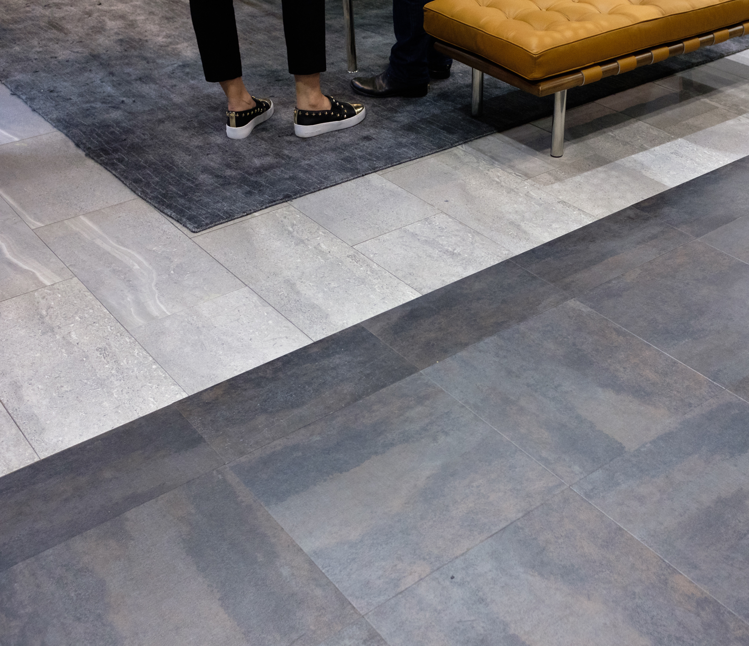
CONTRAST
is a trend
lights and darks used together was a major flooring trend
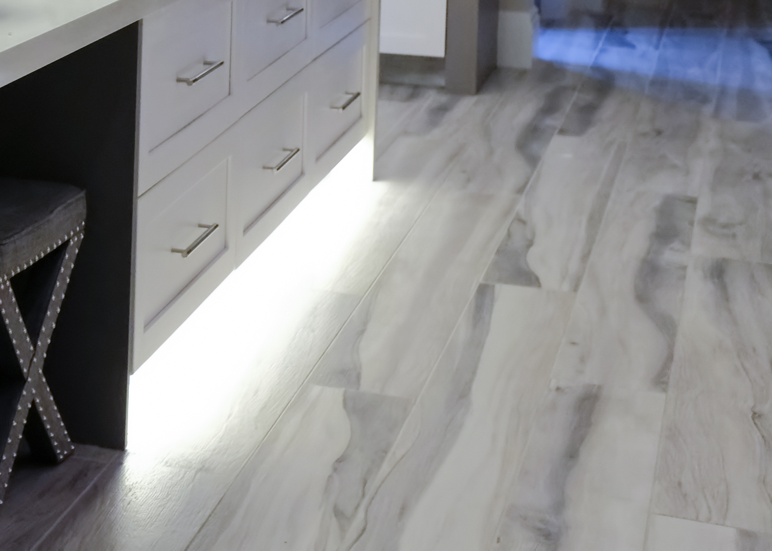
Gray flooring for 2018 remains a strong trend. And, it has pleasant tones! Grays with blue shades, lots of warm, muddy tones, even with barely perceptible touches of green in wood and ceramic flooring are prevalent.
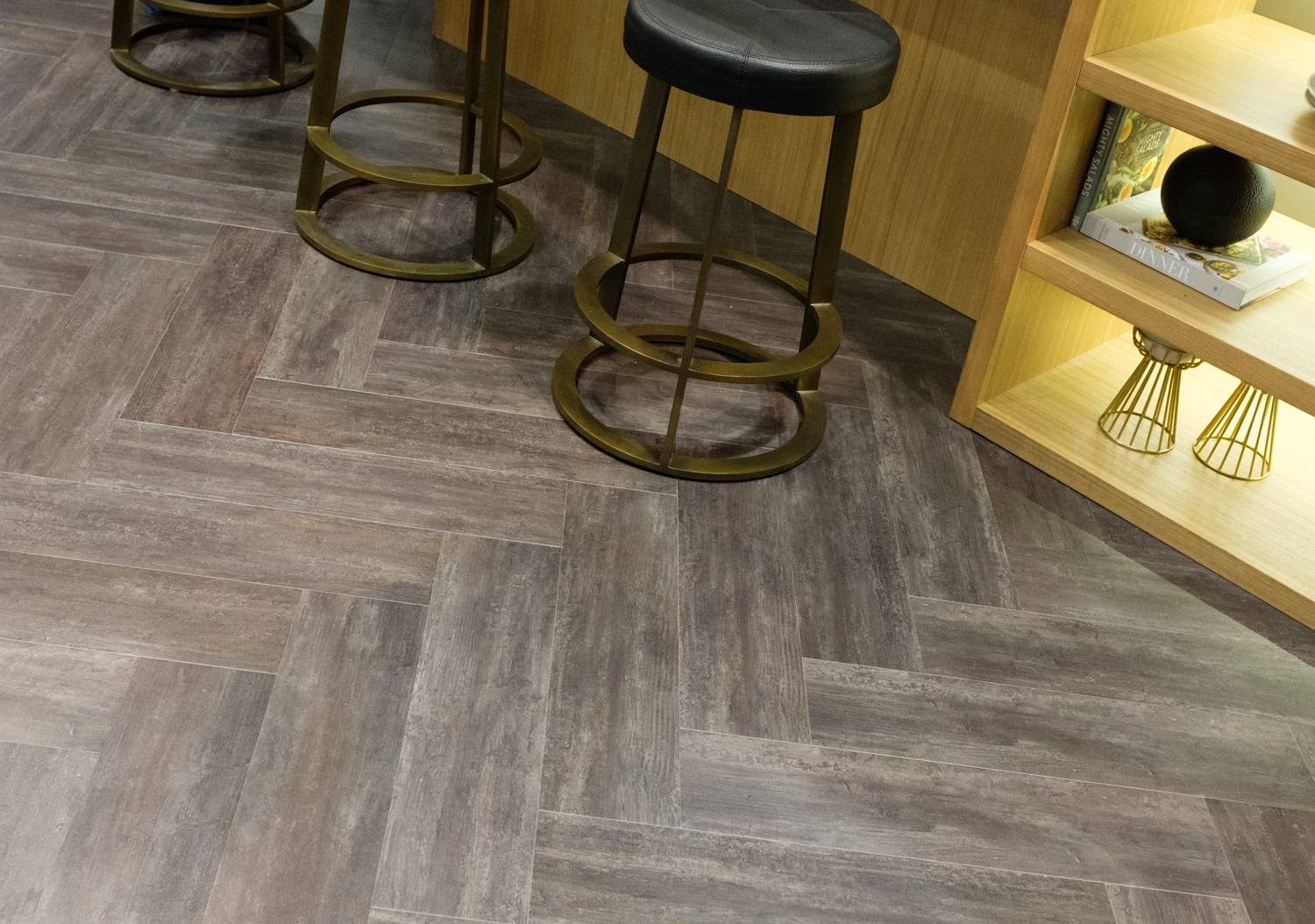
It's interesting how gray flooring can look earthy. Maybe it's a concrete, textured connotation that comes across in some flooring. When gray and brown are mixed in wood flooring, it's an aged look, one that has an authentic element.
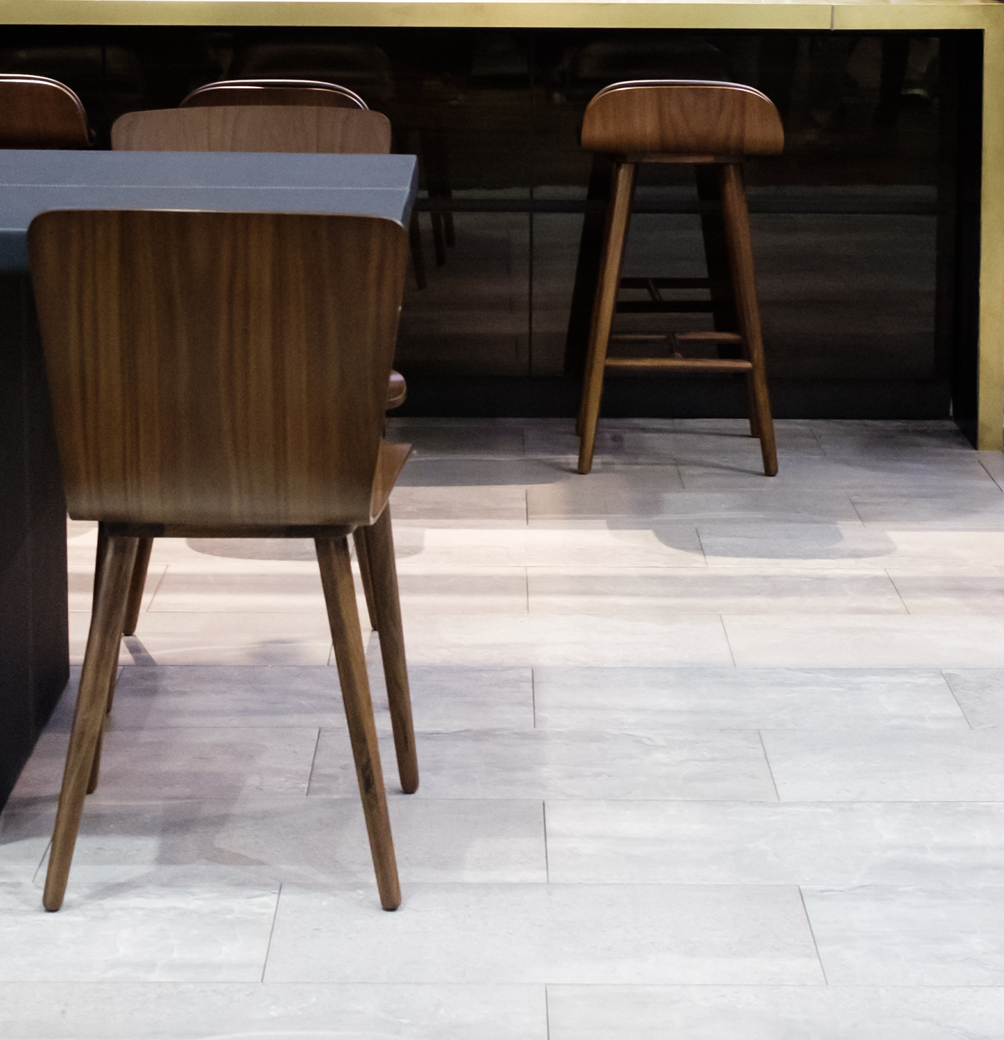
The lighter shades of gray flooring feature a stylish look. Light gray floors also reflect a sort of soft Scandi and more modern style and you always experience an enhanced feeling of spaciousness with light colors. My own wood floors are painted white in my living room and I love the contrast of lights and darks in the room.

Medium tone gray ceramic tile appear soft and always hide a multitude of problems, spills and other unfortunate mishaps! Not too light, not too dark, the middle tones of any color is always the way to go to put off cleaning for another day or three.
Dreamy, flowy,
light grays
Grays can be SO stylish! When you talk about "a designer look", gray floors are a key piece to a room that appears different, unique and definitely has a cool factor. Gray as a foundation for a room's color palette allows one to use warm colors to exploit a warm/cool contrast theme, and, of course, it's a neutral that works with every color for maximum design flexibility.


Gray is elegance
soft, authentic, easy to coordinate with any color
These images reflect the latest trends in gray flooring for 2018. Don't forget, the kitchen floor is a critically important design element. You can select flooring first to drive all other colors and finishes or coordinate the color after you have chosen cabinet finishes but always consider surrounding rooms. One word of caution - gray has been a hot neutral for a few years and there is no telling how long the gray train will continue. If you love gray, my advice is to look for a flooring material that has some authenticity to it in texture and color. Best to have materials be trend-invisible!
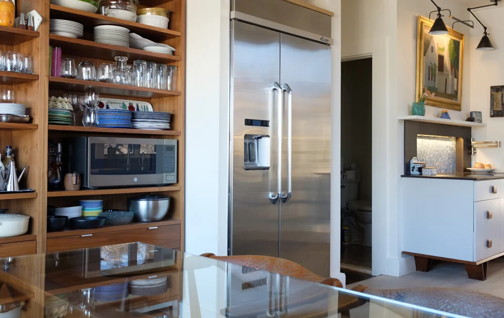
The Microwave And The Shelf
The microwave, trust me as a kitchen design professional for many years, is an appliance that is very tricky to place in the kitchen. One of the pros of the microwave as opposed to other appliances is that there are quite a wide range of sizes available to either build it into cabinetry or, in the case of the countertop model, simply put it on a shelf. You also want to try to place it near the refrigerator since you commonly take something out of the refrigerator and pop it into the microwave.
The cons begin with microwaves needing extra depth to install, making it difficult to position it above countertop height where it is most easily accessible. Some microwaves have trim kits that allow them to be built into cabinetry and many do not. It takes SO much space to just place it on a countertop and is not the best look.
The over-the-range microwave serves a purpose, yes, but the cons overwhelm the single pro of it being off the countertop. Ineffective venting and awkward and dangerous access (imagine foods cooking in pots below) make this installation a worst case scenario, sorry to say.
But, there's another solution!
Sometimes a microwave on a shelf just works. It can be designed to hide in plain sight!
It's the shelf. Sometimes, simply putting a microwave on a shelf just works. You have to first check the depth of both the shelf and the microwave to verify it will fit. In the case of the image above, the shelves are 14" in depth and the microwave is 12" deep. The outlet is recessed into the wall so that the microwave fits.
This is actually a microwave that I've been using on my projects for well over 20 years and it's still as popular as ever! It's the GE Profile Countertop microwave and it's in a stylish, nearly invisible Slate color but it comes in a range of colors.
Hang it from underneath a wall cabinet or place it on a shelf between standard wall cabinets and it will be close in depth to surrounding cabinetry. That's the beauty of this appliance. It even has a turntable and all the most important functions a microwave needs. I just love this stylish, functional, convenient microwave. It works!
Let There Be Light In The Kitchen!
The days are getting shorter, and so quickly. The early mornings in the kitchen are dark and late afternoons are feeling more like early evening - which makes me think of, but mostly not take for granted, the value of natural daylight. How can we change things in the kitchen to compensate for this loss for the next 5 or 6 months? I have a few tricks up my sleeve to share.

Windows are a direct connection to spiritual well-being. The bigger, the better.
WINDOW TREATMENTS
Remove them entirely to allow more natural light into the kitchen. Even a few inches of a valance extending into the window will have a noticeable difference. Add white sheers if fabric is desired. The absence of a patterned, textured or brightly colored fabric will immediately add a clean, spacious look and will reflect more light into the kitchen.
DECLUTTER
The change of seasons is always a good time to reassess what is clutter and what is needed, especially on the countertops, but also on open shelving around the kitchen. Here's my best tip: look at only one small section at a time, slowly - to clearly see items that can be moved elsewhere, out of view.
A LITE DECORATIVE LAYER
Do you have a collection of decorative objects in the kitchen? Remove them all from the kitchen! If any objects go back, put them back slowly, one at a time and be aware of the reclaimed negative space, which can also be beautiful, where a number of objects once were.

Light colors enhance a feeling of spaciousness in a room that has lots of visually heavy design elements.
LIGHT COLORS
Contrary to what you often see and are told to do in spring and summer design magazines, I propose that it's a better idea to incorporate light colored accessories, dinnerware, serveware, placements, even rugs (of which we have wonderful ones at Scandinavian Made) into the kitchen in the "dark months". Finding the light by using light colors and whites will collectively add more light into the kitchen and will lift your spirits, guar-on-teed! Adding some bright colors can help lift the mood for sure. Think spring and summer style - really!

LIGHTING
While it's not so easy to add light fixtures into the kitchen for seasonal reasons, make sure that adequate natural and artificial lighting is seriously considered in the kitchen planning stage.
Think "light" in all its different manifestations within the kitchen as the days become darker and the opposite will occur - there will be light!
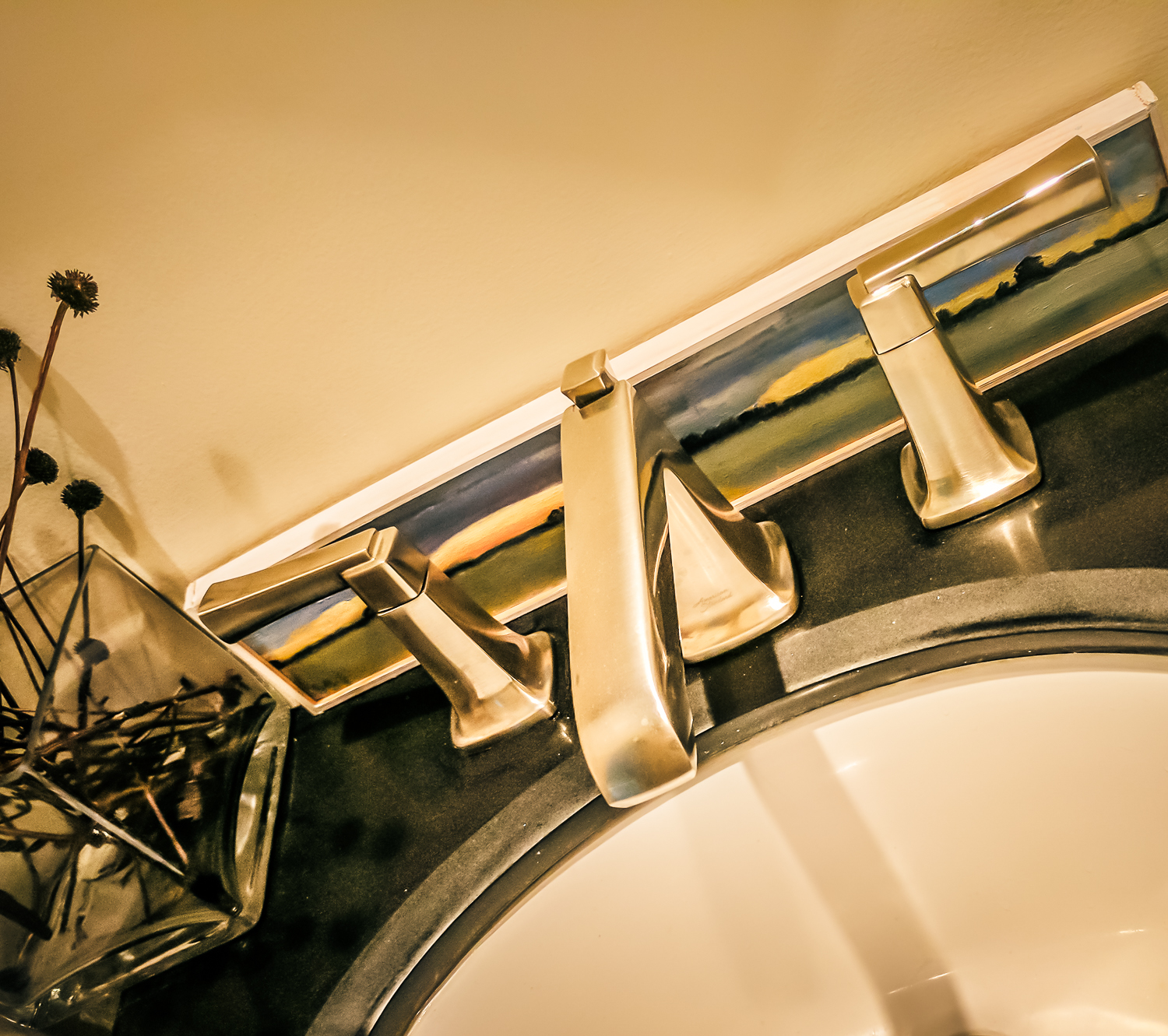
Townsend Faucet By American Standard
The Townsend faucet - American Standard's newest faucet, arrived at my home, compliments of the aforementioned brand. I thought it would be interesting to play with it, solely my own inspiration, to see how this faucet can hold up to some of my creative impulses.
Art Inspiration below
Townsend Faucet American Standard
Scandi Asymmetrical Inspiration below:

Townsend Faucet American Standard
Nature, Texture, Eclectic Inspiration below
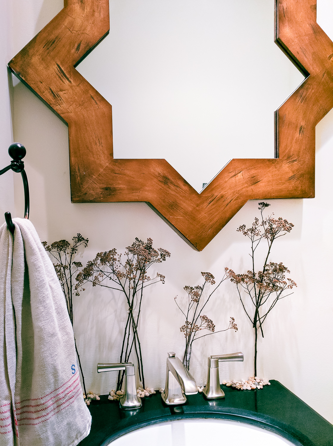
Townsend Faucet American Standard
Close Up of Form and Function Below/Minimalist Look With Texture:

Townsend Faucet American Standard
Bling!

Townsend Faucet American Standard
This what I found right away and what I find most exciting about this Townsend collection - the ability to change the look, in this case of the powder room, allows you to let your creativity loose, to not be bound by one look for all time but rather, to change it at a whim. Change is good!
This faucet in the images is satin nickel. It also comes polished chrome, polished nickel and legacy bronze. Fun fact: The design of the Townsend faucet was inspired by the Manhattan Bridge, thus, it's energy and visual strength. The operation of the handles? Like butter. It also comes with a high arc spout.
The Townsend Faucet, approved by Designhounds www.designhounds.com everywhere, speaks in multiple languages. Is it modern? Traditional? Minimalist? Transitional? Sculptural? It's all that and a bag of chips. To create an eclectic look with disparate design elements and, since I NEED to change my surroundings on a regular basis, I look forward to expressing my creativity, really, whenever the mood strikes.
A Design Pro Renovates Her Own Kitchen
A little over a year ago my husband and I bought a house which was love at first sight. The kitchen? Hate at first sight. This past year we remodeled the kitchen and this is the first of many installments about this kitchen renovation. But first, a brief (not really) back story about how my husband and I ended up buying a house with a closed off kitchen when I've been designing and espousing open plan kitchens since, um, the late 80's AND have never owned a home without an open plan!

The kitchen plan for a fully open floorplan was finished...and then we found our dream home!
We weren’t planning on moving in 2014. Until we were. We significantly downsized from one home to another, 2 towns away, in 2008. By 2014, there were multiple upgrades and repairs that were needed and wanted, which all together, would be a serious investment. Trades were called to get estimates and then final selections; I redesigned the 25 year old kitchen and I was ready to select and order materials. Next step was to sign contracts for some of the work. We were nearly underway.
SHOULD WE STAY OR SHOULD WE GO?
During this planning time and before investing in these projects, we thought it would be smart to see what was out there in our local housing market. Once we put those funds into the remodeling project, that home would surely be our home forever. One part of me was very satisfied with the remodeling plans, but there was another part of me that nudged me to take steps to make sure I was emotionally on board with the prospect of owning this house for the long term. I checked the real estate listings daily while I was in the planning process and occasionally went to open houses.
When Steve, my husband, walked into the kitchen one day in September, 2014, I looked up from the local real estate listing site that was open on my laptop and quietly said, “This house just came on the market today and I think I found our dream home.” We jumped in the car and did a drive-by.

If you look closely, you can see how the cabinetry was cut short above the 8" step. This was built up for sound purposes because the previous owner's mother had her bedroom just below this dining area.
THE DREAM HOME HAS PROBLEMS
The house had features that were the exact opposite of what we wanted. Two sets of stairs connect 3 levels, and each level would be lived in for hours every day. I hate stairs. I was happy to say goodbye to the stairs in our colonial style house when we moved from that house to another in 2008. Ugh.
The kitchen in this dream home I found was cheap, handmade (thrown together), old, and had an 8” step up to the dining area in the middle of it. It was also virtually CLOSED OFF with 3 small passageway openings - I have always disliked a closed off kitchen. Plus, it was smallish at 235 square feet. The room (a nice size room with lots of potential) behind the kitchen had virtually no heat and was closed off from the kitchen by two 12" doors to form a a tiny opening of 24".
But, there were expansive views of the long inlet to the harbor at one end and to LI Sound at the other end. That was it for us, end of story! NOTHING else mattered. Except that the house was in our budget and we felt it was a very fair price. And it looked to be in good condition which an engineer confirmed.

Nice views!
AGING IN PLACE?
At 60 years old, and before finding this house, I looked in the surrounding area for something practical. I didn’t want stairs, which I had NO patience for in a previous house we owned. Plus, the whole aging in place thing had to be considered, right? Also, our current driveway was very steep and treacherous in the cold Long Island winters. We’re not getting any younger so it was wise to make convenience and access the driving factors for the purchase of our next, possibly last, home. And we looked for those features.
MAKING THE OFFER
The day after the house with the views went on the market, we did a walk through with our realtor and while still in the house, we said, “Screw it. Let’s make an offer. We’re not dead yet and it will do us good to move up and down the stairs.” We also talked about putting in a heated driveway one day, an elevator and even moving to the lower level when we’re REALLY ancient and having one of our kids’ families move in the 2 floors above us. There was viable old age living potential in this house.
What we ended up moving to was essentially a 3 floor house with the main floor in the middle, bedrooms on the 3rd floor and the basement (at ground level with front door, large windows, 2 car garage) which served as my office and climate controlled room for my Scandinavian rug collection. Because only the back of the house was underground, the lowest level was very conducive to every day living.
So, long story short - two staircases utilized multiple times every day, another steep driveway, a larger house then the one we had downsized to only 8 years which will need more maintenance, a new home to make changes to which reflected our tastes and - a kitchen I hated. Oh, and killer views!
Next Chapter: Coming To Terms With A Closed Off Kitchen :(
Kitchen Design Chronicles - Gray's Anatomy
My kitchen renovation is in full swing and what a journey it's been up to this point - one that I will be sharing in the weeks and months ahead and there is so much to share! I'm fortunate to have a partner in the development of my kitchen renovation and that partner is Cabico Custom Cabinetry, which is sponsoring my kitchen cabinetry.
The kitchen is that place where all five senses reside which manifests itself in your thoughts and feelings as the kitchen is used in so many different ways. It's a place that is more than just a design - it's an emotional environment in so many ways, don't you think?

When you're a design professional as I have been for 25 years, you are your own client, and you have catalogs, resources, design ideas and your personal lifestyle needs all swimming in your head AND you're designing the kitchen for your forever home, that's pressure!!

I know the Cabico brand from the beginning of my career as a certified kitchen designer. At that time, and still today, Canadian cabinetry was known in the industry for its innovation in design and very much so for precision engineering. In fact, Canadian cabinetry was thought to be on par with European cabinetry's cutting edge manufacturing - or maybe it was vice versa, European manufacturing being on par with Canadian! The point is, I have known and respected Cabico Custom Cabinetry for many, many years and am thrilled to be installing a Cabico kitchen in my home soon. More about Cabico in another post.
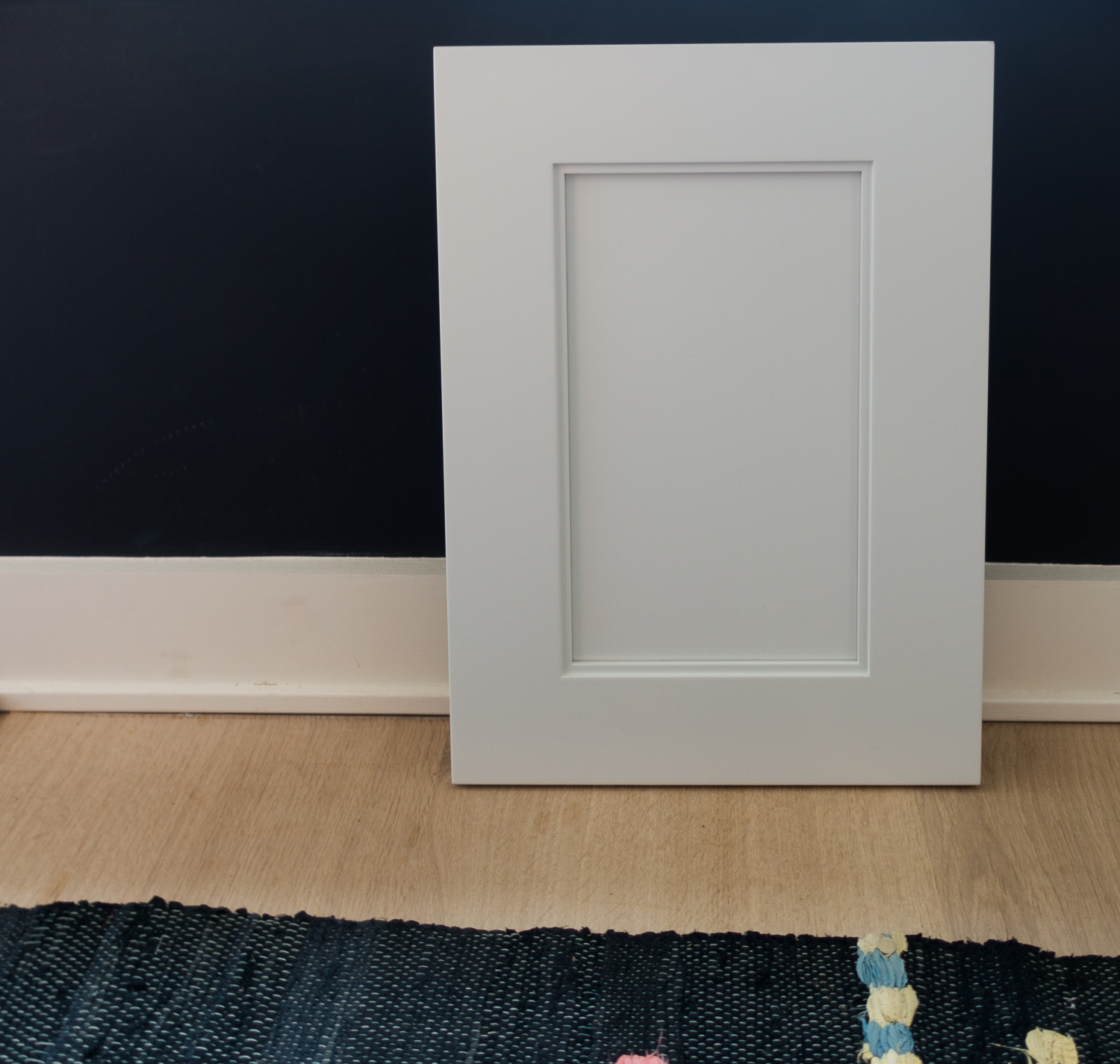
Let's talk color!
I'm going about this a little backwards, but rather than show you today the colors that I considered, any of which I'd be happy to use and which I will soon show you, I want to show you the color I finally chose (after much back and forth). I want you to see it in context with other shades of whites and grays.
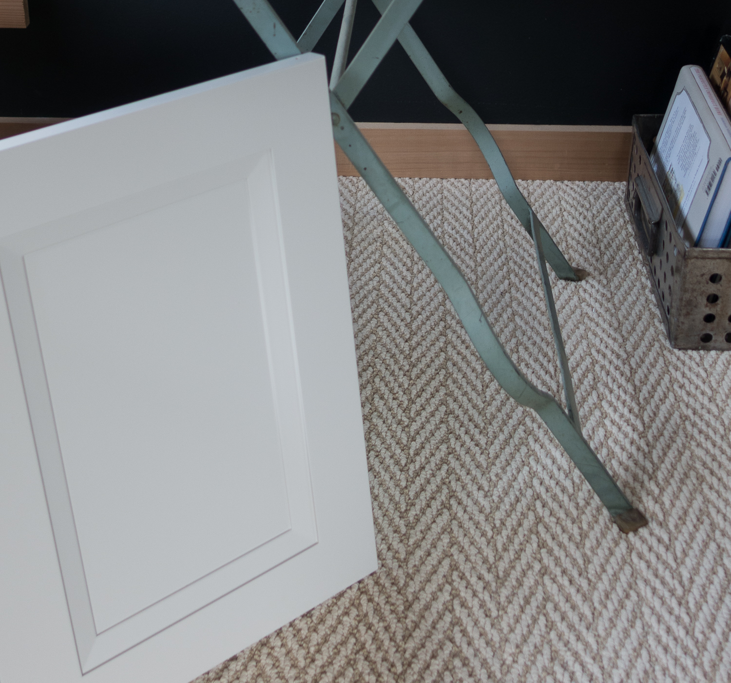
The color is Nantucket Gray. BUT, it's not just any gray. And this is not a gray to think of as a trend color. In fact, it barely looks gray! It's a highly nuanced, extremely flexible color that I know will stand the test of time. It's a bit warm, a bit white, a bit gray and a very elegant color.
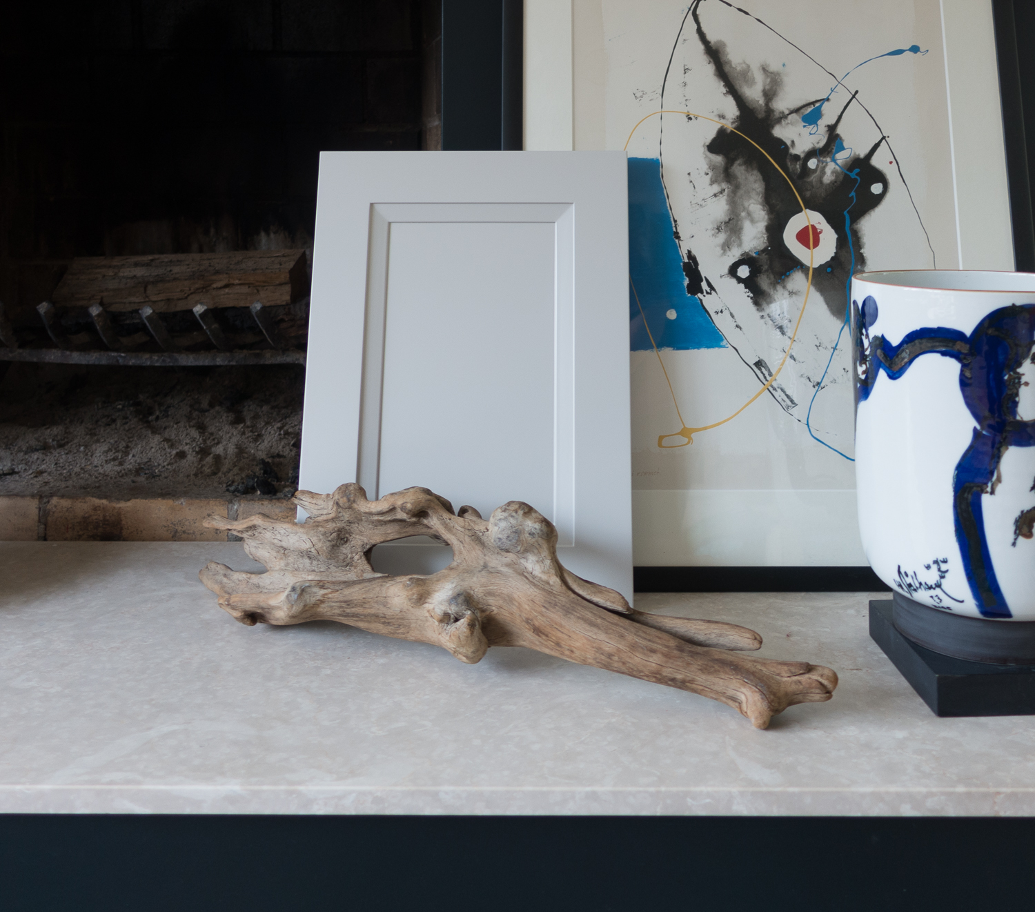
All throughout this post are images of this Nantucket Gray door (my door will be a flat/slab door). Look at the door next to other colors and materials.
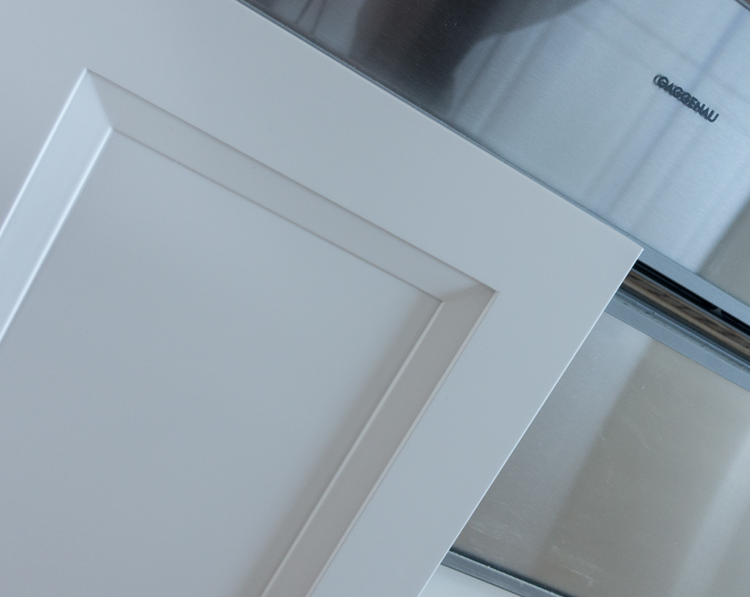
In some images, the door looks white, and it could look white-ish if you wanted it to. In my kitchen, which I'll later explain, I don't expect it to look white, or gray. I expect it to react to natural and unnatural lighting; be influenced by surrounding color and design elements for a look that changes, really, by the hour.

I also expect this color to be affected by the parade of Scandinavian Made rugs that I intend to use in the kitchen and change as the mood strikes. I love change and I look forward to seeing how Nantucket Gray changes in color and spirit with all these design and natural design elements working together. That's the thing to think about when designing a kitchen - you want to have a global vision of how light and design work together. This color, I know, will delight for many reasons. In truth of course, any color and finish is affected by light. But, it's good to keep that top of mind from the start.
And so begins the story of my kitchen renovation, and trust me, there are stories!! I want to hear your stories about how your kitchen changes with light and how you experience it AND how the color of your cabinetry reacts. Wait till you see the other colors I considered! I could have been blindfolded and picked any of them and be thrilled!

Traditional Home Hamptons Designer Showhouse 2015 - Kitchen
The Traditional Home Hamptons Designer Showhouse was a showstopper this summer and of course, I spent quality time in the kitchen. The kitchen cabinets were already a fixture in the showhouse, but Marlaina Teich, interior designer, employed her vision to transform a room with only cabinets in it into a stylish space with a coastal flair - a look that the Hamptons OWNS!
Traditional Home Hamptons Showhouse Kitchen 2015 with images by Susan Serra, CKD and features the complete kitchen decoration by Marlaina Teich with a beautiful handmade Swedish runner from Scandinavian Made.
Hamptons kitchens are most frequently classic white kitchens. The addition of blue in different hues with chartreuse as an accent, to my eye, adds a feeling of blue skies, blue waters and sunny accents. After all, when you're in your beach house in the Hamptons, don't you want to feel cheerful rather than all somber and serious?
And don't forget the handmade Swedish runner from Scandinavian Made! True blue!
Thos. Moser and The Cumberland Collection - Maine Meets Scandinavia
I visited rural Maine last fall, at the invitation of the folks at Thos. Moser to experience the entirety of the Thos. Moser brand, from design to the crafting process in the factory to viewing the pieces in their beautiful showroom. The new Cumberland collection brings this experience full circle to me.
During the year following that visit, every time I thought of the experience of those few days spent in Maine, which was week after week, I was overwhelmed. I was overwhelmed by the people, the processes and the incredible detail of their work along with their dedication and the brand philosophy. I took 636 images. I couldn’t stop taking pictures of my experiences while there.

Image by Thomas Moser
But, one thing that I didn’t expect to feel was a sort of emotional crossroads, an unexpected intersection between my personal Scandinavian heritage and my American roots. The two parts of me collided in a very surprising yet natural way as I became intimately acquainted with the Thos. Moser furniture.
Those of you who know me know that I identify very strongly with Scandinavian design. It’s a design aesthetic that I grew up with and which, in later years, feel comfortable with in all its many iterations. Yet, I’m first a proud American and I am equally comfortable with and enjoy good American design.

Image by Thomas Moser The Thos. Moser brand, to my eye as well as to my heart and soul, features a stunningly original representation of a mid century design aesthetic with a wholly American point of view - for me, and I know, for many others - the best of both worlds. It’s uniquely American and American design at its best in terms of craftsmanship, simplicity as art and function and allowing the lines to speak for themselves in the most organic way.
Image by Thomas Moser
I thought of Thos. Moser when I went to Denmark this past summer. Seeking out the furniture stores which sell authentic midcentury Danish furniture, it is always wonderful to see these historic pieces in their original finishes and materials. I thought how much English and French furniture styles saturate the American market. I thought how Thos. Moser focuses instead on design restraint - pure form and function - with the “less is more” philosophy of the Scandinavians.

Image by Thomas Moser
That is the most difficult design objective of all - the use of restraint rather than the addition of ornamentation and detail to fill in perceived gaps. There are few American furniture manufacturers whose design directors appreciate the importance of design restraint, the beauty that comes from this philosophy and how pure function translates into beauty.
And NOW, again, fresh from my trip to Denmark, Thos. Moser has introduced a new collection, Cumberland, designed by Adam Rogers, Director of Design, inspired by Danish design. It is simply breathtaking. It is fresh and original. It is art and emotion. The finger joint detail in this furniture collection exemplifies the Scandinavian design aesthetic as function is on equal footing with form. Traditional materials, expert craftsmanship and modern design merge as the foundation of Cumberland in an exciting, new, way.

Image by Thomas Moser
Given the introduction of this wonderful new collection, I wanted to bring together my deep feelings about how Thos. Moser furniture touches me personally and also present the new Cumberland collection at the same time in this post. More images and insights soon from my time in Maine at Thos. Moser!
Customize Your Countertops With Concrete
My colleague, Laurie Laizure, founder of the Google+ Community: Interior Design Community sees products, talks to manufacturers, designers and others in the design community every day and one of those products is concrete, which we see used in so many different ways in home design. Laurie has shared with me that she has a "thing" for concrete, and here are her thoughts on this interesting material. Thanks for your insights on concrete, Laurie!
In Laurie's words ...
I have a confession. Born and raised in New Hampshire (also known as “The Granite State”), it feels a little wrong admitting this, but I am not a fan of granite countertops and never have been. Even though there are many colors and patterns available in granite, the look is often a bit busy. I’ve recently been researching concrete countertops on Concrete Network, which has loads of amazing design ideas, and everything you need to know about concrete countertops.
Following the trends in Europe for some years now, engineered stone, tempered glass and concrete have been making their mark. With the popularity of granite beginning in the early 1990’s, it’s no wonder that homeowners are now interested in finding something new. When you consider durability and affordability, concrete is a real winner.
What about color? Many people think of concrete as a dingy gray material with a rough texture that would not be appealing to prepare an evening meal on. This is not what concrete can be today. There are thousands of color options created by mixing different pigments, stains and aggregate colors to make your countertop completely customized and unique to you.
Let’s take a look at some interesting concrete countertops to give you some ideas during your next kitchen remodel.
Customized shapes and features
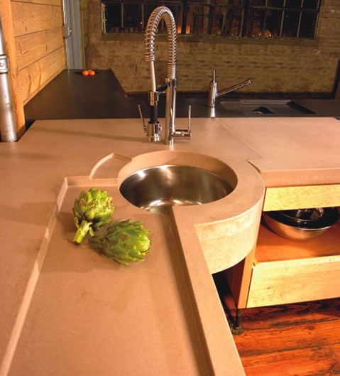 Image Credit: Concrete Network, Design by Pourfolio Custom Concrete, San Diego, CAI love the space for soap and the architectural interest of this circular basin. These counters are sure to be a topic of conversation when entertaining.
Get the look of natural stone:
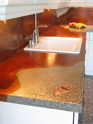 Image credit: Concrete Network. Design by Absolute ConcreteWorks in Poulsbo, WA
Concrete can replicate many stone products at a much more wallet-friendly price-point — and it’s easier to repair if damage occurs. Want to show off your artistic side? The countertop above is unusual and has the feel of gorgeous natural stone. You might be surprised to know that this option also passes LEED certification and features a terrazzo finish with an inlaid Brazilian agate and acid-stained borders. Anyone can appreciate this stylish look!
 Image Credit: concrete-countertops.orgDo you prefer a more traditional look?
Even though concrete may be considered a new and modern material for countertops, styles can be created for any taste profile. This is a more traditional style mold and the results on this island are simply stunning. I love the way the creamy ivory base contrasts with the warm beige that almost has a hint of copper that you see then repeated in the cabinets.
Why stop at a countertop?
 Image credit: Concrete Network Design by: Eycon in Myersville MD
Creating a unique backsplash by adding embedded objects adds texture and style. Perhaps you have precious mementos you would like to incorporate? I think children’s handprints would be a sweet reminder of afternoons baking with your little ones. If you are thinking of something more refined, perhaps a marble carving from a family vacation to the islands or even a few stones you picked up on a special trip through Europe? The options are really endless. Embedding these items into concrete is easy and can make your kitchen much more personal which is not an option you usually have.
Consider concrete, a new and cutting-edge material to use as a design option in your next remodel. It is an economical, sustainable, and easily repairable option with endless customizable finishes. Would you consider concrete countertops? I would love to hear your thoughts in the comments!
Laurie Laizure is the founder of the largest online community for design pros, Interior Design Community. Laurie’s work has been featured on various cable networks such as Bravo and HGTV as well as top publications in the interior design world such as Country Living magazine.
Miele Appliances - It's Really All About The Food
Last fall I attended a press event in Seattle with representatives from Miele, in part, to be up close and personal with Miele appliances via an extended and relaxed cooking session, the focus of the 2 day event.
What I didn't expect was that the entirety of the event would be one soulful experience after another which blew my mind, and I'm very serious, so this post may be a little emotional, expressive, and whatever else comes out into text.
I'm here to tell you that Miele, that precision engineered, sleek, elegant, highly designed, upscale brand, has a whole lot of soul not so far underneath its sleek and buttoned up exterior.
And, that's nice to see.
FYI-do not miss the slideshow of my images below!
As mentioned, the centerpiece of the event in Seattle was to cook with Miele appliances, particularly with their new Combisteam oven, a very versatile appliance that cooks foods to their optimum level of taste. Of course, taste is subjective, but Miele has the foundation built into the Combisteam oven to allow you to follow their lead or to use the oven controls as a take off point toward your own adventurous cooking path. Cooking with moist and dry heat in different combinations, to me, provides nothing less than a creative cooking experience - a little bit of soul purposely built in, I'd say.
There will be another post on the lengthy cooking session that we had at the Miele Seattle Center, but first, a little about the activities before we began cooking.
The first evening was a wonderful dinner at Altura, Seattle's famed open kitchen restaurant. So, right from the start of the event, the cooking process was there for us to witness in all its chaos, tastes, textures, creativity and always, the extremes of the cooks - uber patience mixed with that crazy/breakneck speed/pressure cooker factor which is so entertaining!
The next day started with a tour with a guide who was the essence of cool, hippie, hipster and comedian all rolled into one. The vibe was perfect - the tour was relaxed and focused around Seattle's Public Market, which, if you have not been to it before, it is an indoor farmer's market times a million.
We stopped at quite a few small markets, sampling teas, meats, baked goods and moremoremore. We had mini lessons with purveyors of the shops in how and where their food items are grown, insight on sustainable growing methods and small batch distribution of their food products.
We walked through the entirety of the market. Here's the thing - for these several hours of the tour (it was a long tour) we were happily assaulted with wonderful visual stimulation, often based on plain and simple values where many shops' handwritten signs told a story of what items were in season, just arrived, unique, on sale or another such message. It gave me a feeling that there was no compromise or substitute for the honest, hard working and passionate commitments of the shop owners.
Other visual stimulation was clutter, but an organized clutter (sometimes) and lots of it! An abundance of colors, textures, sounds, tastes and well, this place not only touched all of the senses, but attacked them in the most pleasurable way!
So, we shopped for our food we were to cook later, we quickly got to know one another in this invigorating atmosphere, and I, for one, could not help being "all in" as I took one step after another on this tour. After the tour, there was even time for us to go out on our own before we were to head to the Miele Center.
Note: Please click on the full screen icon - the difference in the slideshow from small to large is incredible!!
Miele put an enormous importance on this part of the event. The proof is in the pudding - we spent more time outside of Miele's showroom throughout the entire event than we did in it, quite a bit more. That surprised me, which speaks to a stunning commitment by Miele to the global experience of the process of food preparation.
Next post will be on the cooking session at the Miele Center. Can you visualize it? After this very soulful day, going on to work with these beautiful ingredients, socializing, and creating delicious foods was multi dimensional - soul, creativity and science colliding in a big way!
Tile Trends 2014
 Having just returned as a guest of Tile of Spain, after attending Cevisama, held in Valencia, Spain, one of the largest tile industry shows, I have compiled a list of tile trends you will want to know about NOW. Just a note - have you seen Tile of Spain's website? It's GOOD - filled with information, quick ship products and easy and fast to navigate. Worth a mention and a visit.
Based on studying my images (over 3,000), here are the tile trends that I spotted on the show floor. Many are continuing strong trends from previous years. Other peripheral trends, at an early stage, are venturing into new visual and functional territory. The trends I spotted are in no particular order. I will do three posts with five trends each. See below for examples of the first five trends!
Fresh TraditionalsNew EleganceRetro RulesI took this image at the end of my time at Cevisama. It captured the essence of the show for me - tile as a natural, emotional, and yes, warm, element
Urban CraftHome Craft....................MetallicsRustic WoodNordic Light FlooringMulti Stone MashupDisruptive Innovation....................Dimension DefinedPhoto StoriesTile as Paper, Fabric, MirrorLarge Format in Situ-How To UseConcrete Zen and Grays
Fresh Traditionals - A fresh take on traditional motifs and design which we have seen taking hold around the world in all products for residential design and new traditional tile interpretation is cool, beautiful, fun! AND, it's perfect for today's easy living.
New Elegance - It's bigger, bolder and dares to emulate traditional elements such as raised panels, strong new flooring patterns and smart sophisticated designs. Mid Century Modern interpretation is seen in new tile shapes, sizes, colors and quiet finishes.
Retro Rules - Exciting to me, are we seeing a return to terracotta colors but with new textures - it's coming! The deep, rich colors and organic textures of the 70s to 90s are coming back along with companion motifs that feel familiar yet new. This trend category was among my favorites that I spotted at the show.
Urban Craft - Anything goes, from comic book motifs to artistic expression that is unique and replicates materials such as rough metals, mirror and has the use of text on occasion. Absolutely exciting!
Home Craft - The look of hand painted motifs that are simple and always charming. Home Craft tile trends also are made with textures that have a warm, handmade look to them - sometimes in pastels or conversely in bold, classic yet primitive patterns.
Without further ado, take a look at the first five trends I spotted at Cevisama! For an overview of my trip to Spain, sponsored by Tile of Spain, see a little bit of my visit to Spain.