Townsend Faucet By American Standard

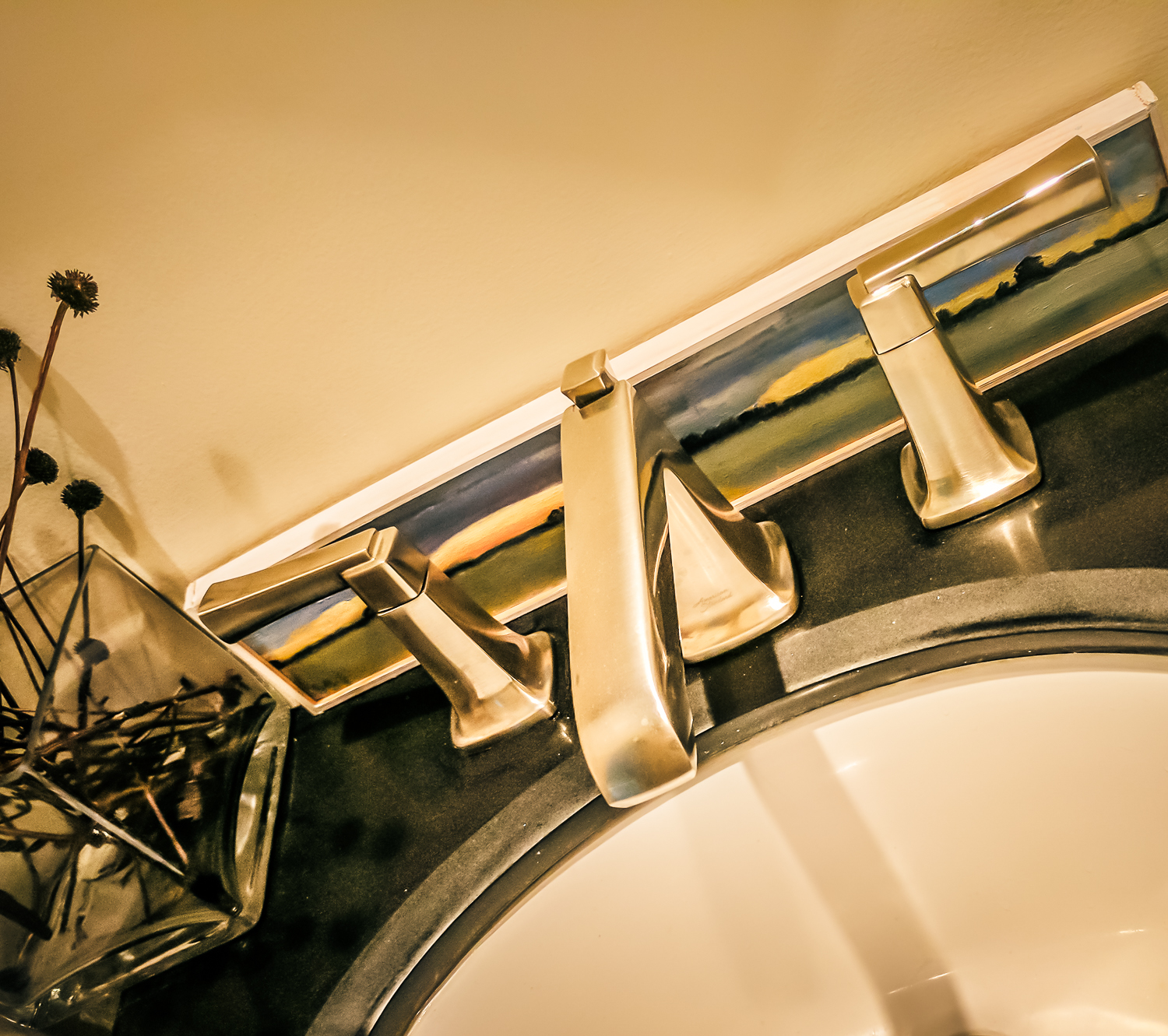
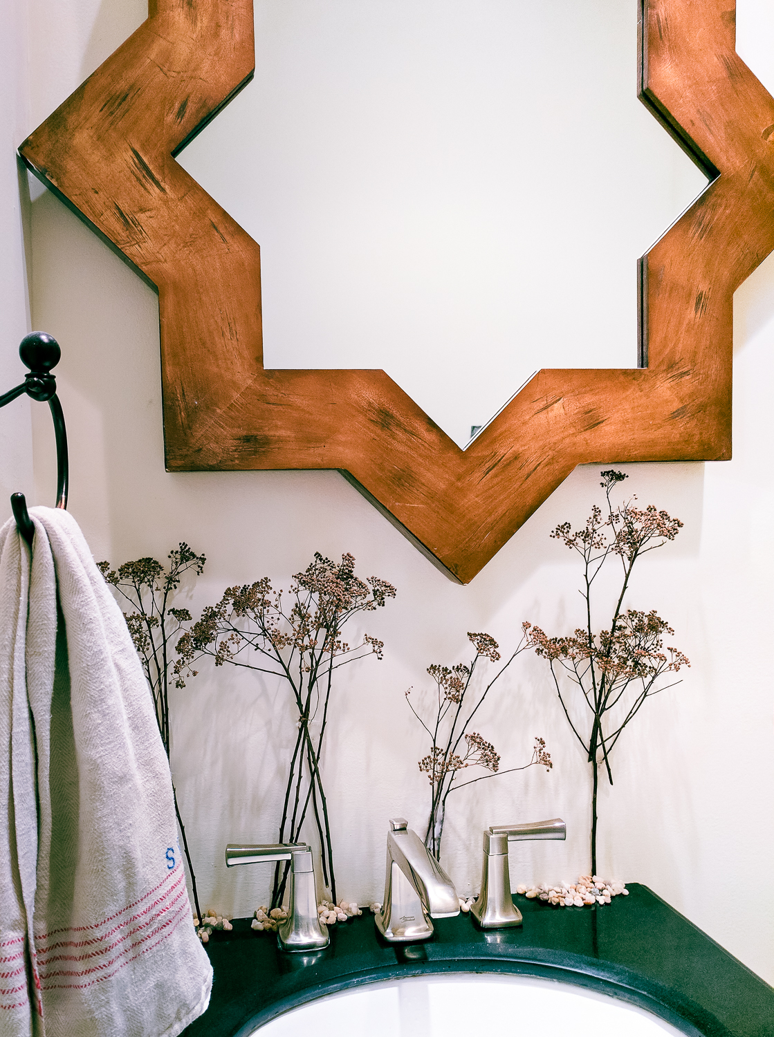
The Townsend faucet - American Standard's newest faucet, arrived at my home, compliments of the aforementioned brand. I thought it would be interesting to play with it, solely my own inspiration, to see how this faucet can hold up to some of my creative impulses.

Art Inspiration below

Townsend Faucet American Standard

Townsend Faucet American Standard

Scandi Asymmetrical Inspiration below:

Townsend Faucet American Standard

Townsend Faucet American Standard

Nature, Texture, Eclectic Inspiration below

Townsend Faucet American Standard

Townsend Faucet American Standard

Close Up of Form and Function Below/Minimalist Look With Texture:

Townsend Faucet American Standard

Townsend Faucet American Standard

Bling!

Townsend Faucet American Standard

Townsend Faucet American Standard

This what I found right away and what I find most exciting about this Townsend collection - the ability to change the look, in this case of the powder room, allows you to let your creativity loose, to not be bound by one look for all time but rather, to change it at a whim. Change is good!

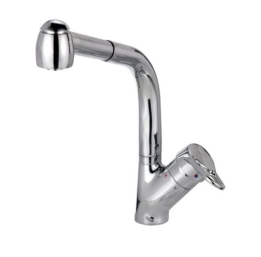
This faucet in the images is satin nickel. It also comes polished chrome, polished nickel and legacy bronze. Fun fact: The design of the Townsend faucet was inspired by the Manhattan Bridge, thus, it's energy and visual strength. The operation of the handles? Like butter. It also comes with a high arc spout.

The Townsend Faucet, approved by Designhounds www.designhounds.com everywhere, speaks in multiple languages. Is it modern? Traditional? Minimalist? Transitional? Sculptural? It's all that and a bag of chips. To create an eclectic look with disparate design elements and, since I NEED to change my surroundings on a regular basis, I look forward to expressing my creativity, really, whenever the mood strikes.


BLANCO Sinks & Faucets At Living Kitchen 2013

Just a few days ago, I returned from my trip to the fabulous Living Kitchen international kitchen show at IMM Cologne in Germany. This was my second trip to the Living Kitchen show at the invitation of BLANCO. This time around I paid my own way (except for a few fabulous dinners with the BLANCO team) because I wanted additional flexibility in my schedule while there...not that there wasn't an ample amount of free time-I just wanted complete freedom...so of course, I ended up attending nearly every event!
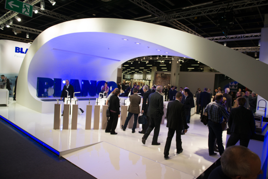
One section of BLANCO's dramatic booth!

I am a member of the BLANCO Design Council, which is truly an honor, as I have the opportunity to contribute to shaping product design and strategy from time to time. BLANCO, while a global brand, has a corporate culture that in my experience with the company over a number of years, feels like a small, local, company (a good one!) The CEO, Achim Schreiber, greets, chats with and listens to anyone and everyone in a casual, friendly, way. I didn't realize who he was when I was chatting with him last week. I thought he might be a local BLANCO distributor or a regular, friendly, guy who had something to do with BLANCO till I found out later. He's relaxed, easy going, friendly and a great listener-a lovely man.

All others connected to BLANCO-in Europe, Canada, US and elsewhere whom I've met over time, are also every bit as friendly and positive from my experience. I have to say, having an interest in "corporate culture", I often observe and try to figure out a company's vibe over time, by connecting the dots from different types of communications and other experiences. I'm convinced that the values of a corporate culture, as has been said before by others, travel from the top down on roads that are either positive, negative, fearful, confused, apathetic, passionate, good enough and so on. BLANCO's U.S. team, a truly great group of people, has a genuine dedication to, and belief in the brand that is remarkable, but let me also say, very well placed.

From my point of view, BLANCO, the corporation, takes the positive, socially intelligent, and passionate paths - from the top down - to create an absolutely superb range of products that has that desirable mix of precision engineering and beauty. BLANCO's products are at once on trend and reflective of a classic modern design which renders them timeless. BLANCO does a whole lot of things right. They know their customer...very well.

Ok, time to see some of the gorgeous products that I shot from the show floor. Some products are not available in the US, many are, but the point here is to help you experience that special mix of design and engineering. Take a look at swoon-worthy kitchen sinks and faucets!
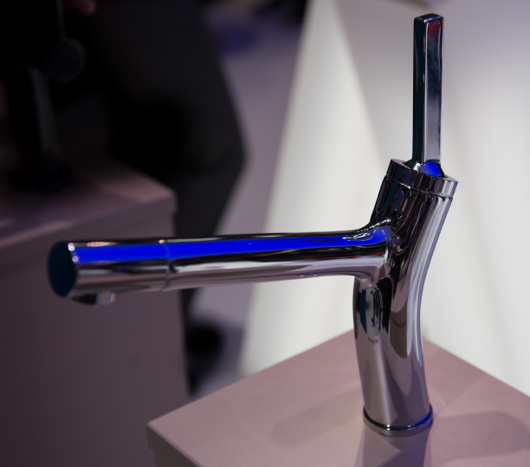
Above: The new BLANCOLIAN kitchen faucet

Above: Note the understated, elegant color, Truffle, the continuity of the flowing lines of the drainboard and the stainless steel rack, the simplicity of the drain cover, and the overall form of this top mount sink.
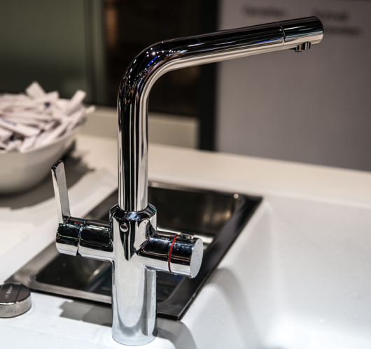
Above: BLANCO's new faucet, BLANCOHOT, that supplies both near boiling water as well as normal hot and cold water from a single spout
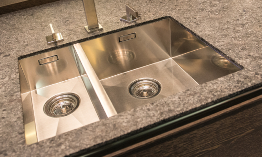
Above: Simply, precision stainless steel sink and faucet
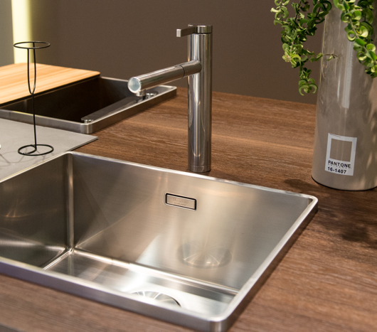
Above: A sink with a beautiful form featuring an edge with an interesting, modern dimension
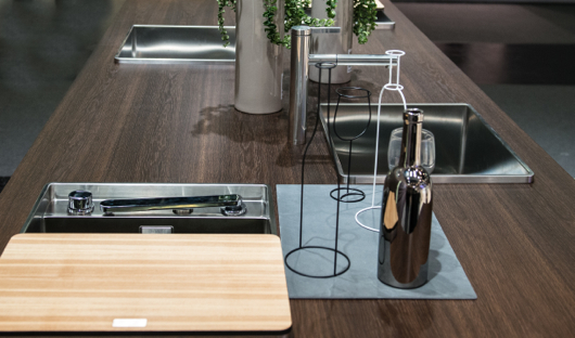
Above: A beautiful island in BLANCO's booth - note the faucet that can be lowered to the sink surface and covered with the cutting board - flexible design
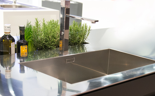
Above: Seamless, stunning, stainless steel
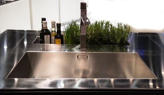
Above: Another shot of this fully integrated, elegant stainless steel BLANCO SteelArt sink and countertop
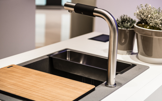
Above: A new faucet by BLANCO which is easy to operate-ideal for universal design purposes by twisting the soft black section back and forth and side to side to operate flow and temperature
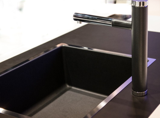
Above: A new take on mixing materials - note the stainless steel trim, the indestructible Silgranite material in the sink and coordinating finishes in the faucet - elegant
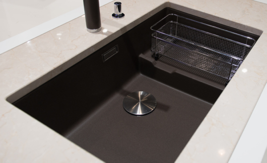
Above: BLANCO's new color, Cinder, with matching color on the faucet as well as a useful sink, sectioned off by a lower separation for design flexibility, once again
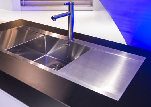
Above: BLANCO SteelArt, useful and beautiful - I could see this paired with a wood countertop for those who are fearful of mixing sinks with wood tops

Above: Simply, a close up of that precision engineering - I happen to really love BLANCO's use of stainless and matte colors on their faucets

I hope you have enjoyed these shots and that they communicate BLANCO's dedication to quality and design!


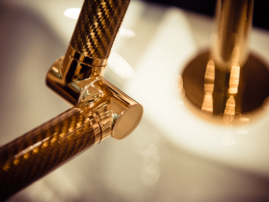
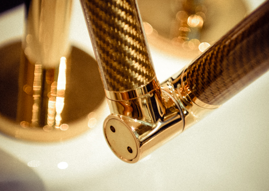
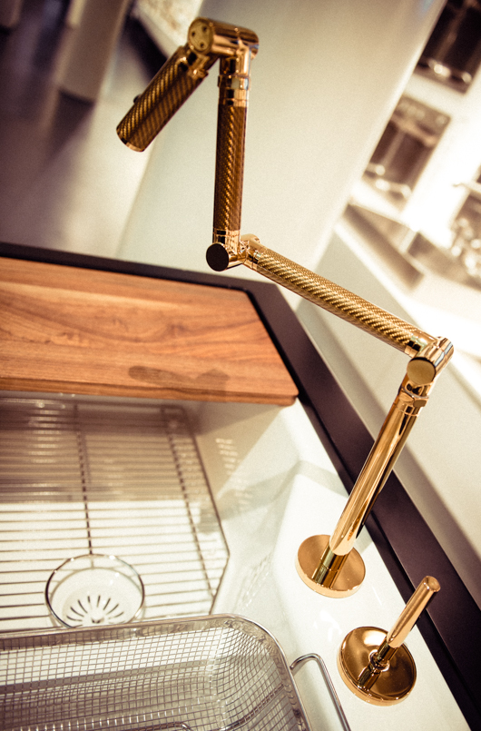
Kohler Karbon Faucet

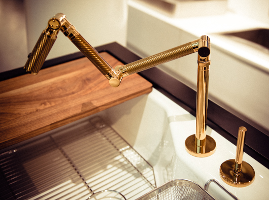
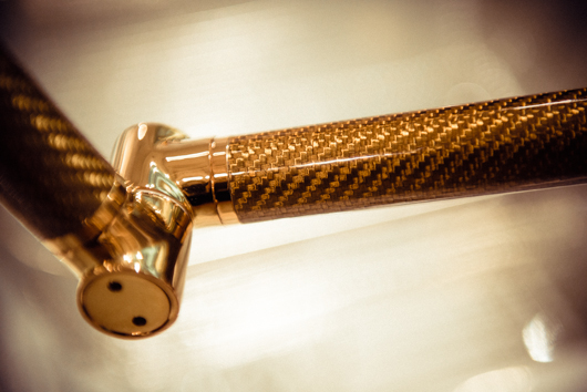
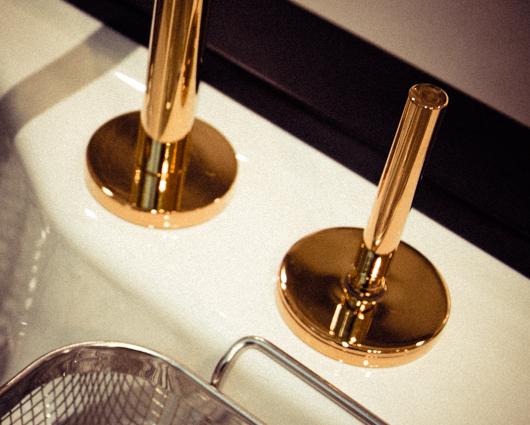
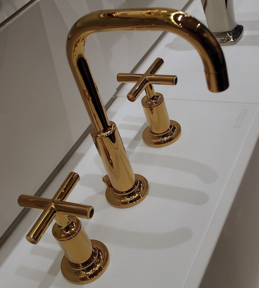
I had the opportunity to go to Kohler, Wisconsin in October, courtesy of Kohler, to attend the Kohler Food and Wine Festival, quite simply, a food and wine fantasy weekend escape! While there, I had so many wonderful experiences which I will share here and there, but as I casually went through my images today, I was struck by those I took of the Karbon faucet at the Kohler Design Center, here, in the Vibrant Moderne Brushed Gold finish. How gorgeous is this faucet? It's like owning a sculptural, or 3D, piece of art in the kitchen. It also comes in a wall mounted version.


New Kitchen Product Introductions

I thought I'd share some great products that I have discovered recently. It's something I should do more often because there are so many truly great products being introduced all year. I'll try to keep up the product info!

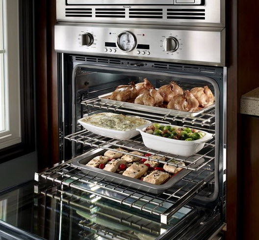
Thermador presents its 2012 line of built-in wall ovens. Who doesn't love to see the latest appliances?? You have the industry's only "softclose" door, the largest commercial style rotisserie with a 12 lb capacity (sign me up), a super large oven cavity at 4.7 cu. ft., the fastest preheat, a 2-hour self clean mode and a lot more! The design, as always, is VERY beautiful. Do you like the knobs? I do.

On the green front, it's well worth noting that BLANCO has recently introduced 9 new kitchen faucets that are focused on saving water in a significant way. With a 20-30% reduction in water consumption, these faucets give you both style and real life energy savings. The HYDRA faucet is ultra efficient, conserving 30% water usage over conventional faucets. 

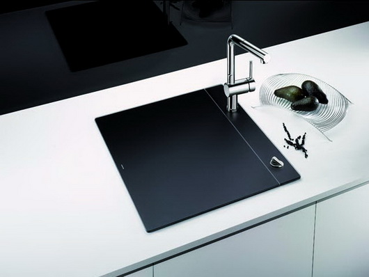
Another winner by BLANCO is their recently introduced Crystalline sink, available in both black and white. We want our kitchens open. At the same time, we have small kitchens. Now you can entertain in style with a "closed" sink, and during periods of prep, or entertaining for that matter, you have additional worktop space. This is not a small product feature. I think it's huge both due to its many functional properties as well as its fabulous looks. Keep things chilled, hide dirty dishes, work on it, put stuff on it, use it partway on, partway off for all sorts of functions.

ThinkGlass is one of the most creative glass brands I know of. An eco-chic solution, ThinkGlass tabletops are made from 100% recyclable glass. I like the textured finish because of its highly durable properties - no staining and it hides smudges and scratches, unlike wood tables! Practical and stylish.

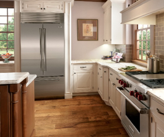
Sub-Zero now has a French door refrigerator. Great for galley kitchens where you want full size/built in flexibility but cannot install a full width 36" door, here's the answer. Perfect for apartment dwellers or those who have a tricky refrigerator installation where a full width door would pose a problem. It's available in stainless steel with a choice of handles or as an overlay model. Some people think there are energy savings to opening one small door - depends on if you know where things are located in the refrigerator, but that could also be good, green, thinking.

Lots more cool products to show you, coming soon!
 

Kohler Design Center - Kitchen & Bath Plumbing Products, Furniture, Tile

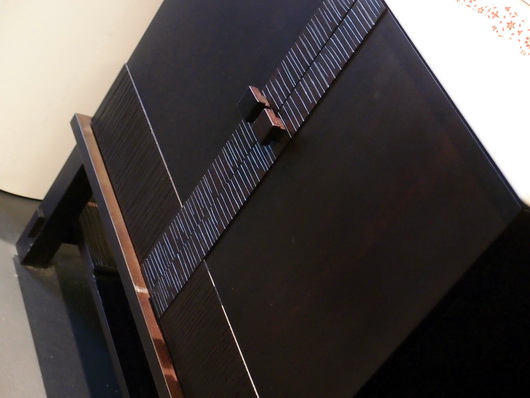
The best part of my trip to Kohler's headquarters in Kohler, Wisconsin a couple of months back at the invitation of Kohler, was to visit the Kohler Design Center (how could I have said that without four "Kohler's" in the sentence??) A beautiful brick building in which all of Kohlers brands are showcased, it is a place that will take a design aficianado hours and hours to go through. There is something for everyone.

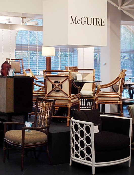
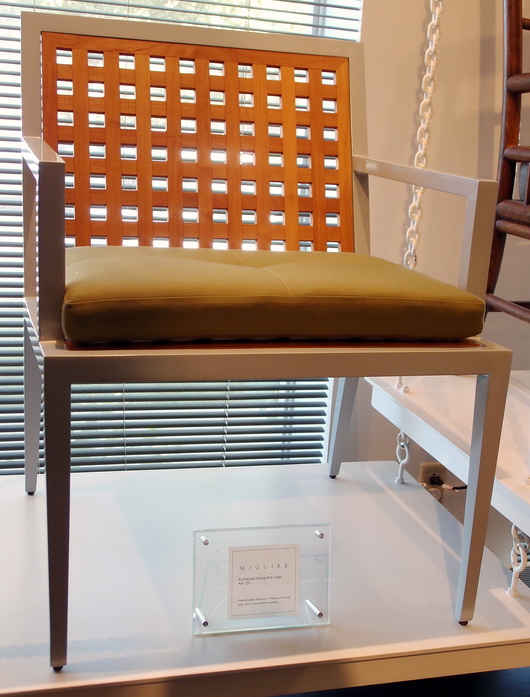
First, there were selections from Kohler's furniture brands such as Baker and McGuire...

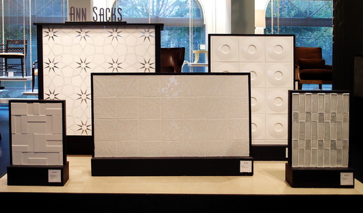
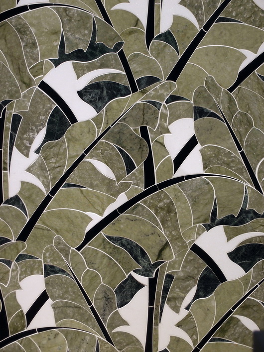
There was a display of stunning Ann Sacks tile and down the road, a tile store with the complete line

But here's what I REALLY came to see, below....and which did not disappoint. In fact, it made me see, as I learned about Kohler through the factory tour as well as discussions with Kohler designers, the incredible depth of design talent, commitment to design, and breadth of style that Kohler embraces and has embraced for decades. 

DID YOU KNOW that for nearly 40 years Kohler has offered an Arts/Industry Program in collaboration with the John Michael Kohler Arts Center in nearby Sheboygan to emerging artists? There have been nearly 400 artists in residence since the program's inception. These artists may work in the Kohler Co. pottery, iron and brass foundaries and enamel shop to hone their skills and explore their vision in functional and sculptural forms.

It was the Kohler family's desire some decades ago to celebrate art by introducing artists to freely reinterpret their products with a fresh vision and point of view. This philosophy has made Kohler's products known for beauty, creative design and originality. From many years in the kitchen and bath industry, I can tell you that Kohler's product introductions each year always excite the senses!

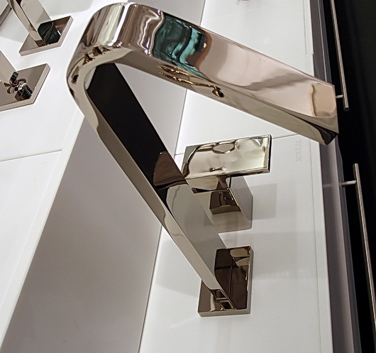
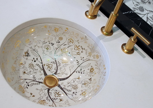
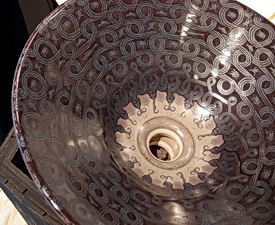
Ok then, time for the good stuff!! I do not have names on these pieces, but ask me what they are and I'll find out for you. These are random shots of product displays that I took from the first floor of the Design Center.

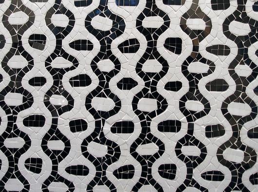
Ann Sacks tile below-looks like fabric!

And there's MORE....

There is so much to show you from this trip to Kohler's Design Center that I cannot leave out what rivals anything you have seen so far, and that is a peek at the fabulous kitchen and bath vignettes situated on the second floor of the Kohler Design Center. Coming soon. Can't leave them out!

As you can see, this is truly a destination. Who knew? More soon