Mecox Gardens - Finding Design Inspiration

Saturday, I took a day trip out to the Hamptons. It had been gloomy most of the week, cold and miserable and the morning was a) a Saturday-yay! b) sunny c) much warmer - all good reasons to go exploring on the east end of Long Island.
Designers find inspiration everywhere and my day trip began with a visit to the stunning, new, Parrish Art Museum, a fantastic place to expand your vision. I cannot overstate what a beautiful museum this is. The backdrop of this elegant, organic building (in design and materials) was perfect for appreciating the art within.

This was followed by a stroll through the truly fabulous shops in Bridgehampton, a visit to Tom Colicchio's new, gorgeous, restaurant and hotel, Topping Rose House built in 1842, by the way and newly restored, and more sensory stimulation as I picked up a few things at a favorite market, Citarella. Even my purple potatoes in my salad nicoise were a visual pleasure! I do enjoy being in the Hamptons in the off-off season-it's easier to slow down and take it all in.

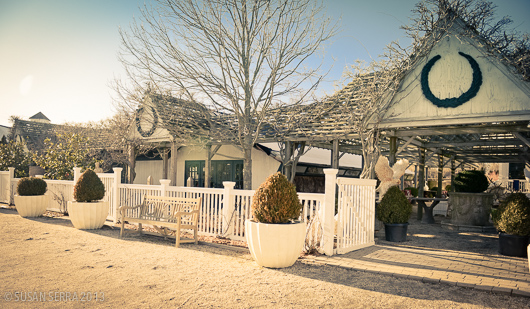
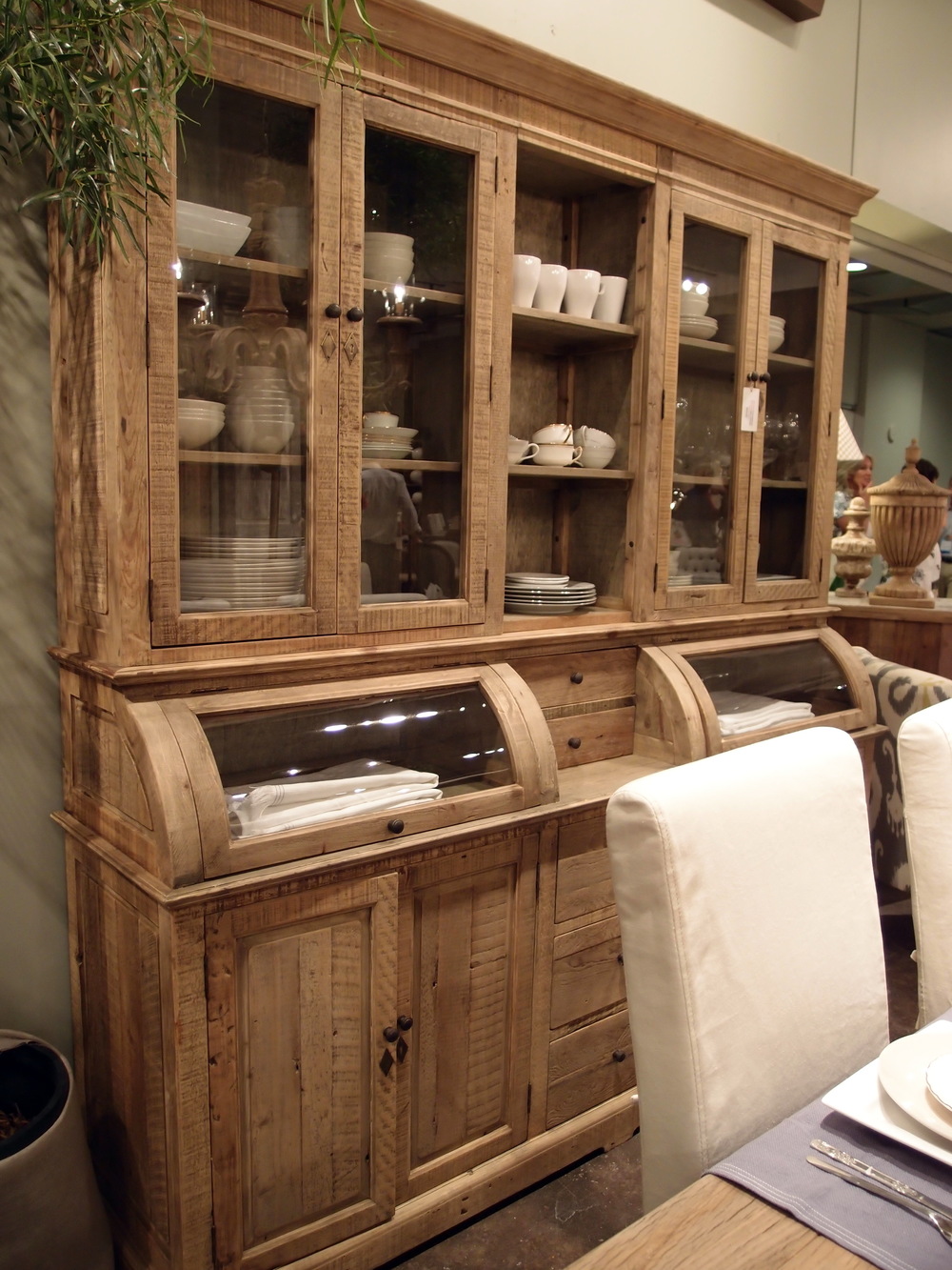
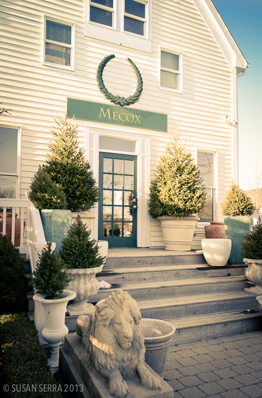
I allowed time before heading home, to stop at Mecox Gardens in Southampton. I've visited Mecox Gardens shops in New York City, Southampton and East Hampton many times. I love the design vignettes they put together in their shops and I also love the jumbled look of objects just waiting to be discovered.

Below: The main entrance

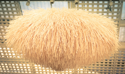
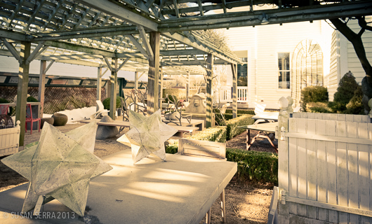
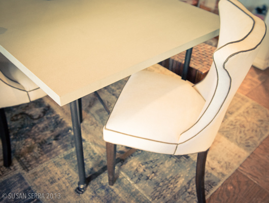
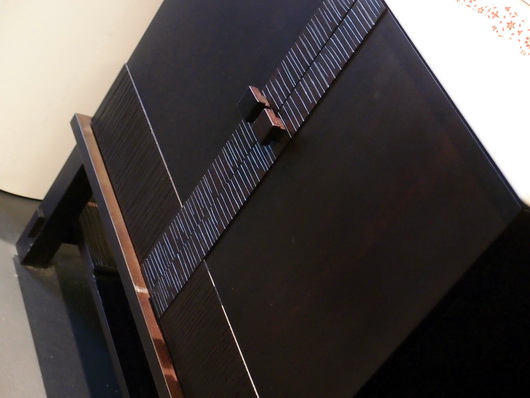
I hope these images convey the beauty and style of the objects. So many of these objects can make their way into the kitchen, now the most important living area of the home.
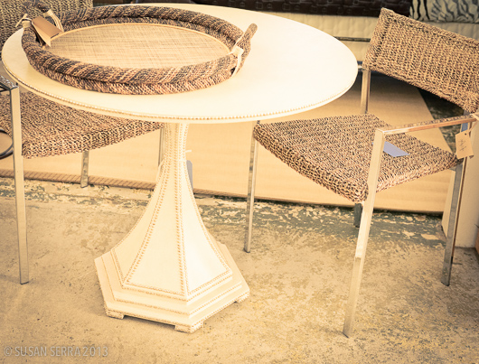
The modern kitchen has indeed been redefined. Since many of these objects have a sculptural quality to them, you can create a focal point that may be experienced as a foundation in a modern style but might also have a traditional, cottage, handcrafted, natural or other characteristic as a sort of companion to the modern object, often adding warmth. The modern kitchen may well have a mix of a few styles to create a unique look. Your personal take on modern interpretation will also benefit from guidance by a design professional to communicate the style message effectively. Take a look and be inspired!
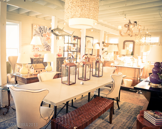
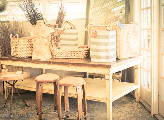
The day was a mix of new and old, modern and tradition via art, architecture, home furnishings, even food. Taking some time out just to explore and soak in disparate types of beauty, just because, is a prescription for, you guessed it, design inspiration!

Kohler Design Center - Kitchen & Bath Plumbing Products, Furniture, Tile

The best part of my trip to Kohler's headquarters in Kohler, Wisconsin a couple of months back at the invitation of Kohler, was to visit the Kohler Design Center (how could I have said that without four "Kohler's" in the sentence??) A beautiful brick building in which all of Kohlers brands are showcased, it is a place that will take a design aficianado hours and hours to go through. There is something for everyone.

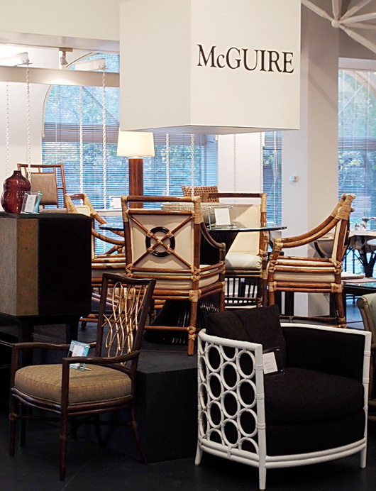
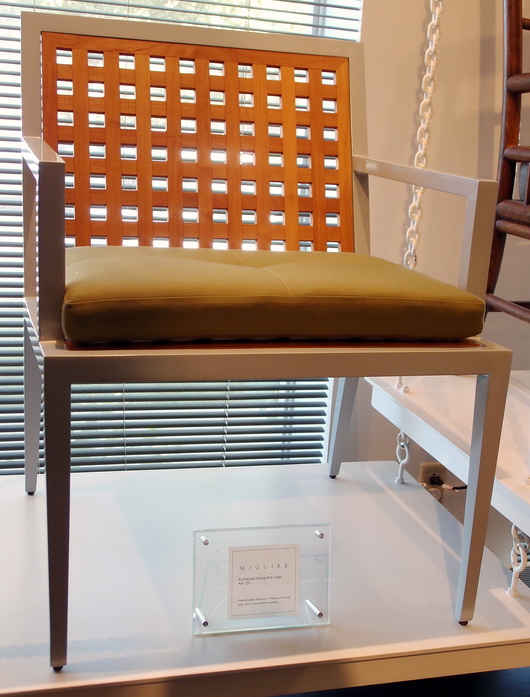
First, there were selections from Kohler's furniture brands such as Baker and McGuire...

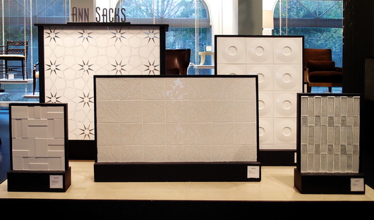
There was a display of stunning Ann Sacks tile and down the road, a tile store with the complete line

But here's what I REALLY came to see, below....and which did not disappoint. In fact, it made me see, as I learned about Kohler through the factory tour as well as discussions with Kohler designers, the incredible depth of design talent, commitment to design, and breadth of style that Kohler embraces and has embraced for decades. 

DID YOU KNOW that for nearly 40 years Kohler has offered an Arts/Industry Program in collaboration with the John Michael Kohler Arts Center in nearby Sheboygan to emerging artists? There have been nearly 400 artists in residence since the program's inception. These artists may work in the Kohler Co. pottery, iron and brass foundaries and enamel shop to hone their skills and explore their vision in functional and sculptural forms.

It was the Kohler family's desire some decades ago to celebrate art by introducing artists to freely reinterpret their products with a fresh vision and point of view. This philosophy has made Kohler's products known for beauty, creative design and originality. From many years in the kitchen and bath industry, I can tell you that Kohler's product introductions each year always excite the senses!

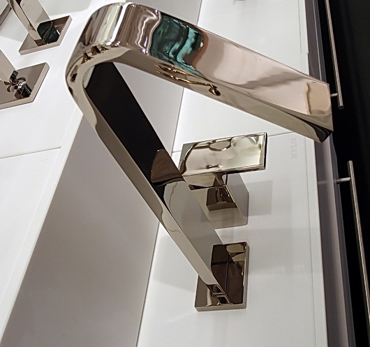
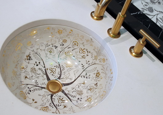
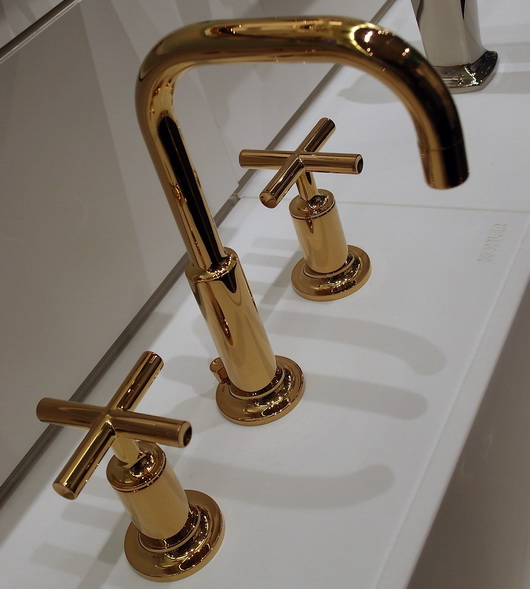
Ok then, time for the good stuff!! I do not have names on these pieces, but ask me what they are and I'll find out for you. These are random shots of product displays that I took from the first floor of the Design Center.

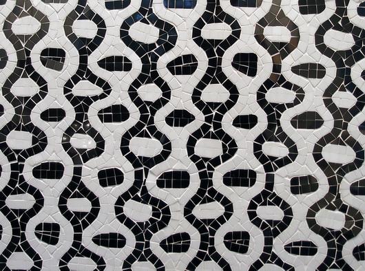
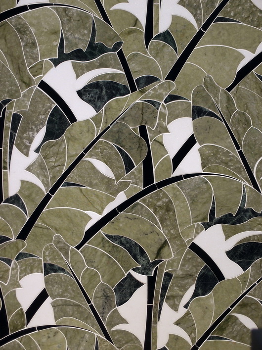
Ann Sacks tile below-looks like fabric!

And there's MORE....

There is so much to show you from this trip to Kohler's Design Center that I cannot leave out what rivals anything you have seen so far, and that is a peek at the fabulous kitchen and bath vignettes situated on the second floor of the Kohler Design Center. Coming soon. Can't leave them out!

As you can see, this is truly a destination. Who knew? More soon


Las Vegas Market - Dining Inspiration

Earlier this week I walked through the Las Vegas World Market Center, the enormous gravitational center for residential furnishings that struts its stuff twice a year. Vegas is a place that makes me smile, so I'm happy upon arrival. 

Rossetti

I came with a "kitchen context" unlike most interior designers, architects and buyers; a context in which I think about the transition, stylistically, of the kitchen to surrounding spaces. The dining area is a critical element of kitchen design and what a great place to dream of the ideal dining experience. Following are dining tables seen at the Las Vegas Market.

Rossetti

I always put a strong emphasis on the dining area in the earliest stages of designing a kitchen. Unfortunately, I often see it, if already designed within preliminary floorplans presented to me by my clients, as almost an after thought. I find nearly always, the dining area needs more space devoted to it.

Bramble

Making space available for friends and family to travel easily around the dining area and designing adequate space so that lingering at the table is an enjoyable and not a confining experience, are two important elements of a well planned dining space. 

Urbana Home

Durability of a table's surface and of the chairs as well is the measure of longevity and beauty. Ask questions and observe product construction and durability. Ask if materials and surfaces can be refinished or easily cleaned down the road. Be practical and realistic to determine if your lifestyle can withstand a white painted tabletop.

Rossetti

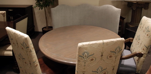
Venturing away from the kitchen, I'm a strong advocate for multiple dining areas in the home. I especially love a dining table, perhaps a 54" round table, depending on the size of the room, situated in a family room.

Lexington

This secondary or tertiary table within the home will serve as an alternative place to dine - maybe on weekend evenings or weekend mornings or the occasional weekday change of scenery. It's definitely about a change of scenery - why eat at the same table every single evening if another table can be accommodated in another space? A little far to bring in food from the kitchen? That's what trays were made for and I promise the effort is SO worthwhile. I've lived it, thus, my endorsement.

What does your ideal casual dining space look like?

Las Vegas Market Summer 2011 - Kitchen Design Interpretation

I'm here in a fabulous hotel suite in Vegas at the invitation of the Las Vegas Market as part of a small group of bloggers. Our mission is simply to walk/work/discover the Market in our own unique way. No requirements, no expectations. Ideal!

Transitions by Sigla My perspective is different than most interior designers who attend Las Vegas Market. In fact, it greatly benefits the home furnishings industry to invite kitchen designers to see the Market. As the kitchen and surrounding rooms become ever more integrated, I, for one, feel a need to understand the current state of home furnishings and design to tap into what designers are thinking and what manufacturers are creating. Of course, also perhaps to specify furniture as opposed to cabinetry in some kitchen areas, to create the look of seamless integration among surrounding spaces as well.

My eye is unique from all others, my perspective toward public rooms surrounding the kitchen is different, and following is a collection of "dots" that I connected while at Market. It was fun!

Antigua FurnitureHappiness is ... the word "happy" came to mind over and over. Living in a pleasant, easy way seemed to be a continuing theme in the furnishings I discovered. Pleasant/simple lines, fabrics, materials and PATTERNS were mostly very easy to live with, often "pretty" and had this wonderful back to basics/simple creativity that I found lovely.

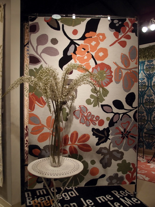
The Rug Market

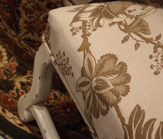
Lots of linen - I did not see as much gray as I did at High Point Market in the spring, although there was a good amount across all furnishings and accessories, but there were beautiful muddied beiges and lots of beige linen fabrics, that whole Belgian country vibe. A resurgence of French Country was talked about at Market as well.

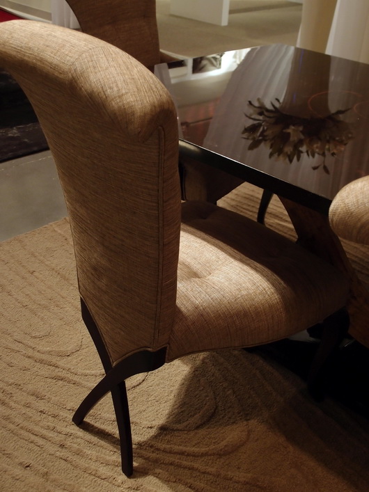
Christopher Guy

Mixed Media - Experimentation with different materials in unexpected ways was interesting to see - in rugs, case goods and upholstered pieces. The effect was usually very well done in my opinion.

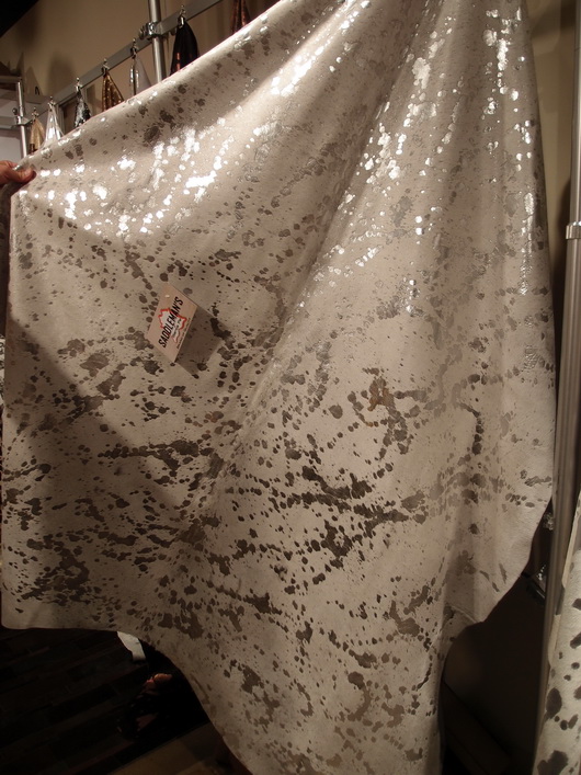
Saddleman's of Sante Fe

Small Scale - Definitely seen throughout Market were smaller scale furnishings across the board, in every category of furniture. Smaller scale furniture seemed to then shed excess ornamentation, allowing for simplicity and elegance in smaller sizes.

Linon

I'll share more of my impressions and inspiration from the Las Vegas Market soon! And more images. I'm very glad I went - it's great to be immersed in the design world!