A French Kitchen Renovation

Some time ago I corresponded with an American living in France who was about to undergo a kitchen renovation in their 200 year old home in a small French village. We talked about working together and for various logistical reasons in connection to the renovation work, it didn't work out (trust me, my bags could have easily been packed in short order!) 

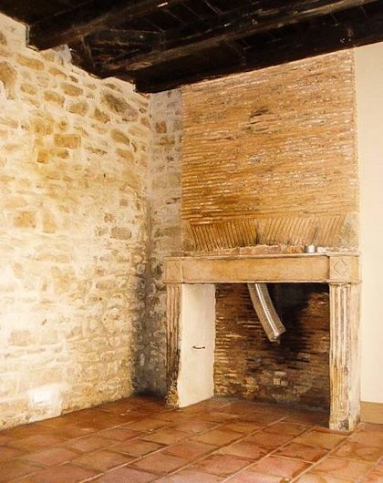
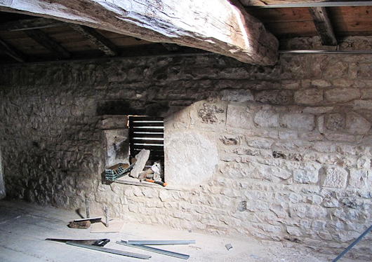
I was so pleased to receive an email yesterday (months after our conversations) with images of the home with its bones exposed...and intact! The home is small. The first floor is 220 square feet and will serve as the kitchen which also features a wood burning fireplace. I am told that the front interior wall will be exposed stone. The homeowner says, "The floor under linoleum is original terracotta tile." Original.Terracotta.Wow!

They will be installing traditional French kitchen cabinetry, made by a local shop called Muebles Baluteau - just look at the beautiful cabinetry in the website. I feel like I've stepped into a French fantasy when I look at some of these pieces.

The whole point is, I wanted to share these cool images with you. Normally, when a house is gutted in the states, we see wood studs, pieces of sheetrock and a plywood subfloor. This gutted space is a beautiful sight to behold!

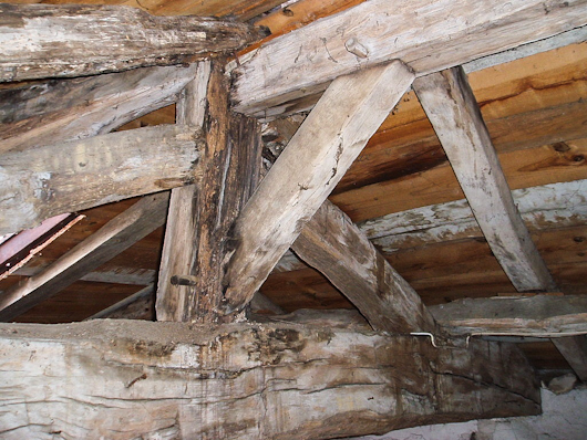
Below, pretty crazy construction with hand hewn timbers:
Below, a lovely combination of original materials - stone, terracotta, hand hewn beams, a simple and elegant fireplace, and beautiful, narrow brick. 
Below, another view of stone, a staircase and large, hand hewn beams:

Below, more beautiful, original and authentic surfaces
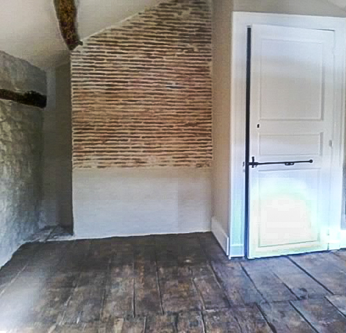
Below, once again - fantastic, preserved, materials
What a privilege to take a look at the exposed interior of this home. I hope to share more images with you as the renovation progresses! 

Las Vegas Market Summer 2011 - Kitchen Design Interpretation

I'm here in a fabulous hotel suite in Vegas at the invitation of the Las Vegas Market as part of a small group of bloggers. Our mission is simply to walk/work/discover the Market in our own unique way. No requirements, no expectations. Ideal!

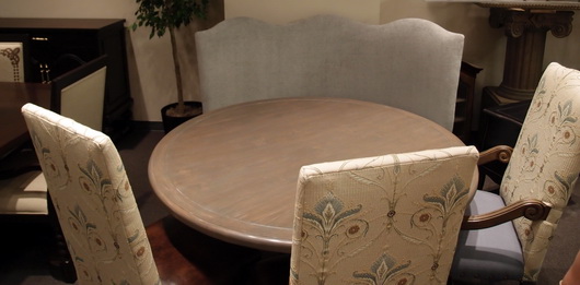
Transitions by Sigla My perspective is different than most interior designers who attend Las Vegas Market. In fact, it greatly benefits the home furnishings industry to invite kitchen designers to see the Market. As the kitchen and surrounding rooms become ever more integrated, I, for one, feel a need to understand the current state of home furnishings and design to tap into what designers are thinking and what manufacturers are creating. Of course, also perhaps to specify furniture as opposed to cabinetry in some kitchen areas, to create the look of seamless integration among surrounding spaces as well.

My eye is unique from all others, my perspective toward public rooms surrounding the kitchen is different, and following is a collection of "dots" that I connected while at Market. It was fun!

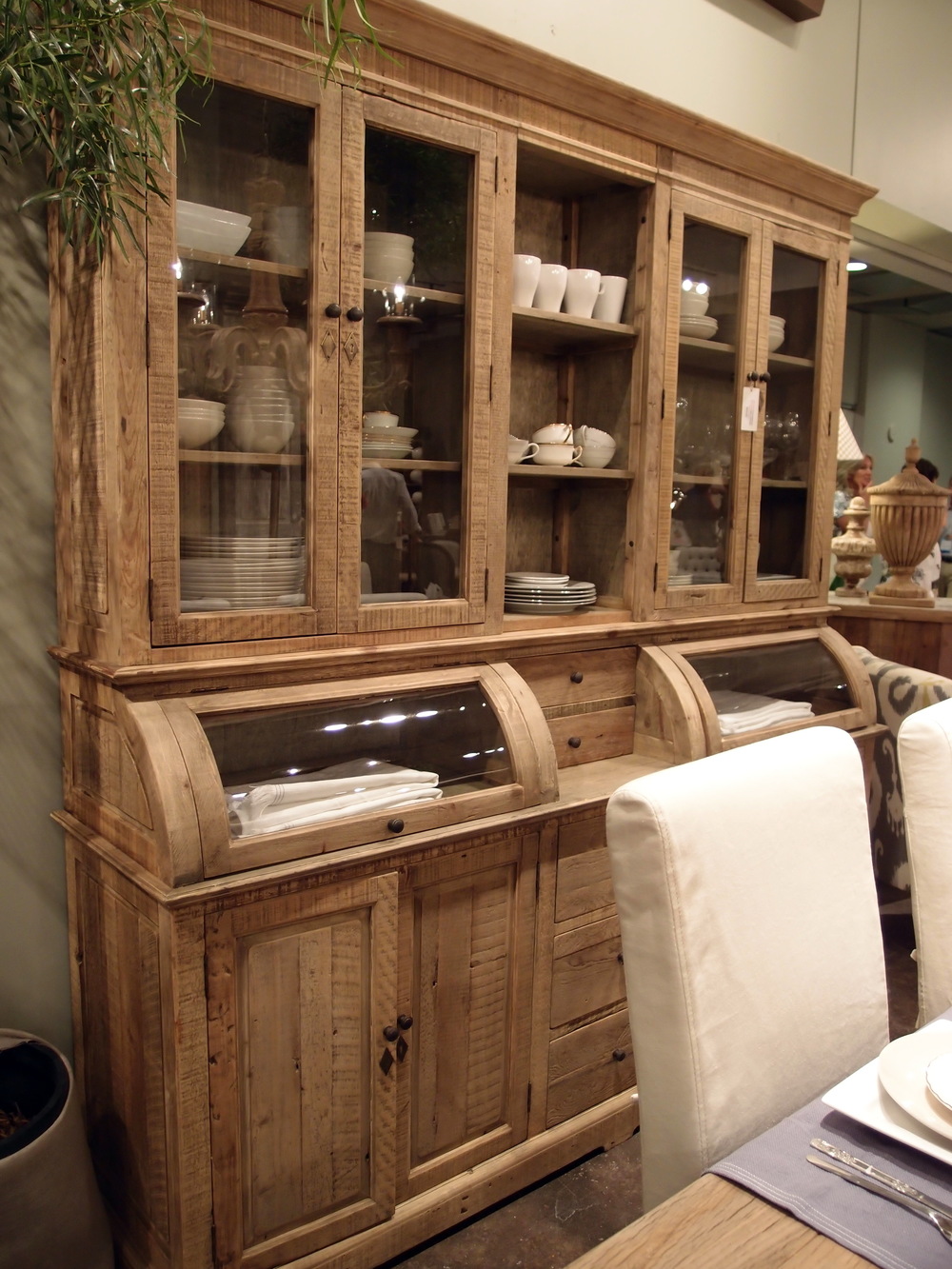
Antigua FurnitureHappiness is ... the word "happy" came to mind over and over. Living in a pleasant, easy way seemed to be a continuing theme in the furnishings I discovered. Pleasant/simple lines, fabrics, materials and PATTERNS were mostly very easy to live with, often "pretty" and had this wonderful back to basics/simple creativity that I found lovely.

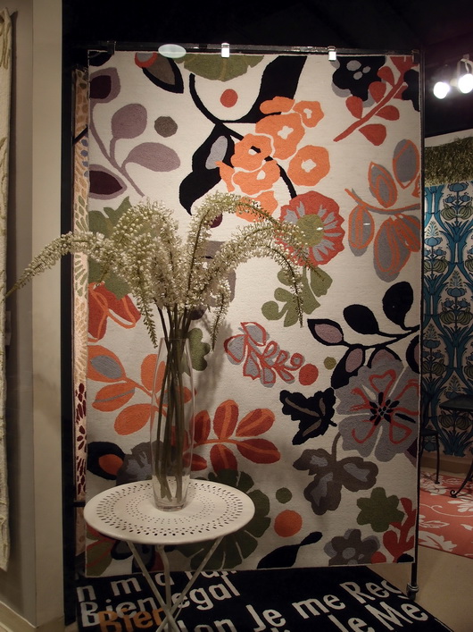
The Rug Market

Lots of linen - I did not see as much gray as I did at High Point Market in the spring, although there was a good amount across all furnishings and accessories, but there were beautiful muddied beiges and lots of beige linen fabrics, that whole Belgian country vibe. A resurgence of French Country was talked about at Market as well.

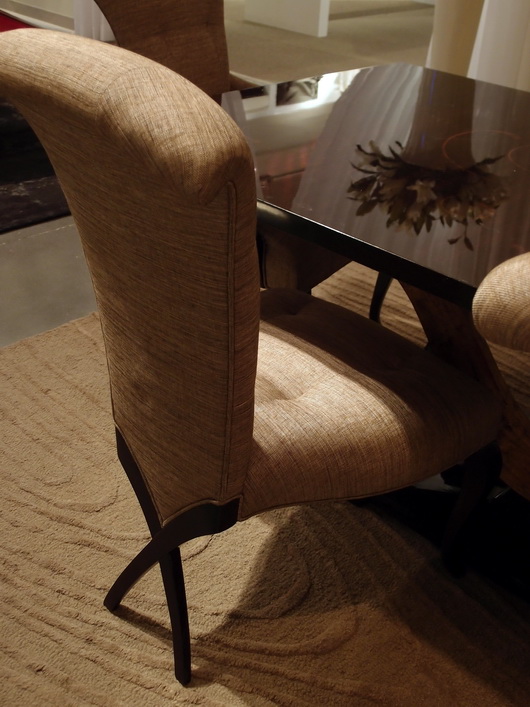
Christopher Guy

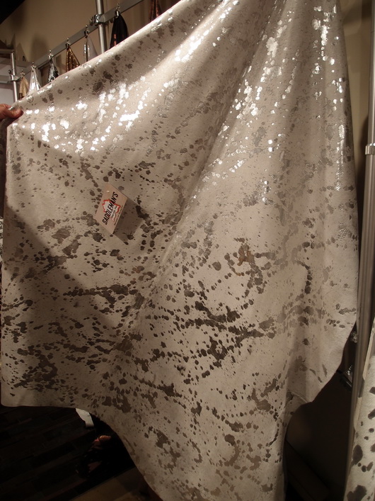
Mixed Media - Experimentation with different materials in unexpected ways was interesting to see - in rugs, case goods and upholstered pieces. The effect was usually very well done in my opinion.

Saddleman's of Sante Fe

Small Scale - Definitely seen throughout Market were smaller scale furnishings across the board, in every category of furniture. Smaller scale furniture seemed to then shed excess ornamentation, allowing for simplicity and elegance in smaller sizes.

Linon

I'll share more of my impressions and inspiration from the Las Vegas Market soon! And more images. I'm very glad I went - it's great to be immersed in the design world!