Cosentino Materials For Kitchen And Bath - It's More Than Silestone!

Last week I went to the latest Cosentino Center opening in Westchester. It was a good reminder that Cosentino, a name so often synonymous with Silestone, offers so many more materials than engineered stone. I mean, did you know that Cosentino offers soapstone? Luxury marbles and granites? And much, much more. 

And did you even know that Cosentino has 20 centers around the U.S. with material in-stock? I did, but I rarely thought about it since there was not one near me, until I received the invitation to come to the opening in Westchester and was so impressed to see this facility and all it offers designers, trade professionals and homeowners.

Usually, when a client considers engineered stone for their home, as one example, they see very small samples. To be able to see full slabs is an entirely different experience. It completely changes the look of the material's pattern and texture.

It's an enormous difference when one looks at a small sample compared to looking at a whole slab. What may have been a noticeable pattern in the material changes to a much smoother, flowing look. Trust me, it is critical to see a surface material for your home in as large a piece as possible. Tiny samples are misleading. Here is a look at a Cosentino Center!

There are many centers in convenient locations around the country - it's a valuable resource for a once-in-a-lifetime project!

BLANCO Sinks & Faucets At Living Kitchen 2013

Just a few days ago, I returned from my trip to the fabulous Living Kitchen international kitchen show at IMM Cologne in Germany. This was my second trip to the Living Kitchen show at the invitation of BLANCO. This time around I paid my own way (except for a few fabulous dinners with the BLANCO team) because I wanted additional flexibility in my schedule while there...not that there wasn't an ample amount of free time-I just wanted complete freedom...so of course, I ended up attending nearly every event!

One section of BLANCO's dramatic booth!

I am a member of the BLANCO Design Council, which is truly an honor, as I have the opportunity to contribute to shaping product design and strategy from time to time. BLANCO, while a global brand, has a corporate culture that in my experience with the company over a number of years, feels like a small, local, company (a good one!) The CEO, Achim Schreiber, greets, chats with and listens to anyone and everyone in a casual, friendly, way. I didn't realize who he was when I was chatting with him last week. I thought he might be a local BLANCO distributor or a regular, friendly, guy who had something to do with BLANCO till I found out later. He's relaxed, easy going, friendly and a great listener-a lovely man.

All others connected to BLANCO-in Europe, Canada, US and elsewhere whom I've met over time, are also every bit as friendly and positive from my experience. I have to say, having an interest in "corporate culture", I often observe and try to figure out a company's vibe over time, by connecting the dots from different types of communications and other experiences. I'm convinced that the values of a corporate culture, as has been said before by others, travel from the top down on roads that are either positive, negative, fearful, confused, apathetic, passionate, good enough and so on. BLANCO's U.S. team, a truly great group of people, has a genuine dedication to, and belief in the brand that is remarkable, but let me also say, very well placed.

From my point of view, BLANCO, the corporation, takes the positive, socially intelligent, and passionate paths - from the top down - to create an absolutely superb range of products that has that desirable mix of precision engineering and beauty. BLANCO's products are at once on trend and reflective of a classic modern design which renders them timeless. BLANCO does a whole lot of things right. They know their customer...very well.

Ok, time to see some of the gorgeous products that I shot from the show floor. Some products are not available in the US, many are, but the point here is to help you experience that special mix of design and engineering. Take a look at swoon-worthy kitchen sinks and faucets!

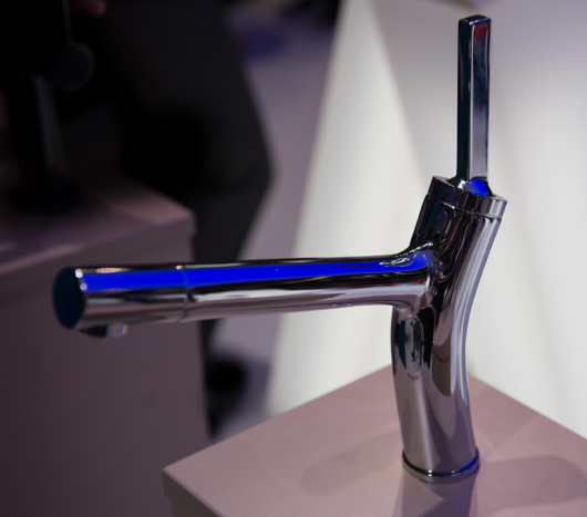
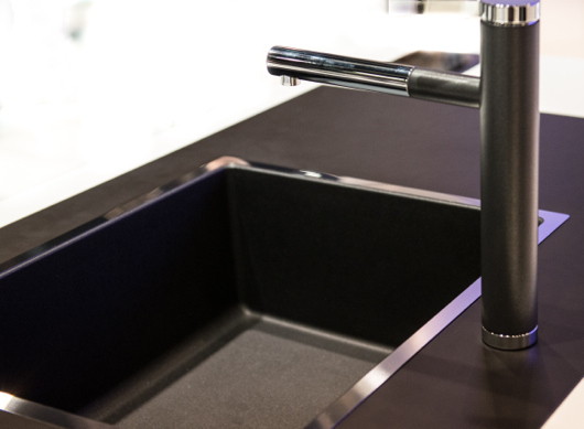
Above: The new BLANCOLIAN kitchen faucet

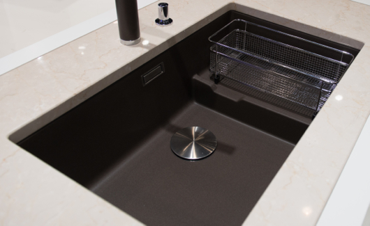
Above: Note the understated, elegant color, Truffle, the continuity of the flowing lines of the drainboard and the stainless steel rack, the simplicity of the drain cover, and the overall form of this top mount sink.

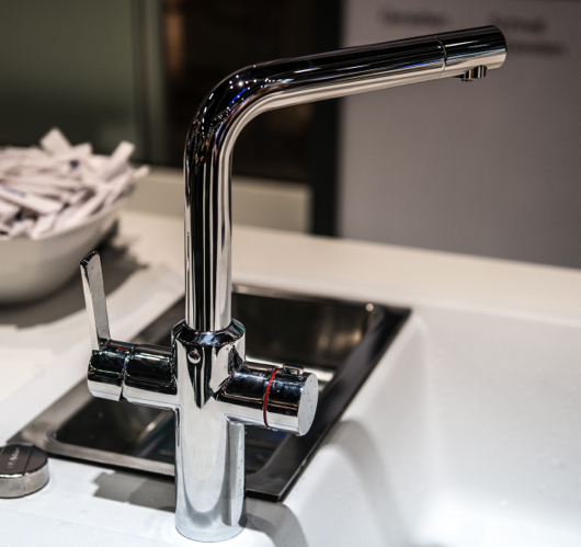
Above: BLANCO's new faucet, BLANCOHOT, that supplies both near boiling water as well as normal hot and cold water from a single spout

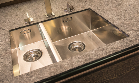
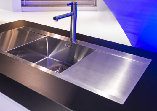
Above: Simply, precision stainless steel sink and faucet

Above: A sink with a beautiful form featuring an edge with an interesting, modern dimension

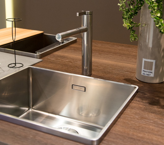
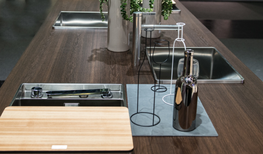
Above: A beautiful island in BLANCO's booth - note the faucet that can be lowered to the sink surface and covered with the cutting board - flexible design

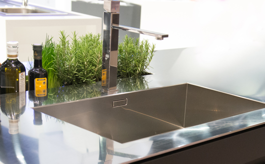
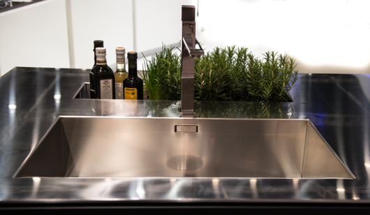
Above: Seamless, stunning, stainless steel

Above: Another shot of this fully integrated, elegant stainless steel BLANCO SteelArt sink and countertop

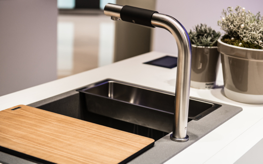
Above: A new faucet by BLANCO which is easy to operate-ideal for universal design purposes by twisting the soft black section back and forth and side to side to operate flow and temperature

Above: A new take on mixing materials - note the stainless steel trim, the indestructible Silgranite material in the sink and coordinating finishes in the faucet - elegant

Above: BLANCO's new color, Cinder, with matching color on the faucet as well as a useful sink, sectioned off by a lower separation for design flexibility, once again

Above: BLANCO SteelArt, useful and beautiful - I could see this paired with a wood countertop for those who are fearful of mixing sinks with wood tops

Above: Simply, a close up of that precision engineering - I happen to really love BLANCO's use of stainless and matte colors on their faucets

I hope you have enjoyed these shots and that they communicate BLANCO's dedication to quality and design!


Kohler Karbon Faucet

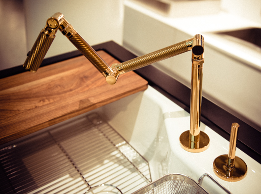
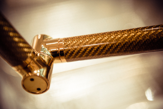
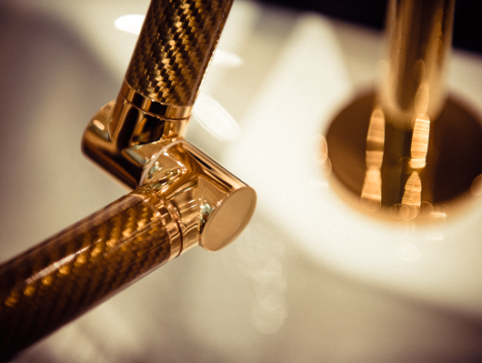
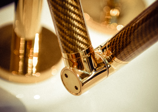
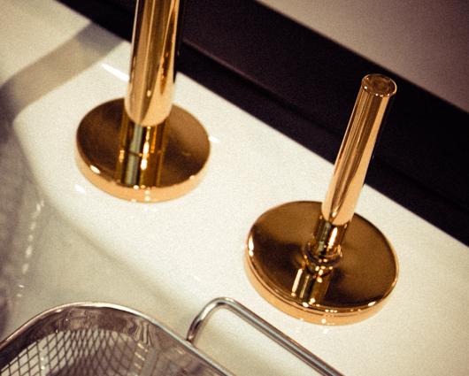
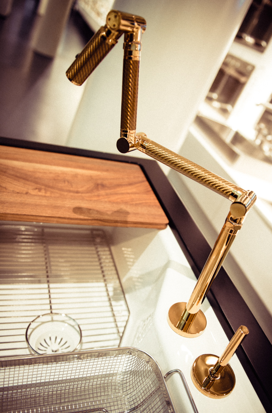
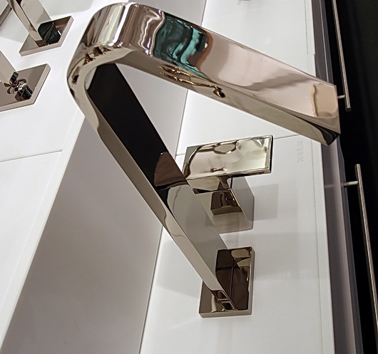
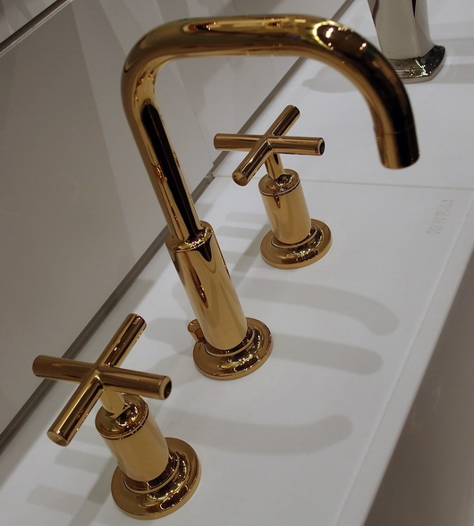
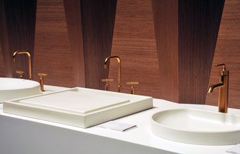
I had the opportunity to go to Kohler, Wisconsin in October, courtesy of Kohler, to attend the Kohler Food and Wine Festival, quite simply, a food and wine fantasy weekend escape! While there, I had so many wonderful experiences which I will share here and there, but as I casually went through my images today, I was struck by those I took of the Karbon faucet at the Kohler Design Center, here, in the Vibrant Moderne Brushed Gold finish. How gorgeous is this faucet? It's like owning a sculptural, or 3D, piece of art in the kitchen. It also comes in a wall mounted version.


New Kitchen Product Introductions

I thought I'd share some great products that I have discovered recently. It's something I should do more often because there are so many truly great products being introduced all year. I'll try to keep up the product info!

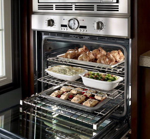
Thermador presents its 2012 line of built-in wall ovens. Who doesn't love to see the latest appliances?? You have the industry's only "softclose" door, the largest commercial style rotisserie with a 12 lb capacity (sign me up), a super large oven cavity at 4.7 cu. ft., the fastest preheat, a 2-hour self clean mode and a lot more! The design, as always, is VERY beautiful. Do you like the knobs? I do.

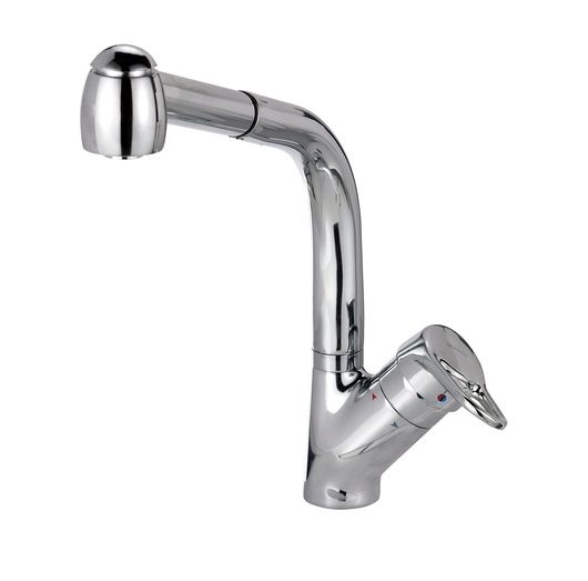
On the green front, it's well worth noting that BLANCO has recently introduced 9 new kitchen faucets that are focused on saving water in a significant way. With a 20-30% reduction in water consumption, these faucets give you both style and real life energy savings. The HYDRA faucet is ultra efficient, conserving 30% water usage over conventional faucets. 

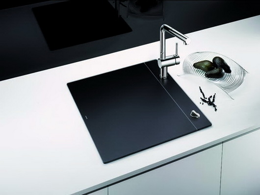
Another winner by BLANCO is their recently introduced Crystalline sink, available in both black and white. We want our kitchens open. At the same time, we have small kitchens. Now you can entertain in style with a "closed" sink, and during periods of prep, or entertaining for that matter, you have additional worktop space. This is not a small product feature. I think it's huge both due to its many functional properties as well as its fabulous looks. Keep things chilled, hide dirty dishes, work on it, put stuff on it, use it partway on, partway off for all sorts of functions.

ThinkGlass is one of the most creative glass brands I know of. An eco-chic solution, ThinkGlass tabletops are made from 100% recyclable glass. I like the textured finish because of its highly durable properties - no staining and it hides smudges and scratches, unlike wood tables! Practical and stylish.

Sub-Zero now has a French door refrigerator. Great for galley kitchens where you want full size/built in flexibility but cannot install a full width 36" door, here's the answer. Perfect for apartment dwellers or those who have a tricky refrigerator installation where a full width door would pose a problem. It's available in stainless steel with a choice of handles or as an overlay model. Some people think there are energy savings to opening one small door - depends on if you know where things are located in the refrigerator, but that could also be good, green, thinking.

Lots more cool products to show you, coming soon!


Kohler Colors by Jonathan Adler

As color, wonderful, bright, bold, free-spirited, color, has moved into the center of our lives, seen in our clothing, in our interiors in so many forms, in our outdoor living areas - and in all sorts of graphic design online and in print (and that is just for starters-as we know, color has upped its presence everywhere) it makes me think that such a significant part of Kohler's culture has been color-focused.

Kohler has had a love affair with color, and few would disagree. Kohler has quietly kept an exceptionally wide range of colors in its collection of products year after year. Although white is king in the kitchen and bath and always a classic, nevertheless, Kohler's commitment to color has been enduring - and passionate! Even if you really dislike a color, I KNOW, as a designer that any one of Kohler's colors is able to play the perfect role, whether bold or understated, a focal point or a quiet design element, in every kitchen and bath - yes, even those peachy, fleshy tones (pair them with white or charcoal for a sophisticated look!)

Take a look at this very interesting, brief, history of Kohler's colors. I loved looking at Kohler's color timeline.

Jonathan Adler Colors

It is with real interest that I observe Kohler's special edition colors by Jonathan Adler. I view these four colors as decidedly non-trendy colors, which is to say, they are colors that you can use to clearly personalize your kitchen or bath that will stand the test of time, and I do not say that lightly.

The colors, Piccadilly Yello, Greenwich Green, Palermo Blue and Annapolis Navy, are not neon - the color darling of the moment. THESE colors can be translated into a kitchen design that can be centered around elegance, country comfort, modern design, or one with a playful theme. These colors are versatile....thus, personal!

Quite honestly, I purposely did not read the press release about these colors because I wanted to go by my instincts as a designer when I went to see the collection in person. It's often a practice I employ for many new product introductions. I knew as soon as I saw this collection first hand, taking my time to work through the colors and sink configurations, that design flexibility is built in, in a very, very smart and aesthetically pleasing way. Surely, that was Kohler's intent-intelligent design flexibility.

I have to say that Kohler is providing the tools for pretty much wherever your design inspiration will take you...so many tools!! The Jonathan Adler collection is available for a limited time but the colors will prove to be enduring - sweet!

La Cornue - Kitchen Le Magnifique

I had the pleasure some weeks back of dining in New York City with Xavier Dupuy, president of La Cornue, my colleague and friend, Leslie Clagett from the blog KBCulture and a couple of PR people, always useful to fill in the blanks for a brand. I very much enjoyed this type of intimate setting.

I love up close and personal meetings with manufacturers. It helps me "get" the culture of the company which always trickles down to my understanding the quality of the product and the type of people who actually manufacture the product. 

Mr. Dupuy spent a fair amount of time talking about his factory workers - the length of time many of his employees have worked for La Cornue along with past generations of these employees' families who also worked at the factory. Lots of interesting stories. In times like these, it's nice to hear that. Mr. Dupuy takes immense pride in those who manufacture his products. This was not a short conversation!

La Cornue is a luxury brand of ranges and rotisseries that are made in France. Now, La Cornue is expanding their line of luxury appliances by adding a collection of custom made cabinetry (complete with the familiar metal banding if desired) called Culinary Architecture Memoire and a collection of handcrafted sinks. 

I've studied French kitchen design over the years. It's different. Here's why: the design emphasis is close to equal in regard to aesthetics and function. Function to the French (and to most other cultures other than, um, us in the US) does not mean that every single space gets filled for storage ... just because the space is there to fill. 

The negative space of the room is strongly considered an aesthetically important piece to the design of the kitchen, equal or nearly equal to functional pieces. What does that mean? It means an "unfitted kitchen" or a collection of islands or sections of cabinetry is preferred as opposed to continuous "runs" of cabinetry such as L-shaped, U-shaped kitchens, etc. Minimum wall cabinetry is also a part of La Cornue's kitchen design philosophy to achieve areas where the eye can rest.

Of course, the cooking area is considered the most important piece of the design ... after all, we know how seriously the French take their cooking!

A lovely evening, interesting insight into a brand and its philosophy, gorgeous products.

Kohler Design Center - Kitchen & Bath Plumbing Products, Furniture, Tile

The best part of my trip to Kohler's headquarters in Kohler, Wisconsin a couple of months back at the invitation of Kohler, was to visit the Kohler Design Center (how could I have said that without four "Kohler's" in the sentence??) A beautiful brick building in which all of Kohlers brands are showcased, it is a place that will take a design aficianado hours and hours to go through. There is something for everyone.

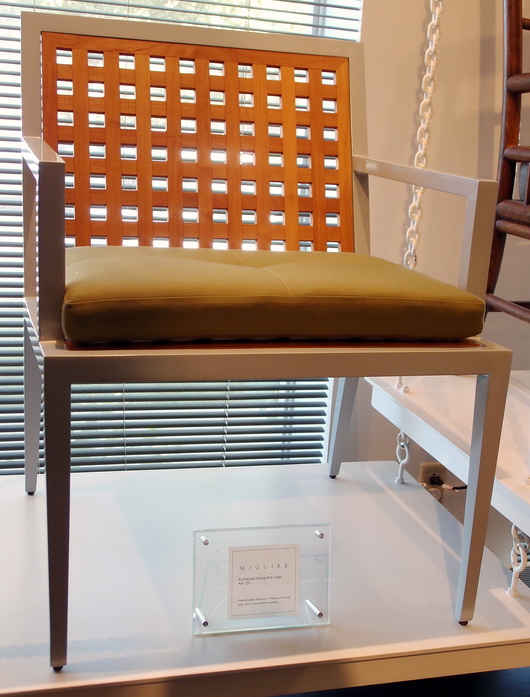
First, there were selections from Kohler's furniture brands such as Baker and McGuire...

There was a display of stunning Ann Sacks tile and down the road, a tile store with the complete line

But here's what I REALLY came to see, below....and which did not disappoint. In fact, it made me see, as I learned about Kohler through the factory tour as well as discussions with Kohler designers, the incredible depth of design talent, commitment to design, and breadth of style that Kohler embraces and has embraced for decades. 

DID YOU KNOW that for nearly 40 years Kohler has offered an Arts/Industry Program in collaboration with the John Michael Kohler Arts Center in nearby Sheboygan to emerging artists? There have been nearly 400 artists in residence since the program's inception. These artists may work in the Kohler Co. pottery, iron and brass foundaries and enamel shop to hone their skills and explore their vision in functional and sculptural forms.

It was the Kohler family's desire some decades ago to celebrate art by introducing artists to freely reinterpret their products with a fresh vision and point of view. This philosophy has made Kohler's products known for beauty, creative design and originality. From many years in the kitchen and bath industry, I can tell you that Kohler's product introductions each year always excite the senses!

Ok then, time for the good stuff!! I do not have names on these pieces, but ask me what they are and I'll find out for you. These are random shots of product displays that I took from the first floor of the Design Center.

Ann Sacks tile below-looks like fabric!

And there's MORE....

There is so much to show you from this trip to Kohler's Design Center that I cannot leave out what rivals anything you have seen so far, and that is a peek at the fabulous kitchen and bath vignettes situated on the second floor of the Kohler Design Center. Coming soon. Can't leave them out!

As you can see, this is truly a destination. Who knew? More soon


Tent London–London Design Festival

I’m here in London, fully immersed in Design Heaven! Part of the Blog Tour 2011 group care of Modenus.com and other sponsors, we are moving about London from one design exhibition to another, spending quality time at each inspiring venue.

Here’s a glimpse of some cool, kitcheny, products I’ve seen so far…

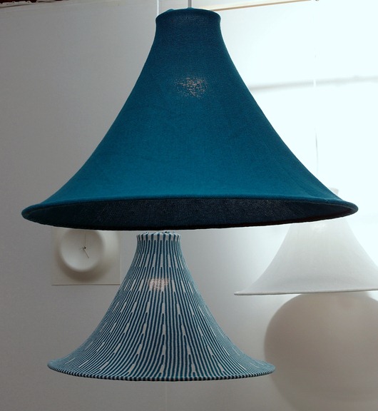
Below: Hanging light fixtures that leaves me warm and fuzzy by Kenichiro Oomori Moving Design

kitchen lamp

Below, beautifully made wooden kitchen utensils by Stovell Design

kitchen utensils

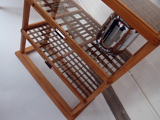
Below, awesome kitchen shelving by Studio Johnmale

kitchen shelving

Below, textured concrete tiles by Ivanka Workshop

concrete tiles

More design inspiration coming your way soon from Merry Olde England! Today, I’ll be “working” my way through 100% Design!

Las Vegas Market Summer 2011 - Kitchen Design Interpretation

I'm here in a fabulous hotel suite in Vegas at the invitation of the Las Vegas Market as part of a small group of bloggers. Our mission is simply to walk/work/discover the Market in our own unique way. No requirements, no expectations. Ideal!

Transitions by Sigla My perspective is different than most interior designers who attend Las Vegas Market. In fact, it greatly benefits the home furnishings industry to invite kitchen designers to see the Market. As the kitchen and surrounding rooms become ever more integrated, I, for one, feel a need to understand the current state of home furnishings and design to tap into what designers are thinking and what manufacturers are creating. Of course, also perhaps to specify furniture as opposed to cabinetry in some kitchen areas, to create the look of seamless integration among surrounding spaces as well.

My eye is unique from all others, my perspective toward public rooms surrounding the kitchen is different, and following is a collection of "dots" that I connected while at Market. It was fun!

Antigua FurnitureHappiness is ... the word "happy" came to mind over and over. Living in a pleasant, easy way seemed to be a continuing theme in the furnishings I discovered. Pleasant/simple lines, fabrics, materials and PATTERNS were mostly very easy to live with, often "pretty" and had this wonderful back to basics/simple creativity that I found lovely.

The Rug Market

Lots of linen - I did not see as much gray as I did at High Point Market in the spring, although there was a good amount across all furnishings and accessories, but there were beautiful muddied beiges and lots of beige linen fabrics, that whole Belgian country vibe. A resurgence of French Country was talked about at Market as well.

Christopher Guy

Mixed Media - Experimentation with different materials in unexpected ways was interesting to see - in rugs, case goods and upholstered pieces. The effect was usually very well done in my opinion.

Saddleman's of Sante Fe

Small Scale - Definitely seen throughout Market were smaller scale furnishings across the board, in every category of furniture. Smaller scale furniture seemed to then shed excess ornamentation, allowing for simplicity and elegance in smaller sizes.

Linon

I'll share more of my impressions and inspiration from the Las Vegas Market soon! And more images. I'm very glad I went - it's great to be immersed in the design world!


KBIS 2011 Decorative Details

I'm sitting at the gate waiting for a flight delayed quite a few hours. Let's take a look at random, decorative details in no order, seen at KBIS, for no reason other than I have time for a free form "gorgeous" fix.

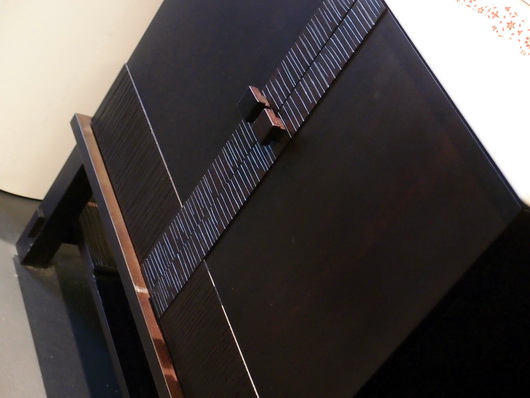
Below, hardware from Schaub

Below, Calacatta marble from Italy Formica

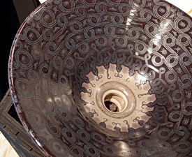
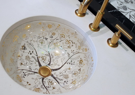
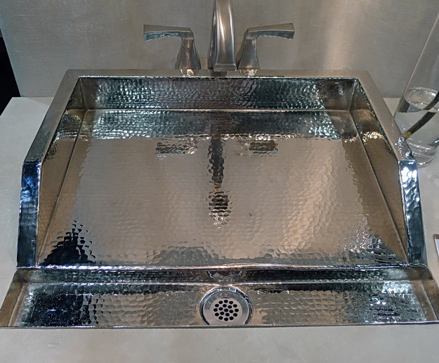
Below, a fabulous sink by Thompson Traders

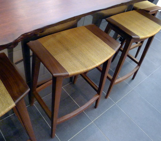
 Below, beautiful stools with no name at the Kallista booth


KBIS 2011 - Kitchen and Bath Industry Show

KBIS 2011, the trade show for all products related to the world of kitchens and baths, begins next week from April 26-29 in Las Vegas. As always, and as for the past, approximately, past 20 years, I will be there again, enthusiastically, to:

  • scour the show floor
  • spot trends
  • discover new products
  • meet friends!
  • attend fabulous events
  • gather tons of information

 Already, pre show, I can share a few choice sneak peeks of products that will debut at KBIS. Here we go!

New Ravenna Mosaics promises to have stunning new collections of tile! 

Below - Seemingly, authenticity is redefined in this new collection by Giovanni Barbieri. It immediately reminds me of this post on antique floors from Spain I wrote for thekitchn. 

Below - A NEW product to the kitchen world, the introduction of a glass kitchen sink by JSG Oceana. I've got to take a look at this, especially to touch it, feel it, see it in action. It is said not to scratch or stain. Made in USA!

Below -  Hafele, an incredible company with some of the most innovative products for kitchen and bath, introduces the LOOX LED System. Think "plug and play", think "easy" solutions where multiple products work together for lighting design flexibility. I KNOW lighting information often begets a groan...in this case, all you have to do is to look for color coded products which all work together.

I am so ready for Vegas!!!! So much more to come!

Delta Pilar Faucet - Touch20 Technology

About a month ago, I was asked to review the Delta Pilar Faucet with Touch20 technology and provided the product by Delta. I knew this might be a perfect product for my son Independent Product Analyst to test in my apartment in Manhattan Independent Product Testing Laboratory.

Review aside, do you know what the chances are to get your college kid to return an email, let alone write about a piece of his life on his mom's blog? Reading his review (it was sent to me at 3 am-no surprise there) gave me much insight into features, benefits, and new, learned, behaviors surrounding this faucet technology. Without further ado, here is my son's manifesto comprehensive review (as well as evidence of where my college dollars have gone these past nearly four years-graduation in May 2010!) I think you will enjoy reading this as much as I did. I asked for a paragraph or two, but I couldn't edit it, it's too good!


We are a pair living in New York City, and we love to cook, which is a byproduct of our statuses as near-starving college students.  Therefore, the kitchen is a very important place to us. It's a small space, typical of kitchens found in New York's cramped urban dwellings.  We were thrilled at the opportunity to test the Delta faucet because, not only do we appreciate functional kitchen appliances, but we have a constant bone to pick with germs as well.
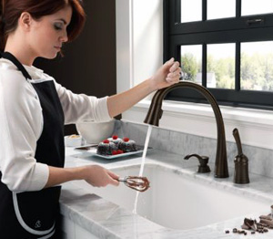
Our menus consist of a lot of meat, poultry, and fish, and before I met my girlfriend, cross contamination rarely, if ever, crossed my mind.  Since this realm of enlightenment, for better or for worse, every time I touch meat or fish I wash my hands immediately after.  Washing your meaty hands with a typical faucet is trickier than it sounds if you don’t want to spread any germs, as it usually involves a lot of elbows, wrists, forearms, sometimes even a foot, or a chin, in the attempt to maneuver the faucet lever higher or lower.  As you can see, this was becoming an issue.

Enter shiny new Delta faucet with removable head. The faucet head can be toggled between two different water flows; spray and regular stream, and it is nice to have both options.  There is a magnetic ring that holds the spout in place for easy removal and reattachment, although the head needs to be faced forward for it to take hold. In addition, the water pressure can go quite high which can be useful, and the temperature changes quickly between hot and cold, which means that unintentional scalding happens a lot less.

When we first started playing around with the touch feature of the faucet, we were like cave people at the dawn of time, touching and poking the object and measuring its responses.  In our studies, we found that it could be slightly temperamental, mostly when the area of the faucet being touched is wet.  This isn’t much of an issue since there is a whole lot of other area on the faucet from which the water flow can be activated and deactivated. 

Since we are dish-glove wearers when doing the dishes, it was of utmost importance that we didn’t have to de-glove to turn on and off the faucet, and thankfully we were not disappointed.  And you may ask “how do you move the faucet around then without activating it?”  It is a logical question, but the engineers at Delta have accounted for that, and designed it such that if you touch or grasp the neck and maintain the touch for a few seconds, it will not turn on or off but stay in the same mode.  This is subject to a certain amount of trial and error, however, and will most likely improve as the technology improves.

The old fashioned on and off handle is also “touchified,” which is confusing at times because you can turn the water on by touching and lifting it, although it must be in the lifted position for water to flow.  This reality takes a bit to wrap one's head around, but in the end we think it’s best to leave it lifted all the time, since it won’t turn on otherwise and it would ultimately defeat the purpose of the “touch and go” aspect of the faucet.  

An understandable concern with this, especially for city dwellers is "what happens when a cockroach (they have P.O. boxes in New York City) or rodent, or perhaps a pet, activates the faucet by accident?"  This is entirely possible since it can be sensitive to a small touch, but there is nothing to fret about because it will automatically turn itself off after four minutes (should be half that). Editor's (mom's) note: We do not have said cockroach or rodent issue-if we did, someone's head would be on a platter!

M&M Cooking TogetherSince Manhattan apartments are especially small, we are constantly in or moving around the kitchen area, so we had a lot of contact with the Delta faucet.  Besides the whole germ thing, the touch feature was very convenient just for the fact that you don’t have to reach those extra few inches and lift up the on/off handle; a quick flail of the finger or forearm is all it takes to turn the water on and let us complete our objective. 

The aesthetics of the brushed metal swan neck faucet are elegant, though I would like to see the touch on/off functionality migrate to different designs to suit a broader range of kitchen and bathroom décor.   The soap dispenser is however surprisingly boring, and it would have been nice if Delta could have taken their mission of decreasing cross contamination a step further by implementing an easy touch soap dispensing system.  Nevertheless, the faucet is the focal point of this unit, and deservedly so.  Since our use began, we have denied millions, if not billions, of pesky germs and other toxic bio hazards from inhabiting the surface of our faucet, making it one less pit-stop the little buggers can hitch a ride from.

As the designated but proud germaphobes of the family, we are happy to have this newly found sense of cleanliness and convenience in our lives.  It is a great start to something that I think will catch on for many. I now have the urge to tap every faucet I see to turn it on, which is either just muscle memory or the mark of a good product.  I think it is the latter.


Editor/mom/Susan: Thanks for the review! My personal observations, after light use over a four day period, are also positive. It was a bit confusing at the start as to what position to leave the main lever in, but it's not rocket science. You figure it out. I felt the faucet spout was too long, falling toward the front of our normal sized sink, which means it should be mounted as far back as possible. As far as the concept behind the technology, although I'm a believer (unlike my son) that exposure to germs makes for a healthy immune system (to a point, trust me) I cannot deny the benefits of its time saving (I'm very impatient) attributes. I like efficiency! 

New Kitchen Products

I'm a bit lax on telling you about some new (or if not new, then cool) products. Here are a few interesting ones.

But, first, within this section is a product which I was asked to personally review. My policy, like many bloggers, is and has been (the one other time that I reviewed a product) that if I like the product, I will review it. If not, I will not. And, I mean, I will not. I do not ask to review products. Example: There is a product which I was approached about and was subsequently sent to me at least 2 months ago, maybe 3 months. There is a small kit which I needed for a certain type of installation in order to review it in a way that makes sense to my lifestyle and I requested it initially. The product functions perfectly without it, I can experience the end result, but it is not how I would normally use the product. I'll review the product if the kit comes unless there is a compelling reason not to. A second example is a colleague of nearly 20 years who sent me her just published book and asked me to review it. I felt the book was poorly written, declined with a diplomatic yet honest assessment, and that relationship declined as well. I have obligations to no one within my industry.

I see nothing wrong with sharing my personal use experiences that are connected to reviewing an occasional product. If I'm extremely enthusiastic about it, that will show. If it's a nice, simple, product that is a generally pleasant experience to use, that will show too. There will be decibels of difference in enthusiasm, so to speak, in my reviews which will honestly reflect my personal experience with a product. Will I say anything negative about a product? Sure. If I dislike it overall, I do not see the purpose of using this platform to make that type of (negative) announcement. In that case, I'm going to assume that it may just not speak to my lifestyle needs/wants. I think this concept serves no ill purpose, whatsoever. In fact, I think it's a positive and helpful service to my readers for a variety of reasons. I hope you think so too.


 MGS T45-DF One spout, two waterways built in, three levers: hot, cold, filtered. Normally, one has an extra spout mounted for filtered water. Made of solid stainless steel, lead free (of course) and NSF certified, it is 100% non toxic. Their own design team has created the faucet, and many others, which MGS calls innovative functionality, with an emphasis on convenience and performance. I am one who likes simple lines. I think simple often = elegance, and I do think this is a very elegant faucet system.


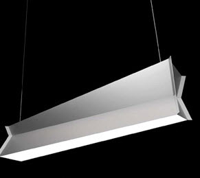
 Studio Italia Design has introduced a MUST SEE lighting fixture. Why? It redefines the single flourescent ceiling fixture in a huge way. Here are their words: "The Inpiega by Italian Designer Marco Ferreri is available as a sconce, table lamp, floor lamp or suspended fixture. It calls for fluorescent lamping and offers both direct and indirect light. With an entirely modern shape with geometric lines, the inner side is available in white, while the outer side can be done in white or raw aluminum."


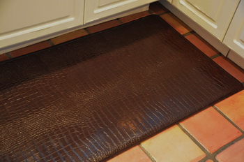
GelPro floor mats GelPro asked me if I was interested in using their product in my home, and I accepted. I had certainly heard of GelPro when they first introduced their product, maybe a couple of years ago, and I had mild interest, but not much more than that.

Having moved into our new (not newly constructed) home 9 months ago and living with a tile floor (which I never had before) it made a lot of sense to try it. FYI...I did not design my kitchen in the images...it's 20 years old, so a renovation is in my future, for sure! 

I came home after a short trip last week, and my husband had the GelPro mat in place. My initial reaction was WOW! It looked really great. Upscale, cool, designer-y, I was extremely impressed. You must take a look at all of the styles and colors. The selection is fantastic. I was a little nervous, because some of the images to my eye did not look that promising, but it was helpful to see both close up and far away shots, in fact, very helpful. Because of those shots, I decided I wanted something that looked like a visible pattern from a ways away. It was very tough to pick a color, the options are great, but I settled on the deep, rich brown, which I LOVE.

The sensation, once I stood on the mat, was truly a surprise. I did not expect the surface to be so soft, especially given the particularly busy pattern. It looked like, and I expected it to be, a semi-tough top surface, for wear purposes. It was not-it was soft. It's great on the feet, it's not too soft and not too hard. I'm sorry I didn't take a closer look at GelPro earlier. The mats come in special "designer sizes" as they are referred to. In fact, there are many different sizes. The performance and looks far exceeded my expectations, very much so. I'm happy to be able to report this.


Sub Zero UC-15I Ice Maker - Sub Zero introduces an ice maker. At 15" wide, incorporating the flush installation Sub Zero is famous for, this appliance can easily fit anywhere. It makes 50 lbs of ice in one day and stores up to 25 lbs. Best news yet, the ice is produced with filtered water, and the filter even tells you when it needs to be changed! Now, that's good thinking. The controls are electronic, the face is stainless steel, and there is led lighting. This ice maker is approved for outdoor use...see the site for further details. Literally....cool!

New Products for the Kitchen! Take a look...

FIRST...JOIN ME FOR MY SECOND FACEBOOK EVENT! I'M TAKING QUESTIONS ON KITCHEN DESIGN. SEND ME YOUR QUESTIONS BY THIS SATURDAY, AND I'LL DO Q&AS ON SUNDAY. DO THE TEST...PLEASE LOOK AT YOUR QUESTION AS IF YOU KNEW NOTHING OF YOUR ISSUE, TO BE SURE IT'S CLEAR AND CONCISE. LOOKING FORWARD TO HELPING YOU WITH YOUR KICHEN DESIGN QUESTIONS! SEND TO: SUSAN @ SUSANSERRAASSOCIATES.COM AND BE A FAN OF MY FACEBOOK PAGE! 

Here is what's catching my attention...new and/or interesting products you need to know about.

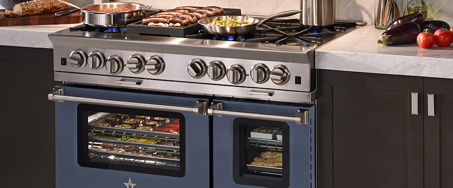
Blue Star is sort of a lone wolf (no pun intended) in the pro range category. A somewhat silent player, it's a product that deserves more attention. Blue Star says that they are the only genuine restaurant range for the home due to their open burner system, producing 22,000 btus of power, resulting in shorter cooking times and an even simmer. BUILD YOUR OWN Blue Star range (that's what I built in the image) to reflect your personal style and preferences.


Miele hasjust redesigned their CombiSets, or modular cooking pieces. I LOVE modular pieces. It's a super flexible, super functional way to precision-design your cooking needs. The new line includes an induction cooktop and Japanese Tepan Yaki. The design of these pieces are gorgeous, with controls that are slanted in an ergonomic way. A slightly larger 15" size is available for some models and that really makes sense to me.


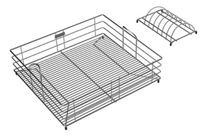
I'm crazy about sink accessories! In my new home, I have this one small built-in cutting board, and it's so incredibly useful to have it right nearby. We do so many tasks at our sinks...sink accessories are a huge help throughout the process. Elkay is introducing a wide assortment of new sink accessories, enhancing aesthetics and expanding functionality in the kitchen. Designed for the Gourmet e-granite and Avado sink families. There are 39 new accessories!


Oceanside Glasstile's Muse is a clean edge, handcrafted, recycled glass mosaic tile. It comes in over 42 colors and nine patterns. 

Some of the colors contain up to 97% recycled bottle glass, which is collected from curbside recycling programs (definitely a ton of Corona bottles!)


I love these random products that I find, just love them.

Here is a copper spice rack. Doesn't it look so elegant? It also comes in aluminum, brass or stainless steel. I would imagine there may be some polishing required on occasion, unless a sealer is used, better check with the manufacturer.

The finishes available are mirror, fine satin, anodized, antique and etched. By Quality Metal Works, in business since 1965. 10 1/4W x 31H x 4 3/4D


Another cool accessory for the sink, here's a cloth holder from Magisso. A clever concept, the cloth holder uses magnets to keep it in place...one magnet inside the sink cabinet on the outside of the sink and one in the cloth holder to attach to the outside magnet. It will not scratch the surface of your sink. Some cool, Scandinavian designs too!


KBIS Product Sightings

Here are more (and no quick 1-2-3 roundup for me-too much to show you) truly fabulous finds that I'd like to share with you.

And, for the uninitiated...here's how I handle the products from KBIS. I'm not in a rush. Over several weeks' time, maybe months, I'll be bringing you products that I have found at KBIS that need to be noticed. Some will be newly introduced, some will already be in a product line for some time but deserve to be brought to the forefront. It is not only new products that should be mentioned!

First up is Texas Lightsmith, a little booth way at the end of the convention center in no man's land (that's where many of the best exhibitors are, scrunched together in a bunch of aisles).

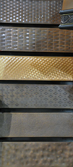
Texas Lightsmith manufacturers lots of things - sinks, hoods, metal panels for cabinet door inserts, lighting, and more. I loved this display for apron sinks, but I'm sure these patterns can be used for other purposes.

Being a bit more of a modern girl myself, I particularly like the third up from the bottom.


Kohler's new stunning (I've been using that word quite a bit during this show) finish, Vibrant Moderne Gold, really took my breath away. You can find it on a variety of products, even on the very sexy Karbon faucet.


Blanco, one of my favorite "no brainer" sink recommendations, has just come out with Silgranite II. What you are looking at in the image is a Blanco representative simply wiping off the metal shavings from the fork that I used to try to sratch (VERY hard) the surface. The material already had one whole day of people taking out their frustrations ahead of me. I saw zero wear. Get this sink.


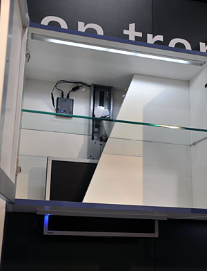
It's funny because my husband and I also talked about a motorized flat panel TV lift...and there it was at KBIS by Hafele! It holds up to a 27" tv and disappears via remote control. Our use for something like that was going to be in our otherwise lovely breakfast room which my husband, anyway (I don't care) wanted this type of mechanism, which would take the tv up into the attic.


Funny ha-ha or funny hmmm?

From:Susan Serra, CKD [mailto:sserrackd@gmail.com]
Sent:Wednesday, January 16, 2008 3:49 PM
To:Ward, Kevin
Subject:Re:
Kevin, I believe I gave some information on dimensions, but if I didn't, I will again. First, take a look at my blog:/journal/2008/1/14/the-kitchen-walls-came-down-my-apartment-remodel.html Look at the oven/refrigerator wall since it's been opened up. I will be getting a smaller refrigerator, a sub zero, built in. The microwave will go away from that spot. I'll be getting high end appliances. I'll have about 54" in width between the wall and the refrigerator. I want that 54" to be perfectly flat, one material, no cabinet doors, just something decorative. The hood I will get will be like this, very minimalistic to keep this sleek theme:http://www.faberonline.com/cristalhc.html I'll end up having around 24" in width between the new refrigerator and the hood. Since I'll have no doors, I'd like some sort of storage solution that will sit up in that area, able to be pulled STRAIGHT down and back up again, of course, as easily as possible. I think this could be a very innovative design and storage solution product.
Read more

First Product Roundup at Kbis 09

There are always neat discoveries to make at KBIS, always. Without further ado, take a look at some images of some wonderful new finds. These are the first of a bunch of products I'm going to share with you, outside of products I've already showcased on Twitter

Distressed copper hood by J.Tribble below:


Terra Aqua, fabulous sinks, below:


Look at these appliance handles by Vincenza, below: 


New to the industry! Lansen sinks flush edge with solid surface material, below:

New Green Kitchen Products

Here are a few more new items I'd like to share with you.

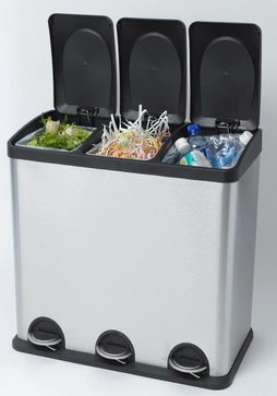
Here's a smart looking multi bin recycling unit called the Smart Bin. Available with two or three compartments, the Smart Bin allows homeowners to cleanly and effectively separate their organic, recycling, and waste in an attractive stainless steel push-pedal bin. Made of post-consumer plastics, the Smart Bin makes the task of sorting and recycling a snap. With removable inside containers, this sturdy and attractive bin is a welcome addition to any kitchen, bathroom, or office.

It's good to be organized!
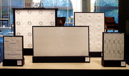


Take a look at what's new at Kichler.

For use inside or below a cabinet or in a variety of other areas, these energy-efficient fixtures use 75 percent less electricity than typical incandescent lighting. Plus, they’re so thin they’re nearly invisible -- just 3/8” thick. In addition, the Design Pro LED discs offer a warm white color rendering and a lifespan of 20 years. A variety of finishes are available to blend into any surrounding.

The new Design Pro Discs can be used individually or in combination with Kichler’s Design Pro LED under cabinet fixtures, which offer the same great energy-saving features and color rendering, to create a seamless flow of light under multiple cabinets and furnishings.

Both products have been awarded the prestigious Lighting for Tomorrow Award, the industry’s highest honor for energy-efficient lighting solutions. Plus, they are ENERGY STAR rated, a distinction given by the Environmental Protection Agency and the Department of Energy for energy efficient solutions, when used with most power supplies.

Perf Go Green produces Biodegradable Plastic Products that are eco-friendly, non-toxic and food contact compliant. These bags are seen as a practical and necessary solution to the problem of plastic waste around the world.

In 2008 Perf Go Green is launching six Biodegradable Plastic Products including the following:

Perf Go Green 13 Gallon Tall Kitchen Trash Bags
Perf Go Green 30 Gallon Lawn & Leaf Bags
Perf Go Green Plastic Drop Cloths
Perf Go Green Commercial Trash Bags
Perf Go Green Kitty Litter Bags
Perf Go Green Doggie Duty Bags

Perf Go Green products are produced using recycled plastic which reduces plastic in landfills. The recycled plastics are then combined with an oxo-biodegradable proprietary application method to produce the film for the bags. This product, when discarded in soil in the presence of microorganisms, moisture and oxygen, biodegrades, decomposing into simple materials found in nature.

Perf Go Green Bags will completely break down in a landfill environment within 2 years leaving no residue or harmful toxins and have a shelf life of 2 years.

White River Achieves Chain of Custody Certification - Very Impressive!

White River announced its achievement of the Forest Stewardship Council's (FSC) Chain of Custody Certification. For the past 18 months, White River™ has been researching the optimal plan for purchasing lumber from certified, well-managed forests for its local manufacture of hardwood mouldings. The FSC Chain of Custody Certification is granted by Scientific Certification Systems (SCS), an independent third party, which is accredited by the FSC. This internationally recognized certification verifies that lumber from certified forests is identified, marked, and recognized as it passes thru a "chain of custodians" or "handlers" from the forest to the consumer. This applies to products manufactured at its Arkansas manufacturing facility.

Good work! I've used and admired White River for many years.

New Kitchen Products

Let's look at a collection of products, some new, some not new, but new to you. Get it? I'm confused.

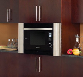
Take a look at Sharp's SuperSteam oven, model AX-1200, a multi-purpose oven that enables healthier meal preparation. Using SuperSteam convection technology, the AX-1200 cooks a wide variety of foods without the addition of oils, fats or sauces while preserving taste and appearance. It also features three other cooking methods – convection, conventional steam, and microwave – all in a single appliance.

I LIKE that idea of combining convection with steam and microwave cooking. Convection mode means that you can heat up that slice of pizza (you know you eat it even though you want the steamer) without heating up the big oven, or worse, using the microwave. OR, those extra oven foods when the big oven is full.

Note the rounded stainless ends. This is a built in kit that is optional. The oven can be used without the built in kit, to simply sit on the counter. Read this.

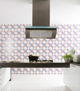
Here is "wallpaper" that is actually recycled glass tile. By Trend, the Wallpaper collection offers a multitude of diverse styles from richly elegant and serene to playful and funky. The collection starts at $23 a square foot. Depending on the pattern, the mosaic tile is saturated with reflective color, recycled from post consumer glass, veined with aventurine stone, shimmering with iridescence, or hand made 24 k colored gold from Orsoni, a 19th century Venetian foundry. The individual tiles are either 3/4" or 5/8" square and assembled into modules that allow seamless repetition of the design.

A 10x10 wall, at their lowest price tile, will cost $2,300. In my world, if money was not an object, yes, I'd consider this product. I think the look is worth the cost. It makes a strong design statement. I like that. This was the only kitchen image they had on their site, but they have lots of very wonderful motifs.

Now a word from our sponsor...yeah, they should be my sponsor! Humor me please. When this commercial comes on, I stop everything and watch it. I LOVE IT! I've seen it a million times and it just came on again. Have you seen it? You have to watch it a few times to get all the perfect nuances of it. What can I say? I just need to share this. :)

Let's look at even more tile just to give you more difficult choices! I have a conflict with choices. I believe in choices, but they quickly get confusing, don't they? This, from Mandala Tile:

"Many of Mandala Tile's colors (sister company to Oceanside Glasstile) contain recycled material. The combination of materials spawns vivid surfaces, making it dance in front of your very own eyes. The earthy colors merge in intriguing patterns highlighting the beautiful combination of glass and stone. 'Avani provides movement and depth to design projects and the color palette complements a wide range of settings, offering limitless possibilities for creating a masterpiece,' noted Feras Irikat, Design Director.

It is available in 10 mosaic blends and three patterns – Herringbone, Random Matrix, and Ministicks. Each piece is precision cut to provide a smooth, continuous field."

I have more to show you, which I'll do tomorrow. I'm freezing and I'm sick (and I think I'm freezing because I'm sick) so I'll leave it here. See you then!


New Kitchen Product Fun!

Ok, it's a lame title, but I couldn't resist, I've been accused of being a ham more than once. I've been filing away information I've received on new, or maybe not new, but cool, (literally) products for a short while, and I'll share a few with you. I see a strong green theme here. 

A little while ago I was an absolute expert in ice machines and the quality of ice making due to a client's needs. I can tell you what's important: clarity, shape, taste, and energy use. Scotman's new Brilliance residential ice machine has these covered. The machine has a water quality sensor to detect hard-water conditions and purge mineral laden water with every harvest cycle. Unlike refrigerator ice, odors are not an issue in the Brilliance. Energy savings include the use of half the energy and 1/3 the water used compared to previous models. AND, the ice melts more slowly, how about that!?


I like this hardware from Sea-Stones. It's something I've certainly seen over the years, but I like this collection. The stones are very varied, and I'd encourage you to use a variety of stones as a result. Don't just get one color/texture. Mix 'em up! Sea-Stones also has stones to be used as towel/coat/other hooks, another fun idea. The stones are found on New England beaches and a new quarried stone is "replanted" in the water to ensure the beach remains as it should for future generations.


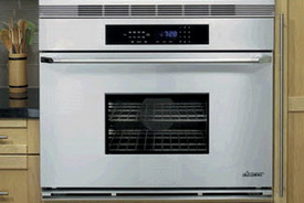
Is bigger better? When it is, it seems to be a necessity. Take a look at  Dacor's new 36" Epicure Renaissance wall oven. I'll tell you something. At first, I felt a little weird about such a big oven in regard to energy. But, with the ability to cook two turkeys, 144 cookies or any other combination of multiple foods, we may just have a new definition of energy savings via one oven rather than having to use two. Hmmmm....