Kitchen Design Trends At IMM Cologne - LivingKitchen 2013

As I get settled in to closely study the nearly 1800 images that I took in a 3 day period at the fabulous IMM Cologne's fabulous LivingKitchen trade fair, I see that this first post needs to simply be an overview of the trends that I spotted. The images that I captured of the stunning displays at the show demand multiple posts, an expanded visual documentation of these trends-coming next. 

I will also be spreading the image love throughout my other social channels, so please follow me here: The Kitchen Designer blog - right here! Sign up for the feed top right or via email, under my picture on the sidebar:   Twitter  +  Google+  +  Facebook +  Pinterest (Pinterest will have both blog images as well as lots of new images from my hard drive). I'm barely beginning to add those images, so check back.

As I look through the images, there are two main categories of design that come to the forefront for me. The first category is those companies whose sole purpose is to be on trend and second, those companies whose purpose it is to do their own thing without much, or less, concern for trends. BOTH types of design are extremely creative, but that word, "trend" can manifest itself in a tricky way if the entire kitchen design one puts in one's home in 2013 is solely based on the hot, new, trends. Like chocolate, trends are fun to indulge in, but an all chocolate diet (while enjoyable to dream of) will cause problems later! Don't trend-binge design! 

Since I also attended this show when it was last held two years ago, it's an interesting exercise to compare both sets of images that I took to get a better sense of how design has evolved in Europe. Here and there, I will be mentioning what's evolved since 2010. And, a thank you to the U.S. and German teams at BLANCO for inviting their U.S. Design Council members, of which I am one, to experience this show with them, providing opportunities for our group to bond as colleagues and friends.

Here are the 2013 Kitchen Trends I Spotted - Brief notes are below with more details/features/thoughts to come in subsequent posts! "M" means it's a mainstream trend throughout the show. "P" means some dots were connected throughout the show but it is not mainstream. "P+" means more than peripheral, less than Mainstream.

Cabinetry

Cabinetry Style:

  • White (lots), light woods, and greige colors - NEUTRALS as a foundation - M
  • Use of texture/natural elements integrated into the design, whether in countertops, backsplash, or cabinetry, often driftwood-y looks, real or faux - M
  • More warmth in the designs overall than I found two years ago-definitely, added comfort - M
  • Gloss or glass combined with texture/more glass in general - P+
  • Color blocking - the color accent of choice for this show was orange! P
  • Blue/dark gray, usually medium to dark GE's new slate finish is on that one! P+
  • Warm, modern design overall - M
  • Usually soft contrast in coordination of material colors in a kitchen display, but sometimes bolder contrasts - P+
  • Use of horizontal lines in overall design (not new, but an important European design element) - M

Cabinetry Features:

  • VERY long drawers, lots of countertop lifts for multi-use (countertops/wall cabinetry/more) and as always-useful, very cool drawer inserts - M
  • Seemingly even shorter toekicks - P+
  • More cabinet cubicles than open shelves-often in unexpected places, always with lighting - P
  • As in 2010, lots of fun and playful geometry in cabinet design - P
  • Integrated benches to rest, sit, or display decorative or useful items - P
  • Tight/seamless appliance integration - M
  • Integrated handles or long, modern, pulls - M
  • Same countertop as cabinet fronts - P
  • Channels between drawers and under countertop - P+
  • Concealed close-like tall and wide sections  - P+
  • Open concept philosophy, considering a kitchen's design connection to surrounding living areas-very clear to me - M
  • Intersecting design elements - P+
  • Open cubicles designed into tall cabinetry for interest - M

Accessories

  • Organic in nature via textural ceramics, hand carved wood pieces, real greens and other handmade items - M
  • A fair amount of skins seen on floors and benches - P+
  • Rather than pattern, accessories communicate the style and theme - M
  • Large in size (perhaps to call attention to the display since it is a trade show) - M
  • Lots of rail systems - attention to universal design, seemingly even shorter toekicks - P+

Countertops

  • All thicknesses - super thin, thick, or in between - M
  • Different materials next to one another in a flush installation - P+
  • Patterned countertops - plaid, modern art, new designs (new look, not a trend) - P
  • Glass - P
  • Wrapped countertops - waterfall on each exposed side (not new, but it's still current and is SO chic) - P+
  • Lifts to raise/lower or conceal a cooktop - much more prevalent than two years ago - P+
  • Cooktops integrated flush with the countertop - P+
  • Built in dining configurations - M
  • Intersecting design elements - P+
  • Stainless steel with integrated/seamless stainless sink - P
  • Virtually no granite or marble - just simple, understated, tightly patterned surfaces - M

Backsplashes

  • Simple, plain, continuous, whether wood, engineered stone, or glass - M
  • Sometimes a 1/2-3/4 height, leaving wall space below the upper wall cabinets - peripheral trend - P
  • Very little tile - M
  • Real wood or faux - M

Appliances

  • Hoods - Look like lamps (not new, but getting nicer) - P+
  • Hoods - double hoods over cooktop - P+
  • Hoods - Integrated/toned down/hidden hoods and blowers - P
  • New, warm, greige mid tone to dark glass appliances - P+
  • Stainless/color mix (reminds me of Whirlpool ICE - P
  • All appliance types very seamless/tightly integrated into cabinetry - M
  • More white appliances seen - P+
  • Ovens concealed - as seen last time too - P+
  • Ovens as an important design element - M
  • Flexible, open, vessel placement (anywhere) on induction cooktop - P+
  • INVISIBLE refrigeration - M
  • Sinks & Faucets - matte, modern, quietly elegant - M

General 

  • Doubles - double hoods, double light fixtures, double cabinets, other doubles - P+
  • Not much vintage/retro/industrial representation - a touch here and there but mostly warm/earthy/modern design - M
  • Occasional attempt at what looks like American Shaker - P

Cool Factor! - Images to come, for now, just descriptions (these are sometimes one-offs)

  • Countertop lifts 
  • Glass patterned countertops
  • Framed multiple ovens
  • Nearly invisible induction burners integrated into countertop
  • Choice of touch screen or knob controls
  • Plaid cabinets
  • Colored glass cabinetry applied as modern art (wait for the image)
  • Awesome, seen more than once, patchwork of wall cabinetry
  • Glass countertop, cabinetry and glass supports in one display
  • Loved the function of a glass sink surround
  • Glass drawer inserts
  • I'm sure I'll select more! 

Lighting

  • LED lights for shelving, around cabinetry, in open shelf cabinets - M
  • LEDS een as a feature in color in appliances (not a trend, just something new)
  • LARGE lighting fixtures, oven seen in doubles over an island - M
  • Simple, rounded, modern shapes in fixtures, often in matte finishes - M

Flooring

  • Lots of light, textured, natural wood, very light, very Scandinavian - M
  • OR, gray or white solid flooring of some sort, with no pattern, perhaps vinyl - M

Dining

  • Benches - M
  • Benches with cushions or skins - M
  • Modern design - M
  • Natural, matte, wood surfaces or matte stone tabletops - M
  • Fresh, modern, designs - M
  • Surprisingly, chairs are often matching or closely coordinated - M

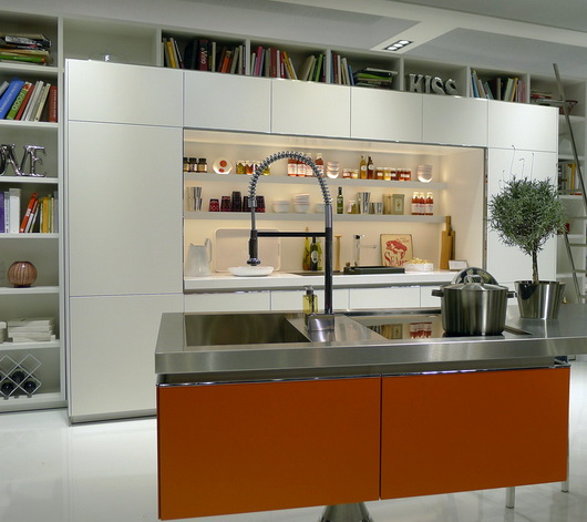
This post is so long that I'm only going to show one image that I took from the show - shortly, LOTS AND LOTS OF IMAGES to illustrate my points above!!!

Leicht Display-Image by Susan Serra


La Cornue - Kitchen Le Magnifique

I had the pleasure some weeks back of dining in New York City with Xavier Dupuy, president of La Cornue, my colleague and friend, Leslie Clagett from the blog KBCulture and a couple of PR people, always useful to fill in the blanks for a brand. I very much enjoyed this type of intimate setting.

I love up close and personal meetings with manufacturers. It helps me "get" the culture of the company which always trickles down to my understanding the quality of the product and the type of people who actually manufacture the product. 

Mr. Dupuy spent a fair amount of time talking about his factory workers - the length of time many of his employees have worked for La Cornue along with past generations of these employees' families who also worked at the factory. Lots of interesting stories. In times like these, it's nice to hear that. Mr. Dupuy takes immense pride in those who manufacture his products. This was not a short conversation!

La Cornue is a luxury brand of ranges and rotisseries that are made in France. Now, La Cornue is expanding their line of luxury appliances by adding a collection of custom made cabinetry (complete with the familiar metal banding if desired) called Culinary Architecture Memoire and a collection of handcrafted sinks. 

I've studied French kitchen design over the years. It's different. Here's why: the design emphasis is close to equal in regard to aesthetics and function. Function to the French (and to most other cultures other than, um, us in the US) does not mean that every single space gets filled for storage ... just because the space is there to fill. 

The negative space of the room is strongly considered an aesthetically important piece to the design of the kitchen, equal or nearly equal to functional pieces. What does that mean? It means an "unfitted kitchen" or a collection of islands or sections of cabinetry is preferred as opposed to continuous "runs" of cabinetry such as L-shaped, U-shaped kitchens, etc. Minimum wall cabinetry is also a part of La Cornue's kitchen design philosophy to achieve areas where the eye can rest.

Of course, the cooking area is considered the most important piece of the design ... after all, we know how seriously the French take their cooking!

A lovely evening, interesting insight into a brand and its philosophy, gorgeous products.

Decorex 2011 – Blog Tour Kitchen Inspiration

As part of the fabulous Blog Tour 2011 group, founded by Veronika Miller of the equally fabulous Modenus.com website, our trip to Decorex, part of the London Design Festival, was simply fantastic, end of story. The creativity and innovation was such a joy to experience. Another type of joy was to see the way that classics, that is, materials or design, were updated to create a new aesthetic, a new definition of classic as well as modern. THAT experience = inspiration.

Here are some kitchen design elements that I found interesting at Decorex.

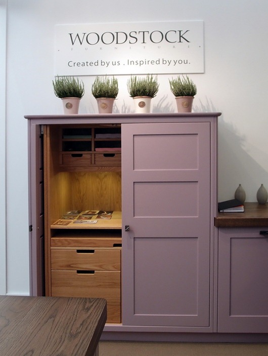
Below, cabinetry by Woodstock – who doesn’t love that name? Of course, the star is the fresh color, but I love the function too and the height of this taller cabinet.

woodstock kitchen

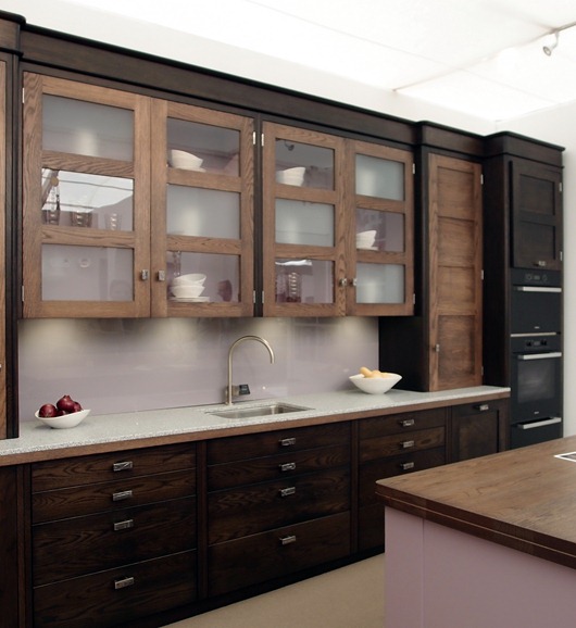
Below, also from Woodstock, the cool mix of light and dark neutrals. Notice, too, the subtlety of the rounded moldings. Love. Backsplash and styling – needs some love…

woodstock kitchen2

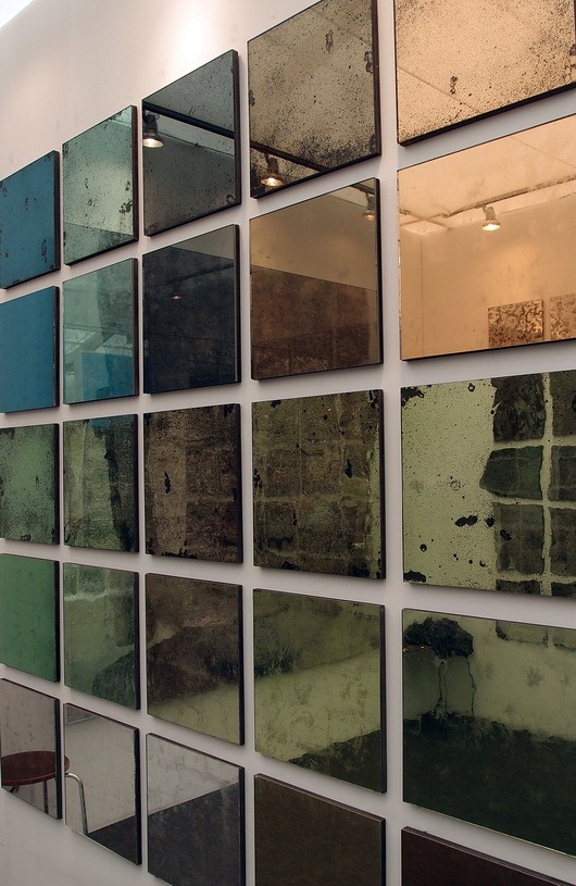
Below, gorgeous Dominic-Schuster mirror – could be a backsplash or wall area maybe? For pantry doors? Yummy! And it comes in a gazillion textures.

dominic-schuster

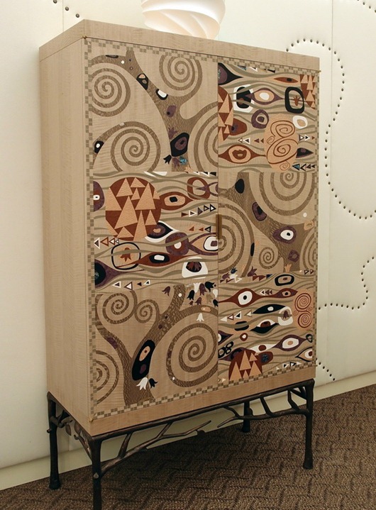
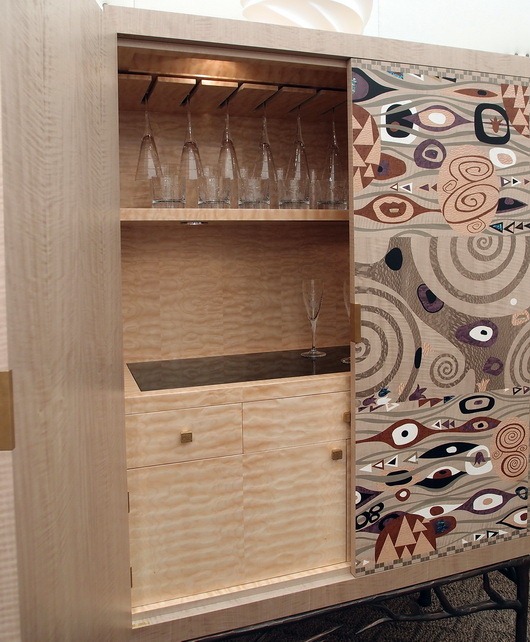
Below, a fabulous update of an armoire, bar cabinet, kitchen pantry, or breakfast room dish storage

archersmith


 archersmith2

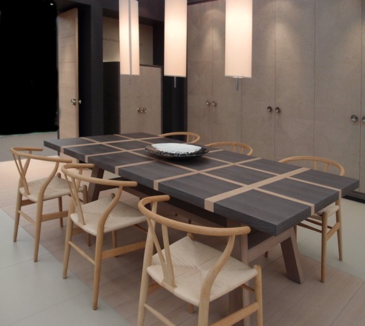
Below, a GOR-juss dining table with Hans Wegner chairs by Isis Furniture

isis furniture

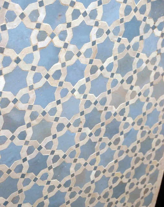
Below, Moroccan tile by Habibi (you are viewing the tile at an angle)

habibi

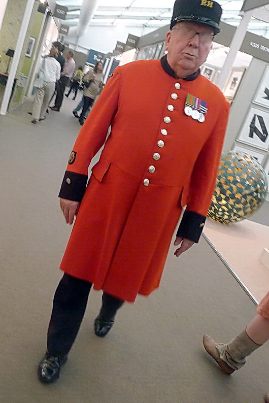
And, a quick shot of this very impressive gentleman who I know does something really important, but he’s also cute!


What’s your favorite??

Martha Stewart's Morning Living Program - 10 Tips To A Great Kitchen Design

Well, we covered a lot of territory in the chat on kitchens with Brian Kelsey (Kelsey On The House) host of Martha Stewart's Morning Living radio show on SiriusXM in which I was the guest. I know, since Brian is a lover of all things "home improvement" we could have kept the conversation going for a long time!

Here is a wrap up of ten tips for a great kitchen design:

1. How long will you be in your home? The answer to this question will guide you toward budget, style and issues of function. If you will be in your home less than 5 years - think in terms of resale and be conservative in your selections. Longer than 5 years, put more of "yourself" into the kitchen design to create a kitchen that works for you.

2. Speaking of personal design, that is surely where we are headed in recent years. Do the hard work up front to determine what is a habit and what is something you really desire in the kitchen. For example - do you want the dishwasher on the adjacent wall of kitchen because you are used to it or because you really like to use it in that position? Beware of kneejerk reactions - think carefully!

3. What is timeless? I think it is safe to say that classic wood species such as cherry, maple, and other, somewhat "quiet" grained woods in brown stained finishes are truly timeless, as they communicate a classic furniture quality. Whites as well are classic for kitchen cabinetry - who doesn't love a white kitchen?

4. How to get value? Value is received, as above, in a timeless design, in timeless products and components, in quality products which will last over time. It is a sustainable way of thinking as well.

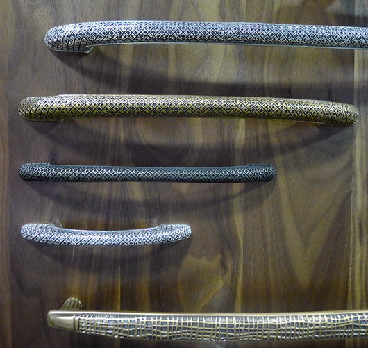
5. What are cool products? Having been to many design shows, I can tell you that sinks with glass worktop covers to conceal the sink from an open kitchen are hot! Hardware in warm finishes and hardware that is more bulky in nature (more bang for the buck) works well in today's kitchens, and of course, hardware is the jewelry of the kitchen! A warm/modern look for the kitchen is what many people are thinking about now.

6. Appliances! Appliances are becoming increasingly concealed as the kitchen floorplan is becoming more open to surrounding rooms. Even ovens are being seen behind closed doors. Panels on appliances do the trick to disguise the function behind the cabinetry facade.

7. Social Network - The kitchen is the social hub of the house and we are seeing larger, multifunctional islands being designed into the kitchen. Easy to communicate with others and great for assisting the chef or a spot to use for entertaining purposes such as arranging wine and wine glasses on one end, islands serve endless social functions. 

8. Where to start? With so many activities happening in our kitchens, write a list of all the activities you see going on in your kitchen. What is your lifestyle? How much importance and use will certain activities take on in the kitchen? Be realistic about your lifestyle and a functional kitchen design will follow!

9. Healthy Kitchen Design - Appliances today have healthy features! Grills, steamers, steam cooking in ovens, rotisseries, filtered water in our taps, fresher refrigerator storage, induction cooking - these are some examples of how appliances can truly work to produce and enhance a more healthy lifestyle.

10. Take your time! The kitchen was not built in a day! The more time you can shed old habits and hone in on what is really important to your family "now", the better your kitchen will be aligned to the real "you." 

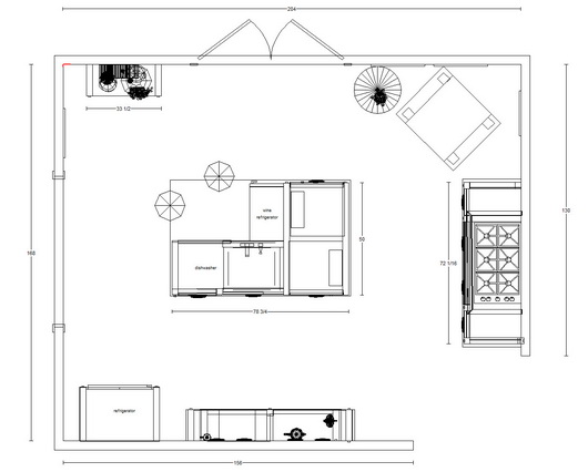
Below, a preliminary floorplan for an open kitchen. Cozy, social, ahhhhh!