Wood Texture Kitchen Trend - IMM Cologne LivingKitchen 2013

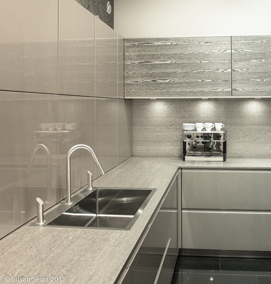
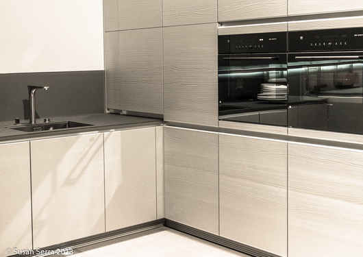
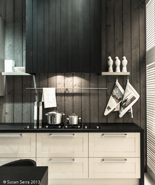
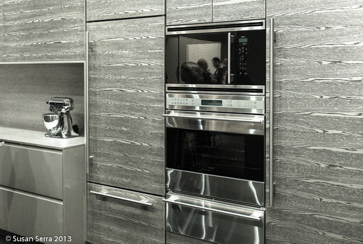
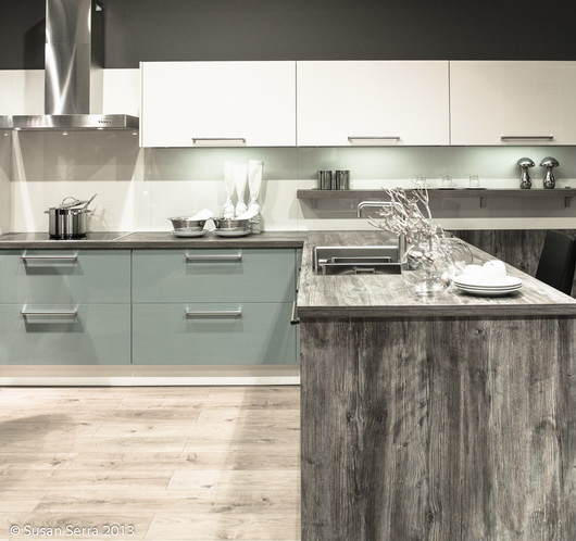
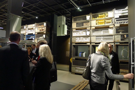
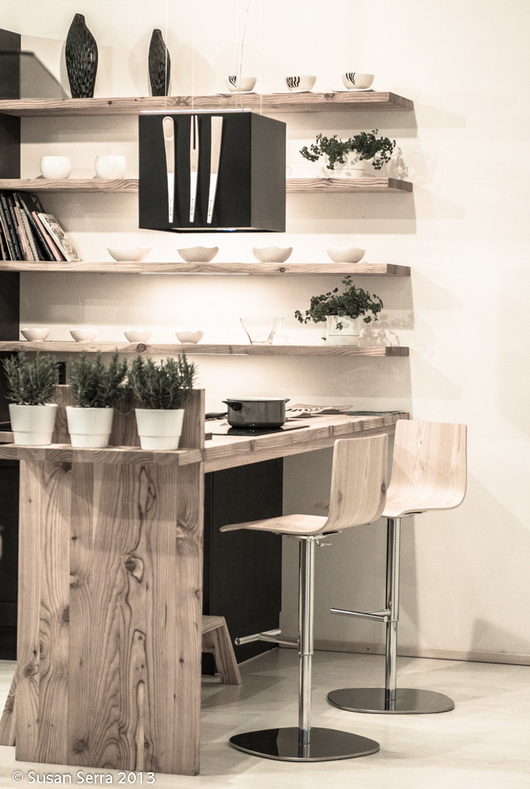
Texture, designed into many of the kitchen displays I saw at LivingKitchen two weeks ago in Cologne, Germany, was front and center as a trend. It showed itself in various forms, but the movement was clear - Europeans clearly want warmth in the form of wood grain, whether real or faux wood.

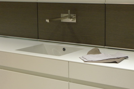
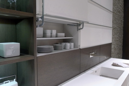
This specific type of texture was shown in walls, backsplashes, cabinet doors and countertops. It was also seen in flooring, which I will be covering separately.

The kitchens were warmer in their overall feel than the last time I was at this show, yet, interestingly, and here is an important point - European cabinet manufacturers show texture in a very modern way as opposed to designing in heavily textured wood with more of a country feeling which we are familiar with here in the U.S.

The new European kitchen designs are using textured wood in a straightforward way - plain (mostly flat, sometimes raised small squares in a modern pattern) and simple. When you add flat, simple, doors, modern accessories and appliances, no amount of heavy texture will move the design toward the next level of warm and fuzzy that we are used to seeing in the U.S. - you need paneled doors and other design elements to go down that road.

Nonetheless, the added texture seen in the kitchen displays does contribute to a sense of comfort, warmth, and a casual nature to the design.

Below are images which illustrate the various ways texture was used at the LivingKitchen show. I've turned the color saturation down quite a bit to more clearly show these textured areas. This was a mainstream trend!

What do you think of this trend and how it's used? 

Kitchen Design Trends At IMM Cologne - LivingKitchen 2013

As I get settled in to closely study the nearly 1800 images that I took in a 3 day period at the fabulous IMM Cologne's fabulous LivingKitchen trade fair, I see that this first post needs to simply be an overview of the trends that I spotted. The images that I captured of the stunning displays at the show demand multiple posts, an expanded visual documentation of these trends-coming next. 

I will also be spreading the image love throughout my other social channels, so please follow me here: The Kitchen Designer blog - right here! Sign up for the feed top right or via email, under my picture on the sidebar:   Twitter  +  Google+  +  Facebook +  Pinterest (Pinterest will have both blog images as well as lots of new images from my hard drive). I'm barely beginning to add those images, so check back.

As I look through the images, there are two main categories of design that come to the forefront for me. The first category is those companies whose sole purpose is to be on trend and second, those companies whose purpose it is to do their own thing without much, or less, concern for trends. BOTH types of design are extremely creative, but that word, "trend" can manifest itself in a tricky way if the entire kitchen design one puts in one's home in 2013 is solely based on the hot, new, trends. Like chocolate, trends are fun to indulge in, but an all chocolate diet (while enjoyable to dream of) will cause problems later! Don't trend-binge design! 

Since I also attended this show when it was last held two years ago, it's an interesting exercise to compare both sets of images that I took to get a better sense of how design has evolved in Europe. Here and there, I will be mentioning what's evolved since 2010. And, a thank you to the U.S. and German teams at BLANCO for inviting their U.S. Design Council members, of which I am one, to experience this show with them, providing opportunities for our group to bond as colleagues and friends.

Here are the 2013 Kitchen Trends I Spotted - Brief notes are below with more details/features/thoughts to come in subsequent posts! "M" means it's a mainstream trend throughout the show. "P" means some dots were connected throughout the show but it is not mainstream. "P+" means more than peripheral, less than Mainstream.

Cabinetry

Cabinetry Style:

  • White (lots), light woods, and greige colors - NEUTRALS as a foundation - M
  • Use of texture/natural elements integrated into the design, whether in countertops, backsplash, or cabinetry, often driftwood-y looks, real or faux - M
  • More warmth in the designs overall than I found two years ago-definitely, added comfort - M
  • Gloss or glass combined with texture/more glass in general - P+
  • Color blocking - the color accent of choice for this show was orange! P
  • Blue/dark gray, usually medium to dark GE's new slate finish is on that one! P+
  • Warm, modern design overall - M
  • Usually soft contrast in coordination of material colors in a kitchen display, but sometimes bolder contrasts - P+
  • Use of horizontal lines in overall design (not new, but an important European design element) - M

Cabinetry Features:

  • VERY long drawers, lots of countertop lifts for multi-use (countertops/wall cabinetry/more) and as always-useful, very cool drawer inserts - M
  • Seemingly even shorter toekicks - P+
  • More cabinet cubicles than open shelves-often in unexpected places, always with lighting - P
  • As in 2010, lots of fun and playful geometry in cabinet design - P
  • Integrated benches to rest, sit, or display decorative or useful items - P
  • Tight/seamless appliance integration - M
  • Integrated handles or long, modern, pulls - M
  • Same countertop as cabinet fronts - P
  • Channels between drawers and under countertop - P+
  • Concealed close-like tall and wide sections  - P+
  • Open concept philosophy, considering a kitchen's design connection to surrounding living areas-very clear to me - M
  • Intersecting design elements - P+
  • Open cubicles designed into tall cabinetry for interest - M

Accessories

  • Organic in nature via textural ceramics, hand carved wood pieces, real greens and other handmade items - M
  • A fair amount of skins seen on floors and benches - P+
  • Rather than pattern, accessories communicate the style and theme - M
  • Large in size (perhaps to call attention to the display since it is a trade show) - M
  • Lots of rail systems - attention to universal design, seemingly even shorter toekicks - P+

Countertops

  • All thicknesses - super thin, thick, or in between - M
  • Different materials next to one another in a flush installation - P+
  • Patterned countertops - plaid, modern art, new designs (new look, not a trend) - P
  • Glass - P
  • Wrapped countertops - waterfall on each exposed side (not new, but it's still current and is SO chic) - P+
  • Lifts to raise/lower or conceal a cooktop - much more prevalent than two years ago - P+
  • Cooktops integrated flush with the countertop - P+
  • Built in dining configurations - M
  • Intersecting design elements - P+
  • Stainless steel with integrated/seamless stainless sink - P
  • Virtually no granite or marble - just simple, understated, tightly patterned surfaces - M

Backsplashes

  • Simple, plain, continuous, whether wood, engineered stone, or glass - M
  • Sometimes a 1/2-3/4 height, leaving wall space below the upper wall cabinets - peripheral trend - P
  • Very little tile - M
  • Real wood or faux - M

Appliances

  • Hoods - Look like lamps (not new, but getting nicer) - P+
  • Hoods - double hoods over cooktop - P+
  • Hoods - Integrated/toned down/hidden hoods and blowers - P
  • New, warm, greige mid tone to dark glass appliances - P+
  • Stainless/color mix (reminds me of Whirlpool ICE - P
  • All appliance types very seamless/tightly integrated into cabinetry - M
  • More white appliances seen - P+
  • Ovens concealed - as seen last time too - P+
  • Ovens as an important design element - M
  • Flexible, open, vessel placement (anywhere) on induction cooktop - P+
  • INVISIBLE refrigeration - M
  • Sinks & Faucets - matte, modern, quietly elegant - M

General 

  • Doubles - double hoods, double light fixtures, double cabinets, other doubles - P+
  • Not much vintage/retro/industrial representation - a touch here and there but mostly warm/earthy/modern design - M
  • Occasional attempt at what looks like American Shaker - P

Cool Factor! - Images to come, for now, just descriptions (these are sometimes one-offs)

  • Countertop lifts 
  • Glass patterned countertops
  • Framed multiple ovens
  • Nearly invisible induction burners integrated into countertop
  • Choice of touch screen or knob controls
  • Plaid cabinets
  • Colored glass cabinetry applied as modern art (wait for the image)
  • Awesome, seen more than once, patchwork of wall cabinetry
  • Glass countertop, cabinetry and glass supports in one display
  • Loved the function of a glass sink surround
  • Glass drawer inserts
  • I'm sure I'll select more! 

Lighting

  • LED lights for shelving, around cabinetry, in open shelf cabinets - M
  • LEDS een as a feature in color in appliances (not a trend, just something new)
  • LARGE lighting fixtures, oven seen in doubles over an island - M
  • Simple, rounded, modern shapes in fixtures, often in matte finishes - M

Flooring

  • Lots of light, textured, natural wood, very light, very Scandinavian - M
  • OR, gray or white solid flooring of some sort, with no pattern, perhaps vinyl - M

Dining

  • Benches - M
  • Benches with cushions or skins - M
  • Modern design - M
  • Natural, matte, wood surfaces or matte stone tabletops - M
  • Fresh, modern, designs - M
  • Surprisingly, chairs are often matching or closely coordinated - M

This post is so long that I'm only going to show one image that I took from the show - shortly, LOTS AND LOTS OF IMAGES to illustrate my points above!!!

Leicht Display-Image by Susan Serra


The Kitchen Countertop - Where To Put The Philips Saeco Espresso Maker!

Whether you are a domestic goddess, work at home or can't wait to get home after a long day at the office, I can report that, I for one, seek out a little treat here and there during the day. It's a reward. And, it's most likely going to be a short or a tall cup of good coffee - and could well be a quick shot of espresso.

Funny thing is - over the span of 25+ years, I never drank coffee. Maybe here and there in a restaurant, sure. Never every day. Since my husband retired from a work injury nearly 3 years ago, little by little I joined him for a cup of coffee. Now, I'm up to 2 cups a day, one of which may be a shot of espresso or a capuccino, one of our favorite food groups!
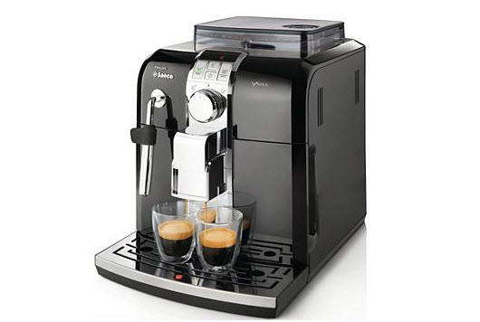
He or I would go out to get the afternoon shot of espresso, so when the nice people at Philips Saeco asked if I would be interested in reviewing the Philips Saeco Syntia espresso machine, I felt it was a natural fit into our lifestyle-and hopefully into the kitchen countertop, which I was quite curious about.

Owning your own personal espresso machine is an enhancement to your lifestyle, I can definitely say that. The Philips Saeco Syntia has rapid steam, a quiet grinder, an easy-clean system, large capacity 40-oz water tank and so many other cool and highly technological but easy to use features. It has an understated beautiful design and is quite compact. 

Which brings me to the larger issue of finding room on the countertop for an espresso maker. Here are some tips:

1. How often is the espresso maker used? If daily or several times per week, it deserves easy access. 

2. Consider a coffee station in the kitchen.  A spot where cups and mugs are stored, one or more coffee makers, utensils, other coffee accessories, teas and more. 

3. Mugs and cups - Begin a collection. Half the enjoyment of drinking coffee is to drink from a beautiful cup. Select the proper cup according to your mood! Display your cups too!

4. The coffee station can live in a kitchen armoire that looks like a piece of furniture, such as a breakfront, with retractable doors, serving as a gracious spot to easily prepare a favorite beverage.
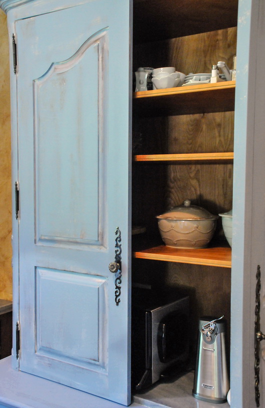
 

5. Scan the countertops - In a small kitchen where space for a coffee station is often not available, check to make sure that over time the countertop has not adopted other small appliances or decorative objects that are not being used. Declutter, scan, rearrange, and chances are a spot can be found for the espresso maker.

5. The compact size of the Philips Saeco Syntia espresso maker can fit easily within the typical backsplash height, a critical issue when shopping for espresso makers if it will live on the countertop, but be sure to check your backsplash height before purchase.

6. Besides its size, is it a good looking piece of equipment? If small appliances are going to live on my countertop, I am fine with that, but it is also important that they have a look of quality. Is that true for you too? 

7. Simple lines without an abundance of dials, knobs and other projecting parts will add far less "visual clutter" and will appear more elegant and more visually quiet on the countertop.

8. Alternatively, the espresso maker can have a home just below the countertop in a cabinet with a roll out shelf, or on an upper open shelf, if use is somewhat less frequent.

I have experienced nothing annoying or bothersome about this machine at all and I love the glossy black finish. It's not immediately intuitive - you have to sit down and read the manual or the quick start guide (who doesn't love a quick start guide?) It has both text and simple pictures to get you going, which I appreciated and needed.

It's great to have lots of wonderful features in your espresso maker of choice, but first, take a look at how you can best integrate this new treasured appliance into your existing space. Check features, dimensions, style and you will find the perfect spot.

IMM Cologne Living Kitchen - Germany, January 2011

A simple post with images to share of the Living Kitchen show in Germany. I am not able to elaborate more at this moment as time does not permit, but surely you can ooh and ahh at the images, no? I am here courtesy of Blanco America. I visited the factory and headquarters today. How do you say "7 patents" in German? I was beyond impressed AND inspired. Look at Blanco. SO-Just for you...

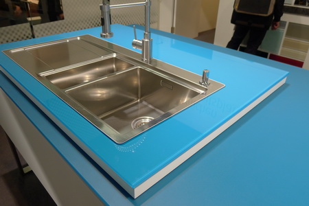
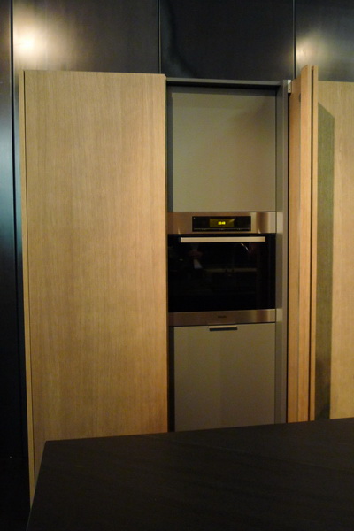
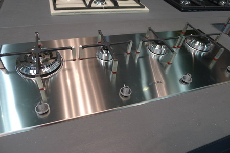
Lechner Countertops - Made of Glass - Trend Alert: sinks in rectilinear "boxes" sit atop countertops Another example of concealed ovens and I will be showing you others Love this cooktop and its grates - by Smeg Gaggenau's awesome booth - a factory type grunge look going on simple, elegant, and note the thin countertopos Clever storage, simple, clean lines, restorative neutrals And last, but possibly my "Best of Show for 2011": Last but not least, the cooktop that I BELIEVE will change cooking forever: Gaggenau's cooktop - put your pot WHERE YOU WANT...anywhere on the cooktop and the cooktop will respond. Image shows the pots at each side of the cooktop to illustrate the burner-less glass

Kitchen Blog Notes

Just a little blog housekeeping to do and to turn you on (do people still say that?) to a few things you may want to take a look at.

First, you'll see a new look for this blog. It's actually an update that I did myself. I may continue tweaking a bit here and there, but I needed a change, and to do a big change requires time that I just do not have right now to work with a professional graphic designer. So, much like organizing the kitchen, my new post on the really great blog, Hatch, here's a small update. I'm open to constructive suggestions too!

NOTE: There is a new share button at the end of every post. Please share! :) I'd love for you to share my posts wherever and with whomever you feel it is relevant for. Sharing is a good thing.


INTERIOR DESIGN CHAT - LIVE ON TWITTER - THURSDAY, FEBRUARY 25, 8-9pm

My great new interior designer friend, Wanda S. Horton, from North Carolina, came up with this very cool and fun idea to have a live chat, open to any questions at all on interior design (including kitchens) on Twitter. All you have to do is go here: #IDzinechat and you will see activity both from those who are asking questions and those who are answering. It's a good reason to start your own Twitter account, if you do not already have one. @tkpleslie (Leslie Carothers) on Twitter also lent her social media expertise to encourage this event to happen.

I'll be participating, so ask your kitchen questions, in 140 characters (I almost said calories-you know what's on my mind!) and I'll be on the lookout for them, and follow me on Twitter too: @susanserrackd

See you there!


A DREAM KITCHEN IN A VENTI CUP!

One day, in the middle of a million things, I suddenly had an urge to ask my Twitter friend, Franki Durbin, whose blog I've read and admired for a long time, to tell me about her dream kitchen. Franki has such a gift for spotting authentic style, so I knew she'd come up with some interesting kitchen dreams!

I love how granite countertops are in her kitchen dreams. You know, I've seen granite in kitchens for, well, 20+ years and yes, there is always the danger that a designer can tire of seeing the same fabulous design element over time. I challenge myself constantly NOT to fall into that trap, and I'm pleased that Franki is of the same mindset...smart gal!

I'd like you to go to Franki's post about her dream kitchen, because there are a number of other GREAT points and design ideas that she talks about, and I don't want to give them away here! Franki has a wonderful way with words...you'll be transported on a path of words right into the heart of that dream kitchen. Thank you for your post, Franki, and for your kind words. Your vision is truly inspirational!