Decorex 2011 – Blog Tour Kitchen Inspiration

As part of the fabulous Blog Tour 2011 group, founded by Veronika Miller of the equally fabulous Modenus.com website, our trip to Decorex, part of the London Design Festival, was simply fantastic, end of story. The creativity and innovation was such a joy to experience. Another type of joy was to see the way that classics, that is, materials or design, were updated to create a new aesthetic, a new definition of classic as well as modern. THAT experience = inspiration.

Here are some kitchen design elements that I found interesting at Decorex.

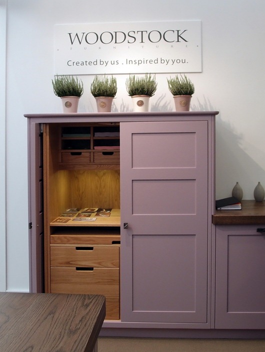
Below, cabinetry by Woodstock – who doesn’t love that name? Of course, the star is the fresh color, but I love the function too and the height of this taller cabinet.

woodstock kitchen

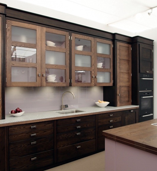
Below, also from Woodstock, the cool mix of light and dark neutrals. Notice, too, the subtlety of the rounded moldings. Love. Backsplash and styling – needs some love…

woodstock kitchen2

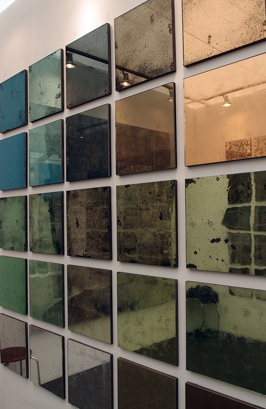
Below, gorgeous Dominic-Schuster mirror – could be a backsplash or wall area maybe? For pantry doors? Yummy! And it comes in a gazillion textures.

dominic-schuster

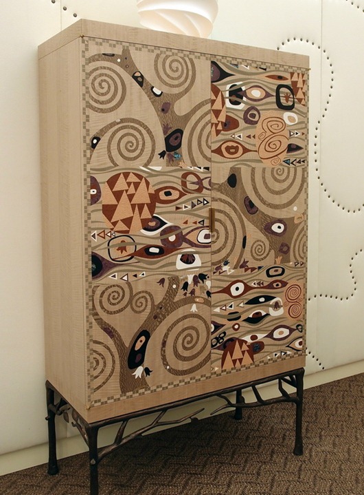
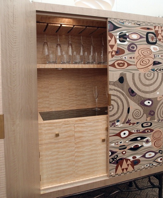
Below, a fabulous update of an armoire, bar cabinet, kitchen pantry, or breakfast room dish storage

archersmith


 archersmith2

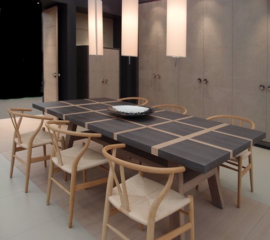
Below, a GOR-juss dining table with Hans Wegner chairs by Isis Furniture

isis furniture

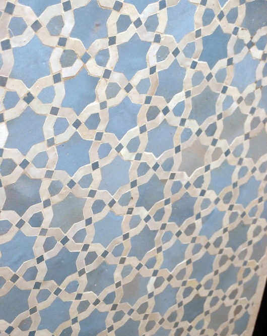
Below, Moroccan tile by Habibi (you are viewing the tile at an angle)

habibi

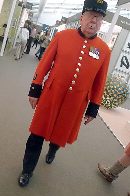
And, a quick shot of this very impressive gentleman who I know does something really important, but he’s also cute!
 

What’s your favorite??

Visualize Your Kitchen Design!

I picked up a new pair of eyeglasses yesterday. They are bold (for me), funky, and remove "good looks" as a (normally) important factor when I wear glasses, instead, replacing that concept with "a" look. Going down this road definitely messes with my head because I've always thought of glasses to be something to enhance my looks (if they had to be worn). So, this is a little getting used to for me. It's out of my comfort zone, too, as I've never purchased glasses with a dark frame as I've always had light colored hair.

Which then made me think about the design of these glasses as compared to design in our homes. Does beauty in our homes (as one's quest is for facial beauty) need to be the singular goal we aspire to? Do you let beauty guide your decisions because it's easy and safe? More importantly, do you define beauty in only one way?

Another piece to this quest for beauty is this - with interesting glasses, as with design, there is sometimes a fine line between cool and, well, odd or ridiculous, don't you think? I observed my thoughts as I tried on the glasses...over and over. Did I look ridiculous? Were they cool? Where they awesome? Which one of these adjectives?

The voice of reason came to me and said, what else...beauty (or an interesting look) is in the eye of the beholder (as is coolness, ridiculousness and awesomeness!) That was my answer. The glasses gave me enough of a "fun" boost to persuade me to buy them.

Two recent glasses purchases-one blue, one tortoise shell, dark, and rounded!

The Kitchen Design Link

I think in the design of our kitchens, there is more to strive for than simple, safe, beauty. We should (and I rarely use the word "should") challenge our traditional view of beauty from time to time, and all across the board in our lives, from eyeglasses to kitchens. And, then, question if we really care about "beauty" as a concept in favor of a different feeling. We can then be open to new ideas, new design solutions, opportunities to explore and thus, expand our personal aesthetic.

Tell me your thoughts about what the word "beauty" means to you and its importance in your life and your home! I want to know. I like enlightening experiences, especially small, everyday, ones.