Kohler Colors by Jonathan Adler

As color, wonderful, bright, bold, free-spirited, color, has moved into the center of our lives, seen in our clothing, in our interiors in so many forms, in our outdoor living areas - and in all sorts of graphic design online and in print (and that is just for starters-as we know, color has upped its presence everywhere) it makes me think that such a significant part of Kohler's culture has been color-focused.

Kohler has had a love affair with color, and few would disagree. Kohler has quietly kept an exceptionally wide range of colors in its collection of products year after year. Although white is king in the kitchen and bath and always a classic, nevertheless, Kohler's commitment to color has been enduring - and passionate! Even if you really dislike a color, I KNOW, as a designer that any one of Kohler's colors is able to play the perfect role, whether bold or understated, a focal point or a quiet design element, in every kitchen and bath - yes, even those peachy, fleshy tones (pair them with white or charcoal for a sophisticated look!)

Take a look at this very interesting, brief, history of Kohler's colors. I loved looking at Kohler's color timeline.

Jonathan Adler Colors

It is with real interest that I observe Kohler's special edition colors by Jonathan Adler. I view these four colors as decidedly non-trendy colors, which is to say, they are colors that you can use to clearly personalize your kitchen or bath that will stand the test of time, and I do not say that lightly.

The colors, Piccadilly Yello, Greenwich Green, Palermo Blue and Annapolis Navy, are not neon - the color darling of the moment. THESE colors can be translated into a kitchen design that can be centered around elegance, country comfort, modern design, or one with a playful theme. These colors are versatile....thus, personal!
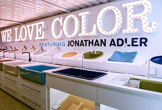
Quite honestly, I purposely did not read the press release about these colors because I wanted to go by my instincts as a designer when I went to see the collection in person. It's often a practice I employ for many new product introductions. I knew as soon as I saw this collection first hand, taking my time to work through the colors and sink configurations, that design flexibility is built in, in a very, very smart and aesthetically pleasing way. Surely, that was Kohler's intent-intelligent design flexibility.

I have to say that Kohler is providing the tools for pretty much wherever your design inspiration will take you...so many tools!! The Jonathan Adler collection is available for a limited time but the colors will prove to be enduring - sweet!

Bosch Appliances + BLANCO = The Perfect Couple

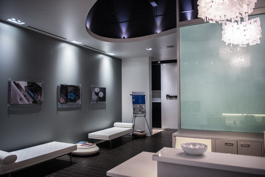
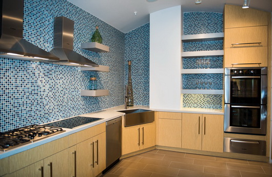
The two German brands, Bosch and Blanco, came together logically and flawlessly throughout the new Bosch, Thermador, and Gaggenau showroom in Irvine, California. I was invited, along with others from the media, to attend the opening of this big, beautiful, state of the art showroom.

The reception area of the Bosch/Thermador/Gaggenau showroom

Two words: German Engineering. It's immediately apparent how perfectly these two brands go together aesthetically, not to mention their beautiful, precise, engineering-the fit and finish is superb. 

But, here's the thing -  although the Bosch portion of the showroom is quite minimalist and of wholly modern design, if you look past that, it's easy to see that both of these brands' products (most of them) can transition easily and logically to a range of kitchen design themes, from modern to traditional and beyond. Some faucets are more clearly suited to one style or another. Others play very well in a variety of styles.

For the price point, you get a WHOLE lot of style, substance, precision and performance. More pretty pictures from this fabulous showroom...

Did you know that Bosch has a slide in range? Allows the design of a clean backsplash

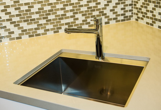
Note the sink cutout - it's interesting to see the sink section. I like that look.

Blanco and Bosch are the happy couple!

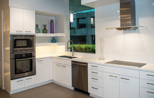
Sleek, simply designed built-in appliances

Note the small stainless sink detail surrounding the countertop cutout - cool

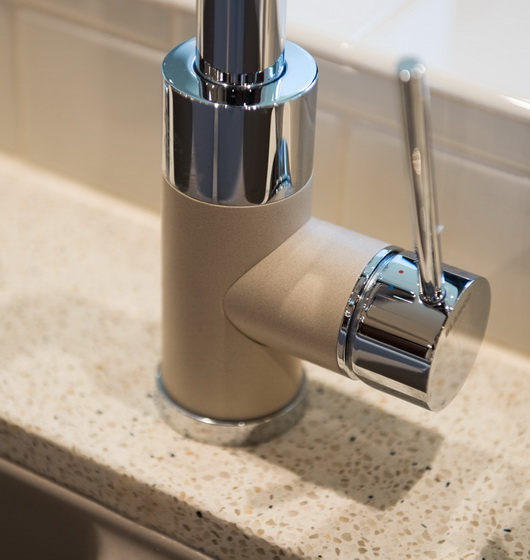
My absolute FAVE combination of Blanco faucet finishes and I love Blanco's silgranite sink-talk about performance!

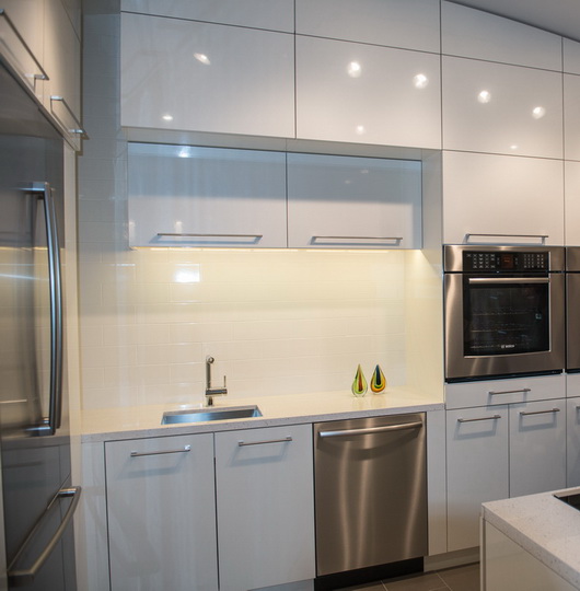
Perfection in the details

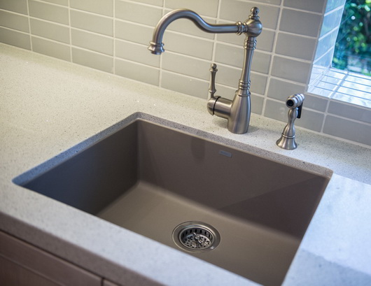
Try this combination - Truffle (color) and a traditional Blanco faucet

I always love a cooktop and under cabinet oven combination-so elegant

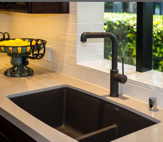
Note the lower divider in the sink and the rich, beautiful, faucet finish

A combination kitchen/display area for multiple appliances

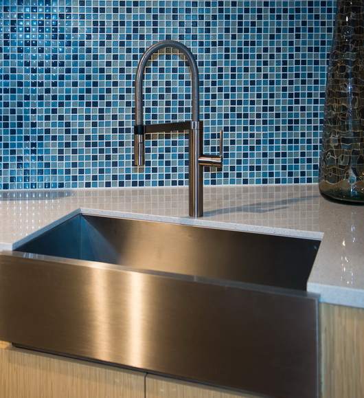
Yes, Blanco does a stainless apron sink + the beautiful, sculptural Culina faucet

Can you see the quality shine through in these pictures?


Kohler

And here is the last, and I hope you'll agree, the best post of the series on my trip to Kohler's headquarters at Kohler, Wisconsin. The trip was a visual feast! It was also an actual feast throughout the weekend since my trip was centered around the Kohler Food and Wine Experience - a weekend event (among many all year 'round) that I highly recommend which takes place in October of each year. 

The piece de resistance of Kohler Village, to me, is the Kohler Design Center. A three level building of beautiful products and room vignettes in beautiful settings surrounded by fabulous materials, products, accessories and design elements, I want to share some of this gorgeousness with you. Without further ado...here we go (all images have been enthusiastically taken by me)!

Please see MORE images on my pinterest board, "Kohler's Design Center", and follow me!

I was so excited and wanted to take as many shots as I could that I did not stop to take note of each and every fixture, fitting or designer's name. If you have questions, please ask and I'll get the information to you!

Below, a stunning interplay of warm and cool tones in a graphic, strong, yet elegant setting

Below, this is a part of a larger master bath which is designed via a universal design philosophy

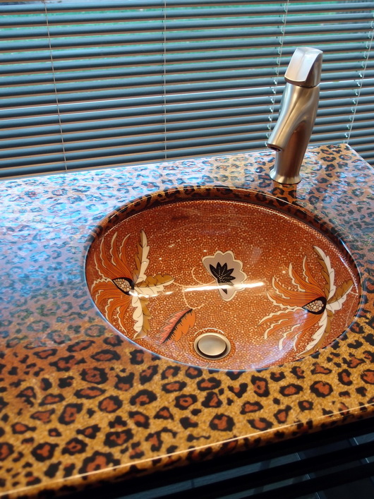
Below, modern, sophisticated, whimsical...creative

Below, an interesting combination of patterns and proportions that works beautifully

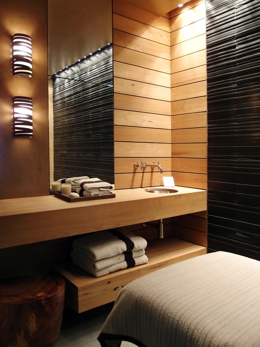
Below, I'm not sure what else to say besides: ahhhhhhhhh. I'm relaxed.

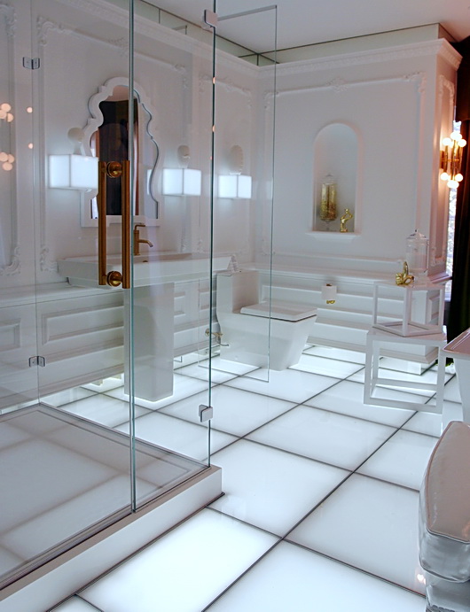
Below, I feel like a superstar being in this space, perhaps somewhere in Paris?

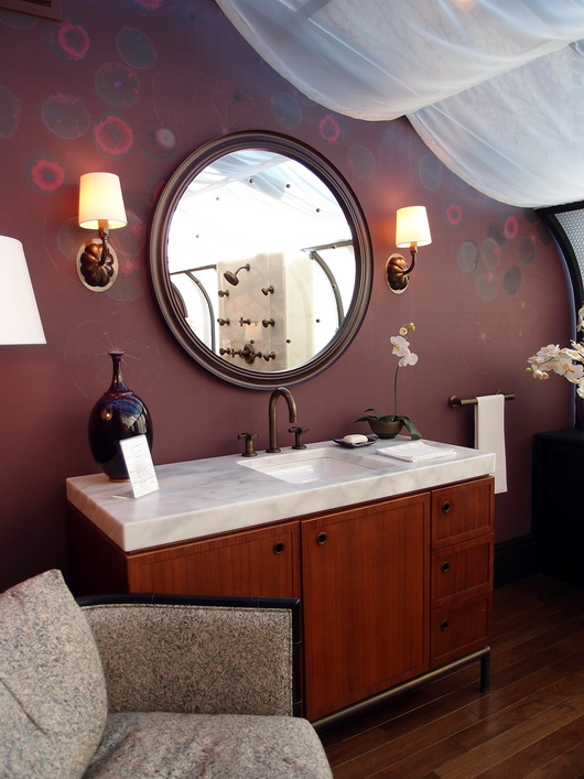
Below, a closer look at beautiful warm design elements set against the purity of white

Below, I feel like I'm living in a loft in Soho - very cool design elements...always love the cool/warm mix

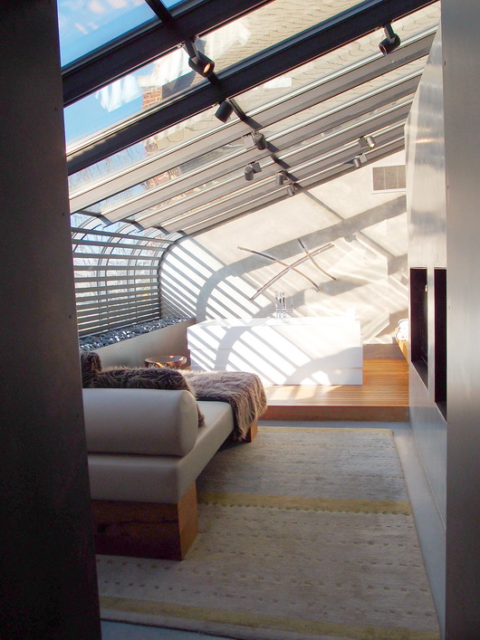
Below, a stunning environment that feels like it's in a penthouse - a warm modern design

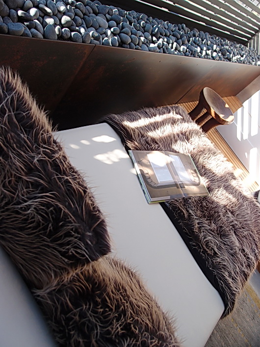
Below, seen in the image above from a different angle. I'm on board!

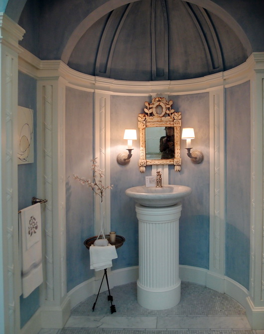
Below, simply stunning, elegant, perhaps Will and Kate's powder room?

Below, I'm awed and excited - I think I'd like to hang out in here!

Of course I knew that Kohler is all about design and function but visiting Kohler's headquarters was a reminder as well as a series of new visual lessons about their quest for beauty, innovation, always a celebration of tradition and a commitment to a strong and clear look to the future. Sounds like copy text, doesn't it? Can you question Kohler's intense interest in design in the most open way, celebrating all design styles? I can't. Just look at the previous posts just below this one. Kohler is a giant in the kitchen and bath industry...for very good reason. I'm also very proud to call Kohler a great American brand. 

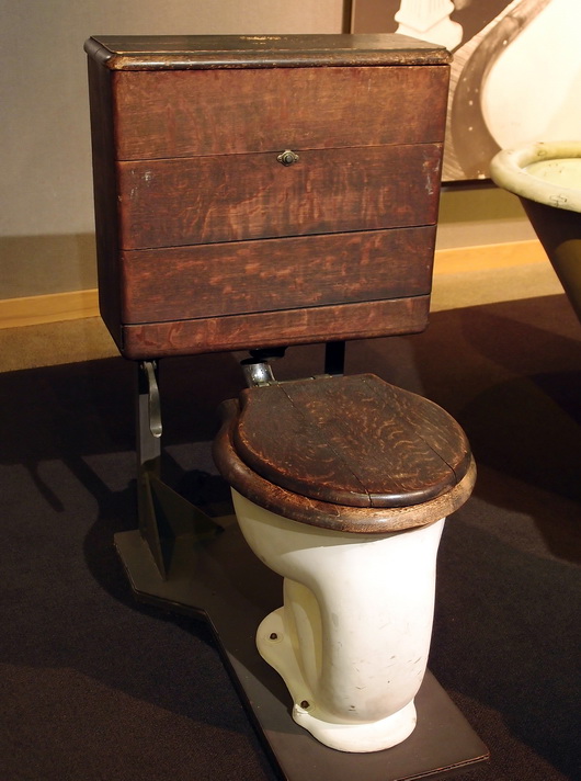
From this....

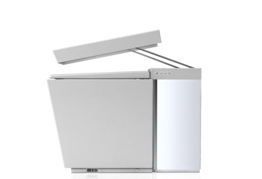
to this, introduced in 2010, the NUMI!


I hope you've enjoyed these posts. Don't forget to see more fabulous images on my Kohler's Design Center board on pinterest! Kitchen images are on that board too!!