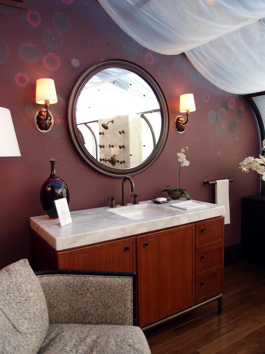
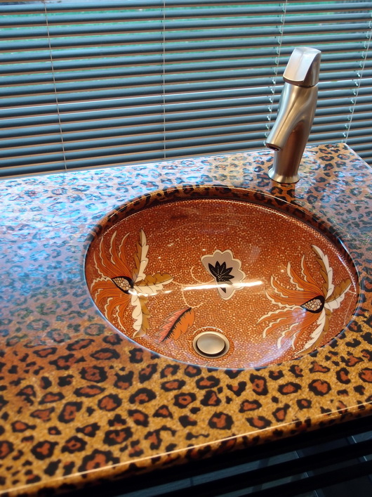
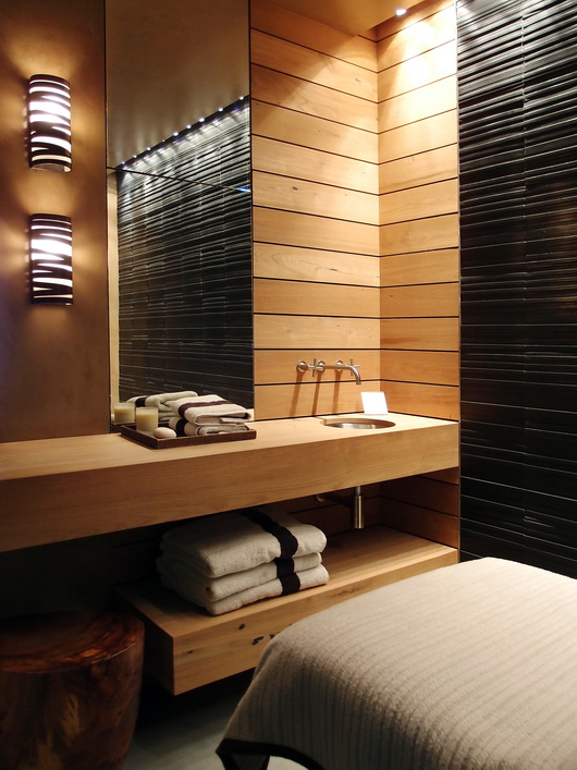
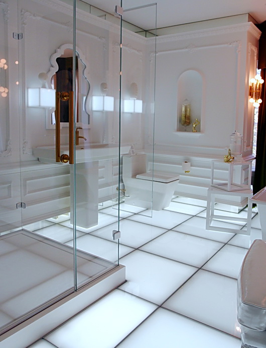
The two German brands, Bosch and Blanco, came together logically and flawlessly throughout the new Bosch, Thermador, and Gaggenau showroom in Irvine, California. I was invited, along with others from the media, to attend the opening of this big, beautiful, state of the art showroom.
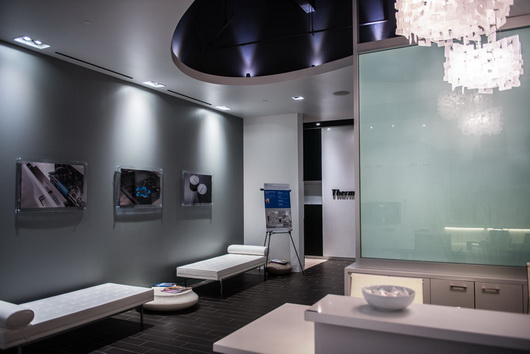 The reception area of the Bosch/Thermador/Gaggenau showroom
Two words: German Engineering. It's immediately apparent how perfectly these two brands go together aesthetically, not to mention their beautiful, precise, engineering-the fit and finish is superb.
But, here's the thing - although the Bosch portion of the showroom is quite minimalist and of wholly modern design, if you look past that, it's easy to see that both of these brands' products (most of them) can transition easily and logically to a range of kitchen design themes, from modern to traditional and beyond. Some faucets are more clearly suited to one style or another. Others play very well in a variety of styles.
For the price point, you get a WHOLE lot of style, substance, precision and performance. More pretty pictures from this fabulous showroom...
 Did you know that Bosch has a slide in range? Allows the design of a clean backsplash
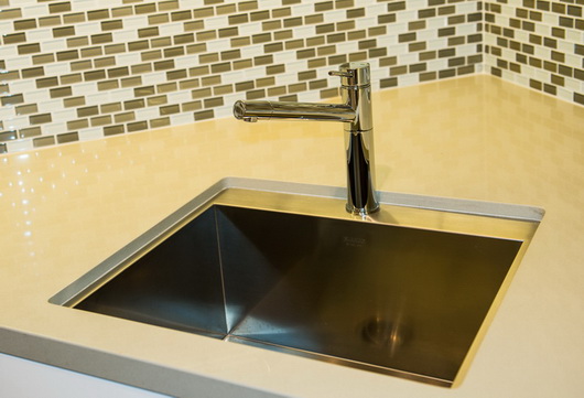 Note the sink cutout - it's interesting to see the sink section. I like that look.
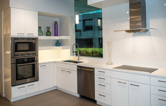 Blanco and Bosch are the happy couple!

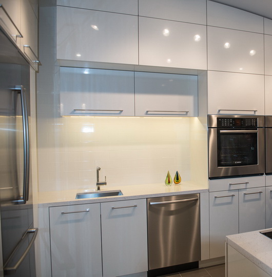 Sleek, simply designed built-in appliances
 Note the small stainless sink detail surrounding the countertop cutout - cool
 My absolute FAVE combination of Blanco faucet finishes and I love Blanco's silgranite sink-talk about performance!
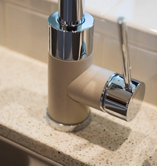 Perfection in the details
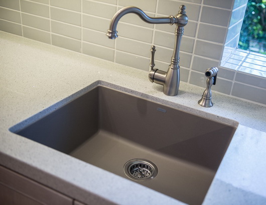 Try this combination - Truffle (color) and a traditional Blanco faucet
 I always love a cooktop and under cabinet oven combination-so elegant

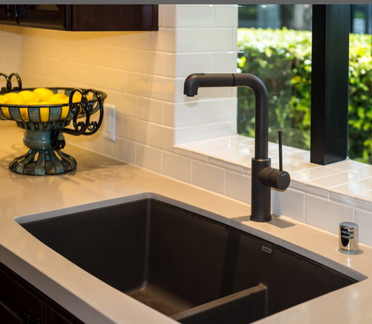 Note the lower divider in the sink and the rich, beautiful, faucet finish
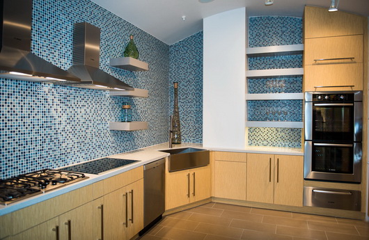 A combination kitchen/display area for multiple appliances
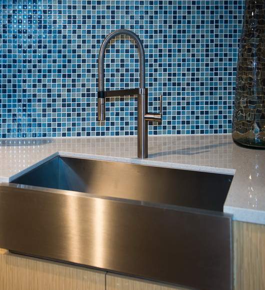 Yes, Blanco does a stainless apron sink + the beautiful, sculptural Culina faucet
Can you see the quality shine through in these pictures?


