Aamanns-Copenhagen - Scandinavian Dining + Design in NYC

Last Friday I was FINALLY able to go to Aamanns-Copenhagen - the authentic Danish restaurant (which also has takeout availability) in New York's Tribeca. Aamaans has been mostly finished for over a year except for a few mechanical issues in the building which took forever to resolve - and I have been waiting impatiently for its opening!
Having a lifelong familiarity with Danish cuisine both from my own childhood in the US, my family in and around Copenhagen and via countless trips to Denmark, I have a deep emotional connection to the wonderful flavors and textures of the food. And, they are wonderful! But, the food is only part of the experience of dining at Aamanns.

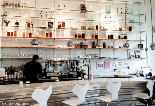
The design of the restaurant is beautiful. Here's what you might feel when you enter the restaurant:

comfort  - surrounded by the natural textures and materials

light spirited - via the expanse of white surfaces, furnishings and huge window which brings in lots of north facing natural lighting

engaged  - with the organic feel of the artwork

relaxed - with the casual nature of the bar

inspired - by the collection of beautiful, yet simple, every day objects on shelving and on tables AND by the wonderful, super fresh, food
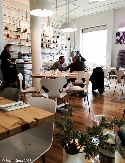
All of the elements work together to effectively create a comfortable, happy, yet stimulating feeling. The natural materials and textures beautifully merge the Scandinavian style with the vibe of its location - Tribeca. 
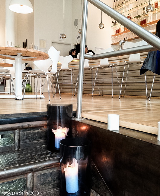
The design of the room has a straight forward and functional feeling to it, but it's the beauty captured in the function, i.e. choice of materials, that the Scandinavians do, not only well, but to perfection which so often translates into a straight path toward comfort-both physically experienced and visual.

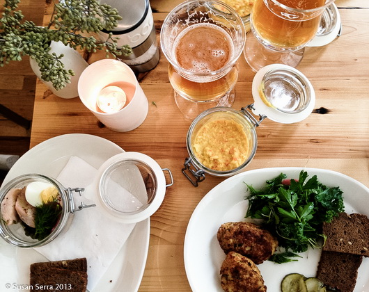
A few words from Sanne Ytting, founder and owner of Aamanns-Copenhagen: 

"The space is designed by the young talented Danish designer from Copenhagen, Anders Buck Faaborg.
Chairs: Fritz Hansen
Lamps: Mater,
Bodum, Holmegaard, MENU, By Nord, Sort of Coal, Anne Black, are also represented at Aamanns-Copenhagen.
The overall goal was for me to create a piece of Denmark in Manhattan, a feel of being somewhere in Denmark.. clean design, elegant but still warm feel....
The art on the walls are made by the famous Danish artist, Peter Max-Jakobsen - we do rotating exhibits every 4 months in a collaboration with Kim Jørgensen, Oxholm Galleries in Copenhagen."

 Here's how this look can translate into a kitchen design - it's so easy!

  • A foundation of white
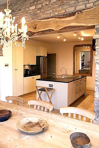
  • Natural stained wood floors - #2 oak is just fine rather than a perfect wood with no knots
  • Modern chairs
  • A touch of stainless and/or glass to bring in a functional feeling
  • Organic elements such as pieces of nature, handmade ceramics, textiles and so on
  • Simple, beautiful forms
  • Good natural lighting

Scandinavian style is not only one interpretation, it can be nudged in many different directions. As so many of us are inspired by hotels, restaurants and other public places, I thought the style of this warm space might inspire, which can translate easily into one's home.

I've been inspired and comforted by both the food and the design - very much so! Aamanns-Copenhagen serves breakfast, lunch and dinner AND you can make reservations online as well.

My Appearance on Martha Stewart Radio - Holiday Kitchen Decorating!

On Tuesday, (today) November 26, just after 8 am, I'll be a guest on Martha Stewart Radio talking about decorating in kitchens and dining areas. There are SO MANY great ways to express your personal style in the kitchen during the holidays that both Kelly and I came up with for whatever your version of holiday is. 

SEE OUR PINTEREST BOARD ON HOLIDAY KITCHENS HERE

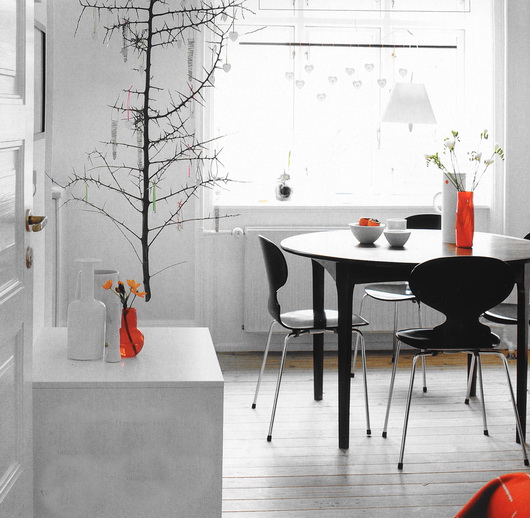
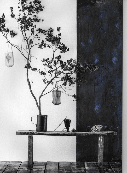
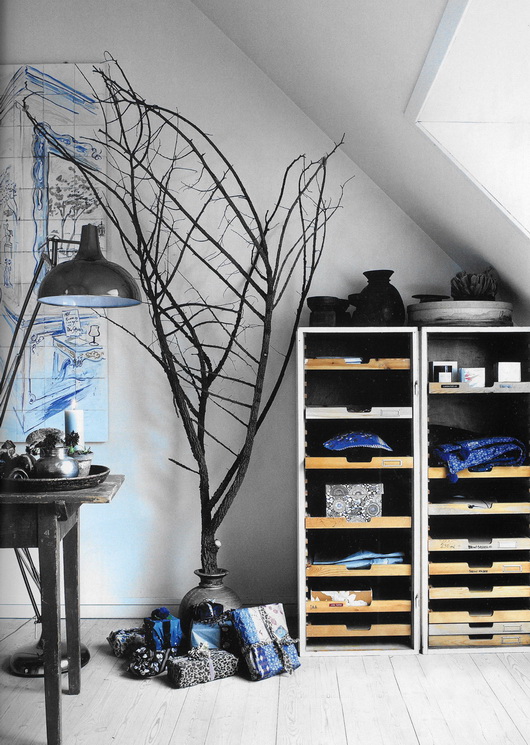
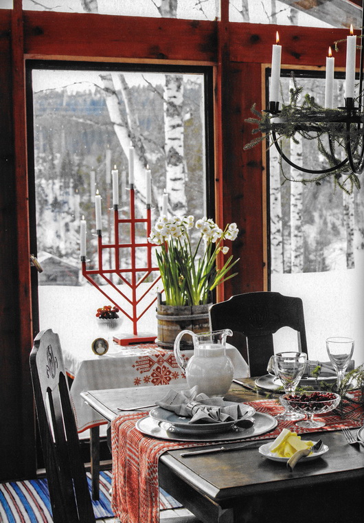
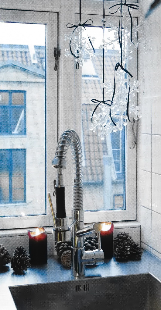
Below are a boatload of tips on holiday kitchens along with some images of a Scandinavian style holiday from Bolig Magasinet and Skona Hem.

I suggested that I chat with the hosts of Morning Living, Brian Kelsey and Betsey Karetnick about tips for decorating the kitchen as well as tips for helping the kitchen function better. I definitely got carried away and brought with me way too many tips than time allows for - but that's what this blog is for, to fill in the blanks!

KITCHEN DECORATING TIPS

Pick a theme! Modern, traditional, natural chic, farmhouse, urban - coordinate with the theme of your home's existing design OR add a small mix of another style if you want a fresh look.

Remove the artwork in the kitchen on one wall - hang a collection of wreaths fairly close together to appear as one arrangement, of various types and sizes to add lots of texture and interest!

Bring winter nature inside - birch branches, evergreen cuttings, pine cones in bowls, any kind of branches will do. I often cut evergreen cuttings from the back of a shrub and I just recently cut down some dead cattails for a stunning indoor display. I will add white twinkling lights inside the tall glass vase!

Spray paint pine cones and simple twigs a metallic gold or silver for a little holiday bling.

Arrange oranges studded with cloves for fragrant pommander in decorative platters or bowls.

Add small kitchen utensils to garland draped around cabinetry - a single theme of different shaped/sizes of wooden spoons around a large wreath, or a mix of utensils in red and silver or blue and silver - or all white looks festive. 

Add a string of lights and/or garland around the bottom of the kitchen island

Add big, gold, red, silver, white or blue bows to the back of kitchen chairs and stools

Collection of 10-20 glittering ornaments on ribbons, hung from one point in the ceiling so they fan out - put them in front of a window, over the island OR add them separately, hung from the ceiling, for a look of charming chaos.

Above the kitchen wall cabinets, add brightly wrapped boxes for a clean, bold, look.

Have some extra space in the breakfast room? Put a small tree, decorated in white lights in a worn gray metal bucket.

Gather silver serveware and arrange the pieces in a collection. Add metallic ornaments, tinsel and other festive ornaments plus a touch of evergreen or red.

Candles, candles, candles - especially in small kitchen pitchers, clear coffee cups, glasses.

Tea lights in mason jars with red ribbon tied around the mouth of the jar.

Branches wrapped in yarn, placed in a vase with felt ornaments hung on it.

Pitchers with an assortment of outdoor greens, cranberries, metallic touches and/or spray painted branches add life to the kitchen - make the arrangements as tall as the receptacles allow!

Put ornaments in and around a decorative bundt pan and wrap the bottom with pieces of small green garland. 


TIPS FOR A USEFUL HOLIDAY KITCHEN

Keep serveware at the ready.

Bring out holiday dishes and after the holidays, use them all season, not just for gatherings.

Bake a few batches of cookies and muffins to freeze for impromptu holiday gatherings or gifts.

Purchase or make a cutting board to cover the cooktop to add additional counter space, especially for entertaining, when the cooking is done. Make it a bit wider than the cooktop on sides and front to back, and a bit taller than the cooktop for a seamless fit.

Cook meals that can be served in the same pot they were cooked in via stove to table cookware such as Le Creuset or Staub.

Clean the countertops and hood filter in anticipation of heavy use.

Clean the countertops and reasses what really needs to be there with the goal of finding more counter space for intense cooking sessions!

Arrange spices in alphabetical order!

Arrange pantry items in categories - baking, cooking, snacks, cereals, etc.

Gather together measuring cups, spoons, baking equipment and other like cooking equipment and store near point of use in the kitchen for easy access.

The holidays are a hectic time, but with a little organization and a festive environment, the cooking, baking, prep and cleanup process may lower your stress level and allow for FUN to become one of the most important ingredients in the kitchen! Bring on the cookies!


French Kitchen Design - Paris Inspiration!

As the Tour de France (which I LOVE to watch every year, often multiple times a day) is heading toward the great finish in Paris this weekend, my thoughts this morning went to the incredibly inspiring colors, textures, materials that I encountered in the streets of Paris over a week long leisurely stay. I've been compelled to write about the Tour de France and kitchen design more than once!

I started looking at my many images of Paris. I began to look at which pieces within a given image could be used as design inspiration, to be translated into a kitchen plan. By looking beyond and around the objects in an image, you can bring a sort of abstract yet highly authentic design concept into a kitchen design. Open your eyes and your mind and the inspiration will come!

Inspiration for your kitchen design theme can come from travel, nature, your home town, a literary work, really, anything. It doesn't have to come solely from looking at images of other kitchens! By looking elsewhere for inspiration, in unexpected places, you can create a kitchen design that is highly personal. That, to me, is a very exciting way to plan the aesthetic layer of your kitchen!

I isolated 40 images that I felt had great ideas that could be translated easily into design concepts. Maybe I'll do a few of these posts. 

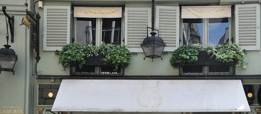
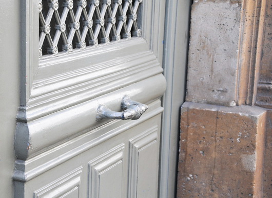
Below: Soft, calm, green-as-neutral accented with a small amount of black and oh-so-elegant soft and light silver...music to my eyes and what a color palette for a kitchen. Don't miss the gilt gold factor!

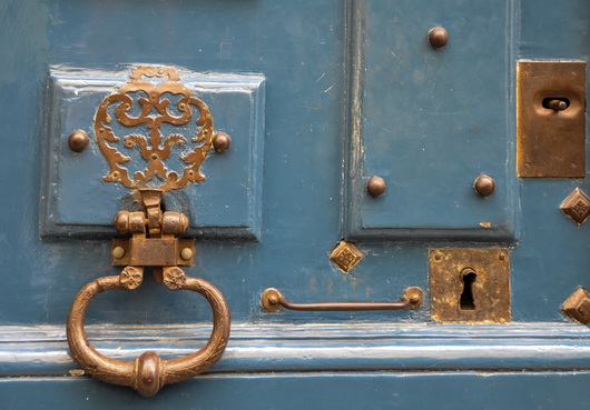
Below: Complementary colors on the color wheel, this warm blue and warm gold are perfect aesthetic companions. This hardware can translate into lighting fixtures, faucet, sink, hardware and other accents combined with blue cabinetry, countertop or flooring.

Below: Colorful artwork brings life into the kitchen as well as a feeling of culture, telling a story about the overall design of the kitchen. Anywhere you can find room for art in the kitchen, do it! I've been saying this since I started this blog in 2007 - art will stir the emotions in this very utilitarian space

Below: Industrial and authentically worn stainless steel meets elegantly worn wood flooring in the always wonderful European herringbone pattern. The cool/warm thing - always an interesting contrast

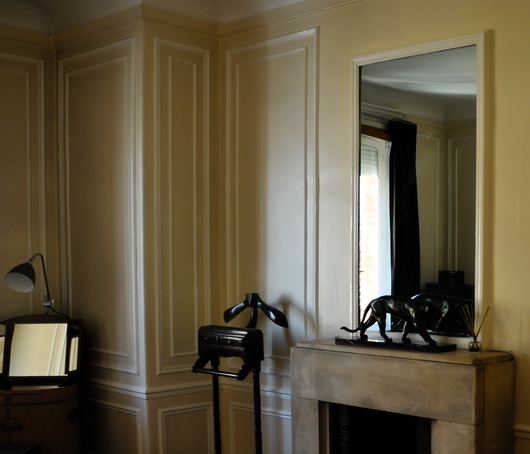
Below: That elegant look of paneling, but look closer and you'll see that it is applied molding - SO easy to do, even diy. Anywhere you can logically frame something will transform the kitchen into....Paris, and don't forget to frame the ceiling and possibly paint sections within the paneling

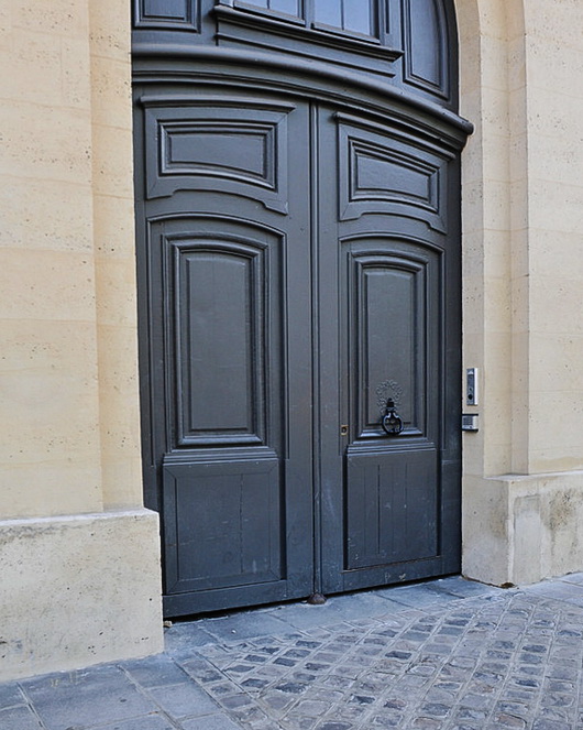
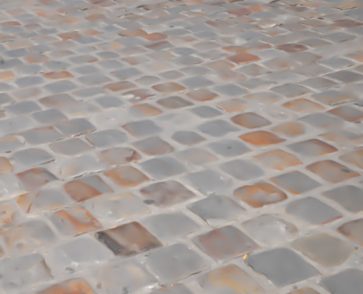
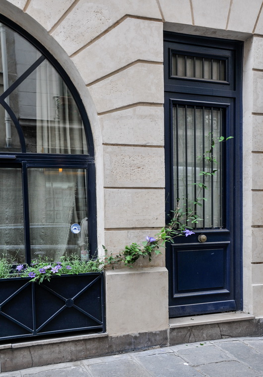
Below: These 3 images below feature a similar color palette, lovely for a kitchen. Again, the cool/warm factor is a natural, and the images show various combinations of lights and dark, each color, allowing the opposite color to pop. To my eye, these are all sophisticated yet easy to use colors in the kitchen. The very dark door MAY be a bit of a trendy color in kitchen cabinets today, but I would like it as a countertop color. Love the blue/gray street!

Below images pertains to the above grouping but is intentionally blurred to remove bad things that happen on the street!

Below: Happy color as seen in the very traditional door design yet viewed as a friendly, casual design element. A color such as this blue can be used in an accent piece in the kitchen which is usually a better choice due to an otherwise potentially overwhelmingly heavy balance. Or, do small pops of color like the great purple color seen in the flowered vine, an analogous color to the navy door and window, but in a light color for added interest and contrast. Love the navy, beige and gray colors in that image.

Look for inspiration anywhere! Start a folder in a project management system of some sort that might be labeled color, inspiration, ideas, design concepts, what I love, whatever makes sense. Or, of course, in pinterest! It's a fabulous way to discover your own, very personal, definition of creativity. It's fun too!


Tile Trends - A Brief History Of The Kitchen Backsplash

Everywhere I look, I see small rectangular tile used on backsplashes and upper walls in the kitchen. It's getting a little bit worrisome to me. It's worrisome because, having been a kitchen designer since the very late 80s, I have perspective. Perspective helps my clients, and I hope it helps you too.

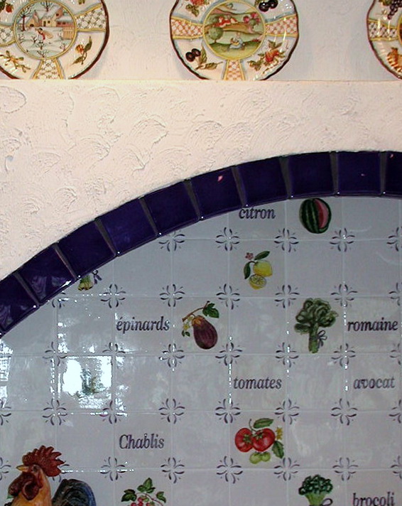
It started (my professional association with tile) with 4x4 ceramic glazed tiles and pretty fruit and vegetable or flower designs, often seen with corner motifs, sort of that Country Floors look. Definitely gorgeous. Funny, I'm seeing it more and more frequently again and it's still every bit as beautiful. Like Terracotta flooring, it was very popular, then went away. Now it is returning, at least on the periphery, to fashion again.

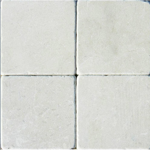
Then came 4x4 tumbled marble tile or matte, earthy, or light shades with fancy border tile. Tile was laid on the diagonal as a lower border against the countertop with a thin border tile above with square 4x4s above that (not on the diagonal), all over the backsplash on the diagonal with a square border at the countertop level, or maybe just in the cooktop area.

Later, probably near the start of the 2000s or a bit later, we began seeing 3x5 subway tile, which we still see, although not nearly as often as a few years back in terms of the "big trend". A very popular trend, subway tile harkened back to a more simple time, a period look, yet removed from the olde world look of tumbled marble 4x4s from the 90s and early 2000s. Mosaic tile in every possible color and material came on the scene first as an accent, then later on the entire backsplash.

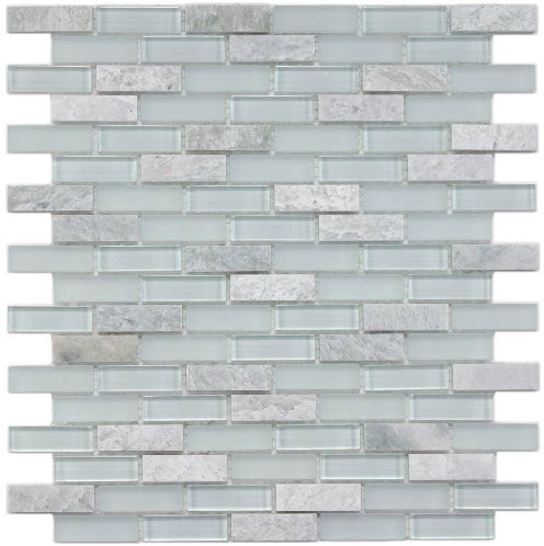
Glass tile, too, in aqua/blue shades, emerged as a very popular option some years back for the modern kitchen, especially in the mosaic form but was/is also seen in subway sizes large and small.

In the past couple of years, maybe a year earlier, we saw a strong trend toward very small rectangular, then longer rectangular subway tile shapes. These shapes are seen in matte finishes, iridescent and/or glass finishes and in typical glazed ceramics, and of course, marble, travertine, etc. It seems that at this moment, everyone LOVES small rectangular tile.

It occurs to me that I should not show full kitchen shots of my clients' kitchens to emphasize my point because in a sense, it certainly could be construed that I am encouraging the point of view that their kitchens be perceived as dated or "in waiting" to become dated. Classic or dated? That seems to be the question. 

The inspiration of this post came to me as Kelly and I recently looked at images of my work going back close to 20 years. When I viewed simple kitchen cabinetry, meaning UNadorned with the old world moldings, etc. of the 90s/early 2000s, which usually included a 4x4 tumbled marble backsplash, the kitchen looks dated due to the tile backsplash, and the cabinetry does not. That holds true for other tile motifs that I mentioned above, seen in other kitchens. Granite countertops? Yes, they played a role to a certain point, but this post is about tile.

These tile images except for the top image, are from Home Depot....probably a pretty good barometer for what is on trend for the unwashed masses. I shop at Home Depot too on a (rare) occasion, or in a pinch but hopefully with a designer's eye, so put me in that category too.

We all think that a tile type or shape is classic and in one sense, it is. When you see that particular shape nearly everywhere you look, especially in a very high end kitchen in a crazy expensive home, it may be amazingly beautiful, both dream worthy and swoon worthy, but it's still a trend. Possibly, it is a huge trend and from my perspective, probably a tile trend that will last 10 years or less (kitchen trends last much longer than fashion, but alas, they then trend downward fast.) Therefore, your kitchen will look dated to most of the world at large as a new shape and material has made its debut to the masses, washed and unwashed.

What is the answer then to deal with trend cycles? Next post, I will share my thoughts on how to think through the backsplash tile issue. I will talk about what is classic, what is trendy, if you should or shouldn't care about all this because "I love my kitchen anyway", and we will figure it out. I have several solutions for you to deal with this issue.

I already knew my responses to much of my work in terms of what is dated and what isn't, but when Kelly sat with me and said, as only a family member or very close friend would say: "that's dated, this is dated, that's dated too, you can't add that/submit that/show that" it told me what a young, design savvy woman thinks and sees right away, NOT being fully immersed in the kitchen world as I am-she is more general interior design focused. She knew immediately from her perspective what "felt" dated as I knew from my different perspective. I thought that was interesting, which was the inspiration for this post. Talk soon....


Decorating For Christmas In The Kitchen!

I've been thinking quite a bit about decorating the kitchen for Christmas, and that does not mean that it has to be this big, ambitious, undertaking. Chances are you already have nearly all the "ornaments" that you need on hand to do the job.

Prior to decorating my own kitchen for Christmas (disclaimer, we moved to this home 3 years ago and have not yet renovated the kitchen so it's definitely not "me") I was a guest on Martha Stewart radio on Monday, December 2nd to talk about this very topic. So, let's get on with the ideas! 


Around the same time, I had a lovely offer from Balsam Hill, retailer of artificial Christmas trees to use some of their products in my home. Of course, since the kitchen is usually the poor step sister in terms of Christmas decorating, I thought it was a great topic to share. Here we go!

1. Frame a kitchen window with greens and twinkling lights - or a huge, oversized wreath!

2. Change out dining chair seat cushions, placements and other easily changeable fabrics with holiday colors/motifs.

3. scan the kitchen collectibles on display and replace with holiday themed colorful and decorative items.

4. Don't forget the floor - replace the kitchen rug or runner for the holidays to have a fresh look! 

5. Add small twinkling holiday lights around the base of a kitchen island or on the sides and back of an island for a holiday glow.

6. Add a grouping of bulbs to hang just below the bottom of the kitchen table light fixture.

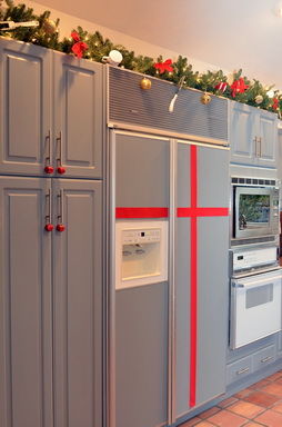
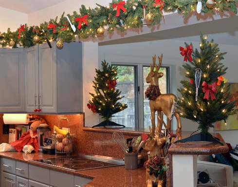
7. Add roping around the kitchen: above the cabinets or under the wall cabinets and tie in dime store kitchen utensils in your favorite holiday color.

8. Gather branches from outdoors, keep natural or spray paint in a holiday color and bundle together with twine and/or add ornaments to the arrangement.

9. Use Japanese Mashing Tape (Washi tape) and tape up past family photos or greeting cards on a wall in the shape of a Christmas tree (a simple triangle shape.)

10. Lots of candles all over - we LOVE the idea of an ebelskiver pan to use as a candle holder when not in service on the stovetop! 

11. Hang ornaments or bells on cabinet hardware (ok, not toooo many bells).


12. Paint cardboard fit to size in your holiday color and fit it to the rear of glass door cabinets for a holiday pop of color, easy to remove after the holiday. 

In my kitchen, I really enjoyed digging through my kitchen drawers (and combing through the local five and dime store) to find lots of small kitchen utensils to hang on the lovely roping from Balsam Hill. The two small Christmas trees came from them as well, and I think they are a perfect anchor for the shelf on each side.

Of course, anything goes, keep it simple or ambitious, but above all, don't stress! Have fun! The kitchen will thank you for it (it would be nice if it were grateful enough to clean itself...)


Silestone Kitchen Countertops - Classic Style & Modern Function

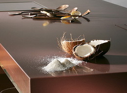
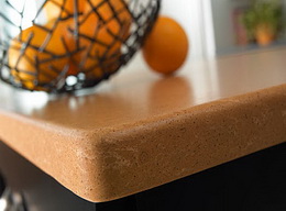
I had the pleasure of visiting Cosentino's headquarters, the parent company of Silestone, in Spain about 6 weeks ago. We toured Barcelona, we dined, we traveled to Almeria, we learned - I was a part of a small group invited to have a well rounded introduction to two fantastic areas of Spain and to have a multi-layered understanding of Cosentino's breadth of products.

Of course, we all know Silestone as the original engineered stone material for kitchen countertops, a market focus the company has always had and which remains the centerpiece of Cosentino's efforts. To that end, Silestone continues to introduce interesting, eco-friendly, and highly durable materials into the kitchen and bath marketplace. 

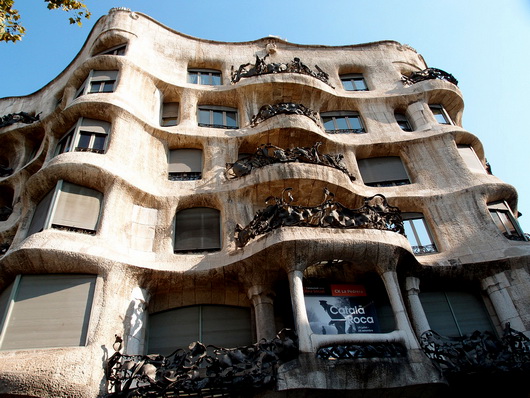
That's a general, and brief, overview, with more details to come. But, I did want to start talking about this trip by showing you some great images of a kitchen that I toured, preserved from the early part of the 20th century. The apartment building in which the kitchen is situated was designed by the amazing Antoni Gaudi called Casa Mila.

Below, the pretty incredible apartment building, designed by Antoni Gaudi...wow!

Below, images of the apartment. But first...I thought it would be fun to imagine which Silestone colors and styles would serve nicely as a modern day substitute in the event the new homeowner wished to, um, rip out the countertops (blasphemous!)

Top left: Grey Amazon | Top right: Lyra | Bottom left: Gedatsu | Bottom right: Sonora Gold

silestonegreyamazon silestonelyra
silestonegedatsu silestonesonoragold

Take a look at these gorgeous images of this historically preserved kitchen...


Get the flash player here: http://www.adobe.com/flashplayer


It was a privilege to walk through this authentic vintage apartment to see this very interesting kitchen.

The work stations look quite defined, certainly, with ergonomic features such as lower countertops in certain areas, adequate countertop space, adequate storage, and storage that starts well above our typical 4" off the floor.

Shelves and glass cabinets add visual aids to storage and the tall cabinets to the ceiling makes good use of extra storage. The cabinetry is built into the architecture of the space in some awkward but interesting ways. The incredible textured window adds glam in a big way. 

Much more coming soon on this incredible trip to Spain!!


Decoration & Design Building - Fall Market 2011

Last week, I was honored to be an invited design blogger to attend the D and D Building's Fall Market. The D and D building, in New York City, is simply, a fabulous building which houses world class interior design showrooms. Here, you can see the finest fabrics, furniture, lighting, accessories, window treatments, wall coverings, paint, and many more decorative products for the residential interior. It's awesome in its collective design offerings.

The Fall Market had a great array of educational workshops, seminars, talks and panels, with nationally known designers, manufacturers, and print and online editors. Going from a beautiful showroom to a insightful, spirited, talk, for me, was design heaven! Hanging out with the other invited design bloggers to Fall Market was equally inspiring! This discussion, below, was on Transcending Branding Boundaries, hosted by Editor in Chief of Traditional Home, Ann Maine.

left to right: Beth Fuchs Brenner, Peter Sallick, Windsor Smith, Jonathan Adler, Christina Juarez

I'd like to share some of the WONDERFUL products I came across that are located in the D and D Building!

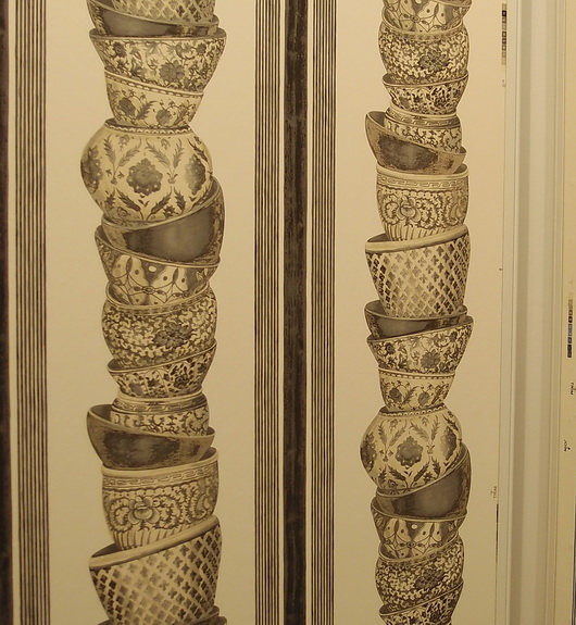
Pierre Frey

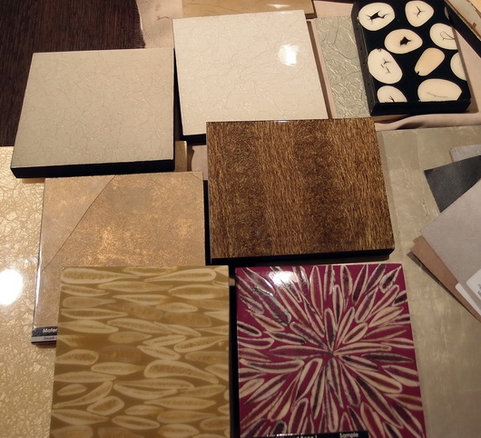
EbanistaBelow, interesting organic designs for dining tables

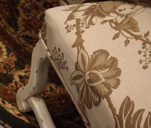
Evanson

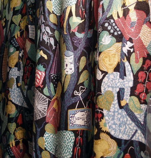
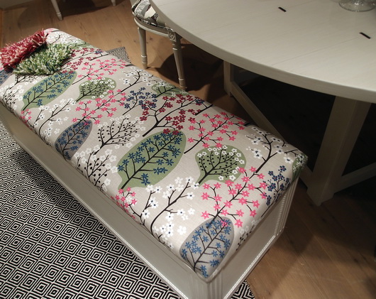
Country Swedish

Country Swedish

Country Swedish

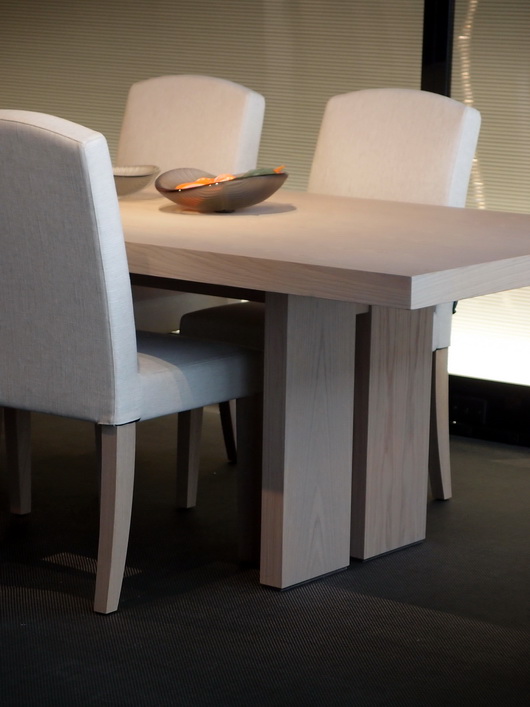
Armani Casa

I hope you've enjoyed these selections from the endless products that basically assault your senses once you enter this building! (That's a good thing!) 

Las Vegas Market - Dining Inspiration

Earlier this week I walked through the Las Vegas World Market Center, the enormous gravitational center for residential furnishings that struts its stuff twice a year. Vegas is a place that makes me smile, so I'm happy upon arrival. 

Rossetti

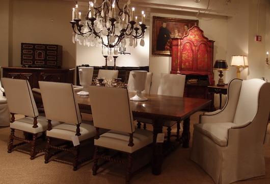
I came with a "kitchen context" unlike most interior designers, architects and buyers; a context in which I think about the transition, stylistically, of the kitchen to surrounding spaces. The dining area is a critical element of kitchen design and what a great place to dream of the ideal dining experience. Following are dining tables seen at the Las Vegas Market.

Rossetti

I always put a strong emphasis on the dining area in the earliest stages of designing a kitchen. Unfortunately, I often see it, if already designed within preliminary floorplans presented to me by my clients, as almost an after thought. I find nearly always, the dining area needs more space devoted to it.

Bramble

Making space available for friends and family to travel easily around the dining area and designing adequate space so that lingering at the table is an enjoyable and not a confining experience, are two important elements of a well planned dining space. 

Urbana Home

Durability of a table's surface and of the chairs as well is the measure of longevity and beauty. Ask questions and observe product construction and durability. Ask if materials and surfaces can be refinished or easily cleaned down the road. Be practical and realistic to determine if your lifestyle can withstand a white painted tabletop.

Rossetti

Venturing away from the kitchen, I'm a strong advocate for multiple dining areas in the home. I especially love a dining table, perhaps a 54" round table, depending on the size of the room, situated in a family room.

Lexington

This secondary or tertiary table within the home will serve as an alternative place to dine - maybe on weekend evenings or weekend mornings or the occasional weekday change of scenery. It's definitely about a change of scenery - why eat at the same table every single evening if another table can be accommodated in another space? A little far to bring in food from the kitchen? That's what trays were made for and I promise the effort is SO worthwhile. I've lived it, thus, my endorsement.

What does your ideal casual dining space look like?

Tour de Kitchens and Tour de France Together Again

Welcome to my third annual series of posts on French kitchens inspired by the Tour de France! This 3 week event is an excellent opportunity to celebrate authentic French kitchens and to study their many wonderful design details.

In the coming weeks, I'd love to look at all sorts of French kitchens, from modern to (really) rustic to those French country kitchens rich with charm and texture. Let's take these kitchens apart, look at the details, compare and contrast, and just admire what makes these French kitchens uniquely....French!

This year of the Tour is particularly exciting for me. After all, it's the Tour de Lance! Lance Armstrong has returned to the Tour to raise funds and awareness and to bring people together toward a common enemy...cancer. I think what he is doing is amazing. Check out Lance's videos and explore the site of Lance's foundation, Livestrong.  Follow Lance on Twitter, I love his tweets.

SO...onward! The prologue of the Tour began today in fabulous Monaco. What kind of kitchens do they have in Monaco? If you rented an apartment in one of the many apartment buildings surrounding the harbor to see the start of the Tour, most likely the style of the interiors would be largely simple, elegant, modern. I would call the kitchens an international style. They are nearly all very similar! Some sort of combination of stainless, black or rich browns and/or white, and you're done. Minimalist. Simplicity and elegance.

Images from


Creative Backsplash Inspiration

What a coincidence...no sooner did I do a post on Decorati on alternative backsplash inspiration via decorative panels, than I see this post on Design*Sponge! It's a very similar, actually, identical concept, and a good one.

As we see on Design*Sponge famous for great ideas, it can be a DIY project or not. However you tackle it, it's different, it's creative, and it makes an alternative design statement with material other than tile, which is beautiful, of course, often stunning, but, let's face it, there really ARE more possibilities for the backsplash than tile.

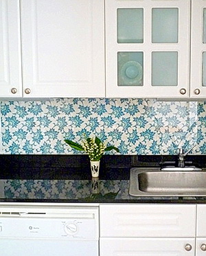
Laura is the owner of Open Face Designs and this is a printed design that she created! Laura used plexiglass on top of her printed fabric, but I'd recommend that plexiglass not be used behind a cooktop or range. Glass is a better material, or, I could definitely see engineered stone or corian behind the cooktop to not clash with the beautiful pattern of the fabric. 

Think beyond tile...I think in this situation the backsplash looks warm, inviting, and "living room like." Don't you? 

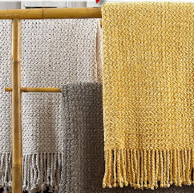
Use any kind of fabric behind glass, decorative panels, yarns (wow, that could be amazing!) shade material, take a fuzzy throw blanket, the list goes on. What textures you could dream up! I want someone to put a chenille throw blanket behind glass and then send me a picture when you do, please! 

Kitchen Design Inspiration at the Flea Market

I probably have access to one of the best flea markets anywhere, on the upper west side of New York in the mid 70s on Columbus Avenue, so there's not much need to do deep searching for great finds, I admit it! Regardless of my good fortune, it's worth it to do the searching at your local flea markets and garage sales to find those great deals on items that can give a fresh look to your kitchen.

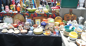
Come on along with me to the flea market I went to the other day. You may have seen those very modern dish arrangements on walls, often using vintage dishes. Many of the dishes you can find are inexpensive - LOTS of bang for the buck. This table's treasures are from A Vintage Home.


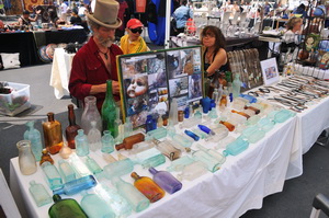
Start a new obsession collection! My husband and I both enjoy our stop at the bottle man's table. You can get very old bottles for as little as $10, maybe even less. We have a nice collection now and purchased one at this last trip...this one with a top on it, unusual! Our collection used to be on the long window sill in my previous kitchen. In my new home, they are all on a tray in the dining room. Hmm, I don't have this contact at the moment. If anyone is interested, let me know and I'll try to find it. I think there might be a website.


Here is a collection that you don't see every day...working vintage toasters! This is a small sample of what was on display. I think these are super cool, high art and functional all wrapped into one. They are beautiful pieces of history. Excuse me while I go put my gown and lipstick on...go to Toaster Central.


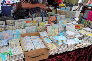
Another very fun kitchen find were these decoupage handmade tiles. These are tiles made from maps! I can see this in a retro kitchen, complete with soda fountain bar stools! They can be used as coasters, as they can also have a cork backing if desired. Not good for behind a cooktop or range, but elsewhere, they're fine. Contact: wendyola @ aol.com


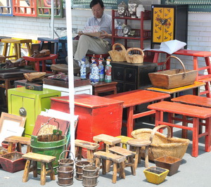
Not really last, but all I have time for now is this fantastic exhibit of asian accessories, many of which can be useful in a kitchen or just for decorative purposes. I mean, here are your color accents! Here are your shapes and forms. Let your imagination run.

For another teriffic New York City source, go to the Housing Works auctions...see what are in the windows of the various Housing Works thrift shops. "Housing Works is committed to ending the twin crises of AIDS and homelessness. We believe that all people have the right to a rich and empowering life."

A great note to end on...shop on!


Swedish Rag Rugs For The Kitchen

You know what is a great accessory in the kitchen? A rug! Change it when you're bored, change it by the season, by the trends, or don't change it at all - keep it as a faithful companion (well, almost.) I really like to bring in some sort of softness into the kitchen if possible, something of comfort preferably. With so many hard surfaces in a kitchen, something soft, even one item, can impart a relaxed feeling.

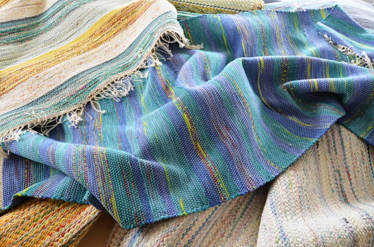
I'm focusing today on Swedish style rag rugs because it's my guess that you may not be aware of this distinctive type of rug. It is a style I happen to love, one that will not be found in Pottery Barn, Crate & Barrel or Room and Board. For that reason alone, I really want to share these with you.

Most of the Swedish rag rugs you will find are vintage rugs, although some are new, depends on the source. I have 3 and I'm almost afraid that next time I go to some antique shops in Denmark, I'm going to collect a few more (with me, sometimes a collection turns into an obsession!) I had one at the outside entrance to my office and it had been in place for over 10 years with an occasional washing. They wear like iron! Of course, you can also find many beauties at our web shop: Scandinavian Made

Now, in my new home, maybe tomorrow, I'll find the rugs I own amongst the remaining boxes of our belongings and will put one in the kitchen and place the other two elsewhere in the house. The prices are very reasonable, considering they have a wonderful vintage look and are in great shape. I guess I like them because of the texture.I like them better than the typical American rag rugs.

Pairing one of these rugs with a collection of sleek surfaces and another few textural objects would make a strong design statement for a modern point of view. Very cool....especially if you can find one in this year's trendy yellow! However you want to express your style, there is a rug design for you.

What do you think? Do you like them?

Happy rug hunting!


French Country Kitchens - Tour de France Inspiration!

As you may remember if you've been a reader for some time, I LOVE the Tour de France!

I never paid much attention to the Tour until our son took up cycling in a very serious way, with dreams of riding in le Tour himself one day. That particular dream has been replaced now, but it was very much alive for a few years. And so it goes.

But, watching the Tour is now a fixture in our home. It's a beautiful sport, one of the most beautiful, I think. Combined with the incredible scenery, the colorful jerseys, the huge pieces of artwork in the farm fields as tributes to the tour, and the magnificent look of the peloton, not to mention the aerial views, I recommend it highly. it's on the channel Versus for the next 3 weeks until the triumphant entrance into Paris.

SO, in the spirit of the Tour and the beautiful tour of the French countryside, let's look at some kitchens. I think we can learn many things from looking at authentic French kitchens.

We get out of our comfort zone

We see new ways of looking at color and texture

We see new ways at looking at form and function

At other times during the Tour, I'll add more images of French kitchens, both modern, farm country kitchens, and formal, elegant kitchens as well.
And, tell me what your likes, dislikes, opinions on these kitchens. Have fun!! Want to rent a French chateau? Images are from Just France.

Randomly Gorgeous Kitchen Styles

Hi dedicated readers and new ones too. I'm feeling a little fluid in the aesthetic part of my mind today. We're in the city this weekend, which always makes me think more specifically about the coming kitchen renovation, and now, more and more, in terms of style, theme, the general look and feel of the room rather than the mechanics of the kitchen, for now. Once the wall came down, it opened up more than the physical space, it opened up questions about the entire space, as I said before.

Short note...my husband further cut the half wall down below the countertop. Looks even better. As we speak, he's removing some soffit pieces (as quietly as he can,) 

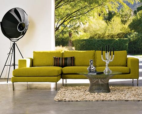
So, I move to questions of style, as I surprisingly came up with the plan for a 12' sofa the other day! I didn't expect THAT, but we're on board with it.

Having a home on Long Island, which is somewhat eclectic in style, more of a soft contemporary, very soft, with more of a touch of an artisan feel than a contemporary feel, I'm thinking, what look do we want in the city?

Our instinct is to go beyond our comfort zone.

We're liking very clean lines, at least one burst of color, perhaps bright white walls AND painted floors, and, as always, pieces of artwork that are stars, not supporting players.

Yet, when I go on Desire To Inspire, which always inspires me, I see these kitchens, some which are so country in their feel, that are stunning as well! Nonetheless, I think we're still leaning toward more modern, a bit eclectic, a bit artisan, that's where we seem to be headed.

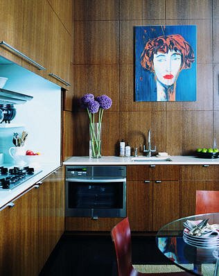
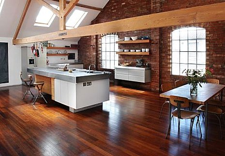
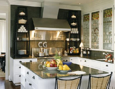
Here, then, are some randomly gorgeous kitchens...enjoy them. :) 

OH...the last image is the sofa we're seriously considering, really, sold on. It's shown in a sectional, but we'd have it in two 70" sections, one a right arm and one a left arm. What you can't see is the fabric is quite textured. The image and the sofa is from Design Within Reach.  

But, honestly, what about you? Are you ever conflicted as to what style you REALLY love and can commit to? 

2205215652_5b9bc7e285_o.jpg 2204425477_249aca5046_o.jpg 2205215344_521a3b5ccd_o.jpg 2205215402_7305ebb9d6_o.jpg 2204425315_bcbb192c92.jpg 2204425343_b747aa8cb2_o.jpg 2204425595_16aa51b1cc_o.jpg 2204425629_ce0c804466_o.jpg 2204424821_ba3d030c2a_o.jpg

Kitchen Design Musings

I received a book in the mail as a request to review it, the other day, which I subsequently declined, for reasons not relating to what's written below. Being a kitchen design pro, and especially, a blogger focusing on kitchen design, I see MANY kitchens, many more than I ever did before I blogged. It's been great!

That part alone, to be exposed to new kitchen design concepts, day after day via my blogging efforts, again, has broadened my aesthetic horizons, leaving me, continually, newly inspired.

The vast majority of the pages of the book I was asked to review contained what I'd call "bread and butter" kitchens. At first glance, I found many of the images in the book to be either dated or uninspired, with a few gems here and there, for sure. On second and third glance, my instinct was further confirmed. I didn't care for the layout of the book, either. I've seen it all before. I had an immediate, "eh" reaction.

Then, another voice (there are many voices in my head) interrupted and said, "excuse me, are you a kitchen design snob? Are bread and butter kitchens of no, or little, worth?"

Interesting question!

I will leave you with that question, as I have to get ready for an appointment. The image, here, is of a kitchen I did about 10-11 years ago, which is typical of many of the kitchens in this book, although way too many images were nowhere near even this level of "nice" and should never have made it into the book. And, again, yes, there were those which were of great interest and innovation. But, those were few, and I wanted more from the book...

More later, as I contemplate, confront, and expose potential biases which may be lurking...stay tuned!

white%20kitchen.jpg


Kitchen Design Inspiration (Hamptons) Long Island Style

What a weekend! On Saturday, I dragged my husband to go to a seminar on green kitchen design in Princeton, New Jersey, Miele's headquarters. Let me tell you, their headquarters are absolutely gorgeous. Modern, colorful, beautifully designed. What a treat. The seminar was filled with great information, which I have to gather together and make several posts of shortly. Very informative and will report back shortly.

The seminar was over at about 1:30, and we began the drive back toward Long Island, over the beautiful Verrazano Bridge. When we were in the sort of beachy Brooklyn area on the Belt Parkway, I said, you know, part of me feels like driving to the Hamptons. My husband said, "let's go!" Crazy kids that we are, we did just that...into the remains of a hurricane which came fairly close to Long Island, resulting in wind and rain...very cozy, if not fun to drive in!

We stopped at a few great shops, and by this time it was around 4:30. I was immediately inspired! The first shop I went into, Schorr & Dobinsky Antiques, in Bridgehampton, had many French Industrial pieces...these warm metallic pieces which looked at once, modern, yet, old. Dining tables, storage racks, carts...I could absolutely see any one of these pieces, or more, in a kitchen.

On to the next store, Jarlathdan, in Amagansett, and I saw a coordinating island, which I was told may be from Ireland. That piece really made me stop, slow down, and admire.

Time for dinner, albeit a quick one. Dinner at The Laundry,  then a movie...American Gangster with Denzel and Russel Crow. What a great day!

Back to kitchens...there are pros and cons to these types of pieces. Find out about maintenance, check for stability/condition, and make sure the size is proportionate to your space. Other than that, pieces like this can add lots of charm. 

The images were taken by my iphone...not the best quality, but I did what I could with them. Oh...the huge root table base? On sale for $18,500, down from $25,000!


Color Trend - More Gray

gray%20wallpaper.jpgMore gray news here for home interiors, fashion, and it's seen everywhere. Blinkdecor calls it gray skies and shows interesting examples of what's happening on the (gray) streets. Beautiful wallpaper from Mod Green Pod.

Unrelated to gray, but I must show you these tiles, seen again at Blink Decor, which I meant to show you a few days back. Look at these, aren't they beautiful? Maybe not grays, but you need some color with gray, that's part of the message.  

And, take a look at who else, a favorite blog, Another Shade of Gray,  who has had a good few posts on gray paint, which is a great look at lots of grays, from warm to cool. Take a look:

here-it starts and continues

here, and

here, ok, and

here 

Coming soon, gray kitchens, and my thoughts on, should you or shouldn't you? 

Kitchen Wallpaper - A Guide

I talked with my blogging buddy, Linda, from Surroundings about wallpaper in the kitchen (wallpaper is BACK...big, bold, patterns and all.)  As the second part of our two posts on the subject, Linda adds some thoughts for you here. Linda is the owner of Chameleon Interiors, a design firm near Boston. Linda's been widely covered in the media, including on WHDH's "Room For Improvement." I'm a frequent visitor to her blog, and always interested in Linda's take on interiors.

"Hi Susan,

 
I've been loving all your recent posts on white kitchens - just fabulous! After the heaviness of the 70s, the overdone 80s and the granite/stainless monsters of the 90's, the sleekness of simpler white kitchens just feels so fresh and invigorating! One thing I've noticed - and love - is the use of bolder, graphic wallpapers in kitchens.

The right graphic can really enhance a blank wall in the kitchen - really balancing the space. I think the trick, however, is getting the scale just right.  A small overall print can feel overwhelming and dated (think cabbage patch roses). Bigger bolder prints are more contemporary and can make the space feel bigger.
 
The right print can also add depth and dimension - such as with a mural paper that draws the eye into a scene. I also like that a bold yet traditional pattern - such as a brocade or stylized toile - can add an ageless quality and soften the lines of a sleek space."
 
Thanks, Linda. As usual, you hit the nail on the head! It's much about scale and proportion.  Here are other factors to consider when thinking about wallpaper in the kitchen:
 
kitchen%20wallpaper.jpgScale: What size is the room? The size of any given wallpaper pattern will be viewed very differently in a small vs. a large room. Best bet? Get a sample, or buy one roll to see it in perspective.
 
Pattern: Is the cabinet design busy? The busier the design, the more confusing a pattern will be. A smaller, consistent, pattern may work best with busy kitchen designs.
 
Theme: How about your style? Do you want to create a constrast of styles between wallpaper and cabinet design or do you want continuity for your chosen look? For example, you CAN pair a minimalist, sleek, cabinet design with a rich, brocade, wallpaper pattern. It's the contrast of styles that is of interest. Conversely, sure, keep the theme flowing with a wallpaper that has a similar connection to the overall kitchen design.
 
Color: Here is where you can have fun, and change your look fairly easily. Take your cue from your cabinetry colors, countertops, and flooring. It really helps if you can visualize your final look from the very beginning. Your walls will play such an important part in your space.  Think about the impact of color hues, shades, tints, and color schemes.
 
Texture: Do you have little pattern, but lots of texture in the kitchen? Watch out for busy countertops, such as granite coordinated with wall coverings. Patterns/textures can clash. Alternatively, a grass cloth wallpaper may be just the trick to give your kitchen that very warm look, in what is often a utilitarian space.
 
Trends: Go for it! This is one area that I fully support riding the trend wave, if you are so inclined. You cannot change your cabinets or countertops so quickly, or appliances for that matter. Wallpaper? Absolutely, positively, express yourself! 
 
For more images of wallpapers in kitchens, don't forget to visit Linda's post on the topic, here.  
 
kitchen%20wallpaper%202.jpg
 

Antique Kitchen Cabinetry - Get The Look


kitchen-furniture-styles-01.jpg I saw this gorgeous image from one of my VERY favorite blogs, The Reclaimed Home, and I immediately knew I have much to say about it. For the moment, enjoy this beautiful kitchen. Later today, when things calm down in my schedule, I'll be back to talk about it in more detail. I'm crazy about this look (and it's not even my style.) More later...what do you think of this kitchen?

OK, I'm back.  Let's take this a step further. You want this look, but you really want it to look authentic, but you don't have the time or inclination to scour the flea markets and salvage yards, or if you do, you've come up with something, but not nearly enough to outfit a whole kitchen.

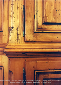
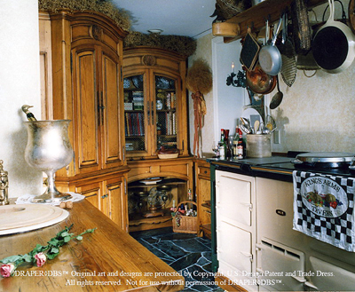
Rustic.jpgYou've got to know about Draper DBS cabinetry. Shameless self promotion aside, you just need to know what this company does. I took on this line of cabinetry for my clients because I was seeking authenticity...and I found it.  To me, authenticity is defined to be as close a replication to an aged patina as possible.

Draper DPS has worked with reclaimed woods, a great way to get a)  modern function and quality from new cabinetry and b) the look of antique cabinetry. Very wonderful.

They also (and truly, this was one of the biggest factors of why I needed to represent this company) hand plane their doors and other wood pieces on request. This means that the doors can have that slightly imperfect, handmade look. They have a variety of other distressing techniques as well. And, do you love that well worn painted look? Draper DBS has that too. Fourteen coats of paint later, a labor intensive process, you can get that multi-dimensional, sort of rippled look that is charming...and authentic!
Draper%20DBS.jpg 

Kitchens and Color = Spirit!

Breaking News! Interrupting our regularly scheduled green series (again), I had to show you this. I felt like I hit paydirt when I checked one of my usual sources for decorating inspiration, Domino. Wow, take a look at Domino's reader's entries for their first decorating contest. This category is kitchens and dining rooms. You will quickly see that Dominos' readers are NOT afraid of color, texture, or decorative details! How great are these??

It's always so much fun to look at "real" kitchens, especially when you see real individuality in the design. I see spirit in these homes, and that's a special ingredient for a kitchen design that is always worth pursuing. Five finalists will be selected, and will be presented on October 23.  Good work, readers!

Tip: While you're at it, check out the Renovator's Diary blog, by Brooke Williams, also on Domino. I've linked to September's entries, a good look at Brooke's very interesting kitchen.  

 domino.jpg