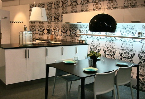
I talked with my blogging buddy, Linda, from Surroundings about wallpaper in the kitchen (wallpaper is BACK...big, bold, patterns and all.) As the second part of our two posts on the subject, Linda adds some thoughts for you here. Linda is the owner of Chameleon Interiors, a design firm near Boston. Linda's been widely covered in the media, including on WHDH's "Room For Improvement." I'm a frequent visitor to her blog, and always interested in Linda's take on interiors.
"Hi Susan,
I've been loving all your recent posts on white kitchens - just fabulous! After the heaviness of the 70s, the overdone 80s and the granite/stainless monsters of the 90's, the sleekness of simpler white kitchens just feels so fresh and invigorating! One thing I've noticed - and love - is the use of bolder, graphic wallpapers in kitchens.
The right graphic can really enhance a blank wall in the kitchen - really balancing the space. I think the trick, however, is getting the scale just right. A small overall print can feel overwhelming and dated (think cabbage patch roses). Bigger bolder prints are more contemporary and can make the space feel bigger.
The right print can also add depth and dimension - such as with a mural paper that draws the eye into a scene. I also like that a bold yet traditional pattern - such as a brocade or stylized toile - can add an ageless quality and soften the lines of a sleek space."
Thanks, Linda. As usual, you hit the nail on the head! It's much about scale and proportion. Here are other factors to consider when thinking about wallpaper in the kitchen:
 Scale:
 What size is the room? The size of any given wallpaper pattern will be viewed very differently in a small vs. a large room. Best bet? Get a sample, or buy one roll to see it in perspective.
Pattern: Is the cabinet design busy? The busier the design, the more confusing a pattern will be. A smaller, consistent, pattern may work best with busy kitchen designs.
Theme: How about your style? Do you want to create a constrast of styles between wallpaper and cabinet design or do you want continuity for your chosen look? For example, you CAN pair a minimalist, sleek, cabinet design with a rich, brocade, wallpaper pattern. It's the contrast of styles that is of interest. Conversely, sure, keep the theme flowing with a wallpaper that has a similar connection to the overall kitchen design.
Color: Here is where you can have fun, and change your look fairly easily. Take your cue from your cabinetry colors, countertops, and flooring. It really helps if you can visualize your final look from the very beginning. Your walls will play such an important part in your space. Think about the impact of color hues, shades, tints, and color schemes.
Texture: Do you have little pattern, but lots of texture in the kitchen? Watch out for busy countertops, such as granite coordinated with wall coverings. Patterns/textures can clash. Alternatively, a grass cloth wallpaper may be just the trick to give your kitchen that very warm look, in what is often a utilitarian space.
Trends: Go for it! This is one area that I fully support riding the trend wave, if you are so inclined. You cannot change your cabinets or countertops so quickly, or appliances for that matter. Wallpaper? Absolutely, positively, express yourself!
 Scale: What size is the room? The size of any given wallpaper pattern will be viewed very differently in a small vs. a large room. Best bet? Get a sample, or buy one roll to see it in perspective.

