20 Tips To Prepare The Kitchen For Resale

With so many homes for sale around the country, due to the current mortgage crisis and general home value downturn we are experiencing, how can you set your home apart, particularly the kitchen, the heart of the home, to appeal to a prospective buyer?

Warning, some ideas may seem obvious, but as I peruse images of homes for sale, they bear repeating. This assumes that big ticket items in the kitchen will not be replaced. Perhaps I'll do a post on replacing bigger ticket items in the kitchen for resale. Don't miss the tips noted on showing your home - super easy tips with instant results!

  • When showing your home, turn on all the lights in the kitchen
  • Clean the windows inside and out as well as window treatments if necessary
  • Declutter your counters. I'll say it again. Declutter your counters!
  • Clean and organize the interiors of your cabinets - people will look inside
  • Pay particular attention to organizing a food/pantry cabinet - this can look surprisingly good if shapes and sizes are arranged well
  • Clean your floors
  • Do touch ups wherever you can - walls, floors, cabinets, etc.
  • Declutter your collections. Again...declutter your collections!
  • After decluttering counters and collections, take a fresh look and add in a very few items if desired. Those items should be proportionate to the space. Do not put a small item on top of cabinets, use a larger item for better balance and proportion
  • Make sure your picture(s) of the kitchen includes a wide angle shot and the kitchen is neat and decluttered
  • Your image should be of good quality. Do not submit it if it is blurry or otherwise inferior in terms of exposure, etc. Ask others for opinions on the quality of the images
  • Include windows if possible in the kitchen shot
  • When showing the home, bring in fresh flowers for the table from the garden, or cut greens of some sort from the back yard, if you have one
  • Remove all the magnets from the refrigerator
  • Clean the ovens, cooktop and microwave!
  • Clean the sink and surroundings! For a showing, move the soap bottles to inside the cabinet, clean the sink and drain baskets and keep it "all clear" around the sink
  • Clean the refrigerator!
  • When showing the home, move the piles of mail, papers, etc.
  • Touch up paint trim on window and door casings, and other moldings
  • If desired, "stage" the kitchen just a bit for a showing...a good looking table (if the table is in poor shape, use a tablecloth) set for a meal, perhaps with a centerpiece, a bowl or two of green apples on a countertop, other fruit, a big bunch of fresh basil in a vase near the sink, a basket of potatoes, just do not overdo it


Take a look at this image of a kitchen on an online listing. It's potentially a very good shot, very impressive and updated kitchen, but who can see a thing? I think there is too much of the staircase in the image as well, the whole image being somewhat crooked. Make a little more effort for much bigger rewards.


I feel better about the next image, but it could have been aligned much better. Try, too, to use a sharpening tool in your images. That will go a long way. The counters are nice and clear. Maybe a large gold bowl or other object could have been in the foreground. I would have removed the coffee pot near the sink.


Relax, and wait for the offers - they're coming!


I'm (Kitchen) Floored!! (Again!)

Had you there for a minute!

I've talked lots about the lightness in Scandinavian kitchens. Light tones are seen in many kitchen materials such as walls, cabinets, countertops, backsplashes and so on. But, I think what is, really, a very cool look, and one that is very UNcommon here in the U.S. are super light floors as are often seen in Scandinavian kitchens. There is SOMETHING about a light floor, and I'm not even sure I can express what it is, but I'll try.

I think light toned floors contribute a number of interesting attributes to a kitchen design:

  • The space appears larger than it really is.
  • If the walls are light as well as the floors, the space seems to float, almost suspended, and there is a flow to the space that, in all light tones, almost defies description.
  • If the large elements such as cabinetry, are dark, the expected contrast is reversed and is a very cool look.
  • The space looks clean! One may want to choose an imperfect light floor, so the inevitable nicks and spots are not so offensive.
  • In my opinion, it is, at once, modern and elegant.
  • The light reflecting work of a light floor contributes to well being, especially in the winter months 
  • A light floor helps reduce the need for artificial lighting, a good green solution.

What do you think of light floors? Me, I'm crazy about them! If I didn't have red oak in my kitchen/family room area, I'd definitely bleach it, but it comes up pink. MAYBE, I'll paint them. Here you go, what do you think of light flooring?

KBIS 2008 - More Pantry Love!

From KBIS, I have too many fun images of organizational finds for the pantry not to share them with you, so there is more for today. And, if you're like me, I think it's so much fun to discover new ways of organizing (yes, FUN.) Keeps the insides of our cabinets interesting, so that they, oh let's take a stretch here, do their JOB to amuse their pantry masters, right? Not to mention adding efficiency to the mix. Poor pantries, SO much work to do! I think my own pantry definitely needs therapy, it's so mixed up...

Here we go again. Would you prefer this for your corner wall cabinet (it pulls out!):

Knape%20and%20Vogt_42.jpg


OR THIS....! No contest!

Knape%20and%20Vogt_2a.jpg


Also from Knape & Vogt is this super handy pull out tray divider...

 Knape%20and%20Vogt_8a.jpg


From Rev-A-Shelf, new (as all these products are) for 2008 is the answer to your pan storage...

 Revashelf_21.jpg


Here's a cool corner solution from Sidelines

Sidelines_3a.jpg


Also from Sidelines, a neat wine/bottle storage device/piece/unit/thing

Sidelines_4a.jpg


And now for the fireworks images!!! Again, from Sidelines, and you'll see a variety of organizational solutions for closets and for kitchens and anywhere else you need to organize your stuff...enjoy!

sidelines%20a.jpg Sidelines_8b.jpg

My Midlife Crisis ... In The Kitchen

Not a crisis, it sounds so dramatic, but a period of transition, yes...honestly...as a kitchen designer, that is. I'm no longer so concerned with the kitchen triangle, and haven't been for awhile. For the most part, the kitchen triangle is fading away in relevance. Why? Because of several things:

  • a client's increased confidence in expressing one's preferred work habits (a good thing)
  • the introduction of so many different shapes, sizes, and types of appliances in response
  • designing multiple work stations into a kitchen
  • multi generations cooking together as fun rather than as a task
  • the kitchen becoming even more the center of the home, attracting people like ants to a picnic

But, it's funny, the thing that is really making me totally rethink the kitchen is its role as a social place. We've all read the magazines talking about the kitchen as the "gathering place." We've heard that for years, and there is the island with a few stools, etc. etc.

But, my eyes have been opened even further. I now find myself thinking far more about social interaction in the kitchen design phase, putting its importance right up there with other functional issues as well as aesthetics, which they do at Hansen, and in a big way. There is more to this philosophy, but, as you know, I will go on forever if I say much more. 

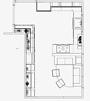
Here's the point for today. Remember this kitchen I told you about? I found myself designing in more opportunities for social interaction, with the occasional traditional thinking thrown into other plans, which many people enjoy. Today, I met with my client, and this is the plan she chose, just below. It was my favorite, but I'm not always asked what my favorite plan is, and do not offer it unless asked. It's subjective, after all.

Every plan has its pros and cons, and this is no exception. In fact, the social kitchen, often with large and/or multiple islands, does sacrifice storage. That's the way it often is. But, the critical question...do you really need all that stuff? In this case, we reclaimed a large wall just off the kitchen for needed storage space. At this preliminary point, it's all about shapes, forms, aisles, and appliance locations, really nothing more. There were others, but these are most of them. In one case, not shown, I put the cooktop in the bay and took out the rear window to have the sink closer to the cooktop in a different plan. Remember, function, social, aesthetics, the order of each is yours to define!

Island%20Plan.JPG

Dream House Diaries March Toward Mediocrity

One more post about the New York Times blog, Dream House Diaries, just one more! And, if the link does not work down the road, this is what the blog was about. A couple from up north builds a house in Florida, spending close to one million smackeroos, double, from what they first planned on spending, land and construction, included.

Here's the bottom line: In the course of spending one million smackeroos, they got a builder's kitchen in their march toward mediocrity (and obvious design flaws.) So, the lesson for the day, for this blog, for those who are about to spend thousands on a kitchen, is this:

There are different types of kitchen designers.

That's it, end of story. Alison and Paul were told this little nugget of wisdom, and they did not listen. As a result, there are so many flaws in their kitchen, I won't bore you again with the list. Instead, I'll go positive and tell you, basically, what's out there.

Low budget for new construction/remodels

Home Depot, Lowes, and your builder's kitchen "connection" come to mind first and foremost. But, that's not the end of the story...For you, you also have this option below...see the next category. If your kitchen is designed in 30 minutes, even 60 minutes, run away. This long term purchase deserves more time than an hour, no matter how nice the person is behind the computer. The business model here is about speed. And, you're not getting the best deal either.

Middle end budget for new construction/remodels

Here is where the local mom and pop kitchen and bath stores come in. They are everywhere. In my market, there is a saturation of them. They work hard, provide good service, care about their clients, go to the jobsite, do creative work, as compared to the big box stores, and as a result, increase the value of the product you are purchasing. Many of these firms will carry a very inexpensive line that the first budget category needs, but with added value to the services than are found in the first category.

Upper middle budget for new construction/remodels

These independent kitchen and bath firms may carry products in the next lower budget category noted and will carry even higher end products, offering even more services to their clients. Most of their work will be in this category, but they may be very willing to take jobs in a slightly lower budget range. Some will, some will not. The products are middle to higher end, and oftentimes the creativity continues upward as well.

High end kitchen design firms for new construction/remodels

These firms carry the best, or nearly the best (not always, oddly) products and generally offer even more detailed design work, devoting a good amount of time to your project. In theory, these designers work with a higher level of creativity, offering products that may not be able to be found elsewhere. Sometimes they have a product line that is somewhat less expensive. Some will take projects in the upper middle budget category, depending on their interest or work load. Their pricing is usually competitive with other equivalent firms and with the category just below. Thus, interestingly, a superb value is often found in this category.

Of course, there are other ways to buy and design a kitchen, but what I am speaking of here are the engines that drive the kitchen and bath marketplace, and how it is, in my mind, categorized.

I can be proven wrong by real life examples in any of these categories, which will illustrate that, as I implored Alison and Paul to do, one must carefully interview designers up front, to find the one that will provide the very best value, and be the right one, for their vision, their budget, whatever their main needs are. Look, interview, evaluate, find a good "fit."

The crazy thing is, many of these providers mentioned, offer design services for free. OR, those that do charge a fee, usually make it fully rebated upon purchase of the cabinets.

But, as I am speaking about Alison and Paul, here, they had this opportunity, they were told about better alternatives, and they chose the #1 solution, above, for the million dollar house. They got what they deserved.  The builders' kitchens are alive and well, I see, warts and all! What a waste. 

Lessons Learned From New York Times' "Dream House Diaries"

As I noted a few days ago, the New York Times blog, of which I was a "regular", has put up its last post. It's definitely bittersweet for me (I can't deny there are SOME emotions to seeing the last post, since I've hung in here for close to a year!) But, somehow, I think I'll be able to work tomorrow. :)

Here are the lessons that, I think, one should learn.

1. Plan in advance. As far ahead as you can, as soon as you are thinking about remodeling or building a home, start the process to find a kitchen designer. Alison and Paul's (the homeowners) builder told them to wait until the kitchen had a floor. That's...I can't find the words.

2. Find a kitchen designer - Take a look at this post for tips to find a kitchen designer. Allow for time up front, it may not be able to get done quickly.

3. Before you sign a contract, tell your builder you may not want to use his kitchen designer. Deal with that up front, and find out what sort of allowance will be rebated back to you. My take is Alison and Paul thought they would get a better deal with the builder's kitchen person. This is unknowable on their part, and I doubt it would have been much of a deal in the end. Not worth it.

4. Be aware that sometimes builders' kitchen designers are most comfortable with doing kitchens one way, and fast. Do you want that for a long term purchase?

5. Will your kitchen designer advocate for YOU...or for the builder? Alison and Paul had an issue with a large air handler which created a very bad aesthetic situation on several counts in their kitchen. Their designer should have been on the spot right away to come up with alternate solutions.

6. Be aware that even if you have to pay an upfront fee for a kitchen designer, in nearly all cases, the fee is refundable upon purchase of cabinetry. Extremely low risk and very much worthwhile to go this route.

7. Make sure the designer draws in surrounding spaces ESPECIALLY (did I say especially?) if the space is a great room. This was not done in Alison and Paul's case. As a result, the great room is a kitchen with a dining and seating/sofa area in it rather than a great room with a kitchen in it.

8. Make sure the dining area is drawn with chairs, the proper size table, all proper size furniture, and the spacing is gone over very carefully with you. Alison and Paul's great room is 44, maybe 45 feet long, with, oh, 9 1/2' allocated to the dining area. Yes, that's REALLY  a place that I want to hang out at. Maybe there is 4' between the table and the sofa on the other side of the space.

9. Note the window placement in relation to the dining table. In Alison and Paul's case, the windows have no relationship to a dining table. And, they are different sizes. It's just bad. They were warned.

10. Alison and Paul have acres of countertop, all of it one dark colored granite. Be aware of the impact of this type of situation.

11. Don't blindly put boxes on the wall. There are many other creative ways to design a kitchen.

12. Look at proportions and sizes of cabinet doors. In quite a few areas, Alison and Paul's doors do not relate well to one another, side by side and/or top to bottom.

13. Please think twice before you "default" to maxing out every possible inch for storage. The kitchen can look like another room, a lovely room, a real room. Do you really need all that stuff? If you do, and it's a great room, then be aware that there are alternatives to all those.....boxes. Creativity takes time. Give it time and understand that the aesthetic nature of the kitchen should be given equal, yes I said, equal, billing, especially in a great room!

14. Just put the time in. Apathy breeds boring design solutions as well as outright bad design due to others' apathy, responding to your apathy.

Ah, I feel better. I've had so much built up frustration during the course of this blog. The apathy, the waste in this kitchen, really was unfortunate. And, again, ad nauseum, I'm talking the apathy and waste in the fundamentals.

Designing A Kitchen For A Large Space

I was recently hired to design a kitchen for a large space, which will incorporate two connecting rooms. The home has its architectural challenges, of which I could mention a bunch off the top of my head. Currently, in this huge kitchen, there is about 36" between the island and the main "run" of cabinets. 36" in a huge kitchen. That really makes sense...no, it doesn't.

Part of what I find to be a lot of fun, is when I go into a home, look at the existing kitchen, and I can see the thinking, the motivations, of the previous kitchen designer. I do enjoy making lots of mini observations, connecting the pieces, to figure out how and why the kitchen was created in its original form. And, I could be way off base, too, with my assumptions, sometimes, but, it's a fun, little, exercise. And, of course, one never knows who really drove a design, the designer or the client.

Here is the empty plan of the existing space. I'll tell you...you draw it out, put in windows, doorways, double check measurements, etc. You're done, after some hours, and then you stop, look at this (in this case, big) empty space in front of you, take a deep breath, and say, here it begins...turn on the inspiration, here we go, find the inspiration, find it, but don't force it, don't rush it, let it flow. Rushing tamps down creativity. Time breeds creativity. This point is sort of a red stop light, a pause, before the light turns green. It's an interesting feeling. It's a natural pause for me.

I do a variety of plans to suit a space. I've already come up with several plans I'm quite pleased with, thus this post. I've also cautioned the clients to keep an open mind (a really open mind) because what I'm coming up with is very different from what they have now! I'm excited about the possibilities for this kitchen and surrounding spaces. They will be able to choose the one plan they like from more than several they will be shown.

The existing kitchen is flawed. It is possible to design fabulous cabinetry in a ridiculous way, yes it is. What's wrong with their existing kitchen is:

  • the kitchen looks like it is boxes on a wall with no architectural interest
  • it defines the term "hodge podge"
  • it blindly makes all surrounding base cabinetry 24" deep
  • it's cramped all around the island
  • it's un-fun to work in
  • the appliance locations are wacky

I'll be creating a family room area in one of these spaces and will need to find harmony with an existing fireplace, a wall of French doors and find room for media, too, with an eye toward relating to a newly opened up kitchen on that end. I'll fill you in on the plans themselves, after I show them to the client, as well as which one they chose. How lucky am I to be doing this work? Even after all these years...

kitchen3.jpg

Here are existing kitchen images, notice the ins and outs and very small areas between very, very large, tall, pieces. Notice the sink is unconnected to other countertop areas. It just looks, to my eye, very disjointed, not making sense, any sort of flow.

 Kitchen%201.jpg

DSCF4361a.jpg

The VERY Latest Kitchen Design Trend 2008

This is truly breaking news, and truth be told, I am THE force behind what will prove to be a movement in architectural and interior design starting the moment this post gets published.

I predict what is already beginning to surface is this: Henceforth, and from now on:

There will be a kitchen in every room in the home.

If not a full size, then, well, something a little smaller, whatever, forget the details for now, I'm busy with the concept.

Kitchens are the nourishment, the heart and soul of the home. It is the most important room in the home. It is SO important, that it only makes sense to expand the concept! The advantages are really where our society is moving, anyway. Here are the advantages:

  • maintaining one's privacy-once and for all! You know all that privacy talk you hear? Now, there's one more way to be private.
  • have your own stash of food
  • decorate the kitchen however you want - seek out and express YOUR inner kitchen
  • design it to suit YOU, functionally, not for a group such as that family concept thing. Want the sink between the refrigerator and the double oven cabinet? Go for it.
  • the appliances are your orchestra and you are the conductor-cooking alone has its advantages.
  • you wouldn't have to unload a dishwasher filled with other people's dishes
  • with the kitchen in a living room or library, one can theoretically be on the social floor of the home but still be alone, that is, if hours for your use are posted in advance and doors are in place to seal the room off
  • you can happily combine cooking and YOUR choice of accompanying media. No more music/tv controlling people in the kitchen
  • you cook what you WANT, not what you are told to cook. She likes tofu, he likes meat? See ya later.
  • everyone ends up in the kitchen...what's so great about that? Crowds? Fighting to be heard? So not fun.
  • you have to eat three times a day, too frequent to have to stop what you are doing and go to another room
  • kids? Playtime is learning time...they need to have the kitchen in the place in the home where they learn the most...in the rumpus room. They'll figure out how the appliances work - kids are curious! 
  • no more topics of discussion you don't care to be included in, no more worries about being invited to join in a conversation, finally.
  • you know that person's laugh you can't stand? Finally, no more laughter in the singular kitchen.
  • no more exhaustion of relating to one another - it's OVER.
  • with all these kitchens I'll be designing, I'll finally be rich, I tell you, RICH!

Hold your applause...There are, indeed, many more compelling reasons to proceed in this direction. Thus, I am beginning an association called the following: The Anti-Kitchen Kitchen. No, that sounds too negative...


April fools!

:)

A Dream Kitchen?

I started reading the New York Times' blog, Dream Home Diaries, late last spring.

Let me say that I truly wish Alison and Paul, the homeowners who built a home in Anna Maria Island, Florida, the very best. I hope they love their kitchen, that it works well for them, and I wish them all good things in connection with their home.

I've been a regular on the Dream Home Diaries blog on posts that had to do with the kitchen. My motivation was to help out Alison and Paul, who asked for help, admitting to being completely clueless to building a home, as well as educating the public at large. Many of us helped out. What a great resource of information (and smart alek-y and snarky comments) they had before them. Man, this blog is so entertaining, I'll be sorry when it's gone.

I found myself feeling quite annoyed at times at the authors' complete lack of response to my and others' advice. Advice on fundamentals! Let me give you an example. Alison wrote that John, their builder, recommended that the kitchen not be designed until the plywood was down in the kitchen and then one could mark it up to feel the space.

I've never heard of anything so ridiculous in my life from a builder of a custom home. And, at that moment, the builder will be screaming for rough ins of electric and plumbing. I, and others, oh what's the word, valiantly campaigned to the authors to get a kitchen designer NOW...and I offered specific advice on how to hire a designer.

Unbeknownst to anyone else, I offered my own services way back (not free) because I was so concerned that the kitchen plan was simply not being attended to...and it really bothered me. I wrote and said I would not wish to be known in the blog as the designer, but I'm here if they needed me to step in (which was before they got a designer.) It was a brief, but sincere, offer, which was met with no response and was not published. I have so many complaints about the way things were done by the authors, I won't even bore you with it, I promise. And, my general negative attitude throughout the blog about how this kitchen design process progressed had nothing to do with my rejected offer. Anyone who has read my subsequent impassioned posts know that I care a great deal about the value of making the most of the time available pre construction...as time breeds creativity, attention to detail, and a whole lot of other good stuff.

The bottom line is that, given the amount of money they spent on their kitchen ($60,000?) I feel it was wasteful, very much so, to not have hired a kitchen designer early on, to have had the luxury of time to plan their "dream home" kitchen and not to make use of that time. If you take a look, you'll hear me whining, cajoling, almost pleading at times to pay attention to this or that. Although, educating the readers was always a goal as well. It's really funny how into their kitchen process, or lack thereof, that I got!

Also, one thing to remember is, what looks shiny and new doesn't necessarily mean it's fundamentally sound design for the kitchen as a separate entity or for the architecture it is surrounded by. But, it's their kitchen and they are the ones to be happy with it, no one else. But, they could have known so much more along the way....

This blog gave a lot of us lots of raw emotions from time to time. I also laughed, got impatient, angry, and always hoped for the best. Take a look before it's gone...

dream%20home%20diaries.jpg


Random Kitchen-ness!

I'm sorry I haven't been around! My head has been moving in other directions...moving from one client to another plus a bunch of other work related stuff.

So much to say, I'll never say it all! One thing I can say very enthusiastically... I find this to be the best time in a very, very long time, that, really, all the kitchens I am working on are interesting, aesthetically challenging, and all kinds of other good stuff. I'm loving my work. I'm enjoying my clients. I'm really revved about all of what I'm working on!

Let's take Grace. As I said, we installed most of the kitchen and Grace decided, after some time, that she just didn't love one section of the kitchen. And, she wanted to design an entirely new and different wall (in the upper section, the base cabinets would stay). Luckily, what she decided NOT to use was not a large financial loss. So, I came up with another plan, which Grace loves. The left side of the elevation is opposite the dining area, the right side, opposite the main kitchen area.

What's the message here? I think it is, that if you can't live with something, and you're willing to change it....change it. Don't freak out. Go with the flow and see where it takes you. The answer is different for everyone. This will be ordered shortly. New%20Wall%201.jpg

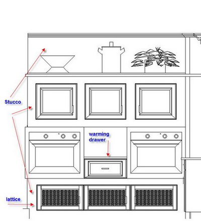
Here's something else I'm working on for another client. It's just one small wall of a BIG kitchen, a Kosher kitchen. I think it's cool.  oven%20wall%202a.jpg


And, one more random note, not really about kitchens, that's why it's random! Run over the Surroundings where a contest is about to begin for a very cool lamp. Free is good, contests are fun, and you really should check out Surroundings in any event! The lamp is from the Jonathon Adler collection.

Be back real soon, I've missed blogging and think of it every day, it's just been hectic!

My Day So Far...What Kitchen Designer Dreams Are Made Of

IMG_0899a.jpgOh, disregard the last part of the message...I just felt compelled to write that, and I'm feeling punchy, lol! So, here's my day so far...

3:45 AM - I can't sleep, no big reason, but now that's it, I'm awake. Reach over for the laptop (it's ALWAYS fired up) and start the day...

5 AM - Down in the office, easing into the day...

6 AM-7:30 AM - I've been asked by a prestigious architectural firm to submit a proposal to include kitchen and bath furniture for a "green" complex of apartments in Washington, D.C. so details back and forth.

8:15 AM - A meeting with a new installer. We had some good conversations in the past few days, but the in-person meeting is very important. How does he look/dress-is he neat? What does his truck look like? Is he messy/organized? Another couple of pieces to the puzzle. I found that this man has a smile even when he's not speaking and almost always when he is speaking. Looks like a very positive person...I like that. Beats the alternative.

10 AM - Met clients at the granite fabricator/granite yard. This is a case where we bought the granite at one yard and another company will fabricate it. The clients (with my help) very carefully chose the granite in December. There were few slabs left. It's gorgeous! And, it's not to be found again, gone forever.

IMG_0900a.jpgAs we walked around the yard, our granite was nowhere to be found.  

I don't know about the person in the yard with us, but my clients and I were silently getting really nervous. The fabricator asked if I was sure they had it, and I said "you have my money, so you should have it!" The fabricator skirted all around, where it could be, yadayada, and my client, the wife, finally spotted my name on it! Just a little drama. We were there to choose a second granite to go on a few different areas of the kitchen, with the busy granite on the island. It will be beautiful.

12-4 PM - Variety of office work...I successfully negotiated downward to have cabinets unloaded from a truck to go into my client's home, and it takes 45 minutes to an hour. $300?? Come on, no way! 

Made a list/picture of window specs so windows can be ordered for a client. I could only go so far, because a few details are unknowable to me, and this contractor may complain, but, he should be able to fill in the blanks where I left off.

Emailed with my son, who is soon building me a new computer. Can't WAIT to get it.

Talked to two press people, one who is doing a story on Hansen, another who is doing a small feature on me, locally, and who gave me ominous news on the state of the newspaper, previously, a very large newspaper. A sign of the times.... 

And, I did other stuff...now, I have the tv on (I often put it on at around 4 pm, maybe later) and I LOVE this commercial, actually the music. Love it. Want to hear it? It really grows on you.   Ontario Travel 

DSCF4023a.jpgThen there's Sparky, our cat. He visits me now and then in the office. When Sparky visits, he plants himself on top of my calculator with his head and paws! Why? Because I'm frequently using the calculator, which means that I'm ignoring Sparky and he does not want that! He's funny.  So, I have to move his whole body over, and of course, he swipes at me with his paws. :)

5 PM Husband comes home with Starbucks and a chocolate biscotti... 

Spoke with my son for about 1/2 hour on computer specs.  I keep saying, "I want it fast!"

And, now, I'm gearing up for the LONG, second shift. I have a meeting tomorrow, 175 miles away, about 3+ hours, in Massachusetts, where I have a project. I'll leave at 4:30 am. I have to finish (I'm 1/4 the way through) a few electrical plans, just organize a bunch of stuff, samples, and then pack stuff to stay in the city for the weekend, convenient for my return from Mass. tomorrow, because Saturday, I want to attend the Architectural Digest Show!

You'll hear ALL about it! I hope I haven't bored you...just sort of rambling. Add to that, I finished a blog post!  

Changing The Kitchen Design In Mid Stream

Grace's kitchen project is, I guess, 2/3 done at this point. Here was the plan.  I think it was a few days before I left for Denmark in August, Grace didn't feel comfortable with the plan (the cabinets had already been ordered) so I told her to mar%20plan%20a.jpgcome by my office and let's figure it out.  I came up with an alternative plan after our meeting and Grace was happy. 

This entire general design reflect's Grace's desire to have continuous countertops everywhere, yet to keep things interesting over and under the counters. She wanted a sort of country/Tuscan feel, yet with modern conveniences. This type of style was what we were after.

FAST FORWARD TO LAST WEEK

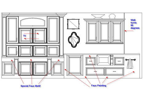
After mulling it over for some weeks, Grace decided to make a big change. She decided she didn't love the entire upper section of the elevation below, she wanted it all gone!

Fortunately, the arch and other built in cabinet next to it was made of plywood, destined to be faux painted. Yesterday, they were dismantled!

We talked about it on and off for some weeks. She lived with it and then said she's just not sure. I said, "Grace, it's plywood...it's nothing. If you want it ripped out, it's not a big deal at all."

So, it's back to the drawing board for Grace and I.  A big change like this does not have to be daunting, or difficult, or negative. In this case, maybe one cabinet will be sacrificed, and then just the plywood.  This IS a first for me, to do a major redesign after installation, but, again, the sacrifice monetarily is small, so why not? Grace must feel 100% about her kitchen in the end. That's all that matters. I'll update you on what we eventually come up with. I'll add some real life images of the kitchen shortly!

Descriptions: That's a tv cabinet under the arch. Under the countertop under the tv cabinet, those spaces would be faux painted with a special design. Surrounding the grid/rounded wall cabinet is plywood, to be faux painted. A wine refrigerator is directly below. To the right of the wine refrig. are cabinets surrounded by plywood, to be faux painted. And, that wide area to the right is the other side of a 90 degree turn.  

Arched%20Wall%201aa.jpg 


Decor8 Blogger House Party!

Decor8 is having a blogger house party, and I was tagged to do the virtual kitchen! As usual, I may be a bit late to the party, but it was fun doing it. OK, here's the client info:

Home owner: Young single mom (cookbook author) with a son living in a 18th century Georgian townhouse in Savannah Georgia approx. 2000 sq ft., 2 floors, 3 bedrooms (one is an office), and a large patio off of the kitchen. She loves to entertain, enjoys pastels and Swedish decor, decorating on somewhat of a budget but she can splurge on one expensive item per room. Loves pattern and feminine touches but can't deal with too much clutter.

Since I only had a few finishes to select,  I thought I'd go a bit further and design this kitchen from scratch, exclusively for decor8's virtual client.

Let's go with dessert first...the one special item chosen for the kitchen was a (pricey) 36" induction cooktop from GE Monogram. For THIS client, a cookbook author, it's a dream come true. The super high power burners with faster response than gas, green technology, and super safety attributes (thinking of her child,) won, hands down. She's psyched and ready to cook up a storm!

Interested in living green, where she can, the countertop is made of recycled materials by Avonite. The cabinetry has green components, is painted with low VOC paints, and her appliances are all energy star rated, all this just for starters. The kitchen was designed to cover all sorts of activities beyond cooking. Our heroine will be able to:

a. do the cooking in an "open" setting, gazing out toward her child or the lovely patio beyond

b. prep at the island as well with a great line of sight all around

c. clean up at the sink with a nice expanse of windows

d. have good, and quick, access to all of her cooking items, tools, and cookbooks on the open shelving section

e. communicate with her child

f. watch tv cooking shows easily

g. hang out in the seating area with a laptop

h. spend quality time with her child

i. Have storage addressed in a variety of ways, maximizing storage, yet maintaining an open feeling

Oh, her aversion to clutter? Once she saw the storage and access possibilities of open shelving, she loved the look! She may be storing items in decorative baskets on the shelves as a compromise. So, here we go! But, first, take a look again at all these really great ideas and inspiration in the other rooms of our heroine's home, over at decor8.  Thanks Holly/decor8, it was fun to dream for a bit....

And, let me obsess just a little more on the cabinetry. Look at the floorplan. It IS a very old, Savannah Home. Maybe we need to section off (in terms of a color), say, the sink base section, or the shelving section, and put another finish on the cabinets there. They could be a glazed, golden yellow finish, something like that. May go really well with the supersoft gray finish, shown below. Imagine for a minute...


And, here is a modern version of the informal, Swedish, cotton kitchen rug:

Recycled countertop has bits of yellow, lots of white, and a very interesting grain pattern, unlike most engineered stones

Yellow kitchen tools/accessories!

So, what do you think? Let's do a little more brainstorming. What do you like/don't like/would change, etc?

Participating bloggers were:

decor8, Creature Comforts, Style Files, Design For Mankind, Perfect Bound, Bloesem, SFGirlbyBay, AphroChic, Gracious Inspiration, Design Is Mine. and Making it Lovely.  and moi.

Ten Top Secret Kitchen Design Tips

It's all in the details! Who knows why, but I just started thinking of how small, pesky, planning details, if overlooked, can cause pain and heartbreak if not addressed. OK, "top secret" may be just a little stretch, but not by much!

I came up with these planning secrets, largely unknown to the typical consumer, off the top of my head, and trust me, there are MANY more that I must be aware of as I slowly and carefully go about editing a kitchen plan for the last time before putting the order "to bed" as I call it, at which time there is no more time for changes. The factory begins to produce the order, and the result of these planning exercises will be known....upon installation. It can be the stuff nightmares are made of, if only thought of, say, during cabinet production, or as a surprise, during installation!

Here are just SOME of the details I'd like to share with you:

 
1. Size (width) of window and door casings - If cabinetry must fit between, say, a wall and a window, the size of the window casing is critical. Likewise, cabinetry fitting BETWEEN window or door casings. Casings being changed? To what size, and how will that affect cabinetry?

2. Casings and moldings colliding - Will your cabinet crown molding and window or door casings collide? That's just not right! Check floor, cabinet, and ceiling junctures.

3. Is there adequate room on the wall planned for receptacles, primarily when one walks into a room? If tall cabinets align a doorway, would there be room/depth planned in for receptacles, even if they have to be cut into the cabinet side?

4. Backsplash height - What height is perfect for you? This is adjustable, unless it is driven by the height of a tall cabinet, but should be planned in advance. Are you short in height? Or, do you have tall countertop appliances? Another critical area to look at.

5. Floor level - Is your floor wavy, as most are? Are you designing in decorative feet, valances, toekick details, or columns, which reach the floor? If so, and the above mentioned items are too short, you will experience gaps, as the cabinets are first installed at the HIGH POINT of the floor...as the floor dips, that's where you see the gaps. The cabinets in the low points are propped up with shims so that the tops of all cabinets are level to receive a level countertop.

6. Microwave - Don't assume it can easily be built in snugly, for a great, tight, look. Many microwaves have trim kits which MUST be used or the warranties will not be in effect. I've not come across any microwaves that can be built in tightly, ever.

7. Large sinks - You love the large sinks, but beware of how deep they are front to back, and if undermounted, add the rim size to determine if your faucet will fit underneath the countertop. More and more recently, I am making sink bases deeper to accommodate these large sinks. This also effects adjacent cabinetry!

8. Cooktop and oven brands, one above the other - In this configuration, make sure you use the same brand of appliance. Typically, if two different brands are used, each warranty may not be in effect. A bad scene...

9. Downdrafts - Downdrafts are tricky. If you do not use the same brand downdraft as the cooktop (this IS typically allowable) the configuration underneath the countertop may not fit with the height or depth dimension of the cooktop under the countertop, making the combination uninstallable..something to check.

10. Where do your cabinets end on a wall? Me...I HATE little slivers of wall, say, 1-2". I think it's tacky. i like to leave at LEAST 3 1/2", more typically, 4" at least between a cabinet side and, say, door casing.

Kitchen Design Musings...II

Back to contemplating, confronting and exposing potential biases based on this post, regarding a book I was asked to review, in which my immediate reaction to its images was not favorable, having ended with the question "Am I a kitchen design snob?"

I am one who likes consensus, not to follow it blindly, but for the information value it provides. I look for consensus in my own mind, by reacting, then verifying what/how/why I'm feeling, sometimes over and over. It's sort of a "checks and balances" thing, and I'm sure many of you do the same.  Thus, the "kitchen snob" question came into mind to verify my immediate reaction, as I do in my design practice, to make sure my ideas and opinions a) are not too personal to me b) survive the "verification" process I give it c) have real merit. I torture myself! "The images are 'eh' " followed by, "Am I a kitchen snob?"

Each of us, whether professional kitchen designer, or consumer, have, and are entitled to, our opinions...but it's helpful to be open, at least preliminarily, to multiple sides of any issue.

Back to my reaction to the book. I'm a different person than who this book is directed to, and I think I forgot that, when I first opened it up and had a negative reaction to the images. I think each of these images represent dream details or dream kitchens to someone. And that's GOOD. To others, those who do not need to follow the "typical," (and there's nothing wrong with typical, seriously) it won't be satisfying. I also feel the image descriptions are too simple, without any "whys" connected to them, which could have been VERY useful. That makes me nuts, quite frankly. The whys are everything to those just starting their kitchen design journey.

But, regardless of what I or the author thinks, people will buy the book for their own personal reasons known only to them and may not even read the text at all. That's ok too. They may like a rug, or a tile, or a color, or they may read every word, keeping it nearby throughout their process. I think the book has value, but more attention to detail could have been taken in several areas. As a kitchen design professional, I'm bored by the images for the most part and disappointed by the information. Putting my consumer hat on, it has value for beginners in the process, yes. I'm choosing to be honest rather than polite, admittedly, not always easy to do, or enjoyable. I have a couple of other quibbles not necessary to note.

ANYWAY, the flip (positive) side to "am I a kitchen design snob?" is this: I'd say I'm on the right track, as long as I keep those checks and balances happening for the benefit of my clients, encouraging, yet not pushing (for too long!), allowing the client to decide what works for them, and supporting their choices in the end. This secondary reaction I had (the snob thing) is an example of the checks and balances in action..

I couldn't recommend this book for one sort of industry bias that is clearly noted in the book, and which is absolutely, positively, not a "must" for consumers looking to use a professional kitchen designer. The text in question adds confusion and influences consumers buying the book to go down a path that has no compelling merit to it.. Sorry to be a bit mysterious here.

This has been helpful for ME to put this into words, sort of a public dissection, and subsequent reaffirmation of my approach to  issues, as they arise, and what happens next. if it's aided as a nap inducement for some of you, that's good too! 

Kitchen Week At Design Hole Blog

Lots going on over at Design Hole, on my blog roll for a long time. Jennifer Mitchell, an interior designer, is quite intense about her work, and what she's doing this week on kitchens are, well, kitchens on steroids! Go and take a look, and while you're at it, take a look at my little chat on kitchen trends.  It's all very good stuff. All this week.


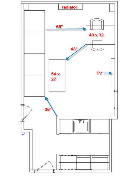
Meanwhile, I've played around with my apartment floorplan for a little bit. It's funny how taking a wall down makes one rethink the entirety of the space, not just the kitchen! That's what I'm doing, having had no previous intention to do that. I felt the furniture worked. Now I'm not so sure, and I never really loved the sofa against the half wall.

Here's the thing. My husband and I require, NOT the typical sofa and one or two chairs in our living space, as is found in nearly all apartments of our size. We need the ability to stretch out and gaze mindlessly at the tv, in between napping, doing computer work, or yes, even talking to one another! Stretching out is an absolute must and non negotiable. Forget a chair/ottoman, it's not really nap-worthy.

So, am I really crazy to consider a huge, I mean huge, sofa in this otherwise small apartment? I'm almost embarrassed to say the size of it. It's nearly 12' (yes, 12') long. Oddly, to my eye, it seems to work. We should both be able to stretch out at opposite ends. It would have to come in two pieces. Here's what I'm considering. I'm not afraid to go beyond what's typical, and sometimes, doing something oversized can be exciting, and in this case, MAYBE it would serve to elongate the room as well, especially if it's on legs and in a light color?

Tell me what you think, please! UPDATE: THE LOWER IMAGE IS WHAT WE LIKE NOW (WE'RE TOTALLY BUYING INTO A 12' SOFA IN A 550SF OR THEREABOUTS APARTMENT!) HUSBAND ENTHUSIASTICALLY AGREES!

sofa%20floorplan1.jpg


apt%20floorplan%202a.jpg

My Chat With Martha Stewart Tonight...I'm Not Kidding!

I bet that title got your attention! But, it's TRUE! Tonight my husband (the #1 Martha Stewart fan...our whole family calls her his girlfriend) and I went to Times Talks, tonight, a week's series of lectures by celebrated thinkers in the arts, media, politics, and more, organized by The New York Times and held in their new facility in their new, green, building in, where else, Times Square! We're in our city apartment for the weekend, a nice break!

Stewart was interviewed by Kim Severson, a very engaging and funny, New York Times food reporter. Martha Stewart talked about her typical day (breakfast is hot water and lemon (in the car on the way to the city), blueberries, and a hard boiled egg white.) After the morning shooting of her show, she stops all work for one hour, to do yoga and regroup for the second half of the busy day ahead, and ends the day watching David Letterman.

After the talk, there was a Q&A period. I had a question for Martha Stewart. I got up to the microphone and asked Martha Stewart if she had a hands on approach in designing her kitchens. Stewart replied that she has designed her kitchens by herself and was very enthusiastic about her love of the kitchen! Where the sinks should be, appliances, counter space, she knows what she wants.

Martha Stewart also said she really likes the convenience and accessibiity of open shelving. She said that the kitchen is the most important room in the home, even more important than the bedroom. She loves the kitchens that are designed in her KB homes developments.

Mistakes? I heard of one. Martha Stewart made her island in her East Hampton home too big, yet it was useful nonetheless. 

After the talk, there was a book signing, and my husband bought two books, Martha Stewart's Homekeeping Handbook, and a cookbook, which I'll update you on tomorrow. How lucky am I? My husband likes to keep a nice (and clean) home, it's a natural for him. A spray bottle and paper towels on the cover, he wants Martha's secrets! Stewart signed both books.

Oh, and when I introduced myself before my question and mentioned I write a blog, Stewart asked for the blog's name. I gave it to her at the book signing. Ms. Stewart, you're welcome to comment to this post!  It was a great evening! :)  

Everyone Ends Up In The Kitchen - Why?

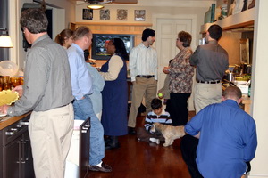
kitchen%20party.jpgYou know it's true...you say it yourself! "Everyone ends up in the kitchen!" I have a new theory about the "why" of it, actually two. We know it's a social thing, the kitchen is a magnet (obviously) to be around food, and people like to help, but it's more than that. I think the reason people enjoy being in the kitchen is because it's "real." You can let your hair down in the kitchen, be more real, more casual, roll up your sleeves and be more "yourself." Even a formal kitchen is still, well, a kitchen, and has far less of the "pretentious" factor than does the more formal living areas of the house.
Show me a fabulously dressed guest in the living room, and then in the kitchen, and I'll bet that guest warms up to the host and other guests just a little bit more quickly!

Beyond that, the other reason I see the kitchen as an attraction for guests is because kitchen tasks/activities allow people to be DOING something, to be involved, to feel useful. Perhaps guests feel they are at a different level of engagement with their hosts, being more of a partner with their host. And, working in the kitchen, doing lite duty, along with your host and other guests sort of takes the focus off of you and on to a team effort. It's fun, it's interesting, it's goal oriented. Hang out and be casual/social or get in there with preparation, there is something for everyone in the kitchen, as we see time after time.

Enjoy being in the kitchen this holiday season in whatever way works for you, whether guest or cook!

Next....Let's Get This Party Started! Anatomy of a Party Kitchen!

Dwell Videos - Design Perspectives

I was just approached by Dwell magazine and was asked to take a look at a series of three videos, featuring innovative design concepts, explained by the designers themselves from their personal and professional perspectives. The first video is by landscape architect, Andrea Cochran, second is an Airstream interior design by Christopher Deam, and the third shows a prefab house by prefab architect Michelle Kaufmann.

To me, good design is good design, and oftentimes concepts can freely move from one discipline to another. Andrea Cochran talks about layers in her design work, the juxtaposition of warm and cool elements, warm being, perhaps, lone plantings placed nearby strong, simple lines in the hardscape. It is a lesson for interiors as well, kitchen design absolutely included. It is a philosophy which is clean, yet not cold. 

Layers of visual interest are designed in, after the foundation of the design is created. This is what I tell my clients about their kitchen design...but, if possible, project forward toward that next layer of visual interest, to understand that the foundation, being simple, is often necessary. 

Take a look also at the Airstream video. You'll see a very interesting kitchen, which conforms to the Airstream's proportions and lines.

The prefab house by Michelle Kaufmann is a sustainable, healthy, home, meant to be able to be reproduced for mass accessibility in terms of cost, with the benefit of sustainable features. The kitchen can also be seen and uses a paperstone countertop.

Take a little time, open your mind to the design concepts and how they can be translated, learn a little something, and enjoy the beauty of these projects as well. Don't forget Dwell's new kitchen blog!