KBIS 2008 Sub Zero Cool!

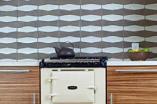
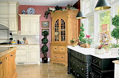
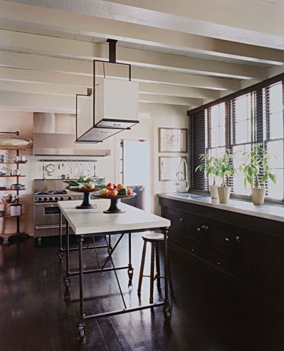
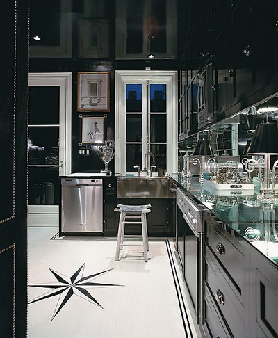
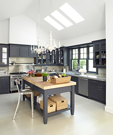
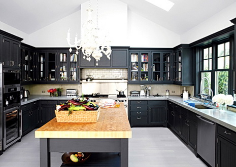
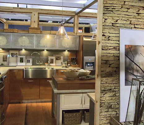
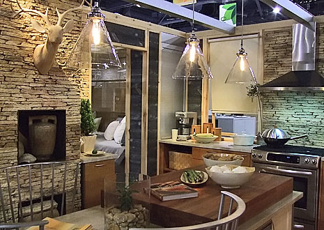
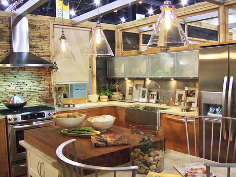
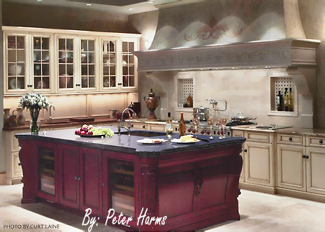
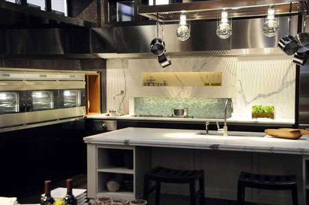
Always, one of the "must see" parts of the show is the Sub Zero booth. Sub Zero always has a couple of amazing, full size, kitchens, showcasing their products to the max! This year is no exception. There were two fabulous kitchens, and the first, by designer Mick de Giulio, follows. Take a moment to look at this slide show, and enjoy.

And, take a look at my blog posts for Glam Media, number ONE in reach for women online...

Talking about KBIS sinks!

And, a show overview here!

FYI...I'll be posting interesting information on KBIS for, probably weeks. So much I want to share with you. It's not old news a few days after the show. There's lots to share over time, and I'll work it all in when I can, in between my day job. :)

subzero512.jpg

2008 Kitchen Trends - Banquettes

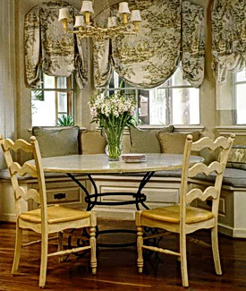
thin%20cushion%20banquette089.jpgThe next trend to talk about, for kitchens in 2008, as identified by Better Homes & Gardens,  in a trend report, sent to kitchen and bath designers, is the banquette. BH&G says they can accommodate a varying amount of people, they allow increased room for the dining area in the space, and create an intimate feeling in the space. They also site the ability for storage in the cabinetry configuration as a real plus. Image by BH&G.

My Take: I do agree. I've been doing more banquettes than ever! That said, my clients have wanted banquettes more frequently as a result of a simple idea I had for a "better banquette" This "better banquette" concept makes so much sense, yet, I hardly ever see it done.

First, let's give the old banquette with the 2" cushion a proper funeral, perhaps a joyous, and respectful, jazz funeral, as it's had a real long run in the world of built in (uncomfortable) seating! R.I.P.

The better banquette, taking its place, is about comfort!

Start with a much shorter cabinet height, approximately 14-15" or so. Typically, a standard cabinet height for a banquette is 18" high. Then, you have a 2" cushion. Out with the 2" cushion! What is far better is a 4-5" cushion. Make the cushions like a sofa cushion....comfortable, yet supportive. The word I use repeatedly is "cushy."

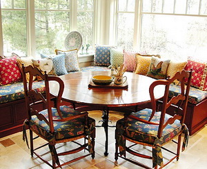
banquette.jpgA much thicker cushion will dramatically improve your, your family's and your guests' experiences and enjoyment at the dining table. Not only that, but, a thick, comfy, cushion will be a magnet for everyone to sit at, not the last choice. You'll want to prop up a pillow behind you with a laptop, pick up your feet and stretch out. It will become a first rate comfort zone. Your family and guests will linger and will be much more relaxed. I would like to have made the cushion in the image another inch thick, had I ordered it, but it's much better than the typical cushion.

I cannot advise you on what should go into the cushion, I'd love to have an interior designer stop by and shed some light on that. I only know that comfort trumps an uncomfortable seating area by miles!

Other than that, you can fit more people into banquettes when you need to. That's real versatility. Space in the room is clearly saved, often, an important factor. Storage is a plus, but should not be the driving force to design a banquette. And, banquettes look great in general...I love the "built-in" look. It makes a dining area have more importance, more architectural interest, in the right situations. Lots of great decorative opportunities.

IS it a trend? It may be, but I don't see it as a trend which may (ever, really) go "out." It's a fresh idea that can work well aesthetically and functionally in the home, thus, to me, it is less of a trend than a good idea in many situations. I wouldn't worry about this being "trendy." I don't see that...in the negative way.

For me, it's really all about putting my feet up and hanging out for a bit in the kitchen. Think comfort!

2008 Kitchen Trends - Lighting

Having just talked about 2008 kitchen trends, I received a little booklet in the mail from Better Homes & Gardens, just for kitchen and bath professionals, all about 2008 kitchen trends. Allow me to give you their predictions, and my comments.  Actually, I think I'll do one trend per post, otherwise this post will be way too long! First up:

LIGHTING

uploaded-file-37227BH&G says forget about lighting for the sake of function alone. Done, boring, over. The trend is for highly decorative (and functional) lighting anywhere and everywhere. Accent lighting, and decorative lighting fixtures, whether for task or general lighting purposes, will be designed into kitchens with more frequency this year.

My Take: I do agree. I'm seeing my clients paying more attention to my lighting ideas and suggestions (I almost always do a lighting plan) and being receptive to more and varied types of lighting in general. They seem to now get that lighting creates moods, it can change functional areas into more dressed up areas, and can create a variety of looks.

My Recommendation: When doing a lighting plan, let the type of lighting guide the type of fixture. Under cabinet lighting can easily be done with "green" LED fixtures, for example, as well as accent lighting, inside cabinets, as another example. Recessed lighting is a good foundation for general lighting and can be installed using flourescent lamps. Use dimmers, too, to save energy and create effects. Be aware of how much lighting you really need and where/how the lighting should be switched to conserve energy. 

To get started, understand that there are/can be three types of lighting in the kitchen: general (often, ceiling mounted lighting), task lighting (under wall cabinets, over an island, under a hood, over a sink), and accent lighting (lighting to feature a hutch, artwork or other decorative area.)

And, yes, have some fun with interesting lighting fixtures:

  • Hang several together at different heights
  • Use bright colors
  • Use interesting shapes
  • Hang pendants closer together than usual to have several appear as "one"
  • Be aware of lighting in stores, hotels, restaurants, other public places for fresh ideas
  • Add sconces that you would normally put in other rooms...they look great surrounding windows
  • Mix styles (carefully) and finishes
  • Ask yourself if you want the lighting fixture to stand out or blend in?
  • Be green and seek out antique lighting fixtures

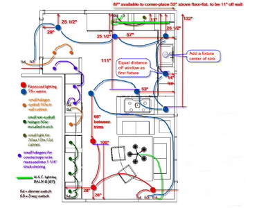
Trend Or Good Idea? It may be a trend, but it's also a good idea in general. The principles of this 2008 trend have been present in professionally designed electrical plans for years. It is a trend in which eco friendly fixtures can play a part too. One can also follow a general design trend if desired and later, change a fixture in favor of another look. Here is an example of a preliminary lighting plan I did (below.) Let there be light!

uploaded-file-06262


Kitchen Trends 2008 - What's To Come?

Do kitchens really change that quickly, from one year to the next? Should we be looking for trends for kitchen design in 2008 and discard what we saw in 2007? What new things will we see for 2008? What do we look for and where do we look?

uploaded-file-41514Progress is a good thing. Progress brings us new ideas, new solutions, a fresh, creative, look at familiar, comfortable, and sometimes, boring, or cumbersome, territory. Often, progress evolves into a trend. Here's where it gets tricky.

Trends, to me, are singular ideas, seen with little differentiation, across numerous manufacturer's product lines and showcased in mass media directed at consumers, resulting in maximum visibility.

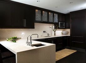
A trend which can become highly influential. Take the color black. It's become trendy to incorporate black in cabinetry, even for all the cabinetry in a kitchen. Black kitchens are seen now in shelter magazines, blogs (yes, here too), showroom displays, and manufacturer's brochures. Top image from HGTV.

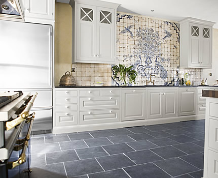
I don't think black kitchens have ever been on the radar for kitchen design...in a big way. They are now.  So are tiled walls...wide swaths of walls with tiles, often mosaic tile, or, the same, seen all across a backsplash, inlcluding behind a range. Imagine a tiled wall combined with a black kitchen? See image above. Very cool from 2006 (first seen) till...oh, maybe three to five years as a guess? No, be careful going down that road. Kitchen materials are not accessories as in fashion or smaller interior design accessories, easily changed, such as pillows. A kitchen should be designed to last decades.

Let me say it this way...it's best when "fresh, new, creative" comes from original ideas suited to specific situatiions rather than being influenced by the power, and security, of a frequently seen/published/displayed idea.

So, create your own original ideas for 2008. Don't know where to begin? No time? No vision? Then, look for a creative designer, interview her/him carefully, and express your desire for true originality, something special...just for you! Something that is a personal expression, an aesthetic that is yours alone that may even break the rules. Go ahead, color outside the lines. Make it meaningful.

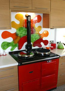
uploaded-file-07627Interested in what's happening now AND expressing your personal vision? Take a look at this kitchen at left. The clients, from the UK, were inspired by.....um, Stilton cheese! Now THAT'S what I'm talking about!

I guess that's really my message for all kitchen renovations in 2008. I'll be doing mine this year, and once I started to relax, this past week, the ideas began to flow. It's good advice for anyone. That's the first step.


Trend Focus - Gray Matters

Gray is the new beige, according to Met Home's November issue, although some are saying gray is the new black. In the kitchen world, we're just on the upswing with black, let alone gray!

I have to say, I remember the gray kitchens of the 80's. They truly were awful. The were either gray glossy formica or gloss lacquer with medium gray 12x12 ceramic tiles on the floor, softly shaded. Always 8x8 medium gray tiles in the bathroom. Maybe an ivory formica breakfast table with large ivory chairs that swung around, of course.  The moment it came into vogue, I, for one, hated that gray trend. I wanted to say, "Don't you see what you're doing?? Stop it!"

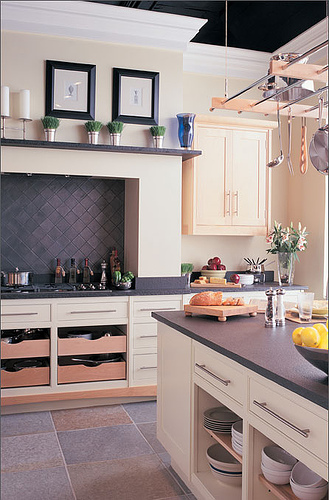
This time it's different. There are a variety of grays, not just the super cold one trick gray. You see warm grays, dark gray/blues, grays paired with tan...and, unlike in the 80s, traditional looks with gray rather than solely modern. Point being, if you happen to like it for the long term, make it into a classic, rather than a trend. Here's coverage from Danielle at  Style Files.  

gray%20white%20kitchen.jpg gray%20cream%20kitchen.jpg


From Heath Ceramics, gray, in context of blue and brown. Grace, from design*sponge was in San Francisco just last week and visited this tile showroom. See more here.

gray%20tile.jpg

Other ways to use gray is paint, dishes, textiles, and other decorative items. The great thing about gray, is how it reacts with color. It's a wonderful backdrop for color, shades and contrast.

What about you, what do you think of gray??

Update: Just found this gray inspiration on Belle Vivir.  

Black Kitchens - Trending NOW!

I know you're ready for some wonderful kitchens! Last week was mostly an informational week, and I think we need a few days of kitchen eye candy, or, let's prepare dessert first in our kitchens!

What a treat today, to see THIS blog mentioned on Decor8, by Rachel Perls of Hue Consulting. Rachel talks about the "black" trend in all things interior design related, including kitchens. Black, absolutely, is a trend in kitchens. I'm observing this trend is only getting stronger. I have to say it is stunning. It may be best dressed up, as you see in the little black dress, always a classic.

But, is it a classic, in terms of kitchen cabinetry? That is the question! Surely, we are seeing so MUCH black these days, but I'm still not convinced it translates to a classic in the kitchen. I predict it will be dated in five years.  I'd tread carefully around black, if you can resist it! Can you? 

Take a look at Rachel's take on black. She is a color expert, and her point of view is interesting and insightful. Images from decor8.

Or, you may want to add a black accent piece, rather than commit to black in your cabinetry, as I did in this kitchen I designed before black was even a whisper! There are other black accents in and around this kitchen:

black%204.jpg 

black%202.jpgblack.jpgblack%205.jpgblack%203.jpg

A Trip To A Kitchen Show

brown%20cabinets.jpgI went to a regional kitchen show on Tuesday and part of Wednesday in Pennsylvania. I go to this show every year. It's small, very small, but I always find some interesting materials or products, and information from seminars, so I go (to the crummy hotel room in King of Prussia, PA.)

In terms of trends, what I saw was DARK cabinetry, whether it be black (lots of black!) or very dark brown wood finishes. I saw some white, but not much, but that doesn't mean anything. I did see some exotic wood door samples and displays, clearly a trend for some time now. 

wood%20countertop.jpgI saw beautiful wood countertops in a good selection of woods that were very impressive, including bamboo and lyptus, among others. I also saw a great soapstone display and had a good refresher conversation about soapstone. It's soft, yet non porous. And, it's all about regular oiling, to maintain an even patina (the positive word for wear marks!)  

One booth I almost missed was a tiny booth showing Sirius hoods that I have used before. They just came out with a great hood for a small application. The hood is 24" wide. Great for apartment or small kitchens.

sirius%20hood.jpgAnd, the very best part of the show was that I got to meet Erinn from The Happy Living Blog! I knew she lived in the area near the show, and I sent her an email and asked if she was free, and to my delight, she was. We had dinner together and had such a really nice visit.

Try it...if you know a blogging buddy may be in a particular area you are visiting, take a chance and make the effort to meet. It's well worth it. Erinn is an architect, so we talked shop for quite awhile (we both agreed it's great to have allied professionals actually talk to one another!) and had an all around good time.


bamboo.jpg 

 happy%20living.jpg

KBIS 2007 Kitchen Design for Better Homes and Gardens Midwest Living Magazine

So, I've been real busy since KBIS, and I took so many pictures and brought back so much information that I have more to share with you! The "Idea Center", which is either three or four full, real, kitchens, produced on the KBIS site in a wonderful, huge area, was, as usual, well, wonderful! Meredith Corp., produces these kitchens, each from a particular magazine, and each has a specific theme. It is a trends spotting experience also! In this case, trends that I am spotting are:

  • a soft contemporary styling
  • walls of tile or stone
  • rustic features
  • an eclectic look
  • mini version of a work stations concept
  • comfortable feeling
  • large, multi-functional sink

From the press release: Midwest Living's kitchen at KBIS, "Back to Basics" is a relaxing weekend retreat, with its ‘back-to-nature’ kitchen and bath space. Pairing the Heartland’s agricultural heritage with contemporary cabinetry and appliances, the converted barn is designed to relax and enhance the weekend getaway experience. The space plays on the growing trend towards more outdoor living, as the entire structure opens to nature with an 8’ entrance flanked by barn doors, an outdoor shower, and a screened porch with daybed.

How gorgeous is this?? Enjoy! 

  Midwest-Living-Kitchen_1.jpg

  Midwest-Living-Kitchen_2.jpg

  Midwest-Living-Kitchen_3.jpg

  Midwest-Living-Kitchen_4.jpg


Kitchen And Bath Ideas Magazine

I like Meredith's Kitchen And Bath Ideas magazine, I always have. I used it many moons ago as inspiration for my own kitchen design before this profession sucked me in I began in this profession. I have always found them to be right on top of what's happening in kitchens today. Yes, they are a mainstream, old, company, under the Meredith Corp./Better Homes & Gardens umbrella of publications, but I'd strongly advise you to pick up a copy of Kitchen And Bath Ideas today, and here's why. They may not show all the up-to-the-minute, cutting edge, fabulous Italian kitchens over and over, throughout the magazine, but, truthfully, how many people own those kitchens? There's a kitchen style for everyone, and Meredith does a fantastic job of mixing it up in every issue, showing just that, something for everyone. Kitchen and Bath Ideas are as relevant today as they ever have been, and I absolutely use them as a go to source for inspiration. Likewise, on occasion, I am a go-to source for them!

OK, I'm also biased, they've been publishing my projects for 12 years! Two more of my projects coming soon later this year! The inside scoop is that the editors I work with on my featured kitchens uncover every last detail of what happened in the kitchen, why, how, and so on. They're professional, and VERY interested in the planning behind the scenes of the kitchen. It's actually why I have submitted my projects to them for so long.

Orange-Kitchen040.jpgHere's a sneak preview of the July/August issue. Just coming off totally inhaling Holly at Decor 8's post on the color orange, supplemented by Rachel Perl's words of wisdom, there are a few kitchens in here too. Meanwhile, I pick up the Kitchen And Bath Ideas magazine and what do I see but orange! 

If this is not enough, Decor 8 continues with an insightful post on color theory, just what you need to consider when planning all the materials and surfaces we use in the kitchen.

This is a full page image in the magazine. There are pages and pages of other shots of this kitchen which you need to see.  

Also in this issue is a kitchen that was set up at KBIS in Vegas in May. It's a great kitchen to just be in and only leave under protest! Here's another sneak preview, with many images surrounding this feature. I took my own pictures of this kitchen, and also interviewed Kit Selzer, Group Editor, Meredith Special Interest Media Kitchen and Bath Group, who took me around the kitchen. We'll get to that story in greater depth soon. Go get your copy!

KBIS%20Kitchen041.jpg 


Kitchens at PointClickHome

I just heard from my blogging counterpart, Timothy, at Charles and Hudson that he's a part of the hot new site PointClickHome, the new shelter hub that brings together ElleDecor, Metropolitan Home, and HOME magazines.  From what I see, there are lots of lifestyle  areas to check out, such as food, decorating, remodeling,  gardening, and more good stuff. It's laid out well and logically, with lots of great images, informative, and down-to-earth chat across the site. The two words that come to my mind are "fresh" and "smart!" Good work, Timothy!

nouveau_01.jpg 

Kitchens Around The Blogs

RupertScottbacksplash2.jpegA slow weekend around here, mostly spent in the garden, in and out of the house, depending on my mood. Either way, relaxing, and I hope you are too! I found some interesting things on kitchens!

First up, a couple of recent posts on Desire To Inspire.  This is one very nice example of kitchens from Israel, and another post from DTI, here. One, all about storage, the other all about open shelving! 

Next, from my colleague in Westchester, Mark R. LePage, AIA, where I'm sure he lives well, is a discussion on the kitchen being more than the typical hub of the home, but the electronic hub as well. I'll be adding more to this discussion, as I uncover my notes and information from KBIS, still a bit buried! You'll be hearing more from Mark soon, as we "get into" a little discussion about architects and kitchen designers working together. Or, maybe we should call it "Survivor!" Stay tuned for this lively discussion, coming soon.

From another colleague, Peggy Deras, CID, CKD, author of Kitschy Kitchens, Peggy has uncovered some very cool backsplash designs from Rupert Scott. They are fabulous glass works of art. Check it out.

And, an article on the 2007 Kitchen and Bath forecast by The New York Times. this forecast seems to be only about appliances and bathroom fixtures. Incomplete about kitchen design in general, but useful. 

IMG_4382a.jpgAnd, totally unrelated, but which I would love to share with you more often than not in the coming months, an antique rose from my garden, photographed today. This is Mons. Tillier, bred in France in 1891, a Tea rose. Enjoy!

My garden is about to burst, with tons of roses, probably one week from now. I'll keep you posted! 

KBIS 2007 - Overview of Kitchen Design Trends I Observed

Here is a list off the top of my head of the trends that I observed at KBIS. Since I am at the airport now with a 3 hour delay, (update: it was a 7 hour delay, getting home at 3 AM rather than the projected 7:45 pm, adding this to the mishaps below post) with my power cord packed (why did I do that?) I am unable right now to work with my images. Nevertheless, here is what I observed as coming on strong for kitchens '07 and beyond. I will take some of these one by one and expand on them in the days ahead, with images and notes. Here's what's happening!


Trough sinks - long, narrow, multi use sinks....secondary sinks

Organically shaped sinks - maybe long and curvy, seeing even more

Sinks with multiple functions - more than ever, more accessories, flexibility

Brown metals
- a rainbow of brown metals from mid to dark colors

Black - Black is HUGE...more to follow

Dark colors - meaning dark wood finishes in cabinetry

Tile walls - strong trend for wall coverings

Light countertops - sandy, earthy, subtle, casual

Thicker counters - anything from 2" to 7"!

Green - meaning eco friendly everything and anything and everywhere. Take care here, as I suspect one small piece of a product being declared as eco friendly may be valid marketing material...there's green, and then there's green...find your green values and then do your research accordingly

Larger sinks - single bowl large sinks, even going larger than last year

Less retro
- retro 40s appliances seemed to have had a very short life in the past few years, did not see much of that this year

More contemporary styling, soft, easy to live with - soft contemporary is very big

Traditional alive and well - traditional styling is alive and well...don't believe all the hot, sleek, kitchens you see elsewhere. That's only part of the kitchen trend story. Important, hot news is being made in traditional styling as well.

Wood variety - more authentic wood finishes celebrating unique wood grain and knots and natural wild grain

Earthy rustic
- a new, sort of contemporary, rustic look

Appliances in various sizes - huge trend, appliances in various sizes for any reason, any situation

Technology in appliances everywhere...lots of bio fresh type of technology, keeping food fresher longer

Hoods - dynamic, innovative, interesting kitchen hoods. Huge.

Purple - seen in more quiet, smoky, or somewhat mid tones, not too strong. You'll see it soon if you don't see it now.

UPDATE 5/11:  I nearly forgot...big trend, lots of open shelving in the kitchen, whether everywhere or just in some spots, it's there.  


I'll expand on these and other trends that come to me. We'll also talk about trends in general...should we care, considering a kitchen is a designed space, with products that are going to have to last, and look good, for 15-20 years? It's sort of a paradox for a professional kitchen designer, at least for me, and I'd like to talk about this. Have no fear, from my perspective, the excitement of trend watching and looking for hot, current, new, products is definitely a "sport" so to speak, but there are underlying issues to consider as well, considering the design/product decisions are financially large, and permanent. I actually can't wait to sink my teeth into this issue, coming at it from several points. But, till then, there it is, above!


KBIS 2007 - Kitchen & Bath Show Madness

It's been a crazy few days here at Vegas! But, of course you knew that...can Vegas be anything but? Leaving the hotel room by 7 am and returning at 9 pm, going nearly nonstop, is exhausting, but a good exhaustion. Surely didn't leave much time for blogging, but trust me, there is lots of new product information coming your way in the days and weeks ahead. I have lots to tell you about.

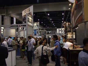
kbis%202007%20floor.jpgI go to the show, actually 2 shows, every year. This show is huge...there are 900 companies exhibiting. I can't explain how huge the show is except to say it took me 2 full days to walk the entire show at a leisurely pace, but not even stopping to examine every booth. That would take a week.

The first day, before the show opened, I attended seminars. In all, I took 413 images (until my battery ran out). I selected and packed up two huge boxes of press kits from exhibitors, which I will go through soon, when they are delivered. I attended press events and seminars. And, I, personally, conducted about 70 interviews at exhibit booths via my voice recorder for podcasts. It was me along with tens of thousands of my closest friends! That said, between all the activities, old friends are greeted, new people are met and cards exchanged.

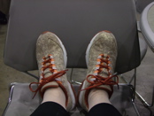
kbis%20tired%20feet.jpgI DO have an advantage. It's "Show Dog!" My husband's (actually registered title when I sent in the form) self designation. He mostly devotes himself to my well being, carrying the water bottles, always waiting patiently, waiting more, carrying stuff, attending the events, being a listening post to me and others, and he's not in the business. So, I must divulge that advantage and say, "thanks, honey, you're the best!" One day he carried my laptop around the entire day so I could blog at a seminar.

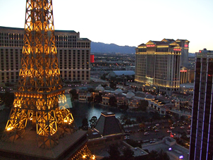
kbis%202007%20vegas.jpgAnd, what would the show be without mishaps? From leaving the camera usb cable at home, buying the wrong one at a local camera store, having the brother in law at home find and fedex it to the hotel, losing my husband at the show early in the day with my cell phone in his bag (finding him, thankfully and then arguing about it of course), me leaving his wallet at the food court (finding it 1/2 hour later still in that spot after suddenly realizing it and bolting back there), having to go to the medical clinic to get a shot for a bad poison ivy outbreak, walking back from one end of town to another in the hot Vegas sun, after the seminars on the first day, because we made a short stop at Nieman Marcus  :-) and then didn't realize the cabs don't stop in the street (not realizing we should go to a hotel driveway to get a cab). And, please, let's not forget the 7 hour plane delay, getting me home at 3 am, rather than my carefully planned 7:45 PM the night before. So, mishaps, there were a few! Probably more than our share this trip! But, it could always be worse. Give me a little time, while I think of how...meanwhile, here's the image from the hotel room, the Eiffel Tower just in front of me, Rome just beyond that, to the right.

When I do the show, I do it the most comprehensive way I know how. It's not just about walking the show. Not for me. It's also about observing and education. Taking as much as one can from a few short days. It's about discovering new trends, connecting the dots, seeing new products, getting reacquainted with tried and true products, and seeking out those little bits of enlightening information along the way. I struggle toward the end of the day with...see more vs. it's enough. That said, I LOVE it! I get giddy at the start and blue when it's time to leave the exhibit hall.

It is an intense experience! Today is the travel day back home. It was, as always, a great, great show. Next, an overview of trends seen at KBIS.


Kitchen Trends 2007 Continued - From KBIS

Continuing a discussion of the seminar I attended today at the KBIS conference, at the end of the meeting relating to kitchen trends, representatives of selected product manufacturers, Libeherr, Kraftmaid Cabinetry, Kohler, Dupont and Saeco (sponsors of the seminar) spoke about their products and what trends they are seeing.

One trend discussed, documented in the New York Times from time to time as well as in other reports, that I have read as well, is the trend of baby boomers moving either back to, or first, to the city (any city). This changes everything, for example, as seen in the typically smaller kitchens that are prevalent in Europe...smaller, yet highly innovative, appliances now become more of a factor in the marketplace than every before. As a result, the U.S. market is seeing more variety in appliances such as sizes in refrigerators, for example, enabling creativity within the kitchen design, something we know baby boomers want!

A continuing trend, growing ever stronger, is the growing wine "culture". New refrigerators incorporate separate wine, freezer, and food areas, into one appliance, or moving toward enormous, as seen in the wine vault by GE Monogram. Ever creative wine storage solutions are being developed, and desired.

We are seeing second sinks that are more fluid and organic in shape. These sinks are easier to clean and easier to fit table ware within. It's fresh, it's creative, and it makes sense.

There was talk of the lines being blurred between pure eco friendly and synthetic materials. We are seeing granite that now has a permanent sealing process, changing the composition of the product itself and traditional synthetic materials such as corian, having renewed interest, as some of its composition is indeed from natural materials. The news here is that one will pick and choose countertop materials not only for their green composition, but, perhaps choosing a combination of green and synthetic materials, depending on their use and function in the kitchen, the bottom line being a choice made about what green means to YOU.

Tomorrow starts the first day of the show exhibits. See you then! 

2007 Kitchen Design Trends at KBIS...International Design Trends

Here are international kitchen design trends, as presented by Sarah Fishburne from Home Depot's upscale sister, Home Expo, who, along with her colleagues, researches lifestyle media, travels around Europe's design fairs, analyzes market trends, and more. Here's what is being seen right now, and design concepts that are emerging fast! I'm sitting in the conference right now...

Trends

All-in-one islands, sink, cooktop, island/table "kitchens". For European purposes, oftentimes the homeowner will take their cabinetry with them when they move, so this concept is logical for parts of Europe;

Hydrolic, telescoping devices creating or changing counter space...swings on and off the countertop to uncover perhaps a small trash opening;

Thinner refrigerators 24" or 30", they are taller, using vertical space, great for customizations, (2) 24" units, etc. etc. See this in Thermador, Liebbher;

Seeing many more refrigerator drawers of different sizes;

Morning kitchens...small kitchenettes in other rooms;

Fully lit pre wired appliance center/cabinet/spot in the kitchen;

Scullery...seeing this come back now...separate rooms for active prep space for entertaining and heavy prep and/or clean up. All is hidden; (I have a project now with a separate scullery in the plan)

UK, French have similarities in traditional styling as is U.S; 

Hoods - in Europe they are art, much more than ventilation;

Innovative ways to use corners in base cabinetry;

Rails used in backsplash for easy access storage-I've seen this for many years, but it is becoming more popular;

Dish drying cabinet, seen in Europe for a long time - open cabinet set over the sink, drip dries behind closed doors. if you live alone, wash few dishes at a time, can be functional;

Counters and sinks getting bigger and thicker;

All in one sinks, cut out of one piece of stone;

Trough sinks, super wide, maybe shallow sink;

Seeing single, large sinks;


JAPAN - kitchen trends 

127 million people over four small islands! Land is hard to come by and live in tiny apartments; 

Corners on upper cabinets telescope out;

All-in-one island as the Europeans do;

Appliances are very small in scale;

Tiny dishwashers;

Big on conservation in Japan;

Drying rack for dishes over a sink with fan;

Shelving across windows;

Japanese has 20% of population over 60, U.S. has 12%...universal design is important;

Sensory touch faucets;

Motorized shelves


FUTURE OF COLOR

White is hot! Modern, traditional, old world, across the board....all different shades of white, including glazes, antiques, etc.

Blue is one of the most popular colors in the kitchen, any shade of blue;

Black...almost as standard a white. All over black kitchens, distressed, or as accents as in an island;

Black is also being seen in paint. People are no longer afraid of black...seen as a traditional color.

Red...Seeing it in cabintry, appliances;

Butter, yellow, willow shades of cabinetry;

Wood finishes - more natural woods...alder, knotty pine, hickory, pecan, mahogany. It's more about the wood than the stain finish;

Much darker woods as well;

Appliance colors...reds, teals, Aga, Viking, Dacor, many are adding color;

Metal finishes changing, graphite, oil rubbed bronze, not all about stainless; 

Stainless blue tints, green tints, warm tints;

Small appliances are becoming much more colorful;

Heather and Purples are very hot now or are coming on FAST! It's the softer purple, the brown, mocha purple, purple undertones that are what is popular.


more soon......break time! 
American Idol Kitchens - NKBA 2007 Design Contest "Showroom Kitchens"

I have a confession to make right here and now. I'm addicted to American Idol. There, I said it. I never watched this program before, ever. About 4-5 weeks ago, my husband and I were surfing the channels (I can't remember who had control of the remote, but I can say "stop right there", right?) But, I digress. 

At first we thought "this is way too bubble gum". We're New Yorkers, we're beyond this! But, we quickly got into it. It's appointment tv for us. We talk about it, judge the contestants, judge the judges, love/hate Simon, have a great time with it. I KNOW who's going, or who should leave, after last night's performances! It WON'T be Sanjaya (he was perfect for that song last night.) And, we'll find out TONIGHT! (Melinda Doolittle, you really needed to move much more during that song, as I suggested to the tv!) Do we call in? No, THAT'S where we draw the line.  ;-)

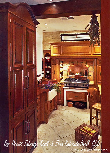
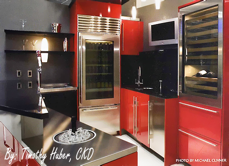
So, what does American Idol have to do with kitchens, kitchen design, kitchen remodeling, etc?? It occurs to me that all of the kitchens from the 2007 NKBA Design Contest thus far are American Idol kitchen contestants of sorts, which are competing for the kitchen design equivalent of American Idol in each of their categories! I'm not a Simon Cowell judge, however, more like Paula Abdul - "Your outfit is great". What about you? Here are the contestants entries for "Showroom" kitchens, where you go to dream. Enjoy!


nkba showroom kitchens002.jpg


nkba showroom kitchens003.jpg

nkba showroom kitchens001.jpg

2007 nkba design competition finalists "open plan kitchens"

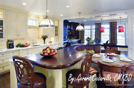
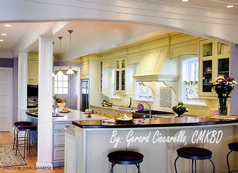
Well, I sure hope you have been following along in this wonderful showcase of the 2007 NKBA Design Competition finalistsfor 2007 in a variety of categories. There are probably two or three small categories to come after this one.

Open plan kitchens have been a fixture now, at least in my design practice, for quite some time. The early thinking at the time this trend started, was that the family could be in closer contact with one another, ending so many decades of the kitchen being isolated, cut off from other parts of the home. It was a concept that was very well received, particularly as we moved into a more casual way of life in our homes, households becoming much busier, and so on, and walls continue to be torn down today, as a result of this thinking, still very much a factor in kitchen design.

Not everyone wants an open plan kitchen. I don't have one, nor did I feel the need for one. Yet, I still wanted my kitchen to reflect what was happening in the rest of my home and incorporate "living room" features into my kitchen, which make me very very happy to be there.

We have seen kitchens, whether they are closed off or open, become more integrated into the decorative theme, including detailing, of the home. I see that moving even more in this direction, which I think is very exciting, and I'll talk about that another time. I got a bit carried away thinking about open plan kitchens! Enjoy!


susan serra openplan nkba037.jpgsusan serra openplan nkba038.jpg

susan serra openplan nkba039.jpg

susan serra openplan nkba040.jpg


2007 NKBA Design Competition Finalists "large Kitchens"

Here again, the finalists for the "Large Kitchens" category of the 2007 NKBA Design Competition. Mostly contemporary, lots of exciting stuff going on in kitchens today, that's for sure. I'm having a tough time picking my favorite. When clients are open to new ideas, good things happen, it's very simple. Very good things.

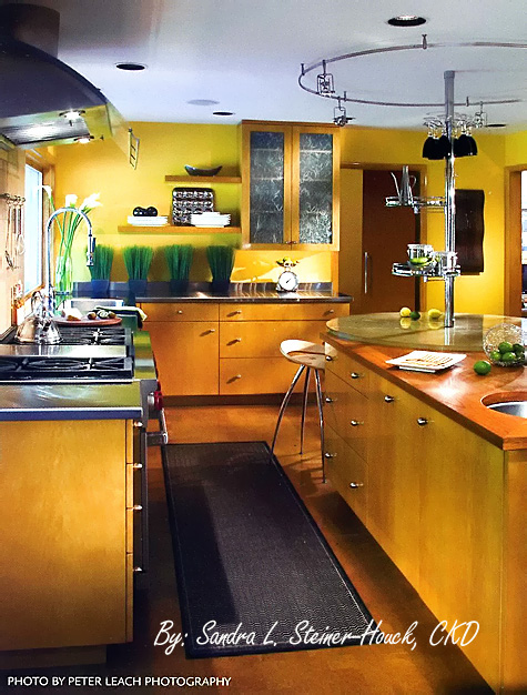
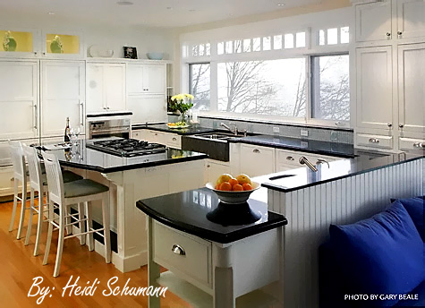
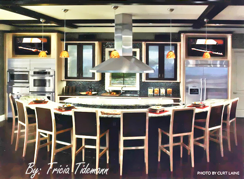
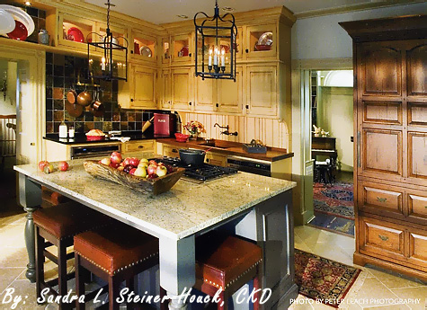
I love the line of windows in the white kitchen. I'm crazy about the circular element in the top kitchen, I keep coming back to the design in the third kitchen, I like that a lot, and I'm wild about the backsplash and the island in the fourth kitchen. I'm very impressed.!

Our final group is called "Open Plan Kitchens". Which ones do you like?


NKBA large Susan Serra014.jpg 

NKBA large Susan Serra013.jpg NKBA large Susan Serra015.jpg


NKBA large Susan Serra016.jpg 

2007 NKBA Design Competition Finalists "Medium Kitchens"

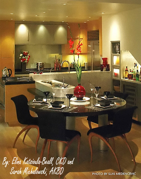
Here are the medium kitchens category, the winner to be decided at KBIS in May. A very strong group. I like them all for different reasons. There is something in each one that appeals to me. But, if I were forced to decide, I'd say the second one down. I really like a warm, contemporary, look. There is also beauty in symmetry, as is shown in the third kitchen down. The first one looks great too, with the different backsplashes and the furniture piece. Nice detail there. And, the last one really seems to be about color, and a cool, sleek, look. I do wonder why they chose black ovens. If not stainless, I think I would have voted for white. So, here they are! Next up, the large kitchen category.
 nkbaimages143a.jpg

nkbamed153.jpg 

nkbamed152.jpgnkbaimages144.jpg

2007 NKBA Design Competition Finalists: "small kitchens"

Every year the NKBA (National Kitchen & Bath Association) holds a competition for the best designs in a variety of categories. Here are the finalists for the "small kitchen category", the winner to be revealed at the Kitchen & Bath Industry Show (it's huge!) in Las Vegas in May. There are numerous other categories which I will go through in the days ahead. Next up are the "medium kitchens" category, these are really cool and elegant. And, there is not just the "large kitchens" category left, there are a few more after that, so stay tuned!
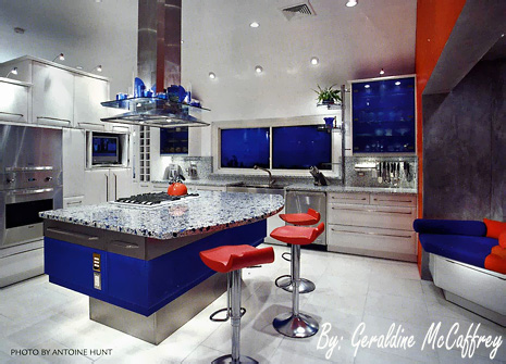
Which one do you like and why? 

 nkbaimages139.jpg


nkbaimages142.jpg


 nkbaimages141a.jpg


 nkbaimages140a.jpg