Jason Wu, Brizo & Kitchen Design = NYC Fashion Week

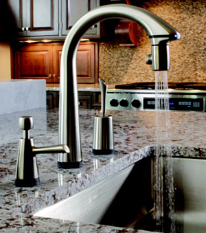
What do fashion in clothing, faucets/fittings and kitchen design have in common? The design and marketing teams behind Brizo, Delta's high end brand, having aligned itself with Jason Wu, designer of Michelle Obama's inaugural gown (one of the most watched fashion designers in recent years) enjoy a relationship that seems to fit like a glove piece of couture. 

I had the opportunity to learn about and examine Brizo's existing line of products a few days ago. Brizo invited a small group of us kitchen/bath bloggers (listed on my colleague Ann Porter's blog) to New York City to see their collection of existing products and to take a sneak peek at new products to be introduced this year. Part of this two day event included attendance at Jason Wu's Fall 2010 collection, part of New York Fashion Week (insert 90 exclamation points here!)
I'll just say this before I get back to the subject at hand. To attend this Jason Wu show was an incredible privilege. It is an experience, simply, like no other I have had, and living near the city, I've attended my share of events in many fabulous venues, sometimes with celebrities in attendance. But, truth be told, I felt downright patriotic (which completely surprised me) as I think back. I feel I was witness to the best in American design and the best in creative production techniques (quite frankly) which, working together (pink carpeting, pink lighting, black flowing curtains, fragrance in the air, amazing music, incredible clothing and let's not forget those super models with 7" heels) produced an atmosphere of awesome creativity as it showcased Jason Wu's very personal design expression. The show manipulated nearly every sense to the max. The creativity, the risks taken, the personal expression, are all qualities that make this country great...I felt a symbiotic convergence of these odd bedfellows (fashion and patriotism) and, thus, felt privileged to be in attendance. 
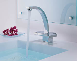
Back to reality...During these 2 days, I had a sneak peek at new products to be introduced by Brizo this year. My lips are sealed, but, some of those pieces I saw were absolutely stunning! Did I like all of Jason Wu's pieces? No. Likewise, not everything in Brizo's fashion forward collection is for me. That said, I WAS grateful to find myself in another privileged position to be encouraged to offer my comments on their products, which the creative team from Brizo, welcomed.

Jason Wu, for some strange reason, did not ask me what I thought of his collection, although I did ask him a question later in the day when he caught up with us design bloggers at the Brizo cocktail reception. I asked him about his specific vision when he designs a garment and how/if it evolves from that original vision. Answer: The garments are fit precisely to each model within the course of a few hours, so the vision is in "collaboration" with the model's body...much like Brizo's designers need to answer to the faucet engineers and my kitchen designs need to relate to the architecture of the home. Interesting how the creative process connects these disparate design disciplines.
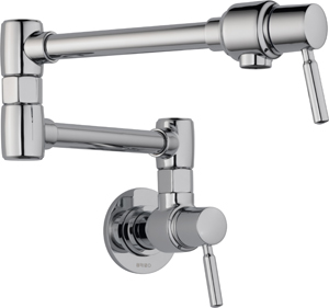
The thread that links fashion, faucet, and kitchen design, begins with creative expression. Creative expression is often influenced by others (in this case, Wu was influenced by Irving Penn). Brizo's designers are inspired by architectural elements, nature, fashion. They wait for a design element to speak to them and the creative process begins. They are open to inspiration. I understand that philosophy; I adhere to it as well in my own work, and I'm thrilled that designers working for a major, mainstream, American corporation are given that freedom of expression, much like the way Wu finds his creative spark. That was enlightening and probably the single most important piece of information that I am coming away with, a sort of satisfaction that ideas are the thing for Brizo. I know that is so because I met and talked to the designers.

Like in kitchen, faucet, and clothing design, function and design blend, collide, and play, ultimately forming the perfect union for that piece of couture, faucet, and for the kitchen of one's dreams. I've been inspired. I'm impressed that Brizo has aligned itself with a fashion designer. THAT is inspiring. In comparison, here was a quick synopsis of a post I did on Fashion Week one year ago, a description of the feeling at that time. We're clearly moving forward. Thank you Brizo for brilliantly linking together American fashion...and fashion forward faucets and fittings. It was an eye opener and a meaningful experience.

NOTE: SHORTLY, I WILL UPLOAD IMAGES OF THE JASON WU FASHION SHOW TO MY FACEBOOK PAGE EXCLUSIVELY. ARE YOU A FAN?? LOOK FOR THE POST WITH THE DATE OF FEBRUARY 14, 2010.

AutoKitchen Kitchen Design Software

A little bit of shop talk here, but I'm happy to share news of this new kitchen design software and technology that I am using.

I'm excited to debut and share information on my new kitchen software with you. It's called AutoKitchen and it's truly state of the art! The AutoKitchen representative, knowing that I am a working designer, offered to provide me with a copy of AutoKitchen software to review and to use in my practice, gratis. I already was using design software, but having recently upgraded my software and being disappointed in the quality of the renderings at the highest level of detail, I thought it a good time to take a look at all the competitors in this narrow field of kitchen design software for professional designers.

As with any product I review (in 3 years, this is my 3rd review) and as is a typical policy for many bloggers, it has to meet my own personal standards as a useful product with qualities that I feel have merit. Otherwise, I decline to review the product, which I have done once after using a particular product and twice in the case of books.

In this case, the graphics (crazy photo realism) were noticeably better than my existing program. I didn't "need" a new program. I was not looking for another program. In fact, I had just recently upgraded my existing program for a nice sum of $$. But, when I looked at this program in more detail, first, in comparison to what I was using, another very reputable program designed for the kitchen/bath industry, there is no question that I was immediately "wowed" by the super sharp graphics that AutoKitchen produces.

This program, from my perspective, IS state of the art! It's a significant enhancement to my business, an upgrade for my clients who will see their kitchen in better detail, and so, I'm extremely happy to share my thoughts on this program with those who appreciate beautifully designed graphics.

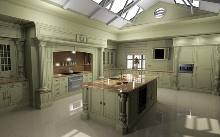
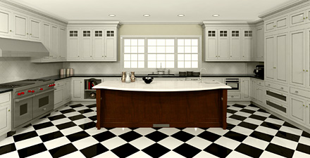
As I become more proficient with AutoKitchen (these images are from AutoKitchen's files) I'll be sharing the very cool drawings that it produces. If you are a designer and looking to make a change, I encourage you to take a look at AutoKitchen. If my existing program had been comparable, I would have had no need to a) learn a new program b) learn a new program c) learn a new program, all of which is extremely time consuming and quite honestly, always slow going at first, then takes more time to get fully up to speed, which designers understand. But, as a designer, beautiful graphics are extremely important, which trumps time spent learning a new program, for sure.

Having used my program (with regular updates) for 18 years, I did not make this change lightly; the software had to produce compelling solutions for my business. After my careful analysis of AutoKitchen and its competition over the course of two months, it does. I did not go for test drives with other software companies, but I very closely analyzed finished renderings on the companies' websites (the ultimate issue for me), talked to industry colleagues, and took a hard look at my existing software as well, which involved several sessions with the manufacturer to make completely sure that I was familiar with its top quality renderings options.

Had I not believed that AutoKitchen produces THE finest graphics in the kitchen design software industry, I would not have been interested. Why change a program I was comfortable with after 18 years to something that is second or third best? That would be a bad decision on several levels.

I can report that AutoKitchen's customer service is superb, otherwise, that would surely be a dealbreaker for me. CAD compatability is a big plus too. There is no question in my mind that the time invested is, and will be, worth it. I'm happy to share my perspective on this program. Miguel, from AutoKitchen, is a delight to work with and endlessly patient. 

For further information, call Miguel Merida. Phone: 201-568-3555 or miguel.merida@microcadsoftware.com.


Kitchen Design Trends 2010

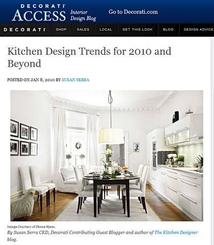
I'd like to share this piece with you that I wrote for Decorati.com on kitchen trends for 2010 and beyond. I spent much time in December contemplating where I feel we are now, and some "whys" too. I've thought about where I think we (many of us) are headed, for those of us who are contemplating changes in the way we live in our kitchens. Maybe these thoughts will ring true for you. 

I'd probably add one or two more things. I want to expand on my feeling about many of us wanting as much permanence or longevity in our design and products as we can get. I think that the recent recession, "The Big Recession" as I'm hearing it called, has truly been a wake-up call. I feel that there is a maturity, a sensible way of thinking, that has evolved. Where we can afford it, I feel we want quality. 

I feel that we want performance from the products we select over the long term. I definitely see that new clients seem to be more involved in the design process, more serious, and dedicated. They/you understand that this new kitchen truly may be a one time purchase, and it needs to be as perfect as it can be. That (importance) has been true all along, but, that call really woke us up! If you are planning a kitchen renovation in 2010, my guess is you will take it very seriously and you'll find it to be a very, very rewarding process. I hope you do!

HERE IS THE LINK FOR MY THOUGHTS ABOUT KITCHEN DESIGN IN 2010 Tell me what you think here, below, or on the Decorati comments page. 

Kitchen Design & Floorplan - Holiday Edition

We still have one more huge holiday to go this week, but for those who are just fresh from hosting visiting family and friends in your home or for those who endured challenging kitchen floorplans (sounds like a therapy session topic) tell me the following about functioning or visiting in your kitchen, or any kitchen you were in over the holidays:

what did you love?

what did you hate?

what must you change?

what worked surprisingly well?

what was a mistake?

what was frustrating?

what was the best idea?

These questions are purposely very open ended. Pick your kitchen issue (whatever it is-traffic, appliance placement, dish storage, etc. etc. and expand as you wish.)

Answer any question or questions you like, tell me all about your likes/dislikes, and add more answers over this weeks' experiences and New Years' weekend as well.

Image of Ina Garten's kitchen from House Beautiful.

Kitchen Design Consulting - Long Island & Metro New York

Finally! Just what Long Island and metro New York needs: in-person, unbiased, professional kitchen design consulting services. Although the emphasis on the page talks about kitchen design phone consultations, local in-person consultations are available as well. My local area is all of Long Island, New York, New Jersey, and Connecticut, as fits, regionally, into the "metro New York" region.

More information can be found in this post, introducing this service. 

My Kitchen Design Consulting service can be helpful if you:

  • are stuck on any one, or several, specific design issues
  • would like a general second opinion on your design
  • need a visit to your jobsite prior to a cabinet order
  • are a DIYer but see the value of a professional evaluation/overview
  • are unsure about materials
  • are unsure about style/theme/color
  • need help with appliance selection
  • need assistance with countertop issues (selection, durability, templates)
  • have questions on a backsplash design
  • need help with any other issue surrounding your kitchen design project

Travel beyond 15 miles (in one direction) is $50 per hour over that minimum distance.

Call me: 631.754.0464 or email me: susan @ susanserraassociates.com to make an appointment. I'm here for you!

Kitchen Design Consulting

I've been offering kitchen design consulting services informally and have not devoted a special page on my blog to this service until now. 

I am very pleased to formally introduce the One Hour Phone Consultation!

Call me about...well, anything related to your kitchen design project that is just not sitting right with you and for which you need a first OR a second opinion. 

I am happy to provide this kitchen design consulting service which can be invaluable to those who otherwise are at a loss as to what decision to make, be it in regard to products, design issues, style issues, or so many other issues that come up in the lengthy course of the kitchen remodeling process. 

I'm here for you!

When you do a kitchen once, maybe twice, I feel it is, in fact, a smart and responsible decision to seek advice from a professional...advice which can enhance your lifestyle in the kitchen, your enjoyment of your kitchen in an aesthetic or functional way, and provide "access" to a high end kitchen designer for a reasonable cost in the context of an overall kitchen budget.

Please call on me to work through your kitchen issues, whatever they may be. I'm looking forward to speaking with you personally!

Open Kitchen Floorplan Or Closed?

The results are in! Thank you for taking the survey! The topic of the kitchen floorplan survey was spur of the moment for me. I had just finished a marathon session designing my own kitchen (in a dreamlike state as it is at least a year or two off). Suddenly, grappling with issues and questions pertaining to a wide open (to the entire main floor) vs. a partially open floorplan, I thought it would be very interesting to hear what others thought...especially now. So, I put up a quick poll and noted it on Twitter.

Now, we are in, what many think, is a different time, a kitchen "evolution". Many of us are enjoying our homes in a renewed way. We're cooking more, entertaining more, we're together more, a mix of multi-generations coming together. We're becoming reacquainted with our homes and finding great comfort there. I'd written about how the kitchen was changing in the past 2 years prior to the "Great Recession" but that event put this trend on the fast track. We want to be together more. Therefore, more activities are taking place in the kitchen. Yes, even more than we've previously read about over the years in all the magazines. 

In the 80s and 90s, the walls suddenly came down between our kitchens and dining rooms or family rooms. That is why the island became the "must have" element in the kitchen. The kitchen became even more social. And, that trend continued. It's only increased in importance, as a social magnet, as the years went on. 

I predict that islands will become even bigger in terms of their size. I predict that little by little, our cabinetry will leave the perimeter walls, or at least one or two of the walls, and will become centered in the kitchen, where possible. I see a change. I think it's in the air, but still in the clouds a bit, perhaps. 

I think a lot about this topic, and I always have...where we are in our kitchens now, what we might want, how we live in them, contemplating the future.

So, on to the survey!

The survey had 150 responses, a good number. Next time I may keep it up longer. But, here's where it gets really interesting...

For a period of time on Twitter, I put out tweets with a link to the survey. Suddenly, I realized that I forgot to put the survey on my blog, but that was quite awhile after it had appeared on Twitter. I was very surprised at what happened next. 

The results from Twitter were markedly different from the results on my blog. I find that fascinating and here's why. On Twitter, I follow many designers, industry leaders, allied professionals and manufacturers of kitchen related products. THAT segment of the responses far and away responded to the survey from many to fewer responses in the order that the questions were asked. I did not capture those statistics because I did not expect this differing result, which was to come (afterward). Thus, far more responses on Twitter voted for a wide open, loft-like kitchen environment. 

Those who voted in the survey on the blog wanted their kitchens less open. I saw fast and consistent results in this pattern, as I monitored the survey.

Here are the original questions that were asked and the OVERALL percentages:

If you could choose, would you like the kitchen to be open to surrounding living areas or closed off?


  • totally wide open to surrounding living areas, loft-like 25.5%
  • open just to one living area 38%
  • partially open kitchen (barriers, 1/2 walls) 27%
  • closed off from all surrounding rooms 9.5%


These results tell me several things:

Forget about wanting to cook in private. We don't want to be isolated or need to be. That era is over for the vast majority of people.

Considering that there were more blog responses than Twitter responses (blog responses generally did not favor a loft-like kitchen) I think it's very interesting that the (overall) responses to the first question was as high as it was. We're moving toward wanting our spaces to be even more open. That's what that number of 25.5% tells me. I think it's impressive, and interesting.

The kitchen being partially open at 27% assumes that homeowners are comfortable being somewhat exposed to surrounding living areas. So, I'm thinking that if we put the first and second numbers together, they are sending a strong message toward designing the kitchen into an open floorplan. And, perhaps the 27% number represents those who currently have closed off kitchens, and are taking a small step visually toward a more open space, but not too open. But, I cannot be sure of this interpretation.

The difference in who the respondents are...professionals primarily in the design industry on Twitter vs. the general public, my readers, who responded to the blog survey, is also interesting. While at first, the difference in the voting results between the two groups was a surprise, I think the "Twitter effect" must underscore the comfort level of design/industry professionals in regard to, perhaps:

  • wanting the eye to travel further in the space
  • a desire to have freedom of movement
  • a desire to unite several areas creatively under a common theme
  • an understanding that a dwelling with multiple people in an open space can foster relationships in a positive way, invite togetherness, along with a physical ease of communication

And, I'm sure there are other issues that these respondents considered. 

In short, it tells me that the Twitter respondents have a unique vision. The response of the blog readers tells me that they increasingly wish to be in a mostly open space, most likely for some of the very same reasons just mentioned. 

I know I've gone on forever. Please tell me your thoughts about this topic!

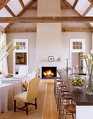
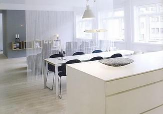
Images: KLMDesign (1) and Boligmagasinet (2)


The Kitchn - Fall Kitchen Cure

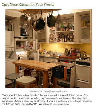
You know that saying, that a lawyer who represents himself has a fool for a client? I can relate, especially when I see the notice for the fall Kitchn Cure. I've meant to do this before, and I'd really like to get into it this time. I'm always open to learning from others...and new organizational concepts sound helpful, to say the least. They always have a plan for a happy and healthy kitchen! It's a great community effort, best of all. 

Sign up here! 


MY POSTS ON KITCHEN DESIGN AROUND THE WEB

I do a fair amount of writing for other wonderful blogs, and it's time that I gather together some recent posts I've done and put them all in one place in case you have missed them. Here we go:


DECORATI.COM

Fine Dining...In The Kitchen! 

White Kitchens - A Philosophy

A Few Of My Favorite Things

French Country Kitchens - The Next Frontier?

Wood Flooring For Kitchens

Pyrolave - Countertops On Fire!

Beyond The Bar - Inspiration From ICFF

KBIS Couture


THE KITCHN SERIES ON COLOR IN THE KITCHEN

Kitchen Design - Color For The Long Term

Modern Kitchen Design - A New Authenticity

White Kitchens - The Absence of Color

Color In The Kitchen...On The Cheap!

A Pinch Of Sugar Color


HOME WORKSHOP

Ten Budget Ideas To Update Your Kitchen


Enjoy! (A quiz will be given next Monday...bring two #2 pencils.)


A White Kitchen - Tricia's Interesting Design Choice

I'm pleased to show you a blogging buddy's kitchen. The kitchen is Tricia's from Avolli, the online store for Swedish antique furniture. Gorgeous stuff, all different price points, and some of my favorite things are the antique rag rugs. Just love them!

Tricia's kitchen is very lovely, but there is one feature that immediately jumped out at me...a feature that I have never designed into a kitchen, which is a big reason why I find her kitchen so compellingly interesting (besides the red, which I love!) I immediately questioned Tricia on it first thing. Questions surrounding any angle I could think of.  To my surprise, my questions were met with a "huh, should there be an issue here?"

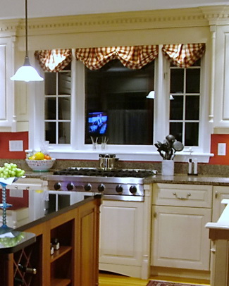
OK, what's the issue? Tricia has her cooktop situated in front of her window.

I know it sounds as if I next expected to tell a story of the kitchen police visiting Tricia's home, but trust me when I say, this is a highly unusual location for a cooktop, let alone a range top.

Tricia reports (after my countless crack designer questions) that there is zero issue with cooking fumes, grease and moisture landing on her windows, woodwork or curtains above, zero. Tricia has a downdraft ventilation system behind the cooktop. I asked Tricia repeated questions all around this issue, and of course, I believe what she reports. Maybe it's a testament to the efficiency of the Viking downdraft.

Here's more on Tricia's kitchen, a Q&A:


What were your original goals? What was most important to you?

When we purchased this house in 1998, the original kitchen had builder made cabinets, which in our case were poorly constructed and designed.  There were no tracks on the drawers, there was dead space in the design, the appliances were outdated, and overall it was unappealing to us.  We wanted a brand new kitchen with top of the line appliances and beautiful details in the overall design but within the existing floor plan.

Were your goals achieved?

In my opinion we did achieve a beautiful kitchen with wonderful details.  The door panels on the cabinet ends, the dentil moldings, columns and plinths that flank the cabinet ends, the built-in hutch with internal lights all contribute to what I find to be quality and beauty.

Tell me about the window behind the cooktop. Did anyone try to talk you out of it? Were you nervous about it?

The windows are part of the original floor plan.  We could not remove them, or change the kitchen footprint, without making major changes to the rest of the house.  I was not nervous about having the cook top there because that is where the original cook top was so it seemed ok to me.  Honestly it never occurred to me to not have it there.  I enjoy being able to look out the window when I cook.

Did you work with a kitchen designer or cabinet maker or what? What was that experience like?

I did work with a kitchen designer and remember it as a good experience.  I had strong ideas and opinions and was highly detail oriented in the process.  It is my understanding that the installer took some issues with the designer though.  Something about designing a kitchen that was nearly impossible to install??? I don’t remember the issues clearly but do remember him grumbling throughout the installation.

What did you want in your appliances? What was important to you?

We definitely wanted high end appliances and felt strongly about an integrated Sub-Zero and dishwasher, double wall ovens and the six burner Viking cook top.  I wanted the double wall ovens because I have a bad back and bending down to put things in or take things out of a traditionally designed oven would not work well for me. We have loved having two ovens and not having to struggle or juggle when planning big meals or for holidays.  My husband wanted the large, single bowl sink for washing big pots, etc. We both wanted the island prep sink which had become quite popular at that time.

Do you cook much? Do you like to cook?

The first part of my marriage I absolutely loved to cook and would read cookbooks in bed at night.  It was fun to created elaborate home made meals to dazzle our guests…and I did all that on an old and outdated kitchen.  By the time we bought this house and renovated this kitchen my children were in 2nd grade and pre-school and were very picky eaters.  This became disheartening to me because I would create a wonderful meal and they wouldn’t eat it.  As time when by their willingness to try new things did change and I was cooking less and less and resorting to the easy meals that I knew they would eat.  Now that I have one off to college I am starting to rediscover cooking, to my husband's delight, and look forward to the weekends when I can devote an afternoon to creating something special.  

I think it's a very nice renovation, and I love the family room too. Thanks, Tricia, for sharing your kitchen with me! I'm secretly jealous of your cooktop under the window! 

Kitchen Design - Advice From Allied Professionals

Cathy sent me an email and asked if I thought there was a design flaw in a section of her cabinet design. I had to write back that, yes, I agreed with her that part of the design was flawed. Unfortunately, it was a finished picture of the kitchen that Cathy had sent me, which made it even more uncomfortable for me to give my opinion. The kitchen was installed, and it looked like it cost a pretty penny. Here are words from Cathy:

"Lesson Learned 

I learned a big lesson the hard way and wish I had gone with my instinct to hire a kitchen designer during my kitchen design process.

My contractor convinced me that it would make more sense for him to design the kitchen layout because he was also working on the electrical, plumbing etc. so there would be a cost savings to me if he designed it and worked with his preferred cabinet company.

We decided to go ahead and in the end I thought the kitchen looked great until I noticed some design elements that look flawed to me. 

I believe that a good kitchen designer would have done a much better job and the money I am thinking of spending to make some changes to the existing kitchen could have been used towards the cost of hiring a kitchen designer.

It is very basic when you think of it. You are paying a kitchen designer for their expertise, experience and knowledge. I even believe that a good kitchen designer could probably help a client with cost-saving plus time saving advice because they have all the resources and know where to look for all the elements that go into a kitchen design project.

If I had to do it all over again I would spend the money to hire an independent kitchen designer. I have learned so much and wanted to pass this on so that someone can learn from my experience. I am definitely an advocate for kitchen designers. 

Cathy"


Here's my advice in terms of the medical profession, which just makes sense to most people:

The pediatrician knows a little about skin problems - go to the dermatologist instead

The orthopedist knows a little about heart problems - go to the cardiologist instead

The ob-gyn knows a little about head injuries - go to a neurologist instead

LIKEWISE...

The architect has designed a few kitchens - go to a kitchen designer instead

The kitchen designer suggests a roof line change for a kitchen renovation - go see an architect

The contractor "lays out" the cabinets - find a kitchen designer

The interior designer discusses the size of a kitchen island - find a kitchen designer

The kitchen designer suggests coordinating, expensive fabrics for the kitchen - find an interior designer

The point is simple. Whatever someone does "every day" as a working professional, that's who you go to for expert advice. It means that you must interview several design professionals to find the right one. It doesn't mean that you do not listen to any advice, given by an allied professional. It means that you put the weight of consideration on the advice from the professional who works in a particular discipline every day, especially if you hired that person after a thoughtful interview process, considering others' advice very, very, carefully in the context of what THEY do "every day."

UPDATE: Cathy said I could post the images she sent me. Now, you may not see a glaring, horrible, mistake, but in my world, it doesn't have to be very obvious. I think the intention was to have "weight" on each end of the L, but to my eye, it doesn't work. Each end ends with an identical pantry, which, again, just doesn't make sense. The weight of the hood is sort of scrunched toward the left, and then you have a run to the right of lighter weight cabinetry. Everything is off. I would also have switched the oven and the refrigerator. Cathy will remove the lower drawers on the countertop cabinet, and it will be much better. Thanks, Cathy, for allowing us to look at this. You're a trooper!

UPDATE 2: Cathy emailed me to ask me to ask me to remove the images of her kitchen, so I did. 

Julie and Julia - Kitchen Thoughts

Marcy Goldman is a new friend. I met Marcy some time ago, and we just seem to hit it off really well. I respect Marcy's hard work and experience as a talented baker and chef. I wanted to celebrate the movie Julie and Julia, and while I'm sure I will have more to say about Julia Child's kitchen, I want to start off with this very wonderful and interesting piece, written by my new friend Marcy.

Marcy Goldman is a cookbook author and master baker, and the creator of BetterBaking.com. She is an occasional baking guest on Martha Stewart Sirius and this fall has two new cookbooks coming out, as well as the current A Passion for Baking, Oxmoor House 2007. Follow Marcy on Twitter.

Marcy's newest cookbooks, A Treasury of Jewish Holiday Baking, and The New Best of Betterbaking.com, both Whitecap Books, will be available September 2009.

Get Marcy's book here: A Passion for Baking: Bake to celebrate, Bake to nourish, Bake for funHere's Marcy, in her own words, talking about Julia Child's kitchen. Enjoy.

I am both a curious chef and a nosy person. While in line at the supermarket, I find I peek at everyone’s grocery order and draw conclusions. Vegan, bachelor, busy working mom, non-cook, potential baker, meat lover, healthy eater, new dieter, and the family and/or must-have-tons-of-kids – those are some main categories. I observe more than actually spy, and I hope I am merely playing food and lifestyle sleuth – and not judging. I am just – as most food people are – interested in everything to do with food.

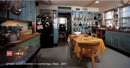
So when I gaze at Julia Child’s kitchen, now enthroned at the Smithsonian Institute, complete with Julia’s own voice inviting you to visit her famed home kitchen from Cambridge, I am both curious – as if I was a neighbor strolling through, and as a fellow chef and cookbook author. What does this kitchen say to me? What sort of person lived and worked here? On occasion of Julie and Julia, the new Nora Ephron movie, I felt a need to go behind the movies and myth and revisit the real thing.

The first thing I notice is that Julia was organized. There are acres of tools, pots, and pans – many choices, and a full battalion of back-up pans. I like that. That speaks of generosity too – a person who had a richesse insofar as she was outfitted with good stuff – not even lavish, but good stuff, easily at hand, and doubles of essentials. Brilliant. Such is the manner of my own kitchen.

I notice the good layout, the spaciousness, and the thoughtfulness in having things in easy reach and visually accessible. Chances are, if you see it, you’ll use it. If you hide tools and equipment away – true, your kitchen (and Julia’s) will look neat and streamlined but the very inspiration (and efficiency!) that comes from having visual reminders of potential culinary adventures cannot be overstated. You lose so much with things being hidden away – as aesthetic as it is, it robs you in other ways. Still, everything in its place, in a mindful way, is aesthetic in its own right. One takes a chance in being cluttered I suppose but Julia’s kitchen is inviting- not cluttered – so it’s possible to do it right.

In Julia’s kitchen you also notice a fusion of objects that were meaningful or serviceable. Items brought back from travel, collectibles, and simply decent, basic, good quality cook and bake ware. There is a charming mix of heavy duty things like her Garland (a range I also have in my own kitchen), a huge sprawling table to work on and host meals on, as well as back-to-basics like choppers, mortar and pestle, and a sweet collection of tea tins. The tins are robin’s egg blue, as is much of the woodwork in the kitchen. Such a sweetness in that blue tone, with its hints of New England tradition, as well as a calm and cheeriness –also trademarks of Julia.

Without doubt, in sensibility and design, Julia’s place is an expansive kitchen, as befits Julia herself. It captures a hominess, hospitality, as well as the spirit of a serious cook and dedicated professional. It seems designed to suit Julia or a team of helpers both. It appears a kitchen that saw miles of food, good times, wonderful chats, and perhaps quiet toasts between just Julia, and her beloved Paul.

Mostly, what I see when I take a glimpse of Julia’s kitchen, is a kitchen and a life, both well-lived. Chef or no, cookbook author or not, I would conclude this is the domain of a person I would like very much.

What do our kitchens say about us? Our homes speak but our kitchens, the heart and hearth of our domain – sing our theme song to world and company we keep. Knowing this, seeing Julia’s kitchen, I think again of my own kitchen with new eyes. Like Julia’s, mine is a place of many recipes, many miles of hospitality. Like Julia’s kitchen, even in repose, there is an energy. Stilled rolling pins, cooled stove, measuring cups dangling from stainless steel hooks – it’s life, it’s a stage, it’s a fusion of love and food, in equal measure. It’s the perfect recipe. Always.

More information on Julia here: Smithsonian


HGTV Design Star Kitchen Episode

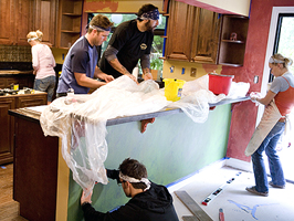
I will admit to only having seen HGTV's Design Star maybe once or twice before, a year or two ago. Somehow, my consciousness was raised about it this past week (good work HGTV) and I thought it would be interesting to view the kitchen episode, which aired last night. 

Of course, I'm going to look at this with a critical eye, how could I not?

Because I have not seen this season before last night, I do not know everyone's names, all their dynamics, abilities, and so on. In any case, it's the end result that matters. So, here are my impressions. Whether or not you watch the show, you can learn from this episode, so keep reading. 

When people go on game shows, I've heard that they brush up on facts, details, and so on. Is designing a kitchen something that these designers could have predicted they might have to tackle during the course of this season? If so, I'd assume that the designers would have spent an hour or two studying kitchen images to pick up creative ideas, tips, etc. Sit down, focus, observe, an hour or two, done. 

This episode goes to the crux of two important concepts:

  • What are the clients' expectations for creative solutions?
  • What is the designer's care/commitment/interest in providing creative solutions?

Did these designers fall into the trap of focusing solely on finishes? IT SURE SEEMS SO. The design of the cabinetry in both of these finished kitchens is kitchen design 101.

The cabinetry, being the largest element in the space (by far), has the fundamental opportunity (key word) to contribute to the design statement for the entire kitchen...in a significant way.

Who came up with the design for the cabinets? Was it the cabinet supplier? I don't remember seeing any plans or planning sessions on how to design the cabinetry into the space. I saw a lifestyle discussion with the clients, but not an overall kitchen design planning session. Did I miss it? 

Yes, I know they had 26 hours to get this done. BUT, taking an additional 20 minutes, at the barest minimum, after, say, the cabinet supplier presented the cabinet design (if that's what occurred) could have brought forth some creative ideas, even just one or two, from the design team(s). 

This is a competition on design ability, isn't it? Or is it just about speed, and how to throw in a BASIC kitchen with new finishes, in which case, nearly anything new will look decent, so what's the point in using designers, who may get their own show on HGTV no less? I expected more. And, not a whole lot more, given the time constraints, but more. Did you?

Here are some VERY simple ideas, one or two which would have sufficed to make it a more creative design. Again, we're talking simple ideas, given the time crunch.

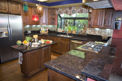
MOROCCAN/ITALIAN KITCHEN 

  1. remove the two round cabinets on each side of the window
  2. remove the diagonal wall cabinet to the left of the window
  3. in their places, just run the wall cabinets straight to the wall and put something decorative on the wall to the left of the window to partially fill that volume of space if it needs it
  4. the island is unattractive. Push the cabinet to one side and add a stool under the countertop overhang at one end
  5. OR push the cabinet to one side of the available countertop and add an open shelf cabinet which one will see upon entering the kitchen
  6. consider having a cohesive section of the wall cabinets "floating" on the wall/unconnected to the refrigerator end panel and right wall and, likewise, the wall on the other side of the window for a less utilitarian look.


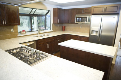
WARM MODERN KITCHEN

  1. Same recommendation, just run the wall cabinet on the microwave wall straight to the end of the wall and remove the one that is to the right of the window
  2. I think the cabinets should have touched the soffit or be 1/3 less the height. This height, to my eye, makes the ceiling look lower
  3. I would have considered a light cream/white color for the upper cabinets
  4. The island looks too large and with everything very simple, there was an opportunity to do SOMETHING to the island, even something little to keep the simple concept. What? How about using 2 refrigerator wall cabinets (24 deep typically) that are about 24" tall and put them on legs (straight, simple, pieces of lumber painted white, so easy) to make a more open feeling.
  5. Use a microwave drawer on the island and create a combination open shelves (seeing wall behind) and closed door wall cabinets on the refrigerator wall


Call me crazy, but a kitchen design is not all about the finishes. Again, the cabinets contribute to the largest volume in the room. A little thought goes a very long way. 

Also, I believe in both cases, the teams talked about entertaining. A few of these ideas above would make the kitchen feel, again, less utilitarian, and more like a "living" environment. If they entertain many people, and as we know, people like to hang out in the kitchen, is an island the best choice in THESE spaces? Could the peninsula end have been angled for more counter space, allowing more area to walk around in the kitchen? How many people can you really accommodate in these kitchens? I can't say, I can't see the dimensions. 

The point is, there was obviously zero time spent in the cabinet design process, except to go the easy way out...what their clients would most likely consider a "wow": either doing a simple, uninspired kitchen design billed as "modern" or embellishing the accessories/finishes as was done in the Moroccan/Italian kitchen. It sells the clients short. 

Twenty extra minutes to come up with something interesting in the cabinet plan by one of these designers OR a request to the cabinet supplier to "add a twist or two to this plan NOW!" is what a designer should have done to exhibit real creativity. 

And, please do not try to move a refrigerator yourself. Only the pros should move refrigerators into a house. 

I only made one comment on a specific finish recommendation. That's a whole other topic on these kitchens! And, rather than answer the top two conceptual questions myself, I'll leave that to others and would like your input. So, what did you think of this episode?


The Skirted Roundtable Podcast With Me!

It was my pleasure the other day to chat with Linda from Surroundings and Joni from Cote de Texas on all things kitchen design related. I think we delved into some interesting territory. 

Joni and Linda do love kitchens, that is apparent, and they have a genuine interest in hearing new points of view and I'm interested in their points of view, as interior designers. We can each teach one another if we are open to it. 

I listen to their podcasts. I'll put it on, go about my work and always learn something. 

In this podcast, I talk about trends, countertops, blogging, more. I was SO taken with this podcast experience that I'm going to do some podcasts here. If you can get past my Long Island accent and singsong voice pattern, you're prepared!

Thank you ladies, what a pleasure! I've been a fan of both of you!

The Kitchn Cure Is Coming

I'm a huge fan of the kitchn, Apartment Therapy's sister site on all things cooking and many things kitchen related. Apartment Therapy does their 8 Step Home Cure every spring, but the kitchn focuses just on, well, the kitchen, a space certainly worthy of singular introspection and periodic hair pulling sessions!

With the kitchen being ground zero for the need to physically nourish one several times a day in some cases (except for those who use the kitchen counter to place the take out food or pick up keys on their way to eat out) issues such as organization, storage, work habits and so on are worth taking a fresh look at now and then. 

In their effort to go back to basics, as the kitchn often does in a satisfying way, I wanted to give the kitchn cure a special shout out. Ok, the truth is, too, that I adore reading all the colorful comments on kitchen angst!

Classic Kitchen Design In A NYC Apartment

Here is a treat (at least for me!) I'm not allowed to talk much about my kids (although I have SO much to talk about, trust me) so, I say very little. Much to my surprise, after a casual question to my daughter on Saturday, asking if I could shoot pictures of her kitchen (with her in it) for my blog, when we would visit later that day, she said "OK, only if you remember to bring in the candle we left behind last weekend." Yay! I made sure to remember the candle.

If I am the Queen of our family, my daughter is surely the princess (2 sons come after her) and NOW, as you may notice, we are all eagerly awaiting a BABY princess in a few months! Does life get any better?

My daughter and son in law are renting a great apartment on the upper west side of Manhattan, close to Central Park. It's in a quiet residential neighborhood and the building is one of those old, grand, buildings. The entire apartment was renovated beautifully before they moved in, including the kitchen.

It was a beautiful renovation of the kitchen. Custom cabinetry, fit to perfection. Appliances include a fabulous Sub Zero refrigerator (I told my daughter she's too young to have a Sub Zero), a Miele dishwasher (likewise) and higher end GE cooking appliances.

I'm not sure what material the countertop is. Maybe some sort of soapstone, although it does not appear to be affected by food substances. The lighting is fantastic and presents a vintage design statement, as do the multiple glass cabinets. And, what about that floor!? The kitchen has the flavor of a retro but classic New York City apartment, with modern conveniences. The pull out narrow pantry is just so useful.

My daughter loves to cook. She always cooks with fresh ingredients, and the wonderful gourmet markets in the area offer culinary inspiration, so we always look forward to being invited to dinner! Last night was black bean and cheese enchiladas, fresh guac (as we call it) and yellow rice.

And, I can tell you too that, no matter the size of the space, everyone ends up in the kitchen! My husband and my son and his girlfriend spent the evening with us too. So nice!

Note to daughter: Thanks for letting me shoot the kitchen! Love you!


5 Ways To Plan For Adequate Kitchen Dining Space

Take a look at the plans below. This home is a fairly large home for 2 people, no kids. The kitchen is a large kitchen. Notice the first plan with handwritten comments (mine) which is how it came to me. Some time later, the second plan is what we came up with. I have some objections to that plan as well, as I had to defer to the clients' wishes, of course, but I was able to substantially enlarge the dining area and if you look at the lower wall of each plan, you'll see where some changes were made based on my suggestions. Not perfect, but much better. It's a shocking example of how, if overlooked and accepted, this large kitchen would have had seating for 2.
Read more

Fashion Week Connection To Kitchen Design '09

It's the end of Fashion Week here in New York, and I thought it would be interesting to get a round up of impressions of what's happening in fashion, as, after all, our homes are also influenced by fashion and trends (including current events.)

To put it bluntly, it appears that the carnage in the various financial sectors have brought forth a sort of "bread and butter" reaction from many fashion houses. Toned down, serious, back to basics, UN-wild is what's new. No lack of creativity, but a return to a designer's original aesthetic, and building on those strengths may be what's new for this season. And, that makes some sense. Less risky, and all that.

Nothing wrong with having a safe haven, and being surrounded by trusted friends, right?


As in kitchens for 09, new (post September 2008) thoughts on kitchen design also include a back to basics point of view, back to well designed kitchens, a focus on function, with the home taking on increased importance now more than ever...the ultimate safe haven.

I'll go into much more detail shortly (next couple of days) on where we are in kitchen design in these strange times of '09. Stay tuned.

It's not a fall, it's a correction....right? ;)

Downdraft Distress!

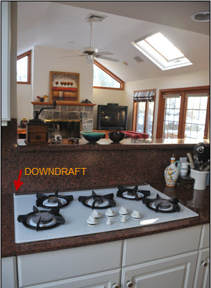
I've been meaning to talk about the downdraft behind the cooktop, positioned in a peninsula which separates the living area beyond. The higher than normal ledge behind the cooktop and downdraft serves somewhat of a purpose, if only to disguise the carnage in the kitchen.  

But, my real message today, is that, in my VERY experienced opinion, downdrafts suck, but not in the, um, physical way of drawing in moisture, fumes, odors and various other solid particulates produced by cooking, whether cooking in a heavy OR light manner. I forgot about the downdraft in a kitchen I owned many years ago, before I became a kitchen designer. At the time, I worked WITH a kitchen designer, who, as I remember clearly, never had the conversation with me about downdrafts vs. updraft hoods. What can I say? I was young and naive as well. And the range was against a wall, which should be a no brainer for a conventional hood and conventional advice! I remember, then, the trick of tilting pot and pan lids so that the fumes would move toward the downdraft far more effectively than just turning on the downdraft, even on high.

So, fast forward to my new home and my new (old) downdraft. Let me just simply say this. I would never, and do never, recommend a downdraft as being equal in performance to a range hood. There is, in my opinion, an enormous difference in performance. Of course, yes, much depends on the conventional hood's specs and proximity to the cooktop, but, when a hood is designed properly, the performance comparision between a downdraft and a hood against a wall is night and day in favor of the hood.

I can tell you first hand, the visible fumes and light smoke, even when the downdraft is on high, do not reach the downdraft. Well, maybe some fumes do, but my guess is over half of the cooking extracts do NOT get removed. What happens instead is that much of the fumes move into surrounding areas of the kitchen, or in my case, perhaps the great room beyond, settling into one's hard and soft furnishings.

Rather than making this post full of statistics and design specifications, I'm making it anecdotal (with a professional's knowledge of course!) If you have a choice, don't use a downdraft if you can avoid it. Mine is a high end cooktop/downdraft. The brand doesn't matter, because they all perform the same way. And yes, my downdraft rises about 7" above the countertop surface. Doesn't matter.

Very simply....try to choose a hood against the wall rather than a downdraft situated anywhere. A hood above an island or peninsula as opposed to a downdraft? That does not make much of a difference, as surrounding air currents interfere with the cooking extracts on their way up toward the hood. Either way, in this scenario, you're scr.....d. :( If you:

a. want the toxins out of your home as quickly as possible

b. want the odors out, as opposed to lingering odors

c. want the smoke and moisture out

d. do not want residue on your hard and soft surfaces

then, you will feel like this, I guarantee it!     :)

Small Kitchen Storage Tips

I'm thinking today about small kitchens as we're in the city for the weekend, in our little piece of New York City! I'm also thinking about small kitchens since my daughter is moving to another apartment and is absolutely wild about her new kitchen, also in New York. I can't wait to share that kitchen with you, but that will not be for another month, when they move, assuming the deal goes through, you never know, fingers crossed.

So, as I sit in the living area and look toward the kitchen, it appears to me that it's actually a very good sized kitchen for most any cook. When I'm here, I feel, what more does one need?

When I think of what I REALLY use in my good-sized kitchen on Long Island with the important disclaimer that I am probably an average cook, average being defined as a GOOD cook (of course!) and one who enjoys cooking, but perhaps not one who cooks with abandon on a frequent basis, needing a batterie de cuisine at my disposal at any given moment, it is helpful to get perspective on what one THINKS one needs, which may be different than every-day habits. That was a run-on sentence if I've ever seen one....yeeesh!

Point being...some back to basics thoughts for small kitchen storage planning:

1. Be honest with yourself...what do you really need, what will you really use in regard to cooking equipment?

2. If you want the bread maker and the rice cooker, can they be stored elsewhere in the apartment/home if there is no room in the immediate kitchen area? I don't want you to do without it, but consider alternative storage places...like under the bed or in a closet if you need to.

3. Counter space rules in a small kitchen. It sounds obvious but bears repeating: Put as much away or on shelves as possible to keep your countertops clear. I think all of us are surprised at how quickly we get used to items accumulating on our countertops.

4. If possible, put the paper towel holder on the sink cabinet door as well as a basket for the liquid soap and sponge. A pull out towel rack can be fitted in a very small space in the sink cabinet as well.

5. Periodically, every few months, take stock of your pantry items and organize them. You will be more likely to use those items which previously could not be seen and not buy duplicates. Organize them as to size or type, whatever works.

6. Do the same for the refrigerator. You are less likely to buy those extra condiments if the refrigerator is well organized. Organize by size or type. 

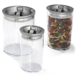
7. Think about removing pantry food items and storing them the new old-fashioned way to save on storage space - in Tupperware type containers. Also check out Rubbermaid, and the Container Store. 

8. Everything should have a home. Again, it seems obvious, but the home for all items and categories of items should be clear and obvious so accessibility is quick and efficient.

9. Have a nearby closet? Use the inside door as a spice rack, hanging spot for pots on a wire grid, flat pans, or other tools for easy access.

10. Organize pots on this handy item, the Pantree. Use roll out shelves were possible in base cabinets. A Pantree on a roll out shelf sounds great to me!

This is not meant to encourage you to pack in all the storage you can in your kitchen. Just as in any size kitchen, I want you to carefully consider, probably more so than one would in a large kitchen, the equal importance of aesthetics. If a bit of storage needs to be sacrificed for a decorative item like a painting or shelf with a few items for display, make that sacrifice, please! I want you to be surrounded with a meaningful and aesthetically pleasing kitchen interior. I cannot overstate my opinion on this. A small kitchen should not be solely utilitarian....just because it is space challeneged. You deserve both, aesthetics in regard to personal decoration AND function!

Tell me about your small kitchen and what organizational tips work for you...