I will admit to only having seen HGTV's Design Star maybe once or twice before, a year or two ago. Somehow, my consciousness was raised about it this past week (good work HGTV) and I thought it would be interesting to view the kitchen episode, which aired last night.
Of course, I'm going to look at this with a critical eye, how could I not?
Because I have not seen this season before last night, I do not know everyone's names, all their dynamics, abilities, and so on. In any case, it's the end result that matters. So, here are my impressions. Whether or not you watch the show, you can learn from this episode, so keep reading.
When people go on game shows, I've heard that they brush up on facts, details, and so on. Is designing a kitchen something that these designers could have predicted they might have to tackle during the course of this season? If so, I'd assume that the designers would have spent an hour or two studying kitchen images to pick up creative ideas, tips, etc. Sit down, focus, observe, an hour or two, done.
This episode goes to the crux of two important concepts:
- What are the clients' expectations for creative solutions?
- What is the designer's care/commitment/interest in providing creative solutions?
Did these designers fall into the trap of focusing solely on finishes? IT SURE SEEMS SO. The design of the cabinetry in both of these finished kitchens is kitchen design 101.
The cabinetry, being the largest element in the space (by far), has the fundamental opportunity (key word) to contribute to the design statement for the entire kitchen...in a significant way.
Who came up with the design for the cabinets? Was it the cabinet supplier? I don't remember seeing any plans or planning sessions on how to design the cabinetry into the space. I saw a lifestyle discussion with the clients, but not an overall kitchen design planning session. Did I miss it?
Yes, I know they had 26 hours to get this done. BUT, taking an additional 20 minutes, at the barest minimum, after, say, the cabinet supplier presented the cabinet design (if that's what occurred) could have brought forth some creative ideas, even just one or two, from the design team(s).
This is a competition on design ability, isn't it? Or is it just about speed, and how to throw in a BASIC kitchen with new finishes, in which case, nearly anything new will look decent, so what's the point in using designers, who may get their own show on HGTV no less? I expected more. And, not a whole lot more, given the time constraints, but more. Did you?
Here are some VERY simple ideas, one or two which would have sufficed to make it a more creative design. Again, we're talking simple ideas, given the time crunch.
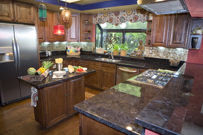
MOROCCAN/ITALIAN KITCHEN
- remove the two round cabinets on each side of the window
- remove the diagonal wall cabinet to the left of the window
- in their places, just run the wall cabinets straight to the wall and put something decorative on the wall to the left of the window to partially fill that volume of space if it needs it
- the island is unattractive. Push the cabinet to one side and add a stool under the countertop overhang at one end
- OR push the cabinet to one side of the available countertop and add an open shelf cabinet which one will see upon entering the kitchen
- consider having a cohesive section of the wall cabinets "floating" on the wall/unconnected to the refrigerator end panel and right wall and, likewise, the wall on the other side of the window for a less utilitarian look.

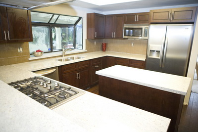
WARM MODERN KITCHEN
- Same recommendation, just run the wall cabinet on the microwave wall straight to the end of the wall and remove the one that is to the right of the window
- I think the cabinets should have touched the soffit or be 1/3 less the height. This height, to my eye, makes the ceiling look lower
- I would have considered a light cream/white color for the upper cabinets
- The island looks too large and with everything very simple, there was an opportunity to do SOMETHING to the island, even something little to keep the simple concept. What? How about using 2 refrigerator wall cabinets (24 deep typically) that are about 24" tall and put them on legs (straight, simple, pieces of lumber painted white, so easy) to make a more open feeling.
- Use a microwave drawer on the island and create a combination open shelves (seeing wall behind) and closed door wall cabinets on the refrigerator wall

Call me crazy, but a kitchen design is not all about the finishes. Again, the cabinets contribute to the largest volume in the room. A little thought goes a very long way.
Also, I believe in both cases, the teams talked about entertaining. A few of these ideas above would make the kitchen feel, again, less utilitarian, and more like a "living" environment. If they entertain many people, and as we know, people like to hang out in the kitchen, is an island the best choice in THESE spaces? Could the peninsula end have been angled for more counter space, allowing more area to walk around in the kitchen? How many people can you really accommodate in these kitchens? I can't say, I can't see the dimensions.
The point is, there was obviously zero time spent in the cabinet design process, except to go the easy way out...what their clients would most likely consider a "wow": either doing a simple, uninspired kitchen design billed as "modern" or embellishing the accessories/finishes as was done in the Moroccan/Italian kitchen. It sells the clients short.
Twenty extra minutes to come up with something interesting in the cabinet plan by one of these designers OR a request to the cabinet supplier to "add a twist or two to this plan NOW!" is what a designer should have done to exhibit real creativity.
And, please do not try to move a refrigerator yourself. Only the pros should move refrigerators into a house.
I only made one comment on a specific finish recommendation. That's a whole other topic on these kitchens! And, rather than answer the top two conceptual questions myself, I'll leave that to others and would like your input. So, what did you think of this episode?

