Blogging for Kitchens!

Here's what's happening around the blogs for some kitchen info and inspiration.

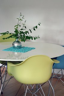
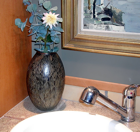
Accolady.jpgFirst, check out Desire To Inspire's post on dining spots. Definitely an important stylistic part of the kitchen, it's great to see this variety of styles and colors. Love their choices! Jo & Kim at DTI recently spent the week guest blogging at design*sponge. Some great postings this week on the d*s blog.

Breaking News: Stay tuned, as this week I'll be interviewing Grace Bonney, design*sponge publisher extraordinaire, on all things NOW, relating to home design.

Did you say you wanted a colorful kitchen? Take a look at this kitchen and all the other home entries in Apartment Therapy's Fall Colors Contest. AT says: "Color is a powerful part of interior design, and the cheapest way to change a room, but few feel comfortable using it. To inspire confidence, we're going to share all of the best color homes, tips and sources, worldwide." Vote!

Kitchen Design Notes has some solid information on butcherblock countertops, all you every wanted to know and all that. I LOVE wood countertops for a whole lot of reasons. I definitely see one in my future. Good work, Laurie!

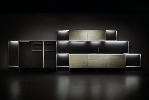
And don't miss this kitchen over at Materialicious, it has, um.....gravitas! 

black%20kitchen.jpg 

Kitchen Accessories

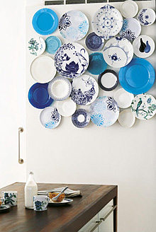
decor8plates.jpgEveryone loves kitchen accessories, right? I go through spurts.  I'll take apart all my decorative "stuff" in the kitchen and redo it again. It takes me forever, but sometimes, I just need a new, fresh, look in the kitchen. And, with kitchen accessories, we can get a new look anytime we want. Here are a few accessories that will freshen everything up quick and easy.

First, I'm wild about these little disc plate hangers I spotted on decor8, when my jaw dropped at the perfection of the concept! It makes me want to go out and start hunting for lots of plates. I love how these plates are hung in such a modern way, too.

Here's your source for them, DISChangers.com. How, absolutely, awesome, are these??


design-public.jpgNext, I want you to take a look at another fresh idea, from Design Public. Design Public happens to have a great collection of hip ideas for your walls.

These decorative wall art ideas are usually seen in other rooms of the home, but who cares? Be innovative and incorporate these ideas into the kitchen. Very easy to do.  


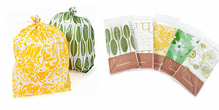
OK, maybe not what you wished for, but, hear me out...found these "trash chic" trash bags on Apartment Therapy -  Kitchen. The price isn't bad either, I was surprised...$14.95 for 80 liners. Makes trash removal something to look forward to now! Ok, it's a stretch...

 trash-bags-2.jpg

Creative Kitchen Designing

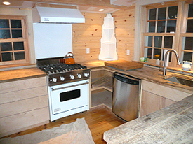
Brooke%20Kitchen.jpgI visited a blog I have been following for some time. It's about a "gut" renovation of a charming, old house in Sag Harbor, that really wonderful town on the east end of Long Island.

I've been waiting SO patiently to see what was going to happen in the kitchen, and finally, the images are up. Brooke Williams, Domino blog editor extraordinaire, (and mom-to-be very soon) did some pretty interesting things with her and her husband's kitchen. Definitely alternative!

Take a look at this kitchen post for more very interesting images and information on the kitchen.

The message, here, is that kitchens come in all different types and styles for all different reasons, and, in the end, should be as individual as you are!

Perhaps you would not have certain design elements or products such as is designed into this kitchen (no upright refrigerator, only 2 under counters opposite the range!) but Brooke and her husband thought this through carefully and decided a spacious, open feel was what they wanted most. Likewise, kitchen countertops made of unfinished, reclaimed antique wood, which will need to be finished on site. Another alternative idea! My understanding is that this will be a second, weekend, residence, another reason to make it a laboratory and venture beyond the typical.

Feel free to seek out, find, and then express your inner "kitchen!" You may get a range of comments and reactions, but, who cares, it's a reflection of who you are, and that's as it should be in kitchen interiors. I see it as having a very interesting mix of textures. Good work following your kitchen bliss, Brooke!

A Long Island Kitchen Designer

Well, that's me, of course, a Long Island kitchen designer! My market/territory/areas served are the Long Island and New York metro area and beyond as demanded!
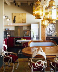
eclectic%20kitchen%20a.jpgWe know that, so?

What I'd like to talk about today is that the kitchen design "look" of Long Island, for the most part, reflects its well established suburban roots. Long Island being situated in the Northeast, close to New England, surrounded by history, naturally evokes tradition in many aspects of suburban life, creating a Long Island kitchen design point of view.

The majority of the architecture on Long Island is based in tradition, as are most furnishings seen in the homes here, as well as traditional landscaping, artwork, accessories, and other areas of home design.

I'm yawning already, what's the point?? 

Don't be so impatient! Here's the point! Most of my clients are in lock step with their physical, regional, surroundings as opposed to who they are, what styles appeal to them, where their interests lie whether recreational, via their heritage, personal interests, or "other." The home is Georgian, therefore, the kitchen is traditional, is often the conventional wisdom.

The point, as discussed regarding Long Island kitchen design, as an example, can be made for other regions of the country as well. The southwest, with its tex-mex point of view, southern California, a similar style of architecture and design, the often sleek, modern kitchen design of New York City and other urban areas, the warm woodsy soft contemporary look of the Pacific Northwest, the sleek, white kitchens of Florida, and other micro-themed regional areas. Point being, most regions have their "look." Actually, some areas on Long Island are more inclined to modern styling, other areas to formal styling, and still others to white, traditional kitchen design.
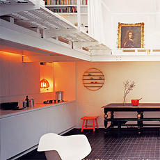
purplearea.jpgSet me free! 

First, be aware, be very aware! Be aware that you may indeed have an automatic reaction to what is the "right" way to design your kitchen either a) based on your region/history and/or b) based on the architecture of your home. 

Can you put a modern aesthetic into the log cabin lake house? A resounding YES. Mid century in a Victorian? Why not? You get the idea. The trick is to understand combining elements such as line, color, texture, mass and form. You will ultimately be creating a composition.

If you are unsure of how to proceed with this sometimes tricky aesthetic, please invest in the services of an interior designer for surrounding rooms and a kitchen designer who understands electic style for the kitchen so that you have a common thread among your spaces. Soon I will talk more about eclectic style, but first, one needs a germ of a thought, to begin to go against the grain, and here that is. Just call me the trouble making Long Island Kitchen Designer!

Desire To Inspire is a great resource to discover your secret eclectic self! Purple Area has some great examples of eclectic styles throughout the home, and also take a look at my category, Scandinavian Kitchens for inspiring eclecticity! (New word!) Although a Long Island kitchen designer, many design languages are spoken here on this blog!
 

Kitchen Design - Fresh Traditional

As I mentioned in my last post, I was away this past weekend. We went to visit good friends at this amazing (and I don't use that word lightly) place. I went to Thousand Island Park on Wellesley Island, located on the St. Lawrence main shipping channel in upstate New York.


This description from www.thousandislands.com talks about the island we stayed at better than I can:  "The charm of Thousand Island Park derives from many things: its splendid setting, its sense of detachment, and its special social history, but not the least from its delightful buildings. The Thousand Island Park Historic District is a unique collection of late 19th and early 20th century structures, and the only surviving example of the late 19th-century summer religious colonies found in the Thousand Islands region. The architecture of the buildings derives its characteristics from the prominent styles of the 19th century: Queen Anne, Eastlake, Stick style, Shingle style and later Bungalow. A more precise architectural description of the cottages in the Park may be found in the Thousand Park Landmark Society office. This is a 19th century town, which has changed very little from a century ago. There is a strong sense of community here and the happy quality of the buildings in the Park is a natural expression of the people who built them and continue to use them."


I felt as if I stepped back in time. The yards all blend into one another. There is one main, central, grassy commons area with an outdoor pavilion for community events situated at the waterfront. This place is about community, and as noted above, the architecture is just rich in its Victorian spendor and charm. The community is on the National Register of Historic Places because of its many Victorian houses. It is a place of simple pleasures, as our hosts described.


Designing The Kitchen - Purist or Not?

How would you design a kitchen in these homes? So far, I have seen a few. Our hosts, just having renovated their kitchen, chose a style totally appropriate to the architecture of the home. It just fits. Beadboard cabinet doors in white, original woodwork all around the kitchen, original windows stayed with the wonderful wavy glass. It feels right.

I think it bears mentioning that one can stay true to the historic nature of a home, design a kitchen in a traditional manner, but use a fresh interpretation of materials such as slate countertops, or wood tops for that matter, an apron sink, perhaps in concrete or a matte fireclay, wide plank floors, in their natural or bleached coloring, among many other opportunities for a new point of view. Think fresh, think natural, think simple, just....think, and the ideas will begin to flow, I promise!

Oh, take a look (trust me, it's worth it) at these flikr photos of 1000 island homes, and dream of an island of your own. I know I do... 


The Kitchen Designer on the Desire To Inspire Blog!

It's really great to be featured on the wonderful interior design blog, Desire To Inspire! Thanks Kim & Jo! I'm honored, truly, because these gals showcase really fantastic interior design, found world wide, in many different styles. It's a source I go to, to get inspiration, ideas, and information. I have often felt that Kim and Jo have a little bit of a kitchen fixation (in a good way!) as it is not unusual to find kitchens among their collections of interiors on any given day. I'm always thrilled to see these kitchen images. 

It's actually helpful to see the kitchens in these interior design collections, as one can see the kitchen design within the context of the entire home. But even beyond helpful, it is a valuable resource, and one of the very few blogs which includes different parts of the home, which one can learn from, in addition to just enjoying the view, a nice enough activity! Again, thank you!


desiretoinspire1b.jpg

desire-to-inspire-1a.jpg

Absolutely Beautiful Kitchens

I love the blog Absolutely Beautiful Things, authored by Anna. Today, I looked through it and found a few posts on particularly beautiful kitchens, which I'd like to show you.

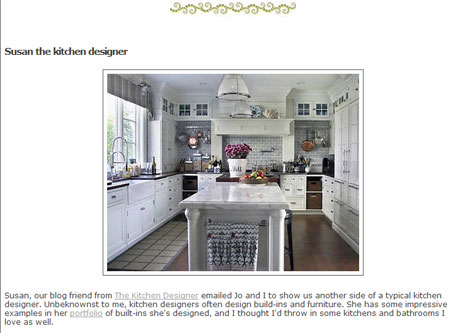
The first post shows a gorgeous white kitchen which is actually very similar to one that I did recently.  And, in Anna's later post Kitchen Love Part Two, please check out the inspiring ways to use shelving on walls and in pantries. Anna is an Interior Designer in Brisbane, Australia and owns a very wonderful shop called Black and Spiro.

shelving.jpgPlease also take a look at the blog At Home With Kim Vallee. The advice on this blog is excellent. It is practical and insightful and creative, a special and important combination. Kim's writing translates into focus and direction and makes it easy to follow too.

And one more, more shelving from Small Space Style, another blog with great ideas and again, very practical advice.

I need to do a post about shelving in kitchens, it is so HOT these days. These blogs have inspired me! In my practice, I am designing with open shelving more and more. It is accepted more than it ever was. A shelving post is coming soon!

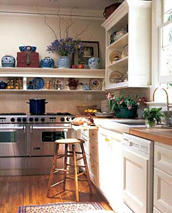
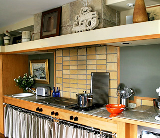
The image shown is one of my favorite images. I love the way this shelving looks. That said, I must say that of course it is completely misplaced and even dangerous due to the placement of the range underneath it. I think this image was from a show house some years back. You can tell it's old because of the dishwasher. Nonetheless, I love the shelving if we look at that alone! 

The State of The Kitchen Designer Blog

I'd like to say a few thank yous!

I started this blog on kitchens and kitchen remodeling, in very early February, as an experiment in another "voice" to my local kitchen design business website. I very quickly LOVED blogging, as I have always also been a writer of sorts!

What I did not expect to find via blogging, was the wide open welcome I received from the blogging design community. My very new blog, untested, unknown, has been welcomed in a way that has surprised me, from early on, and I am very touched, and also grateful for the opportunity to run with this great pack of design bloggers! You rock!

Thank you to those who have acknowledged my blog in one way or another. I am very proud to be associated with you.

Special thanks to the following bloggers:

 
decor8, for making me "blog of the week" last week - how awesome!

ShakaDoo, where I am a guest author in Shak In Style and Shak Hammer, in this very innovative blogging concept, one of a kind for sure.

Design Talk, where I answer questions on kitchen design, thank you, it's a lot of fun and very enjoyable all around! An excellent blog.

Hatch, who just featured me the other day, and another great gal with a great blog, attached to a store which has beautiful and useful things.

Apartment Therapy, who has put me in Slinks to my utter shock and amazement

Charles and Hudson, who will be doing a Q&A with me shortly and I am so proud to be associated with this blog 

Desire to Inspire, who very early on included me on their inspiring blog, thanks ladies

the happy living blog - the first blog who featured me, much to my shock, where I very loudly gasped and sat bolt upright when I saw a post about my blog! I felt like I was on the 6:00 news!
And, an extra special thanks to my friend, Peggy, CKD, CID, at kitchen-exchange, who inspired me to dust off my blog that I had started, but not published, last December.

Please also take time to make a visit to the blogs listed on my sidebar. I enjoy reading all of those blogs, and the ones who are asterisked (*) have supported this blog in a special way, and I encourage a visit to those particular blogs(*), where you will find very creative and beautiful things.


What's On Your Kitchen Counters?

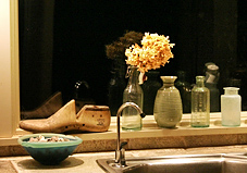
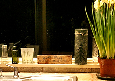
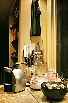
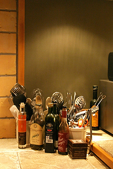
I like to be surrounded by my favorite things. I just need to have things around, meaningful things,...memories. I'm sure many of you are the same way. It is what puts "soul" in our kitchens. Personally, I much prefer meaningful things than decorative items selected for the design of the kitchen, but, that's also a look that certainly is viable and can be a lot of fun and of great interest, and I will be showing this look as well on these pages..

Here's what I have on my counters and also what they mean to me:

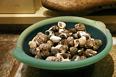
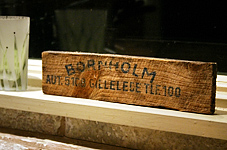
personal kitchen accessories_1.jpgpersonal kitchen accessories_8.jpg

A bowl of shells - picked them up at Jenny Lake out west with my husband many moons ago.

Wooden sign with lettering on it - picked that up off the ground. It is the side of a herring box. Got it in a little island called Bornholm, when I was 16 and visiting with my Danish aunt and uncle. I knew at the time that I'd have it forever. I can't tell you how long ago I got it.

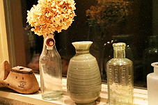
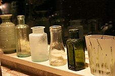
personal kitchen accessories_4.jpgpersonal kitchen accessories_5.jpg

Bottles - many of these were recently acquired as my husband and I found a man who searches for bottles in construction sites in the New York area, antique bottles. He knows many details about these bottles. One by one, at the upper west side flea market in the 70s in New York, we pick a bottle up and add to our collection. These bottles will soon be filled with roses from my garden!

personal kitchen accessories_6.jpgpersonal kitchen accessories_7.jpg

Shoe form - my uncle from Denmark, Thorvald, sold shoes for 50 years and ultimately met the Queen in tribute to his life's work. He's always been an amazingly wonderful uncle.

personal kitchen accessories_2.jpgpersonal kitchen accessories_3.jpg

Other images are of useful items that I think look great together, the oils, utensils, a few appliances. I'm fine with that. Not everything has to have a perfect place. Bring out your precious items and put them on your kitchen counter. Anywhere.

This last image is of a vase bought at a Scandinavian auction and is by a well known ceramic artist. The painting is of a little fishing village in Denmark, near where my cousin has a summer house. This is at the area of my kitchen where I have a second sink. Nice memories...

Kitchen Accessories.jpg  


Moody Kitchen Dining Areas

We talk about the kitchen, and there is lots to talk about, but an equally important part of the kitchen design, whether it is situated in the kitchen or just beyond, is the dining area, also called the breakfast room. This room, sometimes a part of the kitchen, should be wonderful as well, as it is an area in which we linger.

As we know, life happens in the kitchen, and often, life's most serious issues are discussed, where else, but at the kitchen table. Here is what we do at the kitchen table, we:

Dining Area004.jpg

      prep food
      eat
      relate
      love
      laugh
      fight
      read
      work
      plan
      spend money
      relax
      make up


...and so much more. Adding warmth to your dining space, personality, softness, and good lighting can create a soft, relaxed, feeling. Having candles nearby, music accessible, books stacked, magazines, all the things needed to relax, and unwind, is a good thing. Last week, I spoke about the logistics of the dining area. Those logistics will lead directly to "quality of life" in the kitchen, in which so much of life takes place. I suppose you can call it "setting a mood".


Dining Area005.jpg


Will your relationships be better, given all that happens at the kitchen table, if you set a particular mood? Interesting question. My guess, ultimately, is no, but I do wonder if there is indeed any sort of mood effect which can occur, between being in a dining area that is designed in a minimalist decor as compared to one with more decorative detailing in it. I almost used the word "soul" in place of "decorative detailing", but you know, the owner of the minimalist dining area sees elegance and depth as well, in what first appears to some, as "simple".

Accessories009a.jpg 


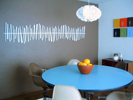
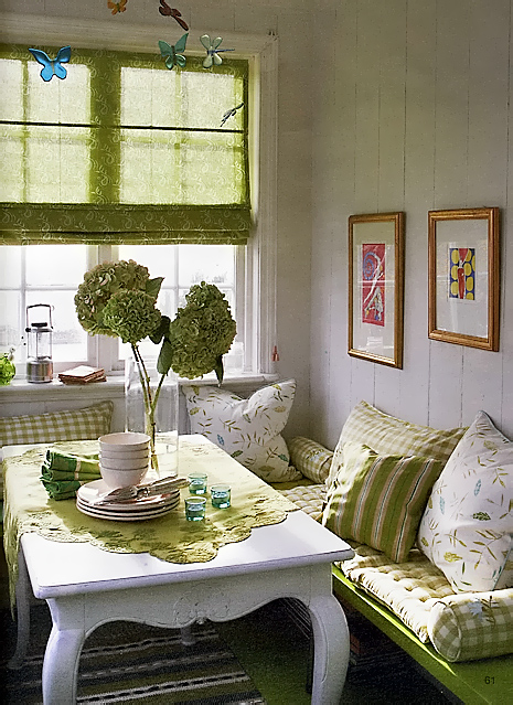
Decor8 has shown us a great image of a dining area, somewhat minimalist in nature, but with soul, as seen in color and texture. The floor adds warmth, the colorful mobile adds whimsy and interest....it looks like a great place to sit down and relate to one another.  How can you be in a bad mood in that spot? Food for thought! It was a great find.

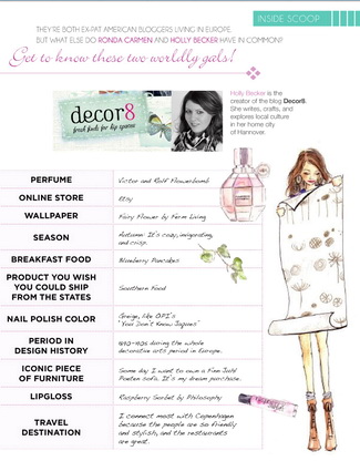
I'd also like to take this opportunity to publicly thank Holly at Decor8 for selecting me to be the "Blog of the Week". This is a great honor, as Decor8 is one of the finest design blogs, and Holly is very gracious. Thank you! Decor8 is a blog that needs to be read continually!
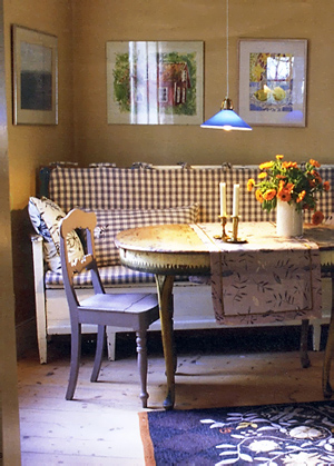
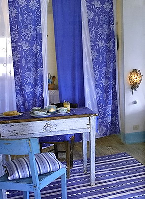
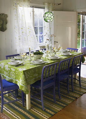
Back to kitchen table decor! In this particular discussion, the images shown are those which are more soft and romantic, and colorful. The images are from the catalog Gudrun Sjoden, the Swedish home/clothing company. I found this company via their store in Norway in December and really loved their look. Hope you do too. Speaking of color, check out Apartment Therapy's color therapy links for starters. I will have much more on color in the kitchen/dining area down the road, as of course, this is also a factor affecting mood. See a post on this same designer, by me, in Shak In Style. I'm in a good mood, are you?


Dining Area006a.jpg 

A cheesy kitchen design

Cheese Kitchen Design.jpgIn the process of talking about the theme of a kitchen, I encourage my clients to express themselves, who they are, in the kitchen. We are passionate about so many things and why not celebrate and surround ourselves with what we are passion about...like cheese!? This family from the U.K. designed their kitchen around their love of Stilton cheese. I think it's fantastic (it helps if you are passionate about something that looks good!) Here's the cheesy kitchen design story.

Good for them! 

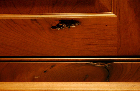
it's gnarly! Rustic Cherry

I have a wood species to tell you about, and I bet you haven't heard of it, or have seen it before! When I first saw it, I just loved it. I loved the rustic nature of it, and most of all, I loved the fantastic knots - the deep, gnarled, dark, craggy, open, sometimes with holes all-the-way-through - knots. It's really a great look. AND, it has the elegance and great grain pattern of cherry, with the rustic nature, of, say, pine, but BETTER. In the two images just below, you can see the overall look. The knots are not all over the place, but are spaced a good amount apart. With the knots, there is often exaggerated graining as well.

If you want, you can go several steps further, with various types of distressing, square pegs, glazing, cobblestone distressing, splits, worm holes, nail holes and more, really, as much as you want from a lite rustic look to a very heavy rustic look. It's something to consider, whether for one piece or a whole kitchen. What do you think?? Me, I'm really crazy about it, which is why this is the first wood species I'm discussing. The custom cabinet manufacturer I prefer to use for this wood is Quality Custom Cabinetry. Enjoy!

mallon 043a.jpg


one thing led to another...

...and I ended up with 4 houses in fabulous urban and resort locations, all mine! How lucky is that? We had the mega millions lottery drawing here 2 days ago, I think it was somewhere around $370 million! I guess I don't have to check our tickets...two people won, one in New Jersey and one in Atlanta. Goody goody for them. Me, I had it spent already...some for me and my husband, some for family, some to give to noble causes, making me guilt free as I turn shopping into at least a part time profession.  Oh yes, I guess some should be saved too.

IMG_2031a.jpgAs my husband and I dreamed (mostly me) which we like to do just before the "big one", I figured we'd get a penthouse in Manhattan (but where, uptown or downtown?), the house in the Hamptons, the house in Martha's Vineyard, a large apartment in Copenhagen (love those Danish kitchens) and maybe something in California, but that would come later.  Let's not forget about the Caribbean!

Four new kitchens.. Four different styles, how much fun can one have?  I may want to live in an 800 year old building in Copenhagen and have a sleek, minimalist kitchen, yeah. Love that combo. However, I do like to mix things up, to be eclectic. My preference is to layer several styles/themes into a room, although in small ways.

I feel my own kitchen right now is contemporary yet charming, two very different words! But, why not? contemporary/charming? traditional/minimalist? Sure. It's very doable. Don't feel you must be pidgeon-holed into one style, you just don't have to be. If you're conflicted about style, then the answer is you integrate both, or more. You don't have to know exactly how at the moment, just that you'd like to. That's a good enough start. What styles reflect who you are?