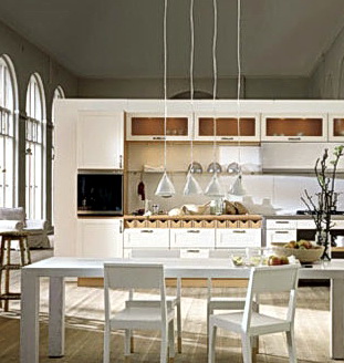
Draper DBS Sub Zero Booth Kbis 2008

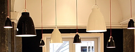
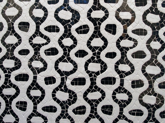
Quick note...as the weather warms...it's 73 degrees and not even 11 am(!) I like to lighten up the blog...so here is a fresh, crisp, change, along with some small new images just below the main image. It feels like summer already to me!

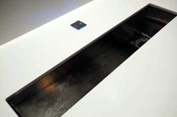
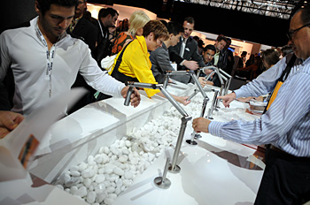
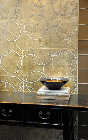
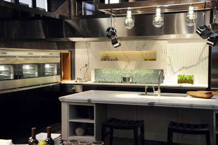
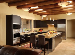
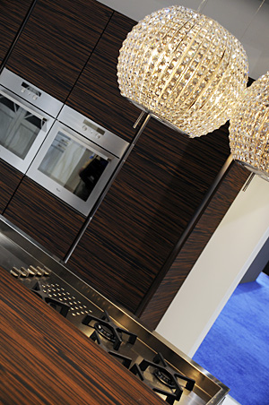
Here is the other Sub Zero booth from the 2008 KBIS show last week, by Bill Draper, of Draper DBS. Bill Draper shares his, always unique, always interesting, vision, creating a mix of materials, a fusion of smoothness, texture, shine, shimmer, waves, and grids in a simple, yet strong, kitchen design.

There is movement in this kitchen...it's in the "wave" drawer fronts, the rounded, amazing, Sub Zero pieces, made as one, the "moving" glass features, even the carved artwork of 3 people in slight movement. The colors are clear and warm, and the lines are strong. Bill Draper's designs for Sub Zero always delight the senses. We, in the biz, KNOW it will be something special if Bill Draper is attached to a project. His cabinetry is wonderful, and he has a policy that his factory will create anything buildable...just go ahead and dream...

Take a look at the Flikr slide show...it's a quick one, only 7 images.

subzero7aa.jpg


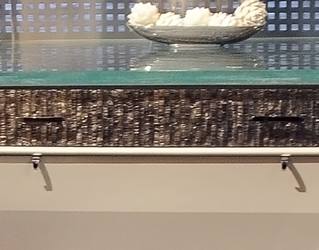
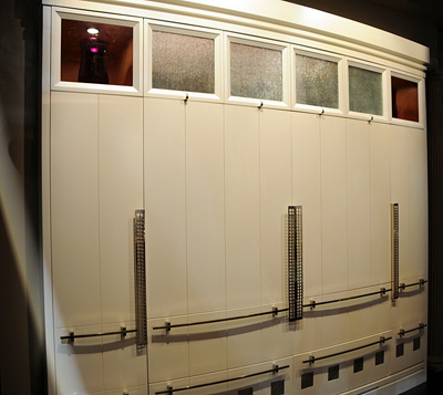
UPDATE: I had a request to see the drawer fronts on this project. I did not focus on them, so they are not as sharp as they could be, but it's not bad. kbis%2008%204831.jpg

My Midlife Crisis ... In The Kitchen

Not a crisis, it sounds so dramatic, but a period of transition, yes...honestly...as a kitchen designer, that is. I'm no longer so concerned with the kitchen triangle, and haven't been for awhile. For the most part, the kitchen triangle is fading away in relevance. Why? Because of several things:

  • a client's increased confidence in expressing one's preferred work habits (a good thing)
  • the introduction of so many different shapes, sizes, and types of appliances in response
  • designing multiple work stations into a kitchen
  • multi generations cooking together as fun rather than as a task
  • the kitchen becoming even more the center of the home, attracting people like ants to a picnic

But, it's funny, the thing that is really making me totally rethink the kitchen is its role as a social place. We've all read the magazines talking about the kitchen as the "gathering place." We've heard that for years, and there is the island with a few stools, etc. etc.

But, my eyes have been opened even further. I now find myself thinking far more about social interaction in the kitchen design phase, putting its importance right up there with other functional issues as well as aesthetics, which they do at Hansen, and in a big way. There is more to this philosophy, but, as you know, I will go on forever if I say much more. 

Here's the point for today. Remember this kitchen I told you about? I found myself designing in more opportunities for social interaction, with the occasional traditional thinking thrown into other plans, which many people enjoy. Today, I met with my client, and this is the plan she chose, just below. It was my favorite, but I'm not always asked what my favorite plan is, and do not offer it unless asked. It's subjective, after all.

Every plan has its pros and cons, and this is no exception. In fact, the social kitchen, often with large and/or multiple islands, does sacrifice storage. That's the way it often is. But, the critical question...do you really need all that stuff? In this case, we reclaimed a large wall just off the kitchen for needed storage space. At this preliminary point, it's all about shapes, forms, aisles, and appliance locations, really nothing more. There were others, but these are most of them. In one case, not shown, I put the cooktop in the bay and took out the rear window to have the sink closer to the cooktop in a different plan. Remember, function, social, aesthetics, the order of each is yours to define!

Island%20Plan.JPG

KBIS 2008 Trends - It's a Mod Mod Mod Mod World!

 hp-logo-washpostcom.gif
FIRST, a big WOW to being named blog of the week by none other than The Washington Post! My blogging buddy, Joni, from Cote de Texas told me the news. The other blog pick of the week was So Haute, a good find. Back to you...

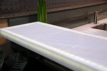
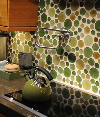
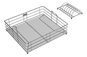
For those of you way too young to remember this movie, if not a mad world, it was a mod one at KBIS. Here are some examples, certainly not all, and to see the brand, roll your mouse over the image. MUCH more KBIS to come (this is nothing!) We haven't even seen kitchens yet!

kohler%201.jpg kohler%202.jpg walker%20zanger.jpg zephyr.jpg interlam.jpg elica.jpg blanco.jpg corian%201.jpg meredith%20idea%20center%201.jpg elkay.jpg


KBIS 2008 Kitchen Trends

ann%20sacks.jpgI touched on a few things in my glam.com post, but, before I show you more products, I want to talk a little more deeply about the trends I saw at the show. Here's what I observed...and I walked the show with a heightened awareness to just observe, put together puzzle pieces, listen, compare, look, and learn. I won't single out products here, I'll just give you my impressions. Look for examples as I show you specific products soon.

ECO IS (mostly) EVERYWHERE

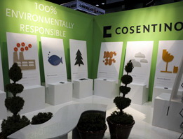
ECO-themed issues, displays, products or any combination thereof, collectively, WAS the 80,000 ton gorilla at the show. It's everywhere. It's shouted from the rooftops (I wish I had taken a shot of Sears' booth). It's the biggest marketing message of all. It's seen in the displays, in press releases, and is on all the KBIS attendees minds and in their words (at least everyone I spoke to.) I took a 1/2 day seminar on green kitchen design, so I guess it's something I'm attuned to as well. Most companies "get it" and are on board the green train, wherever it's taking us. I mean, what can be bad?

ENERGY EFFICIENCY

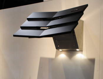
However, that said, beyond the message, in reality, it DOES look like many companies are making special efforts to embrace new technologies to make their products more energy efficient. I've seen more leds than ever as substitute lighting in various (mainstream) products compared to previously used, less efficient, lighting. Appliance companies are actively promoting increasing energy efficiency. Gas cooktops are more energy efficient. An energy efficient hood, which I do believe is the first one to be energy star rated. An effort for faucets to deliver less water out of the spout, but not sacrificing pressure. The mainstream companies are responding bigtime.
corian.jpgGLAMOUR

I cannot predict our economic future, but I can tell you that glamour in the kitchen is very much alive and well! Maybe, it's like having one last dance on the Titanic, who knows, but, wow, baby, many products for the kitchen are ALL DRESSED UP! To me, it's an edgier, riskier point of view that these mainstream (and smaller) companies feel comfortable "going for." Good for them. It's about time! Shine, shimmer, glass, leds, some color (not a whole lot) and you've made a statement.

BROWN, BRONZE, AMBER, WARMTH, ETC. ETC.

SO much at the show was brown...and various shades of browns, and different browns together in whatever materials amuse. Brown metals abound still, in hardware, hoods, sinks, faucets...Brown was really the king at the show. Deep, rich, stains in wood cabinetry were absolutely the norm in most displays I observed. And, I'll tell you this...if it wasn't deep, rich browns, it was browns with white accents.
glamour.jpgSTAINLESS IS A CLASSIC FINISH

Don't listen to those who say stainless is on its way out, just because browns are everywhere. Browns are not everywhere, not in appliance finishes. In other products, yes. I hereby declare that stainless is a classic finish. Yes, I'll go out on a limb on this one, and if I'm wrong about that, well, I've been wrong once before, so my record is good. ;) 

TECHNOLOGY

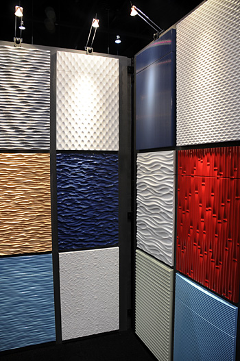
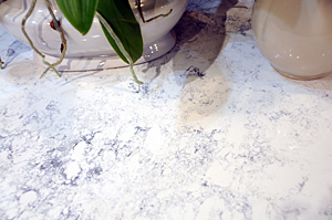
As mentioned a bit above, technology is doing amazing things in products. It is creating beautiful patterns in tile, it is creating beautiful solid surface patterns. Yes, solid surface, thanks to fresh, new, patterns, probably as a result of enhanced technology, need to be looked at again. And, yes, I do mean Corian. It was gorgeous in some displays. But, more than that, technology is giving us so many choices in how we use our appliances to get what we WANT out of them. Technology is helping to give us time back in our lives, it's organizing one's life in the kitchen. I see more technological leaps this year than ever.

APPLIANCE CHOICES

Appliance companies are stepping up to provide us with even better looking appliances. Also, appliances that cook or chill in far healthier ways than ever before. In more sizes and configurations than ever, and the continued introduction of smaller, niche, products to answer those quirky needs and desires of consumers. There are just more choices, let me say it like that!
silestone.jpgTHE ARTISAN/NATURAL INFLUENCE

The artisan touch was huge, in tile, big bold, patterns in hand crafted tile. Artists designed sinks, even in mainstream companies, hoods, interesting countertops, and more. The combination of matte and shine, texture and smooth, coexist and create a more personal expression. Natural materials...everywhere. If not real, then the look of nature. In cabinetry, countertops, hardware, sinks, and more...Mother Nature is surely the Queen this year!
 

KBIS 2008 Sub Zero Cool!

Always, one of the "must see" parts of the show is the Sub Zero booth. Sub Zero always has a couple of amazing, full size, kitchens, showcasing their products to the max! This year is no exception. There were two fabulous kitchens, and the first, by designer Mick de Giulio, follows. Take a moment to look at this slide show, and enjoy.

And, take a look at my blog posts for Glam Media, number ONE in reach for women online...

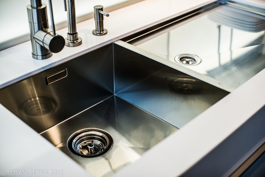
Talking about KBIS sinks!

And, a show overview here!

FYI...I'll be posting interesting information on KBIS for, probably weeks. So much I want to share with you. It's not old news a few days after the show. There's lots to share over time, and I'll work it all in when I can, in between my day job. :)

subzero512.jpg

KBIS 2008 - Cool Finds

I took about 700 pictures at KBIS, that's right, well, closer to 800! OK, it was the new, fancy, camera that made me go crazily snapping on and on and on. Plus, I didn't want to miss a thing!

The show is fantastic...always. New products = fun, cool, interesting, plus, always, a slow shake of the head in wonder at what they thought of next! Here are some random, but notable, picks...

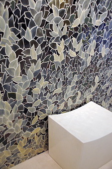
kbis%2008%20050a.jpgAnn Sacks tile, always gorgeous, introduces the Perennial series of tile, all, made in a small, Portland, Oregon, studio. This is custom mosaic tile, and I think it's amazing!


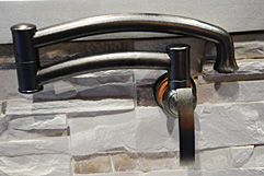
elkay%20pot%20filler.jpgI'll tell you one thing that I kept saying to myself and the person who walked me around the Elkay booth...Elkay has stepped it up! I was continually impressed by the beautiful design and innovation at the products in the Elkay booth. Smart, modern, very nice. Here's a new pot filler.


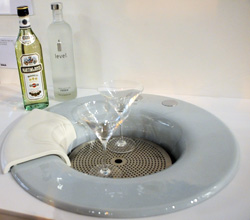
kohler%20cordial.jpgHere was a lovely, new, sink by Kohler, called the Cordial. It's an "entertainment" sink, ready to hold a block of ice, or bottles of wine, a staging area for mixing drinks, all that good stuff. A cutting board is included, an ice mold (hmmm!) and a steel pouring tray. Makes cast iron look modern, doesn't it?


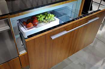
fisher%20paykel.jpgFrom Fisher & Paykel, a new refrigerator drawer. It's great to have a SINGLE refrigerator drawer. You don't always need a double. BUT, that's not all. It's not only a refrigerator drawer, it can be a freezer, a pantry (53 degrees) OR a wine storage unit. Just select the lock button to lock and unlock the temperature selections, decide what you need it for, and wa-laaa, the ultimate in flexible refrigeration!

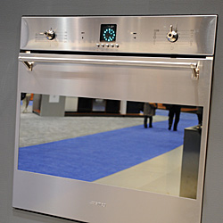
SMEG.jpgAnd, here's a new oven from Smeg...a glossy, mirrored finished door. Looks to me like it is a 24" size, perfect for a second oven in a medium or small kitchen or in an apartment. It's new!


More analysis and images, tons more, soon. An hour after I returned home from the airport yesterday, I met with clients for several hours, so I'm a bit late out of the gate! Lots more to share...

Fun At KBIS

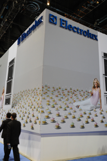
Fun first, and then products and all the rest of KBIS stuff, ok? Here are some images from my first day at KBIS...as I think of the images, there's not a whole lot that I need to say, the images will say it all! Oh, the first image is the same image from yesterday...only finished!

  kbis%201.jpg kbis2.jpg kbis3.jpg kbis%204.jpg kbis5.jpg kbis6.jpg kbis7.jpg kbis8.jpg kbis9.jpg kbis10.jpg kbis11.jpg kbis12.jpg


I'm here in Chicago for KBIS

Hello kitchen fans! Had a great flight yesterday on JetBlue. JetBlue is either fantastic or horrible. Yesterday, on a week's old plane, it was great.

Today, I attended two half day seminars. The first was on kitchen ventilation (use your hood or else all these little particulates will get over everything...heat, vapors, and food particulates, yuck.) Just use it. But, a lot more on this later, I'll expand on what was covered in the seminar (I know you're on the very edge of your seats for this but you'll have to be patient.)  ;)

And, I attended a seminar on green residential design. As things, products, and philosophies change fairly quickly, it's important to keep up to date. Took tons of notes and will expand on that too.

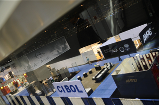
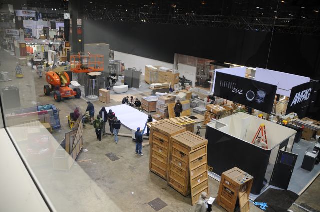
Then, off to a GE press event (LOVE those press events!) More on THAT too. Meanwhile, here's a photo I took of a small spot of the show floor, but trust me, this is what the whole show floor looked like this afternoon, and this was less than 24 hours before the show starts! This is typical, and somehow miraculously, the displays get constructed, wall to wall carpeting goes down on the entire show floor, and the show begins! I REALLY need my sleep now, more soon!

DSC_0023_2.jpg 


Going to KBIS in Chicago!

One of my most favorite things to do year after year is to go to KBIS. My husband usually comes with me, I see old friends, attend fabulously fabulous press events (massage event, anyone? IMAC event?) and just love the whole thing. I've been inundated with pre-KBIS emailings, postcards and other good stuff, and I look at everything.

I will be spotting trends, perusing kitchen design both good and yawn-worthy, extricating myself from nonstop talking marketing people, and watching those super-bending dancers at the hourly show at the Kohler booth. Please, kitchen Gods, don't bring back the Maxewll smart schtick at a booth I can't remember the name of, I can't deal with that again...

I am SO ready to go...leaving Wednesday and coming back on Sunday. I'll be blogging for Glam...more soon!

Dream House Diaries March Toward Mediocrity

One more post about the New York Times blog, Dream House Diaries, just one more! And, if the link does not work down the road, this is what the blog was about. A couple from up north builds a house in Florida, spending close to one million smackeroos, double, from what they first planned on spending, land and construction, included.

Here's the bottom line: In the course of spending one million smackeroos, they got a builder's kitchen in their march toward mediocrity (and obvious design flaws.) So, the lesson for the day, for this blog, for those who are about to spend thousands on a kitchen, is this:

There are different types of kitchen designers.

That's it, end of story. Alison and Paul were told this little nugget of wisdom, and they did not listen. As a result, there are so many flaws in their kitchen, I won't bore you again with the list. Instead, I'll go positive and tell you, basically, what's out there.

Low budget for new construction/remodels

Home Depot, Lowes, and your builder's kitchen "connection" come to mind first and foremost. But, that's not the end of the story...For you, you also have this option below...see the next category. If your kitchen is designed in 30 minutes, even 60 minutes, run away. This long term purchase deserves more time than an hour, no matter how nice the person is behind the computer. The business model here is about speed. And, you're not getting the best deal either.

Middle end budget for new construction/remodels

Here is where the local mom and pop kitchen and bath stores come in. They are everywhere. In my market, there is a saturation of them. They work hard, provide good service, care about their clients, go to the jobsite, do creative work, as compared to the big box stores, and as a result, increase the value of the product you are purchasing. Many of these firms will carry a very inexpensive line that the first budget category needs, but with added value to the services than are found in the first category.

Upper middle budget for new construction/remodels

These independent kitchen and bath firms may carry products in the next lower budget category noted and will carry even higher end products, offering even more services to their clients. Most of their work will be in this category, but they may be very willing to take jobs in a slightly lower budget range. Some will, some will not. The products are middle to higher end, and oftentimes the creativity continues upward as well.

High end kitchen design firms for new construction/remodels

These firms carry the best, or nearly the best (not always, oddly) products and generally offer even more detailed design work, devoting a good amount of time to your project. In theory, these designers work with a higher level of creativity, offering products that may not be able to be found elsewhere. Sometimes they have a product line that is somewhat less expensive. Some will take projects in the upper middle budget category, depending on their interest or work load. Their pricing is usually competitive with other equivalent firms and with the category just below. Thus, interestingly, a superb value is often found in this category.

Of course, there are other ways to buy and design a kitchen, but what I am speaking of here are the engines that drive the kitchen and bath marketplace, and how it is, in my mind, categorized.

I can be proven wrong by real life examples in any of these categories, which will illustrate that, as I implored Alison and Paul to do, one must carefully interview designers up front, to find the one that will provide the very best value, and be the right one, for their vision, their budget, whatever their main needs are. Look, interview, evaluate, find a good "fit."

The crazy thing is, many of these providers mentioned, offer design services for free. OR, those that do charge a fee, usually make it fully rebated upon purchase of the cabinets.

But, as I am speaking about Alison and Paul, here, they had this opportunity, they were told about better alternatives, and they chose the #1 solution, above, for the million dollar house. They got what they deserved.  The builders' kitchens are alive and well, I see, warts and all! What a waste. 

Lessons Learned From New York Times' "Dream House Diaries"

As I noted a few days ago, the New York Times blog, of which I was a "regular", has put up its last post. It's definitely bittersweet for me (I can't deny there are SOME emotions to seeing the last post, since I've hung in here for close to a year!) But, somehow, I think I'll be able to work tomorrow. :)

Here are the lessons that, I think, one should learn.

1. Plan in advance. As far ahead as you can, as soon as you are thinking about remodeling or building a home, start the process to find a kitchen designer. Alison and Paul's (the homeowners) builder told them to wait until the kitchen had a floor. That's...I can't find the words.

2. Find a kitchen designer - Take a look at this post for tips to find a kitchen designer. Allow for time up front, it may not be able to get done quickly.

3. Before you sign a contract, tell your builder you may not want to use his kitchen designer. Deal with that up front, and find out what sort of allowance will be rebated back to you. My take is Alison and Paul thought they would get a better deal with the builder's kitchen person. This is unknowable on their part, and I doubt it would have been much of a deal in the end. Not worth it.

4. Be aware that sometimes builders' kitchen designers are most comfortable with doing kitchens one way, and fast. Do you want that for a long term purchase?

5. Will your kitchen designer advocate for YOU...or for the builder? Alison and Paul had an issue with a large air handler which created a very bad aesthetic situation on several counts in their kitchen. Their designer should have been on the spot right away to come up with alternate solutions.

6. Be aware that even if you have to pay an upfront fee for a kitchen designer, in nearly all cases, the fee is refundable upon purchase of cabinetry. Extremely low risk and very much worthwhile to go this route.

7. Make sure the designer draws in surrounding spaces ESPECIALLY (did I say especially?) if the space is a great room. This was not done in Alison and Paul's case. As a result, the great room is a kitchen with a dining and seating/sofa area in it rather than a great room with a kitchen in it.

8. Make sure the dining area is drawn with chairs, the proper size table, all proper size furniture, and the spacing is gone over very carefully with you. Alison and Paul's great room is 44, maybe 45 feet long, with, oh, 9 1/2' allocated to the dining area. Yes, that's REALLY  a place that I want to hang out at. Maybe there is 4' between the table and the sofa on the other side of the space.

9. Note the window placement in relation to the dining table. In Alison and Paul's case, the windows have no relationship to a dining table. And, they are different sizes. It's just bad. They were warned.

10. Alison and Paul have acres of countertop, all of it one dark colored granite. Be aware of the impact of this type of situation.

11. Don't blindly put boxes on the wall. There are many other creative ways to design a kitchen.

12. Look at proportions and sizes of cabinet doors. In quite a few areas, Alison and Paul's doors do not relate well to one another, side by side and/or top to bottom.

13. Please think twice before you "default" to maxing out every possible inch for storage. The kitchen can look like another room, a lovely room, a real room. Do you really need all that stuff? If you do, and it's a great room, then be aware that there are alternatives to all those.....boxes. Creativity takes time. Give it time and understand that the aesthetic nature of the kitchen should be given equal, yes I said, equal, billing, especially in a great room!

14. Just put the time in. Apathy breeds boring design solutions as well as outright bad design due to others' apathy, responding to your apathy.

Ah, I feel better. I've had so much built up frustration during the course of this blog. The apathy, the waste in this kitchen, really was unfortunate. And, again, ad nauseum, I'm talking the apathy and waste in the fundamentals.

Designing A Kitchen For A Large Space

I was recently hired to design a kitchen for a large space, which will incorporate two connecting rooms. The home has its architectural challenges, of which I could mention a bunch off the top of my head. Currently, in this huge kitchen, there is about 36" between the island and the main "run" of cabinets. 36" in a huge kitchen. That really makes sense...no, it doesn't.

Part of what I find to be a lot of fun, is when I go into a home, look at the existing kitchen, and I can see the thinking, the motivations, of the previous kitchen designer. I do enjoy making lots of mini observations, connecting the pieces, to figure out how and why the kitchen was created in its original form. And, I could be way off base, too, with my assumptions, sometimes, but, it's a fun, little, exercise. And, of course, one never knows who really drove a design, the designer or the client.

Here is the empty plan of the existing space. I'll tell you...you draw it out, put in windows, doorways, double check measurements, etc. You're done, after some hours, and then you stop, look at this (in this case, big) empty space in front of you, take a deep breath, and say, here it begins...turn on the inspiration, here we go, find the inspiration, find it, but don't force it, don't rush it, let it flow. Rushing tamps down creativity. Time breeds creativity. This point is sort of a red stop light, a pause, before the light turns green. It's an interesting feeling. It's a natural pause for me.

I do a variety of plans to suit a space. I've already come up with several plans I'm quite pleased with, thus this post. I've also cautioned the clients to keep an open mind (a really open mind) because what I'm coming up with is very different from what they have now! I'm excited about the possibilities for this kitchen and surrounding spaces. They will be able to choose the one plan they like from more than several they will be shown.

The existing kitchen is flawed. It is possible to design fabulous cabinetry in a ridiculous way, yes it is. What's wrong with their existing kitchen is:

  • the kitchen looks like it is boxes on a wall with no architectural interest
  • it defines the term "hodge podge"
  • it blindly makes all surrounding base cabinetry 24" deep
  • it's cramped all around the island
  • it's un-fun to work in
  • the appliance locations are wacky

I'll be creating a family room area in one of these spaces and will need to find harmony with an existing fireplace, a wall of French doors and find room for media, too, with an eye toward relating to a newly opened up kitchen on that end. I'll fill you in on the plans themselves, after I show them to the client, as well as which one they chose. How lucky am I to be doing this work? Even after all these years...

kitchen3.jpg

Here are existing kitchen images, notice the ins and outs and very small areas between very, very large, tall, pieces. Notice the sink is unconnected to other countertop areas. It just looks, to my eye, very disjointed, not making sense, any sort of flow.

 Kitchen%201.jpg

DSCF4361a.jpg

The VERY Latest Kitchen Design Trend 2008

This is truly breaking news, and truth be told, I am THE force behind what will prove to be a movement in architectural and interior design starting the moment this post gets published.

I predict what is already beginning to surface is this: Henceforth, and from now on:

There will be a kitchen in every room in the home.

If not a full size, then, well, something a little smaller, whatever, forget the details for now, I'm busy with the concept.

Kitchens are the nourishment, the heart and soul of the home. It is the most important room in the home. It is SO important, that it only makes sense to expand the concept! The advantages are really where our society is moving, anyway. Here are the advantages:

  • maintaining one's privacy-once and for all! You know all that privacy talk you hear? Now, there's one more way to be private.
  • have your own stash of food
  • decorate the kitchen however you want - seek out and express YOUR inner kitchen
  • design it to suit YOU, functionally, not for a group such as that family concept thing. Want the sink between the refrigerator and the double oven cabinet? Go for it.
  • the appliances are your orchestra and you are the conductor-cooking alone has its advantages.
  • you wouldn't have to unload a dishwasher filled with other people's dishes
  • with the kitchen in a living room or library, one can theoretically be on the social floor of the home but still be alone, that is, if hours for your use are posted in advance and doors are in place to seal the room off
  • you can happily combine cooking and YOUR choice of accompanying media. No more music/tv controlling people in the kitchen
  • you cook what you WANT, not what you are told to cook. She likes tofu, he likes meat? See ya later.
  • everyone ends up in the kitchen...what's so great about that? Crowds? Fighting to be heard? So not fun.
  • you have to eat three times a day, too frequent to have to stop what you are doing and go to another room
  • kids? Playtime is learning time...they need to have the kitchen in the place in the home where they learn the most...in the rumpus room. They'll figure out how the appliances work - kids are curious! 
  • no more topics of discussion you don't care to be included in, no more worries about being invited to join in a conversation, finally.
  • you know that person's laugh you can't stand? Finally, no more laughter in the singular kitchen.
  • no more exhaustion of relating to one another - it's OVER.
  • with all these kitchens I'll be designing, I'll finally be rich, I tell you, RICH!

Hold your applause...There are, indeed, many more compelling reasons to proceed in this direction. Thus, I am beginning an association called the following: The Anti-Kitchen Kitchen. No, that sounds too negative...


April fools!

:)

A Dream Kitchen?

I started reading the New York Times' blog, Dream Home Diaries, late last spring.

Let me say that I truly wish Alison and Paul, the homeowners who built a home in Anna Maria Island, Florida, the very best. I hope they love their kitchen, that it works well for them, and I wish them all good things in connection with their home.

I've been a regular on the Dream Home Diaries blog on posts that had to do with the kitchen. My motivation was to help out Alison and Paul, who asked for help, admitting to being completely clueless to building a home, as well as educating the public at large. Many of us helped out. What a great resource of information (and smart alek-y and snarky comments) they had before them. Man, this blog is so entertaining, I'll be sorry when it's gone.

I found myself feeling quite annoyed at times at the authors' complete lack of response to my and others' advice. Advice on fundamentals! Let me give you an example. Alison wrote that John, their builder, recommended that the kitchen not be designed until the plywood was down in the kitchen and then one could mark it up to feel the space.

I've never heard of anything so ridiculous in my life from a builder of a custom home. And, at that moment, the builder will be screaming for rough ins of electric and plumbing. I, and others, oh what's the word, valiantly campaigned to the authors to get a kitchen designer NOW...and I offered specific advice on how to hire a designer.

Unbeknownst to anyone else, I offered my own services way back (not free) because I was so concerned that the kitchen plan was simply not being attended to...and it really bothered me. I wrote and said I would not wish to be known in the blog as the designer, but I'm here if they needed me to step in (which was before they got a designer.) It was a brief, but sincere, offer, which was met with no response and was not published. I have so many complaints about the way things were done by the authors, I won't even bore you with it, I promise. And, my general negative attitude throughout the blog about how this kitchen design process progressed had nothing to do with my rejected offer. Anyone who has read my subsequent impassioned posts know that I care a great deal about the value of making the most of the time available pre construction...as time breeds creativity, attention to detail, and a whole lot of other good stuff.

The bottom line is that, given the amount of money they spent on their kitchen ($60,000?) I feel it was wasteful, very much so, to not have hired a kitchen designer early on, to have had the luxury of time to plan their "dream home" kitchen and not to make use of that time. If you take a look, you'll hear me whining, cajoling, almost pleading at times to pay attention to this or that. Although, educating the readers was always a goal as well. It's really funny how into their kitchen process, or lack thereof, that I got!

Also, one thing to remember is, what looks shiny and new doesn't necessarily mean it's fundamentally sound design for the kitchen as a separate entity or for the architecture it is surrounded by. But, it's their kitchen and they are the ones to be happy with it, no one else. But, they could have known so much more along the way....

This blog gave a lot of us lots of raw emotions from time to time. I also laughed, got impatient, angry, and always hoped for the best. Take a look before it's gone...

dream%20home%20diaries.jpg


Products For Kitchen Inspiration

Here are a few things, either new or cool, that I think are definitely worth noting.

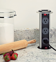
elecgrommet.jpgFirst, take a look at this receptacle. Good for an island situation or other areas around the kitchen. It makes countertop receptacles possible. Not for every installation, but I can think of a few it would be perfect for, a long island, for one. This kitchen receptacle will do a good job being sealed off from liquid spills. By Doug Mockett & Company.


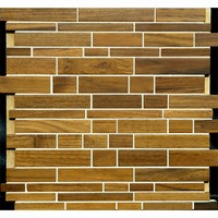
Harmony.jpgLook at these Harmony Wood tiles, by Anchor Bay Tile, aren't they cool? It's a real wood tile that is mounted with mesh, something your tile man will thank you for, that is, after he criticizes you for buying non ceramic tiles, of course. Just tell him they are made of wood from sustainable forests, and he'll feel better..we can dream. 

American%20Clay%201.jpgAnd, I really love this product, American Clay. It is a natural earth plaster, made of natural clays, a green product, recycled and reclaimed aggregates, and contributes to Leed points on your project. It is such a beautiful, sort of suede like finish for your walls, and again, it is healthy for your home. I'm seriously thinking of using it in my home this spring. In fact, someone is coming to my home today to take a look at my walls!

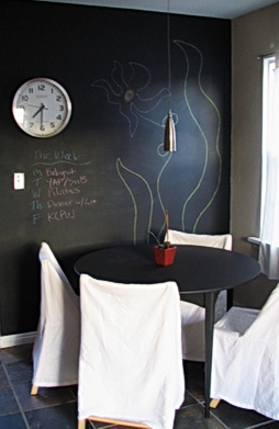
curbly%20chalkboard.jpgI also love the idea of a chalkboard wall, or section. My immediate thought is to do a post just on chalkboards in kitchens, and I may, but I also know that if I say, good idea, it won't happen for a month, so here's the idea now. I'm also seriously thinking of doing this in my kitchen too. The image is by booizzy. Here are a couple of other places for inspiration: Martha Stewart (but, of course) and Apartment Therapy (always.)

Kitchen Eye Candy

I need some kitchen eye candy. I've worked solidly for two days (this weekend.) Tons of detail work doing an electrical plan, plotting very specific dimensions for lighting and appliance centerlines, switching, and receptacles, only to have beams be in the way, I'm sure! Also, uploading plans to my out of state clients.

I also designed a kitchen within an entire space, designing around a structural column in the middle of nowhere, adding in furniture for the family room, again for context, as it is important to understand the negative space as one moves around furnishings, cabinetry, etc. That negative space is equally as important as where to put kitchen cabinets! You have to see it all. Remember that, in your great room design adventures...do not forget to have the surrounding spaces/furniture drawn into your plans. Otherwise, you're driving blind, so to speak.

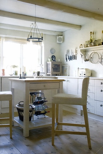
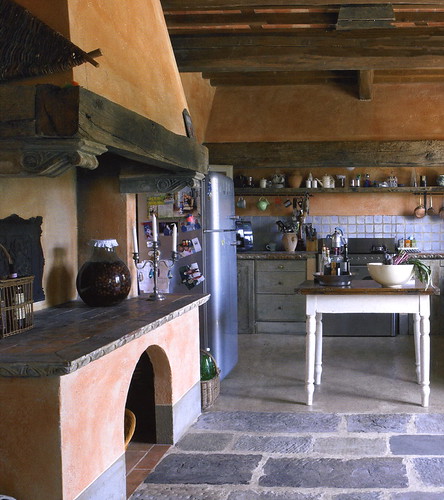
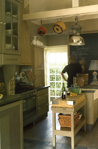
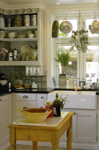
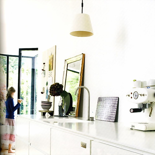
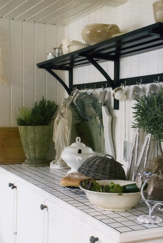
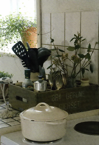
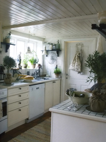
But, I'm wild about my monitor. It's truly the best thing I've done for myself in years! So fantastic, so crystal clear, so vibrant! But, I digress...I need some mindless kitchen eye candy, so let's look at it together and think some really luscious kitchen thoughts...Scandinavian kitchen thoughts, something I have not shown you in some time.

From Vakre, a magazine so beautiful on every page, I can hardly describe it...

Kitchen Tech

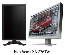
My world has changed today. My computer arrived a week and a half ago, but my new monitor arrived TODAY. I had been using a Sony monitor that I paid $2,000 for about 5 years ago. You'd think it was a good investment. I noticed over time, it was getting increasingly dimmer and dimmer and adjustments made no difference. It wasn't terribly dim, you wouldn't notice it, but put a new, cheap, really cheap, monitor next to it, and there was a huge difference, the cheap monitor blew it away at this point.

FlexScanSX2761W.jpgSo, I researched and researched. And, as I work with images all the time, it was best to have a certain color management ability/setting. And, since I'm always working on my kitchen design drawings, clarity was equally important.

I'm boring you now, I know it! Anyway, I ended up getting an Eizo 27" monitor, a brand that is well known for both photography and cad use. This thing is crazy! It's so bright! It's so crystal clear! I see this BLOG so differently, like, WOW, look at my blog, what colors! (I'm glad it was a GOOD reaction.)

I spent the same amount, I did 5 years ago, around $2,000. But, monitors have come down so far in price (in general), and a good monitor is so much better on the eyes (not to mention so much fun) and makes everything look so much better and realistic, especially all those products, textures, colors that are involved in the kitchen, it's a good reason to upgrade.

This monitor is changing my entire experience on the web, on my blog, in my design program, I'm so thrilled and I just had to share it! Now for the second monitor to put alongside it...maybe a 20" should do it.

Many of our lives are so internet-heavy these days, and I forgot how important a monitor is. Although I hated to replace something that was still functioning, bottom line, this was a good decision, a wise decision!

And, kitchens? They just look fabulous, dahling, on this monitor! Good weekend...

Random Kitchen-ness!
I'm sorry I haven't been around! My head has been moving in other directions...moving from one client to another plus a bunch of other work related stuff.

So much to say, I'll never say it all! One thing I can say very enthusiastically... I find this to be the best time in a very, very long time, that, really, all the kitchens I am working on are interesting, aesthetically challenging, and all kinds of other good stuff. I'm loving my work. I'm enjoying my clients. I'm really revved about all of what I'm working on!

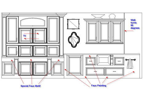
Let's take Grace. As I said, we installed most of the kitchen and Grace decided, after some time, that she just didn't love one section of the kitchen. And, she wanted to design an entirely new and different wall (in the upper section, the base cabinets would stay). Luckily, what she decided NOT to use was not a large financial loss. So, I came up with another plan, which Grace loves. The left side of the elevation is opposite the dining area, the right side, opposite the main kitchen area.

What's the message here? I think it is, that if you can't live with something, and you're willing to change it....change it. Don't freak out. Go with the flow and see where it takes you. The answer is different for everyone. This will be ordered shortly. New%20Wall%201.jpg

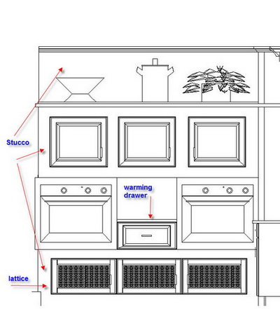
Here's something else I'm working on for another client. It's just one small wall of a BIG kitchen, a Kosher kitchen. I think it's cool.  oven%20wall%202a.jpg


And, one more random note, not really about kitchens, that's why it's random! Run over the Surroundings where a contest is about to begin for a very cool lamp. Free is good, contests are fun, and you really should check out Surroundings in any event! The lamp is from the Jonathon Adler collection.

Be back real soon, I've missed blogging and think of it every day, it's just been hectic!

A Computer For Me, A Computer For you!

No, I'm not giving away computers! I just got a new one yesterday. My very smart son, in college (he just got a 102 on an Economics Test-good job!) told me NOT to get a computer for the $4,000+ I was going to spend, as recommended by my local computer guy. I have a local computer guy because my son, Matt, lives in the city, too far away to respond quickly to my computer issues when they arise.

Matt said, hold everything, he'll build me one!

Matt has been working on computers since he was 12. Matt is also frugal cheap. He is obsessed with doing research to find the best product, part, piece, whatever, at the VERY best price. Matt, being frugal cheap, looked up the specifications of a few of the programs I use most, spoke to people at tech support behind the programs and determined that even though I wanted the best/fastest/ultimate, he reminded me that he could save me money and still make me a computer that was FAST but customized to my specific needs. Above all, Matt knew I wanted FAST. I told him 50 times.

This new computer is fast, AND, I saved WELL over a thousand dollars, probably closer to $2,000 as compared to, say, a Dell! How? Matt tells me that, using Dell as an example, purchasing the same parts, such as memory, at specialty computer stores, is a fraction of the cost of what Dell charges. The same goes for all the other parts and pieces in a computer. The markup is CRAZY.

Would you like to save money too? Matt is now taking orders for new computers and computer tech work in Manhattan! Very reasonable prices and I can tell you he gives great customer service!

Get in touch with Matt at: mserra (at) gmail.com.

Top Ten Secret Kitchen Design Tips - Lighting!

DSCF4158a.jpgDo you think lighting is boring? Do NOT touch that mouse...I promise to totally excite you with these tips, ideas, and whatever, about lighting your kitchen. Here we go... (come on, get ready, settle down!) These are quick, useful, and un-boring ideas, like take-out from the gourmet food store. Maybe not ALL you need to know, but close!

1. Let's talk style! Lighting is jewelry, end of story. Think of it as such. It says something, a big something. Whatever you want it to say, it says it, and says it loudly. Do you want to pick something safe? It will say safe. Do you want style that's "out there"? That's your message. What's the point? Take your fixtures' design SERIOUSLY please...put TIME into choosing your lighting jewelry.

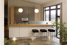
2. Pendants - hang 'em LOW! Low is cozy. Low is dining table-like. Low is cool. If your mother tells you they are too low, you know they're close to perfect, and maybe a little bit lower will do. If your contractor says they're too low, lower them two feet! (I'm joking, no cards and letters please.) :)

And, no, you need not worry as much as you think you need to worry, about the fixtures bumping your head. See? I knew you were thinking that!


Trend-5.jpg3. Pendants - hang 'em HIGH! Some pendants look okay hung high, and they would be wider/bigger/fatter fixtures, please, not the small ones hung high. Please! They will look lost, or worse, insignificant. I can think of lots more adjectives of an unfortunately negative nature for small pendants hung high!


thumb.aspxa.jpg

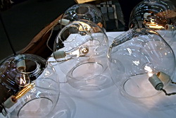
4. Pendants - hang 'em close together! They do not have to be hung 3' apart (yawn) over the island. Put a few close together, especially on a smaller island.  Where you'd normally put 2, put 3 closer together.

5. Does the island have a seating area? Put two different types of fixtures on the island...pendants on the work part, a larger fixture to feature the seated part.

6. Mix your metals, finishes, colors...do it with care, I don't want the lighting police banging on your door, but get creative with complementary styles and color.


DSCF4181a.jpg7. Don't forget the dimmers!

8. Recessed lighting - Save the planet and use CFL (flourescent fixtures)

9. Recessed Lighting - There are two schools of thought...the recessed lighting plan is either a) equally spaced in a logical grid type pattern (watch the swiss cheese effect-too many lights) or b) positioned over certain elements without a strict grid pattern. Give thought to which you prefer, keeping in mind if a light is off center close to a featured cabinet, it could look like a mistake. Take care in your planning. Me, I usually look to see what features are important in the kitchen, and sometimes use a particular feature as a starting point and then move off from that, like the hood, for example. Then, of course, get ready to do it all over again once the electrician says, "lady, there's a beam in the way!"

10. Under cabinet (not under counter as it is typically called) lighting - LED lighting is PERFECT for this application. Look it up, and again, save the planet. It is crazily energy efficient!

Bonus #11 - Trusty Wendy, from the comments section reminded me about sconces! Yes, sconces are very wonderful in the kitchen. I have two kitchens at the moment where I brought sconces into the design from the beginning, and an interior designer on the project said "Sconces? I like it!" They are flanking the window in each case, but don't stop there... 

There, wasn't that fun? I had a great time! 

normcopenhagen12_medium.jpg