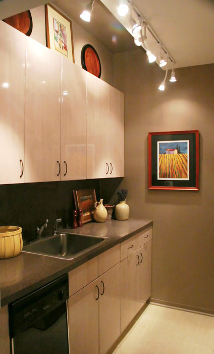
Here's a picture of my small New York City apartment kitchen, well, one side of it. The other side has the refrigerator and the range. Not being ready to redo the kitchen at this point, I wanted to make it appear larger (of course!) The floor was a busy terracotta lineoleum, so that was the first to go. In its place is another vinyl floor, as we did not want to do something major right now, but wanted something special. Here's what we used: Chilewich Plynyl in the wheat color, not as "green" a product as I had hoped, but they say they are close. It adds function and a big dose of light and calm.
Oddly, rather than using a light paint, which was what was in the kitchen, an ivory (ick), I thought I'd experiment with medium to dark shades of paint. The paint chosen is very close to the (granite grained) formica countertop, so there is a flow there. The upper ceiling section was painted this dark color too, with just the lower ceiling section being a near white. This way, there is a flow in the upper section.
We are keeping the cabinets right now. They are light, which is helpful to the space with a minimal design. Add lots of lights, colorful accents, and it looks larger than it is.
Lesson: Don't always think that you need only light paint to expand a space. If you have other elements of light, in this case, a light floor, lots of lights, and light cabinetry, then a darker background can tie it all in and look just as expansive, and more interesting. Lights below the wall cabinets would be a great addition.
Do you have a small kitchen? I'd love to hear about it.


