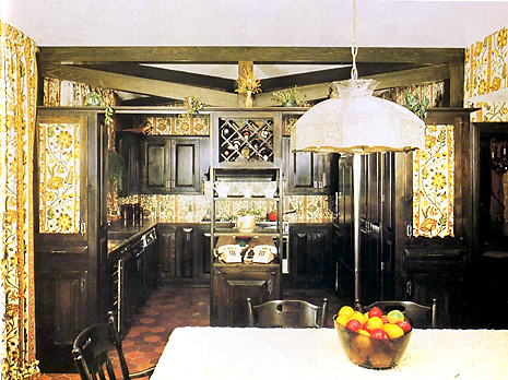
Here's an interesting image! Time again for "Nostalgia or Shredder Material." In design school, I learned of the element of "continuity." It appears that this designer did too. Of course, if this is a 70s kitchen, we must have yellow and gold, and some orange too. That hanging lamp was a typical lamp of the 70s, I forget the name it was called. The cooktop is on the rear wall. Makes me wonder if there is actually wallpaper behind the cooktop!?
One thing we know for sure...they are very important people! See the two phones?
It's fun to look at these images. I think there is a LOT to learn too. Pattern was very important in this little micro time period, it seems pattern anywhere and everywhere, it almost was a measure of creativity, how many patterns could be used together or over how much square footage it could cover. I'll just bet that the ceiling was considered too. To me, the strict symmetry of the cabinetry and the constant pattern equals a dead feeling, void of dimension and interest, even with the beams. To me, they just confuse things. Have fun looking back!


