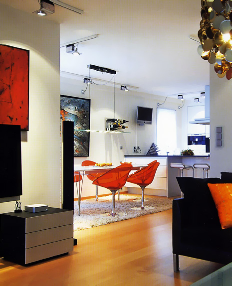
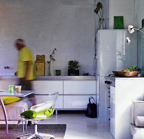
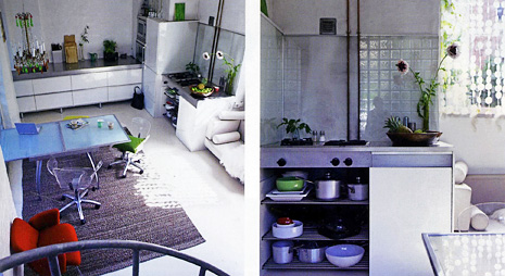
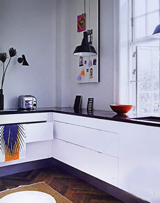
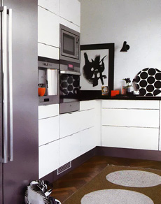
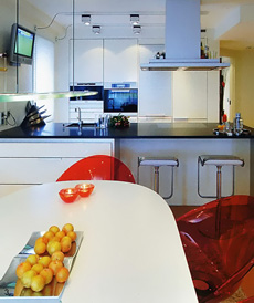
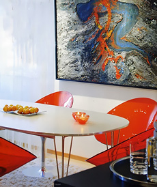
I think it's a very common thing in Scandinavia to show small splashes of color, like, very small. It seems the smaller the color, the bigger the impact (in some cases). My friend, Lone, a Danish girl who lives in New York, showed me an ad (she's a kitchen designer) she was putting in a magazine, and it was a kitchen that was all white with some black and then only half of a red chair was showing, sort of at the way end of the room...of course, an Arne Jacobsen chair. I didn't get it at first, I don't see that a lot, but now, these images brought that concept back to me, and brought it to life. Images from Bolig Liv.
So, now we have 3 interesting elements....white (nearly always), a splash of color, and texture (nearly always). Fantastic combination.
It's fun, cool, and fresh, don't you think? Oh, here's a nice Scandinavian blog, Molly's Heaven and another great one, Lantligt.
 |  |
 |  |
