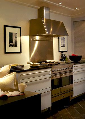
Today we have a little bit of a mix to keep things interesting. All modern kitchens. Some, just downright elegant. A few that you cannot see very well, but you sort of get the picture anyway. Isn't that what our homes are, when all is said and done, an overall feeling? What feelings turn you on and off about these images?
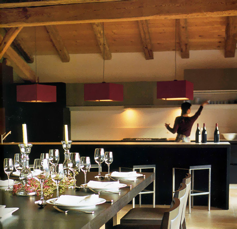
One thing I have not mentioned as yet is that typically, and I only see this in one image, surprisingly, but typically, the lighting hangs down quite low in Scandinavian homes. I LOVE that look. It creates a real intimacy and softness.
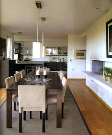 | 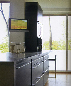 |
These lower two images are from the same kitchen. I'm responding to the large, plain, windows and the white walls, which I love. It's an overall tailored look, very modern, but tailored. 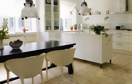 I LOVE the way this one is done. Look at the lighting against the wall. And, the dark table with white chairs love that too. And, of course we see the little splash of red color that we saw last week. This is a comfortable kitchen for me. This last image was from Bolig Magasinet and the other from Interior Magasinet.
And, a couple of blogs as usual. Anyone check into these that I include every week? Here's one called Milly Tulipan . And, Ingrid's Blog.

