After a 2 week absence due to the KBIS show and other things thrown into the mix, it's good to be back with Scandinavian kitchens on Mondays. Here we go!
Here are actually two kitchens, but one has a lot of images. I'd like to take a minute to review what makes them Scandinavian in nature and what is also not only cultural, but good design.
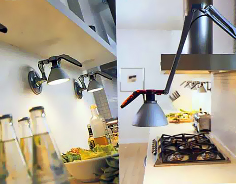
The first concept is lighting. Scandinavians love interesting lighting, and lots of it. So, the lighting fixtures must be well designed as well as highly functional. Task lighting is huge in Scandinavia. There are little light fixtures anywhere and everywhere. So, take note of the lighting.
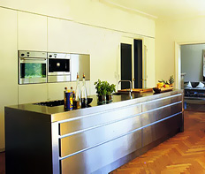 | 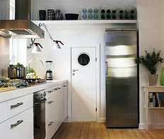 |
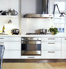
Second concept is "shapes and forms". This is a more architectural concept, which can be seen, for example, in the mosaic tile wall behind the cooktop and elsewhere. Scandinavians do not fear blank walls, and in fact have used them as part of their design work for a very long time, long before this idea became popular elsewhere. It is the "less is more" effect. Always simplicity and elegance combined, as a functional artform, the essence of Scandinavian design.
 | 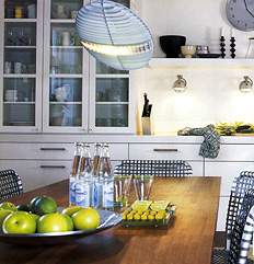 |
Third concept today is something old or hand crafted. Notice the floors, or the wonderful pottery or other items. Some items are old and speak of texture, repetition, or pattern, as we see here as well. There is thought and whimsey both present in Scandinavian design. Nothing is taken too seriously. That seems to be an inherent truth. Enjoy, and I'd love your comments too...
And, as always, another couple of great Scandinavian blogs.....Lantligt and Karna.

