I sold a kitchen to my client, Grace, today. We've been working together since January. Lots of stops and starts, beginning with Asian design and ending up with a Tuscan themed design!
Here are a few very simplistic images of what we're planning. They have not been embellished with wall and backsplash details, they are just simple line drawings. I'd like to point a few things out to you.
 Floorplan
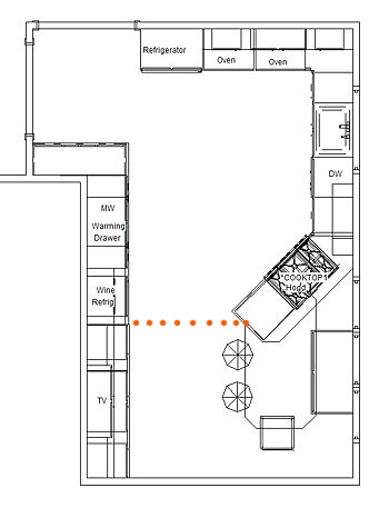
See the orange dots? That delineates, or transitions, the working part of the kitchen from the dining/furniture area of the kitchen. This is by design so that there is a frame of reference across the width of the room, and the length for that matter.
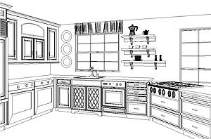
Grace wanted an expanded work area, and she also wanted to interact with her guests, AND, she needed to seat five people within the space. See the large window parallel to the table? It's a very large window, and very low, so the cooktop had to veer off at that angle, which actually works quite well.
I don't love the configuration of the window seat. I had wanted to angle that back in the direction of the cooktop, but Grace objected. I may push that again, or we'll review that as it comes together as we can add to that at the time. That remains to be seen.
I see I forgot to add the doorway at the bottom of the floorplan. There will be a wide doorway into the kitchen from the foyer, positioned more away from the table than toward it.
We were going to have a large stone hood above the cooktop but today Grace decided against that. We'll do a downdraft instead.

Note the open shelving to the right of the window for interest rather than the cabinet-cabinet effect. I didn't want to put cabinetry every possible place. The eye needs to wander and rest on something of interest. So, to the left of the window, Grace will put something decorative in that wall area. Oh, forget the dishwasher, it won't look like that, it will look like a framed door/drawer combination, which will actually be a panel, much more seamless of a look.
Refrigerator Wall
Note the "built in" section where the wall cabinets are positioned to the right of the refrigerator. This surround will probably be faux painted or stuccoed. Again, this is for interest, something different. I think it works in that area. That theme is continued elsewhere, as you will see.
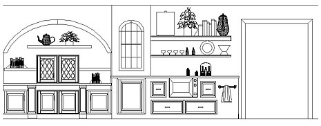
Opposite Wall
The line of transition, the orange dots I spoke about earlier begins after the arch. This arched area will be, oh, maybe 15-18" deep, maybe less. The TV is in the wall cabinet sitting on the countertop. Then we have a few shelves. The top of the arch, the whole upper arch section, maybe stuccoed and fauxed in some manner. Perhaps we will do mosaic tiles in the center section below the arch, something simple, as decorative items on the shelves will take center stage. Below the countertop are three horizontal areas above the base cabinetry which will be faux painted in a decorative design of some sort.
To the right of the arched area is a wine refrigerator, again, sort of "built in". Above that is another built in cabinet which will most likely project forward about 18", probably more than the arched area. Then we have wrap around shelving, see the floorplan on the upper section, and around the corner is a buffet piece which serves the dining room. And, the microwave and warming drawer are to the right of the wine refrigerator.
Again, lots of possibilities for faux painting, tile, etc. I'll do a post in the near future about the colors we're using. I think you'll really love what we're doing, can't wait to show you. For now, Grace has the samples as she shops for whatever she's shopping for, probably tile. I'll be involved in that too.
One more thing...we purposely wanted the upper left side of this wall (upper left in the floorplan) sort of open, as Grace wanted more of a connection to the family room beyond, and previously there were tall pieces blocking any view. We are widening the doorway to the left of the refrigerator. To the right of the microwave is the entrance into the dining room. See where the towel rack is? That is the side of the buffet piece, but it's actually a short wall, as that is part of the "built in" surrounding the cabinetry.
That's it for the moment!


