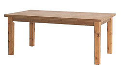
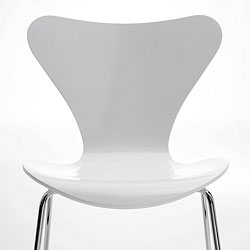
 I happened to see that a blog I frequent (A LOT), An Eye for an I:nterior featured this post of mine, an interesting kitchen design, and I immediately noticed the table and chairs that Jen was putting together, and I'd love to chat about it.
As you notice, the table is raw, rustic, natural, and the chairs are modern, smooth, and white. The thread that they have in common are simple lines.
But, the real interest is found in their differences. I really love this look, and  I encourage my readers to go beyond their comfort zone and experiment! Pairing together "rustic" and "modern" makes them each POP, a wonderful study of contrasting style and theme. Another nice contrast is the juxtaposition of straight lines and curved lines. Each element looks strong and important. It also brings to mind my cousin's kitchen in her summer house in Denmark in terms of the rustic/modern combination.
Just thought I'd take a quick opportunity to share this concept.
Thanks, Jen, for the inspiration!

