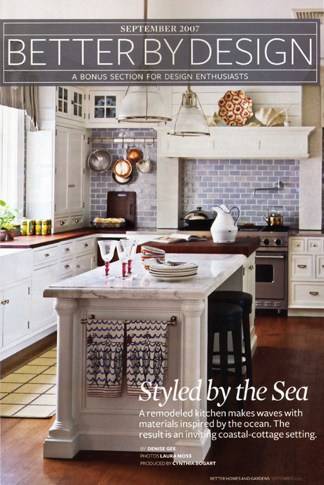
 I arrived home last night from my vacation to see one of my favorite recent kitchens I've designed, finally, in print! The feature just came out in the September issue of Better Homes and Gardens. It's in a section called "Better By Design."
I designed this kitchen a variety of different ways for the client, in an extensive design process, and in the end, the client decided not to change the existing location of windows, doorways, and appliances. BUT, that was only the start of the story. Maintaining these same locations, I wanted there to be a renewed excitement and importance to the kitchen design, but, based on good design principles, rather than easy, but, uninspired "runs" of cabinetry as you can see in the "before" pictures. I also wanted to "lighten up" the area above the refrigerator, which was achieved. A much more spacious feel on that side of the kitchen than before.
Other Ideas Which Didn't Make It:
Some of my ideas were not implemented that I would have liked, but I have to remind myself, it's not my kitchen! I had recommended that the rear wall, rather than subway tile, be some sort of subtle stone, a slab material, although the end result looks great. I also did not want to connect the cabinetry on each side of the range to each wall. I thought it would look interesting to be open, a bit unfitted. Then, I suggested open shelves with the wall showing behind, and no toekick. In the end, the client wanted a more "connected" look, but we did maintain the open shelving below, which makes it.
New Ideas
New design ideas were developed and explored, based on the proportion and scale of the space as well as taking into consideration the architecture and style of the home. I also created a personal style interpretation for the client, which bridges the concepts of tradition, a nautical feel, a bit of a "commercial" look, and some real beauty included in the mix too. Please see all of the images in the gallery.


