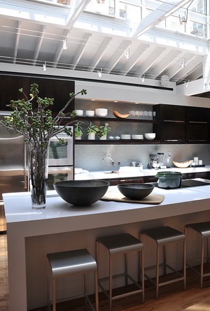
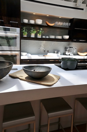
 "I never thought of myself as a designer." So says Jeff Lewis, host of "Flipping Out" and designer of House Beautiful's Kitchen Of The Year 2010, unveiled on Monday, July 19, at Rockefeller Center. Jeff, and his team set out to create a kitchen that reflected his personal aesthetic - a warm, modern kitchen with super clean lines, sleek surfaces and most of all, a minimalist and most importantly, easy to clean, design.
"I really thought of myself living here," Jeff says. Jeff's lifestyle is one of often serving drinks and hors d'oeuvres before going out to dinner with friends, or taking in sushi, and when catering an event at home, having someone there to clean up immediately as the kitchen gets messy. The kitchen in his own home is wide open to the living area, and Jeff must have his kitchen "always stellar" as when he entertains, "everyone ends up in the kitchen."
FLICKR SLIDE SHOW - 9 million pictures!
Jeff talked about it being a challenge to design a contemporary space that is warm. I don't agree with that as a professional kitchen designer, but it brings up a great issue. Do you see this kitchen as warm? Here is what I think:
 My Take
First, let me say that design is highly personal and highly subjective and my opinion is only ... my opinion! I think the kitchen is stunning. I love the use of neutrals and I also love contrast, especially when tempered with, in this case, the textured floor and the quietly textured backsplash. These elements, as well as the reclaimed elm table, add needed texture, and the floor, needed warmth.
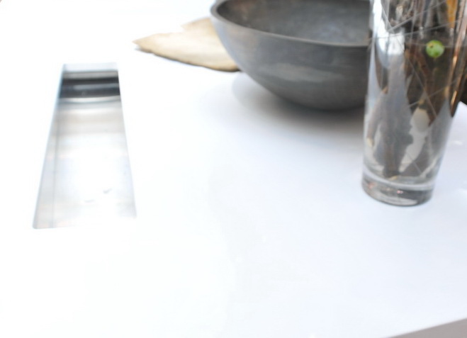
The juxtaposition of these elements (including deep, rich, brown Kraftmaid cabinetry, and the coolness of Kohler's wall mounted Karbon faucet, SUPER cool and functional Crevasse prep sink with Cynchronus rinsing technology and Caesarstone's amazing island countertop, make life in this kitchen FUN! The Jenn Air appliances add to the fun with super functional ovens that will tell Jeff exactly how to cook anything (say, if his housekeeper is away on vacation if he gives her one) ;) without having to waste a second of time and the one-of-a-kind ductless cooktop.
The island shape and size is EXACTLY what is coming on strong today in kitchen design. While Jeff's lifestyle is more entertaining and quick food oriented (he doesn't cook) where the island can serve a use as a buffet, and hang out area, for my own personal demographic, with 3 grown kids and their SO's visiting fairly frequently, a large island serves an important purpose for socializing and meal preparation. This design serves many lifestyles well.
 Once one experiences this fabulous, large island, really, who wants to prep or wash or cook, while facing a wall? I think this is one of the questions of our current time as socializing in the kitchen becomes even more important than it ever was before, which my perspective of kitchen design in the past 25 years points me to. Although in the vast majority of kitchens, some food tasks must be done against walls, (and many prefer to keep a mess more toward a concealed area) I predict, and have, in recent years, that islands will get larger in the foreseeable future solely due to an awareness of the importance of connecting with our friends and family, at the same time that we continue to be interested in more casual living. The integration of kitchen and living spaces is all about socializing. We may not all fully realize that we are feeling that desire more and more as we contemplate renovating our kitchens, but I'm seeing from where I sit, that we do indeed feel a push in that direction.
It brings up the question, which I am hearing from my clients, about "the mess" in an open plan kitchen. That is today's design conflict for sure. Jeff deals with it by having his housekeeper vigilant to the presence of clutter and mess! He's a VERY practical guy.
From a personal perspective, disclaimer already noted, I feel that the kitchen lacks a touch of soul. It's a "type" of kitchen design that is appropriate for many people, of course, but I would have liked to see less cabinetry and more interesting (yet still simple) design/storage solutions, particularly near the table. Cabinetry was the only design tool used to fill the main wall here, going from one end to the other. I would have liked to see the introduction of another material, still maintaining a simple design. That said, I love the large soffit above.
The white dinnerware and accessories and rustic wooden bowls say "stylized" to me rather than "personal" or even "creatively quirky." The focus of the kitchen and cabinetry design seems to be a geometrical "frame of reference" lesson of coordinating dimensions. That said, that is absolutely a viable design philosophy. Maybe because I'm a kitchen designer, I see and interpret some design concepts in a different way and look at what the design process might have been. So, is it a warm/modern design to my eye? I would say more modern than warm...again, completely subjective.
There is no doubt that it IS beautifully designed for the lifestyle of its owner. In that respect, it's a winner!
What do you think??

