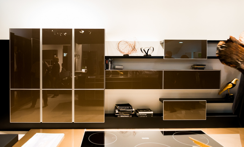
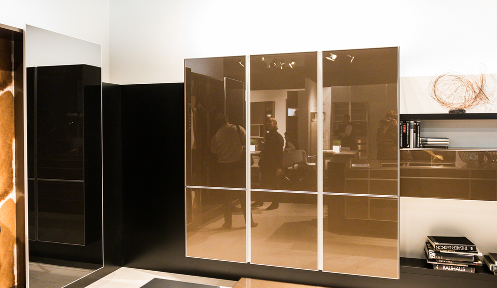
Let's dissect this brown, modern kitchen design. I took these shots of a display, a very large one, similar to a furniture look, as large as a kitchen is if not quite a bit larger, at the LivingKitchen design fair in Germany this year. I attended the show with Blanco America and it showed the very latest in kitchen design from Europe.
Although it's a display, which is meant to instill excitement and show innovation in design, we can still learn quite a bit from a kitchen as large as this one, especially if we are interested in design concepts far away from the typical, which I'm always open to! So, let's get to it. Here's MY take and tell me yours:


Pros:
- It's just an exciting design overall
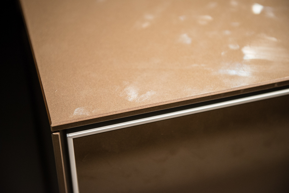
- It's a unique color, one nor normally seen in a gloss door style
- Who wouldn't love the fireplace and skin effect?
- It looks like furniture
- The eye has room to REST, SO important IMO!
- I love the floating effect
- I love the ability to change out decorative/useful items in open/closed storage
- The horizontal lines are interesting, also the depths of cabinetry, etc.

Cons:
- Everything happens at the island - ok if there is ample room on all sides
- The flooring is too sterile for me
- As is, regardless of the warm color, it's a bit cold-I need art

Overall, I think it's gorgeous. My assumption is that the refrigerator might be situated down toward the fireplace, in the tall cabinet section to the right or maybe unseen, at the other end closer to the sink section of the island. Likewise, the ovens might be situated in one of these areas, perhaps concealed. The ovens could also be built into the island.

If a design similar to this one worked out for my own kitchen space, I'd definitely try something like this. I think it's modern, furniture-like, while still being utilitarian.

What do you think of this design? Is it warm, cold, something in between? What would you change?

