Tiii-iii-ime is NOT on your side

How many materials are involved in your kitchen project? Let me say that another way....how many different categories of materials are involved? Let's take a quick inventory:

P2050002aa.jpg

  • cabinetry
  • countertops
  • sink(s)
  • faucet(s)
  • sink accessories
  • faucet accessories
  • lighting, more lighting
  • hardware
  • hardware
  • appliances
  • tile
  • that all encompassing "OTHER"

P2050021a.jpgI'm sure I'm forgetting some smaller types of items. I have a project going on right now where I advised my client to make a decision on her countertops in a timely manner. In this case, the countertops did not have to be templated, they could have been ordered well in advance, to be present at the time the cabinetry was installed and could be installed immediately thereafter.

Time just went on. And on, and on some more. My client finally made a decision on the countertops at the time the cabinetry was being installed. The order was put in for the tops, and unfortunately, they now have to wait a month for the countertops to arrive, with the kitchen finished. But, wait! The tile cannot go in yet because the countertops are not on. 

AND, the sink and faucet cannot be hooked up until the countertops are in. I think I'll suggest a temporary countertop and sink/faucet hookup.

Now that I think of it, the same thing happened with another client. Just putting off the countertop decision has such an impact on timing and the ability to use the kitchen.

My advice? Get all your decisions made at ONE time. Some people do not begin the installation process until everything is at hand. Time has this funny way of just passing in chunks, it seems, at times, as we're busy going about our lives. Get your decisions made, and put it all to bed. Your kitchen will be up and running in no time.


The Color Purple, No, Green


The green text on this right of this page is the tiniest bit too blue, it doesn't match the other greens on this page, which are more yellow. (Trust me, there's a connection to kitchen design...) UPDATE: I changed the green color, but pretend I didn't and read on...   ;-)

But, I LIKE this green text - it is different, but similar, therefore, it "pops", differentiates itself. The voices in my head are in a little conflict over this. My love of this green text is winning over my analytical voice, which tells me that it doesn't match the other greens. (Or, is that my mother's voice!?) I had an olive green text color in its place and it matched beautifully, BUT, it just didn't pop on the page like THIS green does. It's more a combination of many colors in the image, something I liked, also, against the white page.

On to Kitchens

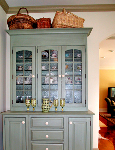
Hochberger_01a.jpgI have one particular kitchen in mind where the paint color of the window and doorway, and baseboard casings match nothing in the kitchen, there being a blue green hutch that cannot be seen in the image in the link below, yet blends with (most) everything.

In this case, the client wanted very light walls without any sort of treatment on it, which to me, meant that white trim and casings would wash everything out, not to mention the cabinetry being an off-white. Can you say "bland"?

The decorator on the project was at a loss as to what color the trim should be, so I was consulted (I should have been consulted prior, anyway). The client chose the granite and the tile by herself. The family room has a wide opening to the kitchen, and the furnishings were more in the olive green family.

Due to the serious architecture of the house, I felt the trim color should be "serious" as well, which is why I ruled out a blue/green color. I felt it would have been too "candy cane", plus it would not transition well into the family room. I thought the color should be strong, yet feel somewhat neutral, yet with some color to it. Most of all, I felt the color should be warm, rather than cool, yet I did not see a tan shade here. Those were my intuitive feelings. I felt choosing a color which would sort of bridge several colors together, yet not match directly, was a good idea. The colors here are somewhat analogous, meaning, they are next to one another on the color wheel, which is one of my favorite ways to use color.

In the end, if I had my choice (and I didn't have a choice here in the following...), I would have chosen a different granite (if it had to be granite) and a different floor tile (if it had to be tile) and a different wall color, plus, I would have painted the niches up above, to have them stand out, as I believe they should. That's not to say it is not a terrific kitchen!

Whether you like it or not, you will have a reaction to this color. See it here.

Lesson: Don't be afraid of color! Your colors do not have to match. They should make sense in some way, and if they only make sense to you, that's ok too! Surrounding rooms have to be considered, as well as the architecture, other materials in the room, and wall treatment/color.  Most of all, colors are seen in context to one another. More on that at another time. But, to my eye, colors look best, and most interesting, when they are slightly off from one another, maybe tied in with another color as a bridge, maybe not. Go beyond "matching".

How about you? How are you going to use color in your kitchen, or how are you using it now in other rooms? 


Meow....Woof!


IMG_6807aa.jpgDo you have a furry friend living with you? We do. First, we had Cleo, a white cat. She had to be an aristorcatic cat of some kind, as she definitely owned US. Next, is another cat, Sparky. We don't love the name, but he responds to his name when he is called! We just adopted Sparky about 2 weeks ago. We keep calling him by his name because it's too much fun when he responds to it! We definitely need to be retrained...

Pets need to be considered in the design of the new kitchen. Not to the point where they attend meetings, and sign off on the plan, no, but just short of that! Here are some thoughts:

  • Planning - where can your pet eat peacefully without fear of being bumped into or forced to move for a moment?
  • Where do the bowls go so that when they are not eating, they are in a spot where they will not be bumped, resulting in spilling water?
  • Do you have multiple pets?  Is it ok if they eat in the same area? Will they know whose bowl is whose and do they or you care?
  • Will the bowls even go in the kitchen?
  • Think about proximity to pet food storage and water. Maybe the pet food goes in the prep sink cabinet, if there is one. What's the best spot to store the pet's food, especially if there is more than one? Feeding should be quick and accessible.
  • How many types of pet food do you have and how much do you buy at one time? Do you have a million small cans or huge bags?
  • Would it be helpful to have the pet's food in roll out shelves?
  • Do you have pet medications? Where do you want to store it/them?
  • Do you not want to see the bowls or at least the feeding bowl? Consider a slide out shelf or drawer at the bottom of, or under the cabinets.
  • Do family members frequently visit with their pet? Is there a secondary feeding area that is convenient? I have that for Max, the dog, who visits us on occasion. Only problem is that Max eats out of the cat's bowls too!
  • Naptime...do you want to include a spot where a small pet bed can be placed?
  • There are auto feeders, which are large in size, so that you only need to refill these infrequently. Will these be part of the plan? Do you want to see, or hide these larger feeders?

Built in banquettes will most likely be a pet magnet, especially if there is a window behind it, ideal for pet naps and their own dining spot (so they think), as they hope to be dining along with you! So far, we are succeeding in training Sparky NOT to walk across the table during dinner...

What am I forgetting? Please fill me in.  And, tell me what works, what doesn't work, or solutions you've come up with, in terms of feeding your pets in the kitchen.


Irrational Fiscal Exuberance


I received a call today from a potential new client. We chatted about his project, about the logistics of the project, and we even began to go through numbers, which I would not have brought up. But, it is always welcome to begin the money talk sooner than later. I worked backward from what his all inclusive budget figure was, categorizing each cost, and ending up with one sum for the construction (not a lot), which I felt was fairly close to what a labor estimate might be, given what he told me of his project. Of course, that is all subject to change when I see the home, but nonetheless, it's a good start, and I had just done a similar project.

 He told me that another kitchen design firm quoted him 3 times the amount, in terms of labor, that I estimated to be reasonable, with that firm also not having seen his home, and double the all inclusive budget overall. So, reasonable question, why the wide difference? Of course, I have no idea what all was included in the other "estimate".

iStock_000002186776XSmalla.jpgThis is one of the toughest and most tricky areas overall, the estimate. Essentially, we need to estimate something before it is designed. We need to evaluate the client's wants and needs and put a dollar figure to it. It's a little bit art, a little bit science, to get that number. But, with care and thought, it's doable.

Me, I don't want to be too low and build false hope. I also don't want to be too high and lose the job. I'd say I err on the higher side, but not too high, HATING the idea of having to reveal much larger numbers down the road and instead, often revealing a pleasant surprise of a lower cost instead of disappointment when the design work is finished. After we go through the whole process, who on earth wants to be told that the project is now out of their budget! That's a huge fear of mine, HUGE! I'd much rather lose the job than estimate too low.

But, you also don't want to mistakenly estimate too too high either.

Perhaps that more expensive shop feels as I do, that erring on the higher side is better than building false hope. From the information I have thus far, I think they went too far afield into irrational fiscal exuberance territory. I'll update this as I get more information. 

Tell me about your estimate story!


First Meeting - Dos & Don'ts


I've had a flurry of first meetings recently, including one I just got back from. It's a dance to get to know one another. I think if the proper steps are followed, the dancing part will soon feel like we are "Dancing With The Stars" (apologies, I  could not resist that). It is these intial steps, too, where manners are very important, along with other tips for a successful first meeting. Here are some dos and don'ts for the Kitchen Designer, (first) as I see it:

  • When a client calls, DO hear him/her out, and if the project is not for you, turn the client down gently and diplomatically. That's a biggie!
  • DON'T name drop or go on about all the huge projects you do, it's a turn off. The work you show speaks loudly and clearly.
  • DON'T dominate the conversation, be a good listener!
  • DO have adequate examples of work you've done on hand.
  • DO speak to, and pay attention to, both homeowners equally.
  • DO be on time, respectful, courteous and establish an approximate meeting length beforehand.
  • DO show where the financial flexibilities lie when speaking of the project's budget.
  • When the dog's nose goes where it shouldn't, DO keep smiling...

Dos and don't for homeowners:

  • DO give the kitchen designer time to tell you their (short) story about the firm and his/her approach to your project
  • DO have both homeowners available to speak with the kitchen designer if that was requested. If one party cannot make it, call to reschedule the appointment, even if it is 1/2 hour prior to the appointment.
  • DO tell the kitchen designer if you have decided not to go with him/her if the designer attempts further contact with you to find out the status. Don't not reply to calls/emails for a status request. THAT is a biggie!
  • DO evaluate the kitchen designer not on the product they supply, but on their body of work, their credentials, professionalism, and that important "gut feeling" you'll get!
  • DO feel free to ask for references.
  • DO evaluate if you are respected and listened to. Nothing good will happen for you if you feel you are not respected.
  • DO speak frankly and openly about your budget and how/if there can be a financial "fit" between you.

There are definitely many more....this is a good starting point. What are turn ons and turn offs for you when first meeting a design professional?


Small NYC Kitchen/Big Style


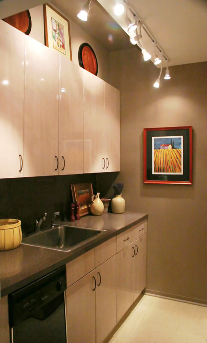
Here's a picture of my small New York City apartment kitchen, well, one side of it. The other side has the refrigerator and the range. Not being ready to redo the kitchen at this point, I wanted to make it appear larger (of course!) The floor was a busy terracotta lineoleum, so that was the first to go. In its place is another vinyl floor, as we did not want to do something major right now, but wanted something special. Here's what we used: Chilewich Plynyl in the wheat color, not as "green" a product as I had hoped, but they say they are close. It adds function and a big dose of light and calm.

Oddly, rather than using a light paint, which was what was in the kitchen, an ivory (ick), I thought I'd experiment with medium to dark shades of paint. The paint chosen is very close to the (granite grained) formica countertop, so there is a flow there. The upper ceiling section was painted this dark color too, with just the lower ceiling section being a near white. This way, there is a flow in the upper section.

We are keeping the cabinets right now. They are light, which is helpful to the space with a minimal design. Add lots of lights, colorful accents, and it looks larger than it is.

Lesson: Don't always think that you need only light paint to expand a space. If you have other elements of light, in this case, a light floor, lots of lights, and light cabinetry, then a darker background can tie it all in and look just as expansive, and more interesting.  Lights below the wall cabinets would be a great addition.

 Do you have a small kitchen? I'd love to hear about it.

Small-Kitchen-1.jpg 


Timing is Everything


What time is it?

I'm often asked "how long will it take to do a kitchen?" The words "how long" really get everyone in trouble. Make people crazy, make them patient, impatient, anxious, all sorts of things. We want things done either a) fast or b) exactly when we want them done. There are those who understand that a kitchen can have a life of its own. Point being, TAKE CONTROL OF TIMING AT THE START OF THE PROCESS, not just before the construction process, but from the initial process.

Talk about timing a lot. With your architect, with your contractor, designer, and anyone else. Keep it in the forefront. Ask for updates (sorry, not every day) from the beginning to the end of the entire project. The client who stays in control and aware of timing will probably get their project done at the most productive (not necessarily fastest) pace possible. Communication is everything.

Set up timing goals from the start. Do you have events? School starting? Holidays? Project forward as much as you can and communicate your timing expectations .

The first journal entry..


This blog will be about anything and everything to do with kitchen design and remodeling. It will be purely random thoughts, probably in no special sequence, just as things come up in my day. Let's see what happens today....so far, it's quiet on the eastern front.