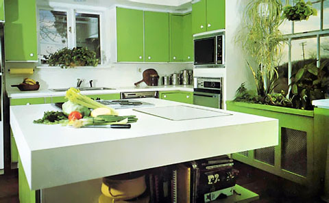
So, here we are with our third installment of "nostalgia or shredder material", ancient kitchens from the 60s and 70s. This kitchen is "Kansas-in-Oz (see the tilted electrical pole in the window-somehow it reminded me of it) meets the Jetsons". As much of the design (seen at decor8) blogosphere is tuning into the color green right now, (also as seen at desire to inspire) and at Design Sponge, plus Happy Mundane and, as we are 4 days away from spring (forgetting the ice storm we had last night) it seemed like a good idea (not to mention, it's St. Patrick's Day) to listen to the pulse and go back to a green kitchen, an entirely different definition of green than we live with now!

OK, so now to pick apart comment on this kitchen. Here's my take:
-
The microwave seems unnecessarily high, look at all the white space between the oven and the microwave, they should be closer together, that looks awkward to me
-
As was typical, such a small window over the sink, AND, does the cook not deserve to look out? What if the cook is 4'2" tall? (Maybe the builder was 6'6"!)
-
Something to try to avoid in one's planning, if the dishwasher and oven opened together, they would surely collide
-
The round, white knob and white framing behind the green doors......charming in a high tech way?
-
The extra thick countertop - a bit much, but not so bad!
-
The color.....I'll be right back, excuse me..
-
Plants/cabinetry below the window - truly, a good way to disguise this unsightly heating, and we KNOW the long spider plant is screaming, EARLY 70s!
-
Interesting shelving around the island, not half bad
How about you, what do you think?

