Mad Men And The Kitchen Set

Have you been watching Mad Men? I just started. I didn't see it last season, so I'm catching up and tonight will be the third episode of the first season I'll see. It's so cool, so chic, with such repressed people, no?

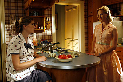
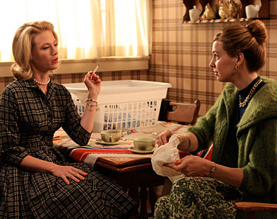
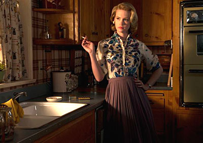
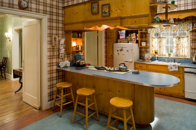
The kitchen is designed quite authentically, I think. Please see the kitchn's post on it. In fact, I think I had those same cabinets in my parents' kitchen when I was a child. I really recommend seeing Mad Men for interesting insight into the decor of the time, the primping and preening behavior most characters surround themselves with, accompanied by the contrast and juxtaposition of usually obnoxious and repressed behavior showcased in limitless variations. All this, just before all hell broke loose some few years later. Don't forget the raw egg in the caeser salad...

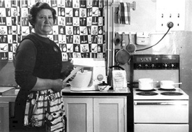
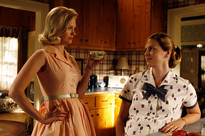
As a young (VERY young, I said) child during this period, here's what I remember. I remember my mother frequently wearing makeup and jewelry with short, curled (after curlers wrapped in a scarf) hair. I remember red lipstick, red cheeks and blue eye shadow. When she and my father entertained, my mother wore either a chic "shift" sort of dress to showcase her curves or one with a taut upper bodice and a full skirt...and always with the "good" apron as she flitted about the kitchen.  And heels of course. And, perfume, of COURSE. I'm sure it was a mix of high maintenance living and fun mixed in too!

As my parents emigrated from Denmark, the furniture in my home was Danish modern furniture, the real thing. The items we later threw away, I can't even think about, it pains me! Today, I use my parents' sleek walnut veneer dining room table for our breakfast table

Smoking was either a pipe or cigar by my father, but there was hard alcohol for social drinking too and of course, when my father returned from work. And, let's not forget Frank Sinatra playing in the background. Yes, life was very good. A T-bird in the driveway, a caddy, and everything. An American dream...until he cheated, he lost the business and they got divorced, but I digress! One thing that's worse than being repressed, is...guess, narcissism (probably rampant in the 60s!) You win the washer/dryer! Here's the set!
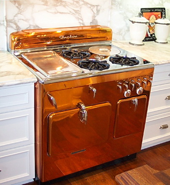
Retro Appliance - Chambers Copper Range

A blogging friend, Dean, from Calfinder, a free service connecting homeowners to contractors in the San Francisco bay area, sent me an image of this amazing range, which resides in his parents' home in Newport Beach, Caleefornia. Isn't it wild? Surrounded by the soft grays and whites, really makes this range the focal point, the star, the diva of the kitchen!

More about Calfinder. Calfinder is a very unusual type of contractor referral service. The people at Calfinder, well, here's a short description, which says it better than I can:

"Before we certify a contractor we perform a variety of checks. Below are just a few of those checks:

  • In-depth check of current license and insurance coverage
  • Personal interview with at least 10 previous clients ensuring customer satisfaction and business reliability
  • Ongoing monitoring and customer satisfaction surveys
  • Follow up with each homeowner we work with to ensure that our contractors are providing a great service"

They also have a blog, which is a GOOD blog on home improvement, lots of information on green remodeling, and an easy form to fill out for the services that you are looking for. I can't imagine how much more confidence one can get, beyond having someone personally check ten references before they will refer a contractor. Quite impressive. I've spoken with several people from Calfinder, and I can tell you that they are nice, and smart people to deal wtih. If I didn't feel that way, I would not write this. My previous thought was that these types of services are nameless, faceless, beauracracies. This one is not. I'd love to know what some of the questions are that they ask. Maybe Dean will stop by and share a bit more information.

Take a look here for more images of the diva copper range.

retro%20copper%20range.jpg 

Retro Kitchens - Step Away From These!

retro.jpgI couldn't let this post go without showing it to you, especially since you know I have a "thing" for retro kitchens of the 60s and 70s. Do I love them? Um.....right now, I have that sort of pained half smile squinty-eyed look on my face. Sort of like greeting someone you really don't like. Let's be brave soldiers together and gaze at these wonders from kitchens past. My mother issues are coming up for me...

What a fabulous collection we have here from Desire to Inspire, ok, fabulous being an oxymoron. Nonetheless, we can talk about color, pattern, pattern (oh, sorry, I said that already) and color. I know there has to be one with a rug in there somewhere.

Desire to Inspire's Retro Kitchens 

Kitchen Appliances - Retro, Color, Cool

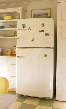
bigchillfridge.jpgI've been wanting to show you the very cool appliances from Big Chill Retro Appliance, and now, seeing this post from Desire To Inspire, this is the moment to do it! As soon as I saw these Big Chill refrigerators, I knew they were done right.

I don't know what 50s or 60s vehicle the special logo comes from, but it's the kind of thing that you know you've seen before. And, the lines of these refrigerators, I feel like I've seen that style before too. It has personality, not just bulk. I'm wild about the lines of this refrigerator!

Very interesting too that the ranges are identical to Elmira's line of ranges, another great line of retro inspired appliances. Oftentimes, one manufacturer distributes the same item to multiple brands, I think that is common knowledge. That said, there could be some tweaks of differentiation on the inside of the appliance, tailored to a brand's specifications.


bigchillrange.jpgNow, I know that Scrappy Girl over at Domino Magazine is interested in retro cool appliances for her future kitchen renovation, and I've been wanting to send this over to her, so here it is. Don't you just love the chrome trim? And those handles!

Of course, we know these appliances are also all about color! That's where a whole lot of fun comes into the pictures, yet, look at how wonderful these images of soft colors looks on these appliances.  

The Big Chill's website has good information on it. The FAQ answers all your questions, I was impressed by how complete it is. The Big Chill is based in Boulder, Colorado. Cool, in more ways than one.


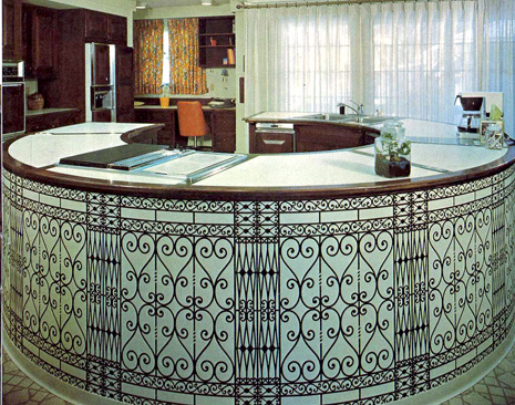
Retro Kitchens - Kitchen Fencing Ideas

Hi kitchen fans, the latest installment is here of 60s-70s kitchens, and the last entry of this type for a little while. I think I've made the point, to show examples of kitchens that we can't believe we really either lived in or were designed, in our recent history! I'll put one up every now and then for another laugh and "yikes!" I'll be replacing this feature with a regularly scheduled Saturday "New/Cool Product." It's important to be aware of what is in the marketplace, and so much is in the marketplace in the world of kitchens. And, having attended 3 design shows in May, I have lots of great material to go through, and I'm really picky too.

So, back to the kitchen of today. It sort of looks like iron fencing, doesn't it? And, the aquamarine? Hmmm, not sure I have an explanation for that! The curtains REALLY give away the time period here, don't you think? But, what really bugs me is the typical cabinetry to the left of the image. I think something there could have had a curve to it. Maybe just curved open shelves between the two tall items. It's just not working for me over there. Oh, and the floor, I can't even go there. Have fun!

60s70s%20blue%20kitchen005.jpg 

Retro Kitchens - The Eagle Has Landed

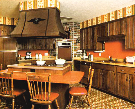
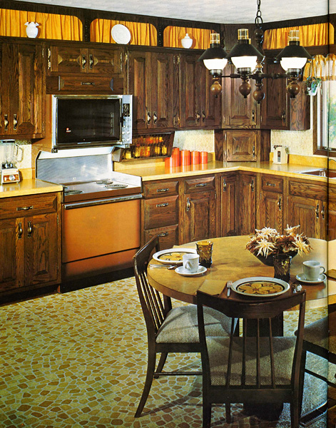
It seems appropriate, as a tribute to Memorial Day, to showcase a 60s-70s kitchen which salutes our national symbol, the eagle! And, our second national symbol, the orange! Ah yes, the brown appliances, the laminate butcher block countertop, the brick veneer, and of course, we must have patterns which don't make sense and colonial style chairs. What more can I say?? Truly, a historically accurate kitchen....have fun!

brown%20kitchen034.jpg 

Retro Kitchens - Shageriffic!

Here is a colorful AND modern kitchen! We have a fabulous built in radio along with a built in light off center above the cooktop. As usual, we have pattern, seen in the stripes, in multiple areas, but I hate to think of the cleaning issue over the cooktop. A wonderfully creative white laminate countertop, and the "piece de resistance" (insert your own accent marks) the shag rug! Love those "cathedral" upper door panels too, they were such a staple for elegant kitchens. Enjoy!

blue%20green%2060s%20kitchen035.jpg 

Retro Kitchens - Nostalgia or Shredder Material? #10

Last week, as part of our Saturday series of 60s-70s kitchens, you were lucky to get color...this week, "the quintessential 70s kitchen." We have

  • soffits 
  • pattern on the soffits
  • brown wood
  • cathedral arched doors
  • that little rail molding around the hood
  • pale yellow formica countertops
  • perfectly finished beams spread far apart
  • a tightly patterned floor
  • cabinets over the peninsula

How lovely. And, for extra pattern, we have the brick surfaced island. I must admit, I'm a little intimidated by the iron work on the end of the island. It freaks me out a little.

See where the dishwasher is on the angle? I hope that floor isn't a rug, because the dishes would be dripping from the sink to the corner. What is in between the sink and dishwasher, is a compactor, another favorite appliance from yesteryear. The whole thing looks pretty choppy to me. And, the hood looks out of proportion to the island, too big and boxy, the whole island thing.

But, even though I criticize, I'm sure many people would have loved this kitchen...hey, maybe even me?  :-)  

 brown kitchen034a.jpg

retro kitchens - kitchen nostalgia or shredder material? #9

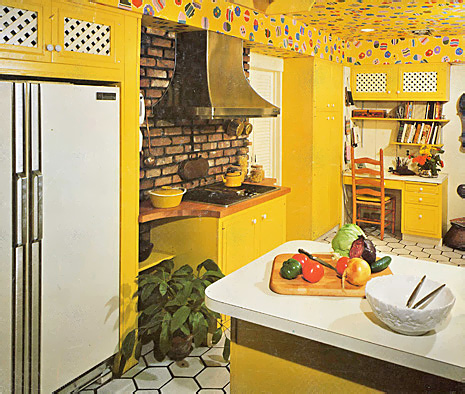
So, kitchen fans, today's kitchen is from the "Yellow Period". Or is it from the "Brick with Black Grout Period" or, as I said another week, from the "Lionel Richie Dancing on the Ceiling Period"!

Look, good for the homeowners. My guess is they were very happy, cheerful, optimistic people, don't you think? Good for them, that they had the guts to go for it! Linda from Surroundings, can we even go down this road, as a companion for the bachelorette pad??

It looks apparent to me that someone had the foresight to recess the, normally monolithic, refrigerator. My guess is this was done because they wanted to have much more space on the opposite side, although that area is not shown. I also guess that the emphasis for, and placement of, ample counter space was on the other side because of the radius cutouts on each side of the cooktop.

Which makes me wonder if the refrigerator could have been positioned where the desk is, thus allowing for much more space surrounding the cooktop. But, who knows?

I cannot see any connection between, or reason for, the combination of the brick and the ceiling pattern (but I think in the 70s brick was obligatory as was pattern of ANY type). And, of course, more pattern was needed in the white lattice doors, and let's not forget the floor!

But, you know what? The owners get lots of points just for the overall happy effect. And, do to two different countertop colors at that time? Come on, how haute couture was that!

Scrappy Girl from Domino...thanks for the mention, is this what you had in mind for your kitchen? 

old yellow kitchen018.jpg


retro kitchens - Nostalgia or Shredder Material? #8

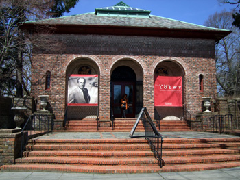
Today is a special day. At The Parrish Museum in Southampton, New York, there currently is running an exhibition on Raymond Loewy, the most prominent industrial designer of the 20th Century. Raymond Loewy designed everything from cars to silverware to broiler ovens during his five decades of work. 50s kitchen2a.jpg The 1950s proved to be a period of great interest in the kitchen for Raymond Loewy as he designed many useful products for both efficiency and his new, modern, aesthetic. The "Raymond Loewy: Designs for a Consumer Culture" exhibition includes today's talk at the Museum, at which I, along with several other speakers, will speak on American kitchens today. My topic will be "Comfort in the Kitchen." The exhibition is ongoing through May 27.

I will also be talking about design blogs! If you were at this event, please add your comments to this post. Tell us about the exhibit, what you learned, how you feel about kitchens, your kitchen, etc. Whatever you'd like to add, I'd love to hear from you! And, if you are new to blogging, don't forget to visit the sidebar to your right where you will discover my favorite blogs you will surely want to visit.

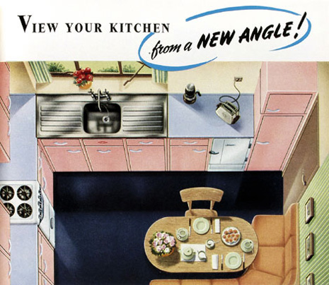
So, for today's kitchens, rather than the typical 60s-70s kitchens I show, let's go to the 50s! And, take a look, once again, at these kitchens from the totally fab blog, Fabulon.

I will update this post after I know I have survived my talk and tell you about the day.  

UPDATE: It was a great day...lots of interesting information from Alice Ross  who talked about the history of cooking, bringing along lots of antique, amazing, equipment, including many antique cooking "gadgets" which was fun to see. I ended up not really following my notes and just talking away about how to create a comfortable kitchen, and how I see trends forming where the individual will become more confident in their kitchen design than ever before, with a professional to guide, thanks to having so many choices available and seeing the many different ways, online, that people are designing and decorating their kitchens. I see a renewed confidence coming down the road. It really was a privilege to be a part of this program, and I thank the Parrish Museum for inviting me. The Museum itself is a wonderful building...see image below.

50s kitchen.jpg


50s kitchen3.jpg


2007_04210019a.jpg

retro kitchens - kitchen nostalgia or shredder material #6

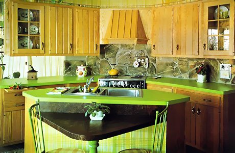
Welcome, once again, to "Kitchen Nostalgia or Shredder Material". Here is what I suppose is trying to be a rustic style kitchen. What really stands out is the lime green countertop. There is a wild and crazy piece of me, deep down somewhere, that LIKES this odd combination of green and very light wood, I'm not kidding. Not that I would design that today, not to worry!

That said, NOT with the large, stone backsplash. And not with plaid wallpaper! That's really an odd combination, isn't it? Also, during this time period, it seems so many kitchens had this railing that goes over the top of the cabinets. Here are a few other little observations:

  • the hood - this is a hood design that I am not fond of...the hood projection but with the backer panel meant to tie into the surrounding cabinets. I say just do a whole separate hood and see the wall space around the hood, thus, accentuating/featuring the hood.
  • The little triangular eating area. I think it's nearly non functional. Look how the chairs are situated, what if there were people there and they were seated properly, would there be room for dishes? Maybe just enough.
  • The space surrounding the sink...there is hardly any to speak of.
  • Notice the modern convenience of the electric can opener in the backsplash? Glad no one wants to show that off any longer!
 

Old Green Kitchen


It is a welcome departure from the dark oak cabinetry of its time, no doubt about that. Enjoy!


retro kitchens - kitchen nostalgia or shredder material ? #5"

Hello, and welcome to our fifth installment of "Kitchen Nostalgia or Shredder Material". I understand that in some areas of the country, the winters are very long, and spring seems like it will never come. Thus, protection from the elements is taken very seriously, and a necessary consideration. There is some very serious cabin fever going on here, bringing it, um, to an entirely different level!

brown kitchen susan serra.jpg


Well, I can say that the brown range is back in style! We're looking today at a resurgance in brown, now called "oil rubbed bronze". The Kitchen Designer says, however, that this new look is NO EXCUSE to revert back to this style of kitchen! The kitchen police will be out in force, dispatched from The Kitchen Desginer blog, should we have notice of infractions. Be very afraid!

Besides the interesting look of this kitchen, let's look at a few things going on here and have even more fun:

  • See the small ceiling fixture and the two large pendant fixtures. The lighting is way off balance.
  • Patterns and color! Brown, brick, and more brown. Geometry everywhere.
  • I wonder if the wall cabinet has any use, the second cabinet to the left of the window. Can anyone even access its contents?
  • I give 2 points to the gold cast iron sink. I actually like it!
  • And one more point, ok 1/2 a point to choosing a light colored countertop to lighten this dark cabin up!
  • And, I almost forgot, the roof material - what are those things crawling on top of the roof over the range?

This one was fun! What do you think?

retro kitchens - kitchen nostalgia or shredder material? #4

Welcome to this Saturday's special vintage kitchen, aka, "Bauhaus meets Disco"! I don't know why, (hmmm) but this one just popped out at me, as I perused my collection of vintage kitchens from the 60s and 70s. I think this kitchen was ahead of its time (for the early 60s), or perhaps was at the cusp of the disco era? You KNOW we need a disco ball light n the center of the ceiling! Get out your platform shoes and start dancing!

old red kitchen design.jpg

Not a badly planned kitchen, really, although I'd love to understand what's going on with that second island up front, where and how that is positioned in the room. Otherwise, the wall cabinets to the right of the refrigerator should have been equal size sets of doors. I'm not sure I could concentrate on reading a recipe in this kitchen, and I'm also not sure I'd go stir crazy after 20 minutes! Other than that, enjoy!


retro kitchens - "kitchen nostalgia or shredder material #3"

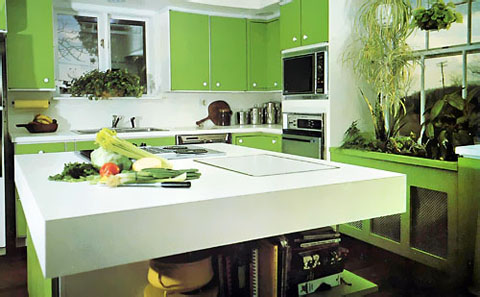
So, here we are with our third installment of "nostalgia or shredder material", ancient kitchens from the 60s and 70s. This kitchen is "Kansas-in-Oz (see the tilted electrical pole in the window-somehow it reminded me of it) meets the Jetsons". As much of the design (seen at decor8) blogosphere is tuning into the color green right now, (also as seen at desire to inspire) and at Design Sponge, plus Happy Mundane and, as we are 4 days away from spring (forgetting the ice storm we had last night) it seemed like a good idea (not to mention, it's St. Patrick's Day) to listen to the pulse and go back to a green kitchen, an entirely different definition of green than we live with now!

greenkitchen146a.jpg


OK, so now to pick apart comment on this kitchen. Here's my take:

  • The microwave seems unnecessarily high, look at all the white space between the oven and the microwave, they should be closer together, that looks awkward to me
  • As was typical, such a small window over the sink, AND, does the cook not deserve to look out? What if the cook is 4'2" tall? (Maybe the builder was 6'6"!)
  • Something to try to avoid in one's planning, if the dishwasher and oven opened together, they would surely collide
  • The round, white knob and white framing behind the green doors......charming in a high tech way?
  • The extra thick countertop - a bit much, but not so bad!
  • The color.....I'll be right back, excuse me..
  • Plants/cabinetry below the window - truly, a good way to disguise this unsightly heating, and we KNOW the long spider plant is screaming, EARLY 70s!
  • Interesting shelving around the island, not half bad

How about you, what do you think?

retro kitchens - kitchen nostalgia or shredder material? #2


The one thing this kitchen has going for it is that it was secretly made to coordinate with this web page (I swear it did before I removed the yellow from the page), a project begun 40 years ago in a remote hamlet of western Oklahoma, being planned to later emerge from the kitchen graveyard for the WORLD to enjoy see gape at in March, 2007. What is wrong with this kitchen, let me count the ways:


yellowoldkitchen131aa.jpg


  • the cooktop is crammed next to the ovens
  • the dishwasher is way too far away from the sink (the sink is purposely recessed to have the DW next to it, which would function well, but not if it were not recessed, thus no need to be so far removed, a little, sure)
  • the unbalanced left side as opposed to the right, not that asymmetry isn't a good thing, but this isn't even asymmetry
  • I feel like I will enter a cave if I stand at the sink - maybe if I got lucky, I'd go through a time warp and arrive in the future with no memories of where I'd been, an apron having been replaced with live-in help!
  • the, um, rug - doesn't it just call someone to do the dishes? And, we know it's a woman with a house dress on.
  • the top heavy wallpaper
  • the fabulous gold countertops!
  • if those are custom dishwasher panels, give me the UN custom vintage DW!
  • Last but not least, and probably not last, let's not forget the black toekicks!

 
Did I forget anything? The one good thing I have to say is that there is not a hodgepodge of different door sizes to cause chaos, that's a minor good thing. OK, I'll say it....there's a little piece of me that just says "awwwwwwwww" when I see this kitchen.

retro kitchens - kitchen nostalgia or shredder material? Kitchen #1

old kitchen124.jpg


Each Saturday morning, I will be reintroducing a kitchen from years past, dredging up either a) memories which will thrust you into therapy anew assuming you are from that era, if not, you were thankfully born into a better kitchen era (except for the grays of the 80s) b) give you an urge to don an apron and find a rolling pin and probably other unpredictable reactions. Thus, I apologize in advance for the rude and (tasteless) reminders, but I couldn't resist!  I've even made a category just for memorializing these kitchens. I mean, look, after all, orange is back in! Chant with me now (preferably with raised fist): NEVER AGAIN!!

Can you guess the year? AND, how many jokes can we make about this kitchen?