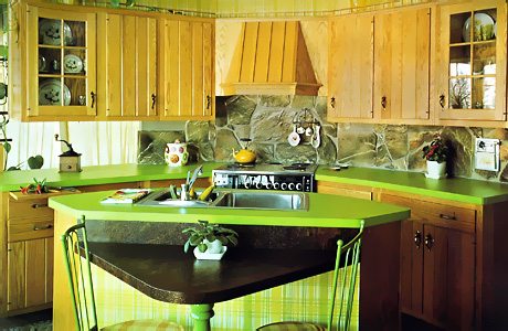
Welcome, once again, to "Kitchen Nostalgia or Shredder Material". Here is what I suppose is trying to be a rustic style kitchen. What really stands out is the lime green countertop. There is a wild and crazy piece of me, deep down somewhere, that LIKES this odd combination of green and very light wood, I'm not kidding. Not that I would design that today, not to worry!
That said, NOT with the large, stone backsplash. And not with plaid wallpaper! That's really an odd combination, isn't it? Also, during this time period, it seems so many kitchens had this railing that goes over the top of the cabinets. Here are a few other little observations:
- the hood - this is a hood design that I am not fond of...the hood projection but with the backer panel meant to tie into the surrounding cabinets. I say just do a whole separate hood and see the wall space around the hood, thus, accentuating/featuring the hood.
- The little triangular eating area. I think it's nearly non functional. Look how the chairs are situated, what if there were people there and they were seated properly, would there be room for dishes? Maybe just enough.
- The space surrounding the sink...there is hardly any to speak of.
- Notice the modern convenience of the electric can opener in the backsplash? Glad no one wants to show that off any longer!
It is a welcome departure from the dark oak cabinetry of its time, no doubt about that. Enjoy!


