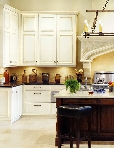
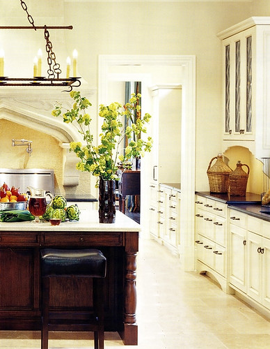
I've been meaning to show you this picture of another light floor. I simply love the feel of the light floor and the light cabinetry.
I like the horizontal dark element of the counters and I like the "important" or strong, feeling of the island in wood.
The island, to my eye, does not overpower the other light colored elements. The reason it looks balanced to me is that there is so much MORE light colored elements in the room, balanced with just a few areas of the dark color. In other words, it makes sense proportionately in regard to color and tone balance.
I also think this image goes a long way toward being serene, don't you? It has great interest, yet it is easy on the eyes and looks very spacious. The light floor, walls, and cabinetry, and understated backsplash, go a long way to achieve this quiet elegance.
The floor...I think this type of floor, being quite textured, is fine in terms of being "busy enough" so you don't see every crumb immediately (unless you bake a lot of brownies.) The recent popularity of super dark wood floors is no better for spots, dings, dust, and so on. The best floor is a medium tone. But, to me, something REALLY speaks to me about a light floor. And, yes, for me, it would have to be textured. I'll have one, one day, in some form. This floor is limestone by Walker Zanger. Yes, limestone needs sealing and nervous care. I'm usually a conservative type, so I do not recommend it.
As seen in the June issue of Veranda.
What do you think of this combination of tones?


