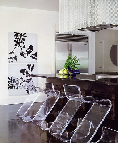
I came across this picture of a kitchen, again, in Veranda magazine, designed by Benjamin Noriega-Ortiz. I immediately liked it.
This kitchen goes more under the heading of "highly stylized" rather than "highly personal". More "showcase", less "high end catalog". And, that said, it's a viable look. Glam meets function meets texture. There was no other image of the working part of the kitchen.
I like the variety of elements, but what I like more is the strength, yet, restraint. I need to continue to explain to my clients that less is more. Fewer, larger, shapes and forms will enlarge a space as opposed to many, smaller, pieces, door sizes, accessories, etc. This is not a good vs. bad evaluation, simply an observation and another way to design a kitchen. The look is simple and elegant, so that the individual pieces say something meaningful yet are linked together in other ways, perhaps in color or tone, if not style.
Here, my eye sees a variety of styles:
utility (stainless refrigerator)
rustic (dark wood island)
glamour (beaded hood)
something hip/fun (plexiglass chairs)
elegance/sophistication yet modern (prints on wall)
modern/sleek yet textural (floor)
contrast (floor and walls)
There are common threads among these elements which tie one disparate piece to another and it's fun looking for them. I'm actually pretty crazy about this kitchen, although I'd probably want to change the prints to something A BIT more personal...give me that. But those chairs...what a WOW!
One question that comes to mind is, what came first, or simultaneously? Was the flooring color picked first, knowing that those chairs would be used, which relate to the walls in terms of tone? Was the big picture seen from the start, or were pieces brought in, to build on the previous concept. How were the layers developed? It appears to me that there was a desire to have a strong foundation first and foremost, as seen in the flooring and the island being similar tones. Other than that, it's hard to guess.
What do you think??


