I like Nate Berkus' style - I'm definitely a fan! Style is the word that comes to mind when I see interiors that have been touched by his creative hand.
 I often see a philosophy of Nate's work which expresses "tradition with an edge." Nate's "edges" are awesome...cool color stories, tradition meets modern, texture meets soft, pattern dominates to unify, among so many more design concepts that delight, and always, for some reason, just feels right! Nate's infectious enthusiasm for design translates into an ease, a gracious informality that's easy to live with. I mean, I see him on Oprah, and before I know it, I'm smiling. He's seems to be such a happy guy! Creating interiors with a happy disposition definitely shines through one's work.
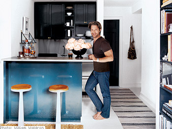
I'd love to see Nate do more kitchens, and I'd love to collaborate with him! Here's Nate's kitchen in his Chicago apartment.
It flows. I love the black window trim. The turquoise is a great color and just flows into a collection of clean, solid, elements, sort of a framework for the room. And, those chairs and table...LOVE.
 And Nate's Manhattan apartment....this kitchen I love! I'm a real lover of white floors...I have two painted white wood floors in my own home. It looks very much like a Swedish rag rug on the floor and the blue, black and touches of wood just punch up the space. The enveloping white on floor, ceiling, and walls, is the unifying element, which adds a flow and maximum spaciousness. There's a Scandinavian aesthetic to this kitchen. Another: LOVE!
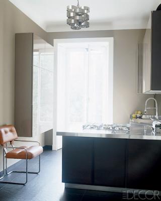
 Nate Berkus' kitchen in his Milan apartment is another Wow! See what I mean? He has a vision! This is European modern elegance. It's quite sophisticated, with strength in large color elements, yet quiet. The brown leather chair adds a feeling that this is a room, not only a utilitarian kitchen, and the color of the chair adds life. Very well done! The lighting fixture, honestly, to my eye, is the perfect touch. LOVE!
Nate, I'd love to see more kitchens! This sampling alone includes such a great collection of creative and diverse (and unexpected) details, don't you think?
First two images from Oprah.com, last image from ElleDecor.com.

