Gloss + Color Blocking Kitchen Design Trends - LivingKitchen 2013

Continuing my (enthusiastic) march toward sharing the many trends that I spotted at IMM Cologne's LivingKitchen, today's two trends which I saw quite well represented are:

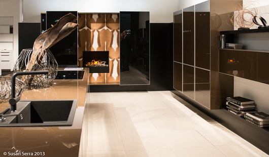
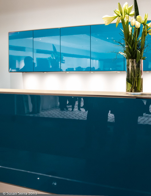
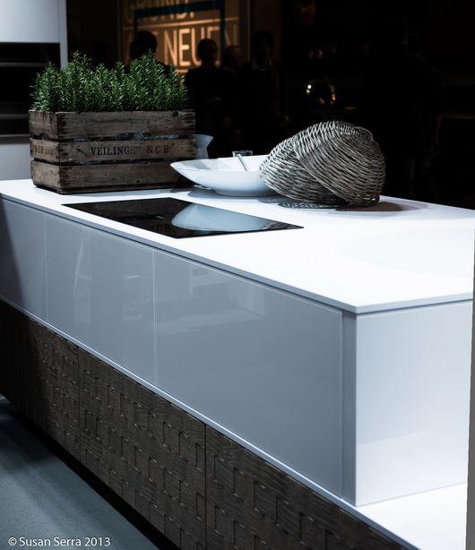
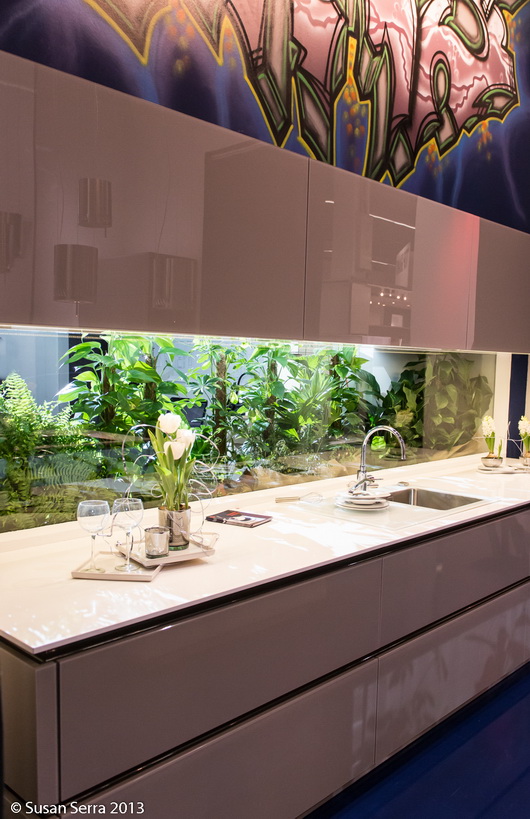
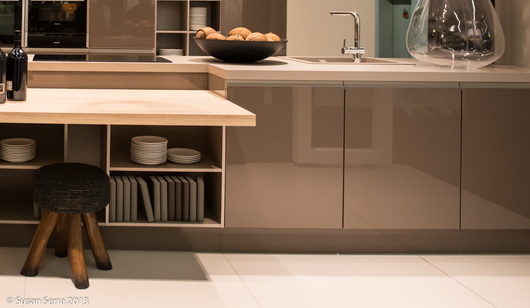
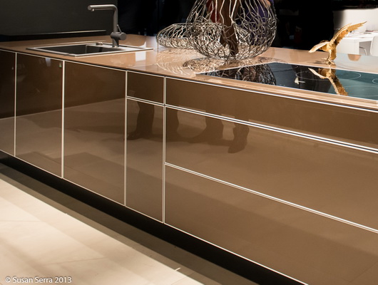
  • Gloss cabinetry
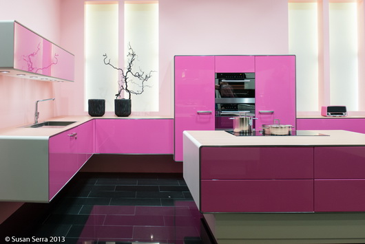
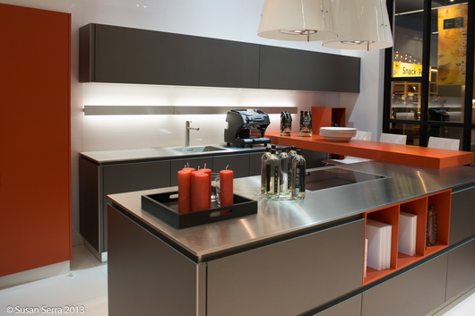
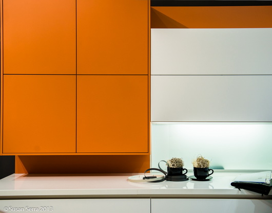
  • Color blocking in cabinetry

Cool, right? They definitely are two hip trends, often mixed up with other kitchen design trends that I listed in my first post on this show.

There is no doubt that nearly every European cabinet manufacturer puts their most creative foot forward in an effort to present eye-catching displays - and it certainly works, like a magnet to design lovers! Well designed, tasteful, cabinet designs are very enjoyable to see, and to learn from too - always, to learn from. Part of the learning process is to look for design attributes which "speak" to you, adding to your global (as in overall) view of design. At some point soon, I will share what I discovered that spoke to me personally. 

To my eye, these kitchens are uncluttered, which gives an opportunity for a design to be fully appreciated. While I would not say these trends were mainstream, they were quite prominant.

GLOSS CABINETRY
 

COLOR BLOCKING CABINETRY

Of course, committing to color could be risky, depending how it's designed into the kitchen. If designed into the kitchen in a way that could be temporary, which is possible, it could be an easy "out" to replace one section of cabinetry, should you get tired of it. In that scenario, put that chartreuse section of cabinetry in the garage, basement, or other area to add to household storage needs.

Some design decisions are the type where, once you are on the "other side" of the decision, which happens during installation, you don't always know exactly how you will feel. That's surely where a design professional can reduce the anxiety by providing expertise and drawings to work it through as completely as possible. I definitely think many of these designs are innovative, bold, and worthy of study. 


Kelly's New Kitchen - It's Personal, Smart, and Flexible

Kelly's kitchen (see Kelly's picture on the right sidebar and wave!) was just finished a couple of months ago after a year of planning and 2 months of renovation! While our images quickly show the overall design of the kitchen, there are MANY features, both aesthetic and functional, that bear dissecting and sharing with our readers. 

Design is often the art of nuance, and this kitchen is all about nuance!! You'll see how soon - this is the start of our series! In each post, we will provide important tips, insight on how a designer thinks, the collaborative process and product information.

When you design a small kitchen, in this case, close to 200 sq ft, (small for the suburbs, huge for Manhattan-and we have (separate) personal living experience in no less than 6 Manhattan kitchens) every decision, no matter how small, is critical! With no additional dining space in the home and needing to accommodate a wide range of activities, it's a design that is either pass or fail once kitchen living begins post-renovation.

Kelly's new kitchen reflects the choices and compromises of real life needs and desires of a young family in their first home. It's a mix of DIY, designing around architectural elements we chose to keep in place and others that we chose to remove and replace. It's about designing with the end always in sight, including the surprisingly important decorative layer.

The kitchen (as many do) needed to serve these purposes:

  • A social kitchen - comfortable to be in for long periods of time
  • Able to accommodate as many people as reasonably possible
  • Appear as spacious as possible while balancing storage needs
  • Allow for a decorative layer including "real" artwork and treasured artifacts
  • Capable of change, which we will talk about in depth later, possibly the most exciting aspect of this kitchen renovation
  • To add an enhanced dimension of efficiency and function to the cooking process
  • Accommodate multi-functional activities (more about that later)
  • Reflect a highly personal design aesthetic overall

We are fortunate to have wonderful partners who donated their products and who had the foresight to see that this kitchen design would provide intelligent and interesting solutions to common design issues. We're proud of how it all came together, and as mother and daughter, we didn't even have a whole lot of drama during the process! Ok, we each took turns with some creative techniques of persuasion...true enough! I may or may not have coached Kelly on how to present controversial design ideas to her husband, a "trust but verify" kind of guy. ;)

So, thank you to our partners:

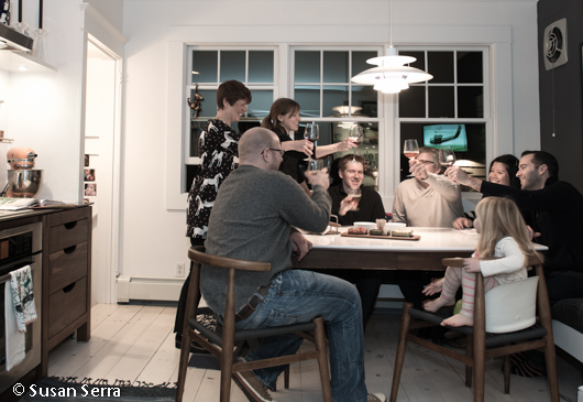
Next up, Kelly talks appliances - what was selected and why, where they should be best positioned, features, design integration, and more. Here's our nuclear family-the only one missing is baby Annabelle.

International Kitchen Design 2013 - Introduction to IMM Cologne

Attending the Living Kitchen fair in Cologne, Germany, as a special guest of BLANCO and member of BLANCO's Design Council, is the equivalent of closing your eyes as you prepare to go to sleep and soon after, entering dreamland - kitchen dreamland!

The kitchen dream is intense, one of those really vivid dreams; it takes you to wonderful new frontiers in kitchen design and technology. There is beauty in many forms, you're surrounded by great people, many of whom are real life friends! This kitchen dreamland, Living Kitchen, is an international fair, showcasing kitchen products from 20 countries and takes place in 11 halls, set up like a campus.

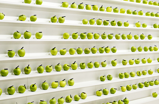
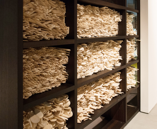
For the moment, I'll share a few fun images of large, graphic, design elements that are part of a booth's design as well as accessories that embellish an individual kitchen display to get us warmed up for the posts coming shortly!

At last count, and this is probably close to the final count, I see that I took 1,744 images, with possibly a small amount of more images to count.

I worked this show as I do all shows-with a hunger to find common threads in different product and lifestyle categories among hundreds of displays. And, I love the process of the hunt and discovery!! 

Just prior to arriving in Germany, I spent 3 days in Copenhagen to visit family, collect my Scandinavian magazines that I love so much (19 of them, this time) and run through a number of showrooms to see the latest in Scandinavian design, which I will compare to what I saw in Germany. I have about 650 gorgeous images from those few days - more, beautiful, discoveries!!


I've already categorized all of my images, looked through them to find those common (mainstream) threads, uncovered some peripheral trends, and evaluated a bunch of products and/or design elements that qualify for "the cool factor" which I will also show...and more. There is a wealth of information and images to come, so stay tuned!!


So much more eye candy to come!