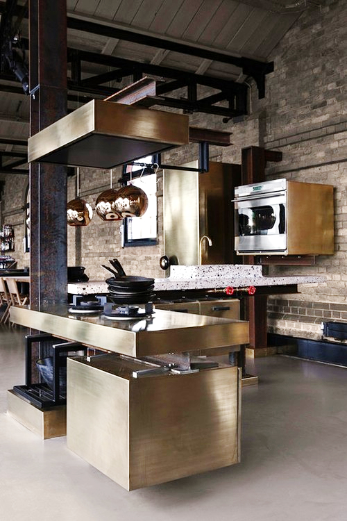
This could be the most fabulously dysfunctional kitchen design that I have laid eyes on in recent memory - what a great find from my tumblr feed!
It's everything fabulous - the uber-serious moody overtones, the sense of haute kitchen fashion, the "this is my kitchen and did you notice the old iron lally column???" nuance. But, the best feature is the utter and ridiculous dysfunction.
First question - who in their right mind would actually spend the money to execute this "design"? It has to have been designed for some sort of set. I do see a table off to the left of the image - could this be a real home? Speaking of fabulous, here is a list of the fabulously dysfunctional elements to this kitchen design:
- Note the high sink edges and the faucet controls
- Where is the storage?
- See the location of the refrigerator-behind the sink
- Doesn't look to be much lighting
- How does the antique brass countertop hold up?
- How do you clean this kitchen?
- What is the significance of 6 pans on top of one another on a gas burner?
- A recirculating island type fan = ZERO FUNCTION
- Where are the dishes and glasses, not to mention food, stored?

If this set was not designed specifically to torture a professional kitchen designer, I'm not sure what other purpose it serves!
To me, this image does provide one interesting lesson: Don't immediately be influenced by what appears to be esoteric, fashionably-original design, as being representative of GOOD design. Money thrown at high end products and materials (and designers) does not necessarily translate to good design. My work is done here ;)

