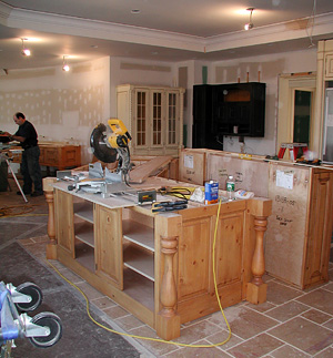
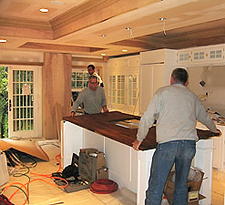
Your Kitchen Design - Big Box Expectations vs. Reality

Just jumping off from yesterday's minor rant, I now want to talk a little about where some people, even, surprisingly, those who will end up making a significant investment in their kitchen, sometimes begin their search, at a big box store such as Lowes or Home Depot , large lumber yard, or other such "kitchens for the masses" place.

These places are downright dangerous (for the mid to high end, to go to as a starting point.) This, really, is the bottom line. The short design time, and low cost may end up being very expensive in regard to lost design/lifestyle opportunities, that you must now endure, or forever be unaware of.

These types of places begin the process of convincing homeowners who are virgins to kitchen remodeling, in many cases, that a kitchen can be designed, specifically for your needs and desires, in 30-60 minutes. They take the dimensions, plug in the appliances, put in equally sized cabinetry surrounding the appliances, if that, and you're done. Your 12 year old can do that.  They also typically do one plan, which, then, becomes obviously, the plan that they feel is the best for the space, knowing virtually nothing about who you and your family are. People are hired and are put directly on the floor to design and sell kitchens with no experience. This is prevalent, in most cases, if the policy of the company is to completely maximize productivity/sales as a business model.

For mid to high end budgets, which is the audience, once again, I am speaking to here, you must be aware that this first experience will help mold the idea, and possibly firmly position the idea, that kitchen design is just a bunch of cabinets placed around appliances, having one solution. And, that this process, taking such little time, can be done easily, late into the remodeling process. 

There are so many lifestyle issues that need to be discussed, that this meeting alone, for me, often takes 2 hours, just to understand who the people are in front of me. And, just to open up my clients' minds to seeing things a different way and taking time to probe their existing habits, which may just be habits, vs. what they may really want, once they took time to think about it, if asked. Layers of years of habits must be peeled away, visions toward the future must be suggested by the designer and considered by the homeowner, and that takes time.

I actually cannot even begin to go into all the many questions that need to be considered when one designs a kitchen, there are just too many. It has to do with some of these factors:

  • how one works now in the kitchen
  • how one wants to work
  • appliances - what is REALLY needed/wanted?
  • doors, openings, and windows...traffic issues as well as quality of life
  • dining area - again, quality of life issues relating to lifestyle, ergonomics, design issues
  • storage - how much and why?
  • the personal layer of oneself, display areas, collections, aesthetic considerations, where and why?
  • specific, specialized wants and needs across the board - discovery issues
  • cook/family/entertainment design work flow
  • the architectural elements of the home in general, and surrounding rooms, specifically
  • and design ideas and choices, for all of the above

These are just some of the issues which are critical to explore in a meaningful way. This is the beginning of what you can get from a good, professional kitchen designer, in the mid to high end budget range. As I do not do kitchens in the low budget range, I cannot speak to the services available in this budget category, but my guess is, if you take time to do your legwork and interview designers, you will find these expanded services in the lower budget range, beyond the big box "outfitters", who design kitchens in 30-60 minutes. Will it be easy to find? Maybe not. But, allow ample time to shop and interview, and you will find a designer who you can work with. The effort and time to do the search up front rests with you and is incredibly worthwhile. After that, you can relax.
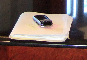
Kitchen%20Project%20FileIMAGE OF A TYPICAL, THICK, PROJECT FILE OF MINE. LOTS OF THOUGHTS, IDEAS, AND MEETINGS IN THERE. 

It's like a healthy, gourmet meal...even if you are doing a relatively simply prepared meal, the totality of the meal will have components of time for research, time to select quality ingredients, from different specialty purveyors, quality preparation time, and the proper cooking time. Or, you can do fast food take out. Designing a kitchen you will have for 20 years in 30-60 minutes is the equivalent of fast food take out! It will tame your hunger, and also will do bad things to your entire body. Unlike your healthy meal, which will do many things that are beneficial for you.

Or, it's the B&B vs. The Holiday Inn Express. You can fall asleep at both, but which will give you the better experience, or memory? Fortunately, this experience is a short one, vs. a multi decade one for a kitchen.

Am I saying that these companies have no place in the world of kitchen design? Well, mostly, yes. For project/volume work, of course, there is usually one type/style of kitchen. That is what it is. However, as long as there are local, small, firms available to offer expanded design services, this is the route that I strongly recommend going with. Is it impossible to find expanded services in the big box firms noted above? Usually, yes. Lumber yards? Actually, maybe not impossible there.

But, first, before you walk in, you need to be aware that a kitchen truly can be, should be, and in fact, is, much more than cabinets and appliances being fit together in a short period of time. It's the most used room of the home, and yes, the heart of the home! It's where life happens, and is nurtured in many different ways.

Again, the real bottom line here is that your and your family's quality of life will be enhanced every single day, for many years to come, if you do the legwork on the front end to find the firm who will give you service, choices, patience, and ideas.  I'm not saying you'll walk down a rosy path to nirvana, without any problems at all, during your remodeling. I am saying, it's a critical first step to take and concept to understand. It's all about time.

A kitchen should be as individual as you are, and why not? You're not just a number, you are an individual, and there are many firms out there who understand that. Find one!

Designing Your Kitchen - Trying To Beat The Clock!

I got a call from a long time business associate on Monday. He asked if I could come out and look at his kitchen. He has a remodeling crew there now. The shell of the extension is up, and they will break through the wall to the existing house, into the dining room and the kitchen, very soon. I was going somewhere else, in that direction, so I said sure.

He showed me a kitchen design that he had been given from Lowe's. I yawned (to myself) at the uninspiring design work. After my yawn, I started to do what I do, which is to ask a series of lifestyle questions. But, details, lifestyle details. Obviously, the husband and wife had never been asked these types of questions before by their architect or the designer from Lowes. They were genuinely surprised at the questions I was asking them. I moved them, figuratively, into the kitchen bubble, where they looked at these issues for the first time. While the hammers were pounding, literally, in the extension.

The urgency of the meeting, as I saw it, was NOT to point out problem areas of the current kitchen plan from Lowes, but to discuss far more critical, and immediate, issues involving windows and doors and the eating area which was right in the center of two 6' or 8' doorways, one going to the outside, one going to the extension, and, the table with 6 chairs not 10 feet away from the dining room table. The dreaded "table/table" syndrome. 

The doors and windows were ordered that day. We quickly decided the contractor should cancel the order.

So, the meeting went well, I was hired and said I'd do my design work. They told me they needed it done soon, and I said I'd do what I can do. I do have other clients!

This was Monday. Yesterday, Tuesday, I received an email late in the day saying that the contractor needs to know the door/window sizes by Thursday.  

I wrote back, saying that while it may be possible to get it done by Thursday, he has a choice of getting it done with 25% or less of devoted quality time and thought put into it than is typical for me, "filling in the blanks" in a very basic way, OR, to allow the proper time for this expensive, and nearly once-in-a-lifetime project to develop.  A kitchen takes time to plan, a lot more than one thinks it "should" take. I hoped to illustrate that.

I advised him to tell the contractor in a nice way that he, the client, misjudged the time needed for planning purposes and that Thursday would not work. Perhaps the contractor can put his crew on another job when they get done with what they are doing.  

This is a crisis for the clients at this moment. They may end up paying the contractor real money for disrupting his schedule, if he's not willing to work with them. They are only now understanding that a kitchen is not just cabinets that someone punches mindlessly into a computer for 30 minutes at Lowes, but,


  • A quality of life for 20 years.
  • A design statement connected to the entirety of their home.
  • A functional environment that has at least several work flow possibilities which must be explored.
  • Perhaps, a once-in-a-lifetime project.
  • A space that needs to address numerous lifestyle activities.
  • A space that needs to "speak to" other rooms in a intelligent way.
  • A space that needs to work with the architectural elements such as doorways and windows.

Here's my message. Truly, it's never too early to hire a kitchen design professional. If you THINK it's just a quick thing to get the cabinets plugged into your plan, you will be doing your family, and your life in the kitchen, and your home, a huge disservice. I cannot overstate that. It's just never too early to get your designer in place. Leave time to interview designers. To find the right designer for this huge undertaking, not to mention expensive, should be given as much time as it needs.

I'm sorry for these people now. Part of their project, including doorways and windows, is up in the air. I have time obligations to other clients. I didn't really realize how strongly I felt about my kitchens. This type of timing issue does not come up too frequently, when one is in the middle of construction, at least not for me. But, it just really bothers me. It needs to be done well, carefully, as dimensioning for locating doors and windows is extremely critical, the lifestyle issues are critical, and so, it must be done right.  And, in my world, that's not done in 30 minutes.

I'm leaving off with a sigh...and a solemn, and slow, shaking of my head, as I hear the drum beat of the hammers in the distance  ;-)


KBIS 2007 - Sub Zero's Inspiring Booth

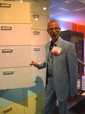
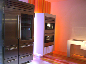
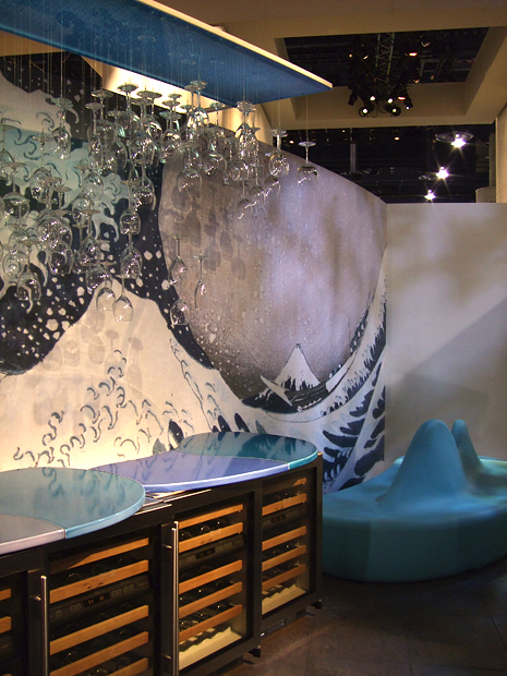
KBIS%202007%20226a.jpgI've got to say, the Sub-Zero booth at KBIS is one of the, if not THE booth to go to to see inspiring designs. More than inspiring, it is wild, wonderful, fantastic, design. This year does not disappoint. Seeing the Sub-Zero booth just gets the design juices flowing, broadening the possibilites for incorporating appliances into kitchens in a fabulous way. Spotlighting Jamie Drake of Drake Design, New York, NY, here is what Jamie Drake's design is all about, from Sub-Zero:

"Jamie Drake's design stems from the magical mystique of the number seven -- seven deadly sins, Seven Wonders of the World, seven seas. The seven deadly sins is a creation featuring a Wolf rangetop with charbroiler set in a red hot peninsula, paired with a series of Wolf wall ovens and a floor afire with glowing embers. This design creates an appliance-focused environment that is presented to designers in an unexpected way. The other two designs also whimsically invoke the number "seven".

The image is of Jamie Drake, himself. 

 
KBIS%202007%20221a.jpg 

 KBIS%202007%20218a.jpg


Kbis 2007 New Products - Siemens Appliances

Siemens is launching an entire new line of appliances in summer, 2007. This is a stunning and highly functional line of appliances, as I observed at KBIS in Las Vegas last week.  Take a look at images of the new line of appliances, and listen in to the podcast on Siemens. I loved what I saw! More information as it becomes available (hello, UPS, deliver the show press kits please??)

Siemens flikr images from the show floor


And, Siemen's podcast from the show floor: 

Siemen's Podcast

Kbis 2007 New Products - Perlick, Gaggenau, Blanco

Here are the first of my images of KBIS 2007! Images are from the Perlick, Gaggenau, Blanco, and Thermador booths. I have access to pretty pictures from press kits, but you know, sometimes I just like the "live from the floor" feeling of the images, so I'll include both types of images.

Also, in this first kbis 2007 flikr set is Thermador's fabulous booth. I'll talk more about Thermador's introductions soon, but for now, enjoy.

Now, hear a podcast of the new sink introductions from the Blanco booth, and follow along in the images included above. Any questions, let me know!

Just fyi, what happens at the show is that there is a press room, where most of the (smart) exhibitors put together a press kit, a folder with information on their new product introductions for members of the media. Then, we go around the room, pick out the press kits which interest us, put them in a box (in my case two large boxes) and send the boxes to our address. I'm not sure just when my boxes will arrive, I'm guessing Monday or Tuesday, so for this particular post, I don't have specific information to fill in on new product introductions, and some of the websites linked (shame shame) do not have their current press releases up either. So, when I get the press kits, I'll fill in the blanks so you know more specifically, what you were looking at in my flikr images. 

For now, enjoy the images, podcasts, and links! 

BLANCO PODCAST

KBIS 2007 - Overview of Kitchen Design Trends I Observed

Here is a list off the top of my head of the trends that I observed at KBIS. Since I am at the airport now with a 3 hour delay, (update: it was a 7 hour delay, getting home at 3 AM rather than the projected 7:45 pm, adding this to the mishaps below post) with my power cord packed (why did I do that?) I am unable right now to work with my images. Nevertheless, here is what I observed as coming on strong for kitchens '07 and beyond. I will take some of these one by one and expand on them in the days ahead, with images and notes. Here's what's happening!


Trough sinks - long, narrow, multi use sinks....secondary sinks

Organically shaped sinks - maybe long and curvy, seeing even more

Sinks with multiple functions - more than ever, more accessories, flexibility

Brown metals
- a rainbow of brown metals from mid to dark colors

Black - Black is HUGE...more to follow

Dark colors - meaning dark wood finishes in cabinetry

Tile walls - strong trend for wall coverings

Light countertops - sandy, earthy, subtle, casual

Thicker counters - anything from 2" to 7"!

Green - meaning eco friendly everything and anything and everywhere. Take care here, as I suspect one small piece of a product being declared as eco friendly may be valid marketing material...there's green, and then there's green...find your green values and then do your research accordingly

Larger sinks - single bowl large sinks, even going larger than last year

Less retro
- retro 40s appliances seemed to have had a very short life in the past few years, did not see much of that this year

More contemporary styling, soft, easy to live with - soft contemporary is very big

Traditional alive and well - traditional styling is alive and well...don't believe all the hot, sleek, kitchens you see elsewhere. That's only part of the kitchen trend story. Important, hot news is being made in traditional styling as well.

Wood variety - more authentic wood finishes celebrating unique wood grain and knots and natural wild grain

Earthy rustic
- a new, sort of contemporary, rustic look

Appliances in various sizes - huge trend, appliances in various sizes for any reason, any situation

Technology in appliances everywhere...lots of bio fresh type of technology, keeping food fresher longer

Hoods - dynamic, innovative, interesting kitchen hoods. Huge.

Purple - seen in more quiet, smoky, or somewhat mid tones, not too strong. You'll see it soon if you don't see it now.

UPDATE 5/11:  I nearly forgot...big trend, lots of open shelving in the kitchen, whether everywhere or just in some spots, it's there.  


I'll expand on these and other trends that come to me. We'll also talk about trends in general...should we care, considering a kitchen is a designed space, with products that are going to have to last, and look good, for 15-20 years? It's sort of a paradox for a professional kitchen designer, at least for me, and I'd like to talk about this. Have no fear, from my perspective, the excitement of trend watching and looking for hot, current, new, products is definitely a "sport" so to speak, but there are underlying issues to consider as well, considering the design/product decisions are financially large, and permanent. I actually can't wait to sink my teeth into this issue, coming at it from several points. But, till then, there it is, above!


KBIS 2007 - Kitchen & Bath Show Madness

It's been a crazy few days here at Vegas! But, of course you knew that...can Vegas be anything but? Leaving the hotel room by 7 am and returning at 9 pm, going nearly nonstop, is exhausting, but a good exhaustion. Surely didn't leave much time for blogging, but trust me, there is lots of new product information coming your way in the days and weeks ahead. I have lots to tell you about.

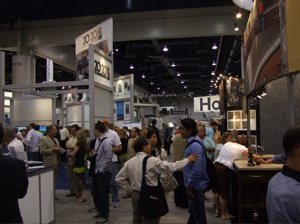
kbis%202007%20floor.jpgI go to the show, actually 2 shows, every year. This show is huge...there are 900 companies exhibiting. I can't explain how huge the show is except to say it took me 2 full days to walk the entire show at a leisurely pace, but not even stopping to examine every booth. That would take a week.

The first day, before the show opened, I attended seminars. In all, I took 413 images (until my battery ran out). I selected and packed up two huge boxes of press kits from exhibitors, which I will go through soon, when they are delivered. I attended press events and seminars. And, I, personally, conducted about 70 interviews at exhibit booths via my voice recorder for podcasts. It was me along with tens of thousands of my closest friends! That said, between all the activities, old friends are greeted, new people are met and cards exchanged.

kbis%20tired%20feet.jpgI DO have an advantage. It's "Show Dog!" My husband's (actually registered title when I sent in the form) self designation. He mostly devotes himself to my well being, carrying the water bottles, always waiting patiently, waiting more, carrying stuff, attending the events, being a listening post to me and others, and he's not in the business. So, I must divulge that advantage and say, "thanks, honey, you're the best!" One day he carried my laptop around the entire day so I could blog at a seminar.

kbis%202007%20vegas.jpgAnd, what would the show be without mishaps? From leaving the camera usb cable at home, buying the wrong one at a local camera store, having the brother in law at home find and fedex it to the hotel, losing my husband at the show early in the day with my cell phone in his bag (finding him, thankfully and then arguing about it of course), me leaving his wallet at the food court (finding it 1/2 hour later still in that spot after suddenly realizing it and bolting back there), having to go to the medical clinic to get a shot for a bad poison ivy outbreak, walking back from one end of town to another in the hot Vegas sun, after the seminars on the first day, because we made a short stop at Nieman Marcus  :-) and then didn't realize the cabs don't stop in the street (not realizing we should go to a hotel driveway to get a cab). And, please, let's not forget the 7 hour plane delay, getting me home at 3 am, rather than my carefully planned 7:45 PM the night before. So, mishaps, there were a few! Probably more than our share this trip! But, it could always be worse. Give me a little time, while I think of how...meanwhile, here's the image from the hotel room, the Eiffel Tower just in front of me, Rome just beyond that, to the right.

When I do the show, I do it the most comprehensive way I know how. It's not just about walking the show. Not for me. It's also about observing and education. Taking as much as one can from a few short days. It's about discovering new trends, connecting the dots, seeing new products, getting reacquainted with tried and true products, and seeking out those little bits of enlightening information along the way. I struggle toward the end of the day with...see more vs. it's enough. That said, I LOVE it! I get giddy at the start and blue when it's time to leave the exhibit hall.

It is an intense experience! Today is the travel day back home. It was, as always, a great, great show. Next, an overview of trends seen at KBIS.


Charlie Trotter's Kitchen Design - KBIS 2007

I eagerly anticipated watching a cooking demonstration today at the Turbo Chef booth. Charlie Trotter, famed chef, cooked a 4 course meal, with courses taking from 45 seconds to cook, to 6 minutes, in the Turbo Chef oven. I tasted a wonderful artichoke salad (I should have kept the menu!) Charlie Trotter is a true believer in the Turbo Chef. For 2007, Turbo Chef is launching a single 30" oven. It will make designing in Turbo Chef ovens just a little bit easier. I had the opportunity to speak with Charlie Trotter after the demonstration about his own, personal, kitchen. Check back to see images from today's demonstration. Here's what he says:

matt Lorenz from Top Design Talks Kitchens!

Podcast for Top Design fans....while at the GE press event last night, a special guest was Matt Lorenz, winner of Top Design. Matt talked about his kitchen design and was also asked about backstage gossip! Meanwhile, after the presentation, I spoke with Matt, only to find out later that I must not have turned on my recorder!

What Matt said to me is that he prefers to have total control over his kitchen designs, and he works out details directly with the cabinet maker of his choice. He feels he wants to have the ability to direct the kitchen design to fit with the design of the entire home. He said that while he fights for what he believes to be the right design direction, in the end, it is the client's home, and they have the final say. His vision for the entirety of the project is held closely by him at all times. Spoken as a "top designer", I'd say. Thanks to GE for this fun opportunity!


Kitchen Trends 2007 Continued - From KBIS

Continuing a discussion of the seminar I attended today at the KBIS conference, at the end of the meeting relating to kitchen trends, representatives of selected product manufacturers, Libeherr, Kraftmaid Cabinetry, Kohler, Dupont and Saeco (sponsors of the seminar) spoke about their products and what trends they are seeing.

One trend discussed, documented in the New York Times from time to time as well as in other reports, that I have read as well, is the trend of baby boomers moving either back to, or first, to the city (any city). This changes everything, for example, as seen in the typically smaller kitchens that are prevalent in Europe...smaller, yet highly innovative, appliances now become more of a factor in the marketplace than every before. As a result, the U.S. market is seeing more variety in appliances such as sizes in refrigerators, for example, enabling creativity within the kitchen design, something we know baby boomers want!

A continuing trend, growing ever stronger, is the growing wine "culture". New refrigerators incorporate separate wine, freezer, and food areas, into one appliance, or moving toward enormous, as seen in the wine vault by GE Monogram. Ever creative wine storage solutions are being developed, and desired.

We are seeing second sinks that are more fluid and organic in shape. These sinks are easier to clean and easier to fit table ware within. It's fresh, it's creative, and it makes sense.

There was talk of the lines being blurred between pure eco friendly and synthetic materials. We are seeing granite that now has a permanent sealing process, changing the composition of the product itself and traditional synthetic materials such as corian, having renewed interest, as some of its composition is indeed from natural materials. The news here is that one will pick and choose countertop materials not only for their green composition, but, perhaps choosing a combination of green and synthetic materials, depending on their use and function in the kitchen, the bottom line being a choice made about what green means to YOU.

Tomorrow starts the first day of the show exhibits. See you then! 

2007 Kitchen Design Trends at KBIS...International Design Trends

Here are international kitchen design trends, as presented by Sarah Fishburne from Home Depot's upscale sister, Home Expo, who, along with her colleagues, researches lifestyle media, travels around Europe's design fairs, analyzes market trends, and more. Here's what is being seen right now, and design concepts that are emerging fast! I'm sitting in the conference right now...

Trends

All-in-one islands, sink, cooktop, island/table "kitchens". For European purposes, oftentimes the homeowner will take their cabinetry with them when they move, so this concept is logical for parts of Europe;

Hydrolic, telescoping devices creating or changing counter space...swings on and off the countertop to uncover perhaps a small trash opening;

Thinner refrigerators 24" or 30", they are taller, using vertical space, great for customizations, (2) 24" units, etc. etc. See this in Thermador, Liebbher;

Seeing many more refrigerator drawers of different sizes;

Morning kitchens...small kitchenettes in other rooms;

Fully lit pre wired appliance center/cabinet/spot in the kitchen;

Scullery...seeing this come back now...separate rooms for active prep space for entertaining and heavy prep and/or clean up. All is hidden; (I have a project now with a separate scullery in the plan)

UK, French have similarities in traditional styling as is U.S; 

Hoods - in Europe they are art, much more than ventilation;

Innovative ways to use corners in base cabinetry;

Rails used in backsplash for easy access storage-I've seen this for many years, but it is becoming more popular;

Dish drying cabinet, seen in Europe for a long time - open cabinet set over the sink, drip dries behind closed doors. if you live alone, wash few dishes at a time, can be functional;

Counters and sinks getting bigger and thicker;

All in one sinks, cut out of one piece of stone;

Trough sinks, super wide, maybe shallow sink;

Seeing single, large sinks;


JAPAN - kitchen trends 

127 million people over four small islands! Land is hard to come by and live in tiny apartments; 

Corners on upper cabinets telescope out;

All-in-one island as the Europeans do;

Appliances are very small in scale;

Tiny dishwashers;

Big on conservation in Japan;

Drying rack for dishes over a sink with fan;

Shelving across windows;

Japanese has 20% of population over 60, U.S. has 12%...universal design is important;

Sensory touch faucets;

Motorized shelves


FUTURE OF COLOR

White is hot! Modern, traditional, old world, across the board....all different shades of white, including glazes, antiques, etc.

Blue is one of the most popular colors in the kitchen, any shade of blue;

Black...almost as standard a white. All over black kitchens, distressed, or as accents as in an island;

Black is also being seen in paint. People are no longer afraid of black...seen as a traditional color.

Red...Seeing it in cabintry, appliances;

Butter, yellow, willow shades of cabinetry;

Wood finishes - more natural woods...alder, knotty pine, hickory, pecan, mahogany. It's more about the wood than the stain finish;

Much darker woods as well;

Appliance colors...reds, teals, Aga, Viking, Dacor, many are adding color;

Metal finishes changing, graphite, oil rubbed bronze, not all about stainless; 

Stainless blue tints, green tints, warm tints;

Small appliances are becoming much more colorful;

Heather and Purples are very hot now or are coming on FAST! It's the softer purple, the brown, mocha purple, purple undertones that are what is popular.


more soon......break time! 

Retro Kitchens - Nostalgia or Shredder Material? #10

Last week, as part of our Saturday series of 60s-70s kitchens, you were lucky to get color...this week, "the quintessential 70s kitchen." We have

  • soffits 
  • pattern on the soffits
  • brown wood
  • cathedral arched doors
  • that little rail molding around the hood
  • pale yellow formica countertops
  • perfectly finished beams spread far apart
  • a tightly patterned floor
  • cabinets over the peninsula

How lovely. And, for extra pattern, we have the brick surfaced island. I must admit, I'm a little intimidated by the iron work on the end of the island. It freaks me out a little.

See where the dishwasher is on the angle? I hope that floor isn't a rug, because the dishes would be dripping from the sink to the corner. What is in between the sink and dishwasher, is a compactor, another favorite appliance from yesteryear. The whole thing looks pretty choppy to me. And, the hood looks out of proportion to the island, too big and boxy, the whole island thing.

But, even though I criticize, I'm sure many people would have loved this kitchen...hey, maybe even me?  :-)  

 brown kitchen034a.jpg

Going To The Kitchen Show in Vegas, Baby!

KBIS.jpgIt's Friday at 5:45 pm, the week is offically closed, although I'll be working my head off till the moment I leave early Sunday morning for Vegas to attend KBIS!

I'll be working hard, trying to fit everything in, the fabulous food samples on the show floor by top chefs like Marcus Samuelsson, from the major appliance manufacturers, the massages from Moen at their press event, the press events at top nightclubs...and, oh yes, the products at the booths, l promise to find all kinds of great stuff and dutifully report back. Whether from major manufacturers, or very small, wonderful artisans, the show has it ALL. You'll hear from me during the show!

I got this great new voice recorder thing that does something special with podcasts, so if I can figure it out, I'll be putting up podcasts. I hate my voice (doesn't everyone?) played back, but I'll sacrifice vanity to give you information right from the sources. I'm so revved up for this as I am every year....see you in Vegas, baby!


I Want This Cabinet Finish For My Kitchen - I Saw It In The Magazine!

I received a call from a client, which is not the first call of this type. The client loved a kitchen that she saw in a magazine, it just spoke to her. That's a great thing, that's really what I hope will happen for my clients, that in some way, they will just know when something is right.

You cannot predict when it will happen, or where. It could be a sample found in my showroom. It could be one of the kitchens I've done that speaks to a client, or it can be one from a magazine that is "the one." Sometimes, it is different elements of the kitchen that speak to clients. In this case, she loved a kitchen seen in a magazine, but she really responded to some of the colors of the materials.

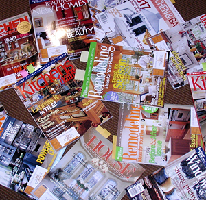
P2050028a.jpgMagazines are great for inspiration. They are an important tool in the process. They can bring to life what you may not have been able to express, or even knew you wanted.

The thing to be careful of, however, is to really understand that the colors in a magazine, on the printed page you are viewing, can be very different from the actual material samples! First, the lighting in the environment where the photo was taken may have been augmented by photographer's equipment. When the image is taken, the camera itself changes the color, followed again, by the tweaking in image software programs to make the color what the art director wants or what the photographer wants. Then, comes the printing, and by the time the image gets on magazine grade paper, depending on what color the paper is, it's a very different color from the original material. And, we know that color is definitely seen and appreciated in nuances. Maybe you now see, this color nuance of the actual sample, as seen in real life compared to the magazine feature, has more of a pink tone than a yellow tone, a world of difference.

Use the magazines for inspiration, not to necessarily seek out specific elements such as the tile, countertop surface, cabinetry, paint color, since once you see the actual color or finish, it will be different. What you CAN do is match up any finish sample to the magazine page. Just today, a client and I matched up finish samples to the magazine page. That's fine because that's what the attraction was. Have fun!

March Toward KBIS - New Kitchen Design Products!

Du Verre hardware is launching three new collections. Sophisticated new works called Kuba and Primitive have been designed exclusively for Du Verre by the innovative designer, Clodagh. Rio is an exotic, sculptural series created by Gina Lubin, founding partner of Du Verre Hardware.

I'll be looking for this at the show, looks just beautiful, doesn't it? I always call hardware "jewelry", and I'd put any of these on a chain around my neck! -susan

deverre-hardware.jpg 

adesso_baby_lowres.jpgErin Adam's new tile collection at Ann Sacks

Erin is known for her award-winning custom mosaics and innovative fused glass tile patterns, which have elevated surface tile design to an entirely new level. She has designed several notable collections, including Quilts, a hand-made glass mosaic tile line inspired by Americana folk art and 1960s graphic design; Lume, a lighting collection; Facet, a glass mosaic tile line inspired by ornamental block walls and 1960s wallpaper; and Luna, a fused glass and aluminum tile line.

I love the hand made quality of these tiles, can you see in the image? They look gorgeous! I see tile happening in larger ways throughout the home. I think more risks are being taken with tile than ever before, and it can truly be seen as an art form such as we see here.  -susan 


Your Kitchen Floor Plan - How To Visualize!!

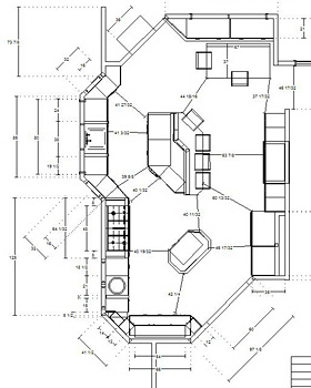
I've had a few clients recently who have needed to come to terms with what their space will really feel like. I hear this often, that people cannot visualize how their space will look and feel, based on a floor plan. You know what? Sometimes, it's helpful to me, too, to get out the old tape measure and double check things AFTER I've done the floor plan, in the actual space. It is, after all, a "feeling" for space, that is put on paper. Therefore, it is important to "feel" the space in the front end however you can, before cabinetry is ordered.

floorplan3.jpgIt's funny that, while it's always at the forefront for me, the movement around the kitchen, I can't say that I'm ever nervous about how the kitchen will feel once it's installed. I mean, it's a huge risk. You're ordering expensive cabinetry in particular sizes where things have to flow and function and operate correctly for a variety of activities. I think it is because the path I use to get to a comfortable flow, works extremely well. It's an interesting phenomenon, having worked off of a floorplan, and then having the real cabinets begin to be put into place. It is the MOST exciting part of what I do, bar none. It is a real rush to see it come to life, for me! When I express enthusiasm to the client, it's for real, I'm as excited, or more so, than they are.

I put a large emphasis on what I call "negative space"...the space which is just space, air. But that "just space" includes the following: walkways, passageways around tables, islands, around appliances, how far appliances project when open, where are steps located, doorways, work flow, all the elements which project into the negative space. It's the negative space, which is extremely important. I mostly consider that first and then "back in" the design of the cabinetry. The negative space often tells the story of how a kitchen can be designed effectively. The first driving force are windows, doors and passageways into other rooms. 

The fundamentals are designed in carefully, even engineered in, often, in my case always, to the 1/8 of an inch. However, that is only half the story. The clients really must be able to understand the new space. 

Here's how the homeowner can visualize their floorplan so they feel confident it feels right:

  • Go over the floorplan with the designer and have the designer measure from one point to another, for as many distances as you can think of on the plan, to verify what the clearances are between which areas.
  • Once you get those distances, do one of two things, or both. Take out the tape measure and look at critical distances in real space. And, or, "mock up" certain items in certain areas in your existing space to see what the "volume" of something will feel like as well as to how it might be situated in the space. This is helpful for something monolithic, like a refrigerator, pantry, to be sure that large items will feel comfortable for you in the space and not block certain views.
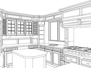
  • floorplan1.JPEGTry to see your plan in a perspective drawing. Keep in mind that perspective drawings are, by definition, out of proportion and scale, exaggerating near and far areas of the perspective. Yet, they do show depth fairly well.
  • Ask your designer, if it's a new construction project, via spray paint, or marker, to outline the areas where cabinetry will be going. This is a great tool for visualizing clearances. This should be done when the floorplan is completed and the cabinetry ordered, otherwise you will have many lines drawn on your subfloor, which will be impossible to interpret. For existing remodels, use blue tape in your kitchen. A word to the wise. Normally, there is a window of time to make any changes on the cabinet order, should that be necessary.
  • When doing these exercises, make note of your appliance locations, particularly the depth of your range or refrigerator. Those items can be as deep as 32"!
  • kitchen perspective.jpgTake note that you have adequate space surrounding your dining area for someone to pass by to a seat or any other similar situation surrounding chairs for island or dining areas. Also, how the dining area impacts passageways and entry ways, take a look at that. And, measure in real space where you need to, and can.
  • One great thing to do is to double check what your spaces are NOW for clearances around certain areas to verify if they will be getting larger in your new floor plan, or just how they will change, compared to how you are living now. For example, how far is the table to the wall now, vs. in the new floor plan, things like that. Be familiar with your existing conditions.

These tips should be a constructive, efficient, way to get you closer to really understanding what your space AROUND your cabinetry and appliances will feel like. And, that's important. Once some of those exercises are done, you can feel even more confident and excited about your new, enhanced lifestyle to come. I really love this part!


Kitchen Color Chat - With Jill Clarkson

Jill was kind enough to lend her expertise in a kitchen chat (say that three times fast) about color. Jill Clarkson is an architectural color consultant and muralist located just minutes north of the Golden Gate bridge in beautiful Marin County. Jill Clarkson Color + Design service offerings include residential and commercial color consultations, custom designed and painted artwork, murals and wallpapers, home staging and redesign. Online color and design consultations are now available. On site consultations are available through out the San Francisco Bay area. See her blog www.jillclarksoncoloranddesign.blogspot.com or call 415 924 4204, for further information.

"Color in the Kitchen"

Kitchens today are becoming more and more colorful, most anything goes, which makes it a fun and exciting proposition to come up with a new color scheme. With so many surfaces to consider, such as the cabinets, the counter tops, the backsplash, the appliances and the walls, it may be a bit overwhelming but nonetheless the perfect place to express your creative vision. Warm colors can be used to create an inviting and convivial environment, fit for friends, feasts and conversation.

I'm sure you've noticed how when entertaining friends and family that there is a natural tendency for people to gather in the kitchen. It's the communal zone and the perfect place to add cheerful, friendly colors which will enhance the kitchen experience. For those that prefer a soothing and elegant space, a monochromatic scheme (see picture below.)

monochromatic kitchen

Using different intensities of the same color will provide interest without raising your pulse. For those a bit more daring, a complementary color scheme such as blue and orange or black and white will create a lively and pleasing space.

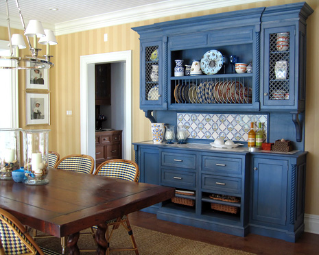
blue hutch yellow background


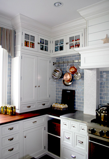
white kitchen blue background

When working with wood cabinetry the color of the finish needs to be considered. For darker, warm cherry finishes, a contrasting cool color such as celadon green will look fresh and clean. For cool white cabinetry you may want to add warm colors such as yellow, almond or biscotti. I think white cabinetry also looks fabulous with sage green and blues.

You can add warm colors with your textiles and accessories. For lighter wood cabinetry such as Maple or Pine you might want to consider going for a mid to darker shade that will really make the cabinetry pop. If you've invested a pretty penny on appliances, cabinetry or tile work then those things should take center stage. Use neutral paint colors that will allow the true stars of the kitchen shine.

red orange tan kitchenReds and oranges stimulate the appetite and will offer a luminous glow under candle light. If you want to lose weight you may not want to paint your kitchen apricot or salmon. Blues and greens are calming and can actually suppress the appetite. Complimentary colors, those found on the opposite sides of the color wheel, are always successful combinations when used in the right ratios.

A great rule of thumb is the 60/30/10 rule and stay away from using 50/50. Assign each color one of these percentages of kitchen real estate and be sure your colors work in harmony with your exisiting finishes and appliances. You'll be on your way to a great looking space! : )

Thanks Jill! I'm more conflicted than ever now, too many great combinations!


Apartment Therapy Smallest Coolest Kitchen Contest

apartment therapy sarah.jpgAre you keeping track of the Smallest Coolest Kitchen contest? There are some great kitchens going on. The next phase of the contest, the finalists, are coming up next week. Voting for entries is going on until May 7, so go over there and vote for your favorite kitchen. Here is the page with the list of entries for Apartment Therapy - Kitchens contest.

Vote for whatever turns you on...elegance, personality, fun factor, form + function, color, there's a great variety. Take a look!


The Kitchen Installer - Your Everything

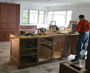
kitchen installation 1You know from time to time I delve into those touchy subjects. After all, as I've said before, you simply cannot do a complete kitchen remodel without being stressed about something. So it is my duty to provide those stressful issues to my readers! Better reading about them than living them. Hopefully, I can help channel some stress into awareness and information. What is to follow are remodeling scenarios at their most stressful.

You've been through the whole process, the contractors, their tradespeople, the inconvenience, change orders, delays. You're tired and you've had it. Stop right here. Is this typical at this stage to feel this way? That's a trick question. The larger the renovation, the more impatient people become later on, understandably. But, of course, one can never generalize, and people are as different as their kitchens!

All is prepared in the kitchen for the installation. The cabinetry is delivered, and a brand, new, shiny source of stress is beginning. Here is a huge investment in cabinetry that will change your quality of life. You are ready for the perfect installation.

We are assuming the kitchen installer is a sub contractor from the kitchen designer. In my world, I have already had a lengthy relationship with my clients designing his/her/their kitchen, but they have not met my installer.  

Here are some tips to know about kitchen installers.

  • There are basically two types of kitchen installers. The first type of installer runs his own business, the second type is an employee of a kitchen installation company. There are pros and cons of each type, and I use each type for different reasons.
  • Installers, like you and I, are capable of making misjudgments and mistakes. It does not mean they are unqualified or less professional, etc. Mistakes must be made, as we are humans. With a competent designer in a supervisory role, and good installers, mistakes or misjudgements are minimized or nonexistent. But, of course, they can happen. More about mistakes another time. When I am talking about mistakes, I'm talking about small mistakes that are easily correctable. Big mistakes qualify as a big problem!
  • kitchen installation 2An installer's appearance is no indication of skill level. I've used one installer with tattoos over most of the exposed parts of his body, for years, and who wears somewhat worn clothes. The skill level has been at the very top compared to any installer I've ever used. His demeanor is professional.  Appearance IS zero indication of intelligence, creativity, and problem solving ability. I've also used, and use, an installer who is missing a few front teeth. The most honorable, pleasant, all around fantastic installer, intelligent, with a skill level on par or above the tattoo guy noted above. And, I use installers who happen to be more well dressed as well. Different installers for different projects for different reasons.
  • Negative opinions or assumptions by the homeowner and the contractor about the installer's work can be extremely damaging to the project, causing an unnecessary (and potentially messy) loss of confidence in the designer and/or installer. Sometimes another tradesperson or contractor will do things a different way and point out where the installer is "wrong."  When the client is having an expensive product being installed, such as cabinetry, the clients are very vulnerable to any and all opinions, good or bad, right or wrong. It is a stressful time.
  • To further this point, again, as noted, the client is often in a vulnerable state at the time of the cabinet installation. An outspoken and opinionated contractor, who has been on your project for months, criticizing a designer and/or a cabinet installer to the client, (whether done ever so softly, or loudly) the installer having been just introduced to the jobsite, can be highly influential to the client. Many clients, in this state, having come so far, now fear, or do not even consider, disagreeing with their contractor, sometimes thinking that their project will be adversely affected going forward if they disagree (a form of Stockholm Syndrome?) This is a particularly common dynamic, a fear to disagree with one's contractor. What to do? Beware of this dynamic, hear the contractor, keep an open mind, and address any situation with your designer in a positive and productive way. See "mistakes" above. A Kitchen being a high priced item, and being installed last as part of a long project, has much stress and expectations attached to it during this time. Do not underestimate the personality dynamics which are a part of every project in one way or another, and how they can affect the client too.
  • The advice above assumes that your designer is highly responsive, professional, and listens to your concerns with respect.
  • kitchen installationInstallers and designers sometimes disagree...sometimes in a heated way. An argument means that both parties care about your project. For me, it is a rare occurance. Plain speaking is most common, back and forth conversation with the installer but occasionally a point needs to be made in another way. Sometimes I will follow an installer's advice, sometimes I insist that my direction be followed. It is a team effort for your behalf.
  • Do not misjudge a seemingly apathetic outward appearance with, well, apathy. Do not misjudge the use of humor with apathy. Installers and designers have dealt with the stress of installing cabinetry for years and in most cases can put emotions aside very easily in an effort to be professional and find good solutions to installation situations which may arise.
  • Treat the cabinet installer with respect and you will get the best job out of him. Your demeanor toward him truly makes a difference. I cannot overstate this. He wants to work in a pleasant atmosphere. He wants an environment where he can take pride in his work. Taking pride in his work means you get the best installation you can for this product you will be using for many years. Be positive and respectful and your installer will work harder and better.
  • Keep a pad and pen near the kitchen and when the installer leaves, observe what was done that day and write down any questions or concerns you may have. Bring them up to your designer.
  • You have the right to expect that your project will be worked on every day until it is completed, perhaps with a gap while the countertop is being fabricated if all other work has been done. Sometimes additional parts need to be ordered, and the installer will return when they come in.


As we say in my business, it is not the problem, it's how it's addressed that is important. This entry morphed just a bit into problem areas with installations, and that will also be covered in a big way in later entries.

Hang in there it will all be over soon!! 

So, when DO you know you have a problem with an installer? What are the signs? Find out soon!