Scandinavian Kitchens - Today's Mix

scandinavian kitchens color030.jpg

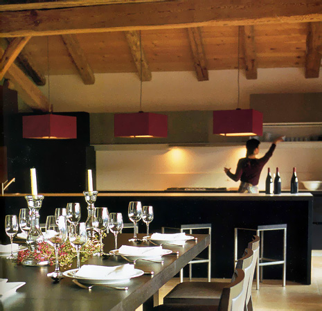
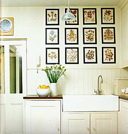
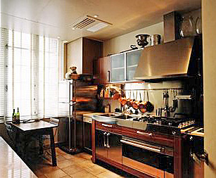
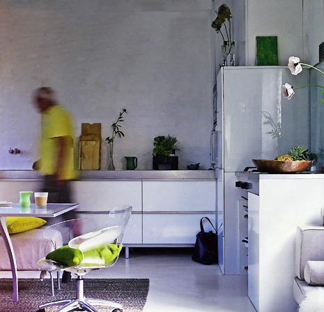
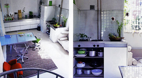
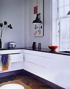
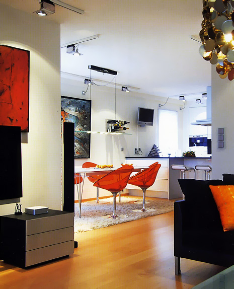
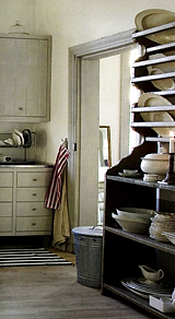
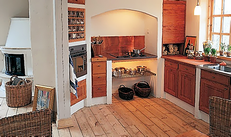
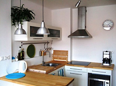
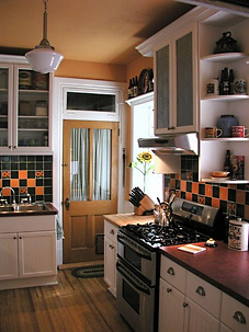
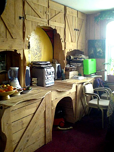
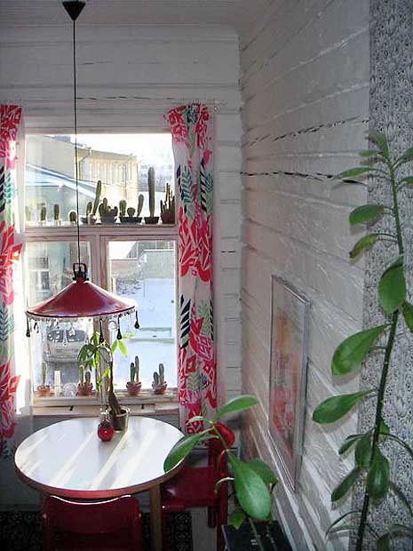
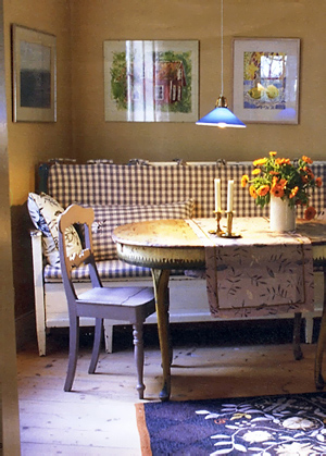
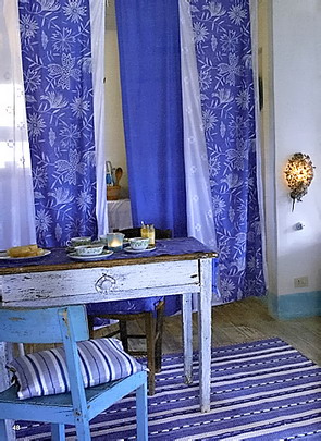
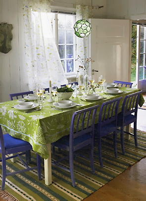
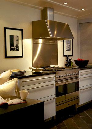
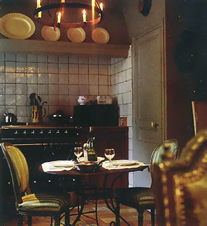
Today we have a little bit of a mix to keep things interesting. All modern kitchens. Some, just downright elegant. A few that you cannot see very well, but you sort of get the picture anyway. Isn't that what our homes are, when all is said and done, an overall feeling? What feelings turn you on and off about these images?

One thing I have not mentioned as yet is that typically, and I only see this in one image, surprisingly, but typically, the lighting hangs down quite low in Scandinavian homes. I LOVE that look. It creates a real intimacy and softness. 


scandinavian kitchens color027.jpg 

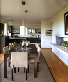
In the top image, I'm crazy about the minimalist feel and the plain walls, Also, the artwork. But, I don't believe those plain walls will remain perfect forever. I don't get that. 
scandinavian kitchens color028.jpgscandinavian kitchens color029.jpg

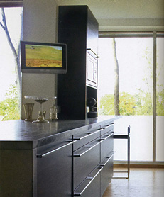
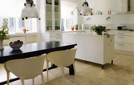
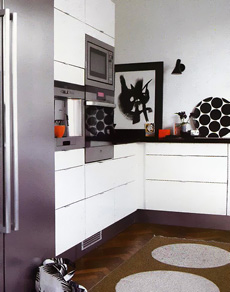
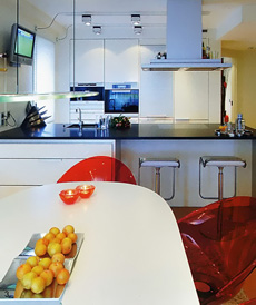
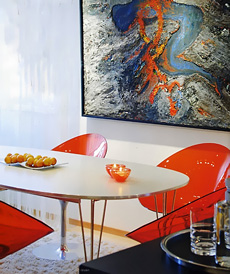
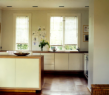
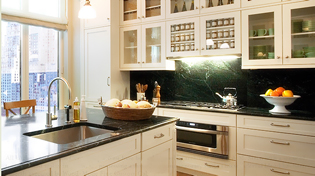
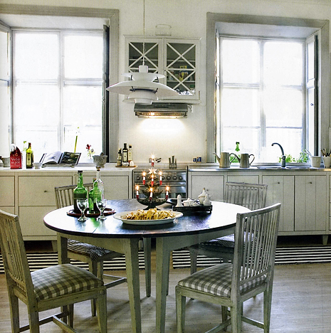
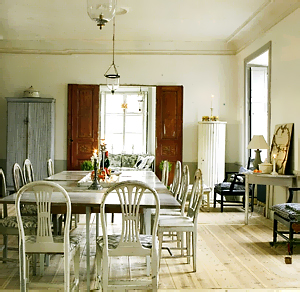
These lower two images are from the same kitchen. I'm responding to the large, plain, windows and the white walls, which I love. It's an overall tailored look, very modern, but tailored. scandinavian kitchens color031.jpg I LOVE the way this one is done. Look at the lighting against the wall. And, the dark table with white chairs love that too. And, of course we see the little splash of red color that we saw last week. This is a comfortable kitchen for me. This last image was from Bolig Magasinet and the other from Interior Magasinet.

And, a couple of blogs as usual. Anyone check into these that I include every week? Here's one called Milly Tulipan . And, Ingrid's Blog.  

march toward KBIS - new product introductions

My separate KBIS folder is packed full of emails, I lost count. Invitations to special press events, new product information, sneak peeks...I love this time of year! Spring is definitely the kitchen season and I'm all geared up for the show, as I am every single year. So here are a few of those sneak peeks.


GE

ge-cafe-collection1.jpgFirst up, GE is launching a new line of appliances called the GE Cafe Series. "The new GE Café series offers a suite of appliances for those who not only love the look of stainless steel-wrapped technology but who actually love to cook and entertain family and friends. The freestanding line of appliances also makes this an easy upgrade for nearly everyone."

Not everyone wants or can afford high end built in appliances. It's very important to have a source for appliances "for the rest of us," as my clients ask for from time to time.  -susan


kog_edo_pattern_670a.jpg
Kalamazoo

"Kalamazoo Outdoor Gourmet introduces the Edo, a new sculptural grill inspired by Japanese design and cuisine. Form meets function as the lustrous, hand-textured stainless steel top glides open to reveal the controls and the 432 square-inch grilling surface. Closed, the sleek, simple form could be mistaken for a beautiful outdoor table or piece of sculpture.

There are two control zones with a total of 50,000 BTUs, powered by Kalamazoo’s signature cast stainless steel dragon burner system. The fuel tank is concealed in the base of the grill. Liquid propane is standard; natural gas is an option. Hidden casters make for easy movement. Kalamazoo’s unique customized grilling surfaces are also available."

With outdoor kitchens so hot, it's great to see some innovative designs for grills. I'd much rather gaze out my kitchen window and look at something scuptural than a big, old, common grill...or kettle. But, that's just me. Very cool. -susan


Swanstone Granite Sink.jpgSwanstone

"Quite possibly the most innovative sinks in the world. Swanstone's newest granite kitchen sinks blur the lines between single and double bowls, offering the advantages of both. The Ascend and Large/Small Bowl combine the most sophisticated design with the functionality, durability, and quality for which they are known."


As a kitchen designer, I know Swanstone to be a well made, well priced, reliable product. I think these sinks have style and function going for them. I'll be looking at them at the show. It's all about the low divider between bowls offering more options for our favorite activity, washing stuff as efficiently as humanly possible. -susan


KWC

KWC-ONO-HIGHFLEX-1.jpgFor that new sink, you need a new faucet...

"This smart new kitchen faucet has an operating lever made of robust yet astonishingly thin, hardened stainless steel. The innovative movement system means that joints and edges which could become dirt-traps are kept to a minimum, while the stream of water flows elegantly and precisely. The “highflex” spring hose, with its accurate and wear-resistant flat-topped spout also swivels 360 degrees.

The KWC ONO HIGHFLEX also produces two types of water stream because of the unique two-stage operating system. At the first stage, a practical filtered stream, and at the second, a powerful pressurized stream for removing tough food residues."

To me, it looks useful and stylish. I happen to appreciate clean lines and the beauty of simplicity. The combination of straight lines and curves is also an interesting aesthetic. While at KWC, check out Eve as well. susan  


retro kitchens - kitchen nostalgia or shredder material? #9

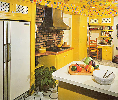
So, kitchen fans, today's kitchen is from the "Yellow Period". Or is it from the "Brick with Black Grout Period" or, as I said another week, from the "Lionel Richie Dancing on the Ceiling Period"!

Look, good for the homeowners. My guess is they were very happy, cheerful, optimistic people, don't you think? Good for them, that they had the guts to go for it! Linda from Surroundings, can we even go down this road, as a companion for the bachelorette pad??

It looks apparent to me that someone had the foresight to recess the, normally monolithic, refrigerator. My guess is this was done because they wanted to have much more space on the opposite side, although that area is not shown. I also guess that the emphasis for, and placement of, ample counter space was on the other side because of the radius cutouts on each side of the cooktop.

Which makes me wonder if the refrigerator could have been positioned where the desk is, thus allowing for much more space surrounding the cooktop. But, who knows?

I cannot see any connection between, or reason for, the combination of the brick and the ceiling pattern (but I think in the 70s brick was obligatory as was pattern of ANY type). And, of course, more pattern was needed in the white lattice doors, and let's not forget the floor!

But, you know what? The owners get lots of points just for the overall happy effect. And, do to two different countertop colors at that time? Come on, how haute couture was that!

Scrappy Girl from Domino...thanks for the mention, is this what you had in mind for your kitchen? 

old yellow kitchen018.jpg


Go Large - Designing Kitchen Windows

large kitchen windowsI just got finished fertilizing about 170 roses in my garden. When I do something, I do it big! It's an extremely exciting time if you are a gardener in the northeast. Hour by hour, all the plants are popping. I'm doubly excited because the  fertilizer I ordered arrived today at my front door, hours before the start of several days of a good, soaking rain. Perfect timing. Coming into the kitchen in the morning shows progress and beauty in the garden every day.

When I remodeled my kitchen a few years back, one of my wishes was to have expansive views of the garden from the kitchen.  We installed 20' of windows. I wanted as many windows as I could get for natural lighting in the kitchen and wonderful garden views. I WAS a bit concerned with not so great views over the winter, but I was willing to pay that very small price. Of course, there is beauty in many winter views as well, with or without snow.

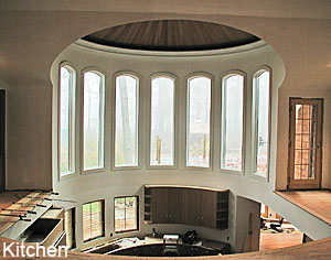
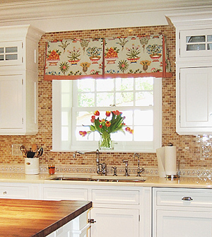
This is a little insight into why I designed large windows in my kitchen (these images are not of my kitchen!)

WHERE DO YOU START? 

When you consider remodeling your kitchen, window size and placement should play an important role. It's funny, but even today, when windows are getting larger in many homes, there is often still hesitation to "go large" with the kitchen window. And, in many cases, and this is a key point, if the kitchen is in the back of the house, the house may have been purchased, partially, for the beauty of the yard, and the existing kitchen windows do not often allow one to fully appreciate the views! It is a paradox that is amusing to me.

kitchen window.jpg 


My recommendation, when planning new windows for the kitchen is to consider:

  • the views of your yard and the role that a lovely view can play in your life in the kitchen
  • the pleasant feeling you get when you are near natural lighting
  • the energy saving costs you could incur, depending on the kitchen's exposure for heating and lighting purposes
  • taking care not to worry that expanding a window relates to an "unacceptable" amount of lost cabinet storage. This part is tricky. Of course, in small kitchens, it is a more critical issue. In medium and large kitchens, carefully evaluate the pros and cons of a larger window before saying a quick "no...I'll lose too much storage."
  • always taking into consideration the architectural view from outside looking in
  • operable vs. non operable windows - operable for needed ventilation, non operable for unobstructed viewing
  • the other windows of your home and select a window style that is the same or very similar
  • if the window or windows should be situated for a specific view of a pool, a play area, garden, wide vista, etc.
  • one's overall psychological well being with a connection to nature
  • what role will privacy play in your window location?

small kitchen windowWhat if your view is not park like, but looks toward a brick wall, a driveway or other nondescript area? Think beyond what you see outside at this moment. Is it possible to add some landscaping to enhance the existing view? Often, it is, but is something the homeowner did not consider.

Is there a spot for a long window? Long windows have a place in a kitchen as well. Short windows are not the only size that must be in a kitchen! I once spoke with a wheelchair bound homeowner and suggested a tall window just beyond the cabinetry, so that he could enjoy the view outdoors. This was a welcome suggestion! 

In a future post, I will discuss how to select the size and shape of the window. 

I'm now energized for the next 6 months of garden viewing out my kitchen window! (see below) And, no, we do not have a gardener! My husband and I designed the garden ourselves, dug every hole (2'x2'), prune every bush, hand water in between rains, do garden clean up multiple times a year, we do not have a "service", it is all our work, which we like to look at and enjoy. A "garden walk" with a glass of wine is a good reward too. Roses were purchased one by one over a several year period. Five more just arrived last week! What can I say? It's a obsession hobby. You'll find me in the garden most days now from 5-8 pm!

UPDATE: While I was thinking roses, see a follow up to this post with good information by Peggy at kitchen-exchange

kitchen window view copy.jpg 

Blogging Kitchens

Rustic Kitchen.jpgI'm so thrilled when I come across a great kitchen in the blogs...they are not so frequent on interior design blogs, so I still say "YES! A kitchen!" and I think interior design bloggers also love kitchens too, I can absolutely feel it. They can't help but put a kitchen in from time to time, one that speaks to them. At least, that's how I see it. I KNOW they love them! The kitchens are often grouped with an entire home's images, so you can see the flow of the home, which is good for context. Here are a few recent ones I've noticed as being special.

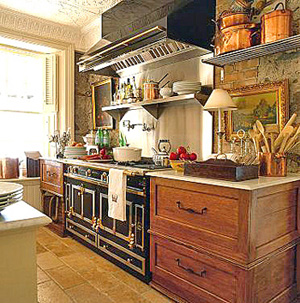
An Eye For An I:nterior chronicles some very nice kitchens. Take a look through the "pages" of the blog.  This rustic kitchen with the (La Cornue?) black range is from the blog. The styles range from rustic to modern, and in between, and the feature with this image is from Sandra Lane, a photographer.

Take a look at the Peak of Chic's complete devotion to kitchens! OK, at least on April 24, it was wholly kitchen focused, and I'll take that! I find it very interesting to read how one responds to certain kitchen styles, and this is a peek at some nicely styled kitchens and some insight into what's liked and why.

At Home With Color.jpgTerramia, who has shown kitchens before, shows a charming kitchen image. Don't we all love a white cottage kitchen? The image is from the book At Home With Color 

I can easily tell you why I like these kitchens. And, I'm not looking so much at function, I'll save that for another day. But, look at the artwork. The textures. The imperfection as to what's positioned where. OK, maybe the lamp is a bit much right next to the range, but I WOULD have a lamp and just position it to the far right, why not? So, to me, these kitchens are carefully chosen, I'm sure, and they have soul.  

A special case are the ladies from Desire to Inspire. Jo and Kim sneak in a kitchen image, I think, possibly once or twice a week. They, too, feature great designers, and whole homes, and include the kitchen, which I always look for first. Just look at this fantastic red and stainless kitchen. Red Kitchen.jpgDon't you love it? I do. It is part of the work of Tony Ingrao. I DO think, however, that they are admirers of modern kitchens, and/or that soft contemporary look. I'm happy about that, which feeds my natural inclination toward kitchens with clean lines.

I am rewarded when I take the time to seek out interior design bloggers' points of view, and it's a bonus to find a kitchen here and there. They are always inspiring.  Take a look at these blogs. The images are those which speak to the blogger in a meaningful way. I appreciate their efforts!

Do you like these kitchens? What do you like about them? 

Scandinavian Kitchens - Splashes of Color!

I think it's a very common thing in Scandinavia to show small splashes of color, like, very small. It seems the smaller the color, the bigger the impact (in some cases). My friend, Lone, a Danish girl who lives in New York, showed me an ad (she's a kitchen designer) she was putting in a magazine, and it was a kitchen that was all white with some black and then only half of a red chair was showing, sort of at the way end of the room...of course, an Arne Jacobsen chair. I didn't get it at first, I don't see that a lot, but now, these images brought that concept back to me, and brought it to life. Images from Bolig Liv.

So, now we have 3 interesting elements....white (nearly always), a splash of color, and texture (nearly always). Fantastic combination.

It's fun, cool, and fresh, don't you think? Oh, here's a nice Scandinavian blog, Molly's Heaven and another great one, Lantligt.

 scandinavian kitchens color019.jpg

scandinavian kitchens color020.jpg


scandinavian kitchens color021a.jpgscandinavian kitchens color022a.jpg


scandinavian kitchens color024.jpgscandinavian kitchens color025.jpg

scandinavian kitchens color026.jpg

retro kitchens - Nostalgia or Shredder Material? #8

Today is a special day. At The Parrish Museum in Southampton, New York, there currently is running an exhibition on Raymond Loewy, the most prominent industrial designer of the 20th Century. Raymond Loewy designed everything from cars to silverware to broiler ovens during his five decades of work. 50s kitchen2a.jpg The 1950s proved to be a period of great interest in the kitchen for Raymond Loewy as he designed many useful products for both efficiency and his new, modern, aesthetic. The "Raymond Loewy: Designs for a Consumer Culture" exhibition includes today's talk at the Museum, at which I, along with several other speakers, will speak on American kitchens today. My topic will be "Comfort in the Kitchen." The exhibition is ongoing through May 27.

I will also be talking about design blogs! If you were at this event, please add your comments to this post. Tell us about the exhibit, what you learned, how you feel about kitchens, your kitchen, etc. Whatever you'd like to add, I'd love to hear from you! And, if you are new to blogging, don't forget to visit the sidebar to your right where you will discover my favorite blogs you will surely want to visit.

So, for today's kitchens, rather than the typical 60s-70s kitchens I show, let's go to the 50s! And, take a look, once again, at these kitchens from the totally fab blog, Fabulon.

I will update this post after I know I have survived my talk and tell you about the day.  

UPDATE: It was a great day...lots of interesting information from Alice Ross  who talked about the history of cooking, bringing along lots of antique, amazing, equipment, including many antique cooking "gadgets" which was fun to see. I ended up not really following my notes and just talking away about how to create a comfortable kitchen, and how I see trends forming where the individual will become more confident in their kitchen design than ever before, with a professional to guide, thanks to having so many choices available and seeing the many different ways, online, that people are designing and decorating their kitchens. I see a renewed confidence coming down the road. It really was a privilege to be a part of this program, and I thank the Parrish Museum for inviting me. The Museum itself is a wonderful building...see image below.

50s kitchen.jpg


50s kitchen3.jpg


2007_04210019a.jpg

Green Kitchens - My First Post About The Subject

Up to this point in this blog, (although the major color is green on this page) I have not addressed designing green kitchens, creating a green kitchen life within whatever kitchen you have now, and green kitchen design issues overall. I am a person, in general, who is open to new ways of thinking, always, and this issue must be addressed.

green leavesWhile I am not a treehugger, I do hear the drum beat about the importance of taking care of our planet, our natural resources, and doing our part. At this point, I am probably more "Lite Green", as I have heard the term used, describing those who incorporate some form of green living into their lives, where they can. That would probably be me.

I've consciously cut down on electrical usage, recycle, bought up lots of flourescent bulbs, admittedly not for everywhere in the home, and try to be aware of my energy usage. Sometimes I am forgetful. My husband is even more on board with this than I am. Central ParkMy idealistic son is involved in this movement in a very big way, having made real lifestyle changes, and of course, telling us how we have (while not using the term he used) screwed up the planet and now he has to pay for it. He's mostly right, isn't he...

Some months ago, I began to ask my clients, as well as having inserted a small section about green kitchen design on my website, if they are interested in green products for their kitchens, and if so, we WILL go down that road. Most clients say they are not, but if there is an interesting product that appeals to them aesthetically, and IF it has proven durability, that is actually a huge issue I am hearing, then it's something they would like to hear about.

This journal entry is an open call to manufacturers to send me samples of your green products as I'd love to evaluate green products in person as opposed to just reading about them. I will have that opportunity at the KBIS show in Las Vegas in May to take a look at what's new and green and will report back. However, a quick look, or a read about a product doesn't give me much to go on. I do need to take a closer look if I am to go down that road with my clients and with my readers.
But, the paradox remains, and here's the thing...with many new types of materials and products coming out under the green umbrella, when one does a kitchen, at ANY cost, whether it is $50,000, complete with construction, cabinetry, countertops, appliances, or up to $200,000++ which many of my clients do, it is fair for all of my clients to want to know...will this product last? IMG_4429aa.jpgIs this finish durable? Having read of some green products not wearing well after having been in the marketplace for a few years, this becomes a very real concern for me, one who recommends products to those who are doing a, possibly, once in a lifetime project.  I take this issue very seriously.

 
In any case, I wanted to put down some preliminary thoughts on the subject as a first post, so you know where I stand on this issue. I am sure I will be showing you products that I come across, as looking interesting. More than that, I cannot guarantee (meaning promises on how long something will last or how durable it might be). I hope, when I go to KBIS in May, in Las Vegas (no, I'm not telling you what I'm doing there after the show ends every day, you know what they say...) I will find that the market has matured somewhat and that there will be more reliable information and time tested information on green products of all types for the kitchen. As cabinetry is the largest expense for a kitchen, at least for my clients, this is an area which concerns me in a big way. Countertops equally, as they REALLY tell the story in the short term in regard to durability. IMG_4437aa.jpgI look forward to becoming familiar with more and more green kitchen products.

So, this is where I fall out on this issue. It's important, I'm very interested, but also cautious as with any new product. Soon, I'll be collecting green websites and blogs for a separate category of links on green kitchen design in my sidebar. I welcome open discussions on this issue as well, plus, any information my readers wish to give to me.

This post was actually precipitated by an article I found in Oregon's Register Guard website. I also found some excellent green kitchen tips from The Jaded Vegetarian, at Green Living, and at the Green Home Guide for starters. I just subscribed to their newsletter. Update: I see you also need to go to my friend Peggy's blog, as she has good stuff on green kitchens: kitchen-exchange.

Images taken by me in Central Park! 
10 things I want For my kitchen

I like lists. Although I'm not the most orderly person around, occasionally I'll get my act together, find a yellow pad (I feel more responsible when I write on a yellow pad) and make a list (usually it's about bills to pay!) but it could be anything. I found this topic floating around the blogs, "10 Things I want For My Kitchen". I'll dream, any chance I can get for a moment, so here are my answers.  The good thing is that I actually had some trouble with making my list. I like my kitchen! I won't tag anyone, but I'd love to see your list, and here's mine:

  1. Gaggenau's oven with a built in rotisserie
  2. Wood countertops - not sure which type...mahogany, walnut, teak
  3. Refrigerator drawers
  4. Very light colored rustic wood floor
  5. the sofa at my kitchen dining area recovered
  6. great speakers for music
  7. easier way to control music from the kitchen
  8. a fantastic juicer
  9. white walls
  10. new cabinetry!
Here are some of the blogs who made lists of kitchen wishes: delicious asian food, food-fusion, mykitch3n, m3rni3.


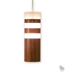
Meanwhile, I can think of a few other things that I could easily enjoy in the kitchen like this pendant from Design Public.

Hatch lamp.jpg 

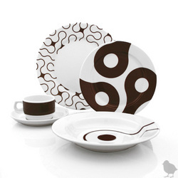
dinnerware Design Public.jpg


How about this dinnerware from Hatch? Wouldn't it look great in these black and white kitchens


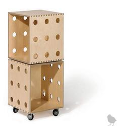
Design Public Storage.jpg


And, last but not least, these boxes. I'm not sure what I'd use it for, but I know it will come in handy for something...Maybe potatoes and onions in baskets? The stock pot? Linens? I'd find a use, I'm sure. 

What about you? What do you want in your kitchen? 


Really Simple Solutions For Your Kitchen Pantry

Sometimes, I know I need simple, basic, advice. Do this and here's why. Point by point, there is advice that makes sense in an effort to organize the pantry.


pantry.jpg 


As a kitchen designer, I typically think through how my clients will use their kitchen, especially the cooking utensils, small appliances, and so on. There are multiple factors which will determine where your pantry items are stored.  You may want to take inventory of not only where your specific activities are in the kitchen, but the frequency of use of the items you need at those locations, having a direct relationship to where the items will be stored most effectively, all having to do with accessibility.


pantry 2.jpg


In my own kitchen, sometimes I do prep work around the main sink and sometimes the prep work takes place at the cooktop area. For that reason, I have multiple measuring spoons, cups, and other utensils, so that there is convenience in each work area. If there is a second sink, you may want to have strainers at each location. Convenience and efficiency does not need to be complicated, but it does need to be thought through in terms of visualizing where, how, and why you use all the many, many items in your kitchen.


pantry storage.jpg 

march toward kbis...new product introductions

Here is a sneak peek at new products being shown at KBIS...


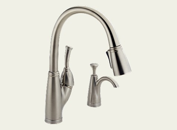
delta allora.jpgDelta's newest kitchen faucet: The Allora

"What makes the Allora stand out is the completely new magnetic closure that joins the pull-down spray to the body of the faucet. Now, consumers can enjoy the convenience of a pull-down spray, without the extra step of twisting and locking the spray head into place because the magnetic closure engages the spray head and wand in a snap."
 
Me, I think that's neat. Another one of those thing that make you say, why didn't they think of that before?? -susan 

EVERPURE....S.Pelligrino, watch your back!

"Everpure unveils the latest in home water filtration with the launch of its Carbonated Chiller. Join us for an exclusive tour of this industry-first, and experience a delicious Italian soda the way it was meant to taste: with crisp, clean Everpure-filtered carbonated water. "
That's my cue to stop by the booth at KBIS and check it out, which I will be sure to do. -susan


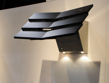
zephyr.jpgThe Padova, BYOM (Bring Your Own Materials) a customizable hood

"A new concept from Fu-Tung Cheng is designed to be customized with the materials of the homeowner’s choice. So whether they prefer mosaic tiles, ribbed glass, or the many possibilities Italian Marmorino plaster, a homeowner can work with their own designer or one of Zephyr’s seasoned designers to make Padova a signature addition to any home. Specifications: Size: 42”, 48”, 54” Internal blowers: 600 cfm External blower: 1000 cfm"

I like the idea of being able to create a transitional piece like this...adding materials, particularly in the more warm or rustic areas, which would add a very exciting eclectic element to this sculptural, thoroughly modern, hood. Imagine barn wood veneer? Why not? Antiqued copper or zink, so many possibilities.  -susan

Scandinavian Kitchens - shades of gray

Scandinavian KitchenI tried to break out of black and white Scandinavian kitchens, but I'll tell you one thing, it's not easy! There is more black than I realized lurking in Scandinavian kitchen designs I am coming across.

Black is very interesting in kitchens...sometimes you hardly know it's there. It is a neutral and it makes a statement, but sometimes it comes on like the strong, yet silent type of statement, sort of like Leonardo DiCaprio...don't you just wonder what's going on behind those eyes (and those eyebrows?) I know I do. Moving on...

Many of us are familiar with a classic light to medium blue gray color, found more in Swedish kitchens than in Danish kitchens, for example. Why gray? Isn't the air cold enough to be also reminded with a cool color? I wonder about that. Doing some quick research does not reveal answers. I'll need to get on this trail. 

The light gray kitchen and dining area is from Vakre Hjem & Interior. The white kitchen, from Interior Magasinet, as well as the top image. The rustic wood and white kitchen, from Bo Bedre.

Enjoy!

 ScandKit 4_16_4.jpg


Scandkit 4_16_5.jpgScandkit 4_16_6.jpg

ScandKit 4_16_7.jpg ScandKit 4_16_8.jpg The top light gray kitchen, is very subtly eclectic in style. Notice the lighting fixture above the table. While a classic design, by Poulsen, and designed many decades ago, it is a contemporary feel. The cabinetry, to me, seems a beautifully simplistic country style, yet, with modern overtones, which complement the lighting fixture. The expanse of wall in a singular color, with little ornamentation can also be interpreted in a simplistic modern way as well as simple country. I suppose in the end, we seem to be looking at a modern country look. Do you agree?

Oh, before I go, again, here are some wonderful Scandinavian blogs...I hope the authors will comment on what they see makes their kitchens so special! Take a look at Dreamhouse, a white kitchen in the latest post, and Annas hus pa landet, with a list of blogs to make you procrastinate all afternoon! OK, and one more, Sara vill fara.

New York City's Latest "Triple mint" Kitchens at 15 CPW

There is an apartment building, hmmm, can it even be called an "apartment building"? I think not. Perhaps I should use the word "residential tower", at New York City's fabulous upper west side address, 15 Central Park West, nearing completion in the months ahead.

cpw.jpgFor the benefit of my readers outside of New York City, unfamiliar with  this famous street, Central Park West is arguably New York City's most architecturally renowned residential street, having been added to the National Register of Historic Places in 1982. The residential buildings along Central Park West are grand, having been developed and built shortly before the depression, during a positive building era of "let's party till it's 1929". The new residential building at 15 CPW, is designed by Robert A. M. Stern and developed by Arthur and William L. Zeckendorf (brothers).


The celebs who have already bought into the residences are:
  • sting
  • denzel
  • jeff gordon, nascar
  • norman lear
  • one half of the google duo
  • and of course, hedge fund managers and Goldman Sachs big shots

My source, a little birdie, inside the building, told me of a sighting of Oprah and Gail, both in hard hats, touring the space. Read more about this building at Triplemint, at Curbed, and at the building's own website, 15 CPW.

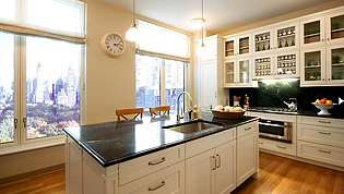
cpw3.jpgNow to the kitchen in the model residence.  Which brings up a very interesting question. How do you design a kitchen for the residential model in this building? The kitchen was designed by Robert A. M. Stern, the building's architect. The state of current kitchen design styling must play a part in some way, along with the need to be sympathetic to the architecture.

It makes me wonder, going 5 years back, with all the columns, corbels, and pilasters seen in every kitchen, if that sort of decorative detailing would have been the style of choice. After all, who would even go down that road to have a 1920s kitchen designed? You couldn't. It was a small, non descript utilitarian space, a kitchen in the 1920s.

cpw1.jpg15 CPW is certainly a grand building, and can handle a grand kitchen, with much decorative detail. Yet, I see the architect used restraint. And, I also see, the design is right out of the movie, "Something's Got To Give", which launched a huge movement to a traditional style kitchen that used to be called Shaker, and is now, what I refer to as a "butler's pantry" kitchen, a style popular still today with my clients, several years later, in fact, gaining momentum as a fresh definition of traditional kitchen design and styling.

I would have had a different design interpretation, had I designed the kitchen for this model in this impressive building. I would have added more interest in the form of simple, elegant, millwork detailing here and there around the cabinetry, yet still maintaining restraint, which would not break the bank (if anyone cared about the bank). I might also have recessed the cabinets above the cooktop 2 1/2 inches, to more easily define this area as a focal point, albeit a soft one. I would have put two pieces of hardware on the long drawers, probably used different hardware, and most likely, bring the cabinetry to the ceiling, and I would have had a conversation with the pantry. Other ideas are floating around as well, all simple, but appropriate and elegant enhancements.

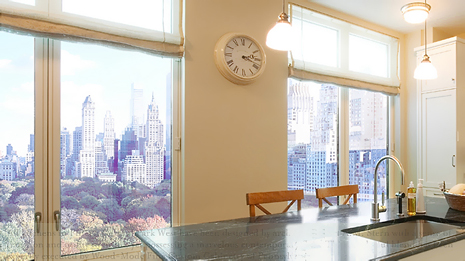
White cabinetry seems to have been used to capture and reflect light, as this room is all about light. And, the green marble, probably from Vermont, of course, reflects the beauty of Central Park, just beyond, as does the wood floor. The kitchen materials and colors are as closely related to the view beyond as it can be.

Sadly, I was not called on to design this kitchen, but I AM available to those in the list above!

cpw2.jpg 

Technorati Tags:

The State of The Kitchen Designer Blog

I'd like to say a few thank yous!

I started this blog on kitchens and kitchen remodeling, in very early February, as an experiment in another "voice" to my local kitchen design business website. I very quickly LOVED blogging, as I have always also been a writer of sorts!

What I did not expect to find via blogging, was the wide open welcome I received from the blogging design community. My very new blog, untested, unknown, has been welcomed in a way that has surprised me, from early on, and I am very touched, and also grateful for the opportunity to run with this great pack of design bloggers! You rock!

Thank you to those who have acknowledged my blog in one way or another. I am very proud to be associated with you.

Special thanks to the following bloggers:

 
decor8, for making me "blog of the week" last week - how awesome!

ShakaDoo, where I am a guest author in Shak In Style and Shak Hammer, in this very innovative blogging concept, one of a kind for sure.

Design Talk, where I answer questions on kitchen design, thank you, it's a lot of fun and very enjoyable all around! An excellent blog.

Hatch, who just featured me the other day, and another great gal with a great blog, attached to a store which has beautiful and useful things.

Apartment Therapy, who has put me in Slinks to my utter shock and amazement

Charles and Hudson, who will be doing a Q&A with me shortly and I am so proud to be associated with this blog 

Desire to Inspire, who very early on included me on their inspiring blog, thanks ladies

the happy living blog - the first blog who featured me, much to my shock, where I very loudly gasped and sat bolt upright when I saw a post about my blog! I felt like I was on the 6:00 news!

And, an extra special thanks to my friend, Peggy, CKD, CID, at kitchen-exchange, who inspired me to dust off my blog that I had started, but not published, last December.

Please also take time to make a visit to the blogs listed on my sidebar. I enjoy reading all of those blogs, and the ones who are asterisked (*) have supported this blog in a special way, and I encourage a visit to those particular blogs(*), where you will find very creative and beautiful things.


Nostalgia or Shredder Material? #7

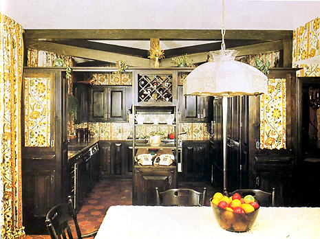
Here's an interesting image! Time again for "Nostalgia or Shredder Material." In design school, I learned of the element of "continuity." It appears that this designer did too. Of course, if this is a 70s kitchen, we must have yellow and gold, and some orange too. That hanging lamp was a typical lamp of the 70s, I forget the name it was called. The cooktop is on the rear wall. Makes me wonder if there is actually wallpaper behind the cooktop!?

One thing we know for sure...they are very important people! See the two phones?

It's fun to look at these images. I think there is a LOT to learn too. Pattern was very important in this little micro time period, it seems pattern anywhere and everywhere, it almost was a measure of creativity, how many patterns could be used together or over how much square footage it could cover. I'll just bet that the ceiling was considered too. To me, the strict symmetry of the cabinetry and the constant pattern equals a dead feeling, void of dimension and interest, even with the beams. To me, they just confuse things. Have fun looking back! 


60s 70s kitchens012.jpg 

What's On Your Kitchen Counters?

I like to be surrounded by my favorite things. I just need to have things around, meaningful things,...memories. I'm sure many of you are the same way. It is what puts "soul" in our kitchens. Personally, I much prefer meaningful things than decorative items selected for the design of the kitchen, but, that's also a look that certainly is viable and can be a lot of fun and of great interest, and I will be showing this look as well on these pages..

Here's what I have on my counters and also what they mean to me:

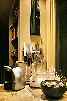
personal kitchen accessories_1.jpgpersonal kitchen accessories_8.jpg

A bowl of shells - picked them up at Jenny Lake out west with my husband many moons ago.

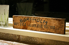
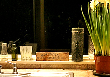
Wooden sign with lettering on it - picked that up off the ground. It is the side of a herring box. Got it in a little island called Bornholm, when I was 16 and visiting with my Danish aunt and uncle. I knew at the time that I'd have it forever. I can't tell you how long ago I got it.

personal kitchen accessories_4.jpgpersonal kitchen accessories_5.jpg

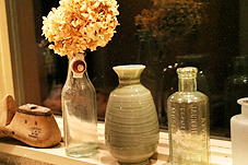
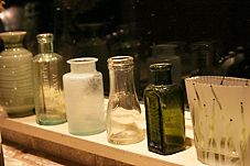
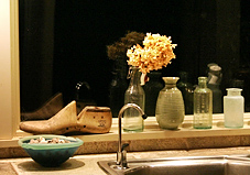
Bottles - many of these were recently acquired as my husband and I found a man who searches for bottles in construction sites in the New York area, antique bottles. He knows many details about these bottles. One by one, at the upper west side flea market in the 70s in New York, we pick a bottle up and add to our collection. These bottles will soon be filled with roses from my garden!

personal kitchen accessories_6.jpgpersonal kitchen accessories_7.jpg

Shoe form - my uncle from Denmark, Thorvald, sold shoes for 50 years and ultimately met the Queen in tribute to his life's work. He's always been an amazingly wonderful uncle.

personal kitchen accessories_2.jpgpersonal kitchen accessories_3.jpg

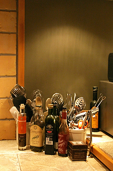
Other images are of useful items that I think look great together, the oils, utensils, a few appliances. I'm fine with that. Not everything has to have a perfect place. Bring out your precious items and put them on your kitchen counter. Anywhere.

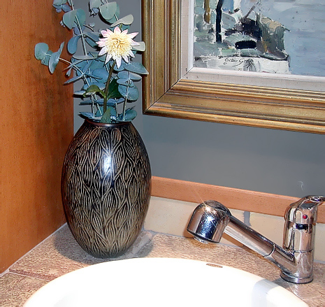
This last image is of a vase bought at a Scandinavian auction and is by a well known ceramic artist. The painting is of a little fishing village in Denmark, near where my cousin has a summer house. This is at the area of my kitchen where I have a second sink. Nice memories...

Kitchen Accessories.jpg  


Normal Room - The Best Kitchens!

Many of you have heard of Normal Room, the website where people from all over the world upload images of the rooms in their home, just to show others how they live and to see how others live. A great concept to make the world a little bit smaller and to understand a little bit better how other cultures do what we do, cook.....and, think about what's the same, what's different....it's all good, right?

So, as a dutiful editor of a kitchen design blog, I went through the entire category of kitchens and chose the ones I thought were most interesting to me.

The rest were, well....normal, not that there's anything wrong with that!  :-) 

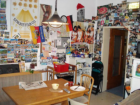
The first image IS a kitchen, a typical kitchen somewhere in Africa...the 2 just below, I did not take note of, the 3rd image on the left is from the U.S., the 4th image on the right is from the UK, and the bottom image is, of course, from Finland. Oops, the one with the postcards before Finland is Germany. And, check out my friend, Peggy's post too on an unusual kitchen.  Enjoy!

Normal Room 4.jpg


normal room 7.jpgnormal room 6.jpg
normal room 5.jpgnormal room.jpg

  Normal Room 2.jpg Normal Room 3.jpg


2007 Kitchen Contest - Apartment Therapy

Apartment Therapy - The Kitchen is hosting a contest for kitchens, "Smallest Coolest Kitchen 2007" The deadline has been extended through April 16, so there is still time to enter!

small kitchen.jpg


The entries are being rolled out now, one by one. I think it's great that the smallest of kitchens get a chance for some, well, respect! Small kitchens always need useful ideas, and every inch counts. It should prove to be a great collection. More inspiration, again, from Apartment Therapy. The image is from This Old House.  


Moody Kitchen Dining Areas

We talk about the kitchen, and there is lots to talk about, but an equally important part of the kitchen design, whether it is situated in the kitchen or just beyond, is the dining area, also called the breakfast room. This room, sometimes a part of the kitchen, should be wonderful as well, as it is an area in which we linger.

As we know, life happens in the kitchen, and often, life's most serious issues are discussed, where else, but at the kitchen table. Here is what we do at the kitchen table, we:

Dining Area004.jpg

      prep food
      eat
      relate
      love
      laugh
      fight
      read
      work
      plan
      spend money
      relax
      make up


...and so much more. Adding warmth to your dining space, personality, softness, and good lighting can create a soft, relaxed, feeling. Having candles nearby, music accessible, books stacked, magazines, all the things needed to relax, and unwind, is a good thing. Last week, I spoke about the logistics of the dining area. Those logistics will lead directly to "quality of life" in the kitchen, in which so much of life takes place. I suppose you can call it "setting a mood".


Dining Area005.jpg


Will your relationships be better, given all that happens at the kitchen table, if you set a particular mood? Interesting question. My guess, ultimately, is no, but I do wonder if there is indeed any sort of mood effect which can occur, between being in a dining area that is designed in a minimalist decor as compared to one with more decorative detailing in it. I almost used the word "soul" in place of "decorative detailing", but you know, the owner of the minimalist dining area sees elegance and depth as well, in what first appears to some, as "simple".

Accessories009a.jpg 


Decor8 has shown us a great image of a dining area, somewhat minimalist in nature, but with soul, as seen in color and texture. The floor adds warmth, the colorful mobile adds whimsy and interest....it looks like a great place to sit down and relate to one another.  How can you be in a bad mood in that spot? Food for thought! It was a great find.

I'd also like to take this opportunity to publicly thank Holly at Decor8 for selecting me to be the "Blog of the Week". This is a great honor, as Decor8 is one of the finest design blogs, and Holly is very gracious. Thank you! Decor8 is a blog that needs to be read continually!
Back to kitchen table decor! In this particular discussion, the images shown are those which are more soft and romantic, and colorful. The images are from the catalog Gudrun Sjoden, the Swedish home/clothing company. I found this company via their store in Norway in December and really loved their look. Hope you do too. Speaking of color, check out Apartment Therapy's color therapy links for starters. I will have much more on color in the kitchen/dining area down the road, as of course, this is also a factor affecting mood. See a post on this same designer, by me, in Shak In Style. I'm in a good mood, are you?


Dining Area006a.jpg 

American Idol Kitchens - NKBA 2007 Design Contest "Showroom Kitchens"

I have a confession to make right here and now. I'm addicted to American Idol. There, I said it. I never watched this program before, ever. About 4-5 weeks ago, my husband and I were surfing the channels (I can't remember who had control of the remote, but I can say "stop right there", right?) But, I digress. 

At first we thought "this is way too bubble gum". We're New Yorkers, we're beyond this! But, we quickly got into it. It's appointment tv for us. We talk about it, judge the contestants, judge the judges, love/hate Simon, have a great time with it. I KNOW who's going, or who should leave, after last night's performances! It WON'T be Sanjaya (he was perfect for that song last night.) And, we'll find out TONIGHT! (Melinda Doolittle, you really needed to move much more during that song, as I suggested to the tv!) Do we call in? No, THAT'S where we draw the line.  ;-)

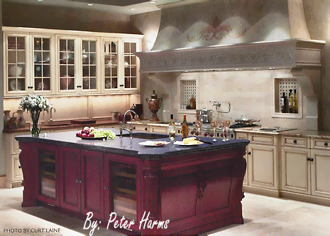
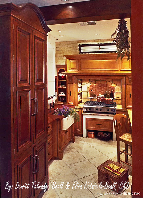
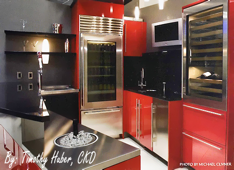
So, what does American Idol have to do with kitchens, kitchen design, kitchen remodeling, etc?? It occurs to me that all of the kitchens from the 2007 NKBA Design Contest thus far are American Idol kitchen contestants of sorts, which are competing for the kitchen design equivalent of American Idol in each of their categories! I'm not a Simon Cowell judge, however, more like Paula Abdul - "Your outfit is great". What about you? Here are the contestants entries for "Showroom" kitchens, where you go to dream. Enjoy!


nkba showroom kitchens002.jpg


nkba showroom kitchens003.jpg

nkba showroom kitchens001.jpg