Kitchen Design Musings

I received a book in the mail as a request to review it, the other day, which I subsequently declined, for reasons not relating to what's written below. Being a kitchen design pro, and especially, a blogger focusing on kitchen design, I see MANY kitchens, many more than I ever did before I blogged. It's been great!

That part alone, to be exposed to new kitchen design concepts, day after day via my blogging efforts, again, has broadened my aesthetic horizons, leaving me, continually, newly inspired.

The vast majority of the pages of the book I was asked to review contained what I'd call "bread and butter" kitchens. At first glance, I found many of the images in the book to be either dated or uninspired, with a few gems here and there, for sure. On second and third glance, my instinct was further confirmed. I didn't care for the layout of the book, either. I've seen it all before. I had an immediate, "eh" reaction.

Then, another voice (there are many voices in my head) interrupted and said, "excuse me, are you a kitchen design snob? Are bread and butter kitchens of no, or little, worth?"

Interesting question!

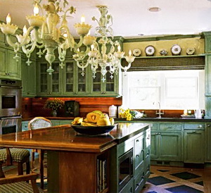
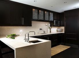
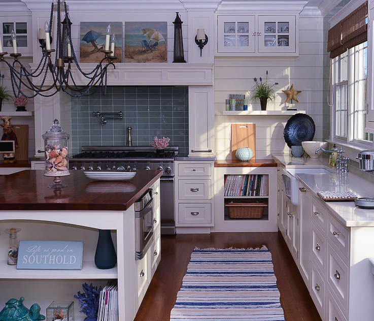
I will leave you with that question, as I have to get ready for an appointment. The image, here, is of a kitchen I did about 10-11 years ago, which is typical of many of the kitchens in this book, although way too many images were nowhere near even this level of "nice" and should never have made it into the book. And, again, yes, there were those which were of great interest and innovation. But, those were few, and I wanted more from the book...

More later, as I contemplate, confront, and expose potential biases which may be lurking...stay tuned!

white%20kitchen.jpg


New/Cool Kitchen Products!

It seems I'm seeing more and more natural, textural, and exotic themed products coming down the pike. With a mainstream eco friendly trend happening, I think we'll see some interesting product introductions in the months ahead, and I'll keep you informed, as spring is the season for the most new products coming to market. Take a look!


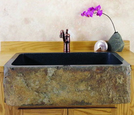
Stone%20Forest.jpgStone Forest introduces a sink made of a black granite polished interior and rim with a natural front apron. The sinks are carved from a single block of stone. Each is unique, and color and texture will vary. The sinks will fit most 3.5" drain assemblies or disposals. Weight: is approx. 300 lbs. It's natural/organic and has non-toxic/low VOC.


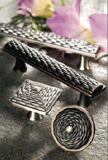
mandalay%20hardware.jpgThe Mandalay Collection of knobs and pulls by Atlas Homewares brings the essence of Burma to you. The intricately woven design is reminiscent of the mastery created by Burmese artisans. Available in finishes of brushed nickel and venetian bronze, Mandalay round knobs are $7.90, square knobs, $9.90, pulls, $14.90, and large pulls, $18.90. Coordinate your appliances with Mandalay appliance pulls, new from Atlas.


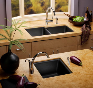
Elkay%20egranite.jpgElkay introduces its new Gourmet egranite, a family of granite silica and acrylic resin-formed sinks that bring a granite-like luxury material into the kitchen. The egranite sink line features spacious compartments and a non porous surface, which prevents staining and reduces any absorption of bacteria or odors. Sinks are available in black, biscuit, and white.

Kitchen Week At Design Hole Blog

Lots going on over at Design Hole, on my blog roll for a long time. Jennifer Mitchell, an interior designer, is quite intense about her work, and what she's doing this week on kitchens are, well, kitchens on steroids! Go and take a look, and while you're at it, take a look at my little chat on kitchen trends.  It's all very good stuff. All this week.


Meanwhile, I've played around with my apartment floorplan for a little bit. It's funny how taking a wall down makes one rethink the entirety of the space, not just the kitchen! That's what I'm doing, having had no previous intention to do that. I felt the furniture worked. Now I'm not so sure, and I never really loved the sofa against the half wall.

Here's the thing. My husband and I require, NOT the typical sofa and one or two chairs in our living space, as is found in nearly all apartments of our size. We need the ability to stretch out and gaze mindlessly at the tv, in between napping, doing computer work, or yes, even talking to one another! Stretching out is an absolute must and non negotiable. Forget a chair/ottoman, it's not really nap-worthy.

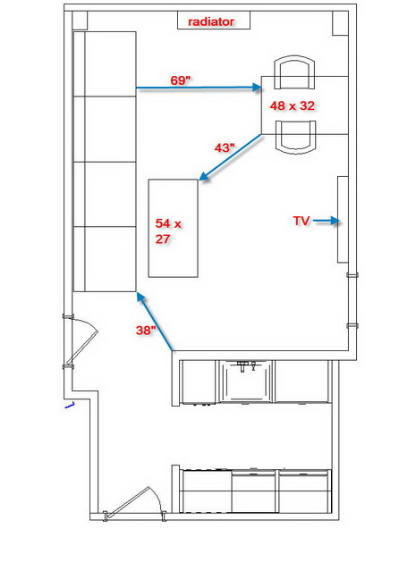
So, am I really crazy to consider a huge, I mean huge, sofa in this otherwise small apartment? I'm almost embarrassed to say the size of it. It's nearly 12' (yes, 12') long. Oddly, to my eye, it seems to work. We should both be able to stretch out at opposite ends. It would have to come in two pieces. Here's what I'm considering. I'm not afraid to go beyond what's typical, and sometimes, doing something oversized can be exciting, and in this case, MAYBE it would serve to elongate the room as well, especially if it's on legs and in a light color?

Tell me what you think, please! UPDATE: THE LOWER IMAGE IS WHAT WE LIKE NOW (WE'RE TOTALLY BUYING INTO A 12' SOFA IN A 550SF OR THEREABOUTS APARTMENT!) HUSBAND ENTHUSIASTICALLY AGREES!

sofa%20floorplan1.jpg


apt%20floorplan%202a.jpg

The Kitchen Walls Came Down! My Apartment Remodel

I met my husband at the apartment in the city on Friday. I drove in, unloaded my stuff, my son loaded his stuff in the car and drove the car home to Long Island, to return sometime on Sunday, at which time we returned to the Island (yesterday evening, car in front of the building, he again unloaded tons of laundry, still undone.)

So, my husband walks in the apartment door at 2:45 pm on Friday, I had just arrived a little earlier, and we both look at each other and know that noisy work in the building has to be done by 3 pm, Monday to Friday, no weekends. He has 15 minutes to cut through the kitchen walls with his sawzall, or whatever it's called. Twenty minutes later (so shoot me!) the wall is cut in half, via horrible noise! Yay!

Just enough time to get cleaned up and go off to see Martha Stewart, in person, at the NY Times Talks series, her biggest fan (HE is.) The walls remained in place until the next day, Saturday, at which time he removed the sheetrock, twisted out the studs and cleaned up the mess. That's all relatively quiet work.

Me? I was out on a girls' day with my daughter...one she owed me for my birthday from July! MOMA, lunch, walk through the park, it was lovely. Trust me, my husband prefers to be alone so he doesn't have to tell me what to do. I'm fine with that!

Upon my return, around 3 pm on Saturday, I opened the door to the apartment, and WOW, what a reaction I had! It looks fantastic...so open! So in need of emergency surgery!

What I felt right away was that this kitchen (obviously) needs to "talk" to the living area in an important way. I want to make the place really flow. In an apartment this size, this kitchen is actually big!  I think that's a good thing. I think, to be able to:

a. have great counter space
b. be able to be at the main counter space and communicate with someone beyond
c. stand at the sink and look toward and out the window
d. watch the tv when desired
e. have nearly full size appliances
is a really, really, great thing in an otherwise tiny New York City apartment!

I won't go into ALL the ideas I have, that's for later...but, I wanted to share this progress with you. A few things I WILL tell you:

a. the tv cabinet goes...a flat screen will take its place
b. the cluttered looking green dining chairs will go...maybe an Arne Jacobsen Series 7 chair?
c. the black sofabed will go...in its place will be a loveseat with legs and arms back a bit, for a lighter look, but we definitely want two sofas in the space, and that's the best place, I think, for them to go.  Putting them opposite one another makes the floor space very narrow, too narrow IMO.

I'm also up for suggestions!  Please take a look at the flikr slideshow for more details.

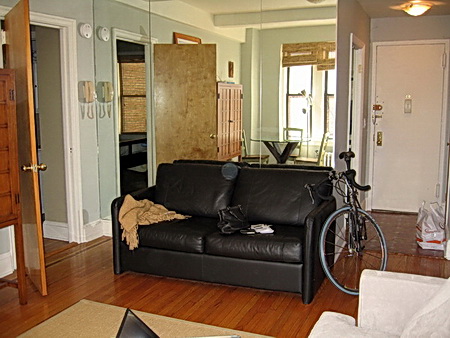
Here's the before, that's a mirrored wall (came with the apt.) behind the black loveseat:


apt%202a.jpg

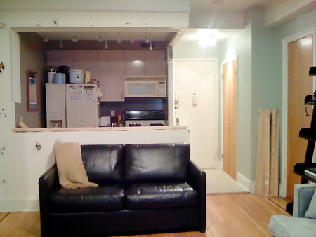
This is the after:

IMG_0090.jpg

More With Martha Stewart

There's more that comes to mind today, as I think about last evening's New York Times' event with Martha Stewart, and I'd like to share it with you!

Interesting bits and pieces...

As Martha sets out for the drive to the city each morning with her hot water and lemon, she carries the beverage in a paper cup, which she reuses. Martha spoke passionately about sustainable living, wanting her products to last. She talked about towels, or was it sheets, that are from her collections, that have lasted 17 years!

In regard to food, Martha was a very early advocate (early 80s) of the locally grown produce movement, a la Alice Waters and Jeremiah Tower, notable chefs of that period. Martha encourages everyone to grow their own produce. As a child, Martha had to do many chores in the garden, on her relatives' farms, where she spent time, and her parents believed in self sufficiency in a big way, teaching tasks to Martha and her siblings with expectations that they would be done properly, instilling confidence and a DIY sort of philosophy in the home. Martha, in later years, raised pigs, sheep, goats, and encouraged her own daughter to do chores outside the house for the animals. She also said that if she didn't do what she was doing now (managing an empire) she'd be a veterinarian. It all makes sense!

Cooking with fresh, preferably, home grown, produce and other fresh foods, is very high on Martha's priorities. 

Martha was friendly, quite outgoing, and surprisingly relaxed. It was a very intimate feeling, at least we thought so!


My Chat With Martha Stewart Tonight...I'm Not Kidding!

I bet that title got your attention! But, it's TRUE! Tonight my husband (the #1 Martha Stewart fan...our whole family calls her his girlfriend) and I went to Times Talks, tonight, a week's series of lectures by celebrated thinkers in the arts, media, politics, and more, organized by The New York Times and held in their new facility in their new, green, building in, where else, Times Square! We're in our city apartment for the weekend, a nice break!

Stewart was interviewed by Kim Severson, a very engaging and funny, New York Times food reporter. Martha Stewart talked about her typical day (breakfast is hot water and lemon (in the car on the way to the city), blueberries, and a hard boiled egg white.) After the morning shooting of her show, she stops all work for one hour, to do yoga and regroup for the second half of the busy day ahead, and ends the day watching David Letterman.

After the talk, there was a Q&A period. I had a question for Martha Stewart. I got up to the microphone and asked Martha Stewart if she had a hands on approach in designing her kitchens. Stewart replied that she has designed her kitchens by herself and was very enthusiastic about her love of the kitchen! Where the sinks should be, appliances, counter space, she knows what she wants.

Martha Stewart also said she really likes the convenience and accessibiity of open shelving. She said that the kitchen is the most important room in the home, even more important than the bedroom. She loves the kitchens that are designed in her KB homes developments.

Mistakes? I heard of one. Martha Stewart made her island in her East Hampton home too big, yet it was useful nonetheless. 

After the talk, there was a book signing, and my husband bought two books, Martha Stewart's Homekeeping Handbook, and a cookbook, which I'll update you on tomorrow. How lucky am I? My husband likes to keep a nice (and clean) home, it's a natural for him. A spray bottle and paper towels on the cover, he wants Martha's secrets! Stewart signed both books.

Oh, and when I introduced myself before my question and mentioned I write a blog, Stewart asked for the blog's name. I gave it to her at the book signing. Ms. Stewart, you're welcome to comment to this post!  It was a great evening! :)  

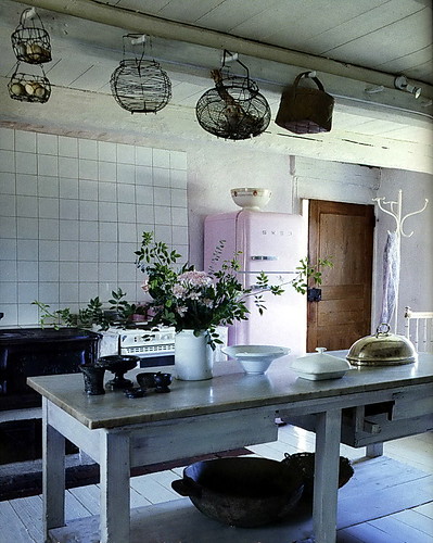
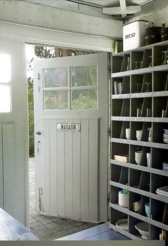
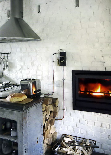
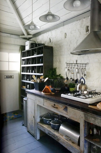
New Kitchen Chic - Boho Modern

I've been really busy recently working on my clients' kitchens. Deadlines of all sorts are always looming it seems, As a result, I've been remiss in bringing my readers beautiful and interesting kitchens! But, this blog is part of me and will not be denied attention! It tugs at me when I think about something or see something I find important in the process of kitchen design/remodeling, or information that is fun, or interesting that I have to share.

In that vein, yesterday, I think it was, or the day before, I was looking through interior design blog, decor8, which I often do to experience the VERY interesting "voice" of Holly, decor8's author,  Long story short, I was transfixed for a good hour (sorry, clients!) reading, thinking, analyzing, her words about a new look, feeling, focus, of interior design styling that decor8 feels is here, very much alive and moving forward. Holly calls it Boho (Bohemian) Modern.

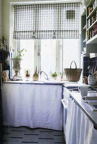
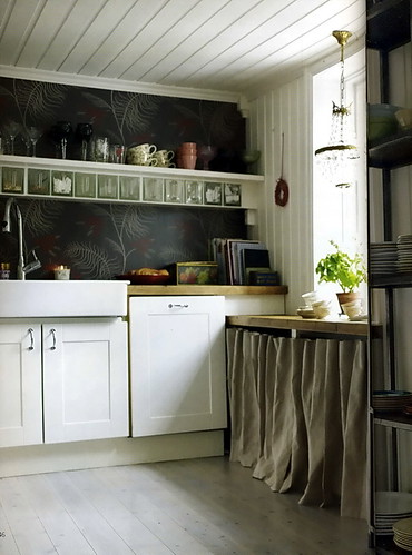
At first glance, below, one could almost conjure up the words "shabby chic" but SC it isn't. Boho Modern mixes old and new, yet, it's more than "eclectic." Boho Modern is more born out of a deeper self expression, a confidence to style one's home with more personal conviction and personal focus as opposed to blindly (key word, here) following trends and/or images of interiors that manufacturers "suggest."

Anyone who knows me or reads this blog knows that I strongly encourage my readers and my clients to be much more personal in the kitchen in regard to styling, bringing in collections and (living room) artwork, sculpture, whatever. And, then, changing pieces as desired, not to think of the accessorization of a kitchen as being "done." Likewise, with cabinetry. So many possibilities, ideas, ways to mix pieces and on and on. The kitchen is the last bastion in the home that really needs to be kicked up about ten notches with the purpose to express one's self in this VERY soulful room. Sort of a paradox, actually.

Please take some quality time to read this post along with the comments (another gold mine of information.) Read this post as well, and the comments, more from Holly in the comments too. Great stuff. Here's MY interpretation of Holly's words in regard to Boho Modern kitchens. Have fun!!

Images from the fabulous Vakre Hjem & Interior (their website is down) and the last two images from Bo Bedre, always a favorite.


2182030996_b51fcf1e1d.jpg

 2182030926_f6c40dc966.jpg2181243015_0a7080e718.jpg2182030782_18f1d55c1c.jpg2182030678_ceba896b7f.jpg2181242781_c048a33c84.jpg2182030506_13c2b49b38.jpg2182280907_403753016f.jpg2182280943_9366987ca0.jpg

Blogging For Kitchens

Here is some really great kitchen info found in some of my favorite blogs!

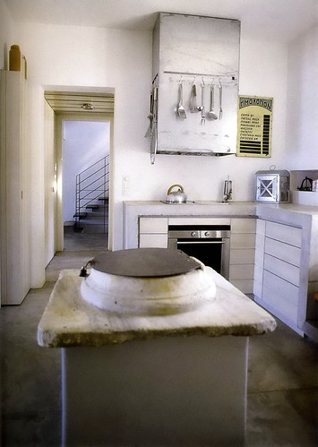
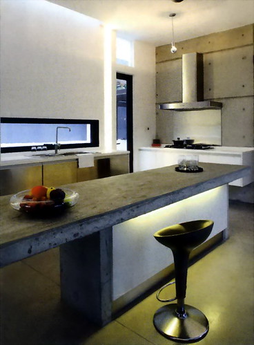
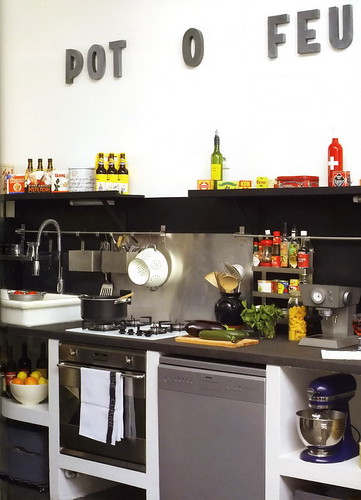
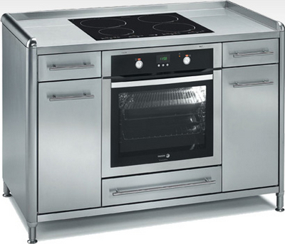
An interesting take on working appliances into surrounding storage comes from Materialicious. I can see these pieces in a small second home, a cabin or cottage, when you just need the basics, but you want some style, or, naturally, in an urban apartment setting. Cool!

From Janet at Remodelista, something brand new, a 36" wide horizontal access dishwasher from Smeg. I love to see new ways to do the same task, and the innovations just keep coming in recent years.

My friend, Kelly, from Kitchen Sync, talks about very practical issues regarding challenges in the remodeling process. We know there must be one or two, right?

And, starting the New Year off green, K+BB Green's Friday's links. An interesting selection it is, too.

Fagor%20cooking%20center.jpg

2008 Kitchen Trends - Banquettes

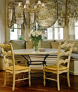
thin%20cushion%20banquette089.jpgThe next trend to talk about, for kitchens in 2008, as identified by Better Homes & Gardens,  in a trend report, sent to kitchen and bath designers, is the banquette. BH&G says they can accommodate a varying amount of people, they allow increased room for the dining area in the space, and create an intimate feeling in the space. They also site the ability for storage in the cabinetry configuration as a real plus. Image by BH&G.

My Take: I do agree. I've been doing more banquettes than ever! That said, my clients have wanted banquettes more frequently as a result of a simple idea I had for a "better banquette" This "better banquette" concept makes so much sense, yet, I hardly ever see it done.

First, let's give the old banquette with the 2" cushion a proper funeral, perhaps a joyous, and respectful, jazz funeral, as it's had a real long run in the world of built in (uncomfortable) seating! R.I.P.

The better banquette, taking its place, is about comfort!

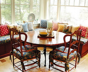
Start with a much shorter cabinet height, approximately 14-15" or so. Typically, a standard cabinet height for a banquette is 18" high. Then, you have a 2" cushion. Out with the 2" cushion! What is far better is a 4-5" cushion. Make the cushions like a sofa cushion....comfortable, yet supportive. The word I use repeatedly is "cushy."

banquette.jpgA much thicker cushion will dramatically improve your, your family's and your guests' experiences and enjoyment at the dining table. Not only that, but, a thick, comfy, cushion will be a magnet for everyone to sit at, not the last choice. You'll want to prop up a pillow behind you with a laptop, pick up your feet and stretch out. It will become a first rate comfort zone. Your family and guests will linger and will be much more relaxed. I would like to have made the cushion in the image another inch thick, had I ordered it, but it's much better than the typical cushion.

I cannot advise you on what should go into the cushion, I'd love to have an interior designer stop by and shed some light on that. I only know that comfort trumps an uncomfortable seating area by miles!

Other than that, you can fit more people into banquettes when you need to. That's real versatility. Space in the room is clearly saved, often, an important factor. Storage is a plus, but should not be the driving force to design a banquette. And, banquettes look great in general...I love the "built-in" look. It makes a dining area have more importance, more architectural interest, in the right situations. Lots of great decorative opportunities.

IS it a trend? It may be, but I don't see it as a trend which may (ever, really) go "out." It's a fresh idea that can work well aesthetically and functionally in the home, thus, to me, it is less of a trend than a good idea in many situations. I wouldn't worry about this being "trendy." I don't see that...in the negative way.

For me, it's really all about putting my feet up and hanging out for a bit in the kitchen. Think comfort!

2008 Kitchen Trends - Lighting

Having just talked about 2008 kitchen trends, I received a little booklet in the mail from Better Homes & Gardens, just for kitchen and bath professionals, all about 2008 kitchen trends. Allow me to give you their predictions, and my comments.  Actually, I think I'll do one trend per post, otherwise this post will be way too long! First up:

LIGHTING

uploaded-file-37227BH&G says forget about lighting for the sake of function alone. Done, boring, over. The trend is for highly decorative (and functional) lighting anywhere and everywhere. Accent lighting, and decorative lighting fixtures, whether for task or general lighting purposes, will be designed into kitchens with more frequency this year.

My Take: I do agree. I'm seeing my clients paying more attention to my lighting ideas and suggestions (I almost always do a lighting plan) and being receptive to more and varied types of lighting in general. They seem to now get that lighting creates moods, it can change functional areas into more dressed up areas, and can create a variety of looks.

My Recommendation: When doing a lighting plan, let the type of lighting guide the type of fixture. Under cabinet lighting can easily be done with "green" LED fixtures, for example, as well as accent lighting, inside cabinets, as another example. Recessed lighting is a good foundation for general lighting and can be installed using flourescent lamps. Use dimmers, too, to save energy and create effects. Be aware of how much lighting you really need and where/how the lighting should be switched to conserve energy. 

To get started, understand that there are/can be three types of lighting in the kitchen: general (often, ceiling mounted lighting), task lighting (under wall cabinets, over an island, under a hood, over a sink), and accent lighting (lighting to feature a hutch, artwork or other decorative area.)

And, yes, have some fun with interesting lighting fixtures:

  • Hang several together at different heights
  • Use bright colors
  • Use interesting shapes
  • Hang pendants closer together than usual to have several appear as "one"
  • Be aware of lighting in stores, hotels, restaurants, other public places for fresh ideas
  • Add sconces that you would normally put in other rooms...they look great surrounding windows
  • Mix styles (carefully) and finishes
  • Ask yourself if you want the lighting fixture to stand out or blend in?
  • Be green and seek out antique lighting fixtures

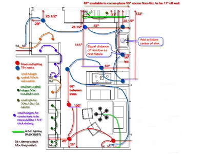
Trend Or Good Idea? It may be a trend, but it's also a good idea in general. The principles of this 2008 trend have been present in professionally designed electrical plans for years. It is a trend in which eco friendly fixtures can play a part too. One can also follow a general design trend if desired and later, change a fixture in favor of another look. Here is an example of a preliminary lighting plan I did (below.) Let there be light!

uploaded-file-06262


Kitchen Trends 2008 - What's To Come?

Do kitchens really change that quickly, from one year to the next? Should we be looking for trends for kitchen design in 2008 and discard what we saw in 2007? What new things will we see for 2008? What do we look for and where do we look?

uploaded-file-41514Progress is a good thing. Progress brings us new ideas, new solutions, a fresh, creative, look at familiar, comfortable, and sometimes, boring, or cumbersome, territory. Often, progress evolves into a trend. Here's where it gets tricky.

Trends, to me, are singular ideas, seen with little differentiation, across numerous manufacturer's product lines and showcased in mass media directed at consumers, resulting in maximum visibility.

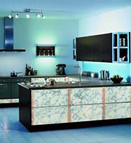
A trend which can become highly influential. Take the color black. It's become trendy to incorporate black in cabinetry, even for all the cabinetry in a kitchen. Black kitchens are seen now in shelter magazines, blogs (yes, here too), showroom displays, and manufacturer's brochures. Top image from HGTV.

I don't think black kitchens have ever been on the radar for kitchen design...in a big way. They are now.  So are tiled walls...wide swaths of walls with tiles, often mosaic tile, or, the same, seen all across a backsplash, inlcluding behind a range. Imagine a tiled wall combined with a black kitchen? See image above. Very cool from 2006 (first seen) till...oh, maybe three to five years as a guess? No, be careful going down that road. Kitchen materials are not accessories as in fashion or smaller interior design accessories, easily changed, such as pillows. A kitchen should be designed to last decades.

Let me say it this way...it's best when "fresh, new, creative" comes from original ideas suited to specific situatiions rather than being influenced by the power, and security, of a frequently seen/published/displayed idea.

So, create your own original ideas for 2008. Don't know where to begin? No time? No vision? Then, look for a creative designer, interview her/him carefully, and express your desire for true originality, something special...just for you! Something that is a personal expression, an aesthetic that is yours alone that may even break the rules. Go ahead, color outside the lines. Make it meaningful.

uploaded-file-07627Interested in what's happening now AND expressing your personal vision? Take a look at this kitchen at left. The clients, from the UK, were inspired by.....um, Stilton cheese! Now THAT'S what I'm talking about!

I guess that's really my message for all kitchen renovations in 2008. I'll be doing mine this year, and once I started to relax, this past week, the ideas began to flow. It's good advice for anyone. That's the first step.


NYC Kitchen Design - My Apartment

My husband and I are vacationing in the city this week. We've been here since Thursday, and we're coming back home on Tuesday. We are loving being here! Our apartment is on the upper west side, such a beautiful area, a real neighborhood feeling to it. Lots of history, charm, great restaurants, and, truth be told, a world class movie theatre!

I LOVE movies, but don't go as oftenas I'd like. So far, we've seen two...The Diving Bell and the Butterfly and I Am Legend (in IMAX...amazing-not the movie (I am Legend), the screen...also $32 for two!) Do you know Rotten Tomatoes? I don't see a movie without it! For the rest of our visit, we just had brunch with our daughter/son-in-law today, I made a random purchase of tickets, yesterday, for a Broadway play ("Is He Dead?") on New Year's Eve at 2 pm on 45th Street, and we'll be milling amongst congregating Times Square revelers (only after the play lets out) and maybe another movie on Tuesday. Mostly, we're enjoying the city!

BACK TO KITCHEN DESIGN...

Being relaxed, and being in the apartment, helps me think about the kitchen renovation we're planning. I have a very different idea for storage, which I have not yet found a solution for. Something I have not seen done anywhere before, either. Perhaps my solution will be a first!

I do believe this design idea could catch on! It's something I first thought of a couple of months back, and, you heard it here first (just remember, NYC kitchens are tiny!) Mine is about 7' × 7' total! Yet, for me, aesthetics must be on an equal level with function, not an after thought.

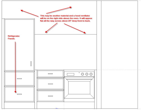
The image below is of one wall in the kitchen. The opposite wall will be opened up to the living area. 

See the refrigerator on the left? Imagine a line on the right side of the refrigerator continuing from the right edge, up to the ceiling. There, that's the way I should have drawn it, as that entire section is 24" in depth. Disregard those arrows in the image that point toward the refrigerator.

For the section to the right of the refrigerator, I want to visually elongate that area in terms of width. Disregard the note on the image that says that area will be 20" deep. It will be 13" deep. I'll install a slide out vent above the cooktop, and all you will see is a 1" bar x about 30" wide. The front door is to the right of the wall next to the oven.

metal%202.jpgThere will be a facade all across this section, 13" off the wall. The facade may be changeable. it could be a distressed piece of metal. It could be a faux treatment on a removable board. It could be rustic barn siding, constrasting with sleek cabinetry. It could be a quiet color or shade, perhaps with a small beam situated at the bottom of the facade to serve as a shelf for artwork or objects.

THE STORAGE SOLUTION/IDEA/CONUNDRUM?

I want to design or find something that can gently be lowered, perhaps a wire shelving accessory of some sort, to lower close to the countertop, have a shelf or two, for storage, and then be designed to be pushed gently up again into position within the front facade, invisible, yet functional. Any ideas? Let me know...I'm thinking too...much more to come!

refrig%20wall.jpg 

Everyone Ends Up In The Kitchen - Why?

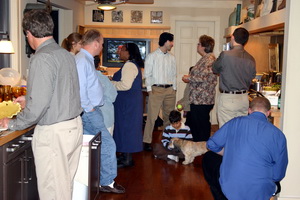
kitchen%20party.jpgYou know it's true...you say it yourself! "Everyone ends up in the kitchen!" I have a new theory about the "why" of it, actually two. We know it's a social thing, the kitchen is a magnet (obviously) to be around food, and people like to help, but it's more than that. I think the reason people enjoy being in the kitchen is because it's "real." You can let your hair down in the kitchen, be more real, more casual, roll up your sleeves and be more "yourself." Even a formal kitchen is still, well, a kitchen, and has far less of the "pretentious" factor than does the more formal living areas of the house.

Show me a fabulously dressed guest in the living room, and then in the kitchen, and I'll bet that guest warms up to the host and other guests just a little bit more quickly!

Beyond that, the other reason I see the kitchen as an attraction for guests is because kitchen tasks/activities allow people to be DOING something, to be involved, to feel useful. Perhaps guests feel they are at a different level of engagement with their hosts, being more of a partner with their host. And, working in the kitchen, doing lite duty, along with your host and other guests sort of takes the focus off of you and on to a team effort. It's fun, it's interesting, it's goal oriented. Hang out and be casual/social or get in there with preparation, there is something for everyone in the kitchen, as we see time after time.

Enjoy being in the kitchen this holiday season in whatever way works for you, whether guest or cook!

Next....Let's Get This Party Started! Anatomy of a Party Kitchen!

My Danish Families' Kitchens

Today is Christmas, I'm the only one up right now. The cold is surrounding me, a candle burns, and I think warm thoughts of my family in and around Copenhagen. I've spoken to a few via email and phone, an uncle who called last night at midnight his time, 7 pm (I think) our time, when he knew our U.S. family was all together. Sweet!

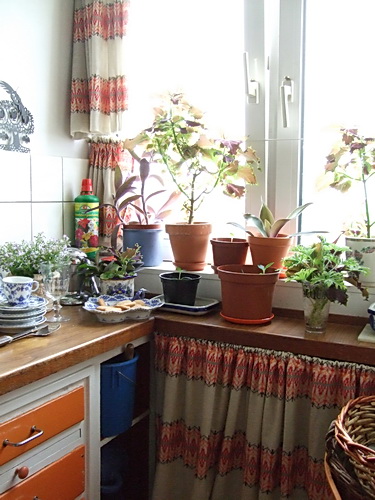
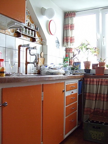
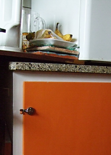
I think of my cousin's daughter (my second cousin?) who just had twins in October with her (married) partner, one of the twins who has been hospitalized since then, having several heart operations. They skipped Christmas at my cousin's home, choosing to stay at the hospital. And, at the other end of life's journey, I think of my uncle who just had his 94th birthday and lives alone, and happily, in his apartment, the orange kitchen seen below. Also, of another uncle and his family who will visit and dine today (12, in a very small dining room) at an aunt's small, log cabin home, overlooking the sea.

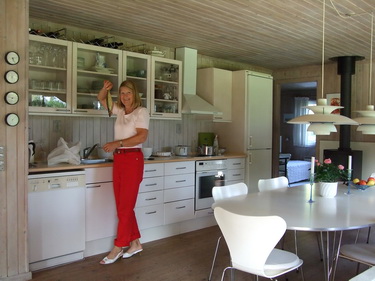
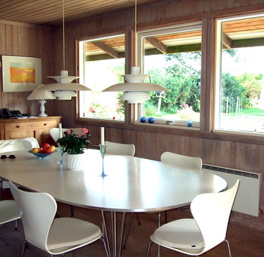
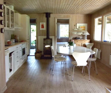
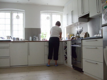
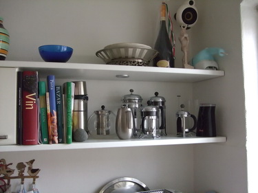
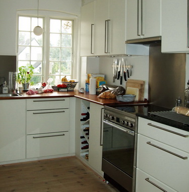
Near or far, family is what life's about. And, as we all know, a whole lot of life happens in the kitchen! So, here we go, take a look at some of my Danish families' kitchens, and dining areas, who, I'm sure, have been busy preparing tasty meals for the days surrounding Christmas. Images taken in August '07. Enjoy YOUR holiday cooking, food, dinners, and gatherings!


The Kitchen Holidays

Is it the Holiday spirit? Yes, I'm sure it is, in part, that makes me so positive about, well, nearly everything today. I just finished watching Celine Dion sing The Christmas Song, which was done with such beautiful restraint and quietness (granted, for a change!) Lovely. Made me think of my experiences today and how it relates to none other than my kitchen design business.

It began with a trip to the dentist (again.) This time it was an hour and a half visit, and again, it was a piece of cake. But, a little twitch on my part, and he was all over it..."do you feel any pain?" "everything ok?" "just tell me" all of which made me feel very, cared for, I suppose. Nice feeling. A little chatting, pleasantries, just nice all around.

Then, I went to my project (wait till you see THIS ONE-not the one below) and, with four different tradespeople there, plus the clients, everyone was happy, cooperative, collaborative, relaxed, all really good stuff that sometimes cannot be found on a project. Another lift to the spirit. In fact, a real big lift, fed by all these people, including a very positive client. Some minor issues came up with a few of the tradespeople...through patience, respect, and collaboration, solutions flowed to these details at hand.

After that, I went to a business supply store and bought two gifts, one for my long time accountant, and one for his employee, my weekly bookeeper. The customer service I received was truly a model for all businesses! The service was courteous, kind, helpful, going above and beyond to help me find the perfect gift, and then wrapping it carefully with a ribbon. Really nice experience. Again, chatting, pleasantries, a warm experience.

I dropped off the gifts at my accountant's office. I wanted to show my appreciation, as I do every year. I don't think I need to in a material way, but it feels good to say thanks. I arrived, we chatted about our families, our plans for the holidays, and I expressed my thanks to my accountant and my bookeeper. More warmth.

So, among these experiences, I thought of my business and how important it is to stay positive, to go above and beyond to not only please, but to delight my clients. I'm human, and sometimes I fall short, but today was a great day to be observant and a reminder of the dynamics involved in people relating to people in a positive way.

Happy Holidays and a wonderful, positive, 2008!! :) And, have faith, because this:

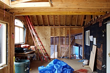
construction.jpg


really will turn into this:

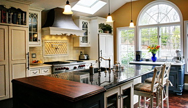
construction%20b.jpg

Gray Kitchens For A Gray Day

This must be the most gray day in history! We're having a nor'easter, and it seems as if everything is gray. Well, not everything. The backdrop of the day is surely gray, but I happen to like this type of day, at this time of year. You have gray skies, then, especially now, there are still trees with beautiful, bright, brown, leaves, peppering the gray skies, that have not fallen yet, the brown tree trunks, some white snow, and green ivy as a ground cover. All this from my window. Gray, brown, white, green. It works for me. Another beautiful color palette by Mother Nature.

So, perfect inspiration for, what else, gray kitchens! Neutral, cozy (some), simple, elegant, charming. Lots of different looks in a gray color scheme. What are cold, gray, skies, to some, may be a cozy backdrop to others. Sort of like these kitchens, I presume. Most images have been collected from Desire To Inspire, a favorite blog with endless, absolutely endless, interior design ideas and inspiration. Each day, a new collection of perfectly themed images. Enjoy!

Green Planet, Green Kitchens

Nobel.jpgYesterday was the ceremony for the award of the Nobel Peace Prize. Of course, since Al Gore is the recipient, it is especially interesting to hear his speech on our planet's climate crisis, including his philosophy, ideas, and solutions. Just as interesting, and compelling, is the speech given by R. K. Pachauri, Chairman of the Intergovernmental Panel on Climate Change. Most likely, one does not hear about this second speech, only Al Gore's, so take a look.

I am not a scientist. I am also not a full fledged treehugger, nor do I have an expanse of knowledge in this area. I'd say that I am increasingly making real efforts to become aware of this issue, especially as it relates to my work. This is a very broad issue to sort through. It will take time and it will take a commitment to continually seek out knowledge and learn to apply that knowledge in my work. Take a look at the speeches given yesterday.  

It did occur to me yesterday, when I put the tv on, that CNN, and other channels gave an incredible amount of time on some murder and celebrity stories and just a moment on this year's Nobel Peace Prize awards. The planet is sick, and they are covering a murder mystery. What can I say?

On a lighter note, my daughter was in the audience at this year's ceremony in Oslo, yesterday. She said it was an incredibly moving experience and called my attention to both speeches. Tonight is the spectacular concert which will highlight Al Gore's and his colleague's contributions as well as showcase great musical acts. I was in attendance at the concert last year, and spent 5 days in Oslo, surrounding the Peace Prize award. It was a very exciting time to be in Oslo, the city was electric (no pun intended!) I'll try to update this post with youtube or other video links of the concert tomorrow.

It is so clear to me how I felt last year. I felt as it the whole world was assembling at Oslo's town hall in peace, as one car after another arrived with flags blowing in the wind. That was the feeling. It was a big feeling, coupled with what appeared to be low security (in the U.S., the entrance into the City Hall would be blocked off for a mile all around!) We stood right at the entrance and watched the dignitaries arrive, complete with a band at the entrance. Life changing.

As we speak, my daughter has my repetitive voice in her head to scoop up all the Scandinavian magazines she can get her hands on!! I should get my hands on them tomorrow. A fresh batch of Scandinavian kitchens!! Life is good!

Here's an update, a song by Kylie Minogue. This stage is probably the largest I've ever seen. It's a fantastic venue. And, the concert has musical artists from around the world, the top musical artists on the planet. In between is a short speech from the recipient (not included in this video) calling attention to the issue at hand for that particular year. It is a concert which should have very widespread attention for its global feeling, fantastic and varied musical content, as well as featuring the recipient of the Nobel Peace Prize in a more informal setting, just "talking" to the audience. It's perfect.

Oh, by the way, the hosts this year were Uma Thurman and Kevin Spacey.

Is Your Kitchen Designer "Too Busy?"

I'm busy these days. I feel it.

My guess is that design pros sort of get that "busy feeling" when business is, let's say, better than normal, obviously. Multiple deadlines is also an obvious giveaway.  For me, it's here. The thing is, my business is a roller coaster, and one where you don't necessarily see the ups and downs from a distance...the roller coaster is enclosed in a dark tunnel! It all has to do with construction schedules, town approvals, architects' schedules, all of which is beyond my control. "It" has a life of its own and the big rolling ball sort of scoops me up when just barely in sight!

For those of you who are looking to do a kitchen renovation, you may want to ask the kitchen designer of your choice what her/his schedule looks like down the road and what it is like now. If they can predict, and to a certain point, a short distance, a designer can. Until that schedule goes to the dogs by the a) architect b) town c) contractor d) other delays, including busy clients where life intervenes!

This past year plus, I've worked on no less than five projects (and I don't do all that many beyond that in one year, maybe double that) where the schedule has been delayed by between 6 (not bad-but only one project) to 18 months.

What do you think is happening now? Well, of course, I could not have planned it better myself, I have the perfect storm! Four of those five, and one of them is the equivalent of three projects, are all moving like molasses suddenly heated with a blow torch!

Their plans have just been approved by the town, schedules have loosened or accellerated, machinery is in the dirt. framing is happening or is soon to happen, which means that the equivalent of seven (most, big, and highly detailed) cabinet orders need to be made very soon. And, very accurate perfect!

In my situation, I'm lucky that:

  • I don't have child obligations (they're grown)
  • I only need 5-6 hours of sleep so I can fit in other things besides work, like needed exercise
  • I work long hours when I need to
  • I have a supremely supportive spouse (we're talking cooking, laundry, and a happy face...good stuff)
  • I have really great clients!
  • I know what needs to be done "when", I have an intrinsically positive attitude
  • I LOVE my work and love working with my clients! I love the collaborative design process.
  • I can manage stress and pressure very well. The candle burning at 7 am near my monitor is one little method.

Schedules happen! Or, maybe, more to the point, scheduling roller coasters happen. They're unpredictable, they are fraught with delays, with stops and starts, and each schedule does whatever it's going to do. Being busy does not necessarily mean the designer took on too much work. It's the nature of our business with unforseen scheduling issues. We don't want this situation either, trust us! Like you, we want the luxury of time to do our work. I've been held up, but I've never held a job up. Another reason why I'm feeling busy...gotta get the work done! In fact, I'm ready to schedule new projects for 08, as this wave will be over in the next couple of months (yes, they last this long!)

I'll get through it, and they will all be perfectly ordered projects, I'm not concerned. Somehow, after doing this for 20 years, I know that the law of averages will continue to be on my side...and that is, that NO cabinet will arrive to a client's home wrongly ordered amidst all of these projects. It just doesn't happen to me.

So, another reason I can find a little serenity at 7:22 am before the business day begins. Writing this post was a good, temporary detour from my work, which I need to do from time to time.

I was going to look for a dramatic before and after image...can't take the time, have to stop here!

OK, I PROMISE...today/tomorrow and the next few posts....gorgeous kitchens (I have so many to show you!!) They're coming!
 

Will Your Kitchen Be Finished For The Holidays?

Every year, in the summer, I look toward the end of the year and wonder, what will the last quarter look like? Will it be a frenzy to get my clients ready for Thanksgiving and then the Holidays beyond? Are there clients who must be completely done by Christmas....or else they will self destruct? If so, then I go along for the ride!
Already, the memories are flooding back. Memories, in particular, of an installer who promised me that he would finish a few items in a client's home (moldings are everything, the finished look) on Christmas Eve, no less, yet called to cancel a day or so prior, setting the client into a tail spin. Or, the client, where there really was no chance of getting done what she wanted anyway, due to her other tradesperson, so instead, I faux painted some 6'' x 54" x 3/4" pieces of wood and put them into place in those empty spots in her kitchen (which looked great!)

And, then there are the countertop deliveries! I can't remember any countertop delivery horror stories, but I may well be blocking those out. I will say, in those last few months, the countertop fabricators and installers are much busier than usual, as, of course, everyone wants their kitchen done, whether it's feasible or not, they just want it! Of course, how can I blame them, I'd want it done too!

And, then, there are those who yawn through the holidays and tell me, whenever, whatever, "I'm not going to drive myself crazy around the holidays." Some of those clients tell me that it gives them an "out" on entertaining responsibilities.

This year, I'm thankful and looking upward (and sideways) that I don't have any clients who are racing against the clock to get their kitchens done by New Year's Eve or earlier. I hit it real lucky this year, I can relax this month, just a bit. While I am busier than usual, it's for future work, not buttoning up present work in the month of December. Yay!

If you're in a frenzy right about now, wondering if you'll get your kitchen done by your deadline, I don't have any words of wisdom for you, unfortunately, There are so many steps, people, and suppliers involved in any one kitchen, that, take your pick, something can go wrong when you least expect it, and it can be legitimately, VERY frustrating for the homeowner. It's a tough one. I actually recommend getting your cabinets delivered by October the latest, if you want your kitchen for the holidays.

So, hang in there, and, Happy Holidays! I hope you all get your kitchens done BEFORE your deadlines!! Here's to that hope!

Drilling for Kitchens

So, I'm at the dentist this morning (a whole hour appointment) and I'm happily under the sweet air, and what do I start thinking about, but this blog. First off, I'm very busy these days, so that's the reason for the less frequent posts.

So, I'm hearing drilling in my head (mind you, all different whirring sounds, not just one type, the high pitch AND the low pitch) and after that I'm hearing beeping, like a truck backing up, yet, I'm relaxed and focusing on details of the blog and what I want to talk about today. Then, I had to concentrate on acting totally normal after I get up from the chair, as if I feel no lingering effects of the sweet air and am in total control! I'll tell you, this is one, painless, dental practice.

But, back to lying down in the chair and thinking of the blog...

What came to mind was just a small detail of the dynamics of the remodeling process and the client/designer relationship, or client and builder/contractor/whatever relationship.

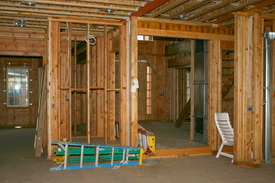
framing.jpgI was emailing back and forth with a client this morning, around 5 am or so, about doing a framing change in the scullery and, of course, the framing is happening now and for this next week (it's a new home.)  Yesterday, I suggested that we increase the width of the scullery by one foot, to not feel confined, when one spends time there. I'm also two states away and it's a new home being built.

The client asked if we could even do this at this point, said maybe we shouldn't, I said, sure, no problem, it will be better, no biggie, and then I heard nothing from the client. Turned out he had left for work earlier than usual. All we had to do was get the blessing from the builder and architect to support this decision.

Here's the point...I think sometimes, with the immediacy and fast pace of building, things like this can be quite stressful for homeowners, where, conversely, us pros are very casual about it...perhaps to the point where the client reads a casual demeanor as either being apathetic, unconcerned, unengaged, however you want to put it.

I'm not sure that's the case here with this client, but I did reassure them that if they want me, I'd drive up tomorrow. I know I've sensed annoyance before when I've acted, perhaps a bit too casual for my clients' tastes. But, homeowners, when we do this year after year, it would be a bad thing if we were to let a little quick pace get us all freaked out, now wouldn't it? A casual demeanor is a good thing, it means steadiness and control, and clear thinking, not apathy.

Just a little fyi...can you relate, pro or homeowner?