Kitchen Faucet Trends

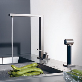
dornbracht%20kitchen%202a.jpgTake a look at this little piece on faucet trends from HGTV featuring "moi" as a contributor! I'm frequently asked for kitchen related information by writers from online and print media outlets, but this was my fabulous (lol!) deput on HGTV's website!

The author is the superb wordsmith, Leah Hennen, from More Ways To Waste Time, an interesting, and often provocative blog.

And, yes, I did notice at the last kitchen show in the spring, how faucets are becoming even more modern, wtih a sculptural sort of look. And, yes, the finishes, well, just take your pick, there are so many to choose from.

Gone are the days when you have to match the metal finishes throughout the kitchen (faucet, lighting fixtures, hardware, hinges, sink, and whatever else is a metal.) SO gone! Sure, keep a keen eye on what's happening with your metals in and around the kitchen, but you are set free to explore the world of finishes, and manufacturers who make faucets understand this trend toward personal expression.

Likewise, consider mixing modern faucets with a traditionally styled kitchen. There should be some sort of eclectic theme going on first, but, your faucet style surely contributes to your overall design "message."  A more utilitarian type faucet may be a better bridge aesthetically to blend with a traditional kitchen than a super sleek style. That's possible, but again, needs care and caution in selecting your materials to achieve an eclectic look that makes sense.

Dwell Videos - Design Perspectives

I was just approached by Dwell magazine and was asked to take a look at a series of three videos, featuring innovative design concepts, explained by the designers themselves from their personal and professional perspectives. The first video is by landscape architect, Andrea Cochran, second is an Airstream interior design by Christopher Deam, and the third shows a prefab house by prefab architect Michelle Kaufmann.

To me, good design is good design, and oftentimes concepts can freely move from one discipline to another. Andrea Cochran talks about layers in her design work, the juxtaposition of warm and cool elements, warm being, perhaps, lone plantings placed nearby strong, simple lines in the hardscape. It is a lesson for interiors as well, kitchen design absolutely included. It is a philosophy which is clean, yet not cold. 

Layers of visual interest are designed in, after the foundation of the design is created. This is what I tell my clients about their kitchen design...but, if possible, project forward toward that next layer of visual interest, to understand that the foundation, being simple, is often necessary. 

Take a look also at the Airstream video. You'll see a very interesting kitchen, which conforms to the Airstream's proportions and lines.

The prefab house by Michelle Kaufmann is a sustainable, healthy, home, meant to be able to be reproduced for mass accessibility in terms of cost, with the benefit of sustainable features. The kitchen can also be seen and uses a paperstone countertop.

Take a little time, open your mind to the design concepts and how they can be translated, learn a little something, and enjoy the beauty of these projects as well. Don't forget Dwell's new kitchen blog!


Kitchen Designer/Client Synergy - How It Works

I had a meeting with a client today, one whose project has stopped and started over many months. Now, we're on a roll, finally.

This client is lovely. She's high spirited, often opinionated and always positive. She obviously really enjoys the process, which is delightful to see.

Here's the thing...I guess I understand what an actor on the stage means when he/she says that he/she "feeds off" of the audience, and the audience is different every night.

My energy, my creativity, my spirit, in large part, is fed from the client. If the client is positive, I'll double that feeling, resulting in lots of real enthusiasm and quite possibly, enhanced creativity. If the client is reserved, nervous, or negative, the stage is set for me to try to bring us to higher ground, where we can connect and become real partners in this venture. I'm at my absolute best with a positive, engaged, interested client. It becomes magic!

Today, I brought forth ideas rapid-fire, I exulted and exclaimed loudly when we hit on a great idea, all in response to a very motivated and positive client. Serious/reserved/"professional demeanor?" I'd rather exclaim, "look at THIS, wow!"

I enjoyed myself immensely today. Clients, motivate your designers with a positive demeanor. You'll get the best work from your designer, and you'll have some fun too. Relax, relate, reap rewards!

Kitchen Professional Range Love

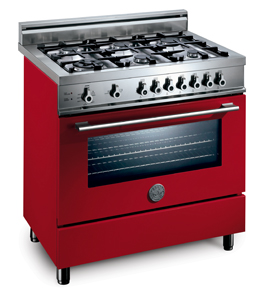
Many kitchen ranges got a big workout this week. Remodelista has put together a nice collection of some hot (pun intended!) ranges for your viewing pleasure. Color is seen in this collection too. Can you live for 20 years or more with a lime green range?
Think twice about that one.

Bertazzoni.jpgI've used cobalt blue, marroon and recently khaki (very nice) on Viking ranges in kitchens I've designed. There IS so much more out there than stainless. To warm up your kitchen a bit, reducing that stainless-steel-everywhere look, you may want to consider, if not a color-color, then think about cream, khaki, brown, neutrals available on ranges, having more staying power (and probably much better for home resale purposes) than a strong color.

This is not to discourage you from choosing color, if that's been your pro range dream. Then, embrace it! Just don't tire of it in five or ten years...that would be a bad thing.

The other great news about this neat collection is seen in the varying styles and configurations of these ranges. There is a whole lot more choices available now than the "typical" style professional range we're so used to. I enjoy seeing these creative alternatives. 

And, some of the prices are not much more, or even less, than we're used to. Can it be that there is life beyond Wolf, Dacor, Thermador and GE? Maybe they're the meat and potatoes, and these "alternative" ranges are the spices...

Inspiring Eat-In Kitchens

Do you need a formal dining room for your Thanksgiving dinner for a small group? No! Over the years, I've had one long table, as well as multiple tables, and I'll tell you what is best: it's whatever works! And, if that means eating in the kitchen, so be it. Here are inspiring eat in kitchens good enough for today's main event, the Thanksgiving meal. Images from Desire To Inspire and the (departed) House & Garden. Enjoy!


Happy Thanksgiving!

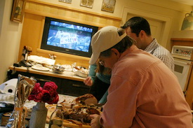
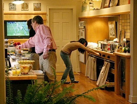
Bar none, even Thanksgiving day itself, I'd say Thanksgiving eve is my most favorite day of the year. It's all potential at this point! The kids come home, we all begin to cook, chaos abounds, wine flows, the cat attacks the visiting dog, we get in each other's way, make the list for take-out, make a grand mess, and it's all good.

Thanksgiving%20142aa.jpgIt all happens in the kitchen at a fever pitch. Nowhere else in the house does the combination of working together and relating, occur, except the kitchen, together with the sensory pieces of food, colors, music, and so much love floating around, too, of course. My daughter and I, since yesterday, and probably before then, have been exchanging emails with multiple exclamation marks. Me saying "Come Home!!" multiple times, and she (having an otherwise very responsible job in the city), with equal doses of enthusiastic responses. It WILL be an invasion in just a few hours from this moment.

It's 12:44 as I write this. I guess I should start planning the menu. I picked up the turkey but that's all I've done. I use Thanksgiving as a metaphor for life's issues. When I haven't done a thing, by late afternoon, and I have 20 people coming for dinner, sometimes more, but much less this year (I do Thanksgiving every year, and I do completely it from scratch) I say to myself..."I'm not sure how I'll get this done, but somehow there will be food on the table tomorrow." I just don't sweat it....um, to a fault, I'd say.

At this moment, I'm the only one home, and the quiet is interesting, knowing what's to come.

Thanksgiving%20132aa.jpgSo, yes, the kitchen really is the heart of the home, and not just on Thanksgiving. My kitchen seems to work quite well for me. Maybe a few tweaks could make it function a little better. I could be more organized with storage...where "categories" of items are stored for logical access. Maybe I'll work on that next. Other than that, it serves me well.

Are you planning a kitchen renovation? Do yourself a favor and try to be aware of how you work in the kitchen. What is a habit, and what is a preference? How is your access to food and cookware items? What is stored too tightly together? What items are in the "other room" because there is not room in the kitchen? Who is working where, and do you need more work "stations?" How is the lighting? Try to notice what is working and what is not working in a curious way instead of a frustrated way. Make notes.

But, in between, enjoy every moment. I hope your Thanksgiving is wonderful. Please tell me about what you're doing, and how your kitchen works for you for Thanksgiving! I'd love for you to share your thoughts.

Enjoy!! 

Thanksgiving%20013aa.jpg 


What I Did Last Week

I guess I took a small leave of absence that was unintentional! I've just finished a crazy week, crazier than usual.

It started last Wednesday in New York City. I was asked by KBB magazine (Kitchen Bath Business) to be a judge of product innovations for 2007, to be disclosed in their December issue. There were five other judges invited and, I believe, 147 product entries for us to go through. This took most of the day, and included much spirited, open, discussion. I suppose it was sort of what a jury room must be like! The jury foreman (non judge representative from KBB) did a great job of adding order to the chaos, and assuring that everyone was heard. We came with different points of view, a good thing. I could tell you who the winners are...but then I'd have to harm you!

The next day, Thursday, I met a business associate from Europe, and we traipsed down to Washington D.C. to discuss a large residential multi apartment project. We took the 6 am train there and the 1 pm train back. We also took a circuitous route back to Union Station in DC by way of a cab driver (I casually said, give us a tour) who then wanted to charge us $60 when all I asked to see was the Capital, which was right near Union Station! Switched trains in New York and took the train out to my home and went to dinner with my husband and business associate.

Friday found me and my associate in the offices of two shelter publication editors, again in New York, striking while my associate was in town (more details at another time!)

Saturday, again in the city with my associate, looking at beautiful showrooms in Soho, with a first stop in DUMBO to see the Gaggenau/Bosch/Thermador showroom, and take in the incredible view.

Mind you, most of these times I went going back and forth to the city from my home in Long Island, an hour away with no traffic. Sunday, I CRASHED at home, of course, doing work too, and my associate left town after a successful trip. I must note that Friday we experienced (got my husband to meet me to drive home together) legendary traffic. We left the city at 4/4:15, I think it was, and came home at 7 pm!

It's a very good "busy." I enjoy doing other types of work involving kitchen design, it makes things interesting, very interesting, rather than doing one type of work each and every day, although, of course, I enjoy my work too. But, I love to branch out and touch all sorts of peripheral kitchen-related parts of the business.  A number of interesting kitchen related events on my calendar that are coming up too...can't wait.  

Kitchen Shelving Trend and Iron Brackets

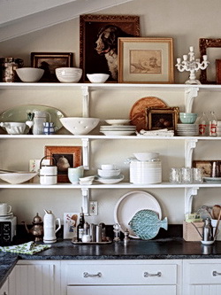
iron%20bracket.jpgNow that kitchen shelving is getting more popular, I also seem to be doing more of it! It adds such warmth and personality to spaces. It is a great look to mix both decorative AND useful items on shelving, that's really the beauty of it. Books, and salt/pepper shakers. Dishes and antique bowls. Vases and oil/vinegar botlles. Of course, closed baskets also look great on shelves, adding texture, but not dust!

I've lived with open shelving for my dishes and glasses now for a few years, and I have to say we love it. The dishes and glasses are used so frequently that there isn't time to accummulate dust. Some glasses which are less used, we'll do a quick rinse under the nearby faucet, and that's it. Open shelving is not for everyone, granted.

kitchen%20shelving.jpgI just ordered 14 brackets for a project. The place I mostly go to is Iron Accents. It's a Yahoo store, a very reliable company, and I've used them for years, I can definitely vouch for their product and quality.  

They also have a million different finishes, including colors! Some items are traditional in style, some are modern, and many are inspired by nature. If you use your imagination, you'll see how adaptable they are to many different design themes.

For the project I just purchased these brackets for, I wanted something very simple, especially having 14 of them. Simple, yet interesting, with a hand made sort of look. For me, it's a great go-to source.

Beautiful shelving image found in the beautiful collections of Desire To Inspire! 


Green Kitchen Ideas

Take a look at this green kitchen, isn't it great? I saw it on Apartment Therapy Green, and I had to show it to you. On that link, you can get lots more information in the form of an interview with the owners including some good, green tips at the end of the interview. Take a look here, for images of the kitchen. Another example of a "lite green" point of view. Well, this one  may be a moderate green remodel, but, again, it does not have to be all or nothing. Finding old things to reuse can generate lots of good design ideas.

kitchen_small1.jpg 

Kitchen Design Inspiration (Hamptons) Long Island Style

What a weekend! On Saturday, I dragged my husband to go to a seminar on green kitchen design in Princeton, New Jersey, Miele's headquarters. Let me tell you, their headquarters are absolutely gorgeous. Modern, colorful, beautifully designed. What a treat. The seminar was filled with great information, which I have to gather together and make several posts of shortly. Very informative and will report back shortly.

The seminar was over at about 1:30, and we began the drive back toward Long Island, over the beautiful Verrazano Bridge. When we were in the sort of beachy Brooklyn area on the Belt Parkway, I said, you know, part of me feels like driving to the Hamptons. My husband said, "let's go!" Crazy kids that we are, we did just that...into the remains of a hurricane which came fairly close to Long Island, resulting in wind and rain...very cozy, if not fun to drive in!

We stopped at a few great shops, and by this time it was around 4:30. I was immediately inspired! The first shop I went into, Schorr & Dobinsky Antiques, in Bridgehampton, had many French Industrial pieces...these warm metallic pieces which looked at once, modern, yet, old. Dining tables, storage racks, carts...I could absolutely see any one of these pieces, or more, in a kitchen.

On to the next store, Jarlathdan, in Amagansett, and I saw a coordinating island, which I was told may be from Ireland. That piece really made me stop, slow down, and admire.

Time for dinner, albeit a quick one. Dinner at The Laundry,  then a movie...American Gangster with Denzel and Russel Crow. What a great day!

Back to kitchens...there are pros and cons to these types of pieces. Find out about maintenance, check for stability/condition, and make sure the size is proportionate to your space. Other than that, pieces like this can add lots of charm. 

The images were taken by my iphone...not the best quality, but I did what I could with them. Oh...the huge root table base? On sale for $18,500, down from $25,000!


The Secret To Making A Selection

I met Grace, my client, and her best friend at the tile store today. She had to choose a floor for her family room, which is somewhat open to the kitchen we're working on. I wasn't purchasing it for her, but she's a great client, and I wanted to help her out, so I readily agreed to meet with her at the store, gratis. Happy to do it.

How does this relate to kitchens? The whole house relates to the kitchen and the kitchen relates to the whole house. Grace had her cabinet samples and granite sample with her.

Here's what we looked at. She wanted a porcelain tile for the floor (the family room is on a slab and the dog mostly stays in that room.) We quickly found three that we liked:

  • A red with multi colored soft tones in it,
  • a very elegant, sleek, tile, very large, very light, very subtle, but with a beautiful light and linear greigy color (my choice-a less is more kind of look),
  • and an in between tile which was quite busy.  All gorgeous.

Long story short, we chose a fourth tile that the store owner uncovered for us, from behind other large displays. Textured but fairly consistent. It had a texture unlike anything else we'd seen, and different, unique, is a good thing. It has warm terracotta and warm gray tones in it, so although cold to the touch, it will feel warm, visually. It works great with the colors of the kitchen, just beyond the room.

At first I admonished myself that I didn't take photos, but, it's not really about what we chose.  

The Secret

The last tile just "spoke" to all of us, equally. We had a visceral reaction to it.  The secret to making a selection is that you want that strong, sort of organic, reaction to reveal itself.  It will come and find you. Be patient, keep looking, and keep the faith. You owe it to yourself to wait for that feeling to surround you. It's unpredictable, but, you know it when you feel it. Keep looking until you feel it. You will!

Sometimes, you have to step away for a little while, turn your attention elsewhere, and then return to the item and be aware of how you're feeling about it. Um, like love, you want to be sure of your selection!

I would love to hear your thoughts on when you knew something was the "right" product or material for your project. Please share your experiences with me.  


Pardon My Dust - LA Times Remodeling Blog

I recently "met" (in a cyber sort of way) Kathy Price-Robinson, author of the blog, "Pardon Our Dust", seen in the LA Times. I was immediately struck by Kathy's "voice." It is a voice of reason in this wild and crazy world we call remodeling. It is a voice of knowledge about the remodeling process, which is exactly what Kathy Robinson-Price specializes in...the process. How to put one step in front of the other, to survive the remodeling process (intact.) Kathy talks about what consumers need to know, and interestingly, what they don't. I like Kathy's take on the process. She knows her stuff, and she pulls no punches! It's my pleasure to introduce you to Kathy Price-Robinson. Thanks, Kathy!

1. OK, I'm curious, why remodeling? Where did your knowledge or experience come from?

I started writing about houses as a fluke when another reporter at the Santa Barbara News-Press hated his assignment to write about a house a week and he asked me to take over the assignment. I love, love, love going into people's homes and writing about them. I wrote a weekly series for the News-Press for seven years (that's 350 houses!) and then moved my series to the L.A. Times in 1997. As for my experience, I'm a writer first, and a remodeling specialist second. I did grow up around construction as all my relatives were in “the trades,” such as plastering, lathing, masonry and carpentry.

remodeling.jpg 2. What do you want consumers to know about remodeling kitchens?

As you mentioned in your intro, I'm into the process of the remodel and helping people get through it. While an expert like you can help with layout and product selection, I like to help people understand that remodeling a kitchen is the most difficult, complex project there is. Perhaps because I am so into food, I want people to take more care when they figure out how they will survive without a kitchen for weeks or months at a time. How will they cook? How will they clean? Where will the refrigerator be? You cannot live on granola bars for two months. You need to eat fresh, nutritious foods, especially during the stress of a kitchen remodel. I think if people took better care of their needs during a remodel, they would have fewer emotional, mental and physical meltdowns during the process.


3. How should consumers put together/hire a team...architect, contractor, kitchen designer, interior designer?


For a kitchen, I suggest that the architect, contractor and kitchen designer work hand-in-hand from the very beginning. So many problems start during the “hand-off” from designer to contractor, and it doesn't have to be like that. The worst way to go about it, in my opinion, is to get bids on a completed design. What you could end up doing, if you are looking for the lowest bid, is hiring the company who left the most things out of the bid, only to add them in later as “change orders,” which will increase the costs. The better way is to decide the team you want to work with, and work with them from the beginning.

4. How can conflicts be avoided?

Communication is the key. Every meeting and phone call between homeowners and their team should be documented. Take notes. I also like the idea of a jobsite notebook where all notes are kept and the team members can leave notes for each other. Also, I suggest that homeowners get out and see all the materials they can in advance. Go to tile stores, and carpet stores, and kitchen shops. Plus, get a stack of magazines and ponder which kitchens you love and which you don't. You'll start to notice common denominators. From my experience, the homeowners who are happiest with their finished kitchen remodels are the ones who did the most upfront research.

Kitchen%20Remodeling%202.jpg 5. How involved should the homeowners be in the process, once it gets going? Can/should they just leave it all up to the experts?

That's a tricky question. It depends on how many issues remain unresolved when construction begins. A kitchen remodel typically requires so many decisions, and homeowners are not usually able to make all of them up front. If there is a well-thought-out list of deadlines for those decisions to be made — color selections, fixtures, etc. — and the homeowner sticks to the schedule, the job goes smoother. Some homeowners like to be involved and some want the pros to take over. I’d say it depends on the team.

6. What are your thoughts on green design/building?

I love this topic and we all must figure out a way to live sustainably. That means that we meet our own needs while not compromising the ability of future generations to meet theirs. Obviously we cannot continue to pour pollutants into the air, water and land forever. We once thought the planet could take whatever we threw at it, but now we see that's just not true. Even in the farthest reaches of the wilderness, we find human-created pollutants have a negative effect on wildlife.

In kitchens, there are many ways to design and build green. We should probably not take as many items to the landfill, so items in the old kitchen should be retained when possible, or reused (old cabinets used in the garage are a great example), or recycled or given away. Then, you want to design the kitchen in a way that cuts down on the need for artificial light in the daytime, and that conserves water. And the materials that are “resource conservative,” as some in the green building field like to call it, are growing in number all the time. You can get some exciting counter materials, flooring, cabinets. And of course, we should all be using compact fluorescent bulbs, if only because they need changing so infrequently. I'm all for that.

7. What other projects are you involved in? Where else can we get a little bit of your wisdom?

Thanks for this interview, Susan. It has been fun. I think my blog is the best place to access my work. I do have a website, www.kathyprice.com, but I don't update it as often as I should. But that's my goal for 2008!

pardon%20our%20dust.jpg 

Beautiful Kitchens - Western Interiors

There's a small part of me that would love to do a kitchen out west, if I had a home, or for someone else, for that matter. What would I do? The whole rustic Colorado/Montana/wild west look? Or, maybe a kitchen with a California mediterranean/Spanish ifluence. Or, an elegant, San Franciscan back in time look? I don't know, but I do dream about a western kitchen. Or, maybe I'd choose sort of a modern, yet, warm, kitchen in Oregon or in Seattle, maybe? That could work out quite well.

I first saw these at Apartment Therapy San Francisco. and gasped! What a treasure trove! They are from Western Interiors magazine.  Sometimes, less is more, and sometimes less is, well, less. You'll find your favorites, which, after all, is the point...there's something for everyone. :)

You've got to see it in the slide show...go ahead, waste a little time and get into the kitchen dream zone...zzzzzzzzz 

Western%20Interiors%20Kitchens_09.jpg 

Retro Appliance - Chambers Copper Range

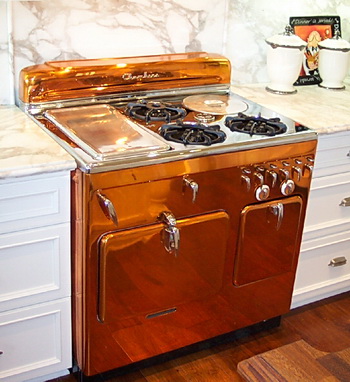
A blogging friend, Dean, from Calfinder, a free service connecting homeowners to contractors in the San Francisco bay area, sent me an image of this amazing range, which resides in his parents' home in Newport Beach, Caleefornia. Isn't it wild? Surrounded by the soft grays and whites, really makes this range the focal point, the star, the diva of the kitchen!

More about Calfinder. Calfinder is a very unusual type of contractor referral service. The people at Calfinder, well, here's a short description, which says it better than I can:

"Before we certify a contractor we perform a variety of checks. Below are just a few of those checks:

  • In-depth check of current license and insurance coverage
  • Personal interview with at least 10 previous clients ensuring customer satisfaction and business reliability
  • Ongoing monitoring and customer satisfaction surveys
  • Follow up with each homeowner we work with to ensure that our contractors are providing a great service"

They also have a blog, which is a GOOD blog on home improvement, lots of information on green remodeling, and an easy form to fill out for the services that you are looking for. I can't imagine how much more confidence one can get, beyond having someone personally check ten references before they will refer a contractor. Quite impressive. I've spoken with several people from Calfinder, and I can tell you that they are nice, and smart people to deal wtih. If I didn't feel that way, I would not write this. My previous thought was that these types of services are nameless, faceless, beauracracies. This one is not. I'd love to know what some of the questions are that they ask. Maybe Dean will stop by and share a bit more information.

Take a look here for more images of the diva copper range.

retro%20copper%20range.jpg 

Color Trend - More Gray

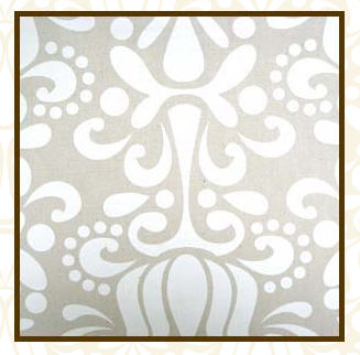
gray%20wallpaper.jpgMore gray news here for home interiors, fashion, and it's seen everywhere. Blinkdecor calls it gray skies and shows interesting examples of what's happening on the (gray) streets. Beautiful wallpaper from Mod Green Pod.

Unrelated to gray, but I must show you these tiles, seen again at Blink Decor, which I meant to show you a few days back. Look at these, aren't they beautiful? Maybe not grays, but you need some color with gray, that's part of the message.  

And, take a look at who else, a favorite blog, Another Shade of Gray,  who has had a good few posts on gray paint, which is a great look at lots of grays, from warm to cool. Take a look:

here-it starts and continues

here, and

here, ok, and

here 

Coming soon, gray kitchens, and my thoughts on, should you or shouldn't you? 

A Kitchen Treat

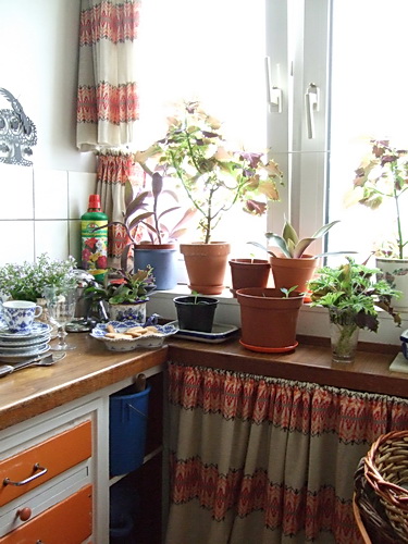
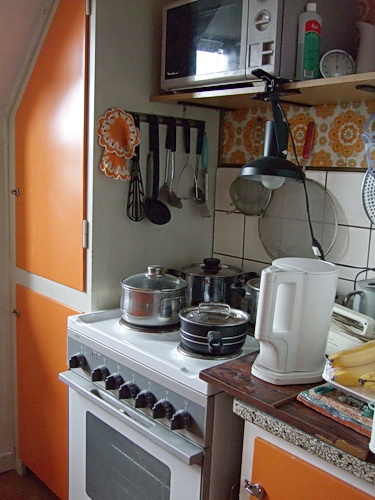
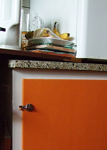
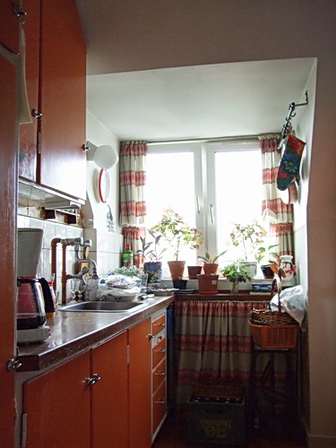
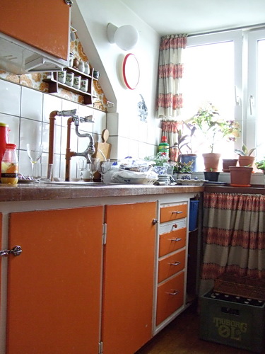
Happy Halloween! In honor of this holiday, which could go either way, depending on my mood (tread carefully today) I'll give you a treat, rather than a trick! Take a look at this (appropriately pumpkin colored) kitchen. How charming is it?? A perfect kitchen for today, October 31, with it's warm, cozy, colors and materials.

I do believe this kitchen has not been changed for quite a few decades! I really should find out how many decades. It is used every single day by Thorvald, my (very active) 93 year old uncle in Denmark. Images were taken in August when I was there on vacation. I've seen this kitchen all my life, and this trip was the first time it occurred to me to photograph it. I'm so glad I did. Don't you see a life well lived? Notice the case of Tuborg beer in front of the curtain in the fourth image-he's always ready for guests. :) Enjoy this special treat!

orange%20kitchen.jpgorange%20kitchen%202.jpgorange%20kitchen%203.jpgOrange%20kitchen%204.jpgorange%20kitchen%205.jpgorange%20kitchen%206.jpg 

Trend Focus - Gray Matters

Gray is the new beige, according to Met Home's November issue, although some are saying gray is the new black. In the kitchen world, we're just on the upswing with black, let alone gray!

I have to say, I remember the gray kitchens of the 80's. They truly were awful. The were either gray glossy formica or gloss lacquer with medium gray 12x12 ceramic tiles on the floor, softly shaded. Always 8x8 medium gray tiles in the bathroom. Maybe an ivory formica breakfast table with large ivory chairs that swung around, of course.  The moment it came into vogue, I, for one, hated that gray trend. I wanted to say, "Don't you see what you're doing?? Stop it!"

This time it's different. There are a variety of grays, not just the super cold one trick gray. You see warm grays, dark gray/blues, grays paired with tan...and, unlike in the 80s, traditional looks with gray rather than solely modern. Point being, if you happen to like it for the long term, make it into a classic, rather than a trend. Here's coverage from Danielle at  Style Files.  

gray%20white%20kitchen.jpg gray%20cream%20kitchen.jpg


From Heath Ceramics, gray, in context of blue and brown. Grace, from design*sponge was in San Francisco just last week and visited this tile showroom. See more here.

gray%20tile.jpg

Other ways to use gray is paint, dishes, textiles, and other decorative items. The great thing about gray, is how it reacts with color. It's a wonderful backdrop for color, shades and contrast.

What about you, what do you think of gray??

Update: Just found this gray inspiration on Belle Vivir.  

A Minimalist Kitchen

I don't think I'd call fellow blogger, Leah, a slacker, even though her blog is named More Ways to Waste Time. I think Leah's efforts definitely look productive, and with some "chic" thrown into the mix. A freelance writer, Leah interviewed me some months back for a piece on kitchen faucets for HGTV's website, yet to come out. Her point of view on home design, I find to be fresh!

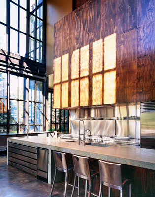
Leah went on a walking tour of homes in California's Oakland hills. The homes were "eh", she needed a drink, but it was the last home her tour group went into, which was the surprise of the day. The kitchen stopped ME cold, when I came upon these images, and she said everyone was just wow'd. Simple, elegant, modern, yet, to me, warm. I really love this kitchen.

Things I'd tweak:  The window doesn't do it for me in this setting, but my guess is the owner wanted the home to stay true to its architecture. I don't get the round thing to the right of the hood. Maybe I'd add a run of stainless steel above the tile to go up to the height of the window, as I feel that's an awkward area, below the window. The window is too high. Just, sort of, to integrate the window in a more meaningful way. I'd revisit the plan. The cooktop/oven is unfortunately in a corner. Maybe they could have been centered on the beam...just random thoughts. Overall, very, very nice.

white%20kitchen.jpgwhite%20kitchen%202.jpgwhite%20kitchen%203.jpgwhite%20kitchen%205.jpg

Kitchen Wallpaper - A Guide

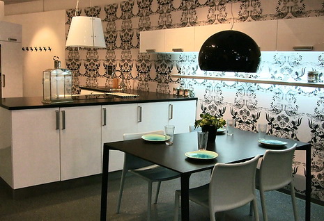
I talked with my blogging buddy, Linda, from Surroundings about wallpaper in the kitchen (wallpaper is BACK...big, bold, patterns and all.)  As the second part of our two posts on the subject, Linda adds some thoughts for you here. Linda is the owner of Chameleon Interiors, a design firm near Boston. Linda's been widely covered in the media, including on WHDH's "Room For Improvement." I'm a frequent visitor to her blog, and always interested in Linda's take on interiors.

"Hi Susan,

 
I've been loving all your recent posts on white kitchens - just fabulous! After the heaviness of the 70s, the overdone 80s and the granite/stainless monsters of the 90's, the sleekness of simpler white kitchens just feels so fresh and invigorating! One thing I've noticed - and love - is the use of bolder, graphic wallpapers in kitchens.

The right graphic can really enhance a blank wall in the kitchen - really balancing the space. I think the trick, however, is getting the scale just right.  A small overall print can feel overwhelming and dated (think cabbage patch roses). Bigger bolder prints are more contemporary and can make the space feel bigger.
 
The right print can also add depth and dimension - such as with a mural paper that draws the eye into a scene. I also like that a bold yet traditional pattern - such as a brocade or stylized toile - can add an ageless quality and soften the lines of a sleek space."
 
Thanks, Linda. As usual, you hit the nail on the head! It's much about scale and proportion.  Here are other factors to consider when thinking about wallpaper in the kitchen:
 
kitchen%20wallpaper.jpgScale: What size is the room? The size of any given wallpaper pattern will be viewed very differently in a small vs. a large room. Best bet? Get a sample, or buy one roll to see it in perspective.
 
Pattern: Is the cabinet design busy? The busier the design, the more confusing a pattern will be. A smaller, consistent, pattern may work best with busy kitchen designs.
 
Theme: How about your style? Do you want to create a constrast of styles between wallpaper and cabinet design or do you want continuity for your chosen look? For example, you CAN pair a minimalist, sleek, cabinet design with a rich, brocade, wallpaper pattern. It's the contrast of styles that is of interest. Conversely, sure, keep the theme flowing with a wallpaper that has a similar connection to the overall kitchen design.
 
Color: Here is where you can have fun, and change your look fairly easily. Take your cue from your cabinetry colors, countertops, and flooring. It really helps if you can visualize your final look from the very beginning. Your walls will play such an important part in your space.  Think about the impact of color hues, shades, tints, and color schemes.
 
Texture: Do you have little pattern, but lots of texture in the kitchen? Watch out for busy countertops, such as granite coordinated with wall coverings. Patterns/textures can clash. Alternatively, a grass cloth wallpaper may be just the trick to give your kitchen that very warm look, in what is often a utilitarian space.
 
Trends: Go for it! This is one area that I fully support riding the trend wave, if you are so inclined. You cannot change your cabinets or countertops so quickly, or appliances for that matter. Wallpaper? Absolutely, positively, express yourself! 
 
For more images of wallpapers in kitchens, don't forget to visit Linda's post on the topic, here.  
 
kitchen%20wallpaper%202.jpg
 

My Day Today - Talking Kitchens and More

Once in a great while I like to sort of write about my day. Today seems to be a good day for that. Things are swirling around. Busy day.

A New Installer 

I started the day with an appointment at 7:15 am in my office with a new, potential, cabinet installer. Choosing to work with an installer is not unlike choosing a business partner. You want to make sure the mutual goals are similar, the business values, good habits, in order to feel that there is synergy at a certain level to produce quality work. An installer and a designer, ultimately, are a team, like it or not. They both need one another to be successful, efficient, and get the job done in the best way possible. I like this installer, and I feel very confident about him. I'm very picky and interview installers with many questions. The answers were great. I foresee mutual respect, which must be present, or it won't work.

This one's for you, Joe Z***

Where I don't see mutual respect, unfortunately, is with Joe Z***, who I met with last Friday. I guess I spent, with travel time, our meeting, and preparing for the meeting, 3 hours that day.

Joe Z*** (a local builder) called me because he loved reading my blog! He needed a kitchen for his own home and asked if I could meet him at his home. I said sure. Through our 1 phone and 1 meeting conversations (I'm a good listener) I learned (about six times) that he is a fourth generation builder, about his youth, his college, his wife, how they met, where she's from, his family, his father, his father's business in the past, where his father retired, what he's (his father) doing now, their kids, his business relationships, all his connections, name dropping legendary NYC real estate developers, and all the big, huge, work that he had done and that was coming up. Joe Z*** speaks softly and always with a big smile. That should have been the give-away.

He was very enthusiastic about working together with me and said there would be much work that he would love to send my way. He liked my approach, and we talked about getting together this past Tuesday. This meeting took place last Friday.

Joe told me at the end of our meeting that he wanted me to do the design only for his kitchen and he would use his cabinet maker. I said that I don't normally do things that way, but let me think about it, and I may have to raise my rate for my retainer to be more proportionate to the work to be performed. Zero reaction/resistance, and we spoke again about meeting on Tuesday. I said I'd get back to him the next day as I thought about a revised rate, if any. I usually like to leave a door open and leave time to consider an offer.

I left several messages for Joe since last Friday.  Joe chose not to return my calls. Joe did not have the decency to pick up the phone to say, "Thanks for your time, but I'm going to go in another direction." Joe has perpetuated the negative reputation that many builders have from their circle of allied professionals as well as the general public. There is no way around this. To ask for 3 hours of someone's time at no charge (all fine, if that's the policy, as it was mine) but to NOT return a follow up phone call (or email) to the professional who gave their time, is rude behavior to say the least. Very rude, very unprofessional, very disrespectful, and, of course, arrogant. Conversely, I have a potential client who recently let me know that he is currently exploring other options and will get back to me at the end of the month in response to my inquiry after a meeting. That's how it's done. I'm grateful that I am not involved in Joe Z's world.

A Gutted Kitchen 

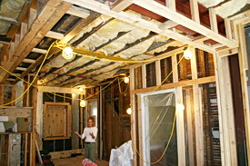
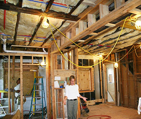
I'm in the middle of a kitchen that is totally gutted. It's both thrilling and nerve wracking every time. In this case, I'm doing some wacky things, so I'm a bit more on edge than usual, and excited too. I'll keep you informed as things happen. Had a meeting today with the contractor and homeowner to work through many details. Her home is ripped apart by my doing, and there's always that little voice...will it all come back together again?? This one will be something very special, you just wait!

The Dog And The Cat 

We're watching my daughter and son in law's adorable little dog. Every once in awhile I hear a yelp! Probably something to do with our cat. The dog used to bark loudly at the cat. Till the cat very quietly put the dog in line. How, I'm not sure...except for those occasional yelps we hear! Now the dog doesn't bark AT ALL near the cat! 

A Wedding 

Now, I'm off out east on Long Island to attend a good friend's daughter's wedding. Gotta run and get ready.