Products For Kitchen Inspiration

Here are a few things, either new or cool, that I think are definitely worth noting.

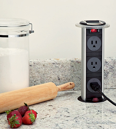
elecgrommet.jpgFirst, take a look at this receptacle. Good for an island situation or other areas around the kitchen. It makes countertop receptacles possible. Not for every installation, but I can think of a few it would be perfect for, a long island, for one. This kitchen receptacle will do a good job being sealed off from liquid spills. By Doug Mockett & Company.


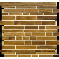
Harmony.jpgLook at these Harmony Wood tiles, by Anchor Bay Tile, aren't they cool? It's a real wood tile that is mounted with mesh, something your tile man will thank you for, that is, after he criticizes you for buying non ceramic tiles, of course. Just tell him they are made of wood from sustainable forests, and he'll feel better..we can dream. 

American%20Clay%201.jpgAnd, I really love this product, American Clay. It is a natural earth plaster, made of natural clays, a green product, recycled and reclaimed aggregates, and contributes to Leed points on your project. It is such a beautiful, sort of suede like finish for your walls, and again, it is healthy for your home. I'm seriously thinking of using it in my home this spring. In fact, someone is coming to my home today to take a look at my walls!

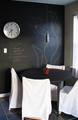
curbly%20chalkboard.jpgI also love the idea of a chalkboard wall, or section. My immediate thought is to do a post just on chalkboards in kitchens, and I may, but I also know that if I say, good idea, it won't happen for a month, so here's the idea now. I'm also seriously thinking of doing this in my kitchen too. The image is by booizzy. Here are a couple of other places for inspiration: Martha Stewart (but, of course) and Apartment Therapy (always.)

Kitchen Eye Candy

I need some kitchen eye candy. I've worked solidly for two days (this weekend.) Tons of detail work doing an electrical plan, plotting very specific dimensions for lighting and appliance centerlines, switching, and receptacles, only to have beams be in the way, I'm sure! Also, uploading plans to my out of state clients.

I also designed a kitchen within an entire space, designing around a structural column in the middle of nowhere, adding in furniture for the family room, again for context, as it is important to understand the negative space as one moves around furnishings, cabinetry, etc. That negative space is equally as important as where to put kitchen cabinets! You have to see it all. Remember that, in your great room design adventures...do not forget to have the surrounding spaces/furniture drawn into your plans. Otherwise, you're driving blind, so to speak.

But, I'm wild about my monitor. It's truly the best thing I've done for myself in years! So fantastic, so crystal clear, so vibrant! But, I digress...I need some mindless kitchen eye candy, so let's look at it together and think some really luscious kitchen thoughts...Scandinavian kitchen thoughts, something I have not shown you in some time.

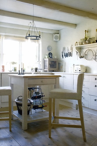
From Vakre, a magazine so beautiful on every page, I can hardly describe it...

Kitchen Tech

My world has changed today. My computer arrived a week and a half ago, but my new monitor arrived TODAY. I had been using a Sony monitor that I paid $2,000 for about 5 years ago. You'd think it was a good investment. I noticed over time, it was getting increasingly dimmer and dimmer and adjustments made no difference. It wasn't terribly dim, you wouldn't notice it, but put a new, cheap, really cheap, monitor next to it, and there was a huge difference, the cheap monitor blew it away at this point.

FlexScanSX2761W.jpgSo, I researched and researched. And, as I work with images all the time, it was best to have a certain color management ability/setting. And, since I'm always working on my kitchen design drawings, clarity was equally important.

I'm boring you now, I know it! Anyway, I ended up getting an Eizo 27" monitor, a brand that is well known for both photography and cad use. This thing is crazy! It's so bright! It's so crystal clear! I see this BLOG so differently, like, WOW, look at my blog, what colors! (I'm glad it was a GOOD reaction.)

I spent the same amount, I did 5 years ago, around $2,000. But, monitors have come down so far in price (in general), and a good monitor is so much better on the eyes (not to mention so much fun) and makes everything look so much better and realistic, especially all those products, textures, colors that are involved in the kitchen, it's a good reason to upgrade.

This monitor is changing my entire experience on the web, on my blog, in my design program, I'm so thrilled and I just had to share it! Now for the second monitor to put alongside it...maybe a 20" should do it.

Many of our lives are so internet-heavy these days, and I forgot how important a monitor is. Although I hated to replace something that was still functioning, bottom line, this was a good decision, a wise decision!

And, kitchens? They just look fabulous, dahling, on this monitor! Good weekend...

Random Kitchen-ness!

I'm sorry I haven't been around! My head has been moving in other directions...moving from one client to another plus a bunch of other work related stuff.

So much to say, I'll never say it all! One thing I can say very enthusiastically... I find this to be the best time in a very, very long time, that, really, all the kitchens I am working on are interesting, aesthetically challenging, and all kinds of other good stuff. I'm loving my work. I'm enjoying my clients. I'm really revved about all of what I'm working on!

Let's take Grace. As I said, we installed most of the kitchen and Grace decided, after some time, that she just didn't love one section of the kitchen. And, she wanted to design an entirely new and different wall (in the upper section, the base cabinets would stay). Luckily, what she decided NOT to use was not a large financial loss. So, I came up with another plan, which Grace loves. The left side of the elevation is opposite the dining area, the right side, opposite the main kitchen area.

What's the message here? I think it is, that if you can't live with something, and you're willing to change it....change it. Don't freak out. Go with the flow and see where it takes you. The answer is different for everyone. This will be ordered shortly. New%20Wall%201.jpg

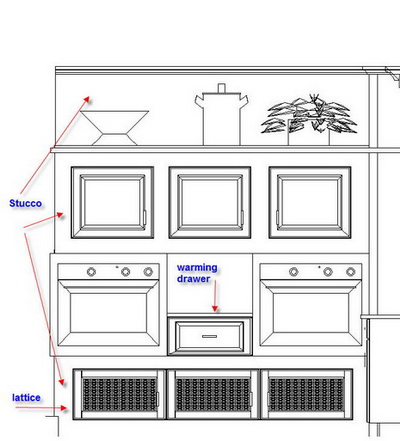
Here's something else I'm working on for another client. It's just one small wall of a BIG kitchen, a Kosher kitchen. I think it's cool.  oven%20wall%202a.jpg


And, one more random note, not really about kitchens, that's why it's random! Run over the Surroundings where a contest is about to begin for a very cool lamp. Free is good, contests are fun, and you really should check out Surroundings in any event! The lamp is from the Jonathon Adler collection.

Be back real soon, I've missed blogging and think of it every day, it's just been hectic!

A Computer For Me, A Computer For you!

No, I'm not giving away computers! I just got a new one yesterday. My very smart son, in college (he just got a 102 on an Economics Test-good job!) told me NOT to get a computer for the $4,000+ I was going to spend, as recommended by my local computer guy. I have a local computer guy because my son, Matt, lives in the city, too far away to respond quickly to my computer issues when they arise.

Matt said, hold everything, he'll build me one!

Matt has been working on computers since he was 12. Matt is also frugal cheap. He is obsessed with doing research to find the best product, part, piece, whatever, at the VERY best price. Matt, being frugal cheap, looked up the specifications of a few of the programs I use most, spoke to people at tech support behind the programs and determined that even though I wanted the best/fastest/ultimate, he reminded me that he could save me money and still make me a computer that was FAST but customized to my specific needs. Above all, Matt knew I wanted FAST. I told him 50 times.

This new computer is fast, AND, I saved WELL over a thousand dollars, probably closer to $2,000 as compared to, say, a Dell! How? Matt tells me that, using Dell as an example, purchasing the same parts, such as memory, at specialty computer stores, is a fraction of the cost of what Dell charges. The same goes for all the other parts and pieces in a computer. The markup is CRAZY.

Would you like to save money too? Matt is now taking orders for new computers and computer tech work in Manhattan! Very reasonable prices and I can tell you he gives great customer service!

Get in touch with Matt at: mserra (at) gmail.com.

Top Ten Secret Kitchen Design Tips - Lighting!

DSCF4158a.jpgDo you think lighting is boring? Do NOT touch that mouse...I promise to totally excite you with these tips, ideas, and whatever, about lighting your kitchen. Here we go... (come on, get ready, settle down!) These are quick, useful, and un-boring ideas, like take-out from the gourmet food store. Maybe not ALL you need to know, but close!

1. Let's talk style! Lighting is jewelry, end of story. Think of it as such. It says something, a big something. Whatever you want it to say, it says it, and says it loudly. Do you want to pick something safe? It will say safe. Do you want style that's "out there"? That's your message. What's the point? Take your fixtures' design SERIOUSLY please...put TIME into choosing your lighting jewelry.

2. Pendants - hang 'em LOW! Low is cozy. Low is dining table-like. Low is cool. If your mother tells you they are too low, you know they're close to perfect, and maybe a little bit lower will do. If your contractor says they're too low, lower them two feet! (I'm joking, no cards and letters please.) :)

And, no, you need not worry as much as you think you need to worry, about the fixtures bumping your head. See? I knew you were thinking that!


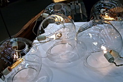
Trend-5.jpg3. Pendants - hang 'em HIGH! Some pendants look okay hung high, and they would be wider/bigger/fatter fixtures, please, not the small ones hung high. Please! They will look lost, or worse, insignificant. I can think of lots more adjectives of an unfortunately negative nature for small pendants hung high!


thumb.aspxa.jpg

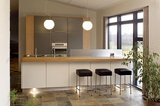
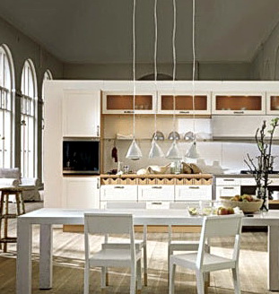
4. Pendants - hang 'em close together! They do not have to be hung 3' apart (yawn) over the island. Put a few close together, especially on a smaller island.  Where you'd normally put 2, put 3 closer together.

5. Does the island have a seating area? Put two different types of fixtures on the island...pendants on the work part, a larger fixture to feature the seated part.

6. Mix your metals, finishes, colors...do it with care, I don't want the lighting police banging on your door, but get creative with complementary styles and color.


DSCF4181a.jpg7. Don't forget the dimmers!

8. Recessed lighting - Save the planet and use CFL (flourescent fixtures)

9. Recessed Lighting - There are two schools of thought...the recessed lighting plan is either a) equally spaced in a logical grid type pattern (watch the swiss cheese effect-too many lights) or b) positioned over certain elements without a strict grid pattern. Give thought to which you prefer, keeping in mind if a light is off center close to a featured cabinet, it could look like a mistake. Take care in your planning. Me, I usually look to see what features are important in the kitchen, and sometimes use a particular feature as a starting point and then move off from that, like the hood, for example. Then, of course, get ready to do it all over again once the electrician says, "lady, there's a beam in the way!"

10. Under cabinet (not under counter as it is typically called) lighting - LED lighting is PERFECT for this application. Look it up, and again, save the planet. It is crazily energy efficient!

Bonus #11 - Trusty Wendy, from the comments section reminded me about sconces! Yes, sconces are very wonderful in the kitchen. I have two kitchens at the moment where I brought sconces into the design from the beginning, and an interior designer on the project said "Sconces? I like it!" They are flanking the window in each case, but don't stop there... 

There, wasn't that fun? I had a great time! 

normcopenhagen12_medium.jpg 

More From The Architectural Digest Home Show

Here is more good stuff I saw at the show...let's look at tables. Tables send such a strong message about who lives in the home. Modern, traditional, formal, informal, textured, smooth, light, dark, light, heavy...these are just a few of the decisions one needs to make when contemplating the table in the context of the room and the home. Tables can also be a functional piece of artwork, and I am finding more and more, manufacturers are building and designing in practicality in terms of being able to refinish scratches, when they occur, which they will.

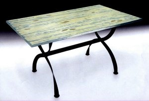
asia%20design%20studio.jpgHere is a lovely table. It IS a piece of art, at least to me. The table is made by the Asia Design Studio.  Designed by Na Winn, a talented Vietnamese artist.


cityjoinery.jpeg

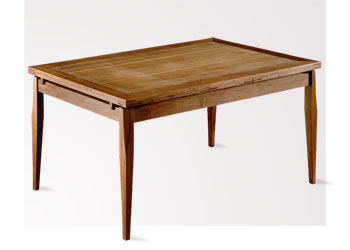
I like City Joinery. I'm also a fan of the name. Made in Dumbo, they have a wildly smooth finish on their wood pieces, allowing the wood to be enjoyed, every piece of grain, pigment, characteristic. They make some great tables. I was also told that it's quite easy to touch up the finish when desired, or when scratches occur. The finish was flawless, yet, they tell you not to be afraid to do touch ups. I like that.

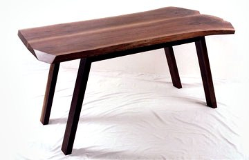
ericmanigian.jpgI also liked Eric Manigian's work. His work is very organic in its look and feel. Manigian designs with longevity in mind, and his pieces come from a small group of millers who provide him with wood from discarded or fallen trees. His designs are of a minimalist nature. After all, with wood as beautiful as this, with all its rugged beauty, that's really all you need.

Next...a slideshow of more, interesting, picks from the show.

Kitchen Ideas At The Architectural Digest Home Design Show

Lucky for me...New York is at my doorstep, so I must take advantage of special events when I can. I really looked forward to the Architectural Digest Home Design Show, featuring "the best in home furnishings from nearly 300 exhibitors" as the press release says. Last year, they say 23,000 people attended over four days...and it's not such a big space, so with an eye on the clock, we (me and Steve-my husband aka "Show Dog") got there at 10 am, when it opened.

When I go to design shows that are not kitchen-centric, sometimes kitchen items, like major appliances, are displayed or a few cabinet companies here and there. I don't really stop at those exhibits. What I think is more interesting are other manufacturers which are NOT necessarily kitchen focused. It allows me to look beyond the "typical' world of products manufactured for the kitchen and bath industry, maybe to find a use IN the kitchen of a product which was designed for elsewhere in the home.

In general, I observed lots and lots of natural woods, and other natural motifs and materials. The characteristics of wood, its grain, knots, multi colors, is prevalent in this show. Lots of white, too, some black, really, a little bit of everything. More modern style than traditional, for sure. Nature, I'd say, was the star.

Here are some random finds that I'd like to show you.  

natalieblake.jpgFirst are some beautiful tiles I found, by Natalie Blake. They are very large, and quite irregular. They are more wall art than kitchen tiles, but I think one or more of these tiles could be beautifully framed around a backsplash of another material. This is an image of a tree, encompassing many tiles, but individual tilse can be pulled out from this and other motifs to stand on their own. Approximately $325 each.


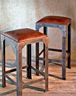
french%20design.jpgFrench design is exquisite, no? I've begun to dream more seriously about going to Paris (I've not been there before) and was delighted to see the beautiful French antiques from Ghislain  Antiques, in Paris, and in Stamford, Connecticut, just down the road. Beautiful metal cabinets, perfect for kitchen pantry storage, stools, tables, can be lovely in the kitchen, no doubt. 


scandinavian_icona.jpg


Another tile, imported from Italy by Wayne Tile. Situated in the back of a display against the wall, in the shadows, I found some tile I really liked for the floor, walls, anywhere.  it is named Scandinavian Mesh, but that's not why I liked it! It's soft, yet textured, a perfect warm modern tile. To me, it appears to be quite elegant.


7.jpgAnd, last, for now, I'm pretty crazy about these wall panels. What an idea! They can go anywhere. They are made in the form of columns, arches, and panels. I don't know about maintenance behind a backsplash, for example, but I do think it could be interesting to have glass in front of a panel with bolts holding the glass to the stone.  Look at the website...so many textures and colors. Very cool. Barnell Stone.

My Day So Far...What Kitchen Designer Dreams Are Made Of

IMG_0899a.jpgOh, disregard the last part of the message...I just felt compelled to write that, and I'm feeling punchy, lol! So, here's my day so far...

3:45 AM - I can't sleep, no big reason, but now that's it, I'm awake. Reach over for the laptop (it's ALWAYS fired up) and start the day...

5 AM - Down in the office, easing into the day...

6 AM-7:30 AM - I've been asked by a prestigious architectural firm to submit a proposal to include kitchen and bath furniture for a "green" complex of apartments in Washington, D.C. so details back and forth.

8:15 AM - A meeting with a new installer. We had some good conversations in the past few days, but the in-person meeting is very important. How does he look/dress-is he neat? What does his truck look like? Is he messy/organized? Another couple of pieces to the puzzle. I found that this man has a smile even when he's not speaking and almost always when he is speaking. Looks like a very positive person...I like that. Beats the alternative.

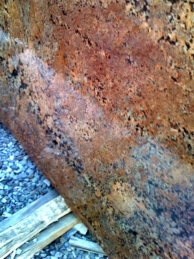
10 AM - Met clients at the granite fabricator/granite yard. This is a case where we bought the granite at one yard and another company will fabricate it. The clients (with my help) very carefully chose the granite in December. There were few slabs left. It's gorgeous! And, it's not to be found again, gone forever.
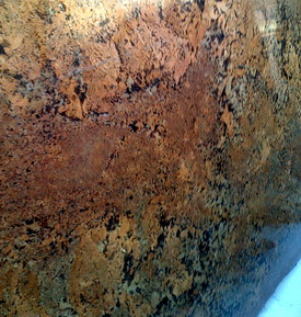
IMG_0900a.jpgAs we walked around the yard, our granite was nowhere to be found.  

I don't know about the person in the yard with us, but my clients and I were silently getting really nervous. The fabricator asked if I was sure they had it, and I said "you have my money, so you should have it!" The fabricator skirted all around, where it could be, yadayada, and my client, the wife, finally spotted my name on it! Just a little drama. We were there to choose a second granite to go on a few different areas of the kitchen, with the busy granite on the island. It will be beautiful.

12-4 PM - Variety of office work...I successfully negotiated downward to have cabinets unloaded from a truck to go into my client's home, and it takes 45 minutes to an hour. $300?? Come on, no way! 

Made a list/picture of window specs so windows can be ordered for a client. I could only go so far, because a few details are unknowable to me, and this contractor may complain, but, he should be able to fill in the blanks where I left off.

Emailed with my son, who is soon building me a new computer. Can't WAIT to get it.

Talked to two press people, one who is doing a story on Hansen, another who is doing a small feature on me, locally, and who gave me ominous news on the state of the newspaper, previously, a very large newspaper. A sign of the times.... 

And, I did other stuff...now, I have the tv on (I often put it on at around 4 pm, maybe later) and I LOVE this commercial, actually the music. Love it. Want to hear it? It really grows on you.   Ontario Travel 

DSCF4023a.jpgThen there's Sparky, our cat. He visits me now and then in the office. When Sparky visits, he plants himself on top of my calculator with his head and paws! Why? Because I'm frequently using the calculator, which means that I'm ignoring Sparky and he does not want that! He's funny.  So, I have to move his whole body over, and of course, he swipes at me with his paws. :)

5 PM Husband comes home with Starbucks and a chocolate biscotti... 

Spoke with my son for about 1/2 hour on computer specs.  I keep saying, "I want it fast!"

And, now, I'm gearing up for the LONG, second shift. I have a meeting tomorrow, 175 miles away, about 3+ hours, in Massachusetts, where I have a project. I'll leave at 4:30 am. I have to finish (I'm 1/4 the way through) a few electrical plans, just organize a bunch of stuff, samples, and then pack stuff to stay in the city for the weekend, convenient for my return from Mass. tomorrow, because Saturday, I want to attend the Architectural Digest Show!

You'll hear ALL about it! I hope I haven't bored you...just sort of rambling. Add to that, I finished a blog post!  
Changing The Kitchen Design In Mid Stream

Grace's kitchen project is, I guess, 2/3 done at this point. Here was the plan.  I think it was a few days before I left for Denmark in August, Grace didn't feel comfortable with the plan (the cabinets had already been ordered) so I told her to mar%20plan%20a.jpgcome by my office and let's figure it out.  I came up with an alternative plan after our meeting and Grace was happy. 

This entire general design reflect's Grace's desire to have continuous countertops everywhere, yet to keep things interesting over and under the counters. She wanted a sort of country/Tuscan feel, yet with modern conveniences. This type of style was what we were after.

FAST FORWARD TO LAST WEEK

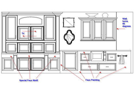
After mulling it over for some weeks, Grace decided to make a big change. She decided she didn't love the entire upper section of the elevation below, she wanted it all gone!

Fortunately, the arch and other built in cabinet next to it was made of plywood, destined to be faux painted. Yesterday, they were dismantled!

We talked about it on and off for some weeks. She lived with it and then said she's just not sure. I said, "Grace, it's plywood...it's nothing. If you want it ripped out, it's not a big deal at all."

So, it's back to the drawing board for Grace and I.  A big change like this does not have to be daunting, or difficult, or negative. In this case, maybe one cabinet will be sacrificed, and then just the plywood.  This IS a first for me, to do a major redesign after installation, but, again, the sacrifice monetarily is small, so why not? Grace must feel 100% about her kitchen in the end. That's all that matters. I'll update you on what we eventually come up with. I'll add some real life images of the kitchen shortly!

Descriptions: That's a tv cabinet under the arch. Under the countertop under the tv cabinet, those spaces would be faux painted with a special design. Surrounding the grid/rounded wall cabinet is plywood, to be faux painted. A wine refrigerator is directly below. To the right of the wine refrig. are cabinets surrounded by plywood, to be faux painted. And, that wide area to the right is the other side of a 90 degree turn.  

Arched%20Wall%201aa.jpg 


Granite Kitchen Countertops 1+1 = ?

two%20granites.jpgHere's an interesting question about a countertop from Meg...

"I have a dark green granite table that I am moving into a  new house.  It matches my current kitchen counter.  The kitchen counter in the new house, although not yet chosen, will NOT match the uba tuba granite of the table.  Should I sell this table?  How can I incorporate a table with a different granite from my counter into my new decor?

A%20Countertops.jpg

My first reaction is that it appears to be assumed that you will be selecting another GRANITE countertop. It also assumes that you can't have enough granite, that you really love it. If that is the case, you are entering an advanced countertop selection process zone! Blending two granites is possible, but must be done with great care.  

The easy way, of course, is to pair Uba Tuba with a Black Impala, a solid black granite. Easy, done, perfect. But, what if you don't like black?

Then, you must begin to be aware of two things: color and grain pattern.

Color, that's easy. I'd recommend looking for a granite with a very different color. Too close to what you have, and the grain patterns can get confusing. At least the color is a start at differentiating your countertops...successfully. 

Pattern is a different issue. Granites have such a variety of patterns. Some granites have movement, some have large chips of pattern, some have tight grain. A very tightly grained granite can have a more contemporary look in many cases. That said, how far apart your granites are will also be a factor in what goes with what and why. In general, be aware that the overall effect will be more busy, than more calm and simple,due to the expanses of grain.

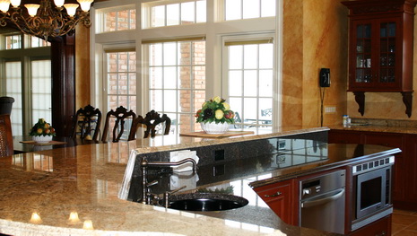
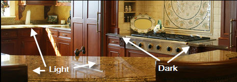
In the upper most image, the raised, light, countertop, has a more distinct grain pattern. The lower, darker, surface, has a somewhat tighter grain pattern, but not super tight. Beyond this image, across from the island the countertop is dark, surrounding the cooktop and it is light surrounding the main sink area.

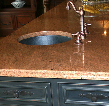
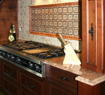
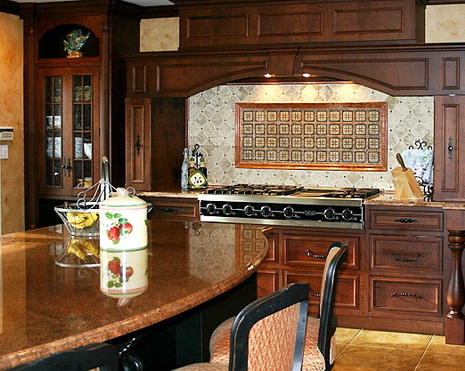
That all said, above, forget everything I said. Sometimes, in a rare occasion, you can find two granites in a similar color which simply work together. I wish I had better images, but this project is a great example.  Although the island looks busy too, in real life, the island looks quite consistent and the perimeter granite looks substantially more strongly patterned, and they work well together. It was important to my client to have an interesting granite pattern on the island, not just something with very tight grain, and with lots of time spent looking, we found the right combination.

Of course, Meg, you may want to consider an alternative, more quiet, surface, other than granite, to "feature" your granite table in a more focused way, especially if you love your table. But, if it's granite you love, and want for your coutnertop, here's how to do it.

IMG_6950aa.jpg

IMG_6962aa.jpg


IMG_6934aa.jpg


Kitchen Details That Might Bore You To Tears

I've talked about this before. The period of time just before an order is submitted to the factory. It's the time with the most pressure, as once released to the factory, that's it forevermore. The right and left sides of the brain collide but must work together...or else. End of story.

Here's an entry for a kitchen order I'm doing that is going to the factory today, and which is the culmination of months of creative thought and engineering on my part, and later, includes even more detailed collaboration with a designated person at the factory. This entry reflects an effort to provide a chef in a small residential kitchen the absolute maximum in storage and ease of use. This is one cabinet, and I've had two highly detailed kitchen orders I've had to make 100% perfect before I go away...oh, did I slip and say "go away?" I must be referring to the TOP SECRET project! But, I digress...

This level of detail and, really, engineering, when working with custom cabinetry, doesn't make kitchen designers good people or have the ability to create world peace. But, I include this to illustrate the interesting result of both sides of the brain working together. The next time you see your kitchen designer dressed fabulously, and laughing about something or other, remember, he/she may also be delving into the dark side of detail behind the scenes, unbeknownst to most.

I'll also share with you that, again, this particular cabinet happens to reflect a good deal of risk on my part, to absolutely maximize storage for this home chef (but a real chef.) His kitchen is an orchestra pit and he's the conductor. Does that make any sense at all? I can predict what will happen is that I will watch with utter excitement as this cabinet is put into place and the adjacent cabinets and appliances are put into place and i will stand there and AUDIBLY marvel at the symphony of all these fractions of inches working together, each fraction of which I chose.

I tend to get very excited, when I design a risky, expensive (thousands $$$) piece of custom cabinetry, and people around me tend to shrug and look at me strangely when I say "YES!!!!" (IT FITS.) It's really true. That's ok, I can celebrate by myself. :) In the meantime, however, my fingers are CROSSED.  But, if you're the client reading this, don't worry...I can't remember the last time a cabinet didn't fit. Really.


Here's the entry for one cabinet:


Base
106 1/4" wide x 34 1/2" high x 24.0" deep - YES, THE CABINET IS 106 2/4" WIDE
Front frame extended down .5" for scribe to be 35" high OA - TO SCRIBE NEATLY TO THE FLOOR
Hold both partitions short 10" from top of cabinet - FOR THE SINK
Left and right dust top recessed .5" from top of cabinet
Do not extend dust top past sink apron - DUE TO SINK
Blind base 43.500" wide - left
Combined cabinet charge
17.063" wide opening left - THIS WAS PLANNED TO THE 1/16" OF AN INCH
Omit drawer above
Full height door opening
False panel and door attached together with center rail to open as one - LOOKS LIKE A DOOR/DRAWER
5" backer
Omit shelf and shelf drillings
Install LeMans Corner System Hafele 541.33.445 - A VERY COOL CORNER  CABINET SOLUTION
Right swing
Full height sink base 19.500" wide-center
Combined cabinet charge
Split doors - NON SPLIT DOORS WOULD BE A NIGHTMARE
Aprom to hide sink - NICE TOUCH
8.5" high x 26" wide
1" radiused corners at bottom L&R
Apron will extend into far left and right openings 2.5"
See sketch
Blind Corner Susan 43.250" wide - right
Combined cabinet charge
16.688 wide openings left - PLANNED TO THE 1/16" OF AN INCH
Hold drawer box short an extra 2.5" from left - SO THERE IS ROOM FOR THE SINK
2 ea. 14" BCS Swingouts left
Blocking extends into opening 0.688"
Flush toekick
Special valance cutout - per sketch
1-Arch valance - 3 bottom rail - NICE LOOK, CURVED "VALANCE" AT BOTTOM
4" high
2" high at narrowest point
Held up 2" from bottom  

There's four more lines, but I think this is enough.  


Random Kitchen Meanderings

ann%20sacks.jpgI'm thinking random thoughts today, so I'll jump around and show you some things you need to see.

You need to see the post from Living Well in Westchester, about antique hardware! I mean, come on, how cool is that?  Mark has lots of good insight on all things home related.

Laurie Burke from Kitchen Design Notes has good information on small space kitchens. Laurie says she likes small kitchens. I do too. They're efficient, smart, and any designer worth his/her salt enjoys the unique challenge of trying to get every square inch of function out of a small kitchen!

Kelly from Kitchen Sync has insightful information on seating around countertops, what works, what may not, and WHY. Most important issues to resolve is real lifestyle behavior rather than assumed. Good ideas and solutions, take a look.

Ann from KitchAnn Style is showing new tile from Ann Sacks. Of course, you know it has to be gorgeous! These handmade tiles of glass give an old world look with modern character. I think they're just gorgeous. Good find!

Oh, did someone ask about my "Top Secret" project? If all the stars line up, it may be unveiled on the weekend of the 22nd. In the meantime, take a look at this. It is connected to the project. What does it have to do with kitchens? Everything!


Decor8 Blogger House Party!

Decor8 is having a blogger house party, and I was tagged to do the virtual kitchen! As usual, I may be a bit late to the party, but it was fun doing it. OK, here's the client info:

Home owner: Young single mom (cookbook author) with a son living in a 18th century Georgian townhouse in Savannah Georgia approx. 2000 sq ft., 2 floors, 3 bedrooms (one is an office), and a large patio off of the kitchen. She loves to entertain, enjoys pastels and Swedish decor, decorating on somewhat of a budget but she can splurge on one expensive item per room. Loves pattern and feminine touches but can't deal with too much clutter.

Since I only had a few finishes to select,  I thought I'd go a bit further and design this kitchen from scratch, exclusively for decor8's virtual client.

Let's go with dessert first...the one special item chosen for the kitchen was a (pricey) 36" induction cooktop from GE Monogram. For THIS client, a cookbook author, it's a dream come true. The super high power burners with faster response than gas, green technology, and super safety attributes (thinking of her child,) won, hands down. She's psyched and ready to cook up a storm!

Interested in living green, where she can, the countertop is made of recycled materials by Avonite. The cabinetry has green components, is painted with low VOC paints, and her appliances are all energy star rated, all this just for starters. The kitchen was designed to cover all sorts of activities beyond cooking. Our heroine will be able to:

a. do the cooking in an "open" setting, gazing out toward her child or the lovely patio beyond

b. prep at the island as well with a great line of sight all around

c. clean up at the sink with a nice expanse of windows

d. have good, and quick, access to all of her cooking items, tools, and cookbooks on the open shelving section

e. communicate with her child

f. watch tv cooking shows easily

g. hang out in the seating area with a laptop

h. spend quality time with her child

i. Have storage addressed in a variety of ways, maximizing storage, yet maintaining an open feeling

Oh, her aversion to clutter? Once she saw the storage and access possibilities of open shelving, she loved the look! She may be storing items in decorative baskets on the shelves as a compromise. So, here we go! But, first, take a look again at all these really great ideas and inspiration in the other rooms of our heroine's home, over at decor8.  Thanks Holly/decor8, it was fun to dream for a bit....

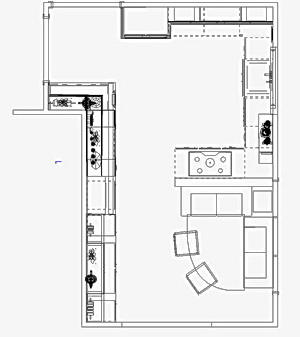
And, let me obsess just a little more on the cabinetry. Look at the floorplan. It IS a very old, Savannah Home. Maybe we need to section off (in terms of a color), say, the sink base section, or the shelving section, and put another finish on the cabinets there. They could be a glazed, golden yellow finish, something like that. May go really well with the supersoft gray finish, shown below. Imagine for a minute...


And, here is a modern version of the informal, Swedish, cotton kitchen rug:

Recycled countertop has bits of yellow, lots of white, and a very interesting grain pattern, unlike most engineered stones

Yellow kitchen tools/accessories!

So, what do you think? Let's do a little more brainstorming. What do you like/don't like/would change, etc?

Participating bloggers were:

decor8, Creature Comforts, Style Files, Design For Mankind, Perfect Bound, Bloesem, SFGirlbyBay, AphroChic, Gracious Inspiration, Design Is Mine. and Making it Lovely.  and moi.

Kitchen Blog Anniversary

Talking about kitchens...does it ever end? It's been a year since I wrote my first post on this blog. I started with a little hesitancy, a bit unsure of where this was going. Somehow I just kept thinking of kitchen related issues to talk about. At this moment, I have so many kitchen focused things to talk about, I don't know what to talk about first!

This is such a natural process for me...just to toss out ideas, stir up the pot a bit, and lots more. I love this process. I've also met so many amazing bloggers who have welcomed me into the design blogging community from the very start. I actually didn't know about this whole, well, underworld isn't the best word, but universe of blogging, until I started blogging, and then, what a surprise I found! Cool people, great ideas, interactivity at its best.

So, I'm feeling good at this one year mark. I also feel I'm at my prime in life and in my career. I've actually never been more happy, more confident, fully engaged with life in a positive way, than right now, and I'm looking forward to more good things to come, including my TOP SECRET project, soon to be unveiled!

I LOVE reading your comments. Say whatever you want. Disagree with me or challenge anything I say at anytime. Maybe I'll learn something.  Maybe you will. Maybe we both will!

I may be gone from this blog for days at a time, it just happens, but I'm here in spirit. Kitchens are the soul of the home, where all five senses come together. They're special. I love thinking about kitchens. I love cooking with my husband and cooking when my kids come to visit. I love the glass of wine that my husband pours for me while we're cooking. I love the sofa as part of my kitchen table. Good stuff happens in the kitchen. My husband just yelled down the stairs "Hey!" which is sort of our word to say hello. Gotta run and get that glass of wine, as I'm sure he's preparing dinner now....

More good things to blog about later...just wait! Thanks for your participation...it would really not be the same without you.  


Your Superbowl Kitchen

How is/did your kitchen function this superbowl Sunday? I'm watching the game as I write, or I should say, watching the commercials and getting up during the game! We've had party superbowls and quiet ones. This is a quiet one this year. Just my husband, me, and my son. Earlier today, Steve (husband) and I took my daughter and her husband (and Max, the dog) back to the city after their weekend visit and we stopped at Whole Foods on the way in.

superbowl.pngLet me tell you, it's all about their chicken wings! Of course, that's a staple for superbowl Sunday, and wow, are they GOOD. Worth going off the diet for! This is actually the smallest choice of food, I think we've ever had for superbowl Sunday. Blue corn chips with salsa, potato salad, blue cheese dip for the wings, and that was IT. I'm almost ashamed! I also bought fresh veggies, and somehow they didn't get on the table, but those wings!!

I want to share my favorite commercial with you. The second half just started, and I don't need to see another one. This one really cracked me up!

Hope you're having a good time..tell me how your kitchen functioned for you. And, what did you make/buy/cook? Did your appliances work well for you? Any post game 20/20 kitchen analyses to share?

Here's my favorite commercial, the first one, but I also really like the fedex one too, below. Enjoy!!

You've got to see this commercial, my favorite

http://sports.aol.com/nfl/superbowlads


GE Monogram New York City Showroom Event

I think I've just taken a totally unintended break from my blog. Wendy, a loyal reader, asked if I took a "busman's holiday." So many things have been going on that I want to share with you, large and small, plus something VERY top secret and hushhush (coming soon) but I just have not had the chance until now to sit down and put these thoughts into words.  And now I'm afraid that if I do, this could very well be my longest post in history.  That runs a huge risk, because as we know, it is not difficult for me to go on for paragraphs over a thought or a detail.  So, I think I had better be a bit cautious at this moment! 

You know, I also have to say that I feel I am so lucky.  I feel so fortunate to be in the kitchen and bath  industry.  It is an exciting industry, it is an industry that is creatively exciting, is technologically interesting, fashion oriented, for better or worse, and nearly every one I have ever met, whether fellow designers, manufacturers, whoever, are engaging and intelligent people.  I feel another post coming on, so I think I will stop here. :)

Last night, my husband and I attended the opening of GE Monogram's beautiful, new, showroom at the Architects and Designers building in New York City.  The theme of the showroom is: New York City! Whether shown on walls or floors or other surfaces, the New York theme was everywhere.  There was a glitzy media display, referred to as Times Square, there was an area called Columbus Circle, a lovely section called Central Park, and the number "59" seen repeatedly in black-and-white tiles.  This imitated the 59th street subway stop. Very clever, and very cool. What's not to like, as a typical New Yorker would say?

I had the opportunity to speak with several GE executives, and they even listened carefully to a product idea I had, and described.  We had a nice chat, and I was delighted to hear that my blog was read by at least one of the GE execs I spoke with.  The showroom was absolutely filled with people from the industry, and I enjoyed seeing several people I've known over the years, one for about 20 years. 

Here are images of the showroom.  Enjoy!  Take a look at this wonderful event that I attended.  I was given a tour around the showroom. The more I learn, the more I think that an induction cooktop is the way to go.  More power, more energy efficient, faster response, all desirable attributes. The pro-ranges were substantial looking and very sexy, and, I saw a cooktop grate that flips over and becomes a special wok grate. How about a cooktop with all burners having double burners on each element, one to simmer, one for highest output? Love it. And, just for you, I sampled the wine, hors d'oeuvres, little desserts, and I can report back to you that the food was fantastic!

The images were taken with my iphone, so excuse any loss of quality, just think artsy thoughts... So much more to tell you soon!!


Ten Top Secret Kitchen Design Tips

It's all in the details! Who knows why, but I just started thinking of how small, pesky, planning details, if overlooked, can cause pain and heartbreak if not addressed. OK, "top secret" may be just a little stretch, but not by much!

I came up with these planning secrets, largely unknown to the typical consumer, off the top of my head, and trust me, there are MANY more that I must be aware of as I slowly and carefully go about editing a kitchen plan for the last time before putting the order "to bed" as I call it, at which time there is no more time for changes. The factory begins to produce the order, and the result of these planning exercises will be known....upon installation. It can be the stuff nightmares are made of, if only thought of, say, during cabinet production, or as a surprise, during installation!

Here are just SOME of the details I'd like to share with you:

 
1. Size (width) of window and door casings - If cabinetry must fit between, say, a wall and a window, the size of the window casing is critical. Likewise, cabinetry fitting BETWEEN window or door casings. Casings being changed? To what size, and how will that affect cabinetry?

2. Casings and moldings colliding - Will your cabinet crown molding and window or door casings collide? That's just not right! Check floor, cabinet, and ceiling junctures.

3. Is there adequate room on the wall planned for receptacles, primarily when one walks into a room? If tall cabinets align a doorway, would there be room/depth planned in for receptacles, even if they have to be cut into the cabinet side?

4. Backsplash height - What height is perfect for you? This is adjustable, unless it is driven by the height of a tall cabinet, but should be planned in advance. Are you short in height? Or, do you have tall countertop appliances? Another critical area to look at.

5. Floor level - Is your floor wavy, as most are? Are you designing in decorative feet, valances, toekick details, or columns, which reach the floor? If so, and the above mentioned items are too short, you will experience gaps, as the cabinets are first installed at the HIGH POINT of the floor...as the floor dips, that's where you see the gaps. The cabinets in the low points are propped up with shims so that the tops of all cabinets are level to receive a level countertop.

6. Microwave - Don't assume it can easily be built in snugly, for a great, tight, look. Many microwaves have trim kits which MUST be used or the warranties will not be in effect. I've not come across any microwaves that can be built in tightly, ever.

7. Large sinks - You love the large sinks, but beware of how deep they are front to back, and if undermounted, add the rim size to determine if your faucet will fit underneath the countertop. More and more recently, I am making sink bases deeper to accommodate these large sinks. This also effects adjacent cabinetry!

8. Cooktop and oven brands, one above the other - In this configuration, make sure you use the same brand of appliance. Typically, if two different brands are used, each warranty may not be in effect. A bad scene...

9. Downdrafts - Downdrafts are tricky. If you do not use the same brand downdraft as the cooktop (this IS typically allowable) the configuration underneath the countertop may not fit with the height or depth dimension of the cooktop under the countertop, making the combination uninstallable..something to check.

10. Where do your cabinets end on a wall? Me...I HATE little slivers of wall, say, 1-2". I think it's tacky. i like to leave at LEAST 3 1/2", more typically, 4" at least between a cabinet side and, say, door casing.

Randomly Gorgeous Kitchen Styles

Hi dedicated readers and new ones too. I'm feeling a little fluid in the aesthetic part of my mind today. We're in the city this weekend, which always makes me think more specifically about the coming kitchen renovation, and now, more and more, in terms of style, theme, the general look and feel of the room rather than the mechanics of the kitchen, for now. Once the wall came down, it opened up more than the physical space, it opened up questions about the entire space, as I said before.

Short note...my husband further cut the half wall down below the countertop. Looks even better. As we speak, he's removing some soffit pieces (as quietly as he can,) 

So, I move to questions of style, as I surprisingly came up with the plan for a 12' sofa the other day! I didn't expect THAT, but we're on board with it.

Having a home on Long Island, which is somewhat eclectic in style, more of a soft contemporary, very soft, with more of a touch of an artisan feel than a contemporary feel, I'm thinking, what look do we want in the city?

Our instinct is to go beyond our comfort zone.

We're liking very clean lines, at least one burst of color, perhaps bright white walls AND painted floors, and, as always, pieces of artwork that are stars, not supporting players.

Yet, when I go on Desire To Inspire, which always inspires me, I see these kitchens, some which are so country in their feel, that are stunning as well! Nonetheless, I think we're still leaning toward more modern, a bit eclectic, a bit artisan, that's where we seem to be headed.

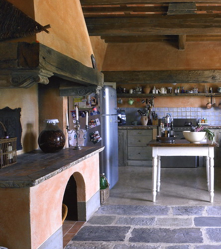
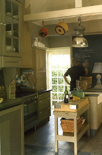
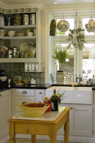
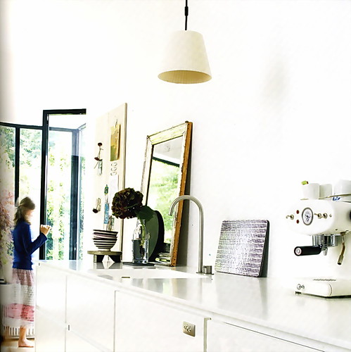
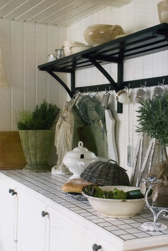
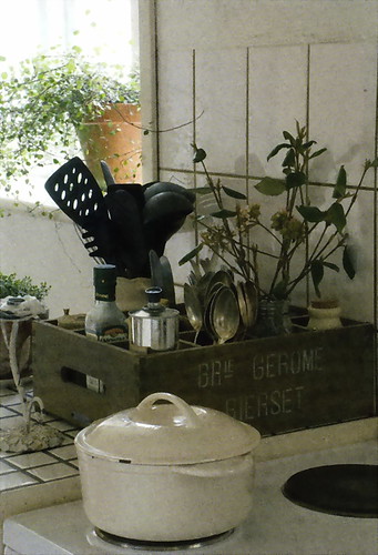
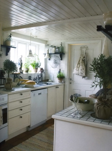
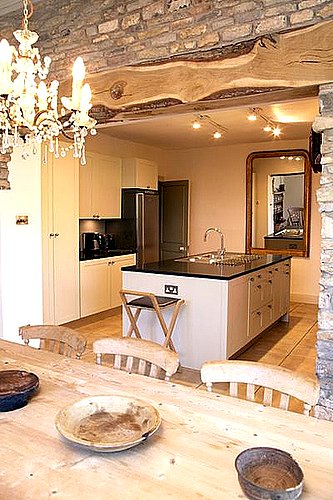
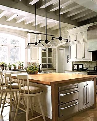
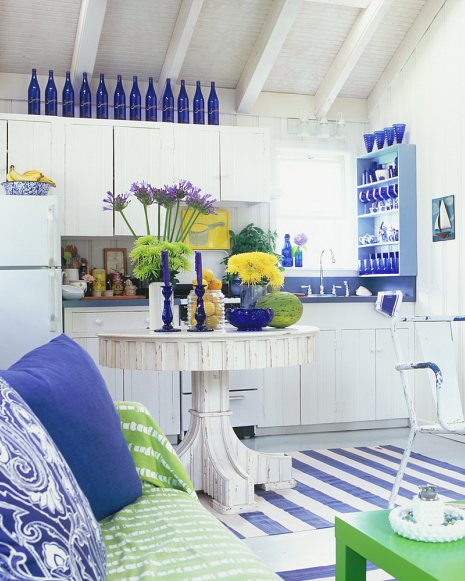
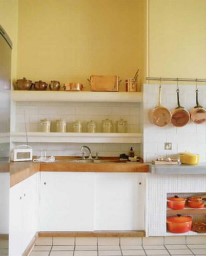
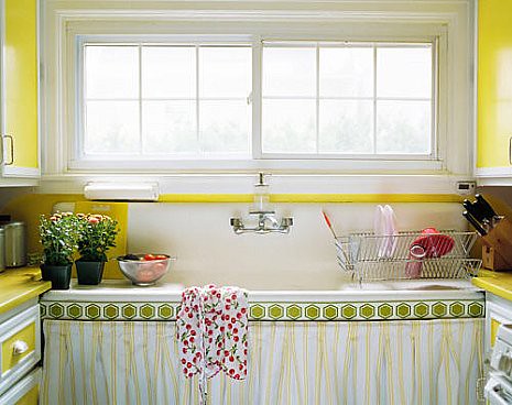
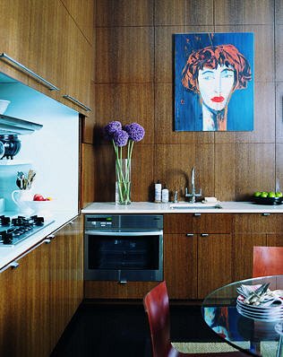
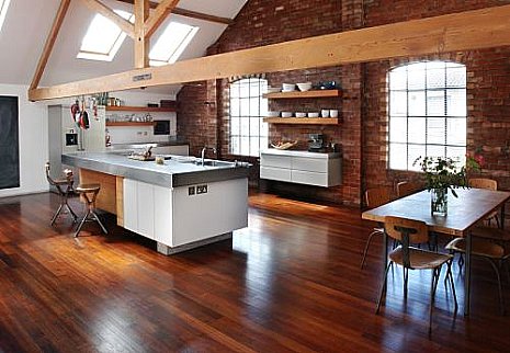
Here, then, are some randomly gorgeous kitchens...enjoy them. :) 

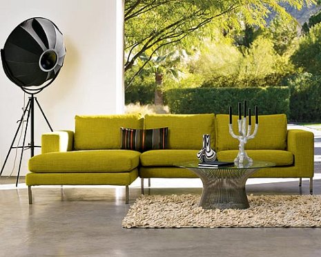
OH...the last image is the sofa we're seriously considering, really, sold on. It's shown in a sectional, but we'd have it in two 70" sections, one a right arm and one a left arm. What you can't see is the fabric is quite textured. The image and the sofa is from Design Within Reach.  

But, honestly, what about you? Are you ever conflicted as to what style you REALLY love and can commit to? 

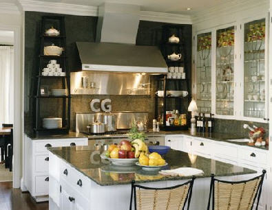
2205215652_5b9bc7e285_o.jpg 2204425477_249aca5046_o.jpg 2205215344_521a3b5ccd_o.jpg 2205215402_7305ebb9d6_o.jpg 2204425315_bcbb192c92.jpg 2204425343_b747aa8cb2_o.jpg 2204425595_16aa51b1cc_o.jpg 2204425629_ce0c804466_o.jpg 2204424821_ba3d030c2a_o.jpg

Kitchen Design Musings...II

Back to contemplating, confronting and exposing potential biases based on this post, regarding a book I was asked to review, in which my immediate reaction to its images was not favorable, having ended with the question "Am I a kitchen design snob?"

I am one who likes consensus, not to follow it blindly, but for the information value it provides. I look for consensus in my own mind, by reacting, then verifying what/how/why I'm feeling, sometimes over and over. It's sort of a "checks and balances" thing, and I'm sure many of you do the same.  Thus, the "kitchen snob" question came into mind to verify my immediate reaction, as I do in my design practice, to make sure my ideas and opinions a) are not too personal to me b) survive the "verification" process I give it c) have real merit. I torture myself! "The images are 'eh' " followed by, "Am I a kitchen snob?"

Each of us, whether professional kitchen designer, or consumer, have, and are entitled to, our opinions...but it's helpful to be open, at least preliminarily, to multiple sides of any issue.

Back to my reaction to the book. I'm a different person than who this book is directed to, and I think I forgot that, when I first opened it up and had a negative reaction to the images. I think each of these images represent dream details or dream kitchens to someone. And that's GOOD. To others, those who do not need to follow the "typical," (and there's nothing wrong with typical, seriously) it won't be satisfying. I also feel the image descriptions are too simple, without any "whys" connected to them, which could have been VERY useful. That makes me nuts, quite frankly. The whys are everything to those just starting their kitchen design journey.

But, regardless of what I or the author thinks, people will buy the book for their own personal reasons known only to them and may not even read the text at all. That's ok too. They may like a rug, or a tile, or a color, or they may read every word, keeping it nearby throughout their process. I think the book has value, but more attention to detail could have been taken in several areas. As a kitchen design professional, I'm bored by the images for the most part and disappointed by the information. Putting my consumer hat on, it has value for beginners in the process, yes. I'm choosing to be honest rather than polite, admittedly, not always easy to do, or enjoyable. I have a couple of other quibbles not necessary to note.

ANYWAY, the flip (positive) side to "am I a kitchen design snob?" is this: I'd say I'm on the right track, as long as I keep those checks and balances happening for the benefit of my clients, encouraging, yet not pushing (for too long!), allowing the client to decide what works for them, and supporting their choices in the end. This secondary reaction I had (the snob thing) is an example of the checks and balances in action..

I couldn't recommend this book for one sort of industry bias that is clearly noted in the book, and which is absolutely, positively, not a "must" for consumers looking to use a professional kitchen designer. The text in question adds confusion and influences consumers buying the book to go down a path that has no compelling merit to it.. Sorry to be a bit mysterious here.

This has been helpful for ME to put this into words, sort of a public dissection, and subsequent reaffirmation of my approach to  issues, as they arise, and what happens next. if it's aided as a nap inducement for some of you, that's good too!