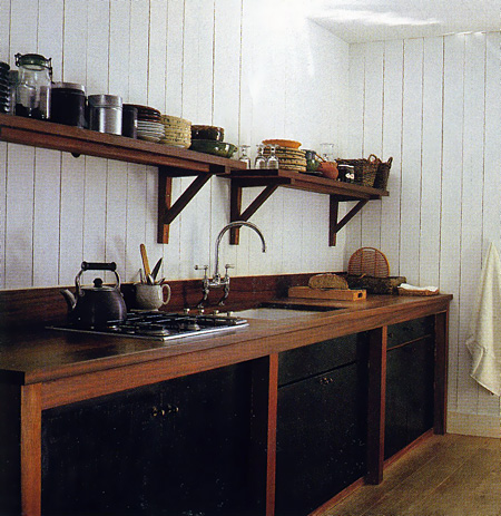
Apartment Therapy Kitchen Features

It seems that I've come across a variety of kitchen features on Apartment Therapy as well as the kitchn so I'll point out a few kitchen related links for your brief reading enjoyment.

First, on AT, take a look at this post in the New York version. Brick, a fireplace, big TV, open kitchen (I love an open kitchen.)

Here, in the LA version, is a discussion on TV's in the kitchen. (Me, I like 'em big.) This comment: "It's a great concept... especially for dysfunctional families" I would call classic AT (but then, I'm from the New York area so I like snarky!)

Not to be outdone, the San Francisco version of AT shows 10, count 'em 10, galley kitchens!

On the main AT page, here's an unusual island (I don't love it but it's interesting to see.)

More galley kitchen love on AT's DC page right here with lots of images.

In Boston, a discussion on where to put the microwave (above the fridge?)

And, the kitchn has a bunch of images on pot racks along with frequent random kitchen design features. Also, an interesting post on recession eating and cooking.

So, that's the roundup on AT's mother and sister sites (or whatever they're called.) Have fun!


Classic Kitchen Design In A NYC Apartment

Here is a treat (at least for me!) I'm not allowed to talk much about my kids (although I have SO much to talk about, trust me) so, I say very little. Much to my surprise, after a casual question to my daughter on Saturday, asking if I could shoot pictures of her kitchen (with her in it) for my blog, when we would visit later that day, she said "OK, only if you remember to bring in the candle we left behind last weekend." Yay! I made sure to remember the candle.

If I am the Queen of our family, my daughter is surely the princess (2 sons come after her) and NOW, as you may notice, we are all eagerly awaiting a BABY princess in a few months! Does life get any better?

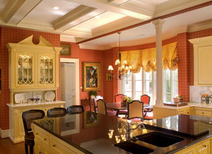
My daughter and son in law are renting a great apartment on the upper west side of Manhattan, close to Central Park. It's in a quiet residential neighborhood and the building is one of those old, grand, buildings. The entire apartment was renovated beautifully before they moved in, including the kitchen.

It was a beautiful renovation of the kitchen. Custom cabinetry, fit to perfection. Appliances include a fabulous Sub Zero refrigerator (I told my daughter she's too young to have a Sub Zero), a Miele dishwasher (likewise) and higher end GE cooking appliances.

I'm not sure what material the countertop is. Maybe some sort of soapstone, although it does not appear to be affected by food substances. The lighting is fantastic and presents a vintage design statement, as do the multiple glass cabinets. And, what about that floor!? The kitchen has the flavor of a retro but classic New York City apartment, with modern conveniences. The pull out narrow pantry is just so useful.

My daughter loves to cook. She always cooks with fresh ingredients, and the wonderful gourmet markets in the area offer culinary inspiration, so we always look forward to being invited to dinner! Last night was black bean and cheese enchiladas, fresh guac (as we call it) and yellow rice.

And, I can tell you too that, no matter the size of the space, everyone ends up in the kitchen! My husband and my son and his girlfriend spent the evening with us too. So nice!

Note to daughter: Thanks for letting me shoot the kitchen! Love you!


7 Paths To Selecting Your Kitchen Cabinet Finish

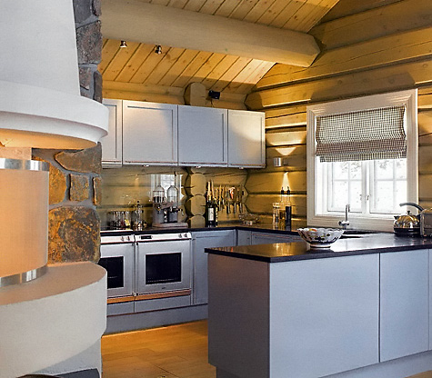
"Hi Susan: A quick question if I may- with an open log cabin kitchen, wood floors, and a wood ceiling with beams, what color cabinets would you suggest? The wood is a light color on the walls and ceiling. Thank you, Patty"

Hi Patty (hand waving!)

First, I never see ONE answer to a question like this. Instead, I prefer to drive my clients crazy with six (or more) additional questions of my own to help them get focused! The method to my madness is as follows and represents off the top of my head questions as a response to this "quick" question.

  • The wood may be light, but how much light is there in the kitchen, either via windows or lighting? Could the room use help with reflected light from a large block of (light) cabinetry?
  • What are the colors/theme in the surrounding rooms? Is there any trend of wood finishes or colors that you will be seeing that you may want to blend or coordinate with, in the kitchen?
  • Do you like contrast or do you prefer colors to be soft and flow within the space?
  • If you are interested in, say, an opaque white, are you aware that, especially if children are in the picture, your cabinetry will look worn far more quickly than if you had other colors/finishes?
  • Are you going after a certain theme? Tailored, rustic, formal, modern, transitional, zen, other? That could give you a clue. Do you want to contrast the rustic framework of your log cabin with another theme to create an eclectic look? Perfectly acceptable. Note your other furnishings as a guide.
  • Could you be open to alternative colors that you normally do not see such as a soft khaki, an oyster grey, grey/blue, a light mushroom color, sort of a cool/warm soft contrast? Speaking of cool/warm, be aware of this color differentiation in the context of the overall color scheme as well as what's happening beyond the kitchen. 
  • You also may want to consider what finishes you want your countertops and appliances to be. These choices will also send a message about the total look of the kitchen. Likewise, the backsplash to a lesser extent.
  • What size is the room? Color/finish of cabinetry plays a role in space perception along with my first item to consider, above, lighting. I feel if the room is small but very well lit (very) perhaps with a light countertop and walls, then dark tones in the cabinetry are fine to use. Of course, a mix of light shades in a small room will allow the space to flow and not appear choppy/busy, something to seriously consider in a small space (choppy/busy).

So, unfortunately, I have no answer for you, only additional questions which should definitely put you on the path to focus and insight! Only you know these answers and it should take a little time to consider the various issues involved in selecting just ONE finish. No pressure or anything! I just can't make the decision for you.


Is a Kitchen Design Trend Always A Trend?

I received an email from Jenney and this is what she is asking:

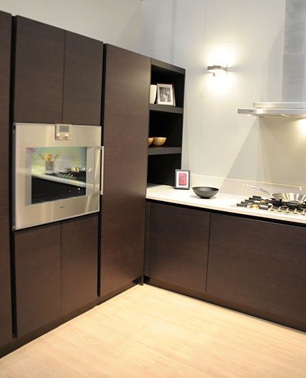
"I am buying a new house. I am planning to have the kitchen counter in white and cabinets in dark brown, but I am afraid the trend will go out of style. what do you think? what is the most classic color for the kitchen?"

What strikes me is that you are calling it a trend. I don't see white countertops and dark brown cabinetry as a trend, at least not a strong trend, possibly a mini trend. But, more importantly, I feel this combination of colors can be considered classic.

The finishes you are talking about are neutrals, even the dark brown. It is a natural finish for cabinetry, and if the rest of the kitchen is designed and decorated in a classic way, as opposed to integrating all the latest design ideas from magazines, catalogs and web home design sites, then you're safe. You needn't worry about your kitchen being pigeon-holed as a trend.

As far as what is the most classic color, of course, white is classic. Most brown wood stains in the medium to dark tones are classic, and some medium to light tones in wood stains. Remember the pickled maple light stains in the 80s and 90s? They were a strong trend, very strong. But, I see that having been a trend partially because those pickled maple/oak colors were an unnatural color for the wood. If these are the colors you like, take note of the above advice, and I'd say, go for it!

Comments?

TRENDY:

MODERN CLASSIC:


5 Ways To Plan For Adequate Kitchen Dining Space

Take a look at the plans below. This home is a fairly large home for 2 people, no kids. The kitchen is a large kitchen. Notice the first plan with handwritten comments (mine) which is how it came to me. Some time later, the second plan is what we came up with. I have some objections to that plan as well, as I had to defer to the clients' wishes, of course, but I was able to substantially enlarge the dining area and if you look at the lower wall of each plan, you'll see where some changes were made based on my suggestions. Not perfect, but much better. It's a shocking example of how, if overlooked and accepted, this large kitchen would have had seating for 2.
Read more

Simple Kitchens

All right, all right, I admit it. If you've been following me on Twitter, I will admit to being just slightly obsessed with it. I think I'm over my initial obsession, but I do think that it is the perfect supplement to this blog! The problem, as with everything, is balance! But, throwing out those random thoughts and pieces of information on Twitter works hand in glove with the more expansive blog posts that I do. So, for expanded discussions, obviously, this is the place, right here. For random musings and piecemeal information, follow me on Twitter!

Today on Twitter, I'm compelled to share my thoughts on social kitchen design tips, so here is the search page for those tips.


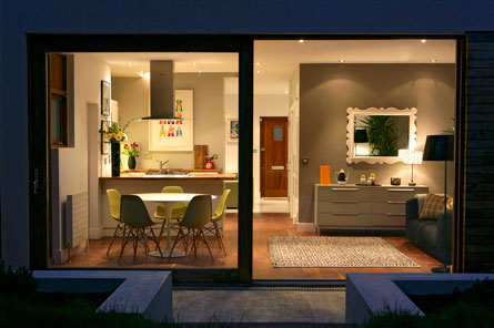
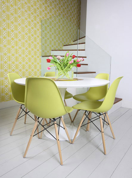
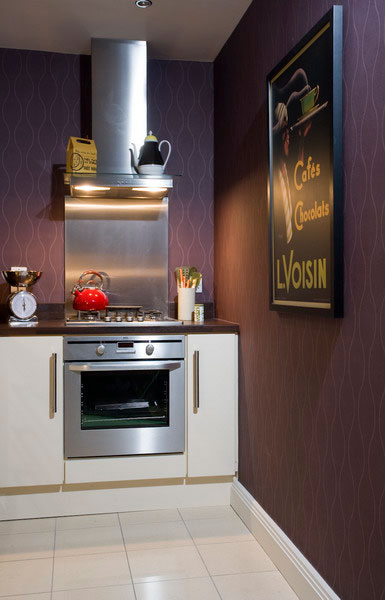
I was contacted by a designer, Danielle Mac Innes, from Ireland, who asked me if I'd like to see her work. Of course, I'd love to see what's happening in Ireland! Following are just a few images, but I think they are interesting. I like the restraint used. The look is simple but with a great, and simple, use of color. Diane's company is Fuse Interiors.

TWITTER Changes Everything!

I spent much of this past weekend familiarizing myself with Twitter. I had not previously taken the time to take a good look at it, really, on any level. Most of all, I spent time thinking about Twitter and what I could do with it that would be of value to myself and others.

As a result, I'm beginning this week VERY excited about Twitter! SO often I have had a single thought, come across a single piece of information, have a single photo, all of which may NOT be a whole big blog post or, that I simply don't have the time to MAKE into a blog post.

I can now share those fragments of information on all things kitchen related on Twitter! It is the perfect supplement to this blog!

There is SO much design related information I come across that I find interesting, and I hope you'll follow my product finds, my thoughts, musings, images, and whatever else I feel compelled to share with you.

I'm still tweaking my page, so you'll see things change around a little bit, but I already know, this is something I definitely want to use.

Follow me!


Fashion Week Connection To Kitchen Design '09

It's the end of Fashion Week here in New York, and I thought it would be interesting to get a round up of impressions of what's happening in fashion, as, after all, our homes are also influenced by fashion and trends (including current events.)

To put it bluntly, it appears that the carnage in the various financial sectors have brought forth a sort of "bread and butter" reaction from many fashion houses. Toned down, serious, back to basics, UN-wild is what's new. No lack of creativity, but a return to a designer's original aesthetic, and building on those strengths may be what's new for this season. And, that makes some sense. Less risky, and all that.

Nothing wrong with having a safe haven, and being surrounded by trusted friends, right?


As in kitchens for 09, new (post September 2008) thoughts on kitchen design also include a back to basics point of view, back to well designed kitchens, a focus on function, with the home taking on increased importance now more than ever...the ultimate safe haven.

I'll go into much more detail shortly (next couple of days) on where we are in kitchen design in these strange times of '09. Stay tuned.

It's not a fall, it's a correction....right? ;)

Swedish Rag Rugs For The Kitchen

You know what is a great accessory in the kitchen? A rug! Change it when you're bored, change it by the season, by the trends, or don't change it at all - keep it as a faithful companion (well, almost.) I really like to bring in some sort of softness into the kitchen if possible, something of comfort preferably. With so many hard surfaces in a kitchen, something soft, even one item, can impart a relaxed feeling.

I'm focusing today on Swedish style rag rugs because it's my guess that you may not be aware of this distinctive type of rug. It is a style I happen to love, one that will not be found in Pottery Barn, Crate & Barrel or Room and Board. For that reason alone, I really want to share these with you.

Most of the Swedish rag rugs you will find are vintage rugs, although some are new, depends on the source. I have 3 and I'm almost afraid that next time I go to some antique shops in Denmark, I'm going to collect a few more (with me, sometimes a collection turns into an obsession!) I had one at the outside entrance to my office and it had been in place for over 10 years with an occasional washing. They wear like iron! Of course, you can also find many beauties at our web shop: Scandinavian Made

Now, in my new home, maybe tomorrow, I'll find the rugs I own amongst the remaining boxes of our belongings and will put one in the kitchen and place the other two elsewhere in the house. The prices are very reasonable, considering they have a wonderful vintage look and are in great shape. I guess I like them because of the texture.I like them better than the typical American rag rugs.

Pairing one of these rugs with a collection of sleek surfaces and another few textural objects would make a strong design statement for a modern point of view. Very cool....especially if you can find one in this year's trendy yellow! However you want to express your style, there is a rug design for you.

What do you think? Do you like them?

Happy rug hunting!


New Green Kitchen Products

Here are a few more new items I'd like to share with you.

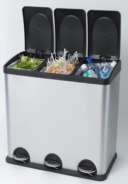
Here's a smart looking multi bin recycling unit called the Smart Bin. Available with two or three compartments, the Smart Bin allows homeowners to cleanly and effectively separate their organic, recycling, and waste in an attractive stainless steel push-pedal bin. Made of post-consumer plastics, the Smart Bin makes the task of sorting and recycling a snap. With removable inside containers, this sturdy and attractive bin is a welcome addition to any kitchen, bathroom, or office.

It's good to be organized!


Take a look at what's new at Kichler.

For use inside or below a cabinet or in a variety of other areas, these energy-efficient fixtures use 75 percent less electricity than typical incandescent lighting. Plus, they’re so thin they’re nearly invisible -- just 3/8” thick. In addition, the Design Pro LED discs offer a warm white color rendering and a lifespan of 20 years. A variety of finishes are available to blend into any surrounding.

The new Design Pro Discs can be used individually or in combination with Kichler’s Design Pro LED under cabinet fixtures, which offer the same great energy-saving features and color rendering, to create a seamless flow of light under multiple cabinets and furnishings.

Both products have been awarded the prestigious Lighting for Tomorrow Award, the industry’s highest honor for energy-efficient lighting solutions. Plus, they are ENERGY STAR rated, a distinction given by the Environmental Protection Agency and the Department of Energy for energy efficient solutions, when used with most power supplies.

Perf Go Green produces Biodegradable Plastic Products that are eco-friendly, non-toxic and food contact compliant. These bags are seen as a practical and necessary solution to the problem of plastic waste around the world.

In 2008 Perf Go Green is launching six Biodegradable Plastic Products including the following:

Perf Go Green 13 Gallon Tall Kitchen Trash Bags
Perf Go Green 30 Gallon Lawn & Leaf Bags
Perf Go Green Plastic Drop Cloths
Perf Go Green Commercial Trash Bags
Perf Go Green Kitty Litter Bags
Perf Go Green Doggie Duty Bags

Perf Go Green products are produced using recycled plastic which reduces plastic in landfills. The recycled plastics are then combined with an oxo-biodegradable proprietary application method to produce the film for the bags. This product, when discarded in soil in the presence of microorganisms, moisture and oxygen, biodegrades, decomposing into simple materials found in nature.

Perf Go Green Bags will completely break down in a landfill environment within 2 years leaving no residue or harmful toxins and have a shelf life of 2 years.

White River Achieves Chain of Custody Certification - Very Impressive!

White River announced its achievement of the Forest Stewardship Council's (FSC) Chain of Custody Certification. For the past 18 months, White River™ has been researching the optimal plan for purchasing lumber from certified, well-managed forests for its local manufacture of hardwood mouldings. The FSC Chain of Custody Certification is granted by Scientific Certification Systems (SCS), an independent third party, which is accredited by the FSC. This internationally recognized certification verifies that lumber from certified forests is identified, marked, and recognized as it passes thru a "chain of custodians" or "handlers" from the forest to the consumer. This applies to products manufactured at its Arkansas manufacturing facility.

Good work! I've used and admired White River for many years.

New Kitchen Products

Let's look at a collection of products, some new, some not new, but new to you. Get it? I'm confused.

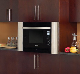
Take a look at Sharp's SuperSteam oven, model AX-1200, a multi-purpose oven that enables healthier meal preparation. Using SuperSteam convection technology, the AX-1200 cooks a wide variety of foods without the addition of oils, fats or sauces while preserving taste and appearance. It also features three other cooking methods – convection, conventional steam, and microwave – all in a single appliance.

I LIKE that idea of combining convection with steam and microwave cooking. Convection mode means that you can heat up that slice of pizza (you know you eat it even though you want the steamer) without heating up the big oven, or worse, using the microwave. OR, those extra oven foods when the big oven is full.

Note the rounded stainless ends. This is a built in kit that is optional. The oven can be used without the built in kit, to simply sit on the counter. Read this.

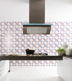
Here is "wallpaper" that is actually recycled glass tile. By Trend, the Wallpaper collection offers a multitude of diverse styles from richly elegant and serene to playful and funky. The collection starts at $23 a square foot. Depending on the pattern, the mosaic tile is saturated with reflective color, recycled from post consumer glass, veined with aventurine stone, shimmering with iridescence, or hand made 24 k colored gold from Orsoni, a 19th century Venetian foundry. The individual tiles are either 3/4" or 5/8" square and assembled into modules that allow seamless repetition of the design.

A 10x10 wall, at their lowest price tile, will cost $2,300. In my world, if money was not an object, yes, I'd consider this product. I think the look is worth the cost. It makes a strong design statement. I like that. This was the only kitchen image they had on their site, but they have lots of very wonderful motifs.

Now a word from our sponsor...yeah, they should be my sponsor! Humor me please. When this commercial comes on, I stop everything and watch it. I LOVE IT! I've seen it a million times and it just came on again. Have you seen it? You have to watch it a few times to get all the perfect nuances of it. What can I say? I just need to share this. :)

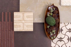
Let's look at even more tile just to give you more difficult choices! I have a conflict with choices. I believe in choices, but they quickly get confusing, don't they? This, from Mandala Tile:

"Many of Mandala Tile's colors (sister company to Oceanside Glasstile) contain recycled material. The combination of materials spawns vivid surfaces, making it dance in front of your very own eyes. The earthy colors merge in intriguing patterns highlighting the beautiful combination of glass and stone. 'Avani provides movement and depth to design projects and the color palette complements a wide range of settings, offering limitless possibilities for creating a masterpiece,' noted Feras Irikat, Design Director.

It is available in 10 mosaic blends and three patterns – Herringbone, Random Matrix, and Ministicks. Each piece is precision cut to provide a smooth, continuous field."

I have more to show you, which I'll do tomorrow. I'm freezing and I'm sick (and I think I'm freezing because I'm sick) so I'll leave it here. See you then!


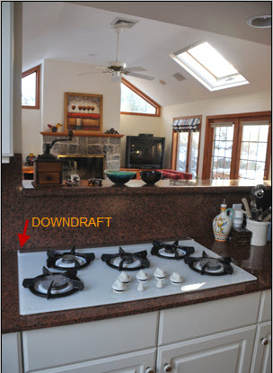
Downdraft Distress!

I've been meaning to talk about the downdraft behind the cooktop, positioned in a peninsula which separates the living area beyond. The higher than normal ledge behind the cooktop and downdraft serves somewhat of a purpose, if only to disguise the carnage in the kitchen.  

But, my real message today, is that, in my VERY experienced opinion, downdrafts suck, but not in the, um, physical way of drawing in moisture, fumes, odors and various other solid particulates produced by cooking, whether cooking in a heavy OR light manner. I forgot about the downdraft in a kitchen I owned many years ago, before I became a kitchen designer. At the time, I worked WITH a kitchen designer, who, as I remember clearly, never had the conversation with me about downdrafts vs. updraft hoods. What can I say? I was young and naive as well. And the range was against a wall, which should be a no brainer for a conventional hood and conventional advice! I remember, then, the trick of tilting pot and pan lids so that the fumes would move toward the downdraft far more effectively than just turning on the downdraft, even on high.

So, fast forward to my new home and my new (old) downdraft. Let me just simply say this. I would never, and do never, recommend a downdraft as being equal in performance to a range hood. There is, in my opinion, an enormous difference in performance. Of course, yes, much depends on the conventional hood's specs and proximity to the cooktop, but, when a hood is designed properly, the performance comparision between a downdraft and a hood against a wall is night and day in favor of the hood.

I can tell you first hand, the visible fumes and light smoke, even when the downdraft is on high, do not reach the downdraft. Well, maybe some fumes do, but my guess is over half of the cooking extracts do NOT get removed. What happens instead is that much of the fumes move into surrounding areas of the kitchen, or in my case, perhaps the great room beyond, settling into one's hard and soft furnishings.

Rather than making this post full of statistics and design specifications, I'm making it anecdotal (with a professional's knowledge of course!) If you have a choice, don't use a downdraft if you can avoid it. Mine is a high end cooktop/downdraft. The brand doesn't matter, because they all perform the same way. And yes, my downdraft rises about 7" above the countertop surface. Doesn't matter.

Very simply....try to choose a hood against the wall rather than a downdraft situated anywhere. A hood above an island or peninsula as opposed to a downdraft? That does not make much of a difference, as surrounding air currents interfere with the cooking extracts on their way up toward the hood. Either way, in this scenario, you're scr.....d. :( If you:

a. want the toxins out of your home as quickly as possible

b. want the odors out, as opposed to lingering odors

c. want the smoke and moisture out

d. do not want residue on your hard and soft surfaces

then, you will feel like this, I guarantee it!     :)

Cool Scandinavian Kitchens

You all know I'm good for Scandinavian kitchens! I haven't kept up the pace on my (yes, beloved) blog as much as I should have in recent months due to several reasons, but that aside, despite the ongoing miserable economic conditions in our country as well as locally, I'm feeling hopeful and ready for a fresh start. As an optimist, which I consider myself to be, that's my job!!

I think part of feeling ready for a fresh start is the office I'm putting together. I'm thrilled with my new home office, and it's only this past week that it's been set up, really, since Sunday, and we moved December 29! Since moving in, I've only had my computer on a table, and have been very patient as we've spent these past weeks organizing the rest of the house, which we continue to do. We still have about 25 boxes to unpack, probably, out of nearly 200. But, with new countertops in the office since last Sunday, adding artwork (lots of artwork), a Stanley Steemer carpet cleaning, office supplies (it's all about the height of each inbox!) organized, I'm feeling great, and ready to go!
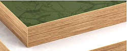
During this time, I HAVE collected a good number of Scandinavian magazines from visiting Danish relatives and from subscriptions of Scandinavian magazines. And, I just spent $300 on new subscriptions for Scandinavian magazines today (good thing the husband doesn't read this blog!) Want to see some?? I really want to share these kitchens with you, which are not so easily available to see and study otherwise (quiz on Monday.) ;) Sure, more varied content will come, but having just organized my Scandinavian magazines for the first time (ever!) I may be on a roll with fresh images in the coming days and weeks.

I think, unlike typically, I'll throw in some comments. Please feel free to comment too. I'd love to know others' perspectives on these kitchens. Images from Rum, Bolig and Bo Bedre.


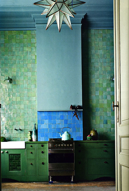
Wow, this one, below, is pretty amazing. I love analogous color schemes. Perhaps the upper section of the hood projects forward to capture the cooktop fumes, I hope so. Would like to visit, but wouldn't want to live there.
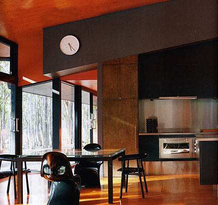
I love this, below. To me, a perfect juxtaposition of cool/warm, texture/smooth. I could happily cook in this kitchen, being among nature and steel...an exciting combination! Bright, textured orange against what looks like flat medium brown? I'm there! The clock? I'd want it larger.
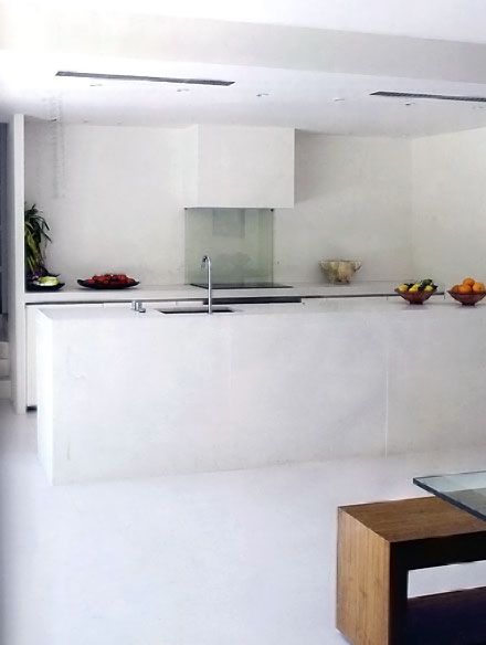
Below, ok, it's bright, but to me, depressing. I'm surprised at my reaction. Tooooo simple/bleh to feel serene (for me.) As an example of minimalist modern kitchen design, it's fantastic. But, I think I may have elongated the hood above on each side to maximize the design concept.
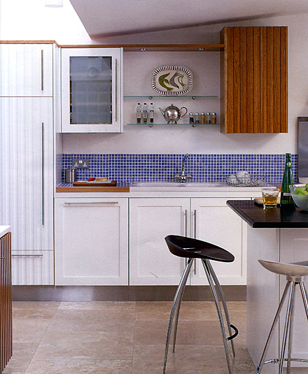
Below, sure it's IKEA-like in its feel, but I love the unexpected introduction of the ribbed white and wood cabinets, the halfway up mosaic tile, which clearly sets apart the cabinetry/shelving above as its own element, and the boldness to position the wood wall cabinet close to the angle of the ceiling, creating an exciting design feature.
Below, no, I'm not on board with this. I see an element of fun. I get the surprise of the ornate brass lamp, but all I really see is a mishmosh!

Below, yeah, I can go down this road, definitely! Another semi-analogous color scheme.

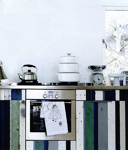
Below, very Scandinavian. Give me a little opportunity for artwork or a sculpture within the space, and I'm good! Definitely has that Hansen feel that is so wonderful.
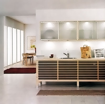
I have more! What do you think? What's your favorite?

A Snow Day In The Kitchen

The snow has been coming down for hours. My husband is home for the next four weeks due to a work furlough, so he's sort of getting to know our new home by doing a variety of things, including working in the kitchen. We LOVE this house. We say that to each other every day. We can't remember feeling this way about our other homes. I have no idea why, but we feel extra special about this house. It's not perfect, but some of the features it has are wonderful.

Back to the snow! There's something SO cozy about cooking comfort food on a snowy day, I love it! Early this morning, I prepared this meal for dinner. I really enjoy cooking in a kitchen that is part of a great room. I would design the kitchen in a different way, for sure. However, being part of a great room makes me, the cook, feel, I don't know, more valued(?) because it's "ok" to be seen and heard while cooking, among the company of others just beyond the 1/2 wall, as opposed to being not seen and not heard? Is that ridiculous? I'm not even sure it's accurate, but, in some sense, it elevates the cook to, perhaps, an equal status in some way. Yeah, maybe that's it. Or, the opposite....sort of, "like it or not, I'm here, I'm cooking, deal with it!" I haven't cooked this much in years, I'm cooking all the time!

Whatever, it's a nice thing to be surrounded by beautiful furnishings, a relaxing environment, things I love, and to not feel isolated. I love that feeling. The feel of the kitchen design, however, is much too kitcheny for me. It shouldn't be a white kitchen, it should be a wood stain of some sort. I do want to make it more furniture/living room like, and I will do that. I think the entire room will flow even better. What about you...anyone have a kitchen as part of a great room or want one? Or, would hate the thought of it?
Goodbye Home Expo

I couldn't believe my eyes when I glanced at the big orange Home Depot logo on my newsletter sent from upscale Interior Design magazine. Right there in black and white it stated that Home Depot is closing all of their Home Expo stores, along with other cuts within the corporation. It went on to say that even in the boom times, Home Expo stores underperformed. 

First let me express my sadness at the loss of 5,000 jobs. It comes at the worst time imaginable, with fewer job prospects out there. I'm sure it will be a difficult time for many. 

You know what? I was going to put down some thoughts (not necessarily all positive) about Home Expo, but, given the sentence I just wrote, above, I'll just keep it as news and will spare you and myself more than that. Not a good idea to do otherwise.  I'm sorry for those losses. They just keep coming, don't they?

Moving From a Big to a Small Kitchen

We've lived in our new (not newly built) home 2 weeks now. Two weeks of moving around boxes and clearing them out little by little. I would imagine that we have about 50 boxes left, maybe less. Plus, we still need to relocate some furniture into other rooms, and way too much stuff to put away, including clothing, as the boxes are unpacked. But, we LOVE the house and the location we're at. We could not be happier with those decisions.

My husband called me a hoarder last night, as he was moving boxes around. He doesn't know what he's talking about. 

We're adjusting quite well to moving from 4000 square feet of living space (not including unfinished basement/garage)  and being in that space for a LONG time, to approximately 1600 square feet of living space (same exclusions). The previous kitchen/eating area was 440 square feet, and the eating area was within the work space. The new kitchen is less than half that size, including the separate but adjacent, eating area. The work area, alone, is probably 120 square feet.

So far so good. I've had near zero anxiety about moving into a smaller kitchen. In fact, something very strange has been happening. I've been cooking every night since we moved in, except for one night. In the old house, we did far more take-out than cooking, and my husband and I shared cooking, together or separately, when we cooked. I USED to cook a LOT in years past, but, somehow that changed. Last night, I actually got in my car at 6 pm to seek out 3 ingredients and went to 3 stores until I found them! I'd NEVER do that before, at that hour of the day on a weeknight in the cold winter! I'm very much amused at this development and am just shrugging my shoulders and smiling. And this town we're in has FAR above average take-out opportunities too, in fact, it's a restaurant town!

Maybe I'm nesting?

Here's what I like about a smaller kitchen and this one in particular:

  • it's efficient - "Efficient" is an important word. Being efficient saves steps, saves time, saves energy. Efficiency is a good thing overall
  • it's good looking - It probably helps that the kitchen is good looking in general, although it definitely needs to be redone as finishes are wearing
  • it has decent appliances - high end for their time. I believe the whole kitchen is 18 years old.
  • it's efficient - in terms of the cooking and cleaning processes, specifically
  • it's small, yet wide open to the living area beyond - the cook is part of the social scene, yet the mess is completely concealed 
  • it's small, yet wide open to the living area beyond - when alone in the kitchen, it's also lovely to be in a multi functional environment.
  • the architecture - there are vaulted ceilings, light painted walls and lots of windows, significantly enlarging the feeling of the space. This is huge, and I cannot overstate the importance of these features.
  • tv and fireplace - for me, that's really heaven, to have both of these in view, while cooking.
  • Bottom line - I LOVE the efficiency!

All is not perfect in Pleasantville, however! I do have storage issues. Which immediately brought back one of the questions that I've asked my clients over the years..."Do you store kitchen items elsewhere in the house that you'd like to move into the new kitchen?" I think I'll be storing some lesser used items outside of the kitchen. Because we are in a split level home, the stairs are about 6 steps each to 3 levels, so it's one short staircase to the next lower level, which is my office area, above the basement, below the main floor. Maybe I'll design some concealed kitchen storage on this level, 6 steps down from the kitchen. That will work and would be the equivalent steps as if my kitchen were large, so I think it's important not to think of removed storage as an unfortunate solution. Whatever works for the owner, that's the right answer.

We moved by choice to a smaller home, so maybe that's part of the relative ease of adjusting. I'm also pretty much a positive person, so my focus seems to be on what's good rather than what isn't. And, I really enjoy looking at and finding alternative solutions to challenges, so it's all good. BUT...is relocated storage now forgotten storage later? I'll find out.

And, with the kids grown, we've become a family of multiple cooks when we get together, so how will that work? Did I make a mistake getting this size kitchen? A big mistake? Granted, this kitchen is not as small as many, but it's a LOT smaller than the one I came from!

But, kitchen design is what I do for a living. I've asked myself, why didn't I look for a home with the biggest kitchen possible in our price range? I could have found a bigger kitchen. I'm going to talk about that soon, what was and was not in "the big picture" of our house search.

How about you? What size kitchen do you have and how do you feel about it? Here are some shots I took the day of the house inspection in mid November. There is another room on the other side of the kitchen, a good sized living room. More about that soon!


New Year New Kitchen

Happy New Year! May 2009 bring us all a new year that is a healthy one, happy, and just enough stress to make life interesting.

Part of the reason that I have been MIA is because three days ago, I (and my husband and son who still lives with us) moved from our home of nearly 20 years to a town just 2 towns away, and just yesterday, we closed on this home (we moved in 2 days prior to closing.) We closed on the house we had owned the day before that. I had not said a word on the blog due to mild superstious reasons! I didn't want to jinx anything. I hear of so many real estate deals not going through, and up until the day of closing, really, anything could have happened. During this time, we had multiple building permit issues, things we had done over the course of 20 years, and that took a LOT of time to sort through, get inspected, etc. etc.

Moving is absolutely brutal, unforgiving, physically strenuous and overall stinks. I'm referring to the act of moving. When you move from a home with 20 years of accumulation, it just never ends! And when you move from a large home with all that stuff AND move into a home of close to half the size, you just hope there will be paths around the boxes. Every room was FILLED with boxes, it was pretty scary.

In short, we have too much stuff. Anyone want some stuff??

When you factor in a person who's run a business in the home for all that time, with tons of samples and tons of files, who has mild packrat tendancies and who LOVES to collect art and artifacts, it's mind boggling!

But, that said, this was a move to downsize to a smaller home. I had been inspired, in recent years, by my family in Denmark, most of whom live in small spaces, so, with kids mostly gone, this was a good time to shed the burden of the "big house" and make a change.

I'm 2 days into this house and we are SO happy! The kitchen is efficient (more on that soon). We don't have to walk endlessly within the house to get something, find someone, etc. You don't have to shout across long distances. This house happens to have fantastic light to the point where I don't think we'll have to put on lights until dark. That's a good thing too.

Moving is stressful, bigtime. It WAS brutal. But, I know we made the right choice to move toward a simpler lifestyle.

I have wall cabinets in my kitchen. I know now that I hate them! I didn't have wall cabinets in my old kitchen. More on that soon. I also didn't have a true "great room" kitchen like the ones I've been designing for years. I'll give you my impressions on that too.

In the meantime, another Happy New Year!

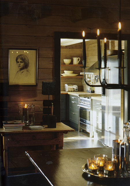
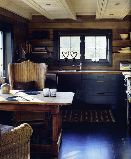
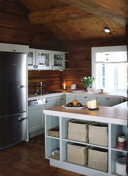
Cozy Scandinavian Kitchens

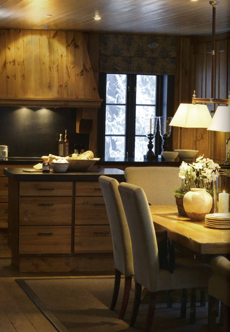
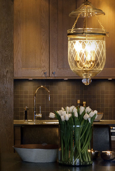
What can I tell you? I can't resist even MORE Scandinavian kitchens! I was cleaning up my desk (I probably have 100 magazines in my office) and this one recent magazine had such great images in it. They're cozy, they're woody, if not in the cabinetry, then in the surrounding walls. 

I decided to show the last image of the oak door because oak is still quite unpopular in the U.S. But, look at that finish. It's new, fresh, and very sophisticated. This is not the "golden oak" finish that we once knew. From Interior Magasinet from Norway. 

More Scandinavian Kitchens

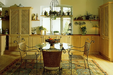
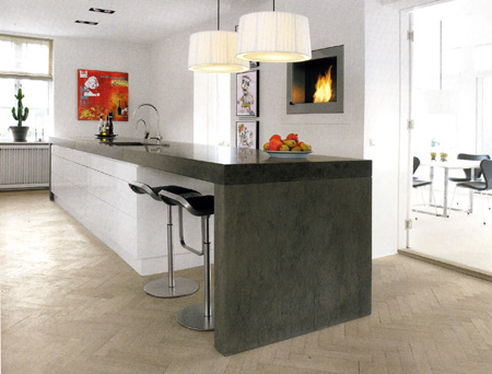
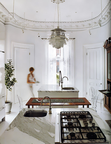
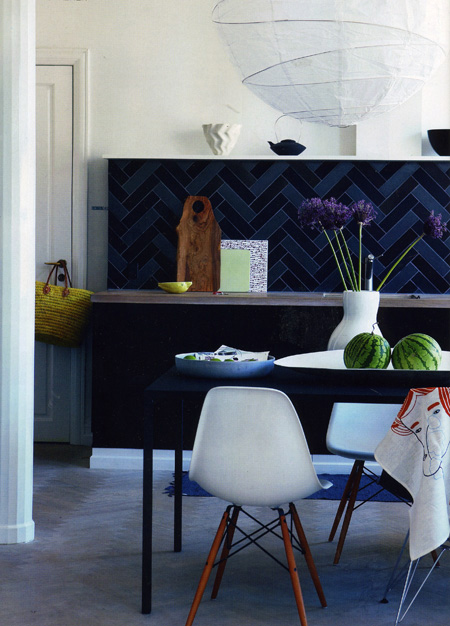
Here are some more...I haven't put someup in awhile, I'm definitely overdue. Me, I can never get enough. The look varies, but the common thread is usually "eclectic" and "modern".

Is there such a thing as a modern eclectic? That's a GOOD question! Sure, why not? If the news says the blue and red states are leaning toward one or the other candidate, I think I can say a Scandinavian kitchen often leans toward a modern eclectic look. Sounds good to me! These are from Metropolitan Home, Bo Bedre, and Bolig.

Which one do you like best?