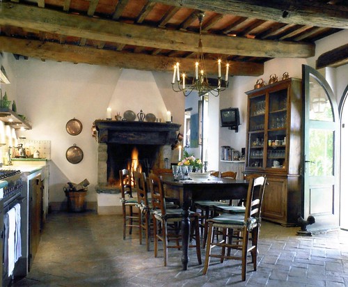
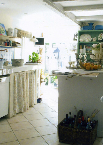
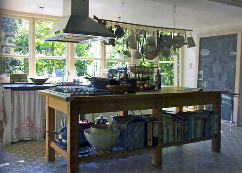
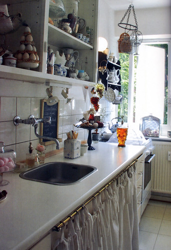
Cool Scandinavian Kitchens

I've been busy blogging for HomeGoods, that's where I've been! Today is the last day of that assignment. They have very good bloggers there, with endless great tips, and it was fun to be part of it. So, here we go again...!

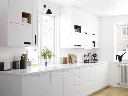
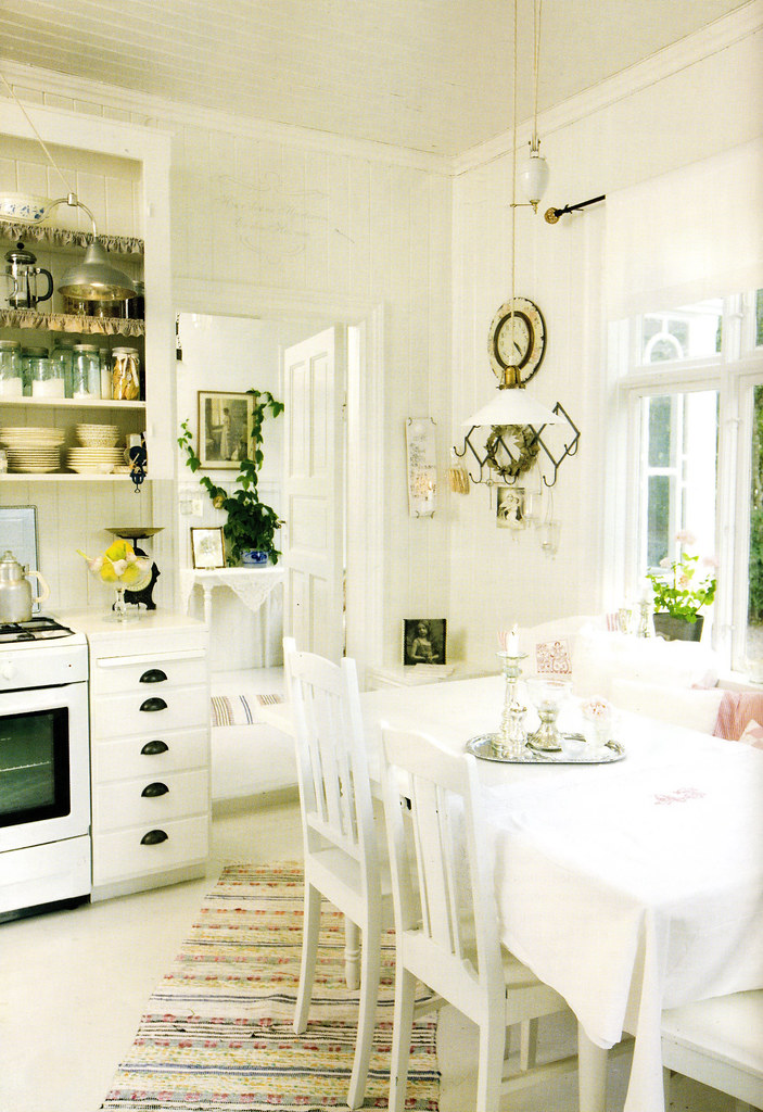
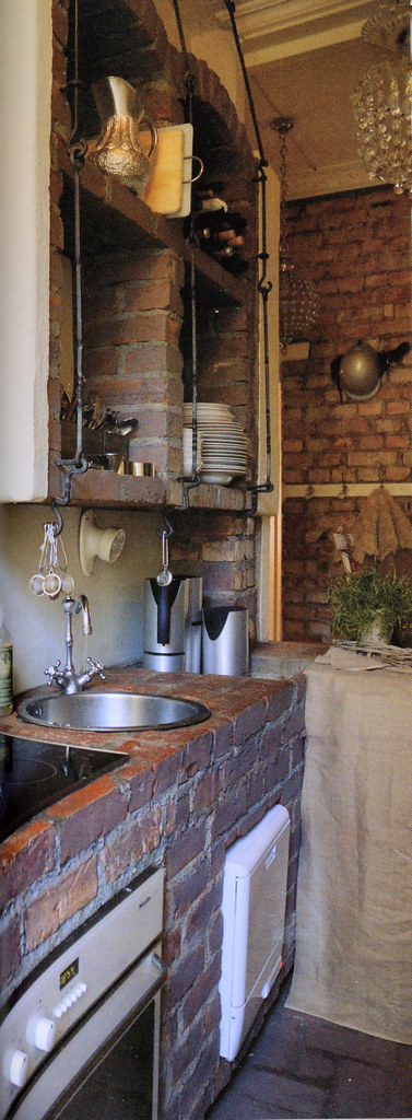
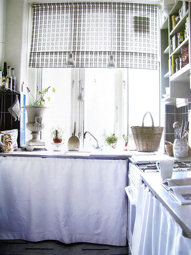
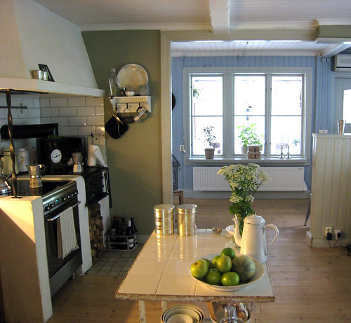
YOU know where to go when you want to see some real, honest, Scandinavian kitchens, right? Right here! Well, I have a treat for you. Peder and Lotte, family members from Denmark, are here visiting for 2 weeks. They had strict instructions to BRING ME MAGAZINES, AS MANY AS YOU CAN CARRY! Of course, with those strict instructions, I end up getting only about 4, but that's ok, I'll take them!!

Without further ado, let's take a look...oh, before I go, I've spent a bit of time, just a bit, in our apartment in the city in the past few weeks. When there, I always get lots of awesome magazines, so I think we're going to be looking at some very hot kitchens in the weeks ahead, so check back. Good?

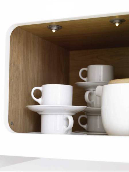
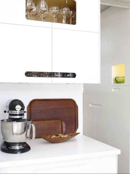
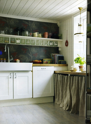
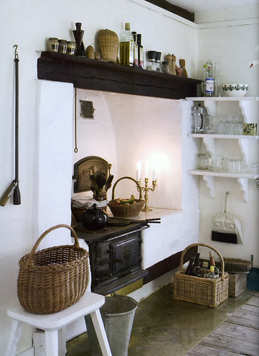
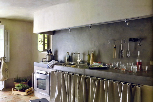
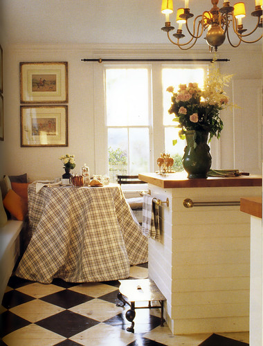
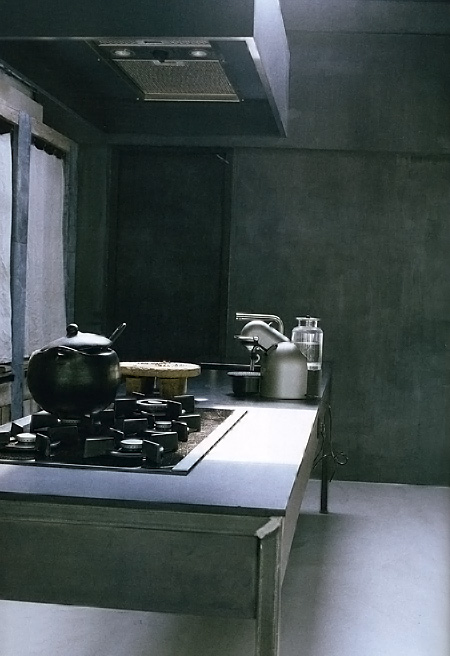
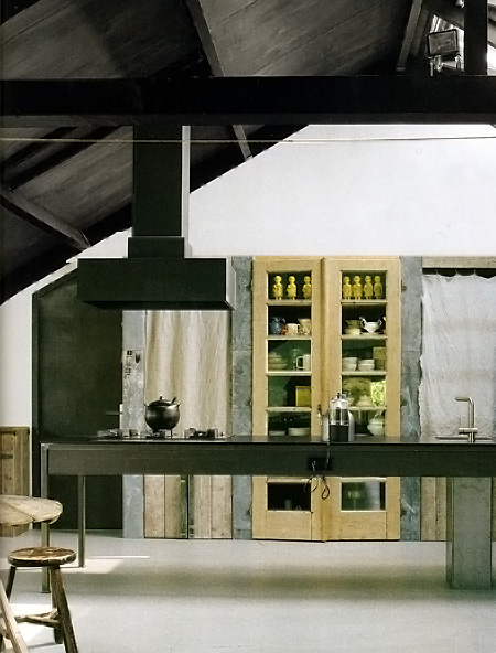
I'll start with the cooooool Scandinavian ones...hope you're all well! Tell me what you like. Bottom 2 images from DesignLiv Middle two images from Bo Bedre, and  top two images from RUM Interior Design. 


Small Kitchen Storage Tips

I'm thinking today about small kitchens as we're in the city for the weekend, in our little piece of New York City! I'm also thinking about small kitchens since my daughter is moving to another apartment and is absolutely wild about her new kitchen, also in New York. I can't wait to share that kitchen with you, but that will not be for another month, when they move, assuming the deal goes through, you never know, fingers crossed.

So, as I sit in the living area and look toward the kitchen, it appears to me that it's actually a very good sized kitchen for most any cook. When I'm here, I feel, what more does one need?

When I think of what I REALLY use in my good-sized kitchen on Long Island with the important disclaimer that I am probably an average cook, average being defined as a GOOD cook (of course!) and one who enjoys cooking, but perhaps not one who cooks with abandon on a frequent basis, needing a batterie de cuisine at my disposal at any given moment, it is helpful to get perspective on what one THINKS one needs, which may be different than every-day habits. That was a run-on sentence if I've ever seen one....yeeesh!

Point being...some back to basics thoughts for small kitchen storage planning:

1. Be honest with yourself...what do you really need, what will you really use in regard to cooking equipment?

2. If you want the bread maker and the rice cooker, can they be stored elsewhere in the apartment/home if there is no room in the immediate kitchen area? I don't want you to do without it, but consider alternative storage places...like under the bed or in a closet if you need to.

3. Counter space rules in a small kitchen. It sounds obvious but bears repeating: Put as much away or on shelves as possible to keep your countertops clear. I think all of us are surprised at how quickly we get used to items accumulating on our countertops.

4. If possible, put the paper towel holder on the sink cabinet door as well as a basket for the liquid soap and sponge. A pull out towel rack can be fitted in a very small space in the sink cabinet as well.

5. Periodically, every few months, take stock of your pantry items and organize them. You will be more likely to use those items which previously could not be seen and not buy duplicates. Organize them as to size or type, whatever works.

6. Do the same for the refrigerator. You are less likely to buy those extra condiments if the refrigerator is well organized. Organize by size or type. 

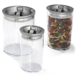
7. Think about removing pantry food items and storing them the new old-fashioned way to save on storage space - in Tupperware type containers. Also check out Rubbermaid, and the Container Store. 

8. Everything should have a home. Again, it seems obvious, but the home for all items and categories of items should be clear and obvious so accessibility is quick and efficient.

9. Have a nearby closet? Use the inside door as a spice rack, hanging spot for pots on a wire grid, flat pans, or other tools for easy access.

10. Organize pots on this handy item, the Pantree. Use roll out shelves were possible in base cabinets. A Pantree on a roll out shelf sounds great to me!

This is not meant to encourage you to pack in all the storage you can in your kitchen. Just as in any size kitchen, I want you to carefully consider, probably more so than one would in a large kitchen, the equal importance of aesthetics. If a bit of storage needs to be sacrificed for a decorative item like a painting or shelf with a few items for display, make that sacrifice, please! I want you to be surrounded with a meaningful and aesthetically pleasing kitchen interior. I cannot overstate my opinion on this. A small kitchen should not be solely utilitarian....just because it is space challeneged. You deserve both, aesthetics in regard to personal decoration AND function!

Tell me about your small kitchen and what organizational tips work for you...


Ten Simple Steps to a Feel Good Kitchen - New OR Old

I confess, I am addicted to CNBC. This is being written as the Dow fell nearly 700 points, most of which happened in the last hour of trading. I admit to feeling that I am living in a dual reality...the writer of a blog talking about the virtues of owning a fabulous kitchen filled with fabulous products and the other extreme of hearing that we may be in for a severe recession (one person's opinion) in 2009, probably affecting many people's lives. So, where do I go from here?

I'm a positive thinker (believe it or not) combined with being a realist. What I'm feeling now, at this moment, is that regardless of where you, the reader are, whether you are planning that fabulous kitchen or wondering what small tips you can get from this blog in an effort to either keep your kitchen for a longer time, in good shape, or prepare it for a home sale, there are common threads in these two extremes. 

I think, which I hope has been an underlying theme in my blog, that one should look at one's kitchen or kitchen design, and get back to basics.

Use the catalogs, magazines and fabulous internet images of kitchens as inspiration, not the word "should." You know the slow food movement? Get into the slow kitchen design movement. Here's how:

  1. Take your time on every decision connected to your kitchen
  2. Make sure it's a personal decision, not one based on, most importantly, a trend, although resale decisions require mainstream aesthetics
  3. Seek out materials that are long lasting, make your money work for you
  4. Watch your stress level. Can you defer decisions? Do so, if you need to.
  5. Say goodbye to matching, say hello to authenticity and blending
  6. Find professionals in whom you trust and who have that important quality of patience - and yes, professionals know how to save their clients money
  7. Get organized in terms of food preparation equipment, it's location and access for a sense of security
  8. Find perspective...put more weight into long term investments, a more casual approach to shorter term purchases
  9. Go out to the garden and pick flowers, leafy branches or another natural collection to keep things fresh in your space
  10. Little luxuries go a very long way to make your kitchen "new again" and can be defined in many different ways

I'm not sure, actually, if I'm making a whole lot of sense in this post, but, the metaphors of the "slow kitchen design" approach and "back to basics" perhaps will provide a bit of insight and opportunity for some to keep things on an even keel.

New Style White Kitchen - Scandinavian, Of Course!

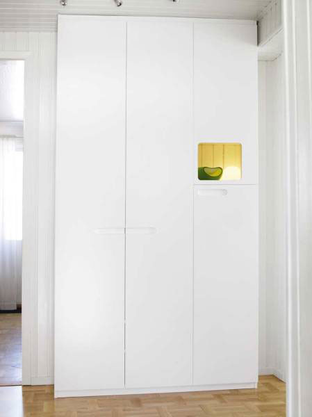
Just when you thought there could be no more true innovations in kitchen cabinetry, I mean, you open a door and you close it. You open a drawer and you close it. What more could there be to that concept? 

How about this combination of little recessed spaces set amongst the cabinetry? I spotted this on the teriffic blog, Emmas Designblogg. Whether the recessed nooks are used for decorative or useful items, I think this is a fun idea. While you're at it, check out this link from Emmas blog too. Images are from Skona Hem. What do you think of this style?


New Kitchen Product Fun!

Ok, it's a lame title, but I couldn't resist, I've been accused of being a ham more than once. I've been filing away information I've received on new, or maybe not new, but cool, (literally) products for a short while, and I'll share a few with you. I see a strong green theme here. 

A little while ago I was an absolute expert in ice machines and the quality of ice making due to a client's needs. I can tell you what's important: clarity, shape, taste, and energy use. Scotman's new Brilliance residential ice machine has these covered. The machine has a water quality sensor to detect hard-water conditions and purge mineral laden water with every harvest cycle. Unlike refrigerator ice, odors are not an issue in the Brilliance. Energy savings include the use of half the energy and 1/3 the water used compared to previous models. AND, the ice melts more slowly, how about that!?


I like this hardware from Sea-Stones. It's something I've certainly seen over the years, but I like this collection. The stones are very varied, and I'd encourage you to use a variety of stones as a result. Don't just get one color/texture. Mix 'em up! Sea-Stones also has stones to be used as towel/coat/other hooks, another fun idea. The stones are found on New England beaches and a new quarried stone is "replanted" in the water to ensure the beach remains as it should for future generations.


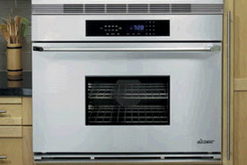
Is bigger better? When it is, it seems to be a necessity. Take a look at  Dacor's new 36" Epicure Renaissance wall oven. I'll tell you something. At first, I felt a little weird about such a big oven in regard to energy. But, with the ability to cook two turkeys, 144 cookies or any other combination of multiple foods, we may just have a new definition of energy savings via one oven rather than having to use two. Hmmmm....


Thermador High Performance Cooktops Sizzle!

I spent the day in the city yesterday, always a good thing. I spent the morning at the Danish Consulate in a meeting with a New York architect regarding Hansen, where we have a showroom space for this fabulous kitchen furniture. I love going to the Consulate. Since the Danes are reportedly the happiest people on earth, who wouldn't want to spend time at the Consulate?? 

After the meeting, I went downtown to an event given by Thermador, to showcase their new line of high performance cooktops. Those Thermadorees are smart people. To arrange an event that is both entertaining and informative is the definition of capturing one's attention. To add a few celeb chefs to the mix, well, everyone was all ears and eyes. It was awesome. 

Tom Colicchio, the lead judge on Bravo's "Top Chef" was the MC, and introduced the chefs.  Michael Psilakis, executive chef and owner, Anthos, and Alexandra Guarnaschelli, executive chef, Butter, and star of "The Cooking Loft" on the Food Network were the chefs in this challenge...15 minutes to create something wonderful with a secret ingredient, chocolate! 

Cooking and commenting on the cooktops ensued, but better than TV, one could smell the fantastic aromas! Michael insisted that he had to have the Thermador induction cooktop he was cooking on, in his professional kitchen. Alexandra was fully confident and completely calm, with four different size pots at various heat settings going at once, with her Thermador electric sensor cooktop. Tom looked like he either wanted to jump in or was glad he wasn't under the gun.

A couple of new hoods hung on the wall beside the cooking station, the Pivot-Lift Glass Canopy, which can be lowered or lifted as needed, and the 36" Chimney Drawer Hood, which slides forward up to an extra 12", great for a low profile (shallow) look in its "back" position. 

The cooktops offer some very cool features. In the electric sensor models, you'll use the "Sensor Dome" technology that continually measures the heat from the cookware! It maintains the precise temperature needed, not to mention the keep warm function, always a desired feature. Induction cooktops by Thermador has a power boost function, a 10 step power micro adjustment, offering a wide range of simmering needs and a silver finish! Gas cooktops offer a larger cooking surface, the star burner design and a powerful 52,000BTU output. All of these have other features worth looking at.

Oh, and let me not forget the fabulous luncheon after the presentation! Fun and informative makes me happy, not cranky. The food and so much chocolate was a good thing too. See the pictures that follow!

Tips For A Green Kitchen

Breaking News! I just received this fantastic list of easy tips to go green in the kitchen. Anyone can get moving on these tips right now. I'm stopping what I'm doing to pass this along to you. Take a look, from the editors of ShopSmart, a publication from those very serious people, Consumer Reports. The folks at ShopSmart took months to find the best energy saving products. Take a look.

  1. Get a water-saver faucet

·         Why: A gleaming new faucet is an easy upgrade, but kitchen models can be water wasters compared with some bathroom faucets. Low-flow bathroom faucets with the Environmental Protection Agency’s new WaterSense label are about 30 percent more efficient.

·         Easy Green Fix: Until the EPA comes up with criteria for low-flow kitchen faucets (they’re in the works), for $3 to $11 you can make most new or existing taps more efficient simply by attaching an aerator.

·         One Possible Draw Back: With lower flow, it might take a bit longer to fill that pasta pot.

·         What to Buy: Two Kohler models that aced ShopSmart’s most recent tests and can be ordered with custom-fit aerators for about $10 are the Vinnata K-690-BX , $550, and the Forte K-10433-VS, $250. Another green choice is a hands-free faucet, like the Danze Parma D421058, $480.

·         Tip: When you find a faucet style you like, make sure it has a lifetime warranty that covers stains and water-wasting leaks.

  1. Switch to watt-stingy lighting

·         Why: Modern kitchens can use up to 2,000 watts for lighting because standard incandescent, halogen, and xenon lights are energy hogs. All that excess heat from lights might prod you to turn down the A/C to cool things off.

·         Easy Green Fix: Switch to cool-burning compact fluorescent lights (CFLs) in overhead fixtures, and also consider adding some LED or fluorescentundercabinet task lighting. This easy fix costs about $200 for five fluorescent fixtures.

·         One Possible Draw Back: Some—but not all—CFLs and LEDs cast a bluish or other funky-color light. Before you buy, ask if you can return the fixture if youdon’t like the way the light looks with your décor.

·         What to Buy: Strips are the most common type of task lighting, round “puck” lights are best for casting pools of light onto a counter and linear lights are best if you need more versatile fixtures. Both round “puck” lights and linear lights are available with LEDs.

·         Tip: If your cabinets don’t have a built-in valence to hide task lighting, either add one or choose a fixture with a sleek housing that’s not as noticeable.

  1. Put in a ceiling fan

·         Why: Kitchens get hot, and if you use an air conditioner to cool things off, it will gobble up a lot of energy and money.

·         Easy Green Fix: A ceiling fan in the kitchen will use only a fraction of the electricity that an A/C would.

·         What to Buy: ShopSmart tested models from Hampton Bay, Harbor Breeze, and Hunter, and most performed pretty well in air-movement tests. So rather than shop for a particular brand, go for a style you like and remember that lighting affects energy use.

·         Tip: You might be able to find CFLs designed for ceiling fans that can replace the original bulbs and save energy.

  1. Renovate with recycled stuff

·         Why: A new countertop or cabinet style can change the whole look of your kitchen, but manufacturing them keeps power plants polluting the air and some green goods aren’t as green as they might seem.

·         Easy Green Fix: Before you buy new, see if you can find secondhand products.

·         What to Buy: Salvage shops are stocked with new or gently used stone countertops, hardwood flooring, decorative lumber, and kitchen cabinets, so they’re a great place to look for bargains. Habitat for Humanity sells used and surplus building materials at outlets called ReStores.

·         Tip: If you must have new, look for greener cabinets and other products made from sustainable lumber and materials.

  1. Trade in the biggest energy hogs

·         Why: The appliances in your kitchen that take the most energy to operate are refrigerators and dishwashers. The older these appliances are, the less energy efficient they are and the more costly they are to run.

·         Easy Green Fix: It usually doesn’t pay to replace working appliances with new ones. But when you do update, look for models that use less energy and arequieter. Though energy efficient models can cost more, you’ll recoup the money as your utility bills shrink.

·         What to Buy: ShopSmart found that the Amana AFD 2535DE [W], $1,550, saved up to $72 a year in annual operating costs compared to a 15-year-old fridge and the Bosch SHE33MO [2]UC, $540, saved up to $51 a year compared to a 7-year-old dishwasher.
·         Tip: You don’t have to ditch the clunkers all at once. Start with the least efficient ones. It pays to replace them when repairs would cost more than half the price of a new appliance. 

Romantic Kitchens

Let's talk about romantic kitchens, ok? Picture yourself in a cottage, set way back  from the winding road. The house sits on a hill. The cottage garden is seen from the kitchen window and the vegetable garden is just beyond that. The kitchen, first and foremost, is a soothing place where its owner finds solace at any given time of day. People speak in soft voices, smiles and every motion in the kitchen is done with love.

OK, I got a little carried away. Next thing you know I'd be saying there are no mortgage issues, no conflict...and nothing to clean up! We can dream, right? Looking at these kitchens, life appears bucolic, and maybe, just maybe, having a kitchen like one of these, contributes to "peace and contentment" being a bit more achievable in one's personal haven. One can hope, and in any case, daydreaming seems quite easy in any of these kitchens..

What are the elements of a romantic kitchen? Perhaps, some of the following:
  • Fabric skirts in front of lower cabinets
  • Pretty things on display
  • Open Shelves
  • Pastel or soft neutral colors
  • White, cream, or off white
  • Breaking the rules
What do you think are the attributes of a romantic kitchen? Do you like this style? All images from Vakre except the last one, from Cote Sud and the second to last from lantlivsdrommar.blogspot.com. 


Cozy Kitchens!

Maybe it's the start of cool weather, the recent economic uncertainty surrounding us or another hidden reason, but, I've had this soft mantra in my head saying "cozy kitchen" for a couple of weeks now, knowing I need to share this subject with you.

I'd say with certainty that a cozy kitchen is in the eye of the beholder. To me, a cozy kitchen is about individuality, whatever the style. It's about your personality shining through, not the replication of a catalog kitchen. Can you get inspiration from a kitchen you see, elsewhere, that you love? Yes, but then you have to make it your own, which is how the soul of your space will eventually emerge. Bring in the antique lighting, the books, the collections, the old, wooden shoe mold on the counter, whatever.

So, then, CAN one define a cozy kitchen? Not easily. Following are familiar descriptions of what a cozy kitchen might look like. Soon, I will show you the "alternative" cozy kitchen...modern, fresh, and definitely cozy. Images are from Chris Madden's classic book, "Kitchens." Classic means timeless, the real definition, in my mind, of "cozy."
A Cozy Kitchen is...


a space with texture of various types, proportions and colors


often seen with more matte than shiny surfaces


an arrangement of personal items on display


colors and finishes that blend rather than match


soft - softness in furnishings, curtains, pillows, rugs


wonderfully imperfect, and a work in progress


simple/clean or cluttered


informal OR formal


I'll be talking more about cozy kitchens! In the meantime, what is a cozy kitchen to you?


Scandinavian Kitchens - End of Summer Edition

I've been collecting images here and there since August, when I thought I'd do a dog-days-of-summer-dreamy-white-kitchens post and, again, was so busy with these two kitchen orders that I could only procrastinate just a little and collect the images, saving them for later. Well, finally, today is the last day I am working on these orders after a summer of finalizing them, believe it or not, but, I digress. It's been intense!

Here are some dreamy kitchens to make you happy, I'm sure, as that's the effect they have on me! Each image has the name of the blog that they are from (all Scandinavian blogs, they're fantastic to look at) so enjoy them and I'll be back to you, now, regularly. That's my plan!


I'm here...

Hi there...happy September! I'm here...I have been completely engrossed in two highly detailed kitchen orders that are...highly detailed! Hundreds of details, hundreds of changes, all of which must be dealt with and end up perfect, so please excuse my absence. Duty calls! I will be finished in a few days, and I'll be back with you soon. In the meantime, how about a gorgeous, summer-y white Scandinavian kitchen (I've collected more in recent days, which I'll show you soon, after all summer isn't REALLY over till a few weeks.)

Thanks for your patience!


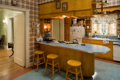
Mad Men And The Kitchen Set

Have you been watching Mad Men? I just started. I didn't see it last season, so I'm catching up and tonight will be the third episode of the first season I'll see. It's so cool, so chic, with such repressed people, no?

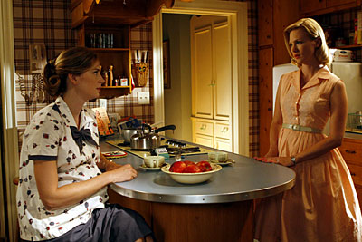
The kitchen is designed quite authentically, I think. Please see the kitchn's post on it. In fact, I think I had those same cabinets in my parents' kitchen when I was a child. I really recommend seeing Mad Men for interesting insight into the decor of the time, the primping and preening behavior most characters surround themselves with, accompanied by the contrast and juxtaposition of usually obnoxious and repressed behavior showcased in limitless variations. All this, just before all hell broke loose some few years later. Don't forget the raw egg in the caeser salad...

As a young (VERY young, I said) child during this period, here's what I remember. I remember my mother frequently wearing makeup and jewelry with short, curled (after curlers wrapped in a scarf) hair. I remember red lipstick, red cheeks and blue eye shadow. When she and my father entertained, my mother wore either a chic "shift" sort of dress to showcase her curves or one with a taut upper bodice and a full skirt...and always with the "good" apron as she flitted about the kitchen.  And heels of course. And, perfume, of COURSE. I'm sure it was a mix of high maintenance living and fun mixed in too!

As my parents emigrated from Denmark, the furniture in my home was Danish modern furniture, the real thing. The items we later threw away, I can't even think about, it pains me! Today, I use my parents' sleek walnut veneer dining room table for our breakfast table

Smoking was either a pipe or cigar by my father, but there was hard alcohol for social drinking too and of course, when my father returned from work. And, let's not forget Frank Sinatra playing in the background. Yes, life was very good. A T-bird in the driveway, a caddy, and everything. An American dream...until he cheated, he lost the business and they got divorced, but I digress! One thing that's worse than being repressed, is...guess, narcissism (probably rampant in the 60s!) You win the washer/dryer! Here's the set!

Granite Countertops - More Radon News

Following is a partial press release I just received from the NKBA: 

"HACKETTSTOWN, NJ (August 4, 2008) - There has been recent news concerning the possibility that granite countertops may contain dangerously high levels of radon. The National Kitchen & Bath Association (NKBA) has long recognized the carcinogenic effects of radon in the home and, as a result, recommends that consumers planning to remodel a kitchen or bath consult with an NKBA-certified designer.

Associate Kitchen & Bath Designers (AKBDs), Certified Kitchen Designers (CKDs), Certified Bathroom Designers (CBDs), and Certified Master Kitchen & Bath Designers (CMKBDs) are experts in design who have been taught the proper methods for eliminating radon and other hazardous gases from the home, as discussed in the NKBA Professional Resource Library volume Kitchen and Bath Systems.

In addition to radon, NKBA-certified designers are familiar with many other health concerns in kitchen and bath remodels that most consumers have never considered. 

For more details on the health effects of radon in granite countertops, the NKBA recommends the Marble Institute of America as a reliable source of information. An associate member of the NKBA, the Institute has prepared a thorough analysis of radon levels and granite in its 2008 Radon Study. This study, as well as a consumer radon brochure and additional documents concerning radon in granite countertops are available at www.marble-institute.com."


While I'm a CKD, as mentioned in the press release, I'd have to say, no, I do not know the proper methods for "eliminating radon....from the home". Everything I read talks about "reducing" not "eliminating." "Eliminating" is a black and white concept. I'm not a scientist or a radon eliminating technician although there are many common sense tasks one can do to reduce. That said, I must put this issue in the hands of the consumer to make their own decision on what they believe in regard to granite and radon or to take other measures, such as hiring a professional radon technician for testing purposes, and so on. I do not have an opinion on either side of this issue as it is beyond my knowledge. Perhaps if I were a geophysicist I'd weigh in on this.

I love the phrase, "I know what I don't know." Perfect for this situation.

What do you think?

20 Tips To Prepare The Kitchen For Resale

With so many homes for sale around the country, due to the current mortgage crisis and general home value downturn we are experiencing, how can you set your home apart, particularly the kitchen, the heart of the home, to appeal to a prospective buyer?

Warning, some ideas may seem obvious, but as I peruse images of homes for sale, they bear repeating. This assumes that big ticket items in the kitchen will not be replaced. Perhaps I'll do a post on replacing bigger ticket items in the kitchen for resale. Don't miss the tips noted on showing your home - super easy tips with instant results!

  • When showing your home, turn on all the lights in the kitchen
  • Clean the windows inside and out as well as window treatments if necessary
  • Declutter your counters. I'll say it again. Declutter your counters!
  • Clean and organize the interiors of your cabinets - people will look inside
  • Pay particular attention to organizing a food/pantry cabinet - this can look surprisingly good if shapes and sizes are arranged well
  • Clean your floors
  • Do touch ups wherever you can - walls, floors, cabinets, etc.
  • Declutter your collections. Again...declutter your collections!
  • After decluttering counters and collections, take a fresh look and add in a very few items if desired. Those items should be proportionate to the space. Do not put a small item on top of cabinets, use a larger item for better balance and proportion
  • Make sure your picture(s) of the kitchen includes a wide angle shot and the kitchen is neat and decluttered
  • Your image should be of good quality. Do not submit it if it is blurry or otherwise inferior in terms of exposure, etc. Ask others for opinions on the quality of the images
  • Include windows if possible in the kitchen shot
  • When showing the home, bring in fresh flowers for the table from the garden, or cut greens of some sort from the back yard, if you have one
  • Remove all the magnets from the refrigerator
  • Clean the ovens, cooktop and microwave!
  • Clean the sink and surroundings! For a showing, move the soap bottles to inside the cabinet, clean the sink and drain baskets and keep it "all clear" around the sink
  • Clean the refrigerator!
  • When showing the home, move the piles of mail, papers, etc.
  • Touch up paint trim on window and door casings, and other moldings
  • If desired, "stage" the kitchen just a bit for a showing...a good looking table (if the table is in poor shape, use a tablecloth) set for a meal, perhaps with a centerpiece, a bowl or two of green apples on a countertop, other fruit, a big bunch of fresh basil in a vase near the sink, a basket of potatoes, just do not overdo it


Take a look at this image of a kitchen on an online listing. It's potentially a very good shot, very impressive and updated kitchen, but who can see a thing? I think there is too much of the staircase in the image as well, the whole image being somewhat crooked. Make a little more effort for much bigger rewards.


I feel better about the next image, but it could have been aligned much better. Try, too, to use a sharpening tool in your images. That will go a long way. The counters are nice and clear. Maybe a large gold bowl or other object could have been in the foreground. I would have removed the coffee pot near the sink.


Relax, and wait for the offers - they're coming!


Slate Countertop Test!

There's always a good bit of conversation on the slate post that I did way back, and that's good, I'm glad people are digging through the archives. Lots of good stuff in the archives.

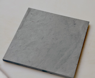
I thought it might be a good idea to redo my test, albeit in a very limited way, on the staining properties of slate, at least in regard to oil.

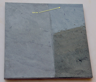
See for yourself what the result is. No staining! If you look closely at the first sample with the oil on it, you may see, on the unoiled part, a few white marks which are scratches. After I wiped off the oil on the sample with dishwashing soap and water on a sponge and brushed the slate using the opposite side of the sponge fairly roughly, "wah laaa" the white spots disappear! If they do not completely disappear, then it is my understanding (although I have not done it myself) that one can lightly sand any significant white scratches and they will disappear.

Yes, slate is strong, VERY strong (and very dense)! Take a look....the yellow text, which is too small, says "dark line" meaning to please try to find the dark line on the second image too so you can get it oriented. Sorry, when I tried to rotate one image or the other, it looked much more skewed and a bit more difficult to see, so you'll have to reorient yourself to find the similar graining of each sample so you can see where the oil was on the second sample. Still, do your own test, on any countertop surface.

Hot Countertops!

No, I don't mean stylish, I don't mean beautiful, I mean hot as in radon hot!

At this moment, The New York Times' article "What's Lurking In Your Countertop" is the Number One most popular article that is being emailed!

I'm no scientist or geologist, but, I'm paying attention and passing it along for you too. Oh, if you have to register for The Times, it's worth it. They do not do anything with your email address, so I'm told. Definitely register.

What you may want to do is contact a certified technician who will test your countertop here, or for $20-$30 you can pick up a radon testing kit at hardware stores.

What's Lurking In Your Countertop? 

When the French Country Kitchens Go Marching In...

I'm sitting here listening to WWOZ radio on the net as I often do, listening to a very modern version of "When the Saints Go Marching In" part rap, part gospel, part jazz, and of course, with that New Orleans influence everywhere. I know, you're saying "whaaaa?" but trust me, it's a good thing. Now, here comes another rendition after that one? Ok, I'll take it!

Oy vey, so how do I weave this into kitchens? There must be a way. Hmmmm....now I'm hearing "When the Saints win the Superbowl...." Ya gotta love NOLA!

NOLA! Yes, there is a huge, historical, French influence in NOLA, plus, I watched le Tour again this morning, from somewhere in France, so how about a few more Frenchy kitchens? I found them here, and many of them seem to be the Americanized version of French Country, but some are so good that I can't tell where they're from, so THAT'S interesting.

What a difference between kitchens from France and French "inspired" American kitchens. And, that's ok, say la vee, we're a melting pot after all over here, oui? Have fun!

Kitchen Open Shelves and More

Wow, you'd think I was on vacation or something! No, just occupied with a wide variety of things. Potential posts go in and out of my head, topics, images, and then time goes by. But, before any MORE time goes by, I want to do some show and tell. I hope you're all enjoying the summer. Please say hi! And, yes, I'm still watching le Tour every day! Everyone is skinny over there, they all need to eat a little something.

 THIS image propelled me into action right now. Come on, how absolutely "feel good" is this image? I found it at the kitchn, always good for wonderfully random good stuff. Really, the kitchn is so much more than recipes, it's very well rounded. Come to think of it, I've been meaning to add some food related info to the blog, after all, without food, what's a kitchen??


And, THESE IMAGES by Habitually Chic, are really fantastic. Showing open shelving in a kitchen, I love how it has caused such a great discussion. It seems one either loves them or could NEVER live with them. I've done posts on open shelves and have lived with open shelves. I love them, they work for me!


French Country Kitchens - Tour de France Inspiration!

As you may remember if you've been a reader for some time, I LOVE the Tour de France!

I never paid much attention to the Tour until our son took up cycling in a very serious way, with dreams of riding in le Tour himself one day. That particular dream has been replaced now, but it was very much alive for a few years. And so it goes.

But, watching the Tour is now a fixture in our home. It's a beautiful sport, one of the most beautiful, I think. Combined with the incredible scenery, the colorful jerseys, the huge pieces of artwork in the farm fields as tributes to the tour, and the magnificent look of the peloton, not to mention the aerial views, I recommend it highly. it's on the channel Versus for the next 3 weeks until the triumphant entrance into Paris.

SO, in the spirit of the Tour and the beautiful tour of the French countryside, let's look at some kitchens. I think we can learn many things from looking at authentic French kitchens.

We get out of our comfort zone

We see new ways of looking at color and texture

We see new ways at looking at form and function

At other times during the Tour, I'll add more images of French kitchens, both modern, farm country kitchens, and formal, elegant kitchens as well.

And, tell me what your likes, dislikes, opinions on these kitchens. Have fun!! Want to rent a French chateau? Images are from Just France.

Kitchen Design - Less Is More

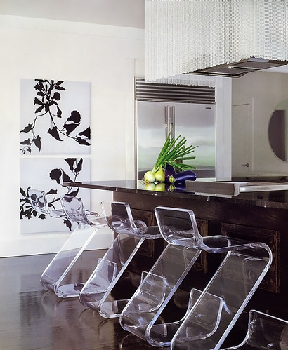
I came across this picture of a kitchen, again, in Veranda magazine, designed by Benjamin Noriega-Ortiz. I immediately liked it.

This kitchen goes more under the heading of "highly stylized" rather than "highly personal". More "showcase", less "high end catalog". And, that said, it's a viable look. Glam meets function meets texture. There was no other image of the working part of the kitchen.

I like the variety of elements, but what I like more is the strength, yet, restraint. I need to continue to explain to my clients that less is more. Fewer, larger, shapes and forms will enlarge a space as opposed to many, smaller, pieces, door sizes, accessories, etc. This is not a good vs. bad evaluation, simply an observation and another way to design a kitchen. The look is simple and elegant, so that the individual pieces say something meaningful yet are linked together in other ways, perhaps in color or tone, if not style

Here, my eye sees a variety of styles:

utility (stainless refrigerator)

rustic (dark wood island)

glamour (beaded hood)

something hip/fun (plexiglass chairs)

elegance/sophistication yet modern (prints on wall)

modern/sleek yet textural (floor)

contrast (floor and walls)

There are common threads among these elements which tie one disparate piece to another and it's fun looking for them.  I'm actually pretty crazy about this kitchen, although I'd probably want to change the prints to something A BIT more personal...give me that. But those chairs...what a WOW!

One question that comes to mind is, what came first, or simultaneously? Was the flooring color picked first, knowing that those chairs would be used, which relate to the walls in terms of tone? Was the big picture seen from the start, or were pieces brought in, to build on the previous concept. How were the layers developed? It appears to me that there was a desire to have a strong foundation first and foremost, as seen in the flooring and the island being similar tones. Other than that, it's hard to guess.

What do you think??