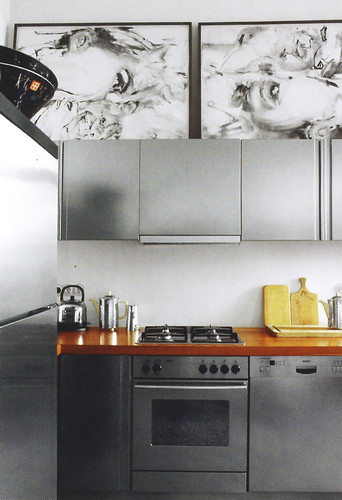
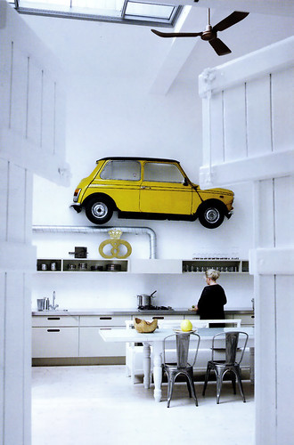
Dream Kitchens

Yay....Meredith has just reprinted, back by popular demand (so they say, but I like to believe it if you don't mind!) a previous version of Dream Kitchens

Here's a sneak preview....one of my kitchens is on pages 24-29.


These are just two of the many images you'll find of this kitchen...get it while it's hot!

Kitchen Design Inspiration at the Flea Market

I probably have access to one of the best flea markets anywhere, on the upper west side of New York in the mid 70s on Columbus Avenue, so there's not much need to do deep searching for great finds, I admit it! Regardless of my good fortune, it's worth it to do the searching at your local flea markets and garage sales to find those great deals on items that can give a fresh look to your kitchen.

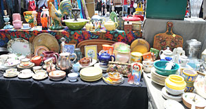
Come on along with me to the flea market I went to the other day. You may have seen those very modern dish arrangements on walls, often using vintage dishes. Many of the dishes you can find are inexpensive - LOTS of bang for the buck. This table's treasures are from A Vintage Home.


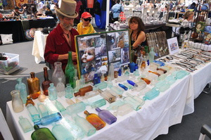
Start a new obsession collection! My husband and I both enjoy our stop at the bottle man's table. You can get very old bottles for as little as $10, maybe even less. We have a nice collection now and purchased one at this last trip...this one with a top on it, unusual! Our collection used to be on the long window sill in my previous kitchen. In my new home, they are all on a tray in the dining room. Hmm, I don't have this contact at the moment. If anyone is interested, let me know and I'll try to find it. I think there might be a website.


Here is a collection that you don't see every day...working vintage toasters! This is a small sample of what was on display. I think these are super cool, high art and functional all wrapped into one. They are beautiful pieces of history. Excuse me while I go put my gown and lipstick on...go to Toaster Central.


Another very fun kitchen find were these decoupage handmade tiles. These are tiles made from maps! I can see this in a retro kitchen, complete with soda fountain bar stools! They can be used as coasters, as they can also have a cork backing if desired. Not good for behind a cooktop or range, but elsewhere, they're fine. Contact: wendyola @ aol.com


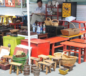
Not really last, but all I have time for now is this fantastic exhibit of asian accessories, many of which can be useful in a kitchen or just for decorative purposes. I mean, here are your color accents! Here are your shapes and forms. Let your imagination run.

For another teriffic New York City source, go to the Housing Works auctions...see what are in the windows of the various Housing Works thrift shops. "Housing Works is committed to ending the twin crises of AIDS and homelessness. We believe that all people have the right to a rich and empowering life."

A great note to end on...shop on!


Granite Countertops - Light Colors?

An email from Jay:

I know that honey oak is not the thing now, but our cabinets are new and the budget is really tight. Can you suggest granite colors that would work with natural oak in a small condo kitchen with no windows and very light challenged?

CambriaYou had me at "no windows" Jay! Take a look at quartzite in a white. It's the lightest stone that is also durable. Ask for that. OR, get the classic black and white granite. I cannot think of the name, but it looks fine and is very inexpensive and has a light appearance. Quite "busy" however. There are also many cream colored granites which might fit the bill.

All that said, I'd prefer that you look at engineered stone instead. Caeserstone, Cambria, Zodiaq, are engineered stones that are more solid in color and perform better than most granites. While you're looking, also consider IceStone, which is made from 100% recycled glass or ECO by Cosentino, another eco friendly engineered stone material made of 75% recycled content.

Some of these materials look very close to granite, but in your case, the visual consistency of this type of material will work to your benefit, helping your kitchen appear more spacious....and just easier on the eyes overall in my opinion. Granite may be a knee-jerk reaction, understandably for many, but please be open to other materials for the reasons stated above. I am not sure if you can get some of these materials in 3/4" thickness, but that would help the budget.

Find a kitchen design professional to help you with getting a quote for your countertop. He/she will handle all the details for you and make suggestions that will enhance the countertop design. Trust me on this. A kitchen design professional knows the little tips and tweaks that other sources for your product generally do not care about or know about. There will be a significant difference in the quality of the details and installation when the specifications are handled by a kitchen designer. 

I almost forgot...whatever material you are seriously considering, please do yourself a favor and get as large a sample as you can get and proceed to put food substances on it and let it sit overnight. Give it a variety of tests...food, scratching, etc. to understand the properties of the material under stress. 

This is Caeserstone, Champagne Limestone, which I love and have used before. 


2009 Kitchen Design Trends

Looking Into the Latest Kitchen Design Trends

By Paige Thomas

Thanks to Susan for so graciously letting me write a guest post on her blog. As a writer for my own home improvement blog I spend a good deal of my days in the office looking at Susan’s kitchen posts, and everything else I bookmark from my seemingly infinite roll of design and home improvement blogs.

When you spend lots of time looking at picture after picture of freshly remodeled kitchens, you start to pick up patterns. There are certain elements which keep popping up again and again, illuminating the trickle down popularity of certain trends in the design world.

Here are three trends that seem to be everywhere in kitchens these days. Take a peak and maybe find some inspiration for your own home:

Open Shelving in the Kitchen

The new chic way to create storage in the kitchen isn’t by refinishing your cabinets, it’s by getting rid of them all together. Open shelving in the kitchen encompasses cabinets with no fronts, or simple long shelves for stacking your kitchen gear.

I’ve heard lots of pros and cons on this kitchen design option. Some people love it, some people hate it. I think if you have great dishware, and you’re organized, why not try it? But I know for me, and my yet to be replaced collection of secondhand college dishes, I couldn’t bear to put anything on display. I might consider a combination of both: some open shelving to display my pretty pieces, and some cabinet type options to tuck away my strictly utilitarian ware. Having open shelving as a focal feature over the sink could be a good option for trying out this trend.


Farmhouse Kitchen Sinks

I grew up with a stainless steel double basin sink. To me, this was the perfect kind of sink: one side for washing dishes, and another side for rinsing. It was the epitome of practical. That sink wasn’t a big focal point of my parent’s kitchen. It was just there to do its duty, to get the dishes clean.

These days, however, choosing a kitchen sink is just as important as any other part of a new kitchen design. While the stainless steel sink is still around, it’s no longer the sink of choice for homeowners. While the choices are endless – ultra modern sinks with space age faucets, concrete sinks, aerodynamically thin looking prep sinks – the ultimate trend these days is the farmhouse sink.

Large white, farmhouse basins are practical. They are big and heavy, and give your kitchen a rustic, cottage charm. Plus, their size makes it perfect for washing big dishes easily. If you entertain regularly, or have a large family, these large sinks will likely be on your shortlist of options. Farmhouse sinks offer more charm than other stainless steel or modern options. And one cannot argue that the look and feel they create will truly make your kitchen feel like the heart of the home.


Buy Locally

I love handmade things, and I love being able to support businesses and people from my own community. Luckily I’m not the only one. The popularity, and economic success, of handmade shopping sites like Etsy are proving that people want to support local artists and craftsman. You can easily be a part of this trend by simply taking some time to research your local options for different aspects of your kitchen remodel. Looking into local options may surprise you with the range of talent in your city, or even in your own neighborhood. Plus, you’ll be helping the local economy and supporting a local business that you know will put the money back into your community.

One of the other great things about this trend is that it’s affordable for anyone’s budget. You can buy something as small as a print or poster from a local artist to hang on your wall. There is always something, whether a big-ticket item for the renovation or some small decorative or functional objects, that can be sourced relatively near one's home.

Whether you love or hate these trends, designing a kitchen is ultimately about what works for you. Use the trends to guide you, not define you. When you’re designing your own kitchen, worry less about the trends, and more about making your kitchen a reflection of your own personality.

About the Author: Paige oversees all things Editorial at ReliableRemodeler.com a nationwide contractor matching service bringing together homeowners with area contractors for free estimates on home improvement projects. She writes regularly for the company’s home remodeling blog posting on a wide range of topics including the newest home improvement trends, the latest in remodeling news, and the growing green building movement.

Kitchens From KBIS09

I always love to look at kitchen displays at KBIS, naturally. It's a study in trends and an attempt to interpret where the looks are coming from, what is the message of the style. 

The message this year was one of diversity, appreciation of wood, deep, rich browns, the occasional black, but neutrals as a rule. Soft modern design, yes, and where traditional design was seen, the lines are ever cleaner than in recent years. 

The shift is toward simple, classic, classic modern, or a green theme as seen in the Jenn Air booth, designed by Fu Tung Cheng, always an inspiration. The name of the exhibitor can be seen when the mouse hovers over the small image. Is an Asian theme creeping into the 2009 design consciousness? I did get that sense.

But diversity and choice is king, that's for sure. I've witnessed THAT concept, as more and more manufacturers are widening their product lines to incorporate modern styling, if they were previously traditional, to cover more bases. One example, is the introduction of numerous Rohl products in a modern theme.

KBIS Product Sightings

Here are more (and no quick 1-2-3 roundup for me-too much to show you) truly fabulous finds that I'd like to share with you.

And, for the uninitiated...here's how I handle the products from KBIS. I'm not in a rush. Over several weeks' time, maybe months, I'll be bringing you products that I have found at KBIS that need to be noticed. Some will be newly introduced, some will already be in a product line for some time but deserve to be brought to the forefront. It is not only new products that should be mentioned!

First up is Texas Lightsmith, a little booth way at the end of the convention center in no man's land (that's where many of the best exhibitors are, scrunched together in a bunch of aisles).

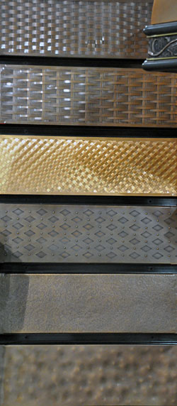
Texas Lightsmith manufacturers lots of things - sinks, hoods, metal panels for cabinet door inserts, lighting, and more. I loved this display for apron sinks, but I'm sure these patterns can be used for other purposes.

Being a bit more of a modern girl myself, I particularly like the third up from the bottom.


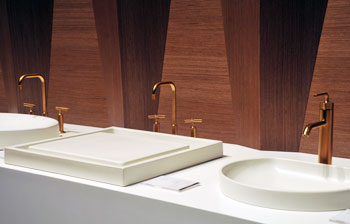
Kohler's new stunning (I've been using that word quite a bit during this show) finish, Vibrant Moderne Gold, really took my breath away. You can find it on a variety of products, even on the very sexy Karbon faucet.


Blanco, one of my favorite "no brainer" sink recommendations, has just come out with Silgranite II. What you are looking at in the image is a Blanco representative simply wiping off the metal shavings from the fork that I used to try to sratch (VERY hard) the surface. The material already had one whole day of people taking out their frustrations ahead of me. I saw zero wear. Get this sink.


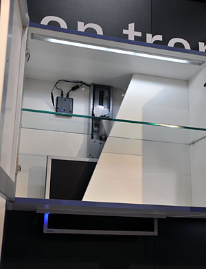
It's funny because my husband and I also talked about a motorized flat panel TV lift...and there it was at KBIS by Hafele! It holds up to a 27" tv and disappears via remote control. Our use for something like that was going to be in our otherwise lovely breakfast room which my husband, anyway (I don't care) wanted this type of mechanism, which would take the tv up into the attic.


Funny ha-ha or funny hmmm?

From:Susan Serra, CKD [mailto:sserrackd@gmail.com]
Sent:Wednesday, January 16, 2008 3:49 PM
To:Ward, Kevin
Subject:Re:
Kevin, I believe I gave some information on dimensions, but if I didn't, I will again. First, take a look at my blog:/journal/2008/1/14/the-kitchen-walls-came-down-my-apartment-remodel.html Look at the oven/refrigerator wall since it's been opened up. I will be getting a smaller refrigerator, a sub zero, built in. The microwave will go away from that spot. I'll be getting high end appliances. I'll have about 54" in width between the wall and the refrigerator. I want that 54" to be perfectly flat, one material, no cabinet doors, just something decorative. The hood I will get will be like this, very minimalistic to keep this sleek theme:http://www.faberonline.com/cristalhc.html I'll end up having around 24" in width between the new refrigerator and the hood. Since I'll have no doors, I'd like some sort of storage solution that will sit up in that area, able to be pulled STRAIGHT down and back up again, of course, as easily as possible. I think this could be a very innovative design and storage solution product.
Read more

First Product Roundup at Kbis 09

There are always neat discoveries to make at KBIS, always. Without further ado, take a look at some images of some wonderful new finds. These are the first of a bunch of products I'm going to share with you, outside of products I've already showcased on Twitter

Distressed copper hood by J.Tribble below:


Terra Aqua, fabulous sinks, below:


Look at these appliance handles by Vincenza, below: 


New to the industry! Lansen sinks flush edge with solid surface material, below:

KBIS 09 Impressions

Just back from KBIS and I'd like to share a few impressions. I've gone to KBIS for 18 or 19 years (I'll assume 18) which gives me an interesting perspective.

My first observation was "hmmm", when I asked the hotel clerk at the Omni, across from the Atlanta convention center, on Friday, if I could add a night if we wanted and he said, sure, they have rooms available. I thought that was odd for that hotel in that location to have rooms available.

My first stop on Saturday was the press room. Here, I was very surprised at what I saw. There were many empty boxes (freestanding shelving with square openings on both sides for press kits.) There were far fewer press kits than at previous shows. Strikingly so.

The difference was felt on the show floor too. Far fewer attendees. Perhaps by close to half. Far fewer exhibitors. No question. The exhibits were smaller. There were fewer events, cooking demonstrations, fewer fabulous exhibits. The whole show was a huge step backward, at least in regard to glamour and excitement, which, after all is fun to be around. The high energy in the air was gone. It felt like a Monday morning rather than a Saturday night! It was a vastly different show than last year or any recent year.
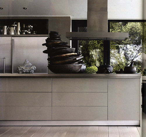
I think the party's over. I think one must take one's medicine, keep a stiff upper lip, carry on and all that.

That was my next feeling after absorbing the contrast of last year vs. this year. So what? This year's show should be considered an anomaly, and that's ok.

The companies who were not there made the right decision for their company, since I'm sure finances were the reason they were not at the show. That's being responsible, and hopefully, when they recover, they will again come to KBIS in a stronger position all around, having cut the fat from their expenses, product lines, whatever. That's a good thing.

It's also good for the companies who exhibited at the show. With less people at the show, there was more time to form relationships and explain their products, which probably meant a better show than in years past. And, it was easier to get their products noticed by attendees and media.

It also made the show much more manageable for attendees. I certainly did not see a shortage of innovation or creativity, and I'll talk more about that this week.

But, I sure did miss the "glam" part of KBIS. Such a pity...

American - Scandinavian Kitchens?

It struck me with this latest collection of Scandinavian kitchens from the fantastic Scandinavian magazine, Vakrehjem & Interior, that elements of some of these images looked very American to my eye.

I'd like to offer some comments on these images. Here we go...

These first two images are castle-like kitchens, sort of down in the musty kitchen we go! I do not see those images as typically American necessarily. It's a bit of a mishmosh to me, this kitchen. I am not a fan of the modern chairs mixed with the traditional chairs, maybe it's just that style of modern or traditional. There are areas of this kitchen that are very charming, but I think its charm lies in the collection of pieces rather than the design of the space per se. That said, anytime one can have authentic beams like those beams in one's home, it's a gift. 
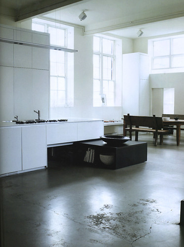
Some of these lower images look very close to American kitchens, and what I am seeing here is the shaker door style that is so popular in the U.S. Add in the beadboard, and I think we are in New England. 

Certain differences illustrate Scandinavian design. The wide use of white in the lower images is very typical. White, white, white. Note that the white continues on the door/window casings and some furniture pieces as well. Or, conversely, sometimes we see the abundant use of natural wood elements, such as ceilings and walls clad in distressed wood.

Platters on open shelves or other fine pieces are often seen on open shelves in Scandinavian country kitchens. Modern touches are too, and in the case of the white kitchen, it doesn't matter that the kitchen is 90% country in its theme, somehow, a modern touch seems never to be out of place and is freely included. I do not have a historical reference on the "X" design seen in the doors, but that motif is generally seen as a Swedish design element.

Splashes of color in the white Scandinavian kitchen are widely enjoyed, which we see in the collection of accessories on the tall shelf over the windows. 

I love sharing my Scandinavian kitchen finds with you. I hope you enjoy them too.


KBIS Sneak Peeks

It's that time of year and it's coming on so fast. I'm going to KBIS, as I do every year, and I can't wait! With thousands of products exhibited, and new technology, new trends and updated classics on display, it's a must see for me.

Shortly before the show, there are often some sneak peaks of new products, so here are a few.

WAC Lighting - I've used WAC lighting for years and years. They just make life simple, clean, easy, elegant, and so on. I don't get complaints from the electricians on the job, and the clients love the light. NOW WAC has LED light bars (love their light bars) and button lights (otherwise known as hockey puck lights). They also have invisiled tape lights for accent lighting. It's all just what you need. A real endorsement.


Eldorado Stone Gemstone Walls - Stunning transformations with stone. New walls are the VinoWall, ArtWall & CandleWall. Read their Sustainable Solutions for Leed Requirements brochure. Documented LEED categories where a project can earn LEED points.

Next is Baarz Decorative Hardware - This is a company that, from my view, offers hardware that looks different, fun, casual, earthy, or formal, for that matter. I've always said that hardware is the jewelry of the kitchen. It's funny...it's the choice that my clients put off as long as they can because you just have to wrap your head around all the choices available...like wallpaper or paint, tons of choices. I did not see a green statement on their website...would like to see that.

Stainless Living - Stainless Steel makes a statement, or any metal for that matter. There is something strong about it, to me. Stainless Living manufacturers deeply textured metals for many applications. They also manufacture stainless steel countertops as well. 


Haier America- Haier introduces their eco-friendly small refrigerator line with the 2.8 cf NuCool model. A brand new technology achieves temperatures as low as 37 degrees, not previously possible with refrigerant models. It is ultra quiet and available at Target. 


Just a few sneak peaks. More product news to come!

Do You Serve Dinner?

A funny thing happened last night at our house around dinner time. My husband called me for dinner (of course I was in my office staring at my monitor).

I go upstairs to the kitchen and what do I see but my husband making a plate for himself of the foods we are having for dinner. What was different about that scene was that he was doing it sort of buffet style, and the dishes that held the main food items were on the kitchen countertop.

I stopped and cried "I can't believe you're doing that! Why have we not done this before now?!" He didn't have an answer. So, we filled our plates and walked over to sit in the family room area and had our dinner. I went on and on about it for another few minutes (was he listening?) I was thrilled!

Have you yawned at this piece yet? In our case, our kids are grown and up until last night (mostly) we've walked all the dishes, serving dishes, beverages, condiments, yadayada to the table and then walked all of these things back to the kitchen after dinner.

Is it a chore to do that? Well, not really, but doing a buffet style dinner seems SO much easier, convenient, time saving, and just less laborious "feeling." When the kids were growing up, we always ate dinner at the table with all the accompanying stuff. But, now with the two of us (our son still living with us doesn't often eat with us) why not make it easier??

I was so excited at this new way of streamlining the process, I called my daughter and told her about this light bulb moment enthusiastically, to which she replied, "We do that all the time for dinner" (she and her husband.)

A bigger issue might be...it is important to anticipate this dinner time behavior and consider designing a kitchen around it. A good question to ask...

What about you? Dinner on the table or buffet style? My vote at this point in my life is buffet, baby!

Around the Kitchen Interwebs

Let's see what's happening with kitchen topics around the web.

A partner in crime, Kelly, is talking about product finishes, always something guaranteed to drive homeowners nutty. Do you blend? Match? How far afield do you/can you go? Kelly gives her usual sage advice!

Met Home's Kitchen and Bath Sourcebook shows quite a few inspirational products for nearly anyone's dream kitchen or bath. I especially like their sharp-eyed pick of the Fisher Paykel dishwasher in the taller version for the big plates that so many of us have.

There's a pretty sexy sink in their slideshow too. Worth a look.

This site has really blossomed in recent months. It sure stimulates the senses!

Another partner in the kitchen design business, Laurie, from Kitchen Design Notes, is informing her readers about Dacor's new energy saving refrigerator. It's a huge 36" refrigerator and is even Energy Star rated, so no guilt there!

And in The Appliancist, all you need to do is scroll in wonder at all their fantastic finds...

Armstrong Flooring Ad

UPDATE OCTOBER 13, 2009:

Here is what I received from Armstrong's PR agency: 

"Armstrong Flooring is partnering with retailers Abbey Carpet & Floor and Floors To Go for a national consumer sales event Sept. 15 to Nov. 15, 2009 to benefit Gilda’s Club Worldwide, a non-profit cancer support organization founded in memory of beloved comedian Gilda Radner. Armstrong will contribute $.10 to Gilda’s Club for every square foot of material a consumer purchases through Abbey or Floors To Go Sept. 15 through Nov. 15. So, if a consumer purchases 1,000 square feet of Armstrong's laminate flooring, Armstrong will donate $100 to Gilda’s Club. Armstrong has guaranteed Gilda’s Club a minimum $30,000 donation."

I'm very pleased to see this development. Thank you Armstrong for stepping up.

Read more

Beautiful Kitchens

Yesterday's post was a first course. Today is the entree!

It is always a pleasure of mine to show you Scandinavian kitchens, as you may know. The reason is that I think the Scandinavians have a very, very special gift for combining their modern design point of view, which seems to be in the collective DNA, (always with some exceptions) with historic surroundings or smaller traditional elements. They do it well, very well. 

If you can, go through this slide show slowly. Examine the parts and pieces of each kitchen design. Think about what you like and what you do not like. 

Some of these kitchens speak to me in a strong way, others do not speak to me at all. I do know one thing....I need about 6 houses to express myself in all my kitchen design "moods".

If you click on "notes" you will see my comments. What speaks to you and why?

The Kitchn Cure Is Coming

I'm a huge fan of the kitchn, Apartment Therapy's sister site on all things cooking and many things kitchen related. Apartment Therapy does their 8 Step Home Cure every spring, but the kitchn focuses just on, well, the kitchen, a space certainly worthy of singular introspection and periodic hair pulling sessions!

With the kitchen being ground zero for the need to physically nourish one several times a day in some cases (except for those who use the kitchen counter to place the take out food or pick up keys on their way to eat out) issues such as organization, storage, work habits and so on are worth taking a fresh look at now and then. 

In their effort to go back to basics, as the kitchn often does in a satisfying way, I wanted to give the kitchn cure a special shout out. Ok, the truth is, too, that I adore reading all the colorful comments on kitchen angst!

Sleek Scandinavian Kitchens!

OK, it's Friday, I'm feeling good, and I want to show you some modern kitchens from my latest Scandinavian magazine collection! I've now accumulated maybe 4 or 5 subscriptions of my fave Scandinavian magazines (and don't ask me the cost of a subscription, I don't want to remember, and don't tell my husband!)

I absolutely think there are things to learn by looking outside our normal kitchen bubble, to see what else is happening in kitchen design. Let's see what we can learn, dissect, and have fun with today, and also admire. These images are from the very chic magazine Rum Interior Design.

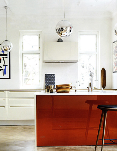
Below: Love the simplicity, the boldness, the white foundation. I also LOVE the artwork, as many of you may know.


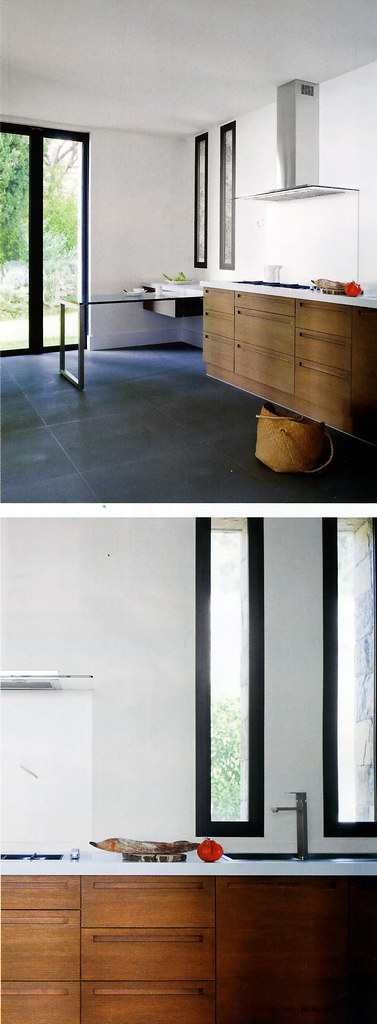
Below: You know, I'm noticing more doors and windows with black trim for some reason, and I like it. Liking the skinny windows here.

Below: Interesting! Sure breaks up the mundane gray everywhere and creates more importance and weight to the upper section of the kitchen. And it's fun, and fun is always good in my book.

Below: I really like this one because there is a great juxtaposition of the profuse green landscape and the modern interior. Not to mention the artfully displayed accessories. Look at that!

Below: Now, this is not normally my style, but I could move into this space! I love white, I love texture, and I love windows. I'm good. 

Below: And, who can't smile at this one?? I sure am! We have white, we have major whimsy going on, and a modern point of view...mostly. Love. 


And you? What do you like/not like??

Want To Sell Your House? Clean The Kitchen!

My new Twitter buddy, Julia, from hooked on houses, has a post today on images that a realtor takes for a home listing. This struck a chord with me, having just bought and sold a house (not in that order!) And, having gone nuts over staging, tweaking images...and cleaning.

In my months of house hunting recently, I cannot tell you how much an unkempt kitchen was a total turnoff. It didn't even have to be a dirty kitchen (that's a definite turnoff.) But, even a slightly messy kitchen was...distracting, yes, that's the word. Distracting in a negative way is a negative thing (oh, how profound.)

Every realtor will tell you that a house, these days, needs an edge to be noticed. The house has to stand out among its competition. The chances of standing out greatly diminish if a home is in disarray, especially if the competition in the same price range shines...literally. The kitchen and bathrooms are viewed as utilitarian spaces, where cleanliness is important. That's sort of an undercurrent in one's mind, I think, when one visualizes oneself cooking and living in the kitchen. Therefore, it should be a clean slate, devoid of clutter and mess. 

In addition to the tips I previously mentioned on getting your kitchen ready for resale, in which I mentioned cleaning, I'd like to go a bit further... 


LIST OF THINGS TO CLEAN IN THE KITCHEN:

  • floor
  • window glass
  • window trim-oftentimes it's just a wipe with a rag. If the trim needs to be painted, paint it!
  • baseboard molding - clean or paint it
  • cabinets - clean your cabinets and all their cracks and crevices on the outside
  • cabinets - clean your cabinets on the inside as well
  • joints - such as at the floor and the cabinet toekick molding, the baseboard molding and the floor, anyplace where grime accumulates
  • walls - does your kitchen need a fresh coat of paint?
  • dust all surfaces, shelving, decorative items, and so on
  • clean the garbage pails - take them outside and hose them down/clean them
  • clean out toaster/toaster oven
  • clean/wipe down all countertop appliances. Move them from their places and clean all around them.


GET OUT YOUR TOOTHBRUSH AND CLEAN THE...

  • sink(s)
  • refrigerator
  • dishwasher
  • microwave - there are numerous solutions, but it's a must-do
  • backsplash
  • cooktop and especially grill
  • vent hood

Basically...clean everything. Wipe down everything. Dust everything. Leave time before showings and open houses to do it again and again and again, as the showings present themselves. 

I promise you your house will have much more of an edge than it did before. I know how important this is...I just sold my home in a very tough market. Tough, because my home's price bracket was completely stagnant - lower priced homes were selling to first time home buyers and much higher homes were selling, although a bit less so. But, the middle/upper priced homes were, and are still, simply not moving in my area. Fortunately, ours did! And, every time we had a showing or an open house, we all pitched in and strived for near perfect cleanliness (and not because we enjoyed doing it.)

I think that helped immensely, and I remember how I reacted as I looked at potential homes for our family. Here is a link to eco-friendly cleaning supplies