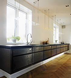
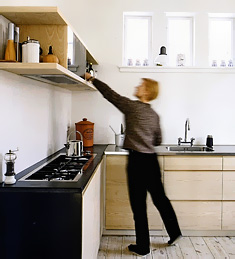
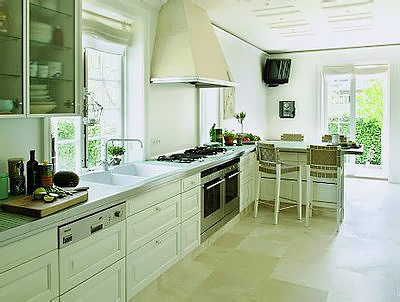
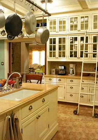
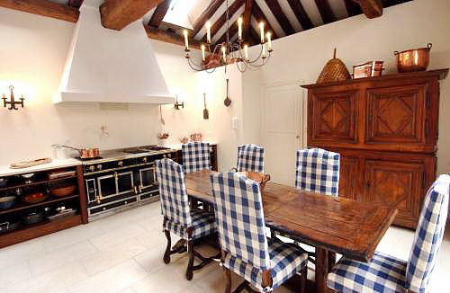
French Country Kitchens - Oooh La La!

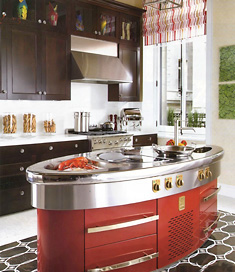
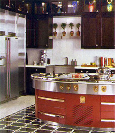
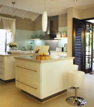
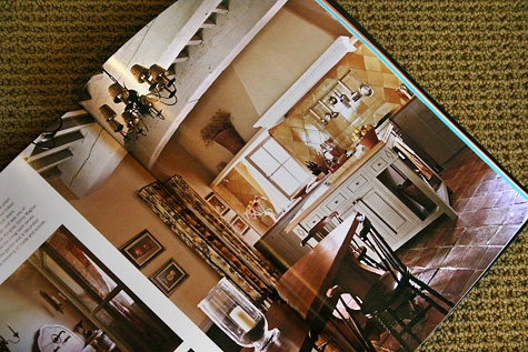
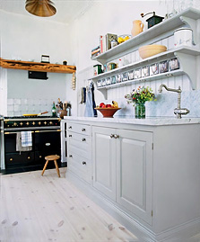
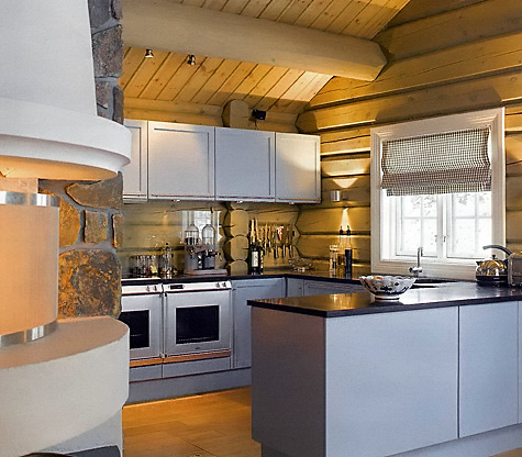
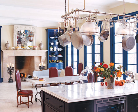
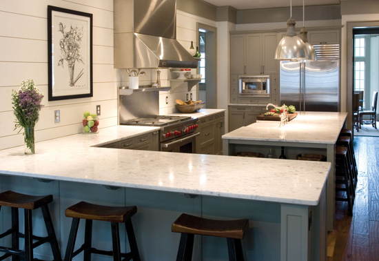
I've hunted for a week to bring you the most wonderful, delicious, sweet and charming, and yes, also austere and elegant, kitchens that are uniquely French, mostly French country, and ah, so magnifique! (That is all the French I know). They are the real thing!

To go along with the kitchens, also, please take a look at some interiors to complete the look. Linda, from Surroundings recently had a post on a new Paris Hotel, always a great type of venue to view interiors. And, if that is not enough, go to Decor8 to do some shopping in Paris, with the fantastic list of Paris shops on the right side of the page, under, well, Paris! And, enjoy a great short read about one woman's love of France over at Hygge House.

Please go to the French Country Kitchens gallery to see the kitchens. I recommend a glass of red wine before you go!


25.jpg


Kitchen Cabinet Delivery Day Is Coming!

The day is finally coming, after all the time, the planning, the labor, and let's not forget, the angst, (just a little bit somewhere). So, what's going to happen? How will it all unfold, and is there anything you need to know? In a word, YES. Here are some tips to make the day go smoothly, and be as exciting as it should be:

  • Start two weeks ahead and review your contract. If extra items were ordered, or any items cancelled, settle up with your designer sooner than later.
  • Note the method of payment on your contract! Is your payment designated to be via bank check? If so, have your funds in order in advance to avoid any unforeseen difficulties.
  • Still 2 weeks in advance, get the day and time of day of your delivery so you can plan accordingly. Be home, or your delivery may not be able to take place if there is no access into the house previously arranged, and as a result, you may be responsible for a redelivery charge. Often, your kitchen is one of several being delivered that day, therefore, it is critical that the cabinets be delivered, or the other kitchens may not be able to be delivered to their destinations, and even if they can be, your cabinets will be moved around in the truck. This is not a day to be forgetful. For me, the designer, it is a high stress day, always, to have it all orchestrated properly, as you will continue to see below!
  • Tell your designer to keep you in the loop as to any changes in delivery time in advance, or even that day, to be aware if the schedule is still accurate.
  • Consider the path into your home. If floors are newly finished, make arrangements to have building paper put down in advance. This step is most likely not in your contract, and can be as simple as putting down drop cloths. My recommendation is to address it in advance with your designer. There may or may not be a charge attached, if you want all of your floors covered with building paper. Consider where you will store the cabinetry. If you realize that you have nowhere to store them, due to project delays, call a storage facility or see if you can delay delivery (sometimes you can, but probably not likely). You want the cabinetry handled as little as possible, therefore, try to make it just one stop.
  • Is your address confusing? Are there two streets with the same name in your township? Advise your designer, who may not know this, or you will be waiting unnecessarily.  
  • If it is winter and you are in a cold climate, or hot and humid, do not store your cabinetry in your garage! Your cabinetry should be in a climate controlled environment. Think of it as furniture.
  • Do you live on a driveway that is up or down a large hill? Make sure that it is completely clear and accessible, and all pathways clear of snow, ice, and debris, or the delivery may not be able to take place.
  • You are permitted to be controlling(!) and if you think of it, ask your designer to stack your cabinetry efficiently (in two layers vertically) and carefully. It does not hurt to occasionally keep an eye on how the cabinets are being brought into your home and ask questions/make suggestions where you see the need to. I always tell those who move the cabinetry into a home to understand that it should be treated as if it is glass. I hover and watch and remind and direct in a nice and professional manner. I will ask that items be rearranged. That's ok to do. 
  • Plan to be home if possible during your delivery. Find out if your designer or his/her representative will be present at delivery and will supervise. ideally, you want someone to stand at the back of the truck to determine if any cabinets are transported off the truck in a damaged state, (a rarity). This is critical. Any damage should be noted on the delivery receipt, which your designer will keep a copy of.
  • Do not worry if anything is damaged or missing. Your contract should protect you in terms of missing items and manufacturer's defects. It rarely happens. Sometimes the factory will not advise the design firm that they are "shipping short".  Your contract is your promise that all materials will be delivered in good condition. Check that on the front end, not the day of delivery.
  • Do you have to tip those who move the cabinetry? No. If you want to, that is up to you. It is not expected.

I would guess that NONE of my clients follow the advice above in regard to the day of delivery and are often not present, and everything ends up fine. However, a word to the wise...


I'll bet you did not think there were so many issues involved during the day of delivery! 


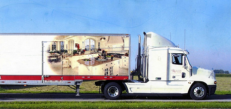
HEY! That's one of my kitchens on the side of the truck! And, it's for real!  :-) Too bad it never comes to my part of the country.


susan serra truck.jpg

NKBA - National Kitchen & Bath Association

The NKBA, as you may know, is the National Kitchen & Bath Association. I've been a member of the NKBA for many years. I also became a Certified Kitchen Designer in 1993.

It's a good thing for a consumer to use an NKBA member firm, or a Certified Kitchen Designer to design his/her kitchen. A CKD must meet requirements for educational points during continuing 2 year periods.

Being a member of an association, generally speaking, means that the member firm is interested in their industry as a whole, going beyond the narrow focus of their business. The NKBA offers many seminars, multi day conferences, and maintains a nation wide chapter organization. There are monthly NBKA chapter meetings which include a presentation on a different topic every month. The NKBA also co-sponsors the enormous KBIS conference each year, to which I travel to every year. It is a good thing for a kitchen designer to be involved in their industry and aware of new philosophies, products, and design information. Now you know a bit more about my national association!

NKBA.gif 

Scandinavian Kitchens - Black & White

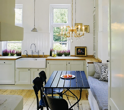
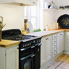
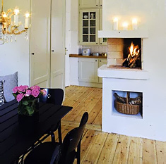
I've previously talked before about Scandinavian kitchens being very light in color, and they often are. White seems to be the common theme. When white, neutral woods, and black, come together, it's very exciting. We'll save color for another day, but these kitchens are no less wonderful without punches of color. Look at these beautiful images from Bo Bedre. Notice the floors, aren't they amazing?

Do you want some inspiration for white or neutral accessories? Look at this amazing blog on Scandinavian design. And, for more inspiration, another Scandinavian home design blog. I will try to feature Scandinavian design blogs every time I do this series, to add the "real" look. I also hope to receive comments and design advice on Scandinavian kitchens from those who live in them!


susan serra scand 2033.jpg


susan serra scand 2031.jpgsusan serra scand 2032.jpg


susan serra scand 2026.jpgsusan serra scand 2030.jpg


How Low Can Your Kitchen Window Go??

I was reading other blogs and came across this image of a kitchen. There is only the one shot, but I have some thoughts about design and aesthetics that I'd like to share with you.

The image is from Terramia, a great design blog I frequent.

window susan serra.jpg 


I think what first struck me was the feeling of light in this image. I'd like to focus on the windows and where they are situated. They nearly touch the countertop. This is a major factor in the aesthetics in this kitchen. It appears to be a nearly invisible transition to the outdoors in a very effective way. I assume the window just over the eating area is at the same height. It's difficult to see.

To situate the windows as close to the countertop as possible seems relatively easy. Cabinetry is most often 34 1/2" tall, and most countertops are 1 1/2" thick, or 1 1/4", reaching 36" overall in height. So, a thought may be to install the window at 37" of height, or less if one is feeling adventurous. Here are two more images of a low window installation:

window2 susan serrawindow3 susan serra

What comes next will contribute the C factor into it all: Confusing Calculations. When remodeling the kitchen, you must consider many factors, if you want the window to be as close to the countertop as possible. Here are some, just off the top of my head, and may not be all issues to worry plan for (purposely all jumbled together.)


Will the flooring be changed? Does the subfloor have to be changed? How thick will it be? Will the subflooring be leveled? What flooring material will go in? How thick is it? Will there be any sort of adhesive material below the floor? How thick will that be, for example, a mud or thin set application? Will the mud tile installation be leveled if the subflor will not be? What is the high point of the room? What is the low point of the room? Will the cabinetry have to be shimmed? (answer..always). By how much? Is some sort of sill or casing below the window desired, or none at all? What will that dimension be? How thick is the countertop material? How is the window constructed? Who, all. will be the players in all of this labor and design decisions and are they giving reliable information or communicating maybes?? What if the window is put in too low?This, in all honesty, is why you rarely see this application. It's risky, very risky! To me, it's not just nice, it's fantastic.


 I was glad to have come across this design element in Terramia. It is a design detail that would have been far from my radar screen to discuss here. I'd love to know what you think of this type of installation.


retro kitchens - kitchen nostalgia or shredder material ? #5"

Hello, and welcome to our fifth installment of "Kitchen Nostalgia or Shredder Material". I understand that in some areas of the country, the winters are very long, and spring seems like it will never come. Thus, protection from the elements is taken very seriously, and a necessary consideration. There is some very serious cabin fever going on here, bringing it, um, to an entirely different level!

brown kitchen susan serra.jpg


Well, I can say that the brown range is back in style! We're looking today at a resurgance in brown, now called "oil rubbed bronze". The Kitchen Designer says, however, that this new look is NO EXCUSE to revert back to this style of kitchen! The kitchen police will be out in force, dispatched from The Kitchen Desginer blog, should we have notice of infractions. Be very afraid!

Besides the interesting look of this kitchen, let's look at a few things going on here and have even more fun:

  • See the small ceiling fixture and the two large pendant fixtures. The lighting is way off balance.
  • Patterns and color! Brown, brick, and more brown. Geometry everywhere.
  • I wonder if the wall cabinet has any use, the second cabinet to the left of the window. Can anyone even access its contents?
  • I give 2 points to the gold cast iron sink. I actually like it!
  • And one more point, ok 1/2 a point to choosing a light colored countertop to lighten this dark cabin up!
  • And, I almost forgot, the roof material - what are those things crawling on top of the roof over the range?

This one was fun! What do you think?

Beautiful Kitchens

We made it to Friday! How about some beautiful kitchens to transition into the weekend with? Also, take a look at these sites for some inspirational ideas on accessories and artwork for the kitchen. I wonder if they have a men's size for this accessory? Oh well, a girl could dream..enjoy these dream kitchens! The beautiful kitchen designs shown here are from Traditional Home's April issue.


tradehome Susan Serra017.jpg


TradeHome Susan Serra018.jpg TradeHome Susan Serra022.jpg


tradehome Susan Serra019.jpg


TradeHome Susan Serra.jpg

march toward KBIS - wood countertops & induction range

Continuing our sneek peak at kitchen products coming out in preparation for a debut at KBIS, here are two to look at. Craft Art countertops are all wood, and this year they will be introducing reclaimed wood tops. How wonderful is THAT? I have used Craft Art before, and they're great. I'm ALL OVER reclaimed wood!

Also got word of the first induction range with a five burner cooktop from Diva. If that wasn't enough, they're offering a free massage at their booth at KBIS. (Note to self: check out all the technical details at the Diva booth till exhaustion sets in, then go for the massage.)   ;-)

diva range image.jpg 

Everybody's Talking At Me!

Disclaimer: The Kitchen Designer blog will not always be light and airy, with eye candy and interesting tidbits. No, sir. On occasion, we will tackle bigger issues that may make us squirm a bit, issues which may come up in the lovely and magical world of remodeling, presented for you to go "hmmmmm..." That said, here we go! All of the below information assumes you are working with a good designer, one who is creative, is open to new ideas, is patient, and offers you choices.

Muncha.jpgEveryone's a critic! We have the architect, the interior designer, the contractor, the mother-in-law, the mother, the father, the friend, neighbor, and let's not forget the man on the street or the plumber! None of those in any particular order, of course, in terms of their willingness to dispense opinions.

After discussing your plans with others, who then jump on the opinion bandwagon, along with their instruments, here's how to keep things from getting out of control and descending into the black hole of chaos (you didn't know kitchen design was full of such drama, did you!)

First, understand this: In an ideal world, when working with a kitchen designer, there is often a process which progresses, sometimes in a fragmented, hodgepodge manner. What that means is, as new concepts are revealed, new challenges are also revealed, or trade offs, as they are called. Pros and cons. I go back and forth with my clients. They travel down my road, or I down theirs, but then double back to travel down a different road (or their friend's or work colleague's or sister in law's road, and so on). This is where it can get confusing.

munch5a.jpgIt's GOOD to get ideas from others! Ideas are good. Ideas are important. However, I would like to offer the following observation, from many years of experience. Those who offer opinions, which may be presented as "shoulds", have not been privy to the process, to the history of the development of the plan up to that point. They do not know your and your family's kitchen "life" as your kitchen designer knows and understands it. And, they do not know how you got here from there.

The most serious effect of advice from others is that a client can lose confidence in their (previously trusted) designer and put more weight on to someone else's advice, perhaps a non design professional, who is of influence to them in their lives. Secondly, if opinions are expressed strongly, and with great conviction and flourish, to a client, existing in an undecided state, which is where clients are residing for a period of time, in "design limbo", a client can thus be more easily influenced to consider an option that may not be right for them. Those who offer design advice do so out of enjoyment, sometimes fierce loyalty, and their own sense of what "they" would do, or more dangerously, what is the "right" way.

munch.karl-johan.jpgCan the designer, even well experienced with golden achievements, think of and present every idea within all realm of possibilities for your space? Definitely, not, nor should that be done. The fact that your designer did not think of this or that, should not be worrisome to the client. What should be worrisome in regard to your designer is a lack of original ideas, lack of choices, or being closed to others' suggestions and changes. I hope that does not happen to any of my readers. That is an entirely different topic.

So, while you reside in the "design limbo" phase, IF you reside there for a period of time, some get in and out very quickly, understand that that is where you are, for right now. It's a process. Listen to others, write down the advice if it sounds good and viable, and discuss it with your designer next time you meet. Ask to see a new idea drawn, if it is something that has possibilities for you. The strongest voice is not necessarily the best voice to listen to. Step back and do your evaluation of all ideas from all sources and the best ones (for you) will rise to the top in its own time. When the process is over, and the kitchen ordered, I hope you will have made the decisions that are right for YOU.
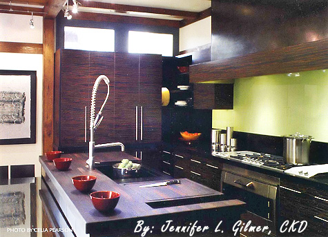
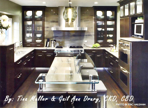
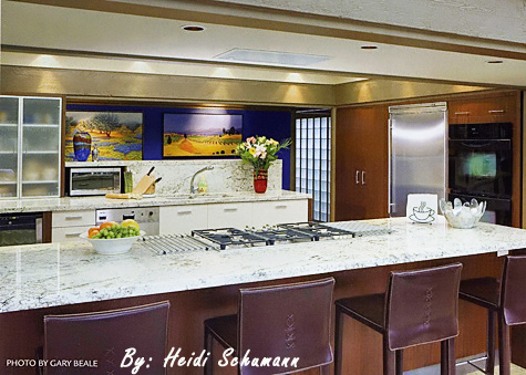
2007 NKBA Design Competition Finalists "large Kitchens"

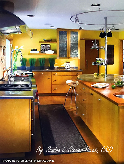
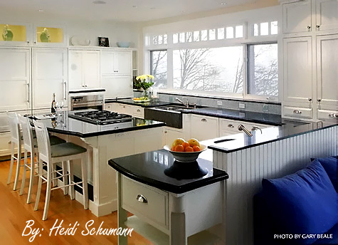
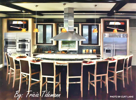
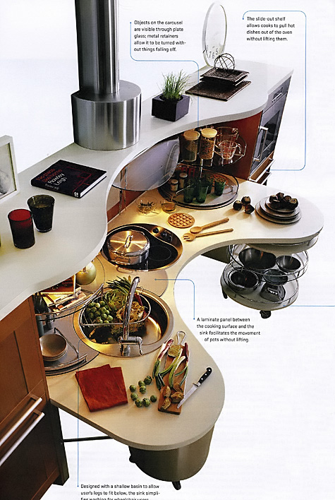
Here again, the finalists for the "Large Kitchens" category of the 2007 NKBA Design Competition. Mostly contemporary, lots of exciting stuff going on in kitchens today, that's for sure. I'm having a tough time picking my favorite. When clients are open to new ideas, good things happen, it's very simple. Very good things.
I love the line of windows in the white kitchen. I'm crazy about the circular element in the top kitchen, I keep coming back to the design in the third kitchen, I like that a lot, and I'm wild about the backsplash and the island in the fourth kitchen. I'm very impressed.!

Our final group is called "Open Plan Kitchens". Which ones do you like?


NKBA large Susan Serra014.jpg 

NKBA large Susan Serra013.jpg NKBA large Susan Serra015.jpg


NKBA large Susan Serra016.jpg 

Uber Universal Kitchen Design

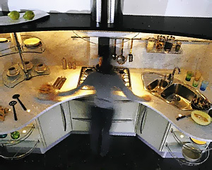
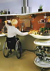
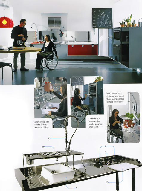
The March issue of Metropolis (mysteriously just received today) has a wonderful feature on "Total Access", three European kitchen companies, dedicating their modern design expertise to universal kitchen design, very aesthetically appealing, very cool. Metropolis talks about 16% of the European population already being over 65!


universal design susan serra003a.jpg

storage/universal design susan serra006a.jpgstorage/universal design susan serra008.jpg

The kitchens included in this entry are Snaidero (top/center images) and Valcucine. Up to now, universal design was virtually an after thought design-wise.  To me, it looks as if universal design thinking for kitchen ergonomics and aesthetics is clearly ahead of the curve. There is more to learn in this feature article. Better get your copy now, it's almost April!

universal design susan serra012a.jpg


Top 5 things to do before you hire a kitchen designer!

I was speaking with a blogging buddy of mine, who mentioned that her parents are planning a kitchen renovation and are having trouble thinking about what to do first. They are at a total stalemate. There are so many issues, so many potential players in a kitchen renovation, I suppose it must be difficult for many to decide just that, what comes first. Well, The Kitchen Designer comes to the rescue! Here are my top five things to do BEFORE you hire a kitchen designer.


  • Get some sort of organized system to make notes in. Whether good, old-fashioned pad and paper, a binder, a software or online program for kitchen organization, begin the process in an organized way. To go one step further, create different categories for your project....one section for cabinetry, one for countertops, one for the contractor, one for the designer, and so on.
  • Do online research for kitchen designers in your area and beyond. This will, and should, take quality time. Don't be afraid to go outside of your area if you seem to connect with the information presented in a website for a particular designer. Many designers travel. Don't limit yourself searching via just one zip code. Take time and "travel" online beyond your town. A great source to begin with is to go to the nkba website. At the time of this writing, their site has been unavailable for some time. Keep trying! Also, speak to your friends and neighbors and check references.
  • At the same time, you will need to begin the search, perhaps for a general contractor, and an architect, depending on if you have structural issues to address in your remodeling project. My personal opinion, is that it is never too early to find your kitchen designer. Who comes first often depends upon the project. In a recent case of mine, I worked with clients for months before the architect was called in. The architect dealt with some of our structural concerns, gave his blessing, and is now awaiting final dimensioning information from me, as the kitchen design is driving the home's extension. In other cases, due to roof lines or other issues, such as surrounding rooms being involved, the architect comes first. Find your professionals and begin the conversation with each of them. The answer what to do first will soon reveal itself to you. Remember, too, that, just as in doctors' practices, each professional has a specific area of expertise. A good professional is one who knows his/her boundaries. Do not ask me about detailed structural issues, that is an architect's domain. Do not ask a contractor about kitchen design. Put the weight of the advice in proportion to the professional's expertise, and to what one does every single day, not on occasion! And, be aware that the product you choose is only as good as your designer. Choose your designer first, and your products second.
  • Begin an idea file. Collect pictures from magazines and bookmark websites where you have seen pictures that you like. Gradually, you will see if your aesthetic vision is focused or, well, all over the place! This will be helpful to communicate to a designer. Do you really want to go crazy? I apologize in advance for turning you on to all of these 1,762 kitchen images. It is well worth the price of a subscription.
  • Work to define a general, not a specific, budget! Think about the quality level of products that you hope to put into your home. Begin some easy leg work, such as pricing out appliances. Write a list of everything you can think of that will have labor attached to it. Don't forget electrical, plumbing, hvac, audio management, general contracting categories. Understand that if you come up with a specific number you want to work with to cover your wish list, this number may or may not be realistic. Be flexible, be open to changing parts of your project, making substitutions, and setting the budget (range) will merely be on your to-do list, rather than be one of anxiety and angst.
  • And, a bonus: Subscribe to this blog, come back, ask questions, start a discussion, and you will find assistance and a constant flow of new ideas and information!


Remember, too, that you do a kitchen once in your life. Put the time in on the front end! Do not get bogged down in any one area, balance all areas and you will come up with a focused direction to begin your project. You will have a budget that you feel comfortable with, and will be well on the way to finding the right people to help you achieve a great result to your project. One step at a time. Now, go, stop procrastinating!!

Go from this:

before kitchen.jpg 


to this: 

after white kitchen.jpg


New franke sinks!

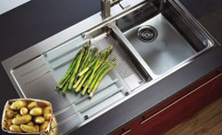
franke sink kitchen.jpgCheck out these new Franke sinks. I'm at their website all the time, looking for one client or another, and this just popped up today. I think these sinks are very cool. Here's what Franke says: "The new Mythos line generation has all the ingredients of a new classic. This stainless steel, ergonimically proven sink, makes work a real pleasure. The mobile sink insert fits exactly into the large working sink and into the spacious draining sink, and is ideal for rinsing, draining or thawing. The flexible preparation board is made of tempered satin glass that you can slide right over your sink."

franke faucet kitchen.jpgAnd, a new line of faucets, commercial in concept, made for home use. Franke says: "Restaurant efficiency and professional style to meet your epicurean requirements." I must say I really do love those restaurant type faucets. And, these new styles on the theme make me want to run and wash something! Did I say that?

These are not the only new product introductions by Franke. There is a fine collection of new sinks and faucets of varoius types and styles on their website. This is just a preview of lots of good stuff.  

Scandinavian Kitchens

I've had a passion, far more than an interest, in Scandinavian kitchen design for many years. It first relates to my strongly held Danish heritage, my parents having left Copenhagen for the U.S., and  me, returning often to visit my family in Denmark, since I was a child. There is a history here. My trips continue periodically.

I have felt for some time that we, in the U.S., are more than ready to embrace the wonderful Scandinavian kitchen and interior design "look". As we move away from a heavier, traditional, point of view in the kitchen toward lighter, simpler, looks, with cleaner lines, the recent interest in Asian design makes sense, and Scandinavian design (far less "known") makes sense to be noticed as well, for reasons anchored in, well, hundreds and hundreds of years past, bringing relevance in a perfect way, to today.

scand kitchen.jpg scand kitchen3.jpg

scand kitchen2.jpg 


 I see several common threads in Scandinavian design, including Scandinavian kitchen design:


  • the broad use of white - as the sun sets so early in the winter months, one needs light! I can tell you that when I was just in Norway in early December, dawn was after 9 am and sunset was at 3 pm, with the sun low in the sky all day, and that was nearly 2 weeks prior to the winter solstice! We walked in town in complete darkness at 3:30 pm. I believe white, or light colors, are nearly a necessity to preserve as much reflected light as possible.
  • the use of color - Scandinavians really love punches of color, whether the color is pastel or bright colors. Often found in contemporary artwork, textiles, and accessories, color plays an important part in keeping away the winter blues.
  • use of natural materials - whether it is light, natural woods, timbers, or other natural materials to remind one of nature and the outdoors. A strong appreciation for texture.
  • clean lines to enlarge small spaces, which most are, in comparison to Americans' generally larger homes. Also, the use of clean lines as part of the Scandinavian design philosophy of an object having beauty in its own simplicity and singular function. A human centered design philosophy. Truly, "form follows function".
  • often, a personal link to the past in regard to beautiful materials and accessories, sometimes encompassing a whole country Scandinavian look of years past.
  • The Scandinavians invented eclectic design! With as much of a strong look to the future, they are masters at combining old, rough, textures with sleek, new surfaces. It is an art to combine the two, and the world must see how the Scandinavians do it so well and so logically. Of course, when you have a kitchen in an 800 year old apartment building with exposed beams and walls, the contrast in new and old materials speak for themselves!
scand kitchen4a.jpg danish kitchena.jpg

I was very excited as I perused the internet on my laptop to see "The Kitchen Designer" site on this great blog, mikkelinesin!  What a surprise! There are some lovely shabby chic, colorful, pieces shown, and the blog is very charming overall with lots of white, natural woods, and color. Another good Scandinavian blog is Guldkant Pa Livet with beautiful images of a lovely Scandinavian lifestyle.

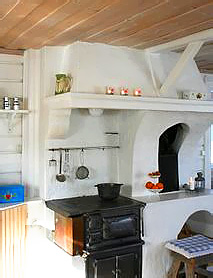
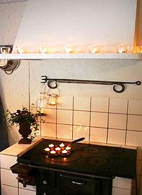
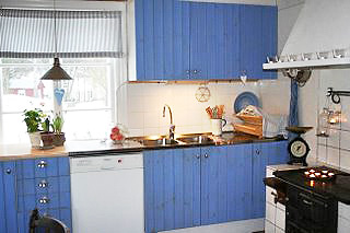
The top three images come from this blog. The top blue kitchen is the blog author's own kitchen. The house is from 1750 and the oven is probably from the same period. The white oven image is from the north of Sweden and dates from 1890. The middle lighter blue kitchen images come from the Kvanum kitchen company.

This is but a very small sampling of Scandinavian kitchens I will be showing you. Every Monday will now be "Scandinavian Kitchens Monday"! Don't miss it. I would love for those who live in Scandinavian countries to talk more about what makes their kitchens wonderful. Please add more information to enlighten us all!

Just to put this over the top, please visit this blog, Red House, authored by a Swedish designer living in the U.S. You can get lost in all the wonderful images.  

Scandinavian Kitchens? You heard it here first. 

The beautiful image below is from the Norway's beautiful interior design magazine, Bonytt. Enjoy!

Scand kitchens 1001.jpg


Kitchen Envy

Thinking of remodeling your kitchen? Stuck on style, colors, theme? Take a look at high style kitchens as the ultimate in inspiration. And, if you think it will make it easier to choose a style, forget it, they're really and truly, far too gorgeous....I'd add another 6 months to sorting out the style question.

housegarden kitchen.jpg 

retro kitchens - kitchen nostalgia or shredder material? #4

Welcome to this Saturday's special vintage kitchen, aka, "Bauhaus meets Disco"! I don't know why, (hmmm) but this one just popped out at me, as I perused my collection of vintage kitchens from the 60s and 70s. I think this kitchen was ahead of its time (for the early 60s), or perhaps was at the cusp of the disco era? You KNOW we need a disco ball light n the center of the ceiling! Get out your platform shoes and start dancing!

old red kitchen design.jpg

Not a badly planned kitchen, really, although I'd love to understand what's going on with that second island up front, where and how that is positioned in the room. Otherwise, the wall cabinets to the right of the refrigerator should have been equal size sets of doors. I'm not sure I could concentrate on reading a recipe in this kitchen, and I'm also not sure I'd go stir crazy after 20 minutes! Other than that, enjoy!


kitchens heard around the blogs

Yesterday and today I am attending a conference and so I will take this opportunity to check out good stuff around the blogs.

How about a miracle product (no guarantees from me, but try it first in a small, hidden, spot) to clean those stainless steel appliances? Get the info from Happy Slob (don't ya just love the blogosphere?)

And, just LOOK at THIS gorgeous kitchen I found at this terific blog, Hatch. Part of the Atlanta Junior League Tour of Kitchens.

This kitchen actually reminds me of one I recently did, a white kitchen with planking across the hood, the appliance built-in, and behind the peninsula.

The tour is this weekend. See you for tomorrow's installment of "Kitchen Nostalgia or Shredder Material #4"! I have a bonus for you tomorrow!

jl-kitchen-tour.jpg


blogging terramia

Take a look at the post from this cool blog, Terramia, on some fresh, spring, kitchens. I'll leave it to Terramia to provide the sources and credits. This image is from the book: Home Cheap Home. She has a bunch more fun kitchen images. Posted today's date. For later dates, the category on the blog is: "kitchens" Happy Spring!

HomeCheapHomekitchen_edited-1.jpg


it's gnarly! Rustic Cherry

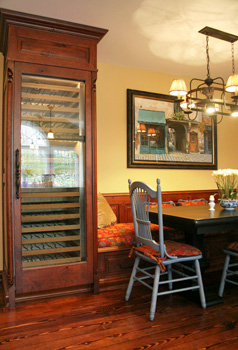
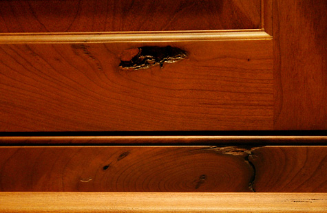
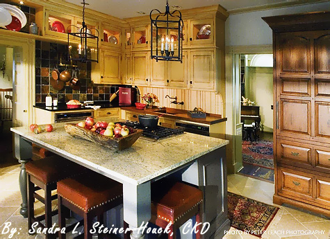
I have a wood species to tell you about, and I bet you haven't heard of it, or have seen it before! When I first saw it, I just loved it. I loved the rustic nature of it, and most of all, I loved the fantastic knots - the deep, gnarled, dark, craggy, open, sometimes with holes all-the-way-through - knots. It's really a great look. AND, it has the elegance and great grain pattern of cherry, with the rustic nature, of, say, pine, but BETTER. In the two images just below, you can see the overall look. The knots are not all over the place, but are spaced a good amount apart. With the knots, there is often exaggerated graining as well.

If you want, you can go several steps further, with various types of distressing, square pegs, glazing, cobblestone distressing, splits, worm holes, nail holes and more, really, as much as you want from a lite rustic look to a very heavy rustic look. It's something to consider, whether for one piece or a whole kitchen. What do you think?? Me, I'm really crazy about it, which is why this is the first wood species I'm discussing. The custom cabinet manufacturer I prefer to use for this wood is Quality Custom Cabinetry. Enjoy!

mallon 043a.jpg


2007 NKBA Design Competition Finalists "Medium Kitchens"

Here are the medium kitchens category, the winner to be decided at KBIS in May. A very strong group. I like them all for different reasons. There is something in each one that appeals to me. But, if I were forced to decide, I'd say the second one down. I really like a warm, contemporary, look. There is also beauty in symmetry, as is shown in the third kitchen down. The first one looks great too, with the different backsplashes and the furniture piece. Nice detail there. And, the last one really seems to be about color, and a cool, sleek, look. I do wonder why they chose black ovens. If not stainless, I think I would have voted for white. So, here they are! Next up, the large kitchen category.

 nkbaimages143a.jpg

nkbamed153.jpg 

nkbamed152.jpgnkbaimages144.jpg