A stunning kitchen


lene_bjerre1a.jpg


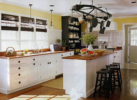
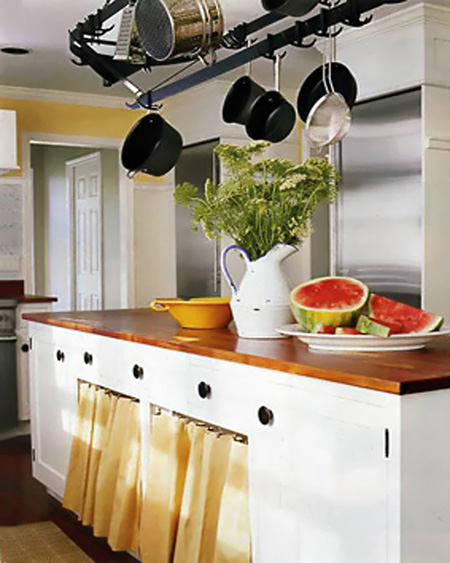
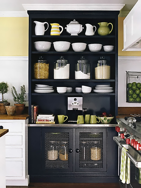
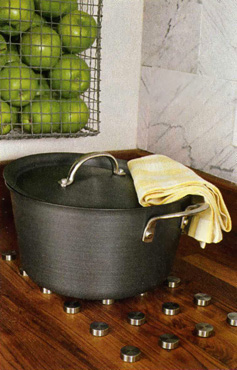
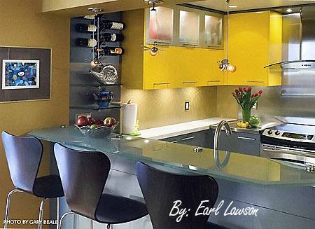
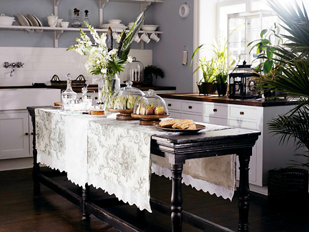
 I just wanted to share this wonderful image with you that I saw on the "of amity & allure" blog. Isn't it gorgeous? Wouldn't you just love to have that table in your kitchen? I could also see decorative, lidded baskets of different types in the center portion of the table, on the floor, for storage purposes, or left just as is. Of course, I'm sure the design presumes there are glass fronted pantries off to the side (as it's certainly not on the wall!). Here's the website for the furnishings: Lene Bjerre Design

March toward KBIS - LG Electronics

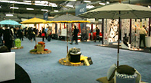
IMG_2948a.jpg"March to KBIS" means it's time again where an influx of press releases are sent to members of the press to either announce or give a tease about their new products, which will be debuted at KBIS in May, a huge show, with approximately 50,000 attendees. KBIS is the Kitchen Bath Industry Show, held this year in Las Vegas. Don't expect me to tell you anything about my trip other than news items...you know what they say about Vegas...

So, here is what I got today from LG:

  • "New high-end kitchen series
  • First-of-its-kind Dual Convection Electric Range and LG's first Gas Range offering
  • Unique refrigerator innovations such as a French-door model with extra-tall vertical ice and water dispenser and the world's first high-definition TV Refrigerator
  • Expanded laundry portfolio including new additions to the award-winning SteamWasher line and new designers colors"

Once at the show, the press kits will show images of these new items, and of course, I will see all the new products myself, wearing my awesome gold sneakers. Up till then, you can only ponder what's to come.

Stay tuned for more "March to KBIS' info HOT off the fiber optic cable! 

Doing the editor's kitchen

This is a project that was brought to me by the regional southern New England/New York metro area Better Homes & Gardens editor, Cynthia Bogart, who has submitted my work to Meredith Corp. for years.

I'm particularly honored that Cindy asked me to do her kitchen in Rhode Island because she personally handles all design submissions for a large territory.

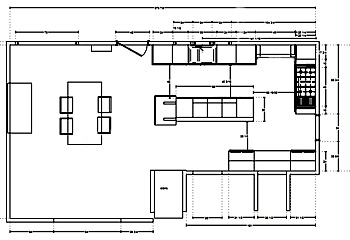
cindy_newa.jpgHere is the general plan, not the final plan but it shows the thought process. At the end of the island, at one point, we were going to put a separate piece, facing the table, which didn't happen, unfortunately. With several doorways, and large appliances, you can see the challenge.

The project was very interesting. Cindy and her husband purchased a modular addition and joined it to their house, across the street from the bay in Portsmouth, Rhode Island. At first, when we started planning the kitchen, I was blown away at all that Cindy wanted to include, in terms of appliances. The separate refrigerator and separate freezer, alone, took over one whole side of the space, and her kitchen was not all that large to handle all these appliances. But, creative thinking soon began, and, bottom line, it all worked out well in the end. Here are some images, and tomorrow, other images from other parts of the house.


One area that did not read well in the shots is the area of which I am most proud. Cindy had a very short wall but wanted a large range. Had all the cabinetry on the adjacent wall been the standard depth, the range would have been proportionately too large for that short wall with little room to move around and cook.

So, what I did was to break up the adjacent walls into two separate areas by virtue of the black, tall, pantry, and since the pantry was much more shallow than the cabinetry to the left of it, it gave Cindy much needed room both aesthetically and functionally, to the left of the range on the adjacent wall. Unfortunately, you can't really see that, it almost looks like the range is jammed into the cabinetry at the left, but it really isn't.

Questions, comments, let me know...more tomorrow.


 Bogart091aaa.jpg 


Bogart093aaaa.jpg


Bogart092aaa.jpg 

Bogart093a.jpg 09 to basement doora.jpg
Bogart095a.jpg Bogart095c.jpg


retro kitchens - "kitchen nostalgia or shredder material #3"

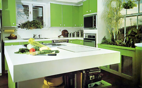
So, here we are with our third installment of "nostalgia or shredder material", ancient kitchens from the 60s and 70s. This kitchen is "Kansas-in-Oz (see the tilted electrical pole in the window-somehow it reminded me of it) meets the Jetsons". As much of the design (seen at decor8) blogosphere is tuning into the color green right now, (also as seen at desire to inspire) and at Design Sponge, plus Happy Mundane and, as we are 4 days away from spring (forgetting the ice storm we had last night) it seemed like a good idea (not to mention, it's St. Patrick's Day) to listen to the pulse and go back to a green kitchen, an entirely different definition of green than we live with now!

greenkitchen146a.jpg


OK, so now to pick apart comment on this kitchen. Here's my take:

  • The microwave seems unnecessarily high, look at all the white space between the oven and the microwave, they should be closer together, that looks awkward to me
  • As was typical, such a small window over the sink, AND, does the cook not deserve to look out? What if the cook is 4'2" tall? (Maybe the builder was 6'6"!)
  • Something to try to avoid in one's planning, if the dishwasher and oven opened together, they would surely collide
  • The round, white knob and white framing behind the green doors......charming in a high tech way?
  • The extra thick countertop - a bit much, but not so bad!
  • The color.....I'll be right back, excuse me..
  • Plants/cabinetry below the window - truly, a good way to disguise this unsightly heating, and we KNOW the long spider plant is screaming, EARLY 70s!
  • Interesting shelving around the island, not half bad

How about you, what do you think?

2007 NKBA Design Competition Finalists: "small kitchens"

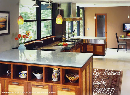
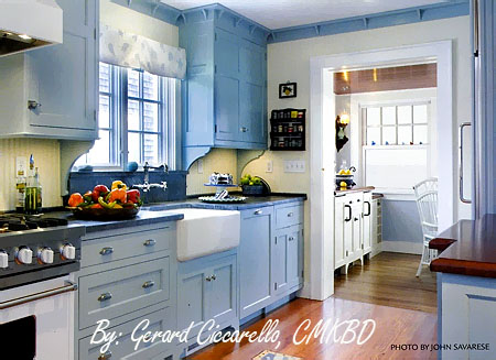
Every year the NKBA (National Kitchen & Bath Association) holds a competition for the best designs in a variety of categories. Here are the finalists for the "small kitchen category", the winner to be revealed at the Kitchen & Bath Industry Show (it's huge!) in Las Vegas in May. There are numerous other categories which I will go through in the days ahead. Next up are the "medium kitchens" category, these are really cool and elegant. And, there is not just the "large kitchens" category left, there are a few more after that, so stay tuned!

Which one do you like and why? 

 nkbaimages139.jpg


nkbaimages142.jpg


 nkbaimages141a.jpg


 nkbaimages140a.jpg


Trending nowhere fast

I got a call yesterday from a top editor at a top publishing house (do they still call them publishing houses?) who I have worked with before. She's writing a book (yay, I'll be credited!) and wanted to talk to me about my life kitchens. Where the trends are going. She was ready right then and there to plunge in and chat, and it was good timing for me, (to procrastinate) and I think we talked for an hour!

What I talked to her about is based on one fundamental feeling I have, but I only connected that puzzle piece later on. What I told the editor is this: I think that trends in the future will not be as strong to pull one into their clutches as they have been in the past. It used to be that a trend would be so blindly followed, really blindly. I see the internet as being responsible for this sea change.

Dey_244a.jpgThe Blogosphere is huge, as we all know. Now, too, there are more social networking sites popping up, like Curbly and Houseblogs.net for those who want to remodel their spaces. I see the fundamental (let me use that word twice!) difference between now and previous internet message board use, as being one major aspect. It's the use of images BY those who are remodeling. Now, they can put up their images and view other homeowner's images, and create a continuing story that goes with it, by publishing blogs, mini websites, etc. Images give knowledge, power, and confidence to those who are remodeling. They were the missing link to the text, and the two have been combined to create an easy to understand, and (usually) interesting, story. Understanding and new ideas are greatly sped up. Sure, some joined flikr right away, but the mainstream, I think, is now beginning to move on this in a big way, like a lava flow, it's moving, and it's unstoppable, nor should it be.

We still have trends, yes. So, if I were to predict, I'd say, a relaxed traditional style will continue to increase, sort of that Hamptons look (but NOT all shabby chic, maybe a touch here and there). There was a HUGE response by my clients to the kitchen in "Something's Gotta Give" which was set in the Hamptons. Many of my clients talked about it. It resonated with them. Relaxed, white (always classic, not going anywhere) and the interest of contrast, darks and lights in terms of surfaces. I call it a "butler's pantry" kitchen style. I also call it "Kennedyesque" or "Cape Cod Kennedy". Do I have one drop of an idea what the Kennedy's Cape Cod kitchen is like? Um, no. But, I have this feeling about it....

I also see people becoming more comfortable with simple, soft, and not so soft, contemporary styling. This style, or any, would feature an increased interest in textures. I think we can finally begin to see a "less is more" understanding and appreciation.  

Dey_264a.jpgAs a result, I see less trend following and more confidence in following one's own sense of style. I see more of a confidence in exploring and using new materials and new ideas, based in part, on the power of social networking.

There will always be the straight "themed" design focus, and of course, the other pieces to intertwine with this new found awareness is to consider the architecture of the home and decor of the home.

As a secondary result, I think people will be comfortable to be more eclectic in their styling of the kitchen, to move toward fun, different, and WOW, to even make up their own style, and to put more of themselves into their kitchen. More soulful touches in terms of bringing in meaningful objects, "living room" objects, to "soulify" the kitchen.  Oh, I made a new word!

I also see the distinct possibility of consumers making their own trends, as they communicate with others online. The viral power of a good idea going from one to another, until it becomes something significant, perhaps a movement. I see that as an interesting piece to all this, which is happening now in small ways, and will grow in the future. Trends coming from all of us rather than from corporate powers. Hmmmmmmm....

I think trends will be less powerful overall, the individual expression more important, and the human spirit will become more exposed in kitchen design and planning. Me, I think it's about time, I've been telling my clients that forever and it's often been tough for them to dislodge from the trend monster!

 
What do you think? 

Blogging The Architectural Digest Home Show, Kitchen Stuff

Went to the Architectural Digest Home Show Saturday, at Pier 94, in New York. It's a good show. There are awesome, very cool, and one-of-a-kind things to be found here.

 misc. 189a
I dressed for a client meeting I had in the morning. It was an outfit I got in Norway from a Swedish clothing design company. Gauzy, with a charming print, which went down to the knees and then with some leggings in a close, but different, pattern that went along with it. So far so good. Meeting went well, on to the city to meet the husband who worked that morning.

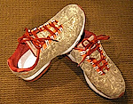
My feet hurt in the shoes I was wearing. I didn't know till after I left for my meeting that we'd be going to the show, so I needed desperately to buy a new pair of shoes before I walked the show. We went to Foot Action on 34th street and 7th avenue. The music was louder than I've heard at any party I've ever gone to, how is that possible? The staff was dancing with whoever walked by. I guess I got in a party mood, my husband's feet were tapping to the music, and so I picked out a pair of lightly sparkling goldy sneakers with orange trim and laces. I'm READY. I'm hip. The only problem was that we went to the Javits Center, only to find it was at Pier 94. A fight with a stupid cab driver later, we finally got there. I swear, they purposely take the long way. You know what I mean.

Back to the show. The items seen here are to die for. They are mostly innovative, luxury, items...a highly stylized point of view. A fair number of companies were showing green/sustainable products, nice to see. Of course, I concentrated on looking for kitchen related items and vignettes.

IMG_3883a.jpg


retro kitchens - kitchen nostalgia or shredder material? #2


The one thing this kitchen has going for it is that it was secretly made to coordinate with this web page (I swear it did before I removed the yellow from the page), a project begun 40 years ago in a remote hamlet of western Oklahoma, being planned to later emerge from the kitchen graveyard for the WORLD to enjoy see gape at in March, 2007. What is wrong with this kitchen, let me count the ways:


yellowoldkitchen131aa.jpg


  • the cooktop is crammed next to the ovens
  • the dishwasher is way too far away from the sink (the sink is purposely recessed to have the DW next to it, which would function well, but not if it were not recessed, thus no need to be so far removed, a little, sure)
  • the unbalanced left side as opposed to the right, not that asymmetry isn't a good thing, but this isn't even asymmetry
  • I feel like I will enter a cave if I stand at the sink - maybe if I got lucky, I'd go through a time warp and arrive in the future with no memories of where I'd been, an apron having been replaced with live-in help!
  • the, um, rug - doesn't it just call someone to do the dishes? And, we know it's a woman with a house dress on.
  • the top heavy wallpaper
  • the fabulous gold countertops!
  • if those are custom dishwasher panels, give me the UN custom vintage DW!
  • Last but not least, and probably not last, let's not forget the black toekicks!

 
Did I forget anything? The one good thing I have to say is that there is not a hodgepodge of different door sizes to cause chaos, that's a minor good thing. OK, I'll say it....there's a little piece of me that just says "awwwwwwwww" when I see this kitchen.

one thing led to another...

...and I ended up with 4 houses in fabulous urban and resort locations, all mine! How lucky is that? We had the mega millions lottery drawing here 2 days ago, I think it was somewhere around $370 million! I guess I don't have to check our tickets...two people won, one in New Jersey and one in Atlanta. Goody goody for them. Me, I had it spent already...some for me and my husband, some for family, some to give to noble causes, making me guilt free as I turn shopping into at least a part time profession.  Oh yes, I guess some should be saved too.

IMG_2031a.jpgAs my husband and I dreamed (mostly me) which we like to do just before the "big one", I figured we'd get a penthouse in Manhattan (but where, uptown or downtown?), the house in the Hamptons, the house in Martha's Vineyard, a large apartment in Copenhagen (love those Danish kitchens) and maybe something in California, but that would come later.  Let's not forget about the Caribbean!

Four new kitchens.. Four different styles, how much fun can one have?  I may want to live in an 800 year old building in Copenhagen and have a sleek, minimalist kitchen, yeah. Love that combo. However, I do like to mix things up, to be eclectic. My preference is to layer several styles/themes into a room, although in small ways.

I feel my own kitchen right now is contemporary yet charming, two very different words! But, why not? contemporary/charming? traditional/minimalist? Sure. It's very doable. Don't feel you must be pidgeon-holed into one style, you just don't have to be. If you're conflicted about style, then the answer is you integrate both, or more. You don't have to know exactly how at the moment, just that you'd like to. That's a good enough start. What styles reflect who you are?

White Hot Kitchen!

The last post really hurt me. Everytime I looked at it, and I'm not kidding, I had anxiety! The yellow, the orange, the brown...the pain was almost unbearable. And, I can't wait to do it again!

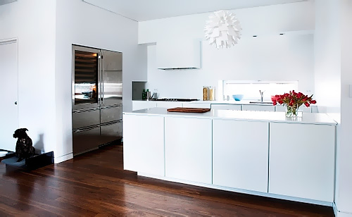
lonekitchen.jpg


So, now, for something a bit more current. Come with me, mod design fans, back to the future, and take a trip to Europe, (I'm not paying) in design style only, to where modern furniture design, truth be told, has its origins. In Scandinavia, in Denmark, to be specific.


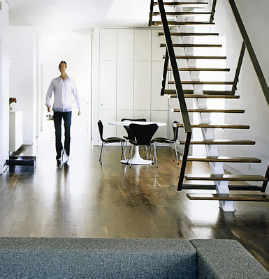
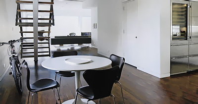
Here's my good friend, Lone's kitchen. Lone (pronounced Lona) Bager is the owner of Kobenhavn Design, kobenhavn design, a to-the-trade supplier of modern Danish cabinetry, including wood countertops.  Lone is based in New York City, in the east village, and operates out of a fabulous design studio.

lone128a.jpg 


The philosophy of Danish design is that there is beauty in the "whole", as opposed to the individual pieces of the whole. The phrase "less is more" was invented just for this concept. It's about function, simplicity, and therefore, beauty. 

lone129.jpg
Note the simplicity and elegance of the cabinetry in the dining area behind the table in the second to last image. Pure function in classic proportions. The beauty lies in restraint. It takes a lot of discipline to allow this type of design to just "be". It's not so much modern, as timeless. Love it.

The cabinetry, affordably priced, is multiform and is available "to the trade" via Lone.


retro kitchens - kitchen nostalgia or shredder material? Kitchen #1

old kitchen124.jpg


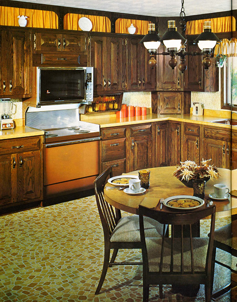
Each Saturday morning, I will be reintroducing a kitchen from years past, dredging up either a) memories which will thrust you into therapy anew assuming you are from that era, if not, you were thankfully born into a better kitchen era (except for the grays of the 80s) b) give you an urge to don an apron and find a rolling pin and probably other unpredictable reactions. Thus, I apologize in advance for the rude and (tasteless) reminders, but I couldn't resist!  I've even made a category just for memorializing these kitchens. I mean, look, after all, orange is back in! Chant with me now (preferably with raised fist): NEVER AGAIN!!

Can you guess the year? AND, how many jokes can we make about this kitchen?

The Next Kitchen Estimate Saga

Since I promised to offer "useful information", I think it's a good thing to talk about the estimate and how it unfolds in certain situations, really, any situation that I come across (well, maybe not ALL, that would be too boring, although I do have a category entitled "The Estimate")...

I went to see a new client over last weekend. Very lovely people. The husband had a number in his head as to what he wanted to spend. So, what I like to do is take my measurements, calculate my costs based on the room size and our conversation, and come up with a categorized list to plug in on my handy estimate form, which my potential clients can keep, file away, rip to shreds, or burn, as desired.

In this case, the client's number in his head was $50,000. I always ask for the client's number after I present my figures.

  • It was a smallish medium kitchen - good
  • They wanted cabinetry with a lacquer finish over an exotic wood and also a painted lacquer finish as well, elsewhere - bad
  • They wanted high end appliances - bad
  • They wanted stone countertops - bad
  • There was a couple of walls to be removed and rebuilt along with other construction - bad


estimate1.jpg


 My first estimate was, $106,000 for everything, except the floor, which they were doing separately, connected to flooring in other rooms.  This estimate included high end cabinetry (including installation)-$48,000, top appliances-$20,000, stone countertops-$10,000, construction-$20,000, and the rest was for tile and sink/faucet fixtures. It was very good that they were sitting down.

That's ok, that's an initial figure. On the estimate form, I have two figures, one for middle quality cabinetry, and one for high end cabinetry. I also have a range within both of those categories, low to high, the low, which includes less options/goodies, the high, which is more realistic and assumes a fully appointed kitchen cabinetry cost.

So, now to work these figures! There were several variables in my estimate. First, and foremost, is the cabinetry. By talking more specifically about their needs, which led us toward middle quality cabinetry, the price dropped substantially. Can they accept a glossy formica door? No. That's ok, at least we all know what is a priority. Now, if one wants to work on a particular budget, one must be flexible. So, my thought was for the appliance category, that they should choose one or two high end appliances that they really wanted, and go toward more middle pricing on the other appliances. That was received as a great option.

Another consideration was construction costs. Can I wave a wand and have my construction price be right on target? Of course not. I do have a good sense of construction costs, and usually estimate a bit too high, so as not to have to surprise people later on. In this case, I felt I could have estimated too high, based on a just completed project, so we deducted some money, probably a bit too much. Next step is to get in a contractor to narrow the costs down, and the client will make their own financial arrangements with the contractor of their choice.

The remaining category was countertops. Would the countertops be $8,000 rather than $10,000? Very possibly, and probably doable, depending on how the kitchen was designed. Let's save $2,000 there.

estimate2.jpgThe bottom line was that we saved about $35,000 off of my original "high end", "dream kitchen", estimate. The final figure was right around $70,000. But, he still wanted to be around $50,000.

OK, let's categorize $50,000:

Appliances: $15,000

Countertops: $8,000

Construction: $12,000 (demo, move 2 walls, relocate 2, patch ceiling, all new lighting, new circuits, relocate plumbing, sheetrock, patch, etc.) This figure is probably doable, I have a good/fast crew, but needs to be verified.

Tile/Sink/Faucet: $3,000 (includes labor)

This leaves $12,000 left for cabinetry. Out of that figure, take about $4,000 out for installation, which is a little low. Take another $1,500 out for freight and tax. This leaves us with $6,500 left for cabinetry.

They realized that their number of $6,500 was not a realistic number for what they want in the kitchen, especially in terms of a decent middle quality cabinet. And, I'm unable to provide a kitchen at that cost. That's ok. It's more important to understand how the numbers add up, as opposed to looking at one large number. This way, they can decide what to do next, expand the budget, rethink certain categories, etc. I can do no more, I'm only one person!


Lesson: The number that you have in your head may be based on what you'd like to spend, but, with all due respect, may not be based in reality. Secondly, be flexible, or else, nothing can happen at all. Rethink those high end appliances. Put in a less expensive countertop temporarily. Yes, you can downgrade your cabinetry as much as you want, but the quality will not hold up over time, and THAT would be a real nightmare five years down the road. The right answer will always reveal itself to you, but also, listen closely to a design professional's suggestions.


Sparks Are Flying!

I couldn't resist the title, but, sorry to disappoint, no juicy gossip here, this topic is, drum roll, electricity related! Nonetheless, I promise riveting information.

A kitchen I'm working on has revealed surprising electrical issues, in terms of additional circuits needed to serve the backsplash lifestyle (you didn't know you had a backsplash lifestyle, DID you??) of the homeowner. It's a small kitchen. I initially assumed the existing wiring would serve the electrical needs in this kitchen along the backsplash, yawn, fairly easily. I was very wrong. (I TOLD you it would be riveting!)

kitchenaidmixer.jpgFor one thing, I noticed the client has a fancy Dualite toaster which, gasp, draws 17 amps. That's a lot! The toaster draws 6 amps more than the microwave! The microwave should be on a separate circuit anyway, (although by code, it doesn't have to be) yet, it makes you wonder if an appliance like this toaster should be too. Also in this small kitchen is an instant hot/cold water tap, which comes with a heating unit, the Franke Little Butler. That should be on its own circuit as well.

Now, if that fabulous toaster and a coffee maker go on at the same time, the coffee maker being 6 or 8 amps, the typical circuit will trip with these two heavy load takers. You wouldn't THINK a toaster and coffee maker could blow a circuit, but you also don't want to wait until everything is all finished, with no way to add another circuit, having purchased a $300 fast, 4 slice toaster, with countertop and beautiful $40/square foot tile permanently installed.

4 Slice Toaster-Chrome.jpgInitially, the electrician wanted to have a total of 18 receptacles (including 2 outlets in the next room and plugmold receptacles) on ONE circuit and ONLY TWO receptacles on another circuit. And, the microwave and toaster would be on the 18 receptacles circuit. Was he serious?


So, what to do? Ask questions and provide information to your remodeling pros about your special small appliances, which may draw far more power than you think. Make sure your receptacles are evenly distributed, in different circuits, to handle several small appliances at once in different spots along the countertop.


delonghi espresso.jpgYou may want to consider plugmold, a great way to keep the receptacles out of site, as they are installed just below the wall cabinetry, at the top of the backsplash. It frees up your backsplash to do that great tile design! Whether you use plugmold or standard electrical outlets, they all must be GFI protected.

Bottom line, take inventory of your small countertop appliances and try to have some idea of where you want them placed and communicate that to your various pros.

Everyone ends up in the kitchen

Our daughter and son in law are out for the weekend, along with their dog, Max. We're trying to introduce our new cat to their dog, and we can't figure out who's scared of who. The cat hissed once, the dog barked and barked (but his tail wagged, so did he want to play?) This was the weekend's excitement. Luckily, the dog is a small 25 lbs so they're on fairly equal territory. Random kitchen images follow (not of this weekend).

I think the best times of the weekend are definitely centered around meals and cooking. Cooking dinner, we break out the wine, always. Someone is at the (indoor) grill, someone is chopping something, and someone else is hanging out at the table chatting, casually on a laptop, whatever. The music is on. After a super busy week of demanding jobs and obligations of various sorts, I'm convinced that there are pieces to our kitchen design that help dissolve those working stresses real fast.

See family and friends VERY relaxed! 

P6260001aa.jpg


 IMG_4826a.jpg


 A recipe to de-stress in the kitchen:

  • large windows to bring in nature and soothing sights
  • a heavy duty, wide, pull out butcher block (from a drawer) to easily expand counter space as well as allow two people to work together, one on each side
  • something soft - we have a raised up sofa as part of our eating area, wonderfully cozy, conducive to hanging out
  • speakers to bring in the music
  • variety of lighting, including a dimmer over the table
  • room to roam, not a crowded or cramped plan
  • large enough dining area to, again, not feel cramped
  • good food, good wine, good conversation
  • love

I'd LOVE to know what makes your kitchen people friendly, conducive to relating. Please do tell!


Tiii-iii-ime is NOT on your side

How many materials are involved in your kitchen project? Let me say that another way....how many different categories of materials are involved? Let's take a quick inventory:

P2050002aa.jpg

  • cabinetry
  • countertops
  • sink(s)
  • faucet(s)
  • sink accessories
  • faucet accessories
  • lighting, more lighting
  • hardware
  • hardware
  • appliances
  • tile
  • that all encompassing "OTHER"

P2050021a.jpgI'm sure I'm forgetting some smaller types of items. I have a project going on right now where I advised my client to make a decision on her countertops in a timely manner. In this case, the countertops did not have to be templated, they could have been ordered well in advance, to be present at the time the cabinetry was installed and could be installed immediately thereafter.

Time just went on. And on, and on some more. My client finally made a decision on the countertops at the time the cabinetry was being installed. The order was put in for the tops, and unfortunately, they now have to wait a month for the countertops to arrive, with the kitchen finished. But, wait! The tile cannot go in yet because the countertops are not on. 

AND, the sink and faucet cannot be hooked up until the countertops are in. I think I'll suggest a temporary countertop and sink/faucet hookup.

Now that I think of it, the same thing happened with another client. Just putting off the countertop decision has such an impact on timing and the ability to use the kitchen.

My advice? Get all your decisions made at ONE time. Some people do not begin the installation process until everything is at hand. Time has this funny way of just passing in chunks, it seems, at times, as we're busy going about our lives. Get your decisions made, and put it all to bed. Your kitchen will be up and running in no time.


The Color Purple, No, Green


The green text on this right of this page is the tiniest bit too blue, it doesn't match the other greens on this page, which are more yellow. (Trust me, there's a connection to kitchen design...) UPDATE: I changed the green color, but pretend I didn't and read on...   ;-)

But, I LIKE this green text - it is different, but similar, therefore, it "pops", differentiates itself. The voices in my head are in a little conflict over this. My love of this green text is winning over my analytical voice, which tells me that it doesn't match the other greens. (Or, is that my mother's voice!?) I had an olive green text color in its place and it matched beautifully, BUT, it just didn't pop on the page like THIS green does. It's more a combination of many colors in the image, something I liked, also, against the white page.
On to Kitchens

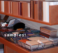
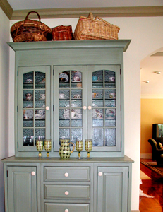
Hochberger_01a.jpgI have one particular kitchen in mind where the paint color of the window and doorway, and baseboard casings match nothing in the kitchen, there being a blue green hutch that cannot be seen in the image in the link below, yet blends with (most) everything.

In this case, the client wanted very light walls without any sort of treatment on it, which to me, meant that white trim and casings would wash everything out, not to mention the cabinetry being an off-white. Can you say "bland"?

The decorator on the project was at a loss as to what color the trim should be, so I was consulted (I should have been consulted prior, anyway). The client chose the granite and the tile by herself. The family room has a wide opening to the kitchen, and the furnishings were more in the olive green family.

Due to the serious architecture of the house, I felt the trim color should be "serious" as well, which is why I ruled out a blue/green color. I felt it would have been too "candy cane", plus it would not transition well into the family room. I thought the color should be strong, yet feel somewhat neutral, yet with some color to it. Most of all, I felt the color should be warm, rather than cool, yet I did not see a tan shade here. Those were my intuitive feelings. I felt choosing a color which would sort of bridge several colors together, yet not match directly, was a good idea. The colors here are somewhat analogous, meaning, they are next to one another on the color wheel, which is one of my favorite ways to use color.

In the end, if I had my choice (and I didn't have a choice here in the following...), I would have chosen a different granite (if it had to be granite) and a different floor tile (if it had to be tile) and a different wall color, plus, I would have painted the niches up above, to have them stand out, as I believe they should. That's not to say it is not a terrific kitchen!

Whether you like it or not, you will have a reaction to this color. See it here.

Lesson: Don't be afraid of color! Your colors do not have to match. They should make sense in some way, and if they only make sense to you, that's ok too! Surrounding rooms have to be considered, as well as the architecture, other materials in the room, and wall treatment/color.  Most of all, colors are seen in context to one another. More on that at another time. But, to my eye, colors look best, and most interesting, when they are slightly off from one another, maybe tied in with another color as a bridge, maybe not. Go beyond "matching".

How about you? How are you going to use color in your kitchen, or how are you using it now in other rooms? 


Meow....Woof!


IMG_6807aa.jpgDo you have a furry friend living with you? We do. First, we had Cleo, a white cat. She had to be an aristorcatic cat of some kind, as she definitely owned US. Next, is another cat, Sparky. We don't love the name, but he responds to his name when he is called! We just adopted Sparky about 2 weeks ago. We keep calling him by his name because it's too much fun when he responds to it! We definitely need to be retrained...

Pets need to be considered in the design of the new kitchen. Not to the point where they attend meetings, and sign off on the plan, no, but just short of that! Here are some thoughts:

  • Planning - where can your pet eat peacefully without fear of being bumped into or forced to move for a moment?
  • Where do the bowls go so that when they are not eating, they are in a spot where they will not be bumped, resulting in spilling water?
  • Do you have multiple pets?  Is it ok if they eat in the same area? Will they know whose bowl is whose and do they or you care?
  • Will the bowls even go in the kitchen?
  • Think about proximity to pet food storage and water. Maybe the pet food goes in the prep sink cabinet, if there is one. What's the best spot to store the pet's food, especially if there is more than one? Feeding should be quick and accessible.
  • How many types of pet food do you have and how much do you buy at one time? Do you have a million small cans or huge bags?
  • Would it be helpful to have the pet's food in roll out shelves?
  • Do you have pet medications? Where do you want to store it/them?
  • Do you not want to see the bowls or at least the feeding bowl? Consider a slide out shelf or drawer at the bottom of, or under the cabinets.
  • Do family members frequently visit with their pet? Is there a secondary feeding area that is convenient? I have that for Max, the dog, who visits us on occasion. Only problem is that Max eats out of the cat's bowls too!
  • Naptime...do you want to include a spot where a small pet bed can be placed?
  • There are auto feeders, which are large in size, so that you only need to refill these infrequently. Will these be part of the plan? Do you want to see, or hide these larger feeders?

Built in banquettes will most likely be a pet magnet, especially if there is a window behind it, ideal for pet naps and their own dining spot (so they think), as they hope to be dining along with you! So far, we are succeeding in training Sparky NOT to walk across the table during dinner...

What am I forgetting? Please fill me in.  And, tell me what works, what doesn't work, or solutions you've come up with, in terms of feeding your pets in the kitchen.


Irrational Fiscal Exuberance


I received a call today from a potential new client. We chatted about his project, about the logistics of the project, and we even began to go through numbers, which I would not have brought up. But, it is always welcome to begin the money talk sooner than later. I worked backward from what his all inclusive budget figure was, categorizing each cost, and ending up with one sum for the construction (not a lot), which I felt was fairly close to what a labor estimate might be, given what he told me of his project. Of course, that is all subject to change when I see the home, but nonetheless, it's a good start, and I had just done a similar project.

 He told me that another kitchen design firm quoted him 3 times the amount, in terms of labor, that I estimated to be reasonable, with that firm also not having seen his home, and double the all inclusive budget overall. So, reasonable question, why the wide difference? Of course, I have no idea what all was included in the other "estimate".

iStock_000002186776XSmalla.jpgThis is one of the toughest and most tricky areas overall, the estimate. Essentially, we need to estimate something before it is designed. We need to evaluate the client's wants and needs and put a dollar figure to it. It's a little bit art, a little bit science, to get that number. But, with care and thought, it's doable.

Me, I don't want to be too low and build false hope. I also don't want to be too high and lose the job. I'd say I err on the higher side, but not too high, HATING the idea of having to reveal much larger numbers down the road and instead, often revealing a pleasant surprise of a lower cost instead of disappointment when the design work is finished. After we go through the whole process, who on earth wants to be told that the project is now out of their budget! That's a huge fear of mine, HUGE! I'd much rather lose the job than estimate too low.

But, you also don't want to mistakenly estimate too too high either.

Perhaps that more expensive shop feels as I do, that erring on the higher side is better than building false hope. From the information I have thus far, I think they went too far afield into irrational fiscal exuberance territory. I'll update this as I get more information. 

Tell me about your estimate story!


First Meeting - Dos & Don'ts


I've had a flurry of first meetings recently, including one I just got back from. It's a dance to get to know one another. I think if the proper steps are followed, the dancing part will soon feel like we are "Dancing With The Stars" (apologies, I  could not resist that). It is these intial steps, too, where manners are very important, along with other tips for a successful first meeting. Here are some dos and don'ts for the Kitchen Designer, (first) as I see it:

  • When a client calls, DO hear him/her out, and if the project is not for you, turn the client down gently and diplomatically. That's a biggie!
  • DON'T name drop or go on about all the huge projects you do, it's a turn off. The work you show speaks loudly and clearly.
  • DON'T dominate the conversation, be a good listener!
  • DO have adequate examples of work you've done on hand.
  • DO speak to, and pay attention to, both homeowners equally.
  • DO be on time, respectful, courteous and establish an approximate meeting length beforehand.
  • DO show where the financial flexibilities lie when speaking of the project's budget.
  • When the dog's nose goes where it shouldn't, DO keep smiling...

Dos and don't for homeowners:

  • DO give the kitchen designer time to tell you their (short) story about the firm and his/her approach to your project
  • DO have both homeowners available to speak with the kitchen designer if that was requested. If one party cannot make it, call to reschedule the appointment, even if it is 1/2 hour prior to the appointment.
  • DO tell the kitchen designer if you have decided not to go with him/her if the designer attempts further contact with you to find out the status. Don't not reply to calls/emails for a status request. THAT is a biggie!
  • DO evaluate the kitchen designer not on the product they supply, but on their body of work, their credentials, professionalism, and that important "gut feeling" you'll get!
  • DO feel free to ask for references.
  • DO evaluate if you are respected and listened to. Nothing good will happen for you if you feel you are not respected.
  • DO speak frankly and openly about your budget and how/if there can be a financial "fit" between you.

There are definitely many more....this is a good starting point. What are turn ons and turn offs for you when first meeting a design professional?


Small NYC Kitchen/Big Style


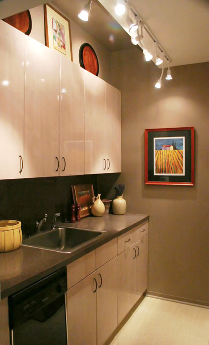
Here's a picture of my small New York City apartment kitchen, well, one side of it. The other side has the refrigerator and the range. Not being ready to redo the kitchen at this point, I wanted to make it appear larger (of course!) The floor was a busy terracotta lineoleum, so that was the first to go. In its place is another vinyl floor, as we did not want to do something major right now, but wanted something special. Here's what we used: Chilewich Plynyl in the wheat color, not as "green" a product as I had hoped, but they say they are close. It adds function and a big dose of light and calm.

Oddly, rather than using a light paint, which was what was in the kitchen, an ivory (ick), I thought I'd experiment with medium to dark shades of paint. The paint chosen is very close to the (granite grained) formica countertop, so there is a flow there. The upper ceiling section was painted this dark color too, with just the lower ceiling section being a near white. This way, there is a flow in the upper section.

We are keeping the cabinets right now. They are light, which is helpful to the space with a minimal design. Add lots of lights, colorful accents, and it looks larger than it is.

Lesson: Don't always think that you need only light paint to expand a space. If you have other elements of light, in this case, a light floor, lots of lights, and light cabinetry, then a darker background can tie it all in and look just as expansive, and more interesting.  Lights below the wall cabinets would be a great addition.

 Do you have a small kitchen? I'd love to hear about it.

Small-Kitchen-1.jpg