More Kitchen Inspiration from GE Monogram

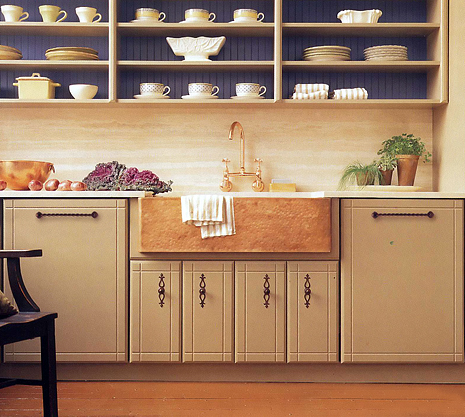
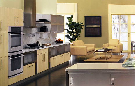
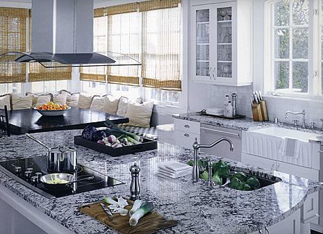
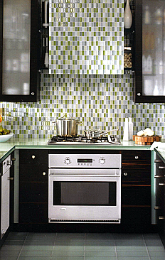
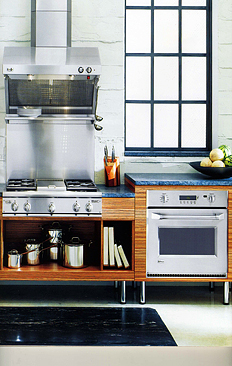
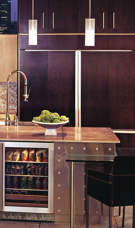
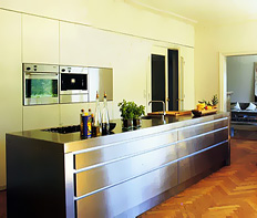
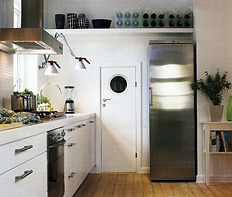
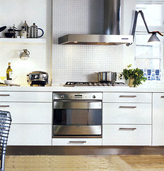
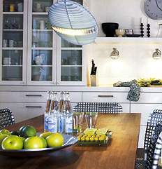
Psychic things happen to me from time to time...I'm sure they do to you too. It's too much fun to think "coincidence." So, what comes in the mail the same day I put up yesterday's post? A new version of the GE Monogram's brochure on inspiring kitchens, called "Perspectives." I just know I'm connected to the energy of the kitchen universe! It finds me! Here are some more great kitchen ideas. And, I must say the appliances are very well designed into the kitchen, don't you think?


GE%20Monogram%20Kitchen029.jpg 

GE%20Monogram%20Kitchen031.jpg 

GE%20Monogram%20Kitchen034.jpg

What Is Kitchen Inspiration?

I have had this glossy GE Monogram brochure opened and folded back to a particular page for months. I have no idea when I got it in the mail. It has traveled from one pile to another pile to another, I'm sure I'm not the only one who does this. It's a reasonable attempt at organization...isn't it??

This first image of the red/cream kitchen just struck me immediately as strong and stunning. I know I would design the cabinetry in a different way, much different. Parts of the cabinetry "speaks" to me, much does not. But, as I often try to communicate to my clients, it's the "feel" of the room, not any one element, that makes a kitchen special. That's the secret ingredient to a wonderful kitchen. It may not be the countertops, or the cabinetry, or the appliances, but all of it and much more working together, each with an important place in the design to collectively evoke a feeling that the owner wants to feel.  Each piece is another layer in the entirety of the design. Each piece plays a key role.

As a kitchen can be an expensive proposition, enormous focus, and justifiably so, is placed on those three elements...cabinetry, appliances, and countertops first and foremost. And that is as it should be. BUT, as we see in this first image, the other layers of paint, yes, simply paint, accessories, and the use of texture, is, well, everything. I don't know about you, but this first kitchen speaks to me. The others are wonderful for other reasons. The message is, every part of the design has valuable work to do. First, however, one must dig deep to explore and discover what one wants and needs to be surrounded by to feel great joy, and comfort, or, for that matter, stimulation! More about that process soon.

Thanks GE Monogram for permitting the use of these images. As stated above, careful selection of appliances in terms of function AND design is also a critical layer. Very critical. These appliances work to enhance the design of the kitchen. That's the goal. Enjoy! 

 GE%20Monogram%20Kitchen011.jpg

GE%20Monogram%20Kitchen014.jpg 

ge monogram kitchen015.jpgge monogram kitchen023.jpg
GE%20Monogram%20Kitchen025.jpg

Kitchens Around The Blogosphere

electrolux_flower_screenfri.jpgToday, I present kitchens to put a smile on your face.

First up is the fabulous Fabulon. I swear, Fabulon is obsessed with kitchens. I've had other great material from this blogging kitchen fan. Oh, and please turn up your speakers when you visit.

Jo and Kim from Desire to Inspire never ever disappoint, with frequent forays into the kitchenworld. Did you ask for more from Desire to Inspire? Ok, you have it, then go here to a beautiful kitchen and here to another beautiful kitchen.

And, also, check out Terramia, for inspiring PINK kitchens...you'll need to exercise your scrolling pointer finger to seek out two kitchens in this post, but it's worth it!

And, a nice idea for a sink/countertop from my colleague Peggy, at Kitchen-exchange.

Enjoy! 


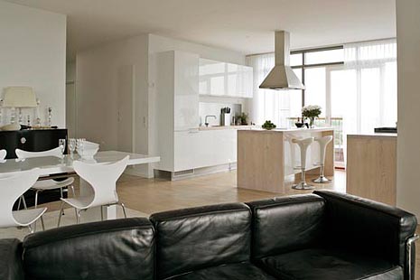
Scandinavian Kitchens - vacation villas!

Well, I guess I took an unintended week of vacation from blogging...very busy week last week! But, more about that another time. After all, clients ARE #1!

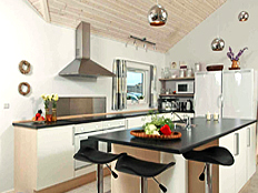
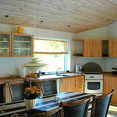
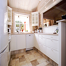
I'm toying around with the idea of going to Denmark on vacation at the end of August. Which got me into the vacation villa, or "summerhus" as it's called, rental mode. A great place to look at REAL Scandinavian kitchens.  I found some lovely kitchens that may actually make you want to COOK while on vacation, do you think? In any event, surely, the design, and openness of a kitchen plan is conducive to happy and casual living in a rental. Who wants to be isolated in an entirely separate room if you don't have to be. A perfect reason to search for an open kitchen plan. Please go to nice summer and take a look. Oh...click on "Luxury Cottages."  Nice start.

sommerhus_638_3657.jpg2701.jpg
nicesummer.com114.jpg1813.jpg


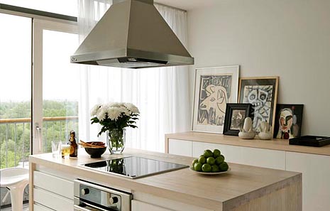
I also found this great kitchen at klmdesign.dk.

klmdesign.dk.jpg klmdesign.dk1.jpg

Scandinavian Kitchens - Beamed Ceilings

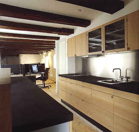
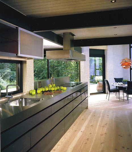
There are many Scandinavian kitchens which have beamed ceilings. There are many old buildings, both apartments in the city and old farm homes, which have beams used as structural timbers in the home. Of course, as said before, Scandinavians beautifully mix their contemporary design aesthetic with these old beams, (or in this one case, contemporary styled beams) and they do it with style and confidence. Thus, a home with truly rustic elements does not have to continue this look of "country", even if the floors are old, the walls are textured stone, as well as the ceiling with ancient beams. Some old structures have low ceilings. In these homes we will see beams too, but they may be closer to the ceiling, more shallow, and perhaps painted a light color, looking into blend in, another great look. Enjoy these images, and please look through the previous images in this category in the sidebar to see other great beamed kitchens. Top image is from Tidens Bolig, second image from Bo Bedre. And, again, here's a great Scandinavian blog: Min Lille Veranda.

A blog bonus for today is a recent blog entry by Holly at Decor 8 on Scandinavian design blogs. 

Scandinavian%20Kitchens%206006.jpg


Scandinavian%20Kitchens%206007.jpg


Retro Kitchens - Kitchen Fencing Ideas

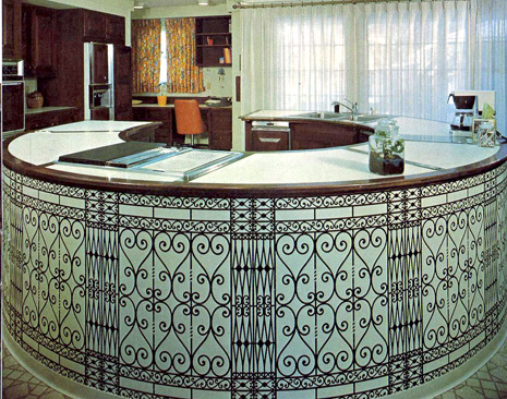
Hi kitchen fans, the latest installment is here of 60s-70s kitchens, and the last entry of this type for a little while. I think I've made the point, to show examples of kitchens that we can't believe we really either lived in or were designed, in our recent history! I'll put one up every now and then for another laugh and "yikes!" I'll be replacing this feature with a regularly scheduled Saturday "New/Cool Product." It's important to be aware of what is in the marketplace, and so much is in the marketplace in the world of kitchens. And, having attended 3 design shows in May, I have lots of great material to go through, and I'm really picky too.

So, back to the kitchen of today. It sort of looks like iron fencing, doesn't it? And, the aquamarine? Hmmm, not sure I have an explanation for that! The curtains REALLY give away the time period here, don't you think? But, what really bugs me is the typical cabinetry to the left of the image. I think something there could have had a curve to it. Maybe just curved open shelves between the two tall items. It's just not working for me over there. Oh, and the floor, I can't even go there. Have fun!

60s70s%20blue%20kitchen005.jpg 

Seen at KBIS - kitschy kitcheny kolors from SMEG

SMEG is a hugely popular appliance manufacturer in Europe. I know I see it all over Denmark, when I go there and visit the kitchen showrooms, so that's MY sharp eyed reporter's factoid!

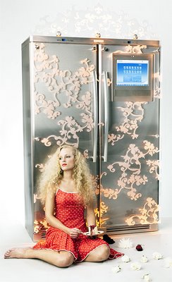
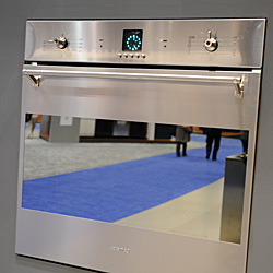
SMEG.jpgSMEG is introducing its line of appliances in the USA now, after having received all the various certifications. The line, aesthetically is very interesting, and I mean that in the most positive way. They're bold, they're sexy, they're highly functional and stylish. And, they do not only show retro appliances, like this beautifully simplistic retro refrigerator we see here. They have many modern appliances in their line too, custom designed by an architect, as you will hear in my podcast.  Look to SMEG for BOTH modern and retro appliances. They will be introducing a refrigerator with a larger freezer section soon.

SMEG2.jpgI know Scrappy Girl from Domino has a possible retro fridge fixation in her future kitchen plans. With Scrappy Girl in mind, I sought out a bit more information via my podcast. I'm glad I did...there's not too much information on the website!

Scrappy, I gotta tell you, though, I DID see another booth with colorful retro appliances, the only other booth I saw with them. I was looking from afar, taking a needed rest at the end of the second day, feet up, pointing weakly to that area, (all for the cause and dramatic effect) and then it left my mind and I inadvertently walked in another direction! Of course, I remembered much later what I missed. Maybe I'll find it in a press kit!

SMEG REFRIGERATOR INTERVIEW

Architect + Kitchen Designer - A Match Made in....

I'm posting this and then running to a client meeting. I'll surely be back soon to respond to this series of issues as presented by Mark LePage, AIA, author of Living Well in Westchester. Let me first thank Mark for tackling these issues with a frank and open point of view. I encourage those who read this to respond in an equally frank way, as this is what is necessary for understanding...real communication. Here, then, is Mark's point of view about kitchen design and kitchen designers. Thanks, Mark!

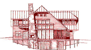
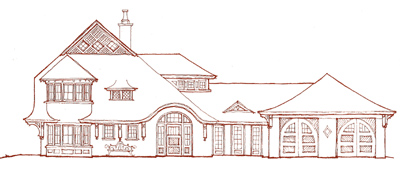
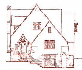
The images are from Mark's website. What a wonderful repertoire. Here's Mark:


Susan asked me to post my thoughts on kitchen design and kitchen designers from an architect's point of view. My first thought was to decline in fear that I would get myself into trouble. My experience with kitchen designers in the past has rarely been positive. But then I thought, this might be a great opportunity to start a dialogue about the reasons for such negative experiences. So, let's talk...

Let me start off by introducing myself and writing a bit about my firm.

Indian_Lake.JPG My name is Mark R. LePage, AIA and I am the Partner in Charge of Operations for Fivecat Studio, a design firm dedicated to the creation of fine residential architecture for clients throughout Westchester County (NY), Fairfield County (CT) and the lower Hudson River Valley. Providing full architectural services for additions, alterations and new custom homes, we're proud members of the American Institute of Architects (AIA ) and we're certified by the National Council of Architectural Registration Boards (NCARB ).

We started the firm in 1999. My partner's experience before Fivecat was designing very large, very custom, second and third summer homes for an elite clientele. With each project, she had the rare opportunity to custom design everything from the cabinet knobs to the cupola.

Old_Orchard_Street_0102.JPG


My experience was in residential construction (before architecture school) and as a project manager for a mid-sized architecture firm specializing in K-12 educational facilities (after school). With Annmarie's (my partner, who happens to also be my wife) design skills, and my construction and project management skills, we make a great team. We are also blessed with the best employees ever.

Being located in the heart of Westchester County, most of our works are additions and alterations. There's just not much land left to develop for new homes in these parts. Most of our additions and alterations include new kitchens. The contract agreement we execute allows our clients the option to work with an independent kitchen designer, and some do.

We have been designing custom kitchens for a long time, so the benefits of a client working with us on their kitchen are many. Besides our experience and design skills, the advantages provided by the continuity of a client working with the same designer throughout the project results in a consistent, integrated language throughout the house. The kitchen always works well with the rest of the project. Details, colors and style are consistent, as if it were a work of art with oils applied by the same hand.

Mountain_01.JPGNow I know that many of you just rolled your eyes. "There goes another architect ranting about being an artist," but that's not the point. What is important about that statement is that the project be consistent. A skilled independent designer can certainly create an equally successful "work of art", if they take the care to understand the context in which the kitchen is built.

Just like a modern house built in a neighborhood of historically accurate Victorians may disrespect its context and forever damage the fabric of that neighborhood, a kitchen designed with no relation to the intent and context of the house in which it is built will forever (or at least until the next renovation) damage the integrity of that house.

So, how can an independent kitchen designer successfully work with a residential architect? Here are three ingredients to a successful collaborative project (whether it be a custom kitchen or a Manhattan skyscraper).

Respect: Mutual respect for the skills, talents and experience of all parties (including the owner) involved in the project will allow the creation of the very best design. Respect always requires good communication...

Communication: My job as a residential architect working with an independent designer is to clearly communicate our intent for the overall project. Verbal and written communications should always be prepared and organized in a way so that they may be easily referenced throughout the project.

Organization: Create an easily understood, easily maintained system of documentation and communication. At Fivecat Studio we've created a Project Organizer System. Two binders, one for our client and one for us, are divided into sections labeled for each phase of the project. Every drawing, every letter, every document is easily filed and retrieved at anytime (even when the client is ready to hire us again, ten years from now, to perform the process all over again).

I could go on for pages more, but I don't want to use up all of Susan's bandwidth. I hope this is enough to get the conversation started. I look forward to reading your comments (don't hold back).

And Susan, thanks again for the opportunity to rant a bit...


ICFF - more great kitchen finds!

Here are a few more wonderful things I found at ICFF. We missed another installment of Scandinavian kitchens yesterday due to the holiday (I was in the garden) and I promise to revisit these kitchens next week. But, I'm real excited to bring these to you. And, no, KBIS is absolutely not forgotten...just want to go through these ICFF items first. I hope you will be glad I did!

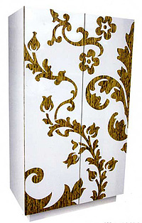
Armoire%20Iannone002.jpgHere's a piece I clearly remember seeing early on at ICFF. When I first saw it, I said "Pantry". In fact, it is called an armoire. That's ok. We can change the nomenclature and the use, right? Iannone Design Ltd., manufacturer, is a Philadelphia based design/build firm dedicated to the creation of eco-friendly modern furniture.

I'd like to see this armoire/pantry tricked out with roll out shelves, in custom sizes that I can design into a space, maybe with vertical dividers installed in an upper or lower space, who knows what options there are for this piece?? I can see quite a few already.

This is one happy furniture piece.


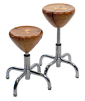
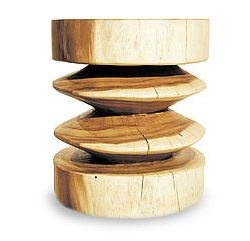
sbwstool_lg1.jpgThen, I saw these stools from SMC Furnishings. There is an increased interest in real, authentic wood, splits, cracks, grain variations, and all. I think it's a beautiful expression of what wood is, sort of like people, imperfect. Wait till you see the other very cool stools and benches they have.


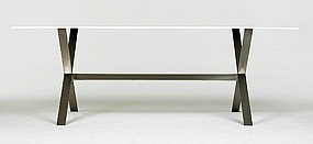
FTF%20Design%20StudioAnd, to complete the look for today, is one of a series of tables from FTF Design Studio. Cool, white, chic, hip....it's Corian on the table top, and there are several styles of tables. The table tops are 1/2" thick. FTF also makes a great line of trays for many different uses, including kitchen uses. Very innovative, very modern. FTF Design Studio is the furniture line of Roseann Repetti and her husband, architect West Chin. I CAN see coordinating the table top with surrounding Corian countertops, or matched up with countertops of contrasting materials, such as wood, perhaps. Or, maybe Norweigian slate. But, I digress (again). It's just really very simple and elegant.


My Day Today In Kitchen World and Beyond

Well, what a day today. That's what's pretty good about life. Who knows where it's going to go at any minute? And, these were fairly mundane events today (no, not a blog about what I had for breakfast.) Just some random, mostly kitchen related items to put out there, mixed with little personal things, which I don't often do. Things just sort of pile up, don't they?

It started with a very slow modem, on and off. Of course, you get several different pieces of advice when you call into the ISP a few different times. One said, get a new modem, one said it's the splitter for sure. So, I got a new modem and felt renewed and happy, all being right with the world again.

Then, I went to the surgeon for a consultation and arranged for subsequent pre surgical appointments (people, especially dedicated and devoted female kitchen designers who do not lift weights, please, um, do not throw yourself into the frey and insist on helping your installer pick up the oven cabinets and cabinets with drawers when he is short handed.) Not good! That's why they invented hand trucks. But, I digress.

After that, I had an appointment with a favorite contractor to look over a client's home for his part in an extensive kitchen renovation, at which time I had the opportunity to measure the space again and hopefully come up with the same numbers as the first time. I'm kidding, this is a kitchen joke. (I DO hope I brought the more accurate tape measure with me this time, I hate when that happens.) Appointment went well. He took copious notes, (and had a fancy laser measuring device.) Like a doctor, I love when I feel confident with a contractor, isn't that the best? This will be one very awesome kitchen, I can promise you that. Think...cabinetry built into, perhaps, stucco framing....a huge arch thing in one whole area (my client calls a cave)....a light khaki distressed cabinet mixed with mahogany cabinetry elsewhere. OK, I'll mention the stone hood. I'll stop there!

Home again, connecting the modem, registering the modem, reading emails from the day, and I'm back in action. To not have a modem is, I'd say, unsettling and also, yes, slighty disturbing. That's all I'll admit to. Oh, while we're at it, let's add to the list, losing a post before I realized the internet was blinking on and off this morning!

Speaking of doctors, since I'm in a rare mood speaking of personal things here and there, I'd like to point you toward a great, GREAT, blog that I seek out daily (it's updated irregularly during the week) that you may wish to pass on to others for one reason or another. It seems, too, that there could be a tiny, charming, kitchen in this blog author's future. Take a look, but be forewarned it WAS fundamentally about dealing with cancer in a very forthright way....now it's about the future. Pass it on where you can and contribute $$$ too if you can and want to. I did.  And, no, I don't know this woman. Never met her. Her writing is simply amazing. I've been checking in every day since mid December. I'd actually love to hear about her plan for the kitchen.

Oh, I almost forgot to mention! While on the east end of Long Island over the weekend, I picked up a copy of The Independent, a paper distributed on...the east end, to check out their article on kitchens, in which I was interviewed. That was fun. A few weeks back, the Southampton Press also did an article on kitchens, in which I was interviewed. More fun! And even more fun, late last week, I was interviewed by a writer for HGTV, and I'll link the article when it goes live on their site. The fun never ends!

Now, on to doing my post of the day, the one I lost this morning! Do over! 
Kitchens Around The Blogs

RupertScottbacksplash2.jpegA slow weekend around here, mostly spent in the garden, in and out of the house, depending on my mood. Either way, relaxing, and I hope you are too! I found some interesting things on kitchens!
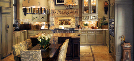
First up, a couple of recent posts on Desire To Inspire.  This is one very nice example of kitchens from Israel, and another post from DTI, here. One, all about storage, the other all about open shelving! 

Next, from my colleague in Westchester, Mark R. LePage, AIA, where I'm sure he lives well, is a discussion on the kitchen being more than the typical hub of the home, but the electronic hub as well. I'll be adding more to this discussion, as I uncover my notes and information from KBIS, still a bit buried! You'll be hearing more from Mark soon, as we "get into" a little discussion about architects and kitchen designers working together. Or, maybe we should call it "Survivor!" Stay tuned for this lively discussion, coming soon.

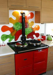
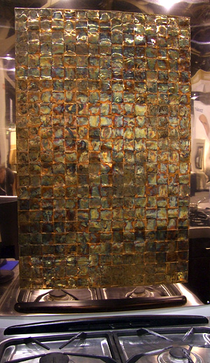
From another colleague, Peggy Deras, CID, CKD, author of Kitschy Kitchens, Peggy has uncovered some very cool backsplash designs from Rupert Scott. They are fabulous glass works of art. Check it out.

And, an article on the 2007 Kitchen and Bath forecast by The New York Times. this forecast seems to be only about appliances and bathroom fixtures. Incomplete about kitchen design in general, but useful. 

IMG_4382a.jpgAnd, totally unrelated, but which I would love to share with you more often than not in the coming months, an antique rose from my garden, photographed today. This is Mons. Tillier, bred in France in 1891, a Tea rose. Enjoy!

My garden is about to burst, with tons of roses, probably one week from now. I'll keep you posted! 

Susan Serra, CKD - New! Kitchen Design Consulting Services

After some time spent thinking and planning, I'd like to announce a new line of services to a whole new group of clients - those who find me online!

I am pleased to introduce kitchen consultation services.

This is an issue that I've been thinking about for some time, and for which I see a real need. There are so many reasons that one might want to reach out and get much needed short term advice from a professional kitchen designer. Oddly, in my industry, this service is extremely hard to find, and practically nonexistent...until now.

Step by Step

It's my personal philosophy in life to take large issues in steps, where possible, and stay flexible. To take one step at a time, reevaluate, then another step, reassess, and so on. For those who may not be able to commit the resources necessary to hire a kitchen design professional, let alone one with certification and recognition in the kitchen and bath world, or who would like to get started more slowly, especially considering a designer often requires a solid financial commitment, such as I always have, now, that has changed. You CAN go step by step. You CAN ask about just what specific issues you need help with. You CAN get that information from a respected professional. Now you can.

Ask me about:

  • evaluating your floor plan! The most important service of all! Uncovering problem areas, providing ideas, solutions, important advice
  • adding creative design ideas into your local cabinet woodworker's design plans
  • color - a single word but with enormous effect on you, your mood, your look
  • cabinetry - what quality do you need? what style is most workable?
  • countertops - what are the options? what are the properties? how do you control templating? so much more on this topic!
  • tile - sizes, types, styles, moldings, ideas
  • appliance options within your plan, new ideas for placement
  • proportion, scale, continuity, and balance design principles - does it work?
  • themes - eclectic, contemporary, traditional...how to create a "relaxed traditional", a "soft contemporary"?
  • getting along with your contractor, architect, interior designer, and even kitchen designer, or other trade professional. Have a conflict? Need to push an issue? Ask me how to proceed!
  • really, there are so many more topics within the design and remodeling process

Contact%20me001.jpgIn setting service fees, a tricky issue, to be sure, I've tried hard to be affordable, fair, and to offer a range of services that are measurable in their time allotments so that a specific service will be provided for a specific cost. Given my level of experience and accomplishments in the kitchen and bath industry, I hope you agree that you will receive superb value at an affordable cost, regardless of the service you choose! To find out more about me, please visit my company page on my website. I'm intense and passionate about my work, as you may see by virtue of this blog,!

I hope I can be of assistance to you in this crazy kitchen remodeling world. And the best part? Visa and Mastercard accepted!


Retro Kitchens - The Eagle Has Landed

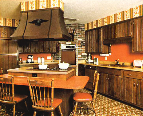
It seems appropriate, as a tribute to Memorial Day, to showcase a 60s-70s kitchen which salutes our national symbol, the eagle! And, our second national symbol, the orange! Ah yes, the brown appliances, the laminate butcher block countertop, the brick veneer, and of course, we must have patterns which don't make sense and colonial style chairs. What more can I say?? Truly, a historically accurate kitchen....have fun!

brown%20kitchen034.jpg 

icff - glass kitchen tile style

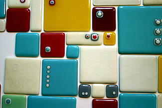
summer-ses-detail.jpgBrooklyn Glassworks, a new company recently launched, redefines glass tile. Founded by artists Erica Rosenfeld, Dena Pengas and Brad Teasdale, they met several years ago at Urban Glass in downtown Brooklyn, where they currently teach. Over time, they each saw that their styles had strong similarities in their shared love of color, design, and form. More than glass tile, there is a line of contemporary lighting and limited edition furniture as well. All pieces are handcrafted in Brooklyn, NY. Colors for tiles are in seasons, spring, summer, winter, fall. Here are shades of summer.


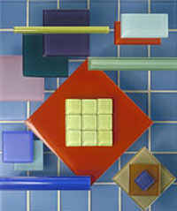
veneto_mouldings2.jpgMore glass tile was seen at Stone Source, one of my sources for many years. Stone Source has really fabulous materials. They're lush and gorgeous and always stylish.  I was surprised to see the many choices that are available for their glass tiles. So many colors, sizes, moldings, color blends, and they do custom blends as well. There are a whole lot more colors for glass tile than just green! A great resource.

icff - Kitchen Chic!

One of the reasons I love to go to a show like this, a non kitchen focused show, is to be open minded and look for wonderful items that may not be designed specifically for the kitchen but can be adapted as a useful piece in the kitchen. Here are a few items which blur the lines between kitchen and other living areas. Blurring is a good thing!

zig_zag%20Tucker%20Robbinsa.jpgTucker Robbins, blending "authentic tradition and contemporary life" has some very amazing pieces which are used as either tables or stools. And, YES, the pieces come in varying heights, depending on how it is used in the kitchen. The image is just one style, but trust me, you MUST go to the website to see all the other great stools. 


 d.e.Sellers.jpg

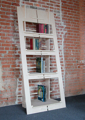
I stopped and looked at this piece by d.e.Sellers.  I don't know why, but I thought of things like copper pots, cookbooks, large bowls, and other progressively smaller items as the shelves get smaller. I immediately thought it could be both useful and interesting in the kitchen. It is made of one piece of 4x8 material, the kind used in cutting boards! It's both art and function. I saw it in black on the floor, which looked great.


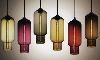
Pharos%20Lighting046.jpgI love this Pharos pendant lighting by Niche Modern. First of all, I enjoy the color palette. The pendants come in either transparent or opaque. I think I prefer the transparent, although they are both beautiful. The jewel tones are beautiful, and imagine the glow! They are available in either 40 watts or 75 watts. Please do me a favor and hang these low! Too often, pendants are hung way too high! Get that intimate, cozy feeling hung a little lower than normal.

So much more to come from ICFF and KBIS over the coming weeks. Stay tuned! 

icff - A crystal hood for the kitchen

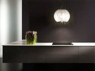
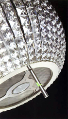
I went to the Elica exhibit at ICFF on Sunday and stopped short when I saw the display of the crystal ventilating hood! Elegance is an understatement, it's crazy bling for the fish odors! They had another one on display too, which changed colors every few seconds. That's a WOW, if I ever saw one! Elica, divorcing from partnership with Zephyr, a well known hood manufacturer, will be in the U.S. under its own power (I couldn't resist.)

Talking about power, I know the next question is, how much? Well, let's just say it's the cubic zirconia equivalent of function, BUT, with 250 cfms per unit, they tell me they frequently install two over a cooktop. But, truthfully, they admit that they suspect many who purchase this are non cookers. What ever gave them that idea??  

crystal hood042.jpgcrystal hood043.jpg


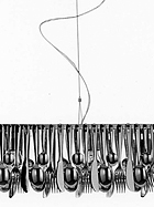
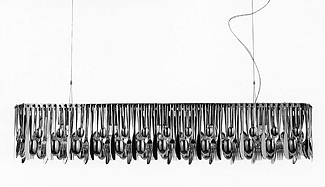
And, here is the lighting fixture, Hungry, from Fabbian! I feel so uncreative, I never thought of a storage solution like that for utensils...


silver lighting045.jpgsilver lighting044.jpg


ICFF - cool stuff for kitchens

I went to ICFF yesterday in New York. What a show. It seems bigger than ever. ICFF is the International Contemporary Furniture Fair, and International it is....many countries are represented, grouped together in their own areas. This is a wonderful show. The products are highly creative, with such beautiful finishes, colors, textures, it's the best of the best I think in terms of creativity for modern design. I was crazy about this show. Lots of ideas for kitchens, creative, fun, or just alternative ideas. Really gets the creativity flowing.

table_large%20ICFF.JPGI will be putting products up from this show for some time, as I will from the KBIS show as well. There is not a "shelf life" that is just days after the show to be compelled to finish reporting on a show. There are so many wonderful items, it will surely take me months to get through the great items I've seen, so look forward to fantastic ideas and resources over time.

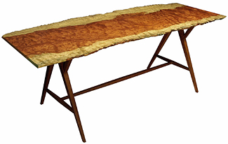
Here's your breakfast table in the city or the country! This table just thrilled me. I love it, and if I could have it in a circular version, I'd put my money right down on it. It's fantastic, don't you think? It's by Mark Cwik.  Love it!

barkskin%20ICFF.jpgAnd, along the same theme, from Caba Company, here is barkskin. A natural handmade wood material for wall coverings or anywhere your imagination can envision it. It is an organic, hand pounded bark material. I think it's fantastic. Why not on a backsplash, covered with 1/4" clear glass? It comes in colors, in very soft, subtle shades and in deeper, stronger textures as well.


Sleek Scandinavian Kitchens

After a 2 week absence due to the KBIS show and other things thrown into the mix, it's good to be back with Scandinavian kitchens on Mondays. Here we go!

Here are actually two kitchens, but one has a lot of images. I'd like to take a minute to review what makes them Scandinavian in nature and what is also not only cultural, but good design.

 Scandinavian%20white%20gray%20wood%20kitchen040.jpg

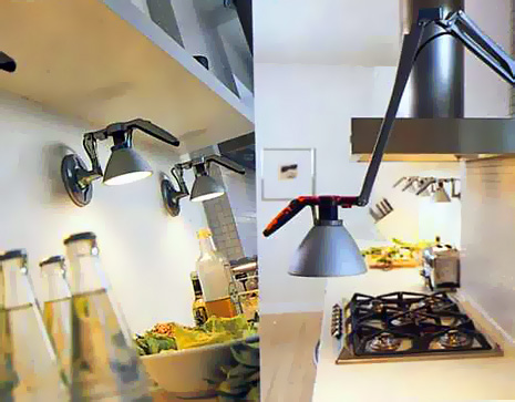
The first concept is lighting. Scandinavians love interesting lighting, and lots of it. So, the lighting fixtures must be well designed as well as highly functional. Task lighting is huge in Scandinavia. There are little light fixtures anywhere and everywhere. So, take note of the lighting.  

scandinavian white gray wood kitchen038.jpgscandinavian white gray wood kitchen039.jpg

Second concept is "shapes and forms". This is a more architectural concept, which can be seen, for example, in the mosaic tile wall behind the cooktop and elsewhere. Scandinavians do not fear blank walls, and in fact have used them as part of their design work for a very long time, long before this idea became popular elsewhere. It is the "less is more" effect. Always simplicity and elegance combined, as a functional artform, the essence of Scandinavian design.

scandinavian white gray wood kitchen036.jpgscandinavian white gray wood kitchen041.jpg

Third concept today is something old or hand crafted. Notice the floors, or the wonderful pottery or other items. Some items are old and speak of texture, repetition, or pattern, as we see here as well. There is thought and whimsey both present in Scandinavian design. Nothing is taken too seriously. That seems to be an inherent truth. Enjoy, and I'd love your comments too...

 And, as always, another couple of great Scandinavian blogs.....Lantligt and Karna.


Retro Kitchens - Shageriffic!

Here is a colorful AND modern kitchen! We have a fabulous built in radio along with a built in light off center above the cooktop. As usual, we have pattern, seen in the stripes, in multiple areas, but I hate to think of the cleaning issue over the cooktop. A wonderfully creative white laminate countertop, and the "piece de resistance" (insert your own accent marks) the shag rug! Love those "cathedral" upper door panels too, they were such a staple for elegant kitchens. Enjoy!

blue%20green%2060s%20kitchen035.jpg 

KBIS 2007 - Cool Woven Copper Kitchen Backsplash

KBIS%202007%20Frigo.jpgThis display just stopped me in my tracks! I love anything woven, textural, hand crafted, and this look gives it all to me. By Frigo, it is woven copper with a fired, burnished finish to get that wonderful rainbow effect.

I'm not sure it's a look to go everywhere, it may be too strong, but at the very least, a great accent. I'm picturing it as the facing for a hood right now. Maybe the back of an island, that comes to me too. So many great places this product can be used.

And the best news is that the maintenance is to simply use warm water to wipe up spills and spots, no special process, cleaners, and so on. Good, right? 

The manner in which it was displayed on the show floor wasn't so great, as the image shows, but look past that and imagine the possibilities!