New, Cool, Refrigerator From Fagor

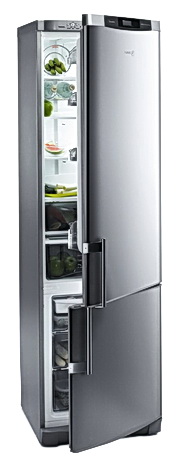
Rfrigerator%203FCA-68%20NFX%20door%20semi%20opened.jpgJust got word that Fagor is introducing a 24" no frost refrigerator. To me, this is huge news, as I'm in the middle of looking for appliances to plan into my 7' x 7' NYC apartment kitchen. So, I'm doubly excited about this product! Let me tell you a few things about it.

It is 24 x 24 x 78 3/4, meaning that it is true cabinet depth, a huge plus for small kitchens (eyes upward in thanks.) It is a sleek, modern, design, and made of high end, and finger print resistant, stainless steel.  

More features include unbreakable glass trays and drawer fronts, and independent compartments with electronic regulation. The independent "multi fresh" and "double fresh" drawers allow for two unique environments within the refrigerator, great for keep vegetables crisp and meats and seafood at another level of moisture. 

According to Fagor, it is the healthiest refrigerator on the market. Equipped with a unique BIO filter, an antibacterial/odor eliminating filter with indicator keeps the refrigerator hygienic by retaining mold and bacteria from the circulating air. A protection cover disables such bacterial particles from settling and growing, allowing foods to remain fresh for longer periods of time. 

Even more features include fast cooling (automatically detects and adjust large food additions at once) and super freezing capabilities with a vacation setting, changing the refrigerator temperatove to 57F, preventing odor and bacteria, keeping the freezer at normal temp.
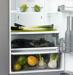
MULTIFRESH%20AND%20DOUBLE%20FRESH%20DRAWERS.jpgAn open door alarm and beeper alarm with warning light indicate any sudden interruption of the cold chain. And, it is said to be less noisy due to one generator source for fridge and freezer. No word on energy star rating, they are currently performing the energy star tests, so that information is not complete.


The unit will be available December 2007. List price is $1699.  


Beyond My Kitchen Window

cape%20cod%20rose%20a.jpgI need a break! I've worked very hard most of today doing computer work in a high level of detail. Time consuming, labor intensive, entry by entry, working on kitchen plans, using both sides of the brain until it hurts! And, I am pleased with what I accomplished. So, let's take a break...

Out to the garden, a beautiful Indian summer early fall day.  The garden is now a jungle, quite unkempt, but it's delightful with aged colors and textures, some beautiful new flowers just hitting their stride, and roses still pumping out the blooms until the frost (hopefully not for a month.)

Please join me for a look at the garden today. Lucky for me, I can see some of these beauties from my kitchen window, a real joy. 

And, how is your day going? Did you get to take a break?


Please see the flikr slide show of the early autumn garden. Best enjoyed s l o w l y !

Back to regularly scheduled programming tomorrow! All images were taken today.

Modern Kitchens - Euro Style

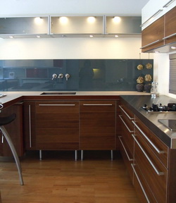
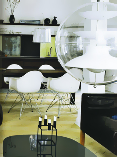
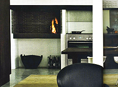
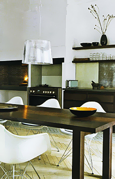
Kitchen%20Showrooms%20_13a.jpgOne of my favorite blogs, freshome, was interested in the kitchen "scene" in Copenhagen, which I have not yet shown on this blog. I went to a good number of kitchen showrooms, every single one of them having wonderful looks and features within. Some features and styling are very subtle, almost imperceptible as being something special, unless pointed out, making the look all the more...I think "organic" is a one descriptive word, following Denmark's great, and historical, tradition for design excellence. So, I encourage you to look closely at these images in the flikr slide show.

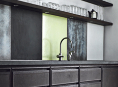
Here is what I observed, which I shared with freshome, on that blog: "I LOVED going to Copenhagen's kitchen showrooms, seeing the latest, and very cool, design ideas. Large patterns on walls, beautiful, and textural wood grains, lots of dark charcoal or black, and white, cabinetry, these are some of the latest trends in kitchen design. I also noticed backsplashes with clear or colored glass sections positioned over painted, textured, walls, a very sleek look! Always fabulous lighting and always little splashes of color, a typical, and modern, Scandinavian touch."

Some of these trends are prevelent in the U.S. as well, as I observed at KBIS in May. I will do an accompanying post on those kitchens in the next few days. That should be interesting to compare! You will see a few country kitchens, too, very charming, I think.

Take a look at the kitchen slide show for many more images (all taken by me!)

And, please take a look at the freshome blog, and click on the top banner for the latest posts. There is much inspiration throughout this blog for the entire home. Enjoy!

Open Plan Kitchens - For Empty Nesters

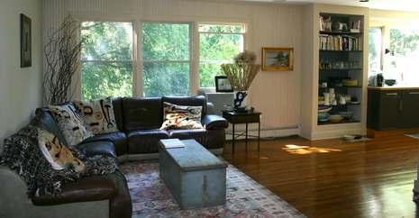
My husband and I changed two rooms of furniture around yesterday, swapping furniture in each room. The dining room furniture was put into the smaller of our two family rooms. The family room furniture was put into the dining area (not the breakfast area), which is open to the kitchen.

We now have a great room floor plan, that I've been designing for my clients for the past, close to, 20 years!

Two of our three kids moved out about 3 years ago, the smaller family room just wasn't getting used, and at the same time, new lifestyle patterns were emerging for us. Our daughter and son in law visit from the city on occasional weekends, our other son, less so, and lots of time is spent in the kitchen along with a variety of activities such as preparing meals with great music playing, laptop use, sports tv with no sound on, hors d'oevres before dinner, relaxing, talking, dining, and any combination of same.

Being on the "other side" of raising children, I can tell you, at least for us, that it is, as, or more, important to have the home conducive to togetherness, since the kids do not come home that often. This floor plan achieves that goal very well. Yet, we still have the large family room, just beyond, with a pair of french doors installed, to "get away" from the kitchen/great room feeling, good to promote privacy and coziness.

So, to empty nesters, or soon to be: Being aware of how your parental role changes often has to do with how your home works for you. And, how it could work better for you in this next phase of life.
I know my kids will be delighted when they see this change in the house. They are 20 somethings adults now, all, and, although a few smarmy comments still sneak through,  they no longer see us as they once did:  a) stupid b) losers c) know nothings d) out of it e) the enemies! Oh man, I thought of five descriptive terms so quickly! Now, I look forward to welcoming them back home to a different experience.

 
As this configuration was never foreseen, I may tweak it a bit more, still. Change is fun! 

Please look at some additional images of my kitchen/family room. Tell me what you think of an open kitchen/family room concept. 


Open%20Plan%20Kitchen.JPG 

White Kitchens - And Your Kids!

I spoke with a Consultation client today, a mother of two very young children. She was struggling because she could not decide which white to choose for her cabinet color.

blue.jpgHer kitchen, at the rear of the house, could be seen from the front door, first through the living room, then through the dining room, then, into the kitchen. She also needed to select paint for her walls in these rooms. This entire space, these rooms, I'd consider to be relatively small in size.

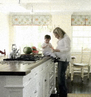
Here's what occurred to me. First, as a mother who raised three kids in a white kitchen(!) I needed to discuss the inevitable...dings, nicks, marks, wear, even non-kid wear combined with kid-wear! It's a bad scene, and if it doesn't happen right away, in time, it will. When asked when will it show, I replied, it could be the next day or much longer, but show, it WILL!

khaki3.jpgWhat I suggested was a soft, neutral, elegant shade, such as a light/medium greigy/beige shade. This type of shade can serve many purposes:


It will serve as a foundation for many other colors

It will not call attention to the kitchen from other rooms close by

It will hide marks better than a bright white shade would

It can look very sophisticated 


 With a similar shade on the walls, a bit lighter, this kitchen can really flow, when you are in it, or when viewing it from a distance.  Many, many colors can be coordinated with this type of shade.

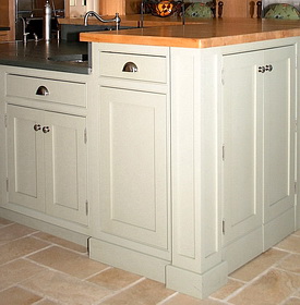
Alternatives we discussed were more creamy/yellow shades, but this top image of a kitchen I did, that's a nice shade too, has a bit of blue in it. Consider shades. They make a statement, hide the bad stuff (marks), and are just as easy to love as white, I promise! In the end, if you've just got to have white, of course, do it.

mom%20child%20kitchen.jpg


Scandinavian Kitchen - Luxe Living

1445484412_268baf7ae2_o.jpg

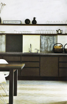
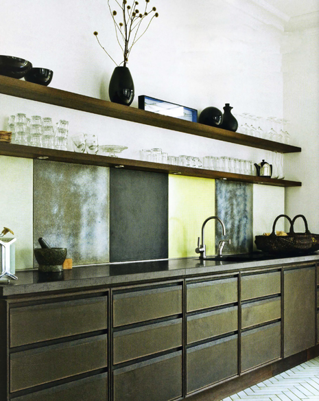
OK, I think it's time for another really fabulous Scandinavian kitchen! I haven't put one up for quite some time, I'm very much overdue and wow, do I have a fantastic backlog of kitchens to show you over time, so stay tuned! I can't tell you one single thing about this kitchen, as, sadly, my parents never taught me Danish! But, since pictures are worth 1,000 words, I'm sure you'll come up with some of your own descriptions. Me? I think this kitchen is quite awesome. Love the texture, the rich feeling of the cabinetry color, the sharp, white, accents, and always a favorite to look for, the lighting. Images from Bo Bedre.

Maybe it's because I went back to Denmark, I'm not sure, but I'm loving light oak herringbone floors right now. They are everywhere, for ages, in Copenhagen, but I think there is a (small) resurgence in herringbone flooring patterns in the U.S. It's a fresh, attractive, pattern and texture to use in wood flooring. I also love the shelves in this kitchen. Anyone else see herringbone patterns heating up? Enjoy!

http://farm2.static.flickr.com/1151/1445484302_01c6a8310a_o.jpghttp://farm2.static.flickr.com/1203/1444622231_5b8b61faa3_o.jpg
http://farm2.static.flickr.com/1427/1445484832_3b999980ef_o.jpghttp://farm2.static.flickr.com/1184/1445484962_7ac6301c02_o.jpg
1445484696_a7a32b4b16_o.jpg

Kitchen Designs - See The Plans!

I'm feeling good right now. I'm seeing a client later this morning. Even though I've been designing kitchens for a long time, I have the desire to reinvent the wheel each time I plan someone's kitchen. Now, that doesn't mean that wild and crazy things are happening in my design process. But, what it does mean is that I try to be open to new ideas, new details, to present to the client.

This stage is, at once, the most exciting and the most nervous for me, for lack of a better word. It's exciting when I know that I did good work and I cannot wait to show the client. I'm nervous because I hope the client is thrilled with the possibilities before them.

And, yes, I provide numerous design solutions. I do this so that what I present is not solely subjective (if I were to present, say, one or two floor plans) and because I feel the client should see multiple possibilities, to avoid a "could have, should have" feeling later. Sometimes, a nuance in the floor plan makes all the difference...

This process for me is fairly slow. It's thoughtful, it's creating shapes and forms to see where we can go with this kitchen. At this first stage, the goal is to select a floor plan. After a plan is selected, then we fill in the blanks with cabinetry. But, for now, the foundation is set:

1) countertop/other shapes, 2) acceptable clearances, and 3) appliance locations, no more!

While the plans look simplistic, much design time and thought lies beneath them. This is nothing, (only) in the sense that more and more design work will build upon the chosen plan.


This is the most important part of the entire process (and that's why I like it clutter free.) Alternative storage ideas are always a part of my design process. Upper cabinets are not always the answer to storage issues and therefore, open up the possibility for entirely new design solutions.


So, at this moment, I'm feeling good. I like what I have prepared for this client (and I'm my own worst critic, trust me.) I'll let you know the response!

These are some of the parameters for this kitchen that I had to work within, although a good size, it has its real challenges:

  • The window cannot move
  • The doorways cannot move
  • The view beyond the table is incredible - expansive views of Long Island Sound (maybe we will change the existing door configuration to the outside)
  • Client wanted the cooking area on the wall shown
  • Seating for EIGHT!
  • Note: Styling is fairly traditional. If this were a modern style kitchen, the shapes/forms would be different. Note too, the wall behind the cooktop is not an exterior wall, I need to draw in the hallway wall, below, and continue the exterior wall on the left side.

 Update: The meeting went well. I laid out all the plans on the kitchen table. They may have been a little overwhelming, but my client quickly got into the groove. Not ten minutes later, (that may be a record) she confidently chose a plan she knew was right for her. She liked this one. Onward!

Kitchen Design - A Brief Pause

So, I've been writing this blog for almost eight months now and I've only touched the tip of the iceberg. I've enjoyed much positive feedback. I want this blog to have substance, not just pretty pictures, and I want to share my thoughts with you on the broad and often complex topic of kitchen design and being a kitchen designer. At this point, I'd like to pause and hear from you! Tell me what you think, I want to know! If you have more then one answer, please comment too!


Update: I'm watching what you want, thank you for the feedback! More emphasis on kitchen images to come. I'm relieved you like the Scandinavian kitchens...just wait till you see what I have to show you! More of what you are asking for, keep voting...

Green Kitchens - Little By Little

Last Monday and Tuesday, I attended a series of workshops, presented by Quality Custom Cabinetry, whose custom cabinetry I use in many of my kitchens. They make a wonderful product Not only that, the entire (and I mean entire) culture of this company is something special. They will go to the very fringes of their ability to accommodate their designers. And, they will do so happily and willingly. I really love this company, and have been carrying their products since 1997.

I'm not so sure Quality would want me to shout this from the rooftops, but, I learned that they employ a Chaplain full time to attend to the needs of all of their employees, in the factory and the office building, complete with his own cubicle.  He is there to be called on as needed. Quite impressive, I thought.

One of the workshops (to Quality's credit) was on green kitchen design and thinking green, as is being implemented by Quality in their products. They referred us to easybeinggreen.com and we went around the room and talked about how we are making changes to green thinking in our homes and businesses, a good start to the workshop, and here were some of what people are doing (I'm in there too!)

  • recycling
  • changing light bulbs to flourescents
  • turning lights off
  • saving energy other ways in the home
  • composing
  • recycling
  • carpooling
  • walking or biking to work
  • learning about green issues
  • talking to clients about green products
It is interesting to note that 15% of homes now include green specifications. To me, that's a WOW! In the residential kitchen and bath realm, demand for green products has yet to take hold. We are seeing designs becoming more "natural" in styling, with more interest in texture, natural products, clean lines, clearly a change from recent years. I always ask my clients if they are interested in green design and green products for the kitchen and bath, and have a prominent (green text) section on my main website about green kitchen design. I do not see mainstream thinking yet, in terms of green kitchen and bath design, at least not in my geographical area. But, it's coming, I know that.

 
Quality Custom Cabinetry is seriously, and always, looking at finding better ways to produce a green product. Much of their plywood is now Pure Bond, formaldehyde free. Quality is the first company to partner with Columbia Forest Products. Quality's finishes on their cabinetry are still solvent based, although the VOCs are continuously dropping, as they find new ways to make a more environmentally friendly finish. They only use FSC certified wood materials as well, guaranteeing that the wood comes from a certified well managed forest, which comes at a premium cost.

I was impressed and surprised at the continuous research being done to create, if not a completely green product at this point, then, a product which incorporates ever increasing green attributes. And, in my world, it's admirable, and I'm glad to see this very strong interest.

When I later took a tour of the factory (see the slide show here) I saw stacks and stacks of Pure Bond plywood, which was nice to see it in a big way.

One more interesting tidbit: The speaker at the green workshop noted that it is sort of a paradox that, living alongside a large Amish community for these many years, with their strong beliefs and a self sustaining and conserving lifestyle, Quality recognizes that perhaps their Amish neighbors have more valuable insight on living responsibly than previously thought...
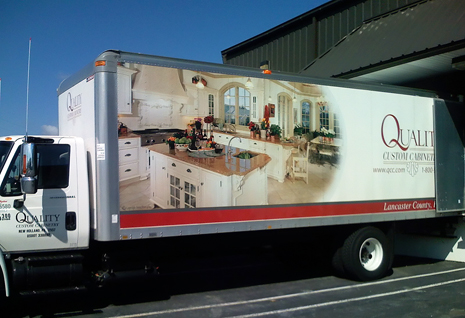
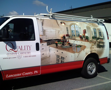
 Enjoy the slide show of the factory, the people working there (so many women!) AND, I cannot close without showing you my pictures of the Quality trucks and vans (one of each in these images) which has a kitchen I designed a few years back, emblazoned (I must use that word) on the sides! I was not thinking of this, when our tour crossed over, via the parking lot, from the factory to the tour of the office building and WOW, there they were!

 Quality.jpg

Quality%202.jpg

An Amish Kitchen - Via Quality Custom Cabinetry

I had lunch in an Amish home on Tuesday.

What a privilege that was. I have yet to write about it, (more about the event and what I learned soon) but, one of my major cabinet suppliers, Quality Custom Cabinetry, invited all of their representative kitchen design firms around the country, to celebrate their 40 years of business in this two day event, Monday and Tuesday of this week, in Lancaster Country, PA. For the second day of the event, three types of recreation were offered, at no charge. I ALWAYS rush back to the office, and when I heard that an Amish tour was offered, I decided to slow it down a bit and take advantage of this particular tour.

We toured the area, saw the horse drawn buggies, saw the corn being cut by men and horses, and entered this beautiful, different world of farms, one room school houses (many) and lovely people with strong values.

I had one of the best lunches in quite awhile, with some of the best food ever. Since the Amish do not have electricity, food is prepared in simple, traditional, ways. They cook with gas, and they may use battery power. There were no lights on of any sort in the kitchen where we had our lunch.

I wish I had taken a picture of all the food on the table, it just kept coming. Here's what was served:

  • several types of preserved vegetables, previously home grown 
    preserved apricots in syrup in a bowl
  • applesauce 
  • fresh beans
  • fresh potatoes, roughly mashed
  • noodles
  • fried chicken
  • ham loaf
  • white, sliced bread
  • homemade jam
  • pumpkin pie (best I ever tasted)
  • shoofly pie
  • iced tea
  • coffee
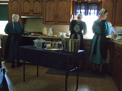
Here is an image of three generations of women in an Amish kitchen, that I took. They have lovely homes, the Amish. The women grow their hair and put it in a bun. They have a quiet elegance, which perhaps you can see here. No dishwasher, only their hands to wash dishes, serving dishes, glasses, and pots, from a group of 20. Afterward, little recipe books came out, selling for $3.50 each. I bought one.


Quality-Tour.jpg
I must mention this too...
after lunch, we went to a large Amish gift/food shop. As I was lingering outside, I glanced over at the ramp and spotted a woman being pushed in a wheelchair by another woman, with a man accompanying them. These people were my husband's relatives, also from Pennsylvania! I had not seen them since 2003, and shouting, hugging, and more ensued.

They live 3 hours away from the gift store we were at, and were in the area for a doctor's appointment for my husband's aunt. How could that happen? What if lunch were 5 minutes delayed? What if I went back to the bus 5 minutes earlier or to the restroom around the corner...that was a real WOW for me! Serendipity!

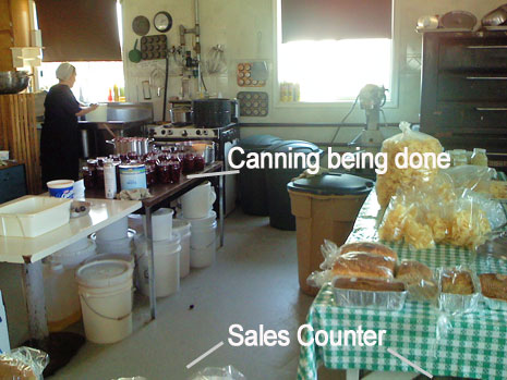
This is an image of the open kitchen just beyond the sales counter in the Amish store we stopped at.  


Amish-open-kitchen.jpg

Kitchen Accessories

decor8plates.jpgEveryone loves kitchen accessories, right? I go through spurts.  I'll take apart all my decorative "stuff" in the kitchen and redo it again. It takes me forever, but sometimes, I just need a new, fresh, look in the kitchen. And, with kitchen accessories, we can get a new look anytime we want. Here are a few accessories that will freshen everything up quick and easy.

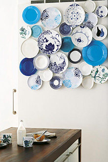
First, I'm wild about these little disc plate hangers I spotted on decor8, when my jaw dropped at the perfection of the concept! It makes me want to go out and start hunting for lots of plates. I love how these plates are hung in such a modern way, too.

Here's your source for them, DISChangers.com. How, absolutely, awesome, are these??


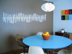
design-public.jpgNext, I want you to take a look at another fresh idea, from Design Public. Design Public happens to have a great collection of hip ideas for your walls.

These decorative wall art ideas are usually seen in other rooms of the home, but who cares? Be innovative and incorporate these ideas into the kitchen. Very easy to do.  


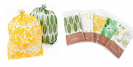
OK, maybe not what you wished for, but, hear me out...found these "trash chic" trash bags on Apartment Therapy -  Kitchen. The price isn't bad either, I was surprised...$14.95 for 80 liners. Makes trash removal something to look forward to now! Ok, it's a stretch...

 trash-bags-2.jpg

Kitchen Artwork - You're The Arteeest!

I went to a serious, very serious (no smile is on my face) art gallery in New York City over last weekend. As I walked around, a thought occurred to me..."I can do this too!" As I walked and gazed (seriously) at the images before me, I knew I had to talk to you, my readers, about this thought.

I took 8 of MY images below and added 3 of the images that were in this gallery show that I attended.

I'd like you to tell me which images, below, you think were done by the artist in the show. That's all. Maybe mine are so bad this will be a simple task, and everyone will guess correctly! Oh, the embarrassment!

What's the point here?

The point, is that you have talent, perhaps unused talent, too. If these images can hang in this prestigious gallery, sometimes two or three next to each other with no space in between the white, simple, frames, a nice look, then you can enlarge your images too (or go out and take some) and hang them in your kitchen and look at them as art (which they are! You don't need to spend bundles on what you perceive to be "real" art. Find the artist inside you, hang your work in your kitchen, be proud of it, and you will feel something special. It's fun and rewarding, and relatively low in cost. 8x10s at mpix are $1.99. The matting and framing can be artfully done as well.
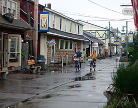
Those who know me know that I am a big proponent of putting art in the kitchen. Whether it is photographs, artfully framed and arranged, or oil paintings purchased from an artist, or other art forms, makes no difference.  I love to see space for art in the kitchen, and this is one way to do it, with meaning, AND, low cost.

OK, so which ones are the artist's images? Put the mouse over each image and its name will pop up at the top left of the small thumbnails.


Built in Coffee Maker Appliances - Rethinking Kitchen Design

Miele-coffee.jpgThe coffee pot! It used to be a non issue, never on the radar screen when planning a kitchen. Now, it's absolutely a checklist issue to discuss.

I'm in the middle of the kitchen design process with a client. Up to now, we had talked about having a place for his coffee/espresso maker and other small appliances, perhaps in one area of the kitchen. Sort of an appliance "center."

Then, I received an email from the client saying he would like a built in coffee maker system. Shortly after, he said, "oh, let's just put a pot on the counter, that's good enough." I then realized that I had not told him the concept behind the built in coffee maker.

It's about convenience. Convenience is nice. It means always having a cup of coffee when you are ready. 

Here are the reasons why one may want to consider a built in coffee maker appliance:

  • convenience - always ready for one cup
  • time saver - no more multiple steps of prep/clean up for one or two cups
  • infrequent water filling, if at all (tank or plumbed)
  • fast response, rather than waiting for the whole pot
  • choice of different coffees and grinds
  • no coffee wasted by making more than you need
  • may select specific amount for a small or large coffee cup
Here is more information from The Appliancist on coffee maker systems. It has good information for comparative purposes.

 
You may read that the coffee maker system will "declutter" your countertops. I'm not so sure of that. The reason is, these appliances are fairly large in width, often 24". Now, space has to be found in the kitchen design, another challenge, which usually eliminates counter space and storage and has a large impact on cabinetry and the entire design.

In our house, the coffee addict (my husband) has, for now, found his solution. The one cup Tassimo. Can this $100 coffee maker compete with these gorgeous appliances in terms of taste? I'm sure the answer is no, especially, as most of the built in appliances grind the coffee beans to taste. So, there is convenience in the countertop one-cup models. The question then becomes, "at what price, taste??" (Shhhhh....don't remind my husband these appliances are available!)

Would you like one of these? 


The Scandinavian Style Breakfast Room

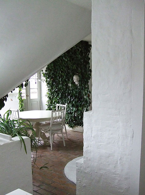
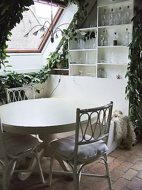
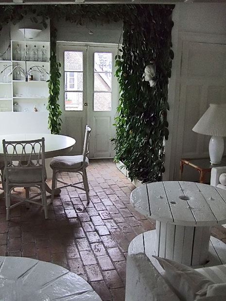
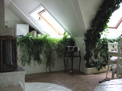
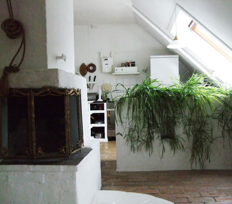
There was one photograph, similar to what I took below, that made me very quickly email the realtor back to say, "book it!" What is not shown so well is this structure of sorts that has a curved, stone, thick, back to it and the front is seating, like a curved sectional. It is situated in the perfect spot, and definitely a surprise in this room.

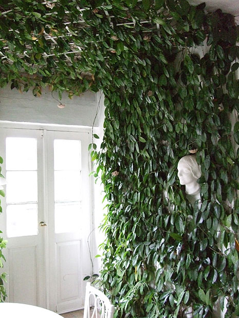
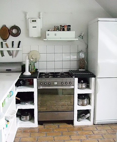
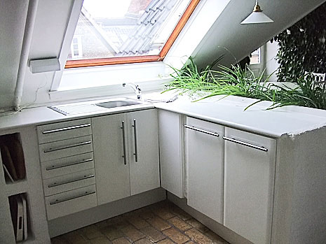
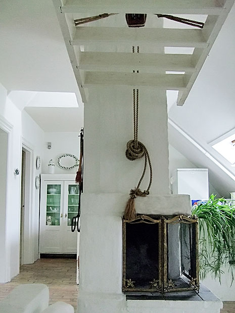
There is a variety of interesting elements in this room...the brick floors for one. These are real bricks, not veneer! I've never seen this used as flooring in a kitchen, a real kitchen. I'm a barefoot walker around the house, and it did not bother me to walk on this floor. Of course, the plants on the walls and ceiling are crazy!  It certainly was THE most interesting breakfast room I've ever had the pleasure to dine in.

And, always white, everywhere, as the perfect shade to complement these colors of nature, the brick and the green plants. Simple, not "decorated" per se, just sort of accumulated elements, creating a comfortable space.  

What makes a breakfast room/kitchen dining area great? I think one way (not the only way) as we see here, is to create the quality of the space feeling "real," not contrived, but to show an authenticity, with a goal to delight, and ignite, the senses. It's one particular look.


Did you say you wanted at least SOME accessories to integrate into this look?? Ok, come with me over to Desire To Inspire's second day of shopping the antique boutiques for some very wonderful furnishings and accessories to get this look! Thanks DTI! 

denmark-kitchen-10.jpg denmark-kitchen-1.jpg Denmark-kitchen-2.jpg denmark-kitchen-3.jpg DSCF1355a.jpg

White Kitchen - Scandinavian Style!

I haven't really shown you any images from my trip to Copenhagen yet! I have so many....over 2,000 to be round about precise (call me obsessive, I'm guilty!) And, let's not forget my 10 (at least) magazines too. Lots of good stuff. Don't get me diamonds, just get me a Scandinavian interior design magazine! (I didn't really say that, right?)

Speaking of good stuff, I went a little crazy with taking lots of images of this very soft, romantic, Scandinavian style that everyone loves so much. I found this wonderful style (so much style) in some very special antique stores, Atelier September and Fil de Fer.

I have shared these particular images with Desire To Inspire, my good blogging buddies, because they have featured one of the stores before and I thought they would enjoy them, a fresh look from being IN the stores. I think they enjoyed them so much that they are doing a feature today AND featuring more, and different, images tomorrow! 

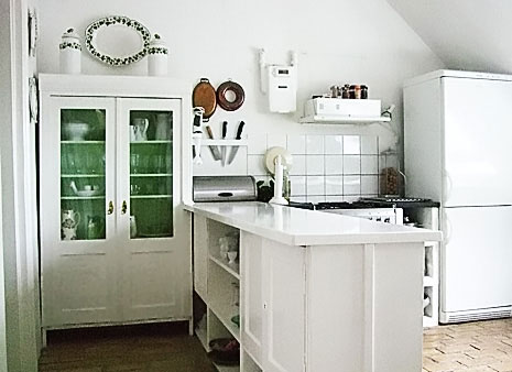
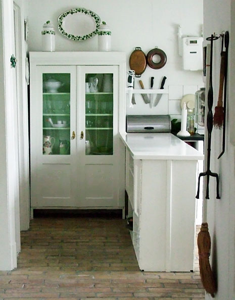
What's missing is the kitchen! The apartment we stayed in, in Copenhagen, definitely had this same romantic style going on. I saw pictures of it online and booked it immediately! I just HAD to stay there. So, here is a kitchen design connection to this romantic Scandinavian style that Desire To Inspire is showing.

Today I will show you the kitchen, tomorrow, I will show you the adjacent breakfast room which will make you fall right over!

Don't forget to check back with Desire To Inspire tomorrow too, to see the complete look, connected with my images here.  

Here are previous posts in Desire To Inspire...on Scandinavian Style  and more Scandinavian style and good Danish design too. I would encourage you to use the search tool in their blog, but watch the time, you'll be there all day!


denmark-kitchen-4.jpg denmark-kitchen-8.jpg denmark-kitchen-7.jpg denmark-kitchen-6.jpg denmark-kitchen-9.jpg denmark-kitchen-5.jpg

Creative Kitchen Designing

Brooke%20Kitchen.jpgI visited a blog I have been following for some time. It's about a "gut" renovation of a charming, old house in Sag Harbor, that really wonderful town on the east end of Long Island.

I've been waiting SO patiently to see what was going to happen in the kitchen, and finally, the images are up. Brooke Williams, Domino blog editor extraordinaire, (and mom-to-be very soon) did some pretty interesting things with her and her husband's kitchen. Definitely alternative!

Take a look at this kitchen post for more very interesting images and information on the kitchen.

The message, here, is that kitchens come in all different types and styles for all different reasons, and, in the end, should be as individual as you are!

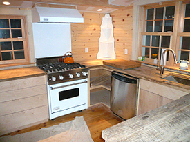
Perhaps you would not have certain design elements or products such as is designed into this kitchen (no upright refrigerator, only 2 under counters opposite the range!) but Brooke and her husband thought this through carefully and decided a spacious, open feel was what they wanted most. Likewise, kitchen countertops made of unfinished, reclaimed antique wood, which will need to be finished on site. Another alternative idea! My understanding is that this will be a second, weekend, residence, another reason to make it a laboratory and venture beyond the typical.

Feel free to seek out, find, and then express your inner "kitchen!" You may get a range of comments and reactions, but, who cares, it's a reflection of who you are, and that's as it should be in kitchen interiors. I see it as having a very interesting mix of textures. Good work following your kitchen bliss, Brooke!

Blogging Kitchen Blogs

Let's see who's talking about what in the kitchen focused blogosphere...

K+BB Green's Jeff Holloway, CKD, who blogs on green kitchen and bath products, issues, and ideas, also looks at green focused kitchen and bath issues, but look beyond that post, and you will be enlightened in a green way.

Peggy Deras, CKD, from Kitchen-exchange, has a great post on a free service for lighting questions. Let me tell you, planning lighting for any room in your home SHOULD be given first rate attention. It's a small price to pay (in this case none) to get it right the first time and to "see" clearly what you need and want to see!

Ann Porter, CKD, of Kitchann Style has a very interesting post on opening up, or visually enlarging small kitchens. Now, the conventional wisdom says that one must pack in as much storage as is possible in a small kitchen. As Ann says, it's more about finding alternative storage solutions, with the benefit of a much more spacious look to an otherwise small feeling kitchen. I like this way of thinking!

Laurie Burke, from Kitchen Design Notes, talks about the maintenance of soapstone.  Soapstone is a quite misunderstood material. No need to be freaked out by scratches...with a little elbow grease, your countertop is brought back to life and lustre. Explore, there is more on soapstone in the blog.

And for pure style, one of my fave design blogs, Desire to Inspire always manages to sneak in some great kitchens in their posts, which are a joy to see, especially in the context of the whole house, apartment, or whatever the environment! Take a look and get, well, inspired...  

Kitchen Designer Diary - A Day In The Life

DSCF3701a.jpgFrom time to time I will share with you real life client meetings, like today. It was an interesting day today. I had received a call last week from a woman who asked about my kitchen design services, as she and her husband are planning a kitchen renovation. I was immediately intrigued when she said they lived on Fire Island. Fire Island is a very long, and very narrow, strip of land, beyond the south shore of Long Island, about 1/2 an hour off of Long Island by boat, reachable only by private boat or ferry. No cars are allowed on the island, and there are several small towns. It's all about the beach on Fire Island!

I was born and raised on Long Island, and I had never been to Fire Island, the residential section of Fire Island, as opposed to the public ocean beaches, a totally separate area, so I was interested in going. The trip there and back was time consuming. I live on the north shore of Long Island, a straight shot across the island from the ferry on the south shore. Here's the math:

DSCF3706a.jpg1/2 an hour to the ferry

1/2 an hour on the ferry

2 hours 45 minutes between ferries (once on Fire Island)

1/2 an hour on the ferry back

1/2 an hour back home, once on the mainland

= close to 5 hours and a fair amount of wear and tear!

But, again, I was interested in seeing it, so off I went. I thought I'd be met at the ferry, so after wandering around a bit, I called, and they said they'd be right there and asked if I rode a bicycle. Hmmmm...I dressed in a skirt and had 2 heavy bags with me, but, this was an adventure, so, I must do adventurous things. "Sure, I said, I ride a bike."

DSCF3746a.jpgSome minutes later, up came a man (the husband) riding a big old bike and holding another bike as he rode, a female style bike, bright blue. The husband took my things, put them in his basket and off we went on the way back to their house.

We rode on some beautiful, very small, narrow, paved lanes, typical for the island, past lovely, small homes, with beautiful gardens, such lush growth everywhere, a front lawn with large seashells, tall beach grasses blowing, and passing others on their bicycles too. Weaving from one lane into another, we eventually got to the house, leaned the bike up against the house and went inside.

DSCF3744a.jpgThe home was beautiful in its simplicity, exposed beams everywhere, as the home is not winterized, and it was all in white. There was authentic, and beautiful, mid century furniture pieces by famous designers such as Hans Wegner, and a light by Louis Poulsen. It was very inspiring. We talked, all went well, and I immediately thought of a new line of cabinetry that I will be announcing soon (!) which would be just perfect for this particular setting. The kitchen is wide open to the living room and dining area. I know exactly what to do here. This kitchen needs surgery! The estimate was received well, it was asked that I fully measure, we'll see what happens.

It was a long day, oh, and how can I forget to mention the pouring rain on the ferry trip back, complete with rough seas, thunder and lightning (and let's not forget the below "E" gas fill-up at the self help mini mart gas station where one must go into the mart, fill up, then go back to the mart, then back to the car (in the rain)? Ugh.  

All in all, I had a great day, met nice people, saw a beautiful place, and an interesting home, it's definitely all good. 

Kitchen Cabinet Order Process

It was a very busy week last week. Of course, a large cabinet order for a kitchen had to be edited while I was away, which I did (while I was away). Then, it had to be looked at in its entirety again right after I got back, to do the back and forth editing with the factory, which I did, and have just finished.

I thought it would be interesting to give you a little glimpse of what is involved in ordering a kitchen, this stage of the order processing, which is the final stage. It's a stressful time. It's decision time, fish or cut bait, do or die, last chance and all that!

I do things the long way. When I put in my cabinet order, it's probably 95% accurate. Usually, that is because I need to rush the order writing somewhat so that I can reserve a particular week for delivery...timing is always critical in my line of business! At this time, the client and I go over the final plans and they place the deposit with me. In the course of going over every final detail, more issues often arise, changes, rethinking, etc. on the part of the client. I permit that, I never discourage it, because I want my clients to have things "their way." I want them to have every opportunity, even if it comes later than it should, to make their kitchen the way they want it.

Sometimes, as in this case, the client kept thinking and rethinking things well after we first placed the order, and I continued to accommodate this client until the day before I left for my trip (a surprise two hour meeting!) And, then we emailed and spoke again while I was away!

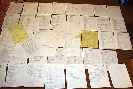
When the factory gives me back their interpretation of my written order, and before production, it looks like the image, here! I need to start from scratch with every single dimension for the entire room, taking another look at a couple of hundred+ cabinet order details, and taking everything else (appliance specs & more) into consideration all over again. That's how I do it.  It takes focused concentration for long periods of time.  As a result, I never, ever, have a problem with a cabinet's fit, and I'll often come up with new, better, ways of detailing a cabinet during this time.

There are four pieces of information that I check, one against the other, constantly: the specifications list in the contract, the floor plan and elevations, my order to the factory, and the original dimensions from the space. Back and forth, one to the other and back again.

Sometimes I have not been 100% clear in the order, and sometimes the factory makes a mistake or misinterpretation on their edited copy of the actual order. They check me, and I then check their final interpretation before it goes into production. We communicate via phone and email. To me, it's not over until it's the last day before production (well, the goal is to have it be over when the factory begins their editing process!) You can get a sense of how detailed a designer is if you ask him/her to tell you how he/she edits their orders with the factory. Sometimes I call it engineering the cabinetry to fit, as I design all cabinetry to the 1/8". If they roll their eyes at the thought of this stage of the process, it's a good sign! Now the order is done, and guess what, when the cabinets arrive, I'm doing the whole thing all over again to remember why I did what I did!

Kitchen%20Order.jpg 


Thank you blogging buddies!

DSCF0972a.jpgI think I'm the only one I've come across who refers to "blogging buddies." I do like the sound of it! I would like to thank my blogging buddies, Holly from Decor8, the gals at Blink Decor, and Linda from Surroundings, for showing my kitchen design work and/or my images from Denmark.

Thanks to Blink Decor for showing the images of my currently published kitchen. I'm glad they enjoyed it! I have to take a moment to say that I'm really crazy about the layout of their blog. I love the colors, it's very exciting, it always revs me up, and it's very user friendly. Good stuff on there too, and always thoughtful and informative advice. Thanks, gals.  

Thanks to Holly from Decor8 for creating that big, fantastic, post on Danish home interiors (images from some of my familys' homes) and for showcasing some of the great, Danish, furniture that I photographed in the fine, home furnishing stores. My cousin's comments on sources and designers of her home furnishings are very interesting. What a thrill to be on decor8! It's always a destination for me. Need to keep up to date and see what's happening design-wise!

And, last, but definitely not least, to my very good blogging buddy, Linda, from Surroundings. I laughed out loud when I saw the title of Linda's post, about the rotten state of Denmark, and wish I thought of that myself! Thank you Linda, for both showcasing my white kitchen and for linking to the Danish inspired posts on the blogs. Always a go-to source for interesting, eclectic, design information, and, I appreciate the mentions, Linda (each live link links to a different post). Surroundings takes the pulse from many sources and makes sense of it all to the rest of us!

You know, I really need to ask this question. Due to the enthusiasm over "things Scandinavian," I am often confused, because I'm SO tied into the culture and the beauty of it all. So, tell me, what do you all love about it? Do you see Scandinavian design becoming even more of a factor in today's design interests? Do you see it moving forward in everyone's design focused radar screens? Or is it just the classic beauty of it which will always be appreciated? Is everything old new again, or is it fresh, new, Scandinavian points of view that you are seeing? I'd really love to hear your thoughts.  

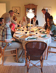
The image is my cousin's dining room, with some of our family, a beautiful Danish home interior.